What is ADER error?
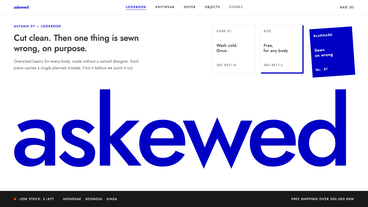
ADER error turns the fashion storefront into a clean white room where exactly one thing is wrong on purpose, and that single mistake becomes the whole brand.
ADER error in brief
ADER error is a Seoul clothing label founded in 2014 and run by an anonymous creative collective. It makes oversized, unisex basics, and what sets it apart is not the cut of the garments but a habit of deliberate imperfection: labels sewn on crooked, logos cropped at the hem, care tags stacked on top of one another. The mistake is the signature.
As a visual style, ADER error is the translation of that habit into screens. The ground is stark white, the only saturated color is a single luminous blue known as Bluemark, and the layout is held on a strict, airy grid. Because everything around it is so orderly, one tilted tag or one wordmark sliced by the edge of the frame reads instantly as an event rather than a bug.
The result is a restrained, gallery-like look that suits fashion e-commerce, brand lookbooks and online stores that want to feel like walking through an exhibition. It is a style built on contrast between discipline and a controlled slip, and it works only if the discipline is real.

Where does ADER error come from?
The label emerged in Seoul in 2014, in the middle of what is often called the 2010s Korean contemporary fashion wave, when a new generation of local brands began to be noticed abroad and to think of themselves as more than domestic apparel makers. ADER error chose to stay anonymous: no star designer, no personal biography, only a house collective speaking through products and spaces.
Its stores were treated as installations rather than shops. Over the following years, installation flagships and collaborations, running from roughly 2017 to 2024, pushed the idea of concept-store retail as art: rooms staged like exhibitions, objects placed as if curated, garments appearing almost as incidental pieces within a larger composition. This is the second tradition the style inherits from, retail space as installation art.
The third influence is the Instagram-era lookbook. Images had to be legible as a thumbnail, memorable in a feed and recognizable without a caption. A single cropped logo or a rotated blue label is exactly the kind of detail that survives that treatment, which is why the brand's visual language travels so well between physical rooms and small screens.
The digital system borrows the storefront's own restraint. It keeps the white ground, the single blue, and the habit of leaving most of the page empty so that the planted error has room to be seen. The typeface is a geometric sans in the spirit of Futura, the kind of clean, circle-and-line letterform that stays neutral while the layout does the provoking.
What defines the ADER error look?
One planned error per view
The defining rule is that each screen carries exactly one intentional mistake: a label turned a few degrees, a wordmark cropped by the edge, a tag overlapping its neighbor. Two errors cancel each other out and the page just looks careless. One error, surrounded by order, looks like a decision.
Stark white ground
The background is pure white, borrowed from the label's storefronts. There is no cream, no tint and no texture. White acts like gallery wall paint: it removes context so that product and error become the only things worth looking at.
A single saturated blue
Bluemark blue is the only saturated color in the system. It is bright enough to glow against white and is used sparingly, on tags, small marks and occasional accents. Because it never competes with other hues, it becomes a signature in the way a house color does for a fashion label.
Strict, airy grid
Layouts sit on a disciplined grid with generous empty space around each item. The strictness matters because the whole idea depends on the contrast between a rigorous frame and a planted slip. If the grid itself is loose, the error stops being legible.
Geometric sans typography
Type is a geometric sans-serif in the Futura tradition, here served by Jost. Letters are built from near-circles and straight strokes, set in modest sizes with plenty of surrounding space. The type stays calm and neutral so that cropping and rotation, rather than ornament, supply the drama.
Cropped and offset wordmarks
The brand name is treated as an object that can be cut by the edge of the canvas, pushed off center or tilted. Readers still recognize it, which is the point: the slip works only because the thing being slipped is familiar.
Exhibition pacing
Pages are paced like rooms in a show. Each section presents a small number of objects, then breathes, then moves on. Dense catalog grids and busy promotional banners work against this rhythm and are generally avoided.

Who shaped ADER error?
The anonymous in-house team behind the label since 2014. By declining to put a named designer forward, it made the work itself, and its deliberate flaws, the author. The visual system is a direct extension of that choice.
Designer of Futura, the geometric sans that this system's typeface echoes. Futura showed that a letterform built from simple circles and lines could feel modern and neutral at once, which is the quality ADER error's layouts rely on.
The open geometric sans that does the work Futura does on the real site. Using it keeps the digital system faithful to the storefront's typographic voice while remaining easy to deploy on the web.
How do you use ADER error today?
For slide decks, the cover is where this style shines. Place a very short title on a white slide, let the company or product name be cropped by the slide edge, and add one small blue mark off-axis. Content slides should keep to one idea, one image and generous margins; resist filling the space just because it exists. For data slides, a single blue series on white with plain thin axes is enough, and the one deliberate misalignment, such as a callout tilted slightly, should be reserved for the number you most want remembered.
On the web, the style is a natural fit for fashion and lifestyle storefronts. Product grids work if the spacing is wide and the product photography is clean, with the blue used only for prices on sale, selected states or a single call to action. Dashboards and pricing tables are harder: the style tolerates them only when the errors are removed, because mistakes in a data interface read as bugs rather than character. Treat it as a presentation layer for brand pages, not as a general application theme.
In editorial and marketing work, think of each page or spread as a wall in a gallery. A lookbook can alternate full-bleed garment photography with white pages that carry a single caption and one cropped detail. Campaign emails and landing pages benefit from the same approach: one headline, one image, one blue accent, one planted error. If a campaign needs a lot of information, split it across several quiet screens rather than compressing it.
Typography should stay disciplined. Use one geometric sans family, a small number of sizes, and plenty of space between lines and blocks. Let the contrast come from scale and cropping rather than from extra weights or decorative fonts.
The most common mistake is treating the idea as permission for general sloppiness. Random misalignment, several errors on one page or messy spacing everywhere will simply look broken. The mistake only works against a background of rigor: an exact grid, clean white, one blue, and exactly one thing that is wrong. Another frequent slip is adding more colors, which dilutes the signature blue and removes the stark storefront feeling.

ADER error — FAQ
What is the ADER error design style?
It is a digital interface style taken from the Seoul fashion label ADER error, founded in 2014. It combines a stark white ground, a single saturated blue called Bluemark, a strict airy grid and a geometric sans-serif, then adds exactly one deliberate mistake per view, such as a cropped wordmark or a tilted label. The contrast between order and the planted slip is the whole effect.
Why does the style use only one blue?
A single saturated hue makes the color a signature, in the way a fashion house has a recognizable shade. It also keeps the page quiet enough that one planted error stands out. If several colors compete, the viewer no longer knows what is intentional, and the stark storefront character disappears.
Can I use it for a dashboard or a SaaS product?
Only partly. The grid, white ground and blue accent translate well to a clean product interface, but the planted error does not. In a tool people use to get work done, misaligned elements read as defects. Use the style on marketing pages, launch sites and portfolio pieces, and keep the application itself conventional.
How is it different from minimalism or Swiss style?
Minimalism and Swiss style aim for correctness: alignment is perfect and nothing is out of place. ADER error shares the white space and the grid but adds a counter-rule, which is that one thing must be wrong. That small, controlled provocation gives it a fashion and installation-art attitude that pure minimalism does not have.
What typeface should I pair with it?
A geometric sans-serif in the Futura tradition. The reference implementation uses Jost, which is open and easy to deploy on the web. Stick with one family at a few sizes and let cropping and rotation provide the interest instead of extra fonts.
Related design styles
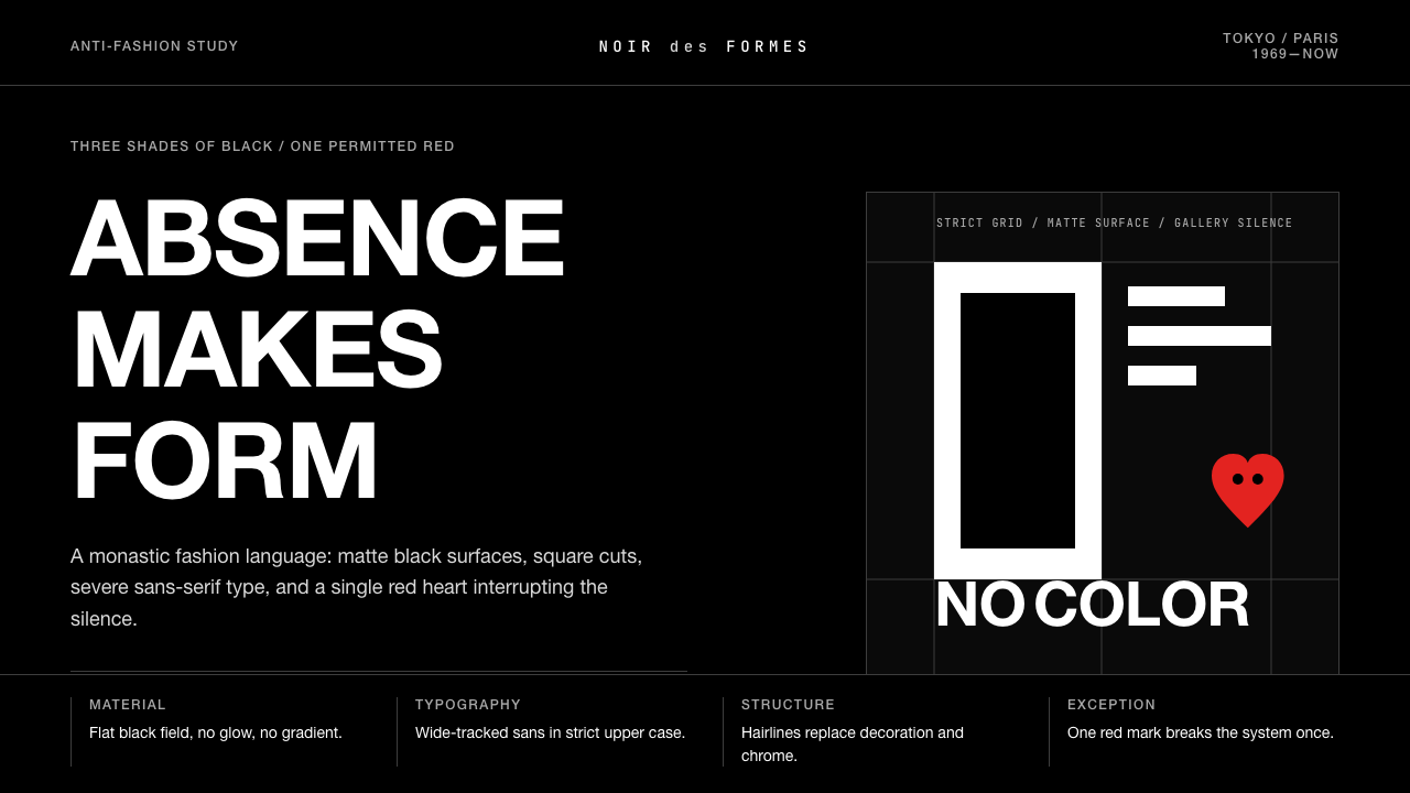 Comme des Garçons (Rei Kawakubo)Austerity becomes the event. Pure black, wide sans type, and one red heart br…
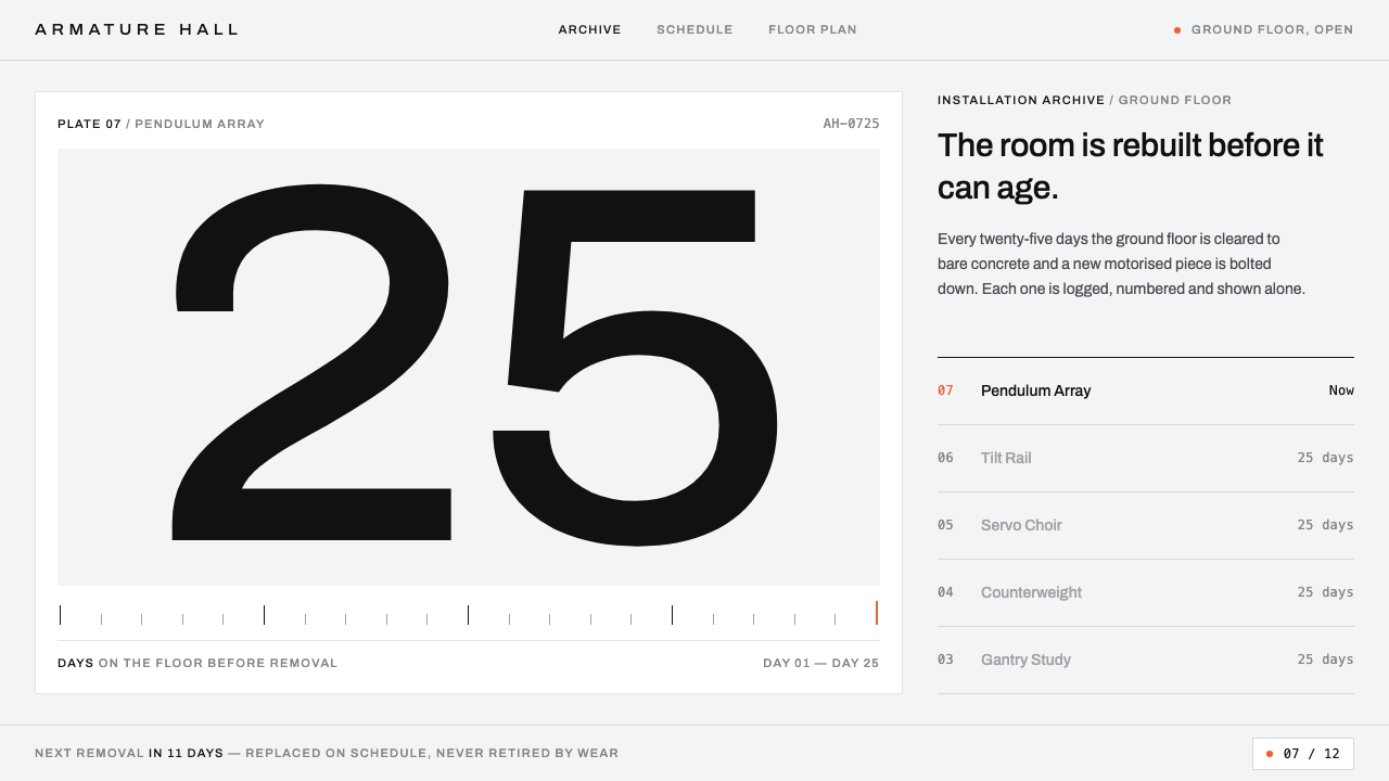 Gentle MonsterObjects filed like machine parts. Grey sweep, tracked Archivo, hairline rules…
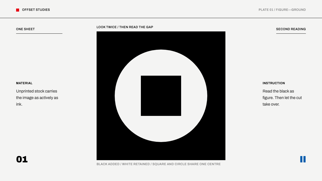 Shigeo Fukuda OpticalOne ink, two readings. Black geometry and a white cut make the sheet do half…
 Malevich SuprematismGeometry declares zero. Red, yellow, blue and black blocks float on active wh…
 Notan Light-DarkTwo values, nothing between. White masses cut from a carbon-black field, figu…
 Prishtina National LibraryCivic modernism that refuses one answer. Unequal plaster cells sit beneath a…