What is Zootopia?
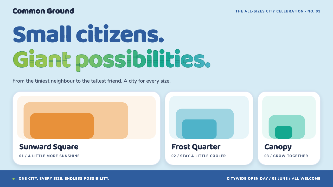
Zootopia turns a film's city into a design system: a pale sky, police-blue actions, navy type and districts that each carry their own climate color.
Zootopia in brief
Zootopia is a design style drawn from the city in Walt Disney Animation Studios' 2016 feature film of the same name. It is not a historical movement or a school; it is the production design of one invented place, translated into the working vocabulary of slides, websites and product interfaces. The result is bright, friendly and a little mischievous, with a clear sense of civic order underneath.
The foundation is a pale, open sky-blue ground inspired by the skies over Savanna Central, the film's downtown. Primary actions take the blue of the city's police uniforms, while headlines and body copy sit in a deep navy that keeps long reading comfortable. Soft, rounded letterforms give the headings a welcoming, almost storybook character, and a green-to-teal gradient taken from the film's own logo lettering is held back for brand moments and success states.
What makes the style distinctive is its organizing idea: every section belongs to a district. Warm orange marks the desert-like Sahara Square, cool cyan marks the frozen Tundratown, and a wet, saturated green marks the Rainforest District. A page does not carry one accent color from top to bottom; it changes environment as the reader moves through it, the way a tram ride crosses a city.

Where does Zootopia come from?
The style comes from Walt Disney Animation Studios, based in Burbank, California, and from the film Zootopia, released in March 2016. The look of the city was developed during the production design phase that ran roughly from 2012 to 2015, a long period in which the filmmakers had to decide not only what the animals looked like, but what kind of city animals of every size would plausibly build for themselves.
That question is the heart of the design. The film imagines a metropolis where predators and prey, mice and elephants, share the same streets. A city like that cannot be built to one scale. The production design therefore leans on doors, transit and buildings that exist at several sizes at once, nested inside one another, so that a tiny resident and a towering one can both move through the same space. This is the origin of the style's habit of offering components in small, medium and large forms: the same card can be a mouse-sized card or an elephant-sized card, and the page always has a change of scale to look at.
The second major idea is climate-zoned urban planning. Instead of one uniform downtown, the film's city is divided into districts, each built to suit the creatures who live there and each carrying a distinct environmental palette. The hot, sandy neighborhood is warm and orange, the icy neighborhood is cool and cyan, the humid jungle neighborhood is dense and green. Worldbuilding of this kind, where an entire animal society is given its own infrastructure and geography, is one of the movements the source material places this work within, alongside the broader tradition of Disney three-dimensional feature animation.
The people credited as key figures include the directors Byron Howard and Rich Moore, the writer and co-director Jared Bush, and the design leads David Goetz and Matthias Lechner. Together their work gave the city a coherent, readable identity: a place that feels designed for its inhabitants, with signage, transit, color and scale all answering the same question about belonging. That readability is exactly what makes it so easy to carry from a film frame into a user interface.
What defines the Zootopia look?
Savanna Central sky
The ground color is a pale, airy sky blue, a light wash rather than a saturated field. It lends the whole system a daytime openness and lets stronger colors sit on top of it without fighting. Because the base is so light, the style reads as a bright, cheerful style rather than a dark or moody one, and the film's city is treated as a place you would want to walk through at midday.
Police-blue actions
Buttons, links and primary controls use the blue of the city's police uniforms. It is confident and trustworthy without being cold, and it gives the eye one dependable color to follow for 'what do I click'. Everything else in the interface may change environment from district to district, but the action color stays steady, which keeps the page usable even when the surroundings shift.
Navy type
Headlines and body copy are set in a deep navy rather than pure black. The shift is subtle but it softens the page, keeping the friendly tone while still giving strong contrast against the pale ground. Headings use rounded, generous letterforms in this navy, and the combination reads like a well-made children's book that happens to be extremely legible.
Logo-lettering gradient
A smooth transition from grass green into teal, lifted directly from the film's title lettering, is the style's one signature gradient. It is rationed carefully: brand moments, hero accents and success states are where it appears. Because the rest of the system is flat and calm, this single gradient reads as a small celebration rather than decoration spread everywhere.
Districts as sections
Each section of a page belongs to a district and takes that district's environmental color. Warm orange suits energetic or sunny content, cool cyan suits calm, clean or technical content, and wet green suits growth, nature or abundance. The ambient color changes as a block as the reader scrolls, so a long page feels like travel through a place rather than a single repeated template.
Mouse, rabbit and elephant scale
Components come in small, medium and large sizes, named after animals of different bodies. This echoes the film's nested doors and transit, where one world is built for creatures of every size. In practice it means cards, buttons and tiles can be sized up or down on purpose, producing a lively rhythm of big and small elements rather than a monotone row of identical boxes.
Rounded, welcoming shapes
Letterforms and containers lean toward soft corners and generous curves. Nothing about the style feels sharp or severe, and that softness is part of its promise of belonging: the interface is meant to look like it has room for everyone. This is why the style suits playful brands and family-friendly products so naturally.

Who shaped Zootopia?
Howard is one of the directors credited on the film. His involvement ties the look of the city to the storytelling choices of the production, where the animal society and its geography exist to serve a story about belonging. For a designer, his name is a reminder that the style is narrative first: color and scale were chosen to make the film's central idea visible on screen.
Moore is the film's other credited director. Working alongside Howard, he shaped a production in which the city had to function as a character, one with its own neighborhoods, rhythms and logic. That treatment of environment as personality is why the style can swap whole sections to a new district color and still feel like one coherent place.
Bush is credited among the key figures of the production on the story side. The film's premise, an ambitious city where every species is supposed to be able to be anything, is what gives the visual system its reason to exist. A design built from that premise inherits its optimism, which is why the interface language is friendly and inclusive rather than clinical.
Goetz is named among the production's design leads. The reading of a city through districts, each with its own palette and architecture, is the kind of decision that sits in production design, and it is the decision this style borrows most directly. When a page turns orange for one section and cyan for the next, it is using the same logic that made the film's neighborhoods easy to tell apart.
Lechner is likewise named as a key figure in the production design. His part in shaping the film's world sits behind the nested sizes and the climate-zoned layout that the style turns into small, medium and large components and district-colored sections. Anyone adapting the style is, in effect, borrowing a piece of that urban planning.
How do you use Zootopia today?
Zootopia is at its best when the project has a sense of place, a bit of humor and an audience that should feel welcome. Children's products, city guides, event pages and playful brand sites are the obvious homes, because the style's rounded type, light sky ground and districted color already read as friendly. It asks the designer to think like an urban planner: decide what each section of the page is, and give it a district.
For presentation slides, the cover works well with the pale sky ground, a large navy rounded headline and one confident district color as a band or block. Content slides can change district from topic to topic, so that an orange section introduces energetic material, a cyan section handles calmer analysis and a green section covers growth. Data slides benefit from the scale idea: let one key number be elephant-sized and surround it with mouse-sized supporting figures, so the eye always knows where to land first.
For web interfaces such as landing pages, onboarding flows, dashboards for family or education products and pricing pages, keep the action color steady in police blue and let the surrounding sections shift environment. Cards and tiles should come in a few deliberate sizes rather than one uniform size. Reserve the green-to-teal gradient for the places where the product wants to say well done: a completed step, a successful save, the first-time hero accent.
For editorial and marketing work, the style supports a travelogue feel. A long article or campaign page can be divided into chapters, each assigned a district color, so the reader senses progress as a change of scenery. Navy copy on a pale ground stays comfortable across many paragraphs, and rounded headings keep the voice warm. Poster-like banners can lean on large, friendly type with a single district color doing the work of attention.
A common mistake is to use all of the district colors at once on a single screen, which turns the city into confetti and removes the logic that makes it work. Each section should commit to one district. A second mistake is to spread the signature gradient everywhere; used constantly it stops meaning celebration. Finally, resist the temptation to harden the shapes or tighten the type to look more serious: this style's strength is its welcome, and a stern version loses the thing that makes it distinctive.

Zootopia — FAQ
Is Zootopia a real design movement?
No. It is a style derived from the production design of a single film, Walt Disney Animation Studios' Zootopia, released in 2016. It sits within the broader tradition of Disney three-dimensional feature animation and of animal-city worldbuilding, but it is not a school with a manifesto. Its coherence comes from the film's invented city, where districts, scale and color were all planned to tell one story about belonging.
What does 'every section is a district' mean in practice?
It means each block of a page is assigned one environmental color and keeps it. A warm orange block feels like the desert-like Sahara Square, a cool cyan block like the frozen Tundratown, and a wet green block like the Rainforest District. Switching districts between sections gives long pages a sense of travel, but inside one section the color stays consistent so the logic remains readable.
Why are components sized after mice, rabbits and elephants?
Because the film's city is built for creatures of every size, with nested doors and transit that accommodate them all. Translating that idea into small, medium and large components gives a page a deliberate change of scale instead of a flat row of equal boxes. It also makes hierarchy easy to express: the elephant-sized card is the one you should look at first, and the mouse-sized ones support it.
Can this style work for a serious or professional product?
It can, with judgment. The navy type and steady police-blue actions give it real legibility and a trustworthy backbone, so it adapts well to education, civic information and family-oriented tools. It is less suited to contexts where severity or austerity is the point, such as legal, financial or industrial products, because the rounded forms and district colors are deliberately warm and playful.
Where should the green-to-teal gradient be used?
Sparingly, and only in moments that deserve emphasis. The gradient comes from the film's logo lettering, so it works best for brand moments such as a hero accent or a wordmark, and for success states such as a completed task. Everywhere else the system stays flat and calm, which is what lets the gradient feel like a small celebration when it does appear.
Related design styles
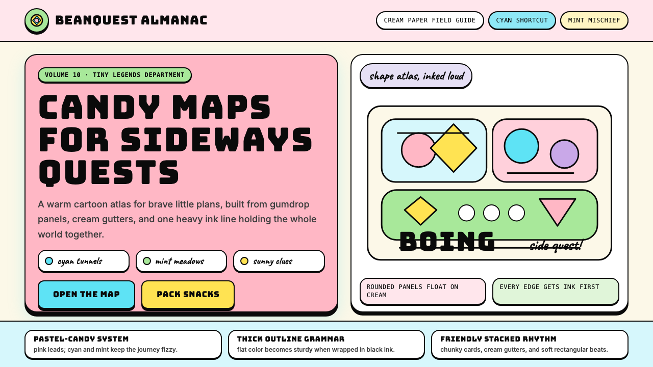 Adventure TimeCartoon warmth, inked loud. Cream gutters, candy pink, cyan and mint lock int…
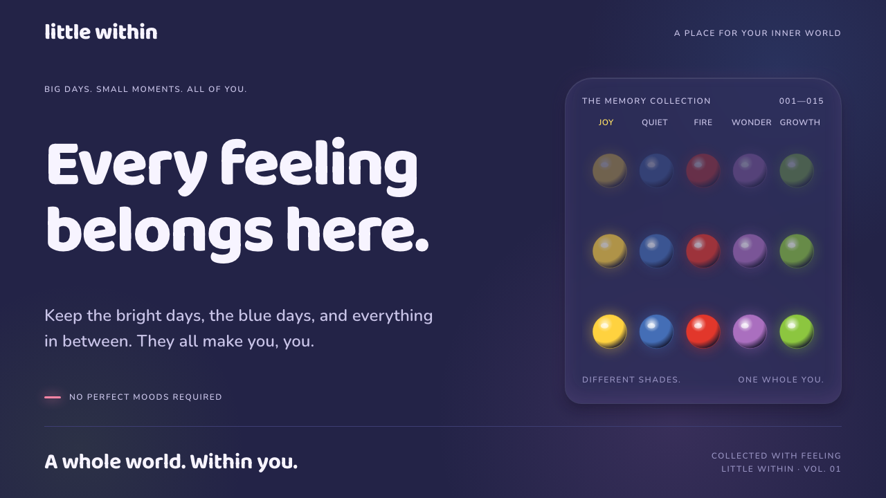 Inside OutFeelings become light. Glowing colour orbs and rounded Baloo type illuminate…
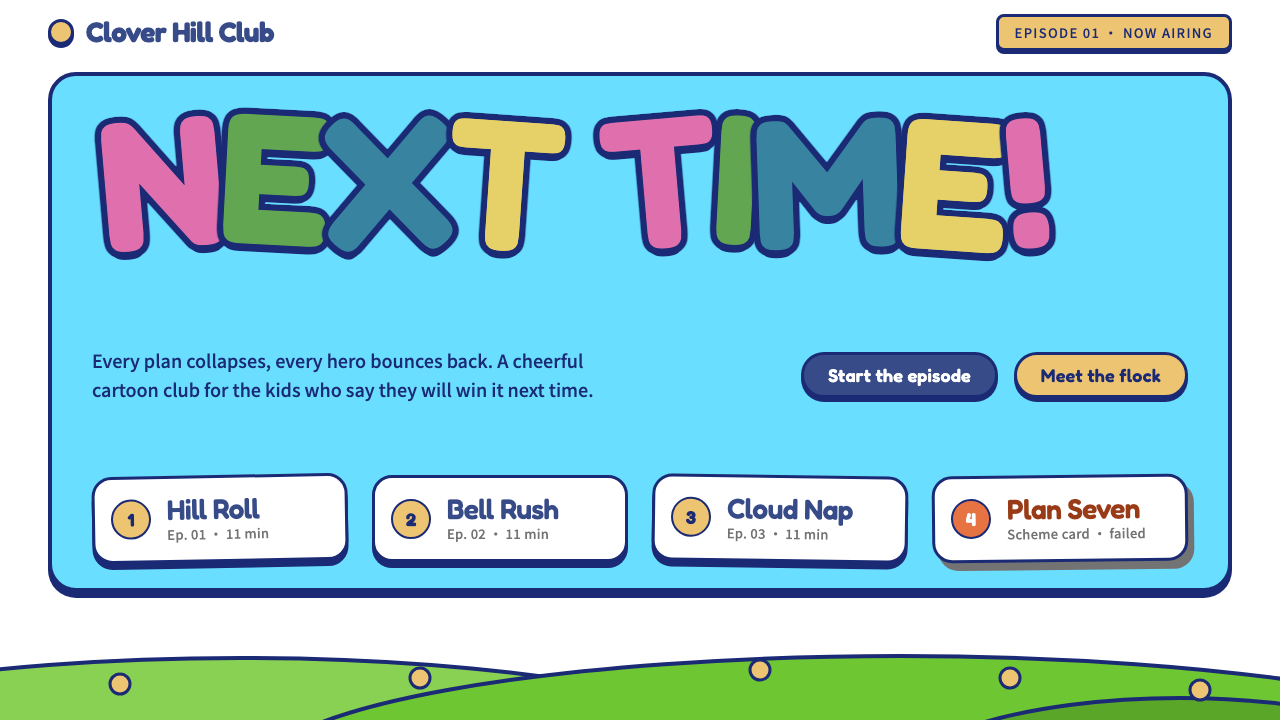 Pleasant Goat and Big Big WolfCheerful and undefeated. Navy-outlined bubble letters on white, cyan sky, gra…
 SpongeBob Bikini Bottom (1999)Undersea suburbia shouts with joy. Banana yellow and cyan bounce inside fat,…
 Toy Story (1995)Playtime becomes a whole world. Cloud blue, chunky type, and glossy two-tone…
 Club PenguinA snow-white island that talks like a kid. Sky-blue panels, navy outlines on…