What is Pleasant Goat and Big Big Wolf?
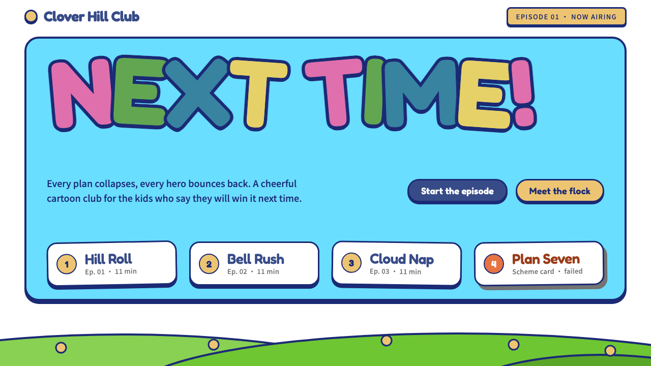
Pleasant Goat and Big Big Wolf is flat Flash colour inside a thick navy outline: cheerful, bubbly and stubbornly optimistic even when the plan fails.
Pleasant Goat and Big Big Wolf in brief
This style is drawn from the early seasons of Pleasant Goat and Big Big Wolf, the cartoon made in Guangzhou that began airing on Chinese television in 2005. Everything is a flat fill inside a thick, even navy outline, set on the plain white of the official key art. The look is the classic Flash-era cartoon: simple shapes, clean edges and bold, readable colour.
The palette follows the characters. Weslie's blue ribbon drives actions and titles, his bell gold marks highlights and badges, and grass green and sky cyan fill the scene bands that stand for the rolling hills and open sky of the grassland. Wolffy's grey and the orange of his beret belong to the villain's side: warnings, schemes and the plan that always fails.
The mood is cheerful and undefeated. Titles are set in round, bubbly letters that look squeezed together like the logo, and the whole system carries an energy of try-again optimism. It is made for children and families, but its confidence works well for anyone who wants a warm, resilient tone.

Where does Pleasant Goat and Big Big Wolf come from?
Pleasant Goat and Big Big Wolf first aired in 2005 and became one of the best-known Chinese domestic television cartoons. It was produced in Guangzhou, Guangdong, by Creative Power Entertaining, with Huang Weiming among the key figures named in its creation. A first theatrical film followed in 2009, a sign of how far the franchise had grown within a few years.
It belongs to the mid-2000s boom in Chinese domestic TV animation, a period in which local studios produced large numbers of series for a young national audience. Many of the programmes of that moment were made quickly and cheaply with Adobe Flash, and Pleasant Goat is among the most successful examples of the method. The software favoured flat vector shapes and limited colour, and the aesthetic grew out of those constraints.
The visual conventions are easy to trace to Flash. Characters are drawn with clean, consistent outlines, colours are applied as flat fills without gradients or heavy texture, and backgrounds are kept simple so that characters read immediately. The Flash-era seasons, from about 2005 to 2010, are the basis for this system, rather than any later redesign.
The narrative frame is just as important as the technology. The show sets a clever, kind flock of sheep against a scheming wolf who never succeeds, and the comedy is built from the repetition of that failure. The design language carries this: sheep-side colours are friendly and open, wolf-side colours are muted and slightly gloomy, and every screen can signal at once whose side it belongs to.
What defines the Pleasant Goat and Big Big Wolf look?
Thick navy outline
Every shape is wrapped in the same thick navy outline, which unifies characters, buttons and panels into one visual family. The outline keeps flat colours readable and gives the system its cartoon-cel feeling.
Flat Flash fills
Colour is applied as flat fills with no gradients, textures or soft shadows. This is a direct inheritance of Flash vector animation and gives the style its crisp, poster-like clarity.
White ground
The page sits on the plain white of the official key art. White gives the thick outlines and saturated fills room to stand out and keeps busy character art from becoming visually messy.
Character-coded colour
Blue ribbon for actions, bell gold for highlights, grass green and sky cyan for scenery bands, and wolf grey and beret orange for alerts and villainous schemes. Colour tells you who is speaking and what role the element plays.
Bubble lettering
Titles use round, chubby letterforms such as ZCOOL KuaiLe and Fredoka, squeezed together like the show's logo. The shapes are friendly and bouncy, and they scale naturally across Chinese and Latin text.
Failure stamp humour
The wolf side of the palette is reserved for warnings and failed plans, even a playful failure stamp. Negative states feel comic rather than frightening, which keeps the whole interface in a good mood.

Who shaped Pleasant Goat and Big Big Wolf?
Huang is named among the key figures behind the series. His creation, made in Guangzhou, became a defining example of mid-2000s Chinese domestic television animation.
The Guangzhou studio that produced the cartoon. Its Flash-based production pipeline shaped the flat fills and clean outlines that this style reproduces.
The title sheep and hero of the show. His blue ribbon and gold bell are the visual anchors for the interface's action colour and highlight colour.
The scheming wolf whose plans always fail. His grey and the orange of his beret supply the colours of alerts and bad ideas in the system.
How do you use Pleasant Goat and Big Big Wolf today?
This style is for products that want warmth, humour and perseverance: children's content, animation merchandise, festival campaigns and any interface that should feel upbeat even when something goes wrong. Its flat, high-contrast shapes are also very robust in small sizes and on low-quality screens.
For slides, use white backgrounds with thick navy outlines around titles and key shapes. Covers benefit from big bubble-lettered headings and one large green or cyan band as scenery. Content slides can use outlined cards in flat colour, and data slides work well with chunky, outlined bars and pie slices, using blue for the main series and gold for highlights.
For web interfaces, make primary buttons the ribbon blue with a navy outline, use gold for badges and highlights, and keep the page white. Cards and inputs should carry the same outline weight. Scenic hero sections can use stacked green hills and a cyan sky as simple flat bands. Wolf grey and orange are best saved for error states, warnings and playful failure messages.
For editorial and marketing work, it suits holiday event pages, family activity promotions, product packaging for children and any story that can be told through repeated attempts and cheerful resilience. Keep sentences short and warm, and use the bubble lettering for names and slogans only.
A frequent mistake is thinning the outline or adding gradients and drop shadows. Once the outline becomes light or the fills become glossy, the cel-cartoon character disappears and the page looks like a generic children's template. Another mistake is using the wolf colours for friendly elements; they are the villain's palette and lose their comic sting if spread across the whole interface.

Pleasant Goat and Big Big Wolf — FAQ
Where does this style come from?
It is drawn from the early Flash-era seasons of Pleasant Goat and Big Big Wolf, which began airing on Chinese television in 2005. A first theatrical film followed in 2009.
Why is the outline so thick?
The thick, uniform navy outline is the signature of the Flash cartoon look. It holds flat colours together and keeps characters and interface elements legible at small sizes.
What do the colours mean?
Blue ribbon is for actions and titles, bell gold for highlights and badges, grass green and sky cyan for scene bands, and wolf grey and beret orange for alerts and failed schemes.
Is it only for children's products?
It is strongest there, but the optimistic tone works for festival campaigns, community tools and any product that wants to stay cheerful when things go wrong. It is less suitable for serious financial or legal interfaces.
What typefaces suit it?
Round, chubby display faces such as ZCOOL KuaiLe for Chinese and Fredoka for Latin text, used for titles and names. Body copy should remain simple and readable.
Related design styles
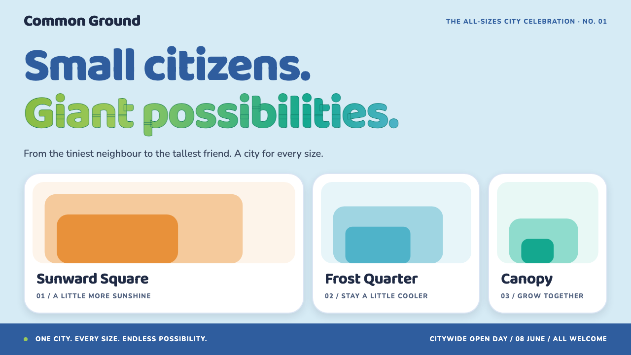 ZootopiaBelonging at every scale. Rounded blue type meets orange, cyan and green dist…
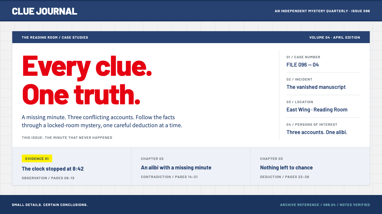 Detective ConanFriendly, methodical mystery. Red Barlow titles and navy bands order a pale g…
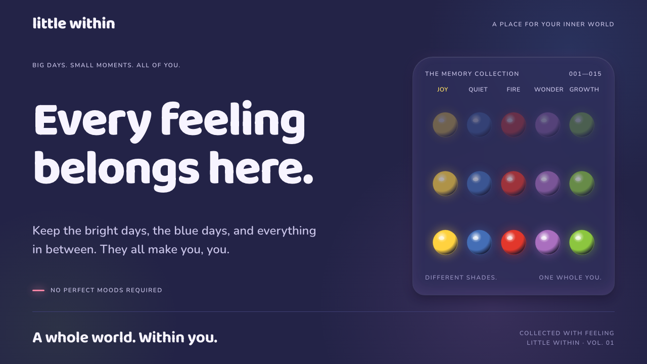 Inside OutFeelings become light. Glowing colour orbs and rounded Baloo type illuminate…
 Naver Webtoon (2024)Built for late-night scroll. Charcoal grids, Noto Sans KR, and green episode…
 Pac-Man (Namco 1980)Arcade joy burns bright. Yellow disc, cobalt maze, and four ghost hues snap o…
 Pokémon Game BoyKawaii meets cartridge logic. Capsule red, LCD green, Anton heft, and 8px gri…