What is Inside Out?
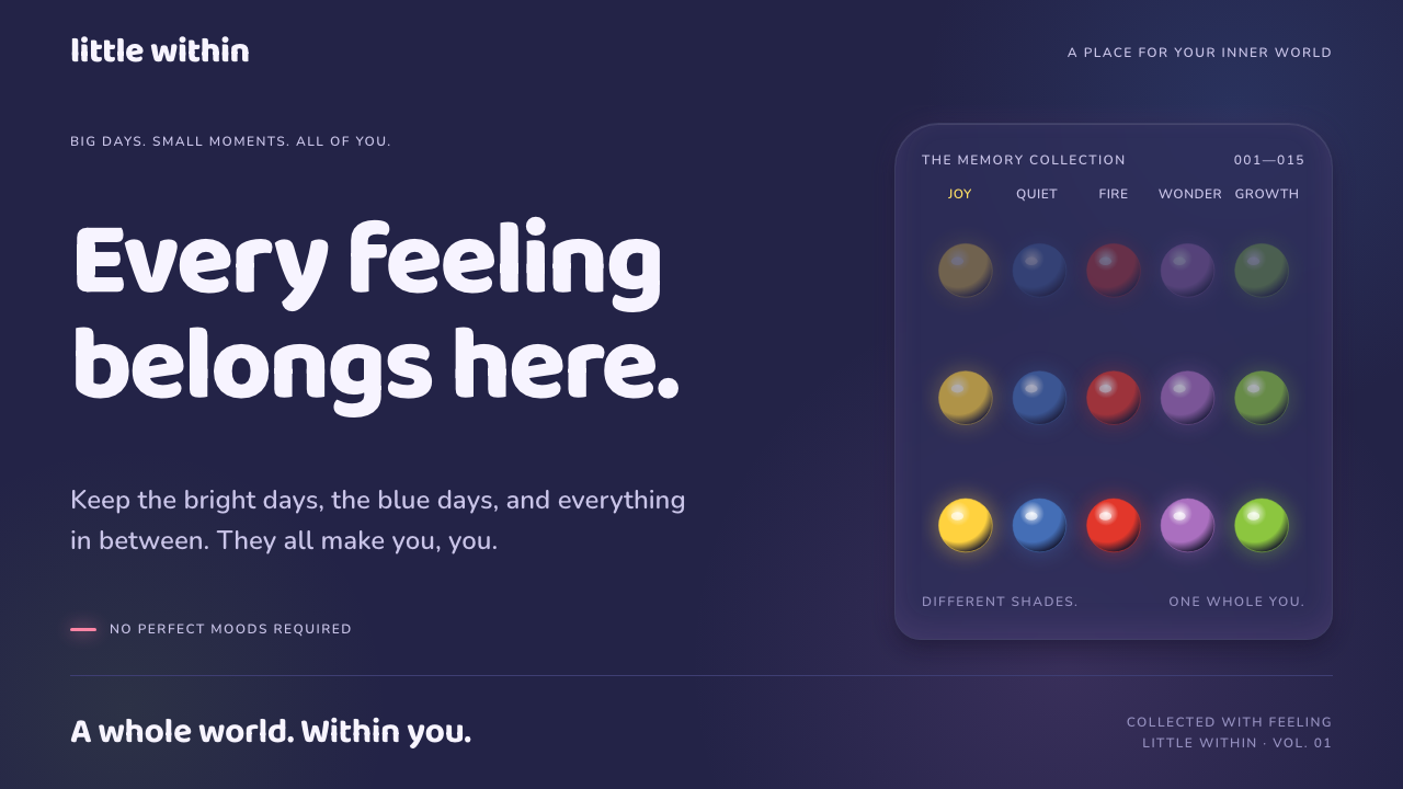
Inside Out turns feelings into light: a deep indigo control room where five saturated emotions glow from within and memories roll by as soft, luminous orbs.
Inside Out in brief
This style is drawn from Headquarters, the control room inside the mind of the young girl Riley in Pixar's 2015 film Inside Out. The film imagines emotions as characters, each one defined by a single saturated colour, who share a console and steer a child's day-to-day decisions. The design language that results is dark, rounded, translucent and warmly lit.
The visual premise is simple and unusually disciplined. The background is a deep indigo, closer to a night sky than a flat black. Every other colour on screen has a job and a personality: a golden yellow for joy, a blue for sadness, a red for anger, a purple for fear and a green for disgust. Because each one is saturated and glows from the inside, they read as sources of light rather than as paint on a surface.
The result feels emotional without being sentimental. Edges are round, panels are slightly see-through, and surfaces carry a soft inner glow instead of a hard drop shadow. The overall impression is of a room that runs on feelings, which makes the style a natural fit for products that want to talk about moods, memories and relationships without becoming childish.

Where does Inside Out come from?
Inside Out was produced at Pixar Animation Studios in Emeryville, California, between roughly 2010 and 2015, and released in June 2015. It was directed by Pete Docter, with Ronnie del Carmen as co-director, Jonas Rivera as producer and Ralph Eggleston as production designer. The central idea, that a child's mind could be pictured as a place with a control room and a team of emotions inside it, required the artists to invent a visual world for something invisible.
The production design is built on a clear split between two worlds. The real world is shown in a naturalistic palette, while the world inside Riley's head is stylised, glowing and geometric. Headquarters, with its curved walls, its console and its tall windows onto memory, is the place where the two meet. The deep indigo of the key art became the ground colour for everything inside, so that the characters would stand out as the main light sources in the frame.
Colour-coded character design is the film's most important tool. Each emotion is given one dominant hue, and the audience can read the mood of a scene before a word is spoken. The glowing memory orbs, tinted by whichever emotion created them, extend the idea: colour is both the identity of a character and the record of a feeling. It is a rare case in feature animation where a palette functions as a narrative system.
Pixar's 3D feature animation tradition also shaped the material language: soft rounded forms, subsurface-like glow and gentle depth of field. Translating that into an interface means keeping the sense of light passing through a surface. In this design system, the five emotions become status and action colours, and the memory orb becomes a recurring shape for avatars, toggles, progress beads and gallery tiles, so the film's logic of colour as feeling carries over into everyday components.
What defines the Inside Out look?
Deep indigo ground
The base of the interface is a rich, dark indigo rather than a neutral black. It carries a faint violet cast that makes the page feel like an interior at night, and it gives the luminous colours something to glow against. Large areas of this ground are left calm, so the emotional colours never compete with each other for attention.
Five emotion colours
The palette is organised around five hues, each tied to one emotion. Joy's golden yellow is the lead colour for primary actions and active states. The other four, a blue, a red, a purple and a green, are reserved for categories of status or feedback, so each carries meaning instead of acting as decoration. Using them in a fixed role is what keeps the system legible.
Inner glow, not drop shadow
Elements appear to emit light rather than cast shadows. A button or orb gets a soft halo in its own colour, and a highlighted surface looks lit from within. This replaces the heavy dark shadows common in dark interfaces and keeps the mood warm. Glow intensity should rise with importance, so the brightest thing on screen is the thing that matters.
Round, friendly type
Headings use a rounded, heavy display face with soft terminals, while body text stays plain and highly legible. The rounded forms echo the shape of the memory orbs and the curved architecture of Headquarters. The contrast between a playful heading face and a calm text face lets the interface sound warm without losing clarity.
Translucent layers
Panels and cards are slightly see-through, so the indigo ground and nearby glows show through. This gives depth without hard borders, and it reinforces the idea of memory as something you look into rather than something printed on a page. Opacity should stay moderate so text remains comfortable to read.
Orbs as a UI motif
The memory orb is the system's signature shape. It appears as an avatar, a toggle knob, a progress bead or a gallery tile, always round, always softly lit and often tinted by the emotion it represents. Repeating one shape across many components gives the interface a strong, recognisable identity with very little decoration.

Who shaped Inside Out?
Docter directed Inside Out and is the creative force behind its core premise, a child's mind pictured as a control room staffed by emotions. His approach, treating an abstract inner life as something the audience can see and navigate, is the conceptual root of the entire visual language.
As co-director, del Carmen helped shape how the emotions behaved, looked and related to each other on screen. His work is relevant to the style because the characters' distinct silhouettes and colours are what make the palette meaningful, not just attractive.
Eggleston served as production designer, responsible for the look of the film's worlds. His split between a naturalistic real world and a stylised, luminous mind-world is the structural idea behind the indigo ground and glowing colours, and it is the reason the interior of Headquarters feels like a place with its own lighting logic.
Rivera produced the film, guiding the project through its years of development at Pixar. His role is a reminder that the look came out of a collaborative studio process, in which story, character and colour decisions were made together rather than as a surface treatment added at the end.
How do you use Inside Out today?
Inside Out works best when colour is treated as meaning. Before applying it, decide what each of the five emotion colours will represent in your product, then use them consistently. The deep indigo ground does the calming work; the glowing hues should be rationed so that each one still feels like a small event on screen.
For presentation slides, the dark indigo ground makes confident covers: a title in round, heavy type, with one glowing orb or a cluster of them as the single visual. Content slides can use the yellow for the headline accent and the other hues as category markers. Data slides work well as sets of orbs or beads, where each colour stands for a series and size or brightness shows quantity, which suits topics about people, feelings and habits.
For web and app interfaces, the style fits diary and mood-tracking apps, family and education products, wellbeing tools and consumer services with an emotional tone. Primary buttons take the golden yellow, status messages borrow the other four hues, and avatars and toggles become orbs. Dashboards should emphasise glow on the metric that needs attention, and pricing pages can use the orb motif for plan tiers without adding more ornament.
For editorial and marketing work, it suits campaign pages, storytelling features, product launches aimed at a broad audience and anything that benefits from a warm night-sky atmosphere. Large soft gradients of indigo with a single glowing focal point give strong poster compositions. Illustrations should be rounded and simple, with light coming from within the subject.
The most common mistakes are using all five colours at once with no hierarchy, which turns the interface into a confetti of competing glows, and applying heavy dark shadows that contradict the inner-light concept. Another is making panels so transparent that text becomes hard to read. Finally, avoid copying the film's characters or scenes; the aim is to borrow the logic of colour, glow and roundness, not to reproduce protected imagery.

Inside Out — FAQ
What is the Inside Out design style based on?
It is based on Headquarters, the control room inside the main character's mind in Pixar's 2015 film Inside Out. The style borrows its deep indigo ground, its five colour-coded emotions, its rounded shapes and its glowing memory orbs, and translates them into interface colours, components and motifs.
Why are there five colours and what do they do?
The film has five emotions, each defined by one hue. In the interface, joy's golden yellow leads primary actions and active states, while the other four hues, a blue, a red, a purple and a green, map to categories of status and feedback. Giving each colour a fixed role is what keeps the palette meaningful instead of merely cheerful.
Is it a dark-mode style or a light one?
It is a dark style. The ground is a deep indigo, and the colours are meant to glow against it. A light version would lose the central idea of colour as emitted light, so if you need a light mode, keep the colour roles and the roundness but use pale tinted panels and softer glows rather than simply inverting the page.
What kinds of products suit it best?
Products with an emotional or personal tone: journaling and mood-tracking apps, family and education tools, wellbeing services, and consumer apps that talk about memories or relationships. It is less suited to dense professional tools, where glowing colour would compete with large amounts of data.
Can I use the film's characters in my design?
The style is about visual logic: indigo grounds, colour-coded states, glow and rounded shapes. It does not require reproducing the film's characters or scenes, which belong to their owners. Use the colour roles and orb motifs to create original shapes and illustrations of your own.
Related design styles
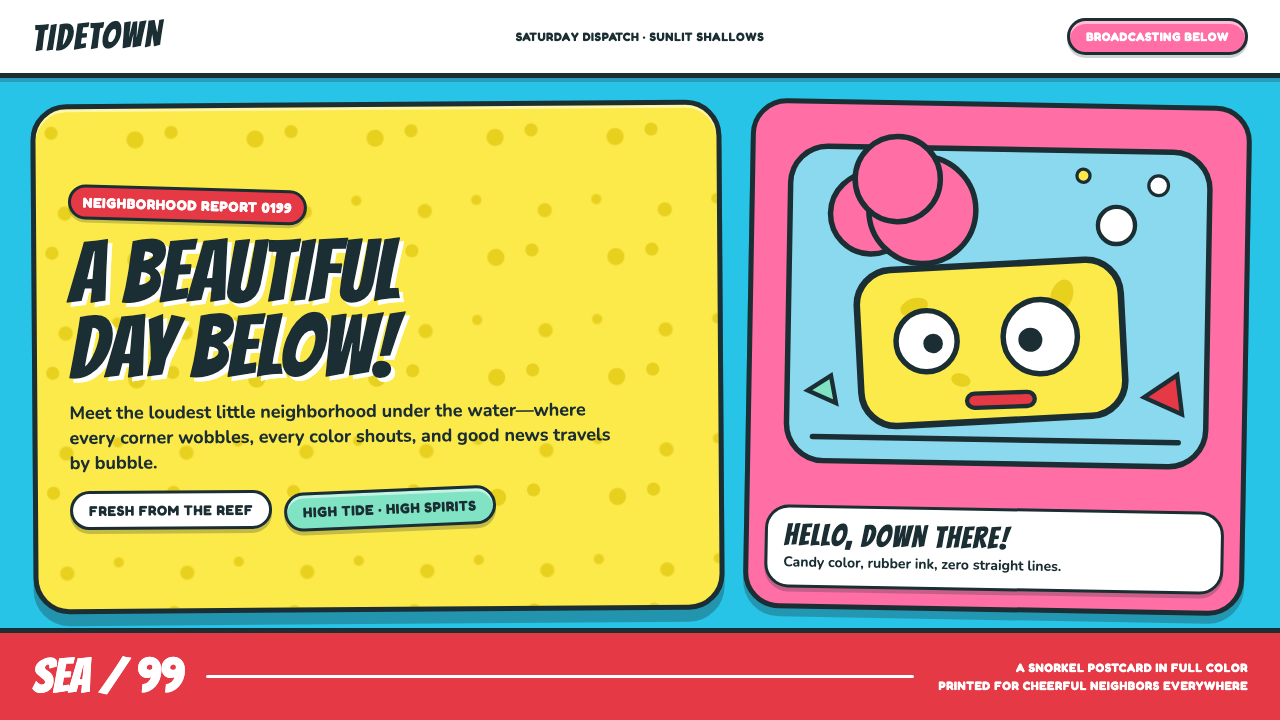 SpongeBob Bikini Bottom (1999)Undersea suburbia shouts with joy. Banana yellow and cyan bounce inside fat,…
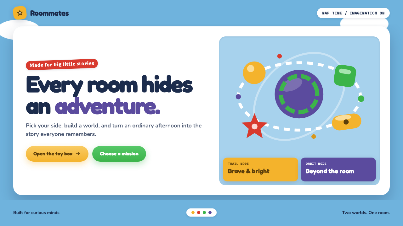 Toy Story (1995)Playtime becomes a whole world. Cloud blue, chunky type, and glossy two-tone…
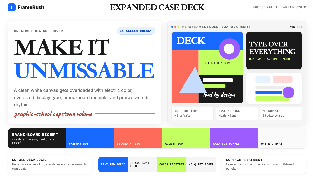 Behance Maximalist PortfolioPortfolio volume at max. Electric blue, coral and lime stack into a full-blee…
 Club PenguinA snow-white island that talks like a kid. Sky-blue panels, navy outlines on…
 Looney Tunes (Warner Bros.)Pure cartoon chaos. Bull's-eye rings, Bungee type, and red-blue-yellow blocks.
 LyftA friend's car, not a taxi. Neon pink on white, heavy Montserrat, pill shapes…