What is Lyft?
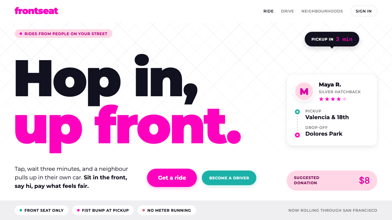
Lyft's early look feels like a friend's car rather than a taxi: neon pink on a white page, heavy rounded type and pill shapes everywhere.
Lyft in brief
The Lyft style recreates the look of a ride service in its first years, when the whole point was that a stranger with a car would give you a lift the way a neighbour might. The visual language is friendly, bright and slightly cheeky. Pages are white, a neon pink is saved for the moments that matter, and buttons and tags are rounded into pills. Nothing about it feels corporate or formal.
The typography does much of the emotional work. Headlines are set in a heavy, round geometric sans-serif that feels warm and confident, as if the words themselves were being said with a smile. Body copy is kept simple and conversational. Teal, taken from the company's 2013 website, appears on buttons and creates a pleasant counterpoint to the pink.
Taken together, the elements say one thing: this is a friend's car, not a taxi. The style is a good fit whenever a product wants to feel approachable and human while still looking sharp and modern. It trades prestige for warmth, and that trade is the source of its charm.

Where does Lyft come from?
Lyft launched in San Francisco in the summer of 2012 as a peer-to-peer ride service. It belongs to the early-2010s wave of the sharing economy and mobile-first on-demand apps, when the idea of using a phone to summon a service from an ordinary person was still new. Logan Green and John Zimmer are the founders most closely associated with the company.
The brand's early personality was built on informality. Drivers were regular people rather than professional chauffeurs, and a fuzzy pink mustache was fixed to the front grille of each car so that passengers could spot their ride. Passengers were encouraged to sit up front, and the greeting was a fist bump. It was a deliberate attempt to make a stranger's car feel like a friend's, and the visual identity was designed to match.
That look is often described as friendly startup branding: bright colour, rounded forms, lower-case warmth and a refusal to look corporate. The mustache visual ran from 2012 until 2015, when it was retired in favour of the Amp, a glowing device on the dashboard. Ethan Eyler and Frank Yoo are among the names associated with the identity of this period, alongside the founders.
The design system here takes that period at face value. It does not try to update the brand for later years. Instead it preserves the white page, the neon pink reserved for key moments, the teal buttons of the 2013 website, the heavy round Montserrat headings and the pill-shaped controls. The goal is to capture the spirit of a service that wanted to feel like a favour between neighbours.
What defines the Lyft look?
White page, pink saved for key moments
The page itself is clean white. LyftPink, a vivid neon pink, is not scattered around as decoration but saved for the moments that matter, such as the main call to action, the brand mark or an important status. Because it is rare, the pink feels like a smile rather than a wall of colour.
Teal buttons from 2013
Buttons take their teal from the company's 2013 website. The cooler colour balances the warm pink and makes actions easy to identify. It also locks the design to a specific moment in the brand's history, which is part of what gives the style its character.
Heavy, round Montserrat
Headlines use Montserrat in a heavy weight, whose full, round letterforms feel generous and friendly. The type is large and confident but never sharp. Short, conversational headlines suit it best, because the letterforms already carry warmth and do not need long sentences to do so.
Pill shapes everywhere
Buttons, tags, inputs and chips are all fully rounded into pills. The repeated shape gives the interface a soft, toy-like consistency and makes every element feel touchable. Avoid mixing in sharp rectangles, because one hard corner immediately breaks the friendly mood.
Conversational tone
The visual style is paired with plain, spoken-style copy. Labels sound like something a neighbour would say, and instructions are short. The aim is to remove any sense of distance between the product and the person using it, which suits a service built on strangers helping strangers.
The mustache motif
The fuzzy pink mustache is the emblem of the period, from 2012 to 2015. In a design system it works as a playful accent, an icon, a sticker or a decorative detail, always used lightly. It gives the page a bit of humour and recalls the car-grille original without turning the interface into a costume.

Who shaped Lyft?
Green is one of the founders most closely associated with Lyft. His name belongs to the origin story of a ride service built on the idea that ordinary drivers could offer lifts through a phone app, the social premise that the friendly, informal visual style was made to express.
Zimmer is the other founder most commonly named alongside Green. Together they are linked to the company's launch in San Francisco in 2012 and to the early sharing-economy idea of a car ride as a friendly exchange rather than a formal transaction.
Eyler is among the names associated with the early identity of Lyft. His inclusion among the key figures points to the way the brand's personality, the pink, the mustache and the playful tone, came from a small creative circle rather than a corporate style guide.
Yoo is also named in connection with the brand's early look. Together with the others, he marks the group of people who shaped a startup identity meant to feel like a favour between neighbours, which this design system seeks to preserve.
How do you use Lyft today?
On slides, the Lyft style suits presentations about community, mobility, local services and consumer products. A cover can use a white background, a bold round headline and a single pink pill as an accent. Content slides should stay light, with one idea per slide, short headlines and generous space. For data slides, use pink for the one number that matters, teal for supporting highlights and keep everything else in neutral dark text.
On the web and in apps, the style is ideal for ride, delivery, local marketplace and community products. Booking flows work well with large pill buttons, friendly microcopy and a single pink moment at the key step. A pricing page can present a few simple options in pill-shaped selectors, using pink to mark the recommended choice. Profile and trust screens benefit from the human warmth of rounded shapes.
In editorial and marketing work, the style supports recruitment pages, community stories, driver and rider campaigns, and playful launch announcements. Photography of real people in everyday settings goes well with it, particularly images that feel candid rather than staged. The pink mustache can appear as a small recurring accent in stickers, social graphics and badges.
A good habit is to treat pink as a reward. Use it for the moment the user is invited to act or the moment something good happens, and let the rest of the interface stay quiet. Keep the pill shape consistent across buttons, tags and inputs, and keep headlines short enough that the heavy letterforms never feel crowded.
The common mistake is to flood the page with pink, which removes the sense of a special moment and makes the interface feel loud. Another is to combine the rounded style with sharp, boxy components or thin, formal type, which breaks the friendly tone. A third is to modernise the look into something sleek and corporate, at which point the whole idea of a friend's car disappears.

Lyft — FAQ
What is the Lyft pink mustache style?
It is a friendly interface style based on Lyft's early years. It uses a white page, neon LyftPink for key moments, teal buttons from the 2013 website, heavy round Montserrat headings and pill shapes everywhere. The overall effect is meant to feel like a friend's car rather than a taxi.
When was the pink mustache used?
Lyft launched in San Francisco in the summer of 2012, and the carstache visual ran from 2012 to 2015. In 2015 the mustache was retired in favour of the Amp. This design system captures the earlier, more informal period.
What products is it best suited to?
Ride, delivery, local services, community platforms and any consumer product that wants to feel approachable and human. It is particularly good for mobile-first apps with simple flows. It is less suited to products that need to look formal, technical or luxurious.
How should pink be used?
Sparingly. Save it for the key call to action, the brand mark or a moment worth celebrating, and keep the rest of the interface white with neutral text. Teal can support it on buttons, but the pink should always feel like a special moment.
What are the common mistakes?
Overusing pink, mixing the pill shapes with sharp rectangles, switching to thin formal type, and polishing the look into something corporate. Each of these removes the warmth that defines the style.
Related design styles
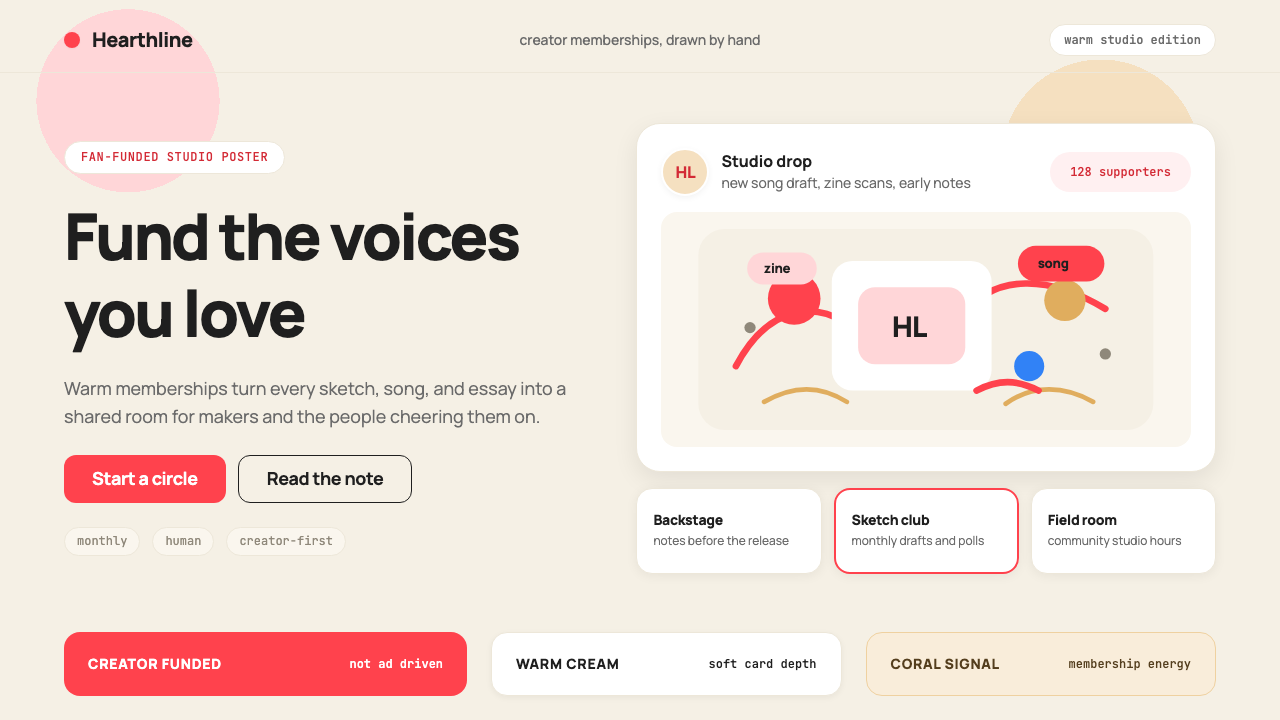 Patreon 2017Creator funding feels human. Coral CTAs on warm cream, rounded cards, hand-dr…
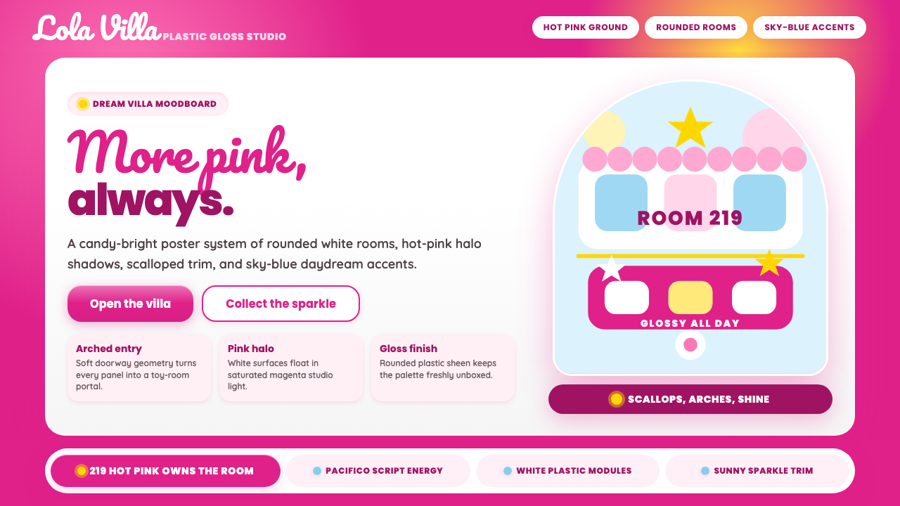 Barbie DreamhousePink is the whole world. Hot magenta ground, Pacifico script, scallops and gl…
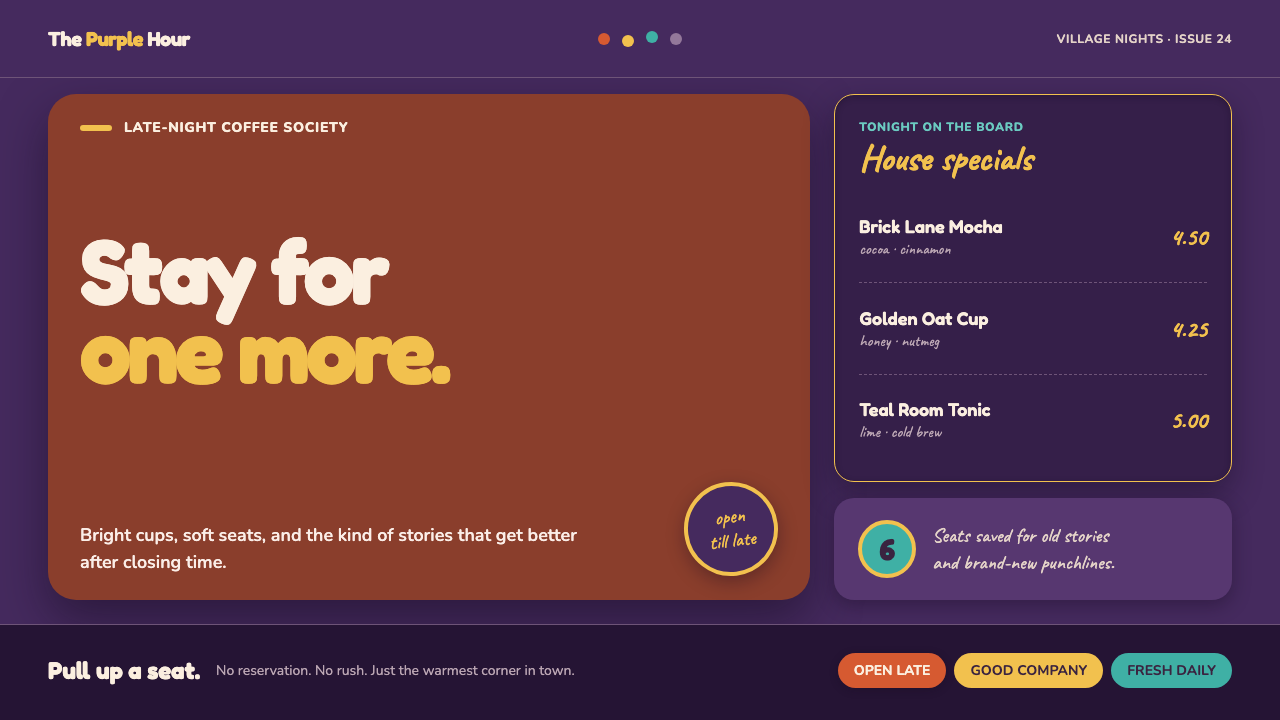 Friends Central Perk (1994)Sitcom warmth, turned TV-bright. Grape walls, couch orange, and bouncing colo…
 Instagram 2010s FilterWhen photos felt like memories. Faded warmth, dark vignettes, cream-tinted Po…
 NykaaPink is the tap, never the page. Packed white tiles, shade circles and lowerc…
 Shake Shack (Green-Chartreuse)Friendly premium, never loud. Chartreuse on warm cream with tight modernist t…