What is Nykaa?
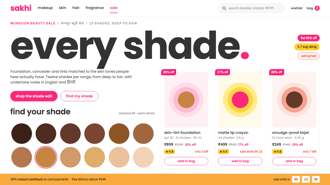
Nykaa turns the beauty aisle into a screen: a pure white canvas packed edge to edge with deals and shade swatches, where pink is the thing you tap, never the thing you stand on.
Nykaa in brief
Nykaa is the visual language of Indian beauty retail at full volume. The page is a pure white canvas tiled edge to edge with deal rails, category tiles and shade grids, leaving almost no empty space. The brand pink lives in three places only: the lowercase wordmark, the pill-shaped call-to-action buttons and the sale ribbons. The page itself stays white. Pink is the figure on the canvas, not the ground beneath it, and that single decision explains most of what makes the style recognisable.
The second idea is that promotion arrives as cards, not fields. On sale days the interface fills with yellows, corals and ambers, but each one is confined to a tile: yellow flags ratings and flash sales, coral signals that stock is running low, and amber marks bank offers and cashback. Because the background never changes colour, a shopper can scan a long, noisy page and still read each colour as a message. It is merchandising turned into an information system.
The third idea is that the product itself is the hero. Shade grids are not an accessory but the centrepiece, with swatch circles spanning deep to fair Indian skin tones. Typography speaks in lowercase, with Devanagari treated as a first-class script beside Latin rather than an afterthought. Taken together, the style suits interfaces that are dense, promotion-heavy and designed for the phone first: marketplaces, beauty and personal-care shops, and any retail product where the sale is the main event.

Where does Nykaa come from?
Nykaa began in 2012 in Mumbai as an Indian direct-to-consumer beauty retailer, founded by Falguni Nayar. The timing matters. In the early 2010s, buying cosmetics in India meant a small number of department-store counters or local chemists, with limited choice and little help matching products to Indian complexions. An online shop built specifically around that gap, with a catalogue organised by the shopper's needs rather than by international brand hierarchy, fit a market that was about to move to phones in huge numbers.
The people connected with the brand include Falguni Nayar together with Adwaita Nayar and Anchit Nayar, and the visual identity is associated with a design practice called Thought Over Design. The current look of the app and the web store took shape over roughly the years from 2020 to 2025, as the company grew from a pure e-commerce site into a multi-channel beauty business. That later period is the one this style documents: not the earliest storefront, but the mature, high-volume interface of a retailer at scale.
The aesthetic belongs to three overlapping traditions listed in its background: Indian direct-to-consumer beauty retail, mobile-first commerce and sale-event merchandising. Each of them pushes the same way. Mobile-first commerce demands a layout that can be thumbed through quickly, so tiles are compact and tappable. Sale-event merchandising, the habit of building the entire homepage around a limited-time campaign, demands a visual system that can swap banners in and out without breaking the brand. Indian D2C beauty adds the third ingredient, a commitment to showing the full range of skin tones and to treating regional languages as part of the product.
What emerges is a deliberately busy design that is nevertheless disciplined. The white canvas is the discipline: because the ground is never negotiable, hundreds of promotional elements can be added without the page turning into visual noise. In that sense Nykaa's style is a lesson in how a dense retail interface can stay legible. It is also a distinctive regional voice, in which lowercase friendliness, shade-first product display and bilingual typography all reflect the particular shoppers it was built for.
What defines the Nykaa look?
Pink as the tap, not the page
The saturated brand pink is rationed. It appears on the wordmark, on pill-shaped buttons and on sale ribbons, which means it always sits on something the shopper can act on or should notice. Large areas are never filled with it. This keeps the page feeling clean while giving the brand a powerful, instantly recognisable signal: wherever you see the pink, something wants a tap.
A pure white canvas
The ground is plain white from top to bottom, with no tint, texture or gradient. Because everything else is saturated and busy, the white is what allows the page to be read at all. It also flatters product photography and makes shade swatches look accurate, an important point when the whole business depends on matching colour to skin.
Packed tiles and rails
Content is organised into horizontal deal rails, category tiles and carousels that fill the width of the screen with very little margin between them. Density is a feature here, not a flaw: the homepage behaves like a shop floor where every shelf is stocked. Tiles are compact, evenly spaced and consistently sized, which gives the crowding a regular rhythm.
Shade circles as protagonists
Swatches are small solid circles arranged in grids, running from deep to fair tones to reflect the real range of Indian skin. They are treated as primary navigation and primary content, not as decoration under the product photo. A shopper can compare, select and filter by shade in a single glance, which makes the colour system functional as well as expressive.
Lowercase friendliness
Headlines and brand moments are set in lowercase in a rounded, geometric sans-serif, which gives the interface a conversational, approachable voice. A second, more neutral grotesque handles filter bars and numeric detail, where legibility matters more than personality. The pairing separates the brand's voice from the working parts of the interface.
Devanagari as a first-class script
Hindi in Devanagari sits beside Latin text at the same weight and size, not in a smaller or lighter fallback. The system is built for a bilingual audience, so typography, spacing and line height have to work for both scripts. This is a quiet but important feature: it signals that the interface is designed for its users rather than adapted for them afterwards.
Promotion colours kept in boxes
Yellow, coral and amber each have a defined meaning and live inside cards or badges. Yellow for ratings and flash sales, coral for urgency and low stock, amber for bank offers and cashback. They never become backgrounds. The result is a colour code that a shopper learns quickly and that survives even the busiest sale day.

Who shaped Nykaa?
Nayar founded Nykaa in Mumbai in 2012 and is the person most closely associated with the brand's identity. Her company took an unmet need — a beauty shop that understood Indian complexions, and could be reached from a phone — and turned it into the retail model this style documents.
Adwaita Nayar is one of the names listed among the people connected with the brand. Her presence in the record is a reminder that the style is the product of a family-led company growing through the 2010s and 2020s rather than of a single designer.
Anchit Nayar is likewise listed among the people connected with Nykaa. Together with the other names, he belongs to the team behind the retailer's growth from a pure online store into the mature, multi-channel interface this style captures.
Thought Over Design is the design practice named in connection with the brand's visual identity. Its inclusion here marks the point that the interface's disciplined busy-ness — white ground, rationed pink, boxed promotion colours — was a designed system, not an accident of merchandising.
How do you use Nykaa today?
In slides, this style is a strong choice for retail, e-commerce and consumer-brand decks. A cover can be nothing more than a white slide with a lowercase title and a single pink pill, which is surprisingly confident. Content slides should be built from tiles: a row of compact cards, each with a small label and a bold figure. Data slides can use colour badges to separate message types, with yellow for ratings, coral for risks and amber for offers. Keep the white ground absolutely clean; it is what gives every coloured element its meaning.
On the web and in apps, the style is at its best for marketplaces, beauty and personal-care shops, grocery and fashion storefronts, and any commerce interface that runs sale campaigns. Build the homepage as a stack of rails with consistent card sizes, put the product or the shade grid at the centre, and reserve the brand pink for buttons, ribbons and the wordmark. Filters should use the more neutral grotesque and stay compact. Make sure bilingual content, including Devanagari, receives the same weight and spacing as the Latin text.
For editorial and marketing, the same grammar works in emails, campaign landing pages and social carousels. A campaign banner should arrive as a card on the white ground, with the sale colour contained inside it, so that the surrounding page keeps its identity. Lowercase headlines give a friendly voice that suits beauty, wellness and lifestyle copy. Product comparison pages can reuse the shade-circle device for any attribute where the choice is visual: colours, finishes, materials.
The style also carries well to packaging inserts, in-store signage and printed lookbooks, where white paper does the work of the canvas. Keep the pink for stickers, ribbons and call-outs, and let product photography fill most of the space. Because the system relies on a strict separation between ground and accent, it prints more reliably than styles that depend on subtle tints.
The most common mistake is to flood the page with pink. Once the background, headers and banners all turn pink, nothing is the tap any more, and the brand's strongest signal is lost. A second mistake is to let promotion colours escape their cards and become section backgrounds, which turns the dense layout into a visual wall. Finally, do not copy the density without the regularity: tile size, spacing and alignment have to stay consistent, or a packed page stops feeling abundant and starts feeling chaotic.

Nykaa — FAQ
Why is the brand pink never used as a background?
Because the white ground is what makes everything else readable. If pink filled the page, the buttons and ribbons that rely on pink to stand out would disappear into it. Keeping pink for the wordmark, pill buttons and sale ribbons means it always marks something the shopper can act on, which is the whole point of the system.
What do the yellow, coral and amber cards mean?
In this system yellow flags ratings and flash sales, coral signals that stock is running low, and amber marks bank offers and cashback. They only ever appear as cards or badges, never as page backgrounds, so a shopper can read a colour as a message even on the busiest sale day.
Why are shade swatches so prominent?
For a beauty retailer, matching a product to skin tone is the central decision, so the shade grid is treated as primary content. The swatches span deep to fair tones to reflect the real range of Indian skin, and they work as both display and filter. Making them a protagonist rather than an accessory is what lets the interface sell with confidence.
Can this style work outside beauty retail?
Yes, wherever an interface is dense, promotion-heavy and designed for the phone first: groceries, fashion, electronics, travel deals and marketplaces. The transferable ideas are the clean white ground, the rationed brand accent, the card-bound promotion colours and the compact tile rhythm. It is less suited to calm, editorial or luxury brands that need empty space to feel premium.
How should multilingual content be handled?
Follow the source's principle: Devanagari is a first-class script, set beside Latin text at the same weight and size rather than as a smaller fallback. Choose a Devanagari face that matches the voice of the Latin one, check line height for both scripts, and test headings in each language so the layout never favours one over the other.
Related design styles
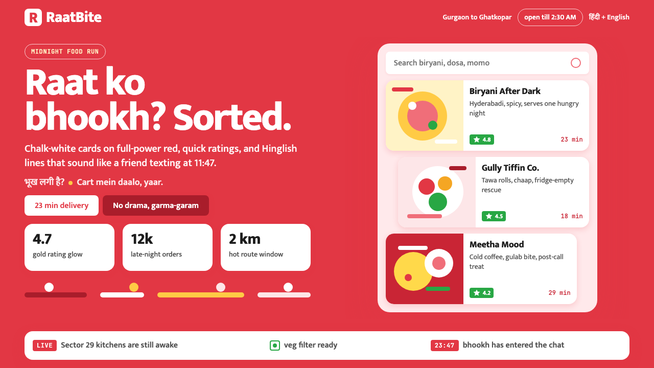 Zomato India DeliveryOwns the midnight scroll. Saturated red, Mukta Hinglish, white cards and gold…
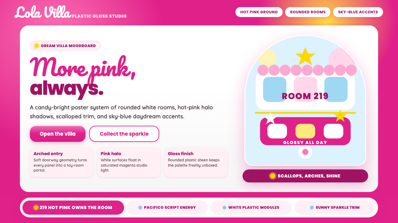 Barbie DreamhousePink is the whole world. Hot magenta ground, Pacifico script, scallops and gl…
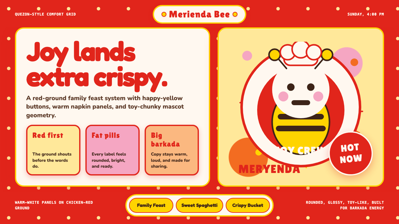 Philippines Jollibee Bee MascotJoy shouts first. Red ground, Fredoka curves, yellow pills, chunky grid.
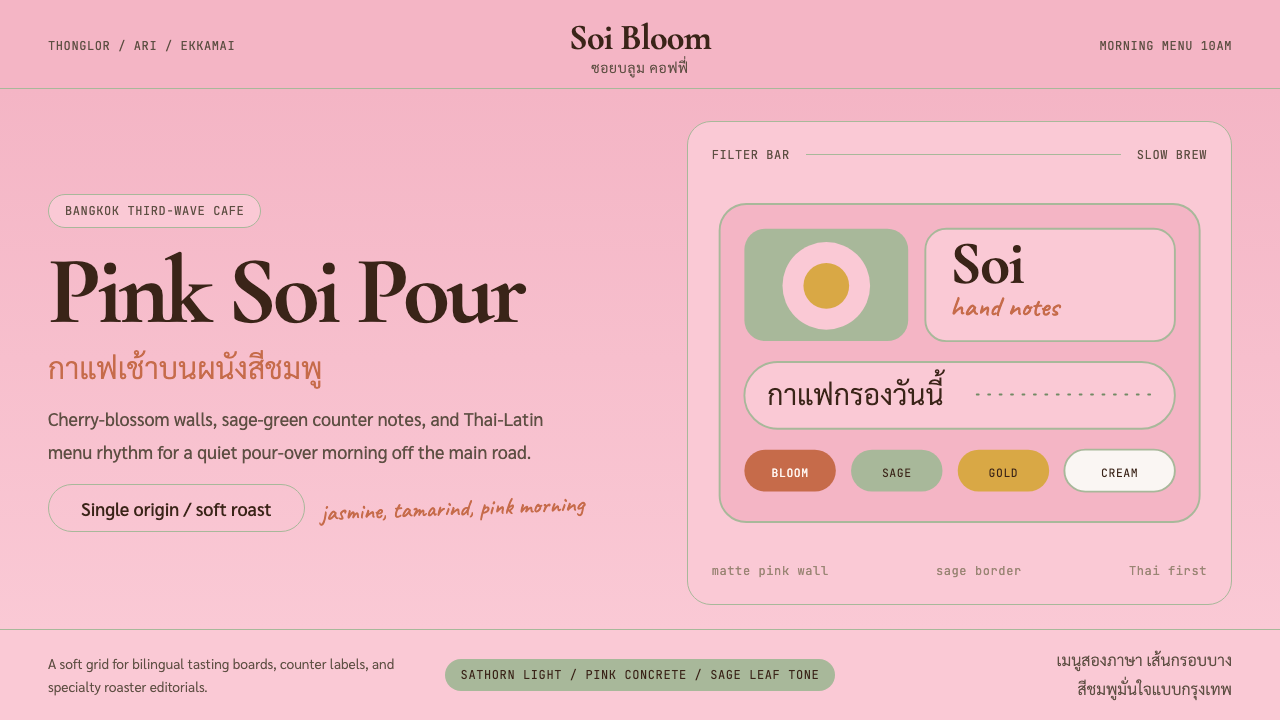 Bangkok Third-Wave CafeBangkok feels soft but sure. Cherry pink, sage borders, and Thai-Latin menu r…
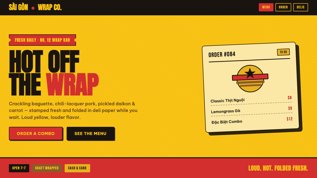 Bánh Mì Deli WrapA poster printed on a wrapper. Marigold ground, chili-red lockups, chunky Ant…
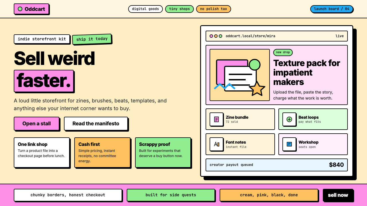 Gumroad CreatorGeoCities by way of Memphis. Hot pink, chunky black borders, hard offset shad…