What is Bánh Mì Deli Wrap?
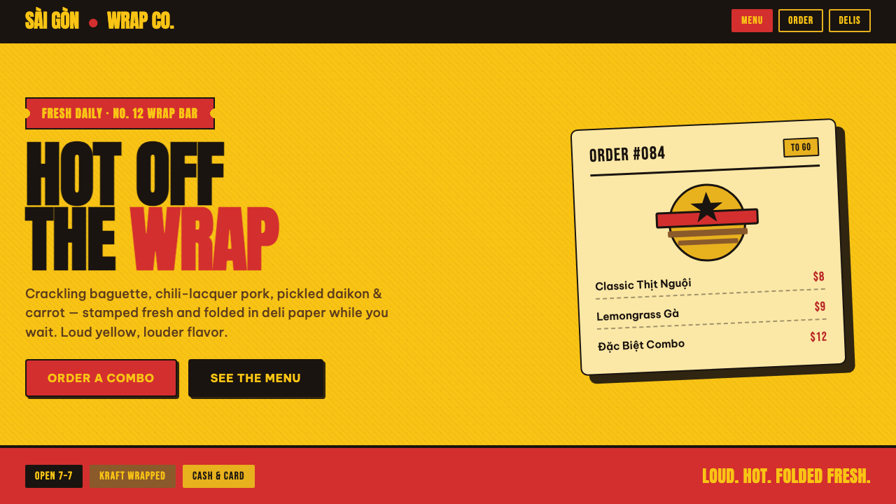
Bánh Mì Deli Wrap turns the sandwich counter into a street poster: marigold ground, chili-red brand marks, kraft warmth, and type built to be seen before the first bite.
Bánh Mì Deli Wrap in brief
Bánh Mì Deli Wrap is the visual genre of the contemporary Vietnamese sandwich shop. It combines a saturated marigold-yellow field, chili or lacquer-red lockups, kraft-brown deli-paper cues, and chunky grotesque display type. The result is deliberately immediate: bright enough to register from the street, warm enough to suggest fresh wrapping paper, and forceful enough to make a small food counter feel like an event.
Its central image is a poster printed on a wrapper. The background is not a neutral stage behind the brand; marigold is the ground itself, filling the surface with appetite and daylight. Red carries the name, the offer, and the visual hit. Kraft brown prevents the composition from becoming purely synthetic, introducing the familiar material feeling of deli paper and a direct connection to food being wrapped, carried, and eaten.
The genre rejects the restrained cafe language of cream, pure white, delicate serifs, and quiet hospitality. It does not try to look precious or artisanal in a hushed way. Instead, it treats loudness as a service quality: a clear storefront, a readable wrapper, a strong sign, and a visual identity with enough energy to compete with surrounding urban commerce.
Where does Bánh Mì Deli Wrap come from?
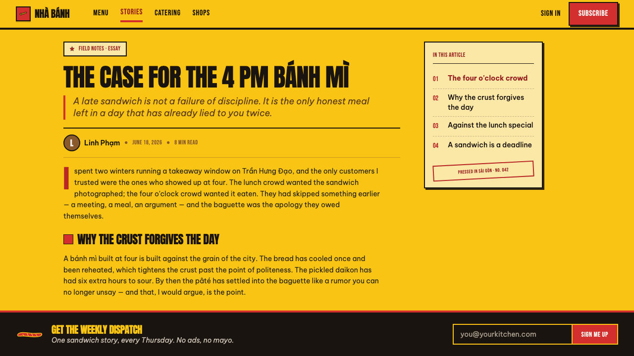
The genre belongs to the contemporary bánh mì shop branding wave that has developed from around 2010 to the present. Its region is not a single city or a closed national scene: it appears across Vietnam and Vietnamese diaspora communities, wherever bánh mì delis and chains need storefront identities, menus, wrappers, and packaging that can speak quickly to passing customers.
Its visual roots are practical. Deli-wrap and kraft-paper packaging design give the style a ready-made material logic: food is prepared, wrapped, handed over, and carried away. Rather than hiding this process behind polished luxury branding, Bánh Mì Deli Wrap turns the wrapper into a visible part of the identity. Kraft brown becomes an emotional anchor, while the surrounding color and typography operate with the urgency of a printed notice.
Modern food-brand identity contributes the commercial clarity. The brand must name itself quickly, make food seem appetizing, and remain recognizable across a storefront, a bag, a wrap, and a compact menu surface. The marigold-and-red relationship answers that need with a strong hierarchy: yellow establishes the field, red gives the brand its force, and brown reconnects the visual system to the tactile world of paper and food.
Bold grotesque poster typography completes the language. Its display lettering is not refined into the background; it acts as an active part of the sign. Banh Shop, Bánh Mì 365, and independent Vietnamese-diaspora identity studios are named within this contemporary wave. Together, these references frame the style as a living commercial vernacular rather than a fixed historical school: a repeatable language shaped by sandwich shops, packaging, and public-facing food retail.
What defines the Bánh Mì Deli Wrap look?
Marigold Ground
Marigold is the dominant field rather than a small accent. It makes the identity feel sunlit, hungry, and public-facing, giving every red mark a surface to strike against. A pale neutral ground weakens the genre because it removes the visual pressure that makes the wrapper read like a poster.
Chili-Red Lockup
Chili or lacquer red carries the brand lockup and the strongest verbal message. It should feel printed, assertive, and compact, not atmospheric or decorative. Against marigold, red behaves like a stamped declaration: it identifies the shop before it begins to explain it.
Kraft Warmth
Kraft brown introduces the material memory of deli paper. It keeps the saturated palette connected to handling, wrapping, and food rather than drifting into abstract graphic display. The brown should read as paper-like warmth and utility, not as a luxury finish or a rustic costume.
Chunky Grotesque Type
Chunky grotesque display type gives the genre its public voice. The lettering should feel broad, compact, and built for a sign or a wrapper, with enough density to stand beside the saturated ground. Fine serif forms and genteel editorial lettering contradict the direct, appetite-led character of the system.
Hard Ink Shadow
Shadows are hard and ink-like, functioning as printed force rather than soft illumination. They make lettering and lockups feel pressed onto the surface, adding a blunt physicality without turning the composition into a realistic scene. The shadow belongs to the poster language, not to atmospheric depth.
Wrapper-Poster Directness
The composition favors immediate recognition over subtle discovery. Brand name, food cue, and offer should appear to have been printed for a moving street audience and a hand-held package. Loudness is disciplined through clear roles: ground, brand, material cue, and message all need to remain legible.
Who shaped Bánh Mì Deli Wrap?
Banh Shop is listed among the key references for the contemporary bánh mì shop branding wave. Within this genre, it represents the public-facing food-brand context in which storefront identity, packaging, and a fast visual read must operate together.
Bánh Mì 365 is another named reference in the contemporary wave. Its inclusion situates the genre within the everyday visual world of bánh mì delis and chains, where recognizable color, assertive type, and packaging presence support repeated public encounters.
Independent Vietnamese-diaspora identity studios are identified as a key force in the genre. They matter because the style travels across Vietnamese communities worldwide, adapting the visual requirements of local storefronts and food retail while retaining the marigold, red, kraft, and poster-type logic.
How do you use Bánh Mì Deli Wrap today?
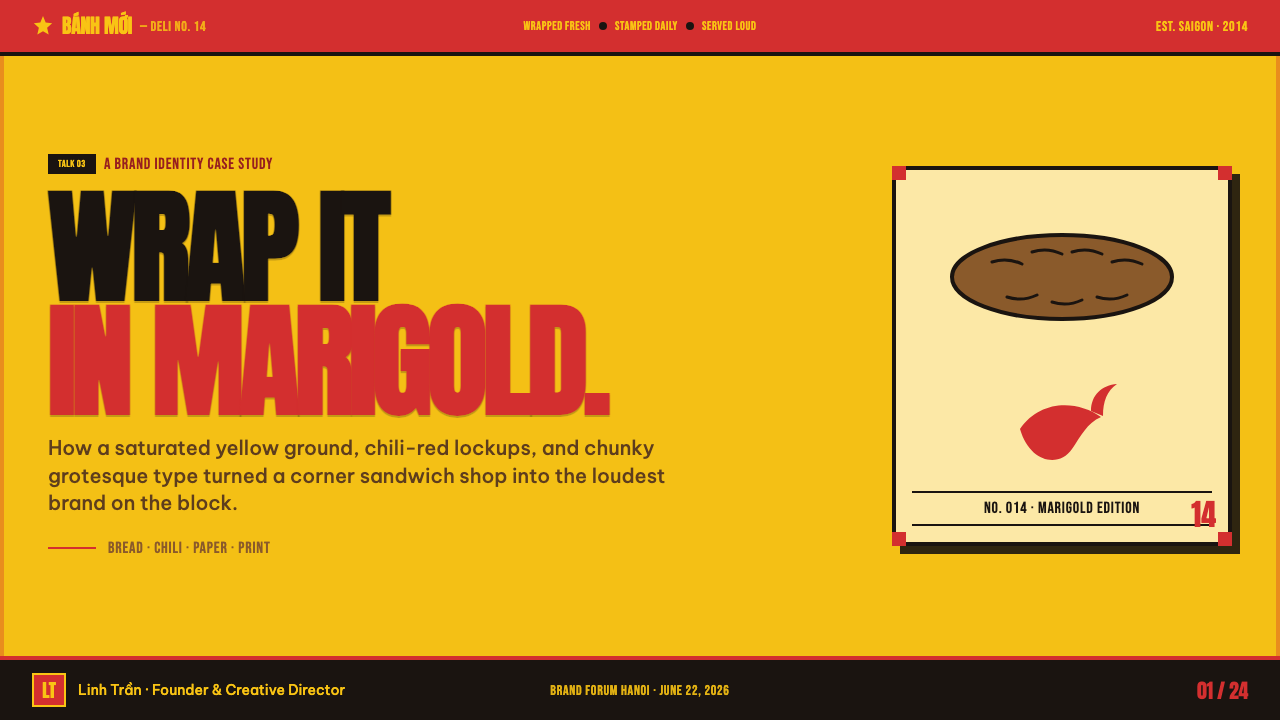
For presentation covers, use the style as a bold opening announcement. Let marigold establish the full visual field, place the title in a chili-red lockup, and use kraft-brown material cues only where they reinforce the food or packaging story. Content slides should remain poster-clear: large display statements, compact supporting copy, and a hierarchy that can be understood at a glance rather than through decorative detail.
For content and data slides, translate the wrapper logic into information hierarchy. A data chart can use the marigold field as context while red identifies the key comparison or takeaway; brown can support labels, notes, or paper-like framing. The goal is not to make every element loud. It is to make the primary message feel stamped forward, while secondary information remains organized and edible.
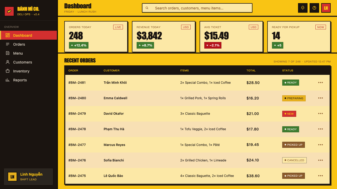
For web interfaces, the genre is strongest on restaurant landing pages, online ordering surfaces, menus, offers, and location-led pages. A dashboard or pricing-like page can borrow its decisive hierarchy when the product needs strong categories, offers, or ordering paths. Keep the interface practical: clear brand lockups, readable navigation, obvious actions, and paper-inspired warmth that supports the service instead of turning the screen into a novelty wrapper.
For editorial and marketing work, Bánh Mì Deli Wrap is effective where food, neighborhood energy, and visible appetite are part of the message. It can carry promotional posters, seasonal menus, social graphics, takeout inserts, and campaign pages because its visual system already understands short public messages. The strongest layouts let the brand and the offer occupy the same expressive world rather than separating identity from sales language.
A common mistake is reducing the style to yellow plus red. The genre depends on roles, not merely ingredients: marigold must behave as the ground, red must carry the brand, kraft brown must restore material warmth, and chunky type must deliver the message with conviction. Another mistake is adding delicate serif elegance, pale neutral space, or soft atmospheric effects; these choices mute the wrapper-poster logic until it no longer feels like Bánh Mì Deli Wrap.
Bánh Mì Deli Wrap — FAQ
Is Bánh Mì Deli Wrap a traditional Vietnamese historical style?
No. It is described as a contemporary genre associated with the modern bánh mì shop branding wave from around 2010 to the present. Its context is Vietnamese food retail in Vietnam and across diaspora communities, not a fixed historical art movement. Its authority comes from repeated commercial use across storefronts and packaging.
Why are marigold and red so important to the style?
They do different jobs. Marigold forms the saturated ground and creates the bright, appetizing atmosphere. Chili or lacquer red carries the lockup and strongest brand message. Their contrast gives the genre its instant public read; kraft brown then keeps that intensity tied to deli paper and food handling.
Can the style use a white or cream background?
That would work against its defining logic. The approved description explicitly treats marigold as the ground itself and rejects cream and pure white. A light neutral background shifts attention away from the saturated wrapper-poster effect and makes the red lockup feel less embedded in a distinctive food-retail identity.
Does it work only for physical packaging?
No. Packaging supplies the metaphor and material reference, but the visual language can extend to storefronts, menus, online ordering, promotional graphics, and restaurant pages. The requirement is that the work retain the same public clarity: a strong ground, a readable red brand message, kraft warmth, and display type that behaves like signage.
What most often makes an interpretation feel inauthentic?
Usually it is excessive refinement. Soft, elegant, pale, or luxury-coded decisions distance the work from the loud deli-wrap premise. The style needs saturation, a clear hierarchy, hard ink-like emphasis, and chunky grotesque type. When every element is softened or made precious, the design stops reading as a poster on a wrapper.
Related design styles
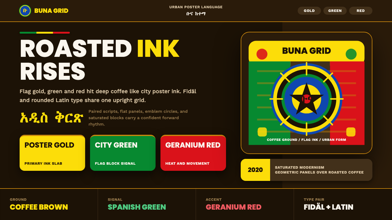 Addis Ababa ModernUrban coffee modernism. Flag gold, green and red snap from a roasted-brown gr…
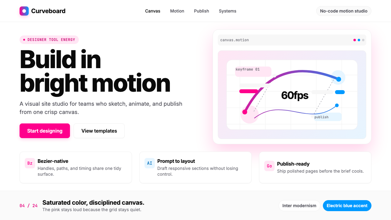 Framer Motion PinkDesigner-tool pink stays sharp. Inter whitespace frames electric blue Bezier…
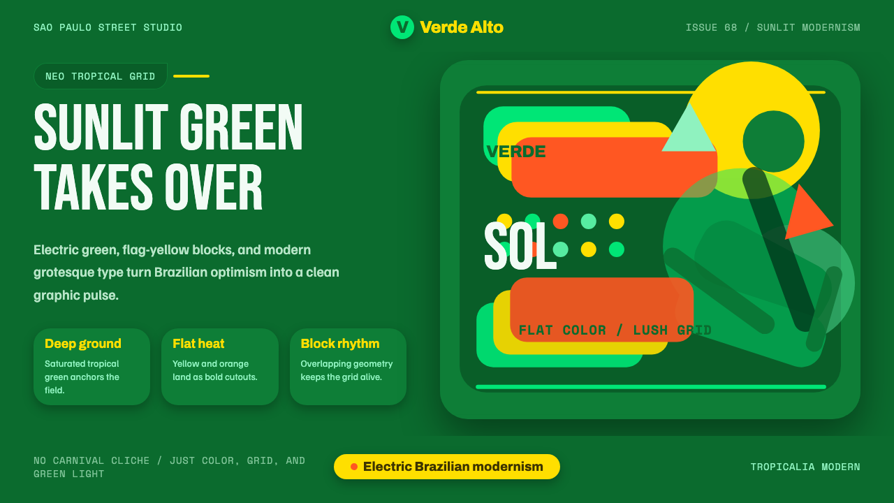 Tropicália ModernBrazilian optimism goes electric. Deep green, flag yellow, and leaf silhouett…
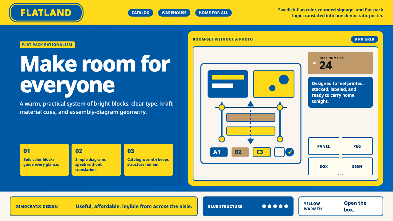 IKEADemocratic warmth in a box. Swedish blue-yellow blocks, Noto Sans, and assemb…
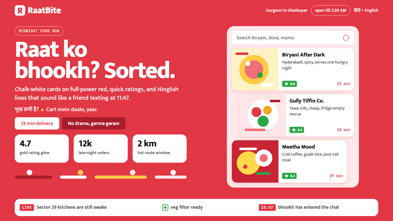 Zomato India DeliveryOwns the midnight scroll. Saturated red, Mukta Hinglish, white cards and gold…
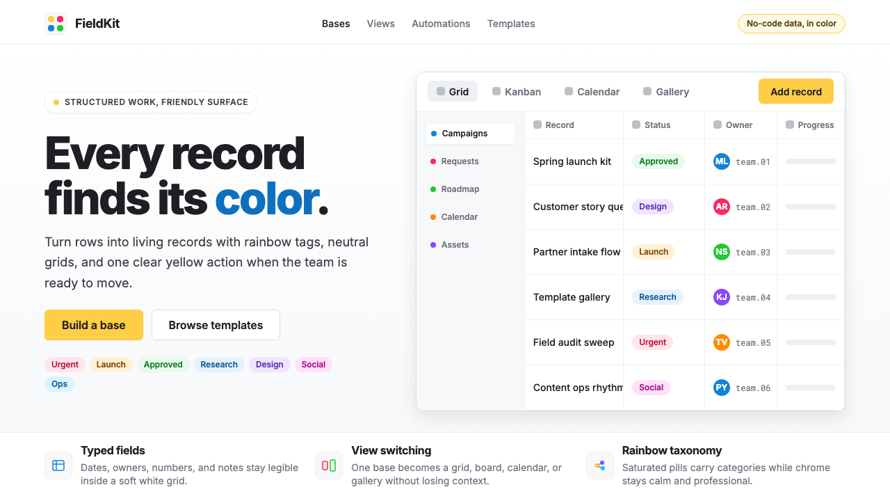 Airtable Spreadsheet-RainbowWork becomes celebratory. Inter grids stay white while rainbow pills and yell…