What is Zagreb School of Animation?
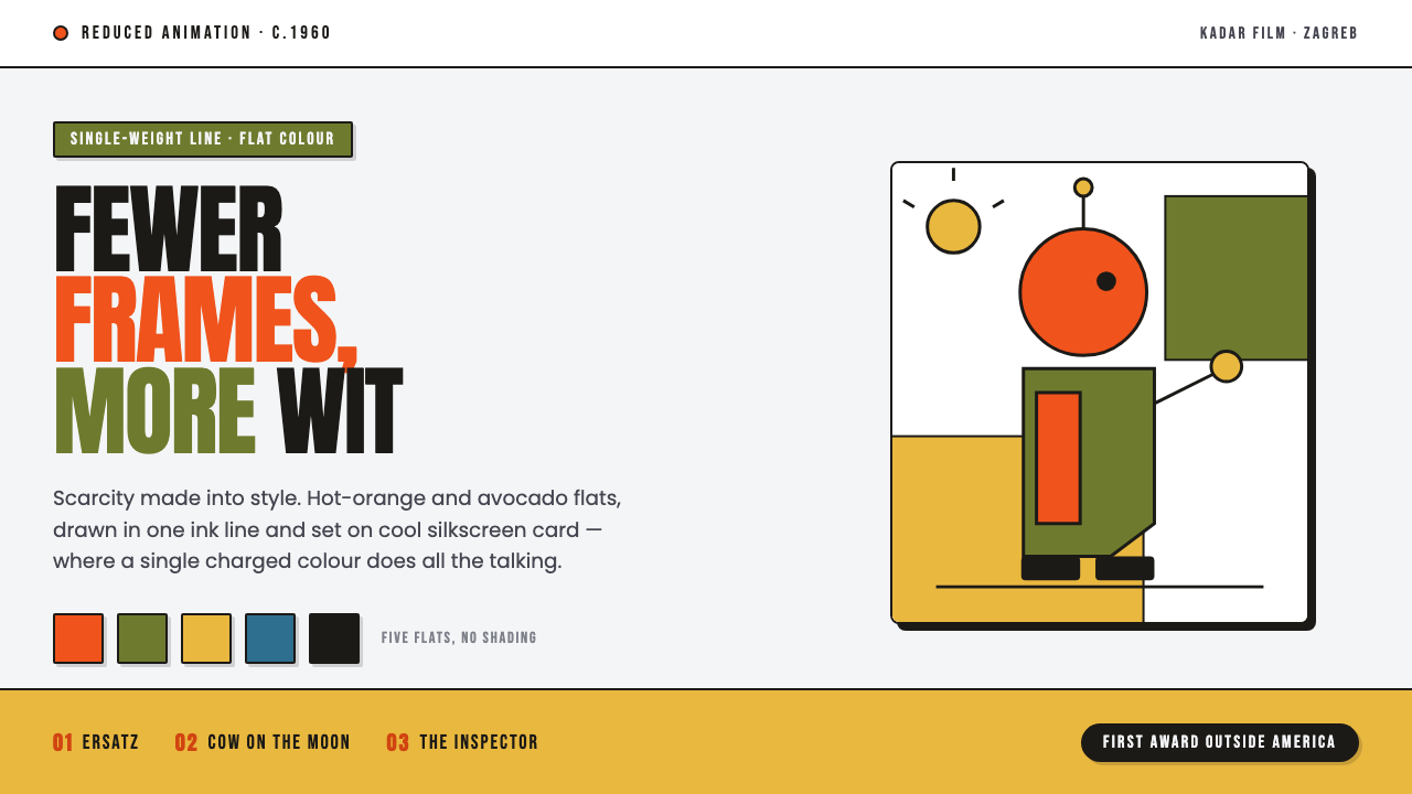
The Zagreb School of Animation made economy feel electric: a single lively line, a charged flat color, and enough blank card to let the joke land.
Zagreb School of Animation in brief
The Zagreb School of Animation names the modernist animated-film language developed around Zagreb Film in socialist Yugoslavia from the mid-1950s, reaching its characteristic expression around 1960. Its makers embraced UPA-influenced reduced animation: instead of pursuing continuous illusion, volumetric rendering, or densely detailed movement, they built films from concise graphic decisions. Figures are flat, witty, and visibly designed; movement is selective; each frame can read as a self-contained poster.
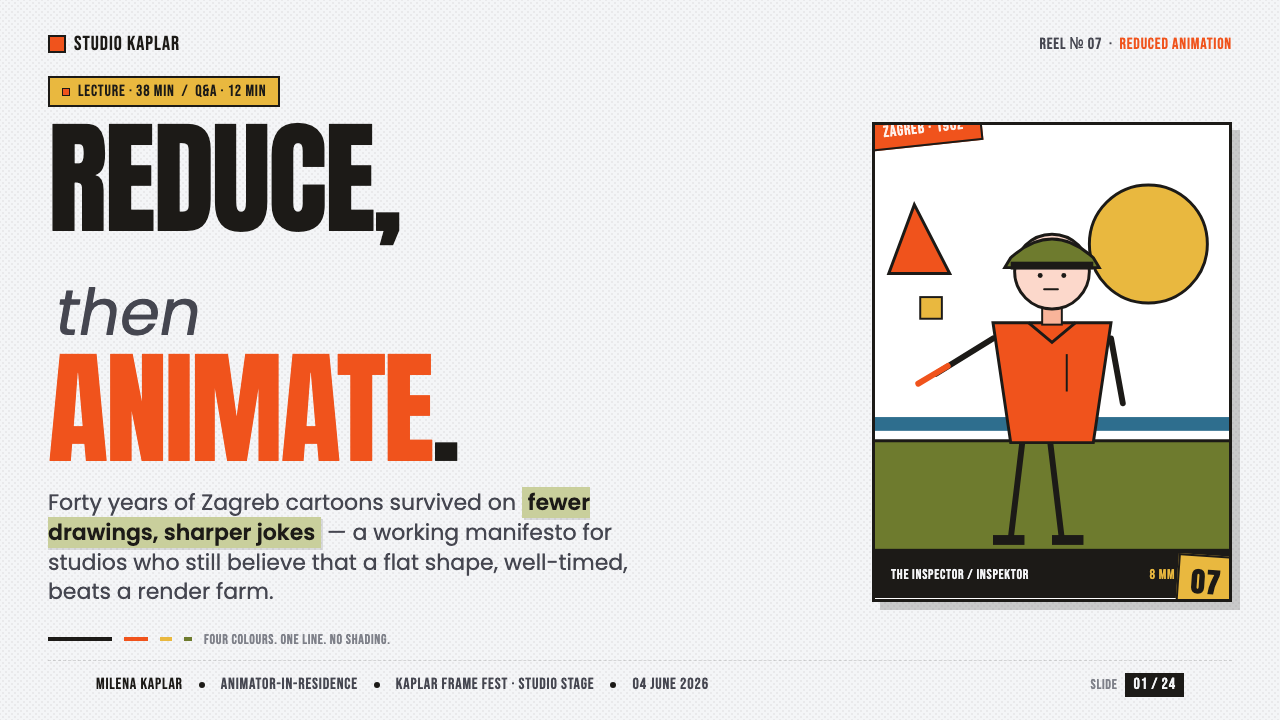
Its visual vocabulary is unusually direct. A cool card-white field holds single-weight ink contours, broad hot-orange or avocado flats, and bold poster-like type. There is no atmospheric shading to soften the image and no gradient to simulate depth. The result feels close to silkscreen printing and jazz-poster composition: color arrives as an event, empty space carries timing, and a crooked or off-center arrangement becomes part of the humor.
This is not merely a retro cartoon look. The school’s reduction is a discipline of attention. By withholding detail, it makes a gesture, a line break, a color interruption, or an awkward pause seem intentional. The style asks viewers to notice construction rather than disappear into illusion, turning limited means into a confident, urbane visual voice.
Where does Zagreb School of Animation come from?
The Zagreb School emerged from Zagreb Film in Zagreb, Croatia, during the socialist period of the former Yugoslavia. The studio was founded in the mid-1950s, and its animators worked in an Eastern European setting where modern graphic design, film, and cultural production could meet under conditions that rewarded invention with modest means. Scarcity was not hidden behind polish; it became the pressure that clarified the image.
A decisive influence was reduced animation associated with UPA. Rather than making every drawing compete with live-action realism, the approach treated animation as graphic composition in motion. A character could be conveyed by a contour and a flat fill; a shift in pose could matter more than exhaustive in-between motion. This made the line, the background field, and the timing of color changes central expressive tools rather than technical leftovers.
Around 1960, the Zagreb Film approach became recognizable through its combination of modernist flat two-dimensional design and a silkscreen-jazz-poster sensibility. Dušan Vukotić and Vatroslav Mimica are key figures associated with this atmosphere, while Zagreb Film provided the institutional setting in which the language cohered. The enduring lesson is not that limitation automatically produces style, but that a system can become vivid when every available mark is asked to do a distinct job.
What defines the Zagreb School of Animation look?
Reduced Motion
Movement is edited down to the gestures that carry character, rhythm, or a joke. The frame does not pretend that every surface is continuously alive. A held pose, a sudden directional shift, or a deliberately spare transition can become more expressive than elaborate fluidity. This economy makes timing visible and gives the animation a dry, knowing wit.
Single-Weight Line
Figures and objects are defined by an even, graphic contour rather than by modeled light or varied draftsmanship. The line behaves like printed ink: firm enough to organize a silhouette, light enough to remain playful. Because it does not thicken into theatrical emphasis, shape and pose do the expressive work.
Charged Flat Color
Hot orange and avocado green function as active graphic statements rather than descriptive local color. Usually one emphatic flat does most of the visual talking, while the surrounding field stays calm. This restraint gives color comic timing: a bright shape can interrupt, punctuate, or redirect the eye without needing texture, glow, or tonal buildup.
Card-Stock Flatness
The visual world sits on a cool, paper-like ground with the matter-of-fact presence of a printed card. There is no attempt to open a realistic window behind the figures. Flat fills, exposed empty field, and crisp silhouettes keep every element on the same designed plane, recalling the physical clarity of silkscreen poster work.
Playful Asymmetry
Composition resists centered politeness. A figure may lean toward an edge, type may arrive at an angle, or a small colored form may counterbalance a much larger empty area. The imbalance is controlled rather than chaotic: it produces anticipation, visual bounce, and the sense that the frame is participating in the film’s joke.
Poster Typography
Type is bold, declarative, and treated as a graphic actor rather than neutral captioning. It belongs to the same flat stage as the line and color fields, creating blocks of emphasis with scale, placement, and contrast. The best applications let lettering share the composition’s visual rhythm instead of floating above it as interface decoration.
Who shaped Zagreb School of Animation?
Vukotić is a key figure named in connection with the Zagreb School’s characteristic period and visual identity. In an account of the style, his importance lies in representing an animation culture that trusted graphic reduction, pointed observation, and formal wit. His association helps locate the school in Zagreb Film’s modernist film practice rather than treating the look as a generic vintage illustration trend.
Mimica is another key figure associated with the Zagreb School. His presence in the school’s story underscores that this was a shared visual movement, not the signature of one isolated author. The language could accommodate individual voices while maintaining a common commitment to flat design, selective motion, visual intelligence, and a refusal of unnecessary pictorial finish.
Founded in the mid-1950s, Zagreb Film is the institutional home from which the school developed. It matters because the style was not simply an arrangement of colors and outlines; it was a working method for animated films. The studio context joined artists, production constraints, and modernist graphic thinking into a repeatable language whose economy became part of its identity.
How do you use Zagreb School of Animation today?
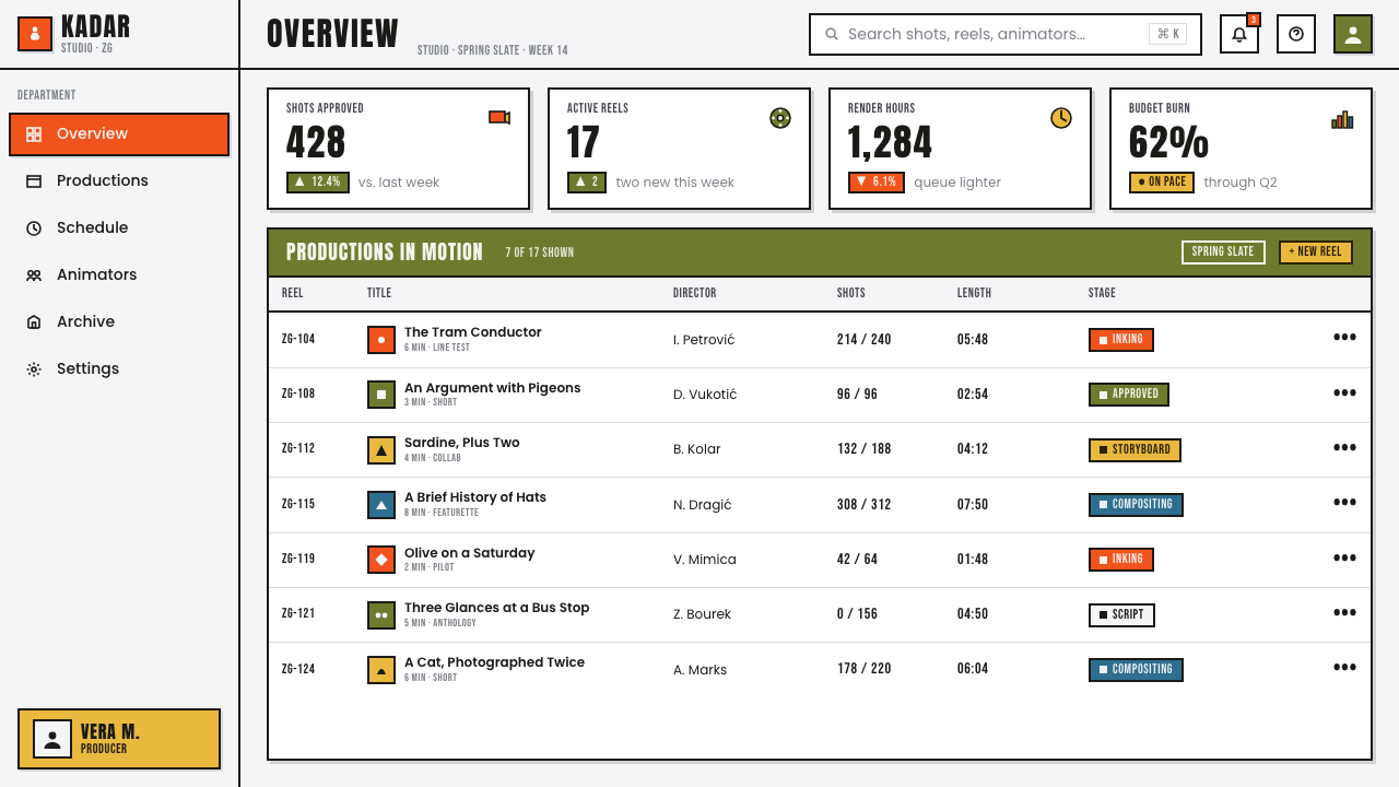
For presentation covers, use the Zagreb School as a compact visual proposition: a calm card-like ground, one off-center illustrated form, one charged color flat, and a title that behaves like poster type. Content slides should preserve the same restraint. Let a single line drawing, a short heading, and generous blank field establish hierarchy; avoid turning every bullet, icon, and divider into a competing gag. On data slides, recast charts as crisp flat shapes and reserve the accent color for the insight that deserves attention.
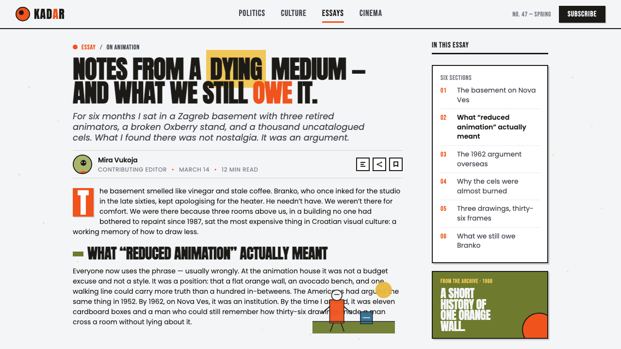
In web interfaces, the style is particularly effective for dashboards, analytical tools, pricing pages, and editorial products that benefit from an alert, human modernism. Use a quiet background, clear dark text, and a limited set of outlined controls. A single orange or avocado state can identify the active choice, a warning, or a highlighted plan. Cards should feel printed and bounded, not softly lifted into simulated space, while icons should read as simple line characters rather than glossy utilities.
For editorial and marketing work, the system suits campaign pages, explainers, event programs, and culture-oriented product launches. Build each section as a small poster: one dominant proposition, one visual interruption, and one clear route onward. Cropped figures, sideways labels, and asymmetrical text blocks can create energy without overwhelming the reader. The essential question is whether every visual move advances the message or merely imitates animation-era charm.
The common mistake is to mistake reduction for casualness. Adding many bright flats, quirky illustrations, irregular type treatments, and decorative squiggles at once produces noise, not Zagreb clarity. The style works because one charged element is allowed to speak against a deliberately quiet field. Do not add gradients, soft shadows, realistic texture, or elaborate simulated depth to make it feel more finished; those effects undo the printed, constructed conviction that gives the language its force.
Zagreb School of Animation — FAQ
Is the Zagreb School simply a form of minimalism?
No. It is economical, but its aim is not neutral reduction for its own sake. The style is theatrical, comic, and deliberately graphic. Blank space creates timing, color creates interruption, and an uneven composition can carry personality. A merely minimal layout may feel quiet and anonymous; a Zagreb-derived layout should feel as though its limited elements are actively performing.
Why should a design use only one strongly charged accent color?
Because the visual logic depends on contrast between an active event and a calm field. When several saturated flats compete at once, the eye loses the route through the composition and the poster-like timing disappears. One emphatic color can define a focal character, action, status, or proposition; the surrounding restraint gives that choice its authority.
Can photography belong in a Zagreb School-inspired composition?
It can, but it should be treated as a designed flat element rather than a naturalistic scene. Crop it decisively, simplify its role, and place it in clear tension with line, type, and empty field. If the photograph introduces soft atmospheric depth, richly modeled lighting, or too much incidental detail, it will overpower the graphic system instead of participating in it.
Where does this style work poorly?
It can struggle where reassurance, luxury softness, or dense realism is the central promise. Products that need tactile richness or solemn documentary credibility may find its humor and visible construction too assertive. It is strongest when a product can benefit from clarity, cultural intelligence, and a little visual mischief. The fit depends less on whether the style looks attractive than on whether its brisk, constructed tone supports what the product needs to say.
Related design styles
 Blue Note JazzCool intelligence, printed flat. Midnight blue, paper type, and one burnt-ora…
 Braniff (Girard)Color becomes fuselage. Jellybean orange, turquoise blocks, and geometric san…
 iPod Silhouette 2004Discipline dances. Lime flat-field, black silhouette, and one white cord carr…
 Matchbox LabelPropaganda for the pocket. Flat orange-red-yellow spot inks on dark slate, co…
 Atompunk / Raygun GothicTomorrow shines loud. Tangerine marquee type cuts through turquoise chrome ge…
 Hockney Pool BlueSerenity turns graphic. Turquoise planes, salmon edges, one white splash.