What is Ysyakh Festival?
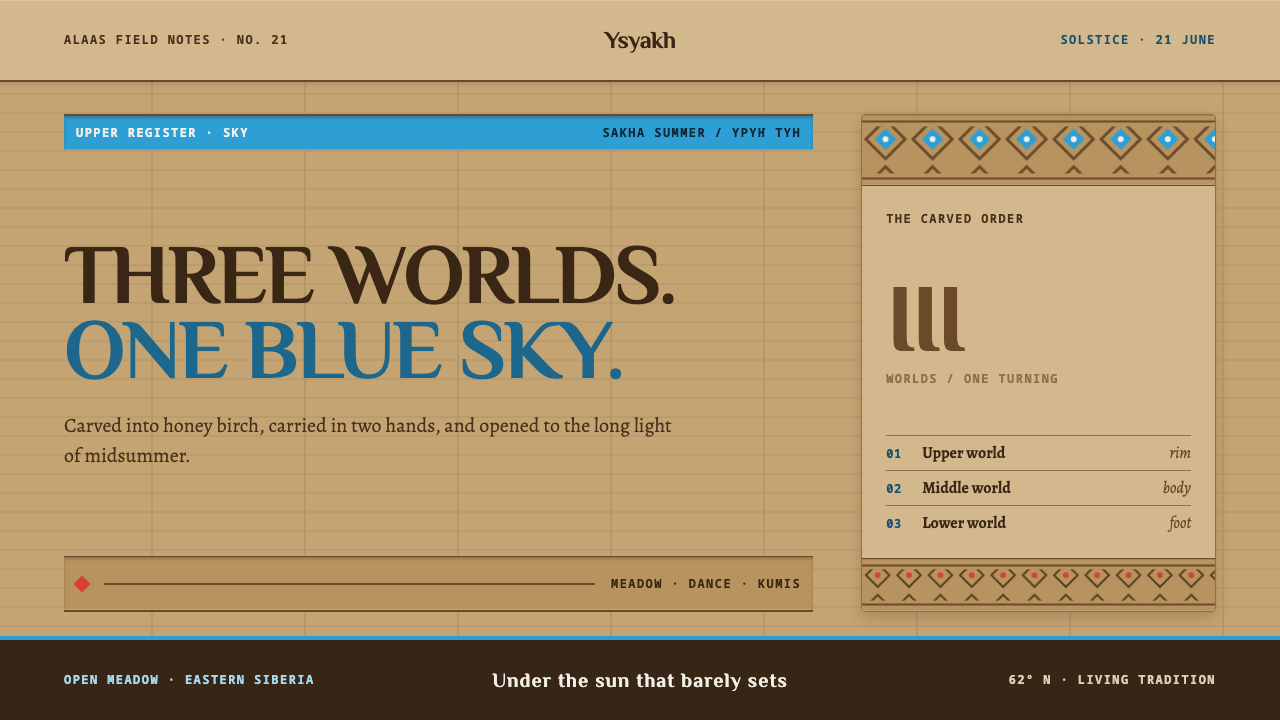
Ysyakh Festival takes the Sakha summer-solstice cup, the choron, and turns its three carved zones — rim, body and foot — into a layout system where nothing floats and everything is cut into the surface.
Ysyakh Festival in brief
Ysyakh Festival is a design language built from the choron, the carved birch cup used for kumis at the Sakha summer solstice. Ysyakh is the main festival of the Sakha people of eastern Siberia, held on open meadow outside Yakutsk, and the choron is its central object: a drinking vessel turned from a single piece of birch and banded with carving from top to bottom.
The cup is also a map of the world. Its rim and throat stand for the Upper World, its body for the Middle World and its foot for the Lower, so three worlds are stacked inside a hand's width of wood. The design system takes that stacking literally. Every panel divides into a rim, a body and a foot; every screen is a short vertical cosmos rather than a flat sheet.
Visually, the style is warm, tactile and light-grounded. The base colour is aged honey birch — a wood surface with lathe marks and the polish of long handling, not paper. Sky blue carries every action, red, green, white and silver appear as named ornament colours, and all ornament is cut into the surface instead of floating above it. It is a calm, communal and ceremonial look, closer to a well-used heirloom than to a polished product.

Where does Ysyakh Festival come from?
Ysyakh is the summer solstice festival of the Sakha, the Turkic-speaking people of the Sakha Republic, also called Yakutia, in eastern Siberia. It is a rite of pre-1900 origin and is still held every 21 June. Families and communities gather on open meadows — the alaas clearings that structure Sakha life in the taiga — outside Yakutsk, and the largest gathering is at Us Khatyn. The festival marks the turn of the year at the height of summer, and its spirit is communal rather than commercial: everyone is a participant, not an audience.
The choron belongs to kumis culture, the Sakha tradition built around fermented mare's milk and the horse that supplies it. Kumis is poured and shared in the choron at Ysyakh, and the cup's carved bands encode the Sakha picture of the cosmos: the Upper World at the rim and throat, the Middle World in the body, the Lower World in the foot. The same cup is thus an object, a vessel for a ritual drink and a diagram of the universe. A design that takes its structure from it inherits a built-in sense of hierarchy without needing arrows or headings to explain it.
The ritual layer of the festival is carried by people rather than by artefacts. The algyschyt, blessing-singers, open the day with spoken-sung invocations that bless the meadow, the community and the cup. The osuokhai is a circle dance in which participants join a large ring and move together to a leader's chanted lines; its leaders set the pace and the response. These two figures matter to the design vocabulary because both are about rhythm and repetition: the same pattern carried around a ring, the same banding carried around a cup.
The form of Ysyakh as a large public festival, with an organised programme and mass participation, has taken shape since roughly the 1990s and continues to the present, but it stands on much older ground. Sakha ritual woodcarving gave the choron its ornament; Sakha silver repoussé, worked from behind into raised patterns, supplies the silver of the ornament; and the lathe-turned birch supplies the honey ground. The Curio system treats these as a single, coherent material world and reads them as design rules.
What defines the Ysyakh Festival look?
Honey Birch Ground
The page is not white. It is the warm, slightly amber colour of aged birch, with the suggestion of lathe marks and hand wear rather than any fake wood texture. This ground sets the tone: friendly, used, human-scaled. It also means the whole interface reads as an object you could hold, so type and ornament have to sit in it as if carved or burned rather than printed on top.
Rim, Body and Foot
Every panel, card and section is divided into three zones: a top band that frames and names, a main body that carries content, and a foot that closes and anchors. The division mirrors the Upper, Middle and Lower Worlds of the cup, and it makes every unit of the interface complete in itself. Panels never simply end; they are finished the way a turned vessel is finished.
Sky Blue as the Action Colour
Sky blue is the colour of the Sakha flag, which names it as the sky, and in this system it carries every action: links, buttons, selected states, focus. It never appears as decoration. Because it is the only colour with this job, users learn quickly that blue means a thing can be done, and the remaining colours are free to be ornament.
Named Ornament Colours
The remaining palette is tied to named things in the Sakha world. Red is the Sardana lily, green is the taiga, white is kumis and horse mane, and silver is the chased silver of ornament. Each colour is a noun rather than a mood, so the palette can be used descriptively and consistently: the same hue always refers to the same part of the landscape or ritual.
Carved Bands, Not Floating Layers
Ornament is arranged as narrow horizontal bands of repeating motif, like the carving on the cup, and it is cut into surfaces rather than laid over them. There are no floating cards and no detached shadows; depth, where it exists, reads as recess and relief. The result is dense but orderly, with decoration that belongs to the structure of the thing rather than sitting on it.
Turned, Hand-Worn Form
The choron is made on a lathe from one piece of wood, so the underlying geometry is rotational: rings, curves and concentric bands rather than sharp corner-to-corner rectangles. The interface carries this in softly rounded forms and in ring-like repetition. The effect is not slick roundness but the gentle irregularity of a hand-finished object.
Communal Rhythm
The osuokhai round dance and the blessing-song give the style its sense of rhythm: patterns repeat around a ring, lines are call-and-response, and spacing is steady. In layout terms this means regular intervals, repeated modules and a gentle cadence from section to section. It is not busy; it is the pleasure of something carried round a circle by many hands.

Who shaped Ysyakh Festival?
The blessing-singers open Ysyakh with invocations that consecrate the meadow, the people and the cup. They are the voice of the festival's ritual layer, and their role explains why the Curio system treats the first moment of any interface — the cover or header — as a short, formal blessing rather than a sales pitch.
The leaders of the osuokhai set the rhythm for a ring of dancers, calling lines to which the circle responds. Their art is about sustaining one pattern across many people, and it supplies the style's feel for repetition, cadence and shared movement.
The turners shape each choron from a single piece of birch and band it with carving, dividing the cup into its three worlds. Their work is the origin of the system's tripartite panels, its honey ground and its rule that ornament is cut in, not laid on. The style is essentially a translation of their craft logic into layout.
Sakha silver repoussé, in which a pattern is pushed up from the back of the metal, gives the tradition its silver ornament. The silver is a support colour here, never a glittering lead; it reflects a craft of restraint in which the pattern lives in the relief itself.
How do you use Ysyakh Festival today?
Ysyakh Festival works best for projects with a communal, ceremonial or cultural warmth. It is not a general-purpose style; it is most convincing when it is used to organise content into three-part units on a warm, light surface, and when sky blue is reserved for action. Applied that way, it gives even routine screens an unusual sense of completeness.
For presentation slides, use the honey ground for every slide and divide each into rim, body and foot: a narrow title band across the top, a main content area, and a closing footer or key takeaway line. Covers can lead with one large sky-blue element and a band of repeating ornament in the title zone. Data slides suit bar charts and timelines drawn in sky blue against the warm ground, with the other colours used only to label categories; avoid chart junk or glossy effects.
For web interfaces, the style suits cultural platforms, community tools, event pages, learning products and craft or heritage marketplaces. Use rim-body-foot cards for products and articles, keep links and primary buttons in sky blue, and use ornament bands as section dividers or card borders rather than as full-screen backdrops. Forms and settings pages are well served by the three-zone structure, which naturally separates a heading, the inputs and the confirm-or-cancel row. Keep shadows minimal and replace them with recessed edges and borders.
For editorial and marketing work, the style supports festival programmes, cultural guides, food-and-drink storytelling and anything about gathering, rhythm and tradition. Use banded headers and repeated motifs sparingly to give pages a handmade cadence, and set the red, green, white and silver as accents in illustrations or section markers. Photography of people, meadow and craft pairs well with the warm ground, since the colours harmonise rather than compete.
The most common mistake is to swap the honey ground for stark white, which removes the material warmth that defines the style. Others include using sky blue as ornament rather than action, scattering the ornamental colours until the palette loses its meaning, and adding drop shadows that make panels float. It is also worth remembering that the choron and its ornament belong to a living ritual tradition; use the motifs with care, as structural inspiration rather than as exotic decoration.

Ysyakh Festival — FAQ
What is a choron and why is it the basis of a design system?
A choron is the carved birch cup, turned from a single piece of wood, from which kumis is drunk at the Sakha summer solstice. Its carved bands divide it into three zones that stand for the Upper, Middle and Lower Worlds. That built-in structure — a top, a middle and a base, each with its own role — makes a ready-made grammar for interface panels, which is why the style adopts it directly.
Why is the background honey-coloured instead of white?
The ground represents aged birch, a wood handled by many hands over time. White paper would turn the interface into a printed page; honey wood turns it into an object. The warm ground also lowers glare, flatters the sky blue and makes carved-in ornament feel natural. Replacing it with white is the single quickest way to lose the style.
How should the blue and the ornament colours be divided?
Sky blue is reserved for action: links, buttons, selected states and focus. The red, green, white and silver are ornament colours tied to the Sardana lily, the taiga, kumis and horse mane, and chased silver, and they belong in bands, markers and illustrations. Keeping the two roles apart is what lets users read the interface at a glance.
Does it work for dense business tools?
It can, with discipline. The rim-body-foot structure is helpful for dashboards and forms because each panel has a clear header, content and action row. The risk is over-decoration: keep ornament bands thin and sparse inside dense tools, and let the honey ground and sky-blue actions do most of the work. For purely analytical products with no cultural or communal angle, a plainer style may suit better.
How should the cultural source be treated respectfully?
The choron, its carved bands and the Ysyakh rite belong to a living Sakha tradition. The style borrows structure and colour logic, not sacred meaning. Use it for work that fits a communal, craft or heritage tone, credit the source where it is natural to do so, and avoid using the motifs as a generic exotic backdrop or in contexts that would trivialise the ritual.
Related design styles
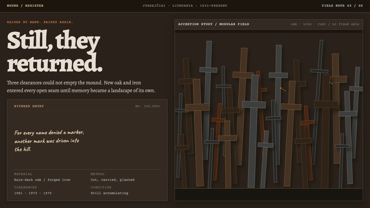 Hill of CrossesMemory returns by hand. Rain-black oak and rusted iron overlap until density…
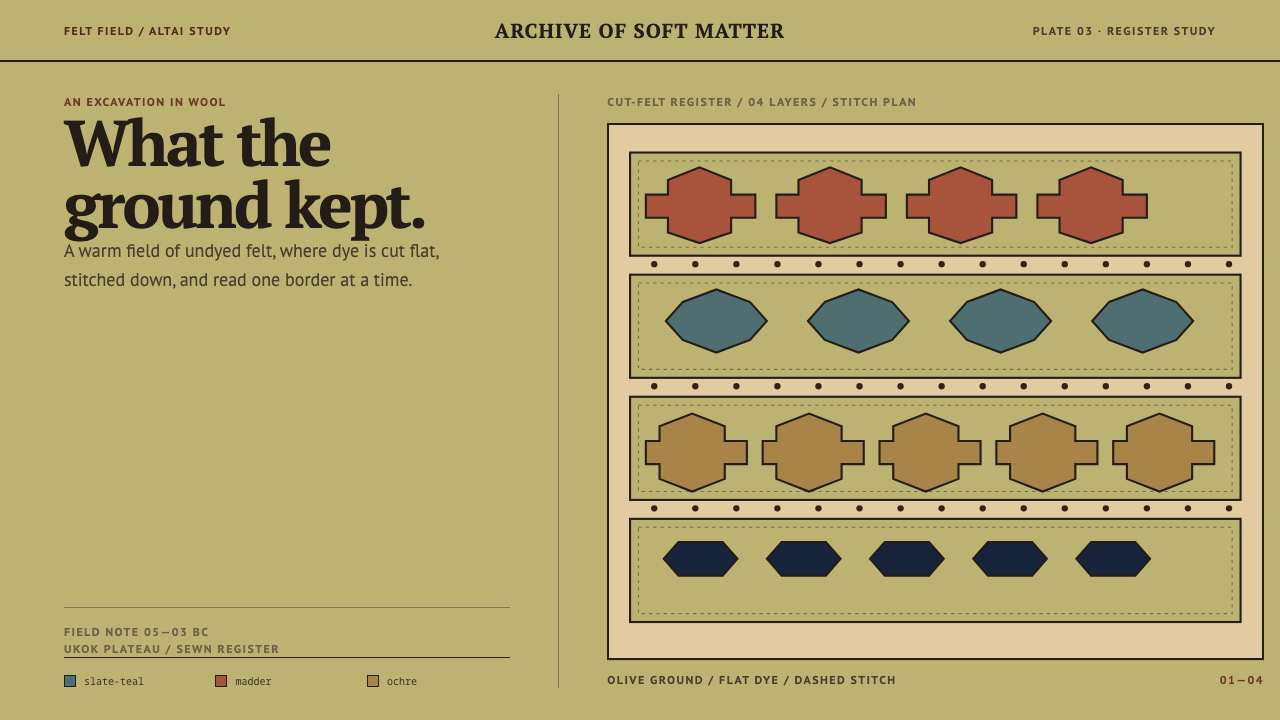 Pazyryk Ice MaidenSoft matter holds its ground. Olive felt carries stitched teal, madder, and o…
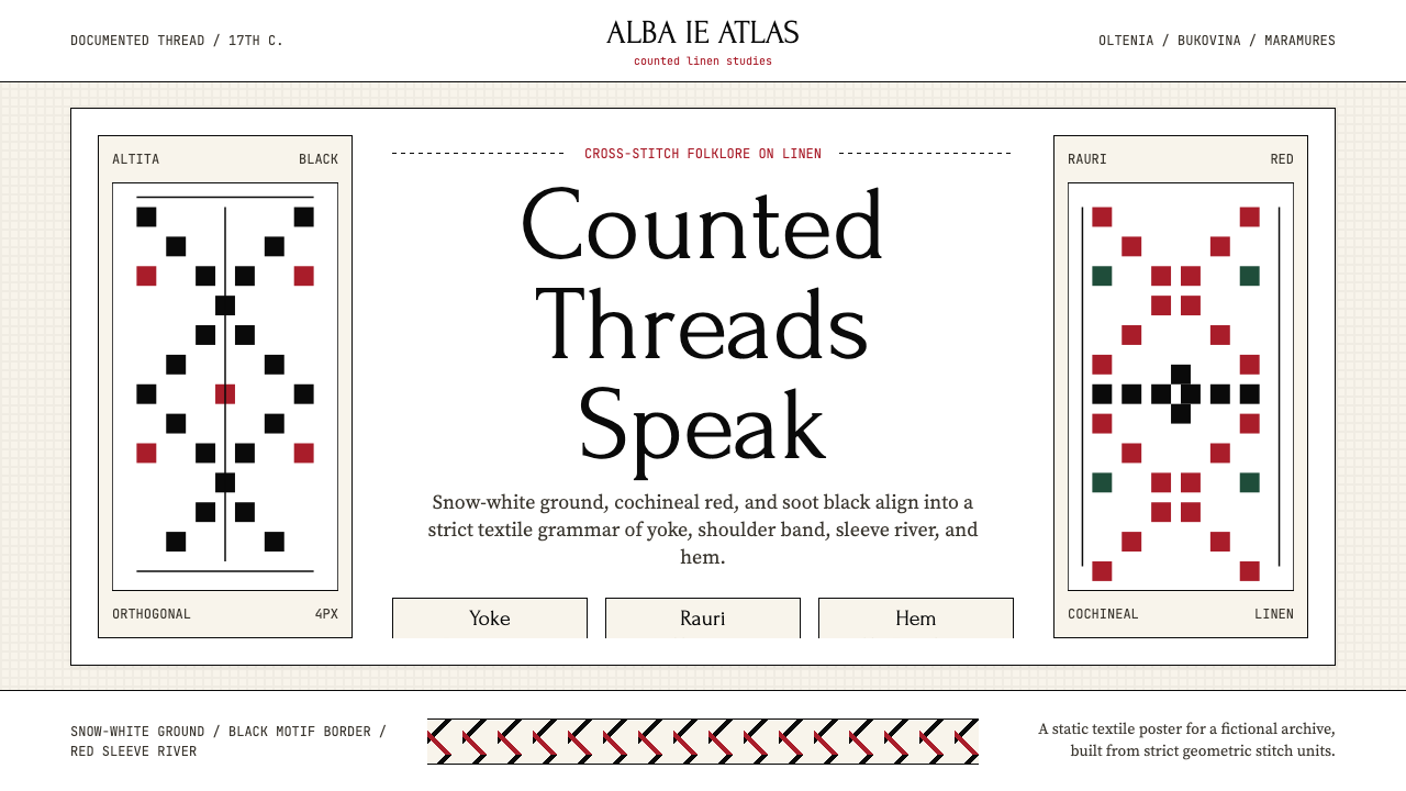 Romanian Ie (folk embroidered blouse)Folklore becomes grid. Cochineal red and soot black stitch strict bands on li…
 Cham My Son TowersWall before ornament. Greyed brick bays recede around cut shadows and sandsto…
 Chinese Jianzhi Paper-CuttingRitual red, cut as one. Vermilion lacework on rice-paper cream locks every sh…
 Egyptian Coptic TextileWarmth woven flat. Madder, indigo and saffron medallions sit on linen cream.