What is Yahoo! JAPAN?
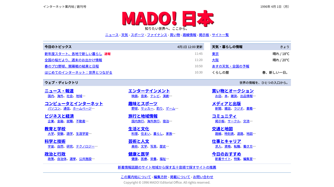
Yahoo! JAPAN showed that a homepage could be a whole city on one screen: a red logo, a search box, and rows of small blue underlined links.
Yahoo! JAPAN in brief
Yahoo! JAPAN opened in April 1996 as a directory of websites and quickly became the front door of the Japanese web. Its homepage had almost no visible design in the usual sense: a plain white page, a red logo with a beveled, three-dimensional look, a search box with a button, and then rows and rows of small blue underlined links, joined by hyphens.
The style built on this page is a style of density. News, weather, stocks, auctions and the full category directory all share a single screen. Content is organized through centred, fixed-width tables, pale-blue section bars and hairline rules. Form controls are left in their browser defaults. Nothing floats, nothing is padded and nothing is decorated for its own sake.
The pleasure of the style is in its efficiency. A reader can scan dozens of destinations at once, and every one of them is a link. It evokes the early web, when a portal's job was to be a map of everything, and it suits any project that values showing it all at once over a calm, spacious layout.

Where does Yahoo! JAPAN come from?
Yahoo! JAPAN launched in Tokyo in April 1996 as a joint venture between the Japanese company SoftBank and the American Yahoo!. Masayoshi Son, the head of SoftBank, and Yahoo's founders Jerry Yang and David Filo are the names the source material attaches to the project, and Masahiro Inoue appears as the figure associated with running the Japanese company. The idea was to adapt the American directory model to Japanese users, organizing the web as a list of categories that a person could browse by hand.
At that point the web had too many pages for anyone to remember, and search engines were not yet the default way of finding things. A directory was a way to impose order. Editors sorted sites into categories and sub-categories, and a visitor could drill down from a broad heading to a specific page. That structure explains the design: the home page is essentially a table of contents for the entire internet, and its rows of hyphen-joined links are the visible form of that classification.
The visual look is tied to the technology of the time. In the years the source material marks as the homepage's visual period, 1997 to 2005, web pages were built from HTML tables. Designers fixed a page to a set width, centred it in the browser, and used table cells to divide content into zones with colored bars and thin borders. Controls such as the search box and the button were whatever the browser supplied. The result was what the source material calls table-based HTML layout, and it explains why the page feels more like a printed form than a modern website.
A third influence is the long Japanese tradition of dense information design. Newspapers, train timetables, magazines and catalogues in Japan often pack a large amount of small, closely set text onto a single page, and readers are accustomed to scanning it. The portal fit that expectation. Its home page offered baseball scores, headline news, stock prices and the day's weather in one glance, in a format that people found useful rather than overwhelming. The source material names these three currents: early web-directory portals, table-based HTML layout and dense Japanese information design.
What defines the Yahoo! JAPAN look?
White default ground
The page sits on the browser's plain white. There is no tinted background, texture or card. Color appears only in small, deliberate doses, such as the logo and the section bars, which makes the white feel like paper and keeps attention on the text.
Red beveled wordmark
The logo is a red wordmark with a raised, beveled look typical of the period. It is the single loud element on the page and acts as the brand anchor in the top corner. Everything else is quieter, so the logo reads instantly.
Blue underlined links
Links are small, blue and underlined everywhere, with no hover tricks or button styling. The convention is simple and universal: anything blue and underlined is clickable. Long runs of links are separated by hyphens, so they form lines of text rather than separate boxes.
Pale-blue section bars
Sections are introduced by flat bars in pale blue, which give each block a clear header without any shadow or border. They also set up a light vertical rhythm, so the eye can jump from news to weather to directory with ease.
Fixed-width centred tables
Content is laid out in a centred column of fixed width, divided into cells by hairline rules. The layout does not stretch or reflow elegantly; it is a precise, stable grid in which every block has a known place. That predictability is a feature for a portal people visit daily.
Default form controls
The search box and the button look exactly as the browser draws them. No custom styling is applied, and the grey, beveled button is part of the look. Leaving controls untouched keeps them familiar and signals that the page is a tool before it is a brand.

Who shaped Yahoo! JAPAN?
Son led the Japanese company SoftBank, which formed the joint venture that launched Yahoo! JAPAN in April 1996. He is the business figure behind the decision to bring the directory model to Japan.
Yang is one of the two founders of Yahoo!, the American directory on which the Japanese service was modeled. His name is part of the lineage that connects this look to the early American web.
Filo is the other founder of Yahoo!, and the directory structure that defines this style grew from the system he and Yang built. The idea of sorting the web into categories by hand is the root of the page's hyphen-joined link rows.
Inoue is the figure the source material associates with running Yahoo! JAPAN. He belongs to the operational side of the story, the team that turned a foreign directory model into a daily habit for Japanese users.
How do you use Yahoo! JAPAN today?
On slides, the Yahoo! JAPAN style suits decks about the internet's history, portal and media businesses, information architecture and nostalgia. A cover can be a white page with a red wordmark, a search box and a handful of blue underlined links, treating the whole slide as a miniature homepage. Content slides can use pale-blue section bars as headers and dense, small-type lists beneath, which works well for agendas, indexes and directories.
On data slides, the portal logic of showing everything at once is an advantage. A single slide can hold a table of metrics, a short news-like list of changes and a column of key links, divided by hairline rules. Keep the type small but consistent, align everything to a fixed-width column and let the pale-blue bars carry the section titles. This is a good format for status summaries and weekly reports.
For web interfaces, the style fits directories, link collections, documentation indexes, news aggregators, internal portals and dashboards where users want to see many options without scrolling. Use fixed-width centred layouts, underlined blue links, hairline dividers and default-looking inputs. Resist adding cards, large padding or hover animation. Make sure links are grouped under clear section bars, because the density only works when the structure is visible.
In editorial and marketing work, the style can power a deliberate retro homepage, a link-driven newsletter, a resource list or a parody of the early web. A launch page can present every feature as a link in a hyphen-joined row. The tone is helpful and plain, never glamorous, and the style rewards writing short, specific link labels.
The most common mistake is to modernize it by adding generous padding, rounded cards and a soft color palette, which removes the density that defines it. A second mistake is to style every link as a button, losing the simple blue-and-underline convention. A third is ignoring accessibility: small type and tight spacing need good contrast and a clear structure, so keep link text legible and make sure section bars are obvious. Finally, do not use red anywhere except the wordmark; its power comes from being the only loud element.

Yahoo! JAPAN — FAQ
What is the Yahoo! JAPAN portal style?
It is the look of Yahoo! JAPAN's homepage in its early years, which launched in April 1996 and kept its classic visual form from 1997 to 2005. The style combines a white page, a red beveled logo, a search box and rows of small blue underlined links, organized by pale-blue section bars and thin rules into a very dense, single-screen portal.
Why are there so many small links?
The site began as a directory, a hand-sorted list of websites by category. A directory homepage has to show as many categories and destinations as it can, so links are small and closely packed. The density is the function: it lets people jump straight from the front page to a specific topic.
Why does it use fixed-width tables?
In the period when this look was established, web pages were built from HTML tables. Fixing the width, centring the page and splitting it into table cells was the standard way to control layout. The style keeps that structure because it produces the stable, predictable grid that the portal depends on.
Can this style be used for a modern product?
Yes, in the right places. It works well for directories, link hubs, documentation indexes, internal portals and nostalgia-driven pages. For a mainstream consumer app it would feel cramped. A good compromise is to borrow its structure, section bars and plain links, while still keeping the touch targets and contrast that modern users need.
Related design styles
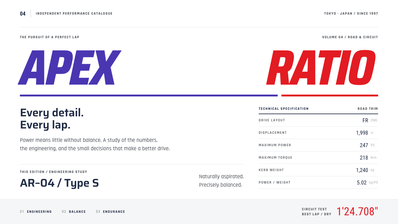 Gran TurismoPrecision without noise. Slanted violet-red type and hairline spec rows on sh…
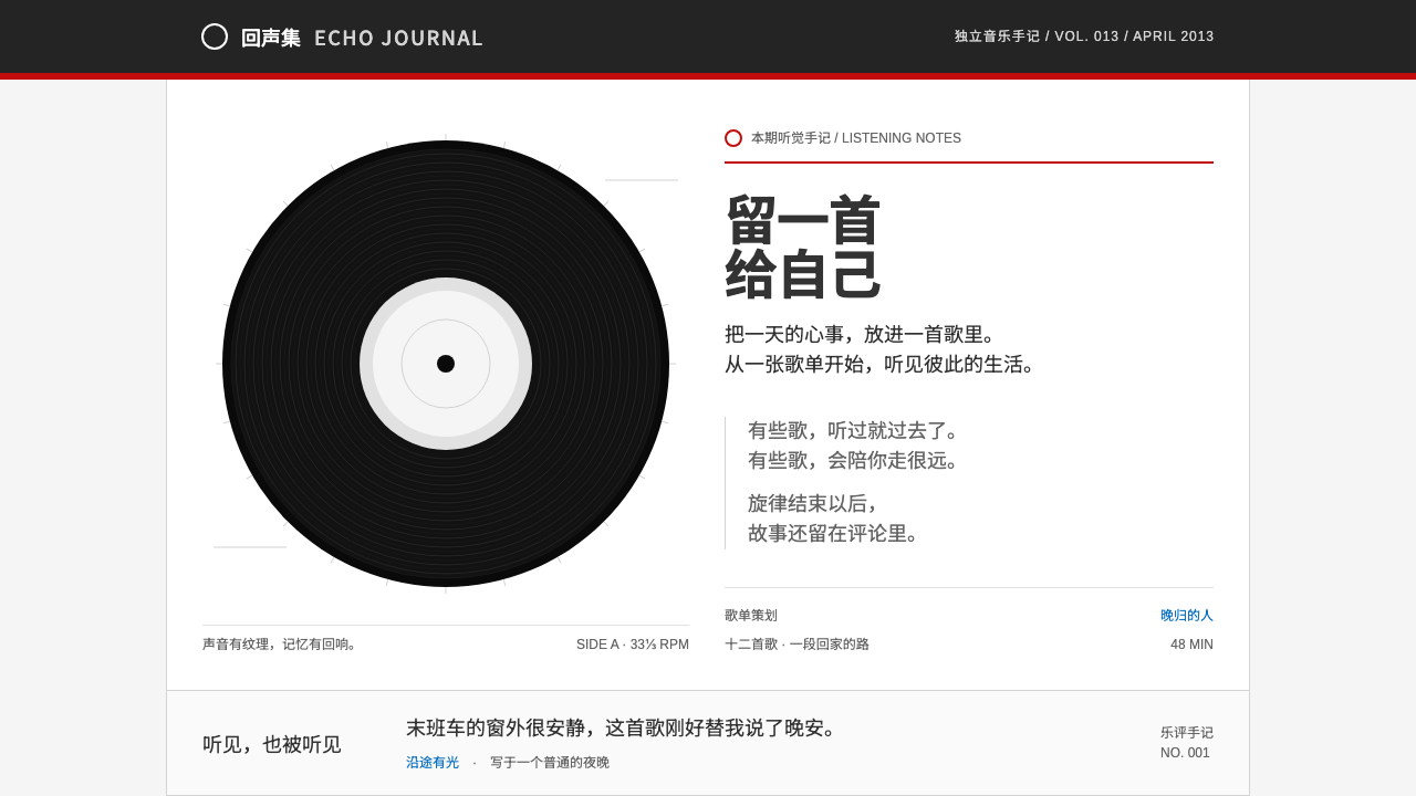 NetEase Cloud MusicListening feels personal. Black concentric grooves, a thin red strip and a qu…
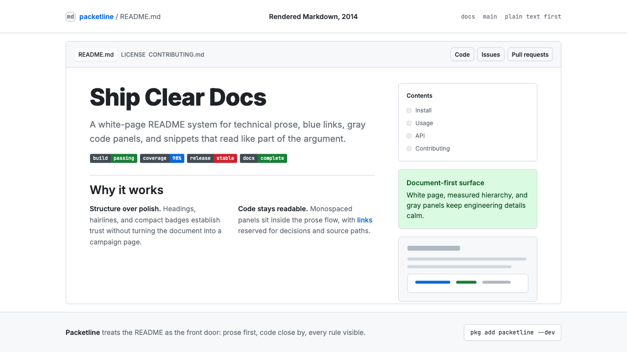 GitHub README Markdown (2014)Calm code authority. Blue links, gray code panels, and Inter/Mono stack on wh…
 Stack OverflowUseful answers rise. Blue links, square tags and pale-green resolutions on a…
 UNIQLO LifeWear (2006)Whitespace is the product. A hard modular grid and one rationed red square en…
 BlackBerryPortable precision. Dense black Arimo, white ruled rows and one decisive blue…