What is NetEase Cloud Music?
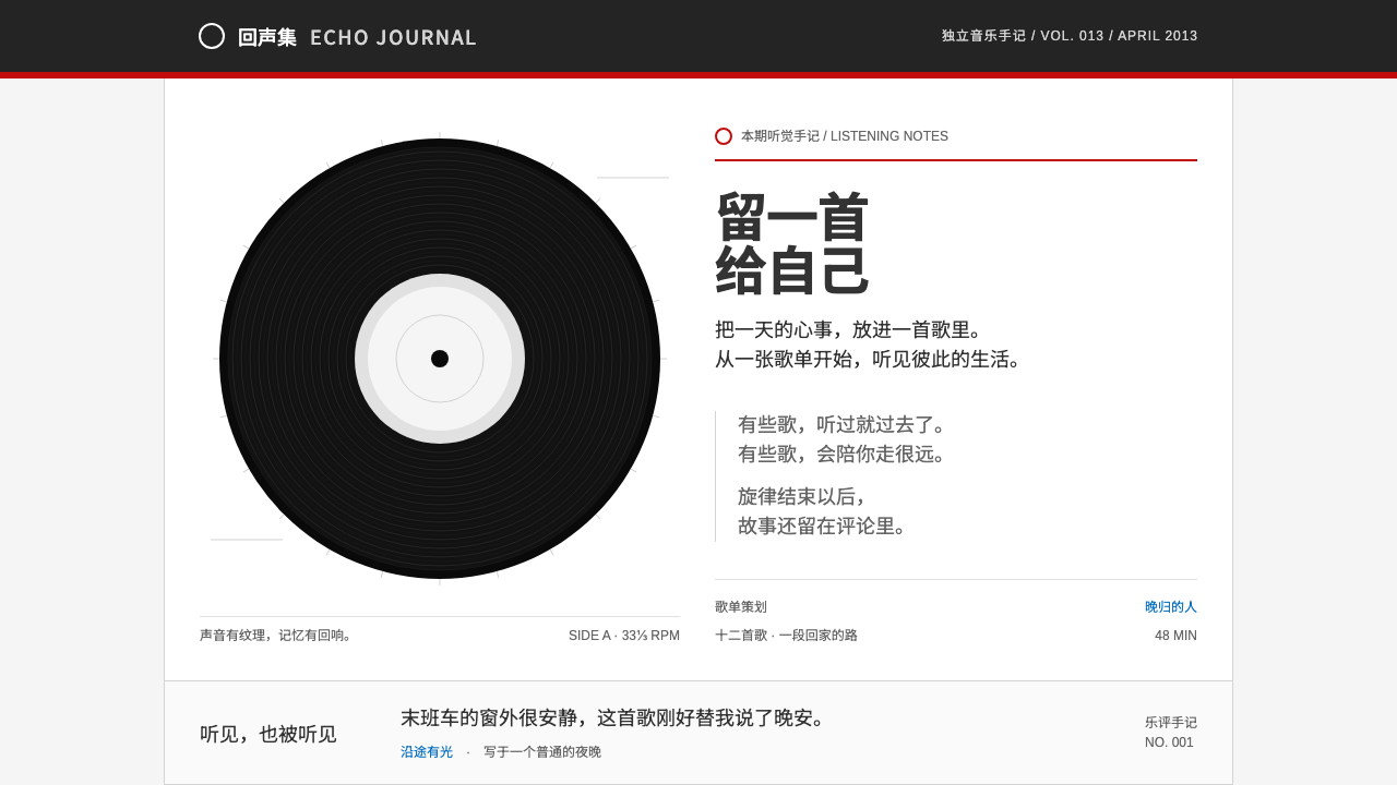
NetEase Cloud Music pairs a restrained grey portal and one thin strip of red with a single romantic gesture: a black record turning on the player page.
NetEase Cloud Music in brief
The NetEase Cloud Music design style comes from the web client of the music streaming service that NetEase launched from Hangzhou in April 2013. Its everyday interface is a study in restraint: a pale grey page, a fixed-width white content column, a near-black top bar, and one thin strip of NetEase red running beneath it. Section titles carry a small red dot and a red underline, and that is nearly all the brand color there is.
The emotional center sits elsewhere. On the player page, the album art is blurred into a soft background of color, and in front of it a glossy black record spins beneath a white tonearm. Lyrics scroll alongside. Around this one theatrical moment, the song list, the grid of playlists and the hot comment wall carry the practical work of listening.
The system therefore has two registers: a quiet, portal-style frame for browsing, and a warm, analog-flavored stage for playing. Together they describe a product with real content density that still leaves room for a human touch.

Where does NetEase Cloud Music come from?
NetEase Cloud Music launched in April 2013 in Hangzhou, from the company led by Ding Lei. It entered a Chinese music-streaming market already crowded with players that looked like traditional portals, and its web client kept much of that portal grammar: a fixed column, a top navigation bar, tabbed headings and tightly packed lists. The innovation was not in the layout but in what the service chose to emphasize.
Three ideas defined the product through the 2010s. The first was user-made playlists, the 歌单 culture, in which ordinary listeners curated and shared collections that became a primary way to discover music. The second was comment culture: thoughtful, confessional, sometimes funny reviews under songs, which grew so well known that selected comments were later printed on the walls of the Hangzhou metro. The third was algorithmic daily recommendations, a personalized feed that made the service feel like it knew its listener. Together these placed community and personality at the center of a utilitarian-looking interface.
The red-and-black web client, and especially its vinyl player page, defined the visual identity of the service across the decade. Black records and white tonearms were a nostalgic choice in a digital product, a reminder of analog listening ritual, while the blurred album-art background tied each song to its own color. The brand color, a clear red, stayed disciplined: a strip, a dot, an underline, and the occasional button, never a flood.
The movement behind this look is best described as Chinese mobile-internet music streaming, grown out of web portals and then carried to phones. Its design system is a record of that transition: the structured density of a portal, softened by one analog metaphor and a layer of human voices.
What defines the NetEase Cloud Music look?
Color
The palette is mostly neutral: a pale grey page ground, a white content column, a near-black top bar and dark text. NetEase red is used with great discipline as a thin strip beneath the top bar, a dot beside section titles, a short underline and the occasional emphasis. The player page adds glossy black for the record and a soft, blurred wash of the current album's own colors. Because the red is so rare, it works as a signature.
Vinyl Player
The player page is built around a black record with fine concentric grooves, turning slowly beneath a white tonearm that drops in from above. Album art sits at the center of the disc as the label. The record is the one expressive, skeuomorphic element in an otherwise flat portal, and it is what people remember. Treat it as a single focal point; everything else on the page supports it.
Blurred Album Backdrop
Behind the record, the album cover is enlarged and blurred into an abstract field of color. The effect personalizes every song: a warm record gives a warm room, a cool one gives a cool room. It also keeps the page from feeling like a fixed template, since the mood is borrowed from content rather than imposed by the interface.
Portal Column
Everyday pages use a fixed-width white column centered on a grey ground, with a dark navigation bar on top. It is the grammar of the Chinese web portal: structured, dense and predictable. Content is organized in clear blocks with titled headings, so users can scan quickly through many items without losing their place.
Playlist Grid and Song List
Playlists appear as tidy grids of square covers with short captions, and songs appear as compact rows with alternating shading, small action icons and durations. Both are workmanlike and made for volume. They show that the product's real engine is a large, user-curated library, and the design treats it with clarity rather than flourish.
Hot Comment Wall
Below the player, comments are laid out as a plain vertical stream with small avatars, names and like counts, with the most appreciated ones raised to the top under a section title. This is the human layer of the product. Visually it is quiet, but its content, personal and often moving, supplies the warmth that the restrained grey frame leaves out.

Who shaped NetEase Cloud Music?
The head of NetEase, the company that launched the service in Hangzhou in April 2013. His name marks the corporate source of a product that moved a portal-style interface toward playlists, comments and personalized recommendation.
The Hangzhou-based company behind the service. Its red-and-black web client and vinyl player page defined the visual identity of the product throughout the 2010s.
The community of ordinary listeners who built and shared playlists. Their collections became a main way to discover music, and the grid of playlist covers in the interface is a direct display of their work.
How do you use NetEase Cloud Music today?
In slides, the style suits presentations about media, culture, community or content products. A cover can use the near-black bar, the thin red strip and a single large black record as the central image. Content slides follow the portal grammar: a white column on a pale grey ground with red-dotted section titles. Data slides work as compact lists and tidy grids, where a thin red underline marks the key section and numbers sit in neat rows.
On the web, it fits content-dense products that still want a human touch: music, podcasts, reading, video playlists, community platforms and editorial portals. The fixed white column and dark top bar give predictable structure, and the red should be reserved for one strip, small dots and underlines. A single expressive moment, such as a spinning disc, a featured hero or a now-playing view, can carry the emotional weight, while the rest of the page stays quiet and scannable.
For editorial and marketing work, the style brings the warmth of shared listening. A campaign about playlists, late-night songs or fan comments can pair the vinyl motif with a blurred cover backdrop and a handful of real quotations set plainly. Posters and covers can use the record as a circular hero over a soft colored field, with the red strip as the only brand mark.
The most common mistake is to flood the page with red. The brand color is a thin accent, and turning headers, buttons and backgrounds red destroys the restraint that makes the vinyl moment land. A second mistake is spreading the skeuomorphic vinyl motif everywhere; one record is a gesture, ten are a theme park. A third is to over-style the comment wall; its power comes from plain, honest text. Finally, do not abandon the portal density, since the product's character is a lot of content handled calmly.

NetEase Cloud Music — FAQ
What defines the NetEase Cloud Music look?
A restrained portal frame of pale grey, a white fixed column, a near-black top bar and a thin strip of NetEase red, plus a player page where a black vinyl record turns beneath a white tonearm over a blurred album-art backdrop.
How much red should I use?
Very little. The red appears as a thin strip under the top bar, a dot and underline on section titles, and the occasional emphasis. Its rarity is what makes it feel like a signature, so avoid red headers, backgrounds or large buttons.
Why a vinyl record in a digital product?
It adds a single warm, analog gesture to an otherwise businesslike portal. The spinning record and tonearm recall the ritual of listening, and give the player page an emotional focal point that the dense browsing pages deliberately do not have.
What are playlists and the comment wall?
Playlists are user-made collections of songs that became a main way to discover music on the service, and the comment wall is the stream of listener reviews under each song, whose best entries have even been printed on Hangzhou metro cars. Both express the product's community character.
Is this style good for dense content products?
Yes. Its fixed white column, clear titled sections and compact lists are built for volume, while one expressive element and a few human voices keep it from feeling cold. Keep the density, keep the red rare and give the product one memorable moment.
Related design styles
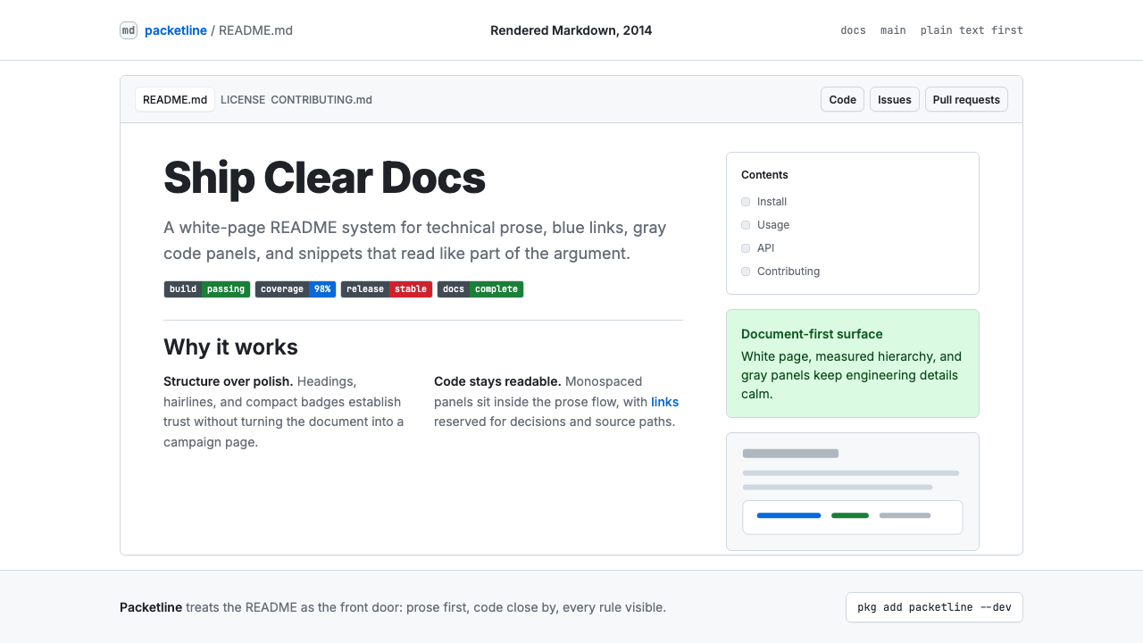 GitHub README Markdown (2014)Calm code authority. Blue links, gray code panels, and Inter/Mono stack on wh…
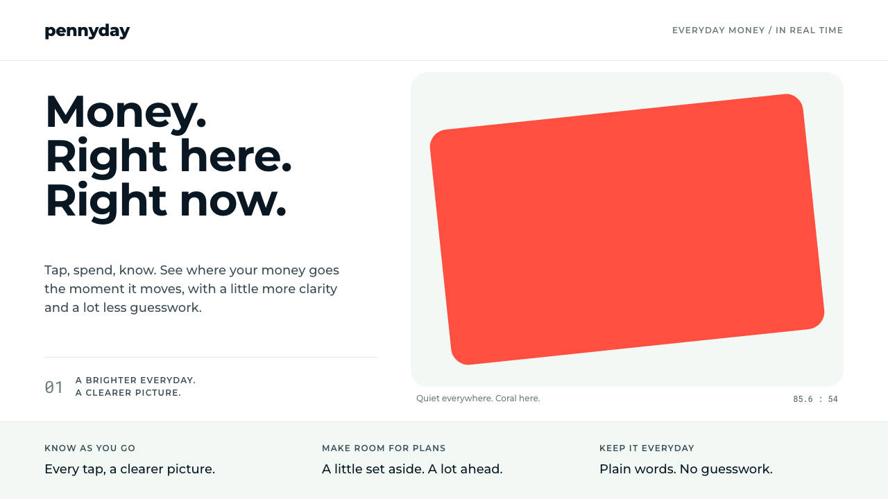 MonzoOne loud coral, everything else calm. Navy type and mint-grey space keep mone…
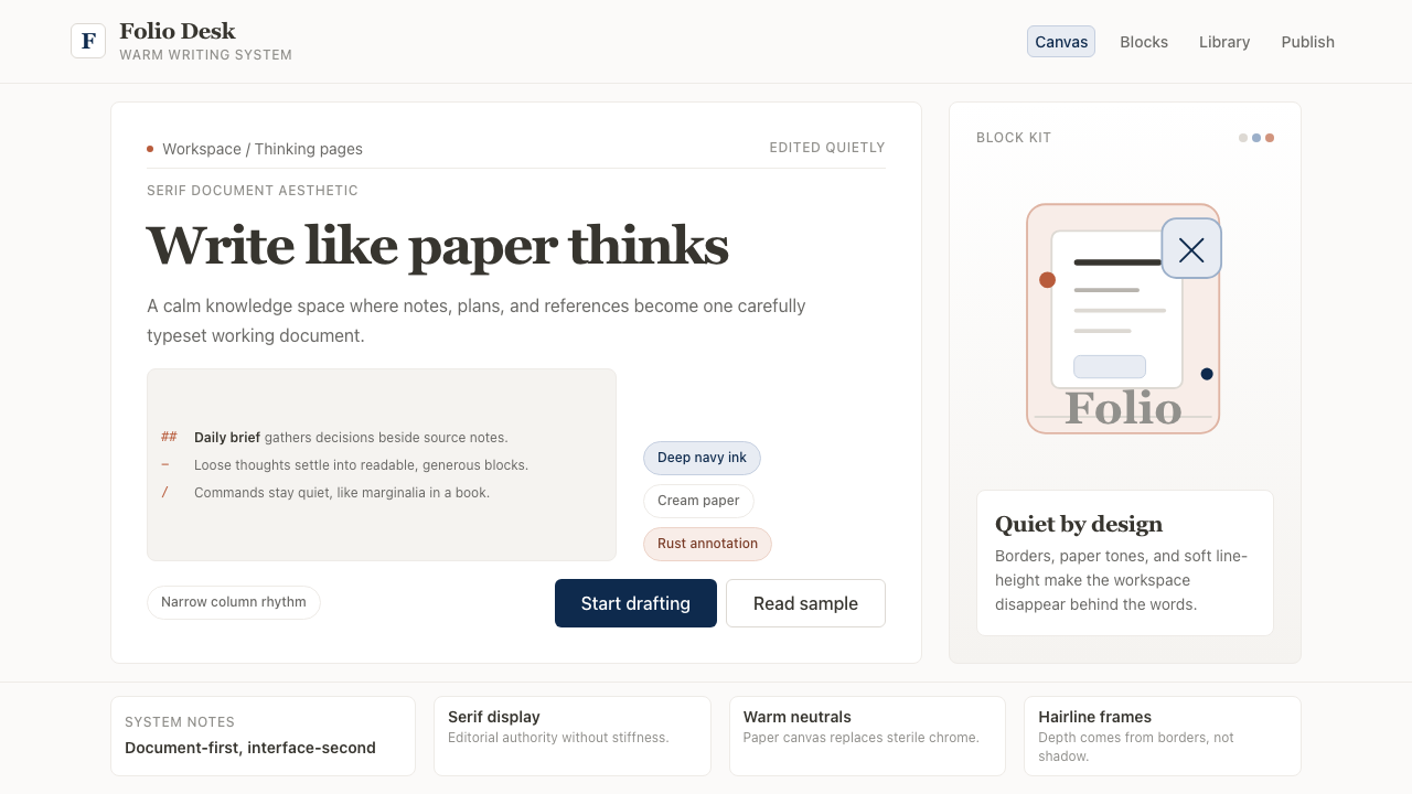 Notion ModernWriting feels papery. Source Serif on warm cream, navy ink, and hairline bord…
 PaystackPlain-spoken payments infrastructure. White page, navy ink, four flat cyan ba…
 Signal Encrypted MessengerCalm privacy, plainly stated. Cobalt Inter type and white space carry the tru…
 Things 3Colour saved for action. White page, cool-grey sidebar, one blue for the plus…