What is xkcd Stick Figure Comic (2005)?什么是 xkcd Stick Figure Comic (2005)?
xkcd proved that a stick figure, a white page, and a sharp punchline are all a comic — or a design system — ever needs.xkcd 证明了一个火柴人、一张白纸和一句精准笑话,就是漫画——或一套设计系统——所需要的全部。
xkcd Stick Figure Comic (2005) in briefxkcd Stick Figure Comic (2005) 速览
xkcd is a webcomic created by Randall Munroe, a former NASA roboticist, and launched in 2005 from Cambridge, Massachusetts. Its visual language is radically stripped down: stick figures drawn with an unsteady hand, wide expanses of white space, no panel borders, no color except the occasional blue used for charts or a muted yellow for rare highlights, and captions rendered in a loose monospaced lettering style. After nearly three thousand strips, not one element of this aesthetic has been added or changed without good reason. That consistency is itself the argument.xkcd 是前 NASA 机器人工程师兰道尔·门罗于 2005 年在美国马萨诸塞州剑桥创办的网络漫画。其视觉语言经过彻底的减法处理:线条不够稳定的火柴人、宽阔的白色留白、没有面板边框、除偶尔用于图表的蓝色和极少数高光的暗黄色外几乎无色彩,文字说明则以一种松散的等宽手写体呈现。近三千期漫画之后,这套美学没有任何一个元素被无故添加或改变。这种一致性本身就是一种立场。
The style operates on a single conviction: the idea is the point, and the drawing should get out of its way. Munroe's stick figures are not charming because they are badly drawn — they are charming because they are willfully indifferent to being well drawn. Every character is just a circle balanced on two lines. Every scene is a flat white field. The result is that all energy goes to the reasoning, the wordplay, the data, or the absurdist logic — and the reader never has to work through visual decoration to reach it.这种风格建立在一个信念之上:想法才是核心,画面应当让路。门罗的火柴人之所以迷人,不是因为画得差,而是因为它对画好这件事毫不在意。每个角色都只是一个圆圈架在两根线上,每个场景都是一片平坦的白色。结果是,所有的能量都流向了推理、文字游戏、数据或荒诞逻辑——读者无需穿越任何视觉装饰就能直接抵达。
As a design aesthetic, xkcd occupies a unique position: it is the visual vernacular of a specific intellectual community — programmers, mathematicians, scientists, and the people who enjoy reading about them. Applied to digital products and presentations, it signals intellectual honesty, a dry wit, and a fundamental disinterest in impressing anyone with production values. It is the anti-corporate aesthetic of people who take ideas seriously and ornament not at all.作为一种设计美学,xkcd 占据着独特的位置:它是特定知识社群——程序员、数学家、科学家,以及喜欢阅读关于他们内容的人——的视觉方言。应用于数字产品和演示文稿时,它传达出智识上的诚实、干燥的幽默,以及对用制作精良来打动任何人这件事的根本漠然。这是那些认真对待想法、完全不理会装饰的人的反企业美学。
See the xkcd Stick Figure Comic (2005) design system查看 xkcd Stick Figure Comic (2005) 完整设计系统
Where does xkcd Stick Figure Comic (2005) come from?xkcd Stick Figure Comic (2005) 从何而来?
Randall Munroe began posting xkcd sketches in 2005, initially from a set of old drawings he found in his notebooks while working at NASA's Langley Research Center as a contract roboticist. The early strips were posted without a formal publishing schedule to a small personal website. Within months, the combination of technically accurate humor, self-deprecating romance plots, and surreal math jokes had accumulated a substantial readership among engineers and scientists on early internet forums. By 2006 the comic had its own domain and a growing reputation as the internet's de facto publication for STEM humor.兰道尔·门罗于 2005 年开始发布 xkcd 草图,最初来自他在 NASA 兰利研究中心担任合同制机器人工程师期间,在笔记本里翻出的一批旧画稿。早期漫画没有固定发布时间表,挂在一个小型个人网站上。几个月内,技术上精准的幽默、自我解嘲的爱情情节和超现实的数学笑话相结合,在早期互联网论坛上积累了大量工程师和科学家读者。到 2006 年,这部漫画已拥有专属域名,并逐渐赢得互联网 STEM 幽默事实刊物的声誉。
The aesthetic was never designed — it emerged from constraint and personality. Munroe has repeatedly stated that he draws poorly and has no interest in improving. The monospaced caption style reflects the lettering habits of someone more comfortable with code editors than with calligraphy pens. The absence of color is partly a production shortcut and partly a philosophical position: color decoration would distract from the argument. The white space is not a minimalist choice; it is what happens when someone who does not care about backgrounds simply does not draw one.这套美学从未被刻意设计——它从约束与个性中自然浮现。门罗多次公开表示自己画功不佳,也没有改进的兴趣。等宽字体说明风格,反映的是一个更习惯代码编辑器而非书法笔的人的文字书写习惯。无色彩的选择,一半是生产上的省力,一半是哲学立场:色彩装饰会分散读者对论点的注意力。而大量留白也并非极简主义的刻意追求——它只是一个对背景不感兴趣的人、不画背景的自然结果。
The context that gave xkcd its intellectual character was the 2000s webcomic golden age, a period when the internet allowed niche creative projects to find global audiences without passing through traditional publishing gatekeepers. Munroe was part of a generation of online creators who addressed readers as peers — people who would catch a reference to the Halting Problem, enjoy a graph labeled with units like 'number of Stalins per unit of time,' or appreciate a map of the continental United States drawn entirely from memory and annotated with corrections. The comic assumed intelligence and rewarded it.赋予 xkcd 其智识气质的背景,是 2000 年代网络漫画的黄金时代。那是一个互联网允许小众创意项目在不经过传统出版把关的情况下找到全球受众的时期。门罗属于一代把读者当作同伴的网络创作者——那些读者会听懂停机问题的梗,会欣赏一张以「每单位时间斯大林数」为单位标注的图表,或者会喜欢一张完全凭记忆画出的美国大陆地图并附有勘误标注。这部漫画预设了读者的智识水平,并以此作为回馈。
By the early 2010s, xkcd had become a cultural reference point far beyond its original audience. Munroe's companion books — What If? (2014), Thing Explainer (2015), and How To (2019) — applied the same visual logic to long-form popular science, demonstrating that the stick-figure-plus-diagram approach could carry genuinely complex technical explanation. The style's influence on data visualization and science communication grew substantially during this period, particularly as data journalists began adopting the rough, annotated chart aesthetic to signal accessibility and intellectual approachability over corporate polish.到 2010 年代初,xkcd 已成为远超其原始受众的文化参照点。门罗的配套书籍——《万物解释》(2014 年)、《如何用错误的方式做每一件事》(2015 年)和《如何》(2019 年)——将同样的视觉逻辑应用于长篇科普,证明了火柴人加示意图的方式能够承载真正复杂的技术解释。这种风格对数据可视化和科学传播的影响在这一时期大幅增长,尤其是当数据新闻从业者开始采用粗糙、带注释的图表美学来传达亲近感和智识上的平易近人,以区别于企业式的精致时。
What defines the xkcd Stick Figure Comic (2005) look?xkcd Stick Figure Comic (2005) 的视觉特征是什么?
Palette色彩
The dominant ground is pure white, and the dominant mark is black — the starkest possible contrast, reflecting the look of a pen sketch on blank paper. Color is used as a signal rather than a decoration: a single muted blue appears on charts, graphs, and diagrams to indicate data or emphasis; a warm yellow occasionally marks a highlight or a background region. Flesh tones, gradients, shadows, and any decorative color do not appear. The effect is of a document that treats color as information and withholds it everywhere it would only be aesthetic.主导底色是纯白,主导笔触是黑色——这是空白纸张上钢笔素描所能呈现的最强烈对比。色彩作为信号而非装饰使用:单一的柔和蓝色出现在图表、曲线和示意图上,用于标示数据或强调;暖黄色偶尔用于标记高光或背景区域。肤色、渐变、阴影以及任何装饰性色彩一概缺席。整体效果是:这是一份将色彩视为信息、并在一切仅具美观功能的地方将其收回的文件。
Linework线条
Lines are hand-drawn in character: slightly wobbly, inconsistent in weight, and free of the mechanical perfection that vector tools produce. Circles for heads are not quite round. Stick-figure limbs taper and waver. This imprecision is not a flaw to correct; it is the defining quality. The handmade line signals that the maker is human, that the communication is direct, and that no intermediary layer of professional polish stands between the idea and the reader.线条具有手绘特质:略微颤抖、粗细不均,完全没有矢量工具所产生的机械完美感。头部的圆圈并不真正圆,火柴人的四肢会变细、会抖动。这种不精确不是需要纠正的缺陷,而是定义性的品质。手工线条传递出一个信号:创作者是人类,传达是直接的,在想法与读者之间没有专业抛光的中间层。
Typography字体排印
Text in xkcd reads as handwritten but monospaced — each letter occupies the same horizontal slot, as if typed on a typewriter or rendered in a code editor. This hybrid of casual handwriting and programming-environment lettering is both the most recognizable element of the xkcd voice and the one that places the comic firmly in the world of people who spend their days in terminals. Captions sit below strips rather than inside speech bubbles wherever possible, keeping the drawing area uncluttered.xkcd 中的文字读起来像手写,但是等宽的——每个字母占据相同的水平空间,仿佛在打字机上敲出或在代码编辑器中渲染。这种随意手写与编程环境字母习惯的混合体,既是 xkcd 声音最具辨识度的元素,也是将这部漫画牢牢锚定在整天面对终端的人的世界里的那个元素。说明文字尽可能置于漫画条下方而非对话气泡内,保持画面区域的整洁。
White Space留白
xkcd uses space with unusual generosity. Strips frequently have no background at all — figures and objects float in white void. Long-form comics and infographics spread information across large white surfaces rather than packing it dense. The emptiness is not awkward; it is confident. It says that the content is complete as it is and needs no visual filler to make the page feel finished. In design applications, this principle means breathing room is structural, not incidental.xkcd 对空间的运用异常慷慨。漫画条中常常完全没有背景——人物和物体悬浮在白色虚空中。长篇漫画和信息图将信息铺展在大面积白色表面上,而非密集堆砌。这种空旷并不显得局促,而是充满自信。它在说:内容本身是完整的,不需要任何视觉填充来让页面感觉完成。在设计应用中,这一原则意味着呼吸空间是结构性的,而非偶然性的。
Data as Visual Object数据作为视觉对象
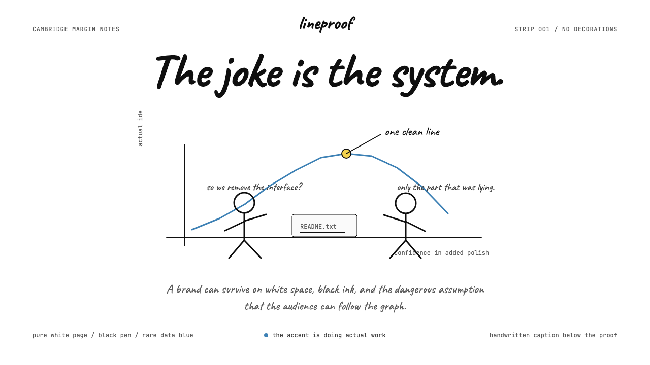
Among xkcd's most influential contributions is its treatment of charts, graphs, and diagrams as first-class visual elements — not appendices, but the main event. Axes are hand-drawn, labels are annotated with wit, and the chart itself often carries the punchline. The style demonstrates that a bar chart can be funny, a scatter plot can make an argument, and a timeline can tell a story — provided the person drawing it has something to say. The handmade quality of xkcd diagrams signals that data visualization is an act of communication, not a display of software competence.在 xkcd 最具影响力的贡献中,有一项是将图表、曲线图和示意图作为一等视觉元素对待——不是附录,而是主角。坐标轴手工绘制,标签以机智的方式标注,图表本身往往承载着笑点。这种风格证明了:柱状图可以很有趣,散点图可以构成论点,时间轴可以讲述故事——前提是绘制者有话要说。xkcd 示意图的手工质感传递出一个信号:数据可视化是一种传播行为,而不是一种软件能力的展示。
Radical Simplification of the Human Figure人物形象的极端简化
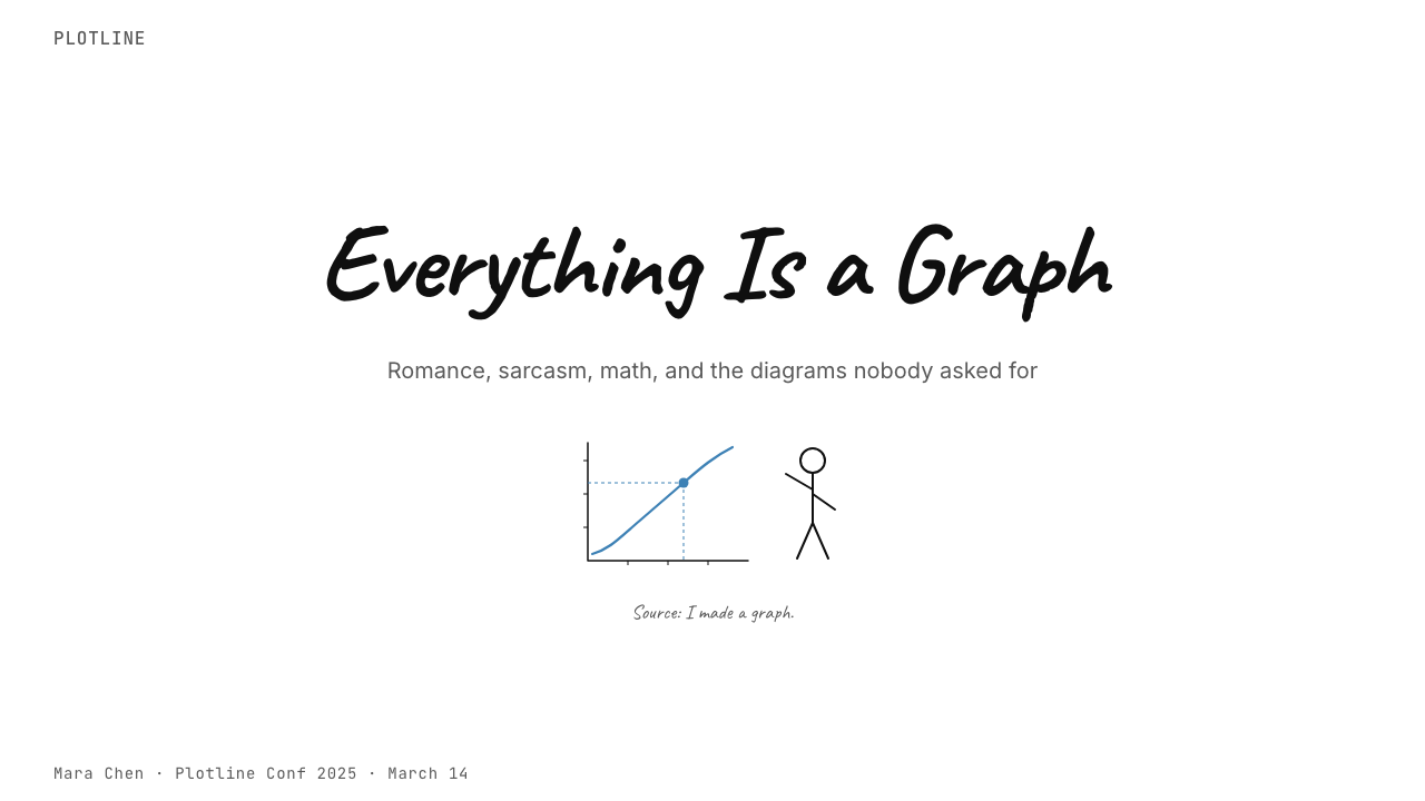
The xkcd stick figure — a circle, a vertical line, two arm lines, two leg lines — is possibly the most reduced human representation in wide cultural use. It conveys posture, gesture, and emotion entirely through the angle and position of these six elements, with no facial features beyond dot eyes and a curved mouth. This extreme economy means any reader anywhere can project themselves onto the figure. The universality is earned through reduction, not through representational accuracy.xkcd 的火柴人——一个圆圈、一条竖线、两条手臂线、两条腿线——可能是在广泛文化使用中被简化到极致的人类形象。它完全通过这六个元素的角度和位置来传达姿态、手势和情绪,除了点状眼睛和一条弧线嘴巴外没有任何面部特征。这种极端的经济性意味着任何地方的任何读者都能将自己投射到这个形象上。这种普遍性是通过简化而非表现准确性赢得的。
No Panel Borders无面板边框
Traditional comics use ruled borders to define panels and contain the action. xkcd dispenses with them almost entirely. Scenes exist as freestanding islands on the white page — they begin and end wherever the drawing stops, without a box to contain them. This borderlessness reinforces the impression that the content is unmediated: thoughts and diagrams appear as if directly placed on paper, without the formal structure of a published work. For slide decks and web layouts, the equivalent principle is letting content breathe without containing boxes wherever containment is not functionally required.传统漫画用直线边框来定义面板和容纳场景内容。xkcd 几乎完全放弃了这种做法。场景作为独立的孤岛存在于白色页面上——它们在绘画停止的地方开始和结束,没有框来容纳它们。这种无边框性强化了内容是未经中介的印象:想法和示意图仿佛直接被放置在纸上,没有出版物的正式结构。对于幻灯片和网页布局,等效原则是:在容纳框不具备功能必要性的地方,让内容自由呼吸,不加任何包裹框。

See the xkcd Stick Figure Comic (2005) design system查看 xkcd Stick Figure Comic (2005) 完整设计系统
Who shaped xkcd Stick Figure Comic (2005)?谁塑造了 xkcd Stick Figure Comic (2005)?
Munroe is the sole creator of xkcd and the entire source of its aesthetic. After leaving NASA in 2006 to work on the comic full time, he has produced strips consistently for nearly two decades without significantly altering the visual style. His background in physics and robotics explains the technical precision of the comic's scientific content — references to orbital mechanics, graph theory, and thermodynamics are used accurately, not as decoration. His stated indifference to drawing quality is not false modesty: it is the founding philosophical position of the aesthetic.门罗是 xkcd 的唯一创作者,也是其全部美学的来源。2006 年离开 NASA 后,他全职投入这部漫画创作,近二十年来持续发布漫画,视觉风格几乎未曾改变。他在物理学和机器人学方面的背景解释了漫画科学内容的技术精确性——轨道力学、图论和热力学的引用都是准确使用,而非作为装饰。他公开表示对画功质量的漠然并非虚伪的谦逊:这是这套美学的创始哲学立场。
Among xkcd's recurring cast, the character identified only by a black hat is the most visually distinctive. All xkcd figures share the same body — a circle and six lines — so character differentiation depends entirely on added accessories. The Black Hat figure wears a single filled circle atop the head circle, functioning as a top hat rendered in two shapes. This character typically represents nihilist reasoning taken to logical extremes, and the hat communicates his identity to readers across thousands of strips without a single additional visual element. The lesson for design: accessories are character.在 xkcd 的常驻角色中,仅以黑帽子识别的角色在视觉上最为独特。所有 xkcd 人物共享相同的身体——一个圆圈和六根线——因此角色区分完全依赖于附加配件。黑帽人物在头部圆圈上方戴着一个实心填充圆,用两个形状呈现出一顶礼帽。这个角色通常代表被推演到逻辑极端的虚无主义推理,而那顶帽子在数千期漫画中向读者传达了他的身份,不需要任何额外的视觉元素。设计的启示:配件即性格。
The unnamed, hatless protagonist of most xkcd strips is referred to by fans as Cueball — a bare circle for a head, no distinguishing features beyond the standard stick figure anatomy. Cueball is most often a stand-in for Munroe himself, or for the reader, or for the rational agent encountering an irrational world. The deliberate blankness of this character is both a production shortcut and a device that maximizes reader identification. In design terms, Cueball is the visual equivalent of a well-designed empty state: maximum possibility, no assumptions.大多数 xkcd 漫画条中那个无名、无帽的主角被粉丝称为「台球头」——一个光秃秃的圆圈作为脑袋,除了标准火柴人的身体结构外没有任何区分性特征。台球头最常作为门罗本人、读者,或一个面对非理性世界的理性行为者的替身。这个角色刻意的空白既是生产上的省力手段,也是最大化读者代入感的叙事装置。从设计角度来看,台球头相当于设计精良的空状态界面:最大的可能性,零预设。
Munroe's What If? column (started 2012) and subsequent book (2014) extended the xkcd visual system into long-form scientific explanation. A typical What If? entry poses an absurd hypothetical — what would happen if you threw a baseball at near the speed of light? — and answers it with genuine physics, illustrated by xkcd-style diagrams. The diagrams in these pieces demonstrate that the aesthetic scales: it can explain plasma physics as legibly as it can deliver a two-panel punchline. The work established xkcd as a design system, not just a comic aesthetic.门罗的「如果」专栏(2012 年开始)及随后出版的书籍(2014 年)将 xkcd 视觉系统扩展至长篇科学解说。典型的「如果」条目提出一个荒诞的假设——如果你以接近光速的速度投棒球会发生什么?——并以真实的物理学作答,辅以 xkcd 风格的示意图。这些文章中的示意图证明了这套美学具有可扩展性:它可以解释等离子体物理学,与传递两格漫画笑点同样清晰。这项工作确立了 xkcd 作为一套设计系统而非仅仅是漫画美学的地位。
In 2010 Munroe ran a color-naming survey with over two hundred thousand respondents, asking them to name colors displayed on screen. The resulting dataset and analysis — published as an xkcd post — became a widely cited reference in data visualization and human-computer interaction research. The survey was illustrated entirely in the xkcd style: handwritten charts, annotations in the comic's typeface, and the characteristic mixture of rigorous statistical analysis and deadpan humor. It is a case study in how the aesthetic communicates that data is being handled honestly and that the audience is trusted to engage with complexity.2010 年,门罗开展了一项有超过二十万受访者参与的颜色命名调查,要求他们为屏幕上显示的颜色命名。由此产生的数据集和分析——以 xkcd 帖子的形式发布——成为数据可视化和人机交互研究中被广泛引用的参考资料。调查完全以 xkcd 风格呈现:手绘图表,以漫画字体书写的标注,以及严格统计分析与冷面幽默的典型混合。这是一个关于这套美学如何传递「数据正在被诚实处理,受众被信任能够接触复杂性」的案例研究。
How do you use xkcd Stick Figure Comic (2005) today?今天怎么用 xkcd Stick Figure Comic (2005)?
xkcd's aesthetic is more transferable than it first appears, but it transfers well only when the product genuinely shares the underlying values: directness over polish, ideas over impressions, functional communication over persuasive aesthetics. Applying it correctly is less about replicating the stick figures and more about understanding the logic — ruthless reduction, trust in the reader, and the confidence to let white space do structural work. When those values align with the product, the result reads as authentic; when they do not, it reads as affectation.xkcd 的美学比乍看起来更具可移植性,但它只有在产品真正共享其底层价值观时才能迁移得好:直接胜于精致,想法胜于印象,功能性传达胜于说服性美学。正确应用它,与其说是关于复制火柴人,不如说是关于理解其逻辑——无情的简化、对读者的信任,以及让留白承担结构工作的自信。当这些价值观与产品对齐时,结果读起来是真实的;当它们不对齐时,读起来则是做作的。
For presentation slides, the xkcd approach works on both cover and content pages but requires restraint. A cover slide in this style uses a single hand-drawn or sketch-style illustration — a stick figure, a diagram, a rough chart — on a white ground, with a title set in a monospaced or handwritten typeface. The absence of gradient backgrounds, stock photography, and templated layout signals immediately that the content is the point. Content slides should follow the same principle: one idea per slide, text kept to the minimum needed to support the spoken word, and any data rendered as a rough but legible chart with annotated axes. Transitions and animations should be minimal to nonexistent.在演示文稿中,xkcd 的方法在封面和内容页上都有效,但需要克制。这种风格的封面幻灯片在白色底面上使用单一的手绘或草图式插图——一个火柴人、一张示意图、一个粗略的图表——标题以等宽或手写字体排印。渐变背景、商业摄影和模板化版式的缺席,立刻传递出内容才是重点的信号。内容页应遵循同样的原则:每张幻灯片一个想法,文字压缩至支撑口头表达所需的最低限度,任何数据以粗略但清晰的图表呈现,附有标注坐标轴。过渡和动画应减至极少乃至完全没有。
For web interfaces, the aesthetic is particularly well suited to documentation sites, developer tools, data dashboards, and any product whose audience self-identifies as technical. The approach: keep the background white, use a monospaced or near-monospaced typeface for body text and labels, reserve the blue accent exclusively for interactive elements and data marks, and let page sections breathe with generous vertical spacing. Avoid decorative imagery entirely. Card components, if needed, should be bordered without shadows rather than elevated with drop shadows — the design should read as flat as a printed page. Pricing pages and feature comparison tables benefit especially from the style's diagrammatic clarity.对于网页界面,这套美学尤其适合文档站点、开发者工具、数据仪表板,以及任何受众自认为具有技术背景的产品。做法如下:保持背景白色,正文和标签使用等宽或近等宽字体,将蓝色强调色专门保留给交互元素和数据标记,让页面章节以宽裕的垂直间距自由呼吸。完全避免装饰性图像。卡片组件如有必要,应以边框而非投影阴影来界定——设计应当像印刷页面一样平整。定价页面和功能对比表格尤其受益于这种风格的示意图式清晰度。
For editorial and marketing work, xkcd-style illustration is powerful for science communication, data journalism, and educational content. An annotated diagram of a complex system — drawn with deliberate imprecision, with callouts in a handwritten font — communicates that the explanation is accessible and that the explainer is not trying to impress. Marketing materials using this aesthetic should avoid professional photography; hand-drawn icons and rough schematic illustrations are more consistent with the voice. The style supports strong information hierarchy through scale and spatial arrangement rather than color or decorative framing.对于编辑和营销内容,xkcd 风格的插图在科学传播、数据新闻和教育内容中具有强大的力量。一张复杂系统的标注示意图——以刻意的不精确绘制,用手写字体附上说明——传达出解释是可及的,解释者并不试图给人留下印象。使用这套美学的营销材料应避免专业摄影;手绘图标和粗略示意图与这种声音更为一致。这种风格通过尺度和空间排列而非色彩或装饰框架来支撑强劲的信息层级。
The most common mistake when applying this aesthetic is using it as pure irony — deploying intentionally rough visuals while actually caring deeply about being impressive. Readers are perceptive: a presentation that uses stick figures but over-polishes every other element, or a product page that adopts the typeface but fills it with marketing superlatives, produces a register mismatch that undermines both the humor and the intellectual credibility the style is supposed to convey. The aesthetic only works when the substance behind it is genuinely confident enough not to need ornamentation.应用这套美学时最常见的错误是将其作为纯粹的反讽使用——部署刻意粗糙的视觉,同时实际上对给人留下印象深度在意。读者是敏锐的:一个使用火柴人却对其他每个元素过度精致化的演示文稿,或一个采用了字体却用营销最高级词汇填满它的产品页面,会产生语域错位,同时破坏这种风格本应传达的幽默感和智识可信度。这套美学只有在其背后的内容真正自信到不需要装饰时,才能发挥作用。
See the xkcd Stick Figure Comic (2005) design system查看 xkcd Stick Figure Comic (2005) 完整设计系统
xkcd Stick Figure Comic (2005) — FAQxkcd Stick Figure Comic (2005) · 常见问题
Do I need to actually use hand-drawn stick figures to apply the xkcd aesthetic?应用 xkcd 美学一定要真正使用手绘火柴人吗?
Not necessarily, but the closer you get to the original the more authentic it reads. The core of the aesthetic is not the stick figures themselves but the principles behind them: extreme reduction, hand-made imprecision, trust in the reader, and absence of decorative intent. A product that uses clean vector icons and geometric type but applies those same principles — generous white space, no decorative layer, annotation-style labels, rough-chart data visualization — will feel xkcd-adjacent without literal stick figures. What does not work is applying the typeface and color system while keeping polished stock photography and gradient UI components: the result is costume, not aesthetic.不一定,但越接近原始形式,读起来就越真实。这套美学的核心不是火柴人本身,而是其背后的原则:极端简化、手工不精确、对读者的信任,以及装饰意图的缺失。一个使用干净矢量图标和几何字体、但应用了同样原则的产品——慷慨的留白、没有装饰层、标注式标签、粗略图表风格的数据可视化——即使没有字面意义上的火柴人,也会呈现出 xkcd 的气质。不起作用的是:采用字体和色彩系统,同时保留精致的商业摄影和渐变 UI 组件——结果是服装,而非美学。
How does the xkcd style differ from generic 'flat design'?xkcd 风格与普通的「扁平设计」有何不同?
Flat design, as it emerged in the early 2010s primarily through mobile operating system redesigns, is a professional aesthetic discipline: precise geometry, deliberate type choices, systematic color palettes, and the deliberate elimination of skeuomorphic texture. xkcd is none of those things on a technical level — its flatness comes from indifference, not from system. What the two share is the rejection of simulated depth and decorative texture. What differentiates them is intent and voice: flat design communicates 'we are modern professionals who have made careful deliberate choices'; xkcd communicates 'we have something to say and we did not bother to dress it up.' The first is a craft position; the second is an intellectual one.扁平设计作为一种主要通过 2010 年代初移动操作系统重新设计而兴起的专业美学规范:精确的几何、刻意的字体选择、系统化的色彩搭配,以及对拟物质感的刻意消除。xkcd 在技术层面不具备上述任何一项——它的平面感来自漠然,而非来自系统。两者共同的是对模拟深度和装饰质感的拒绝。区分它们的是意图与声音:扁平设计传达的是「我们是做出了谨慎刻意选择的现代专业人士」;xkcd 传达的是「我们有话要说,我们懒得打扮它」。前者是一种工艺立场,后者是一种智识立场。
Is xkcd a suitable aesthetic for consumer-facing products?xkcd 美学适合面向消费者的产品吗?
With significant qualifications. The xkcd aesthetic resonates strongly with audiences who self-identify as technical, analytical, or intellectually curious — developers, scientists, engineers, quantitatively minded students, and anyone who enjoys reading footnotes. For these audiences, it signals authenticity, competence, and a refreshing absence of marketing pressure. For general consumer audiences — particularly in categories like food, fashion, wellness, or luxury goods — the aesthetic's deliberate roughness and intellectual detachment can read as cold, unfinished, or simply off-brand. The safest test: does the product's core value proposition depend on being smart and honest? If yes, xkcd-adjacent design is likely an asset. If the core value is warmth, beauty, status, or pleasure, look elsewhere.需要相当多的限定条件。xkcd 美学在自认为具有技术性、分析性或智识好奇心的受众中具有强烈共鸣——开发者、科学家、工程师、定量思维的学生,以及任何喜欢阅读脚注的人。对于这些受众,它传达出真实性、能力,以及令人耳目一新的营销压力缺失。对于一般消费者受众——特别是食品、时尚、健康或奢侈品等类别——这套美学刻意的粗糙感和智识上的疏离可能会被解读为冷漠、未完成,或者与品牌不符。最安全的测试:这个产品的核心价值主张是否依赖于聪明和诚实?如果是,接近 xkcd 的设计很可能是一项资产。如果核心价值是温暖、美丽、地位或愉悦,那就另寻他法。
How should data visualizations be handled in this style?在这种风格中应当如何处理数据可视化?
Data visualizations are the heart of the xkcd style, not an afterthought. The approach is to treat charts and diagrams as the primary illustration, drawn with hand-style imprecision and annotated with plain-language labels rather than legend boxes. Axes should be clearly labeled and include units; the chart title can carry the main insight or even the punchline. The blue accent color marks data series or emphasis points; all other marks are black. Gridlines, if present, should be light and recessive. The key discipline: every data element should be there because it communicates something, not because the charting tool generated it by default. Remove tick marks that do not anchor reading, remove gridlines that do not guide the eye, and add annotations wherever the data makes a point worth calling out.数据可视化是 xkcd 风格的核心,而不是事后补充。做法是将图表和示意图作为主要插图,以手绘式的不精确绘制,并以平白语言标签而非图例框来标注。坐标轴应清晰标注并包含单位;图表标题可以承载主要洞见甚至笑点。蓝色强调色标记数据系列或强调点;所有其他标记均为黑色。网格线如有必要应轻淡而退隐。关键原则:每个数据元素都应该存在是因为它传达了某些内容,而不是因为图表工具默认生成了它。删除不锚定阅读的刻度线,删除不引导视线的网格线,并在数据有值得特别说明的要点时添加标注。
Can this style work in a dark-background interface?这种风格能在深色背景界面中使用吗?
It can, but the original is a light-ground style and the inversion requires careful handling. On a dark ground, the hand-drawn black line becomes a light or white line, which changes the character substantially — the sketch feels less like a pen drawing on paper and more like chalk on a board. That is not necessarily wrong; chalkboard aesthetics carry their own intellectual associations. The blue accent needs adjustment on dark grounds: a brighter, lighter blue reads better against dark than the muted tone that works on white. The bigger challenge is that the style's signature quality — the illusion of a sketch floating freely on a white page — is lost entirely on a dark background. If dark mode is required for functional reasons, it is worth preserving light-ground panels within the dark layout for diagram and chart areas rather than inverting everything uniformly.可以,但原始风格是浅色底面风格,反转需要仔细处理。在深色底面上,手绘黑色线条变成浅色或白色线条,这会显著改变其性格——草图感觉不再像纸上的钢笔画,而更像黑板上的粉笔。这未必是错的;黑板美学有其自身的知识联想。在深色底面上,蓝色强调色需要调整:更明亮、更浅的蓝色在深色背景下比在白色背景下有效的那种柔和色调更易读。更大的挑战是:这种风格的标志性品质——草图自由漂浮在白色页面上的幻觉——在深色背景下完全消失。如果出于功能原因必须使用深色模式,值得在深色布局中为示意图和图表区域保留浅色底面板,而不是将所有内容一律反转。
Related design styles相关设计风格
 Kanye — 808s & HeartbreakGrief in restraint. Cream paper, one red heart, yellow heat, and a black hair…克制承载悲伤:奶油纸、红心、热黄与黑色细线。
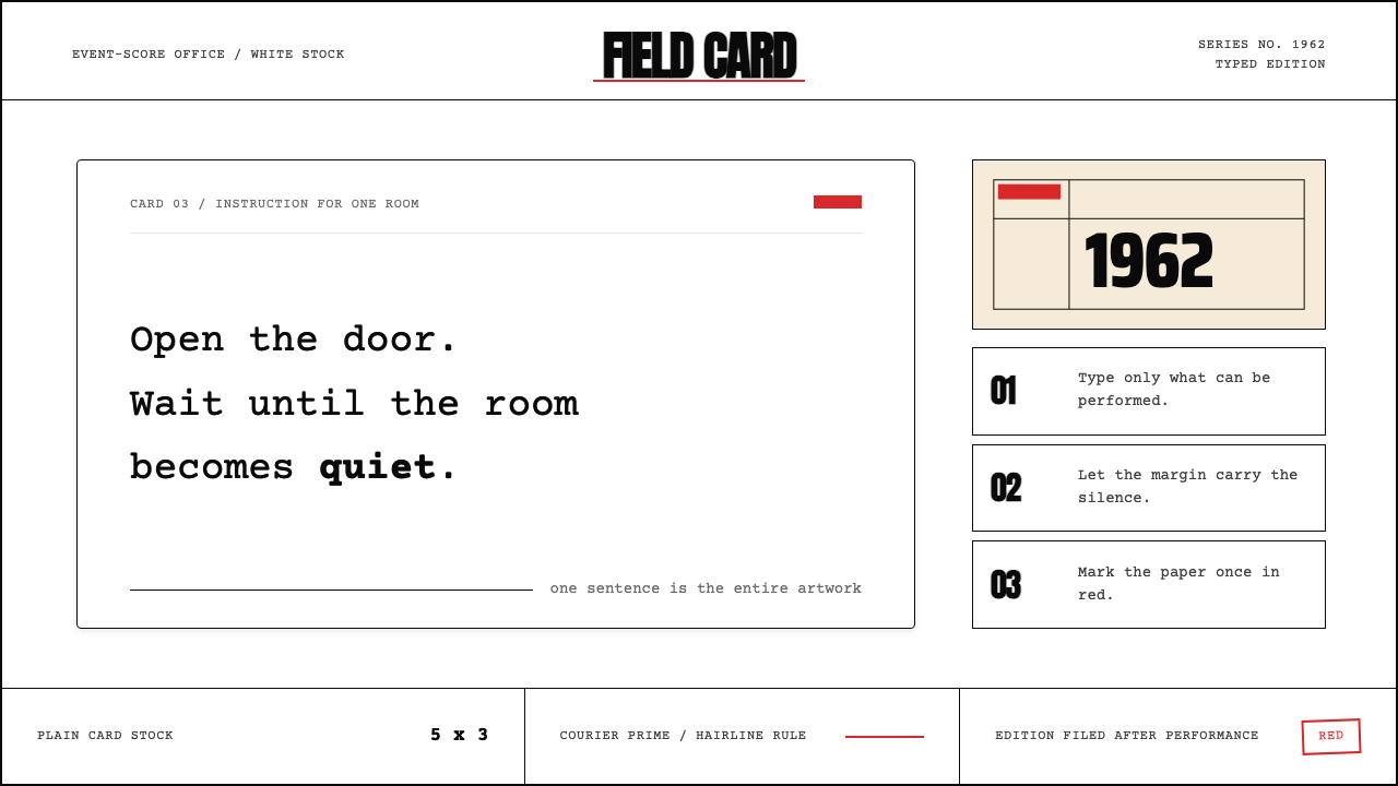 Fluxus Event Score (1962)Instruction becomes art. Courier on white card, hairline rules, one sharp red…指令即艺术:白卡上的Courier、细线框与一记红色标记。
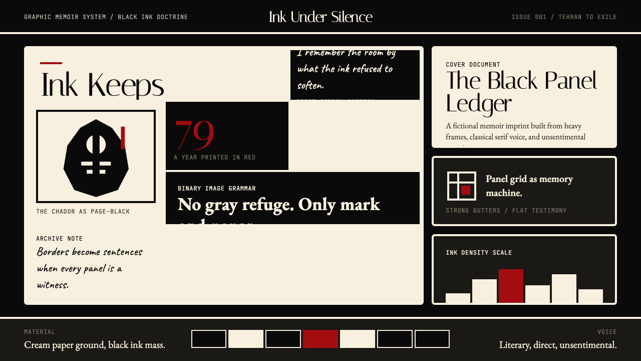 Persepolis (Marjane Satrapi, 2000)Stark memory, pure ink. Cream panels, heavy black borders, one revolution-red…记忆冷峻如墨。奶油纸格、粗黑边框,一笔革命红。
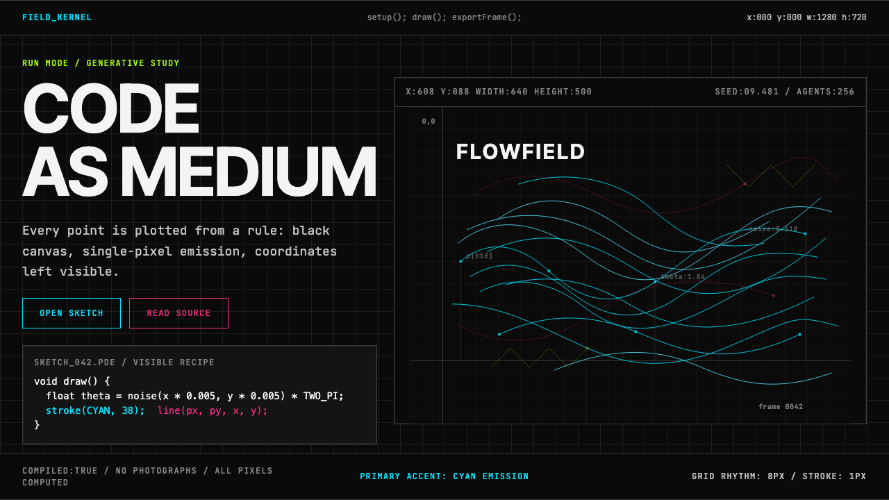 Processing / GenerativeCode becomes image. Cyan hairlines trace black-grid flowfields with mono coor…代码即图像:青色细线、黑网格流场与等宽坐标显影。
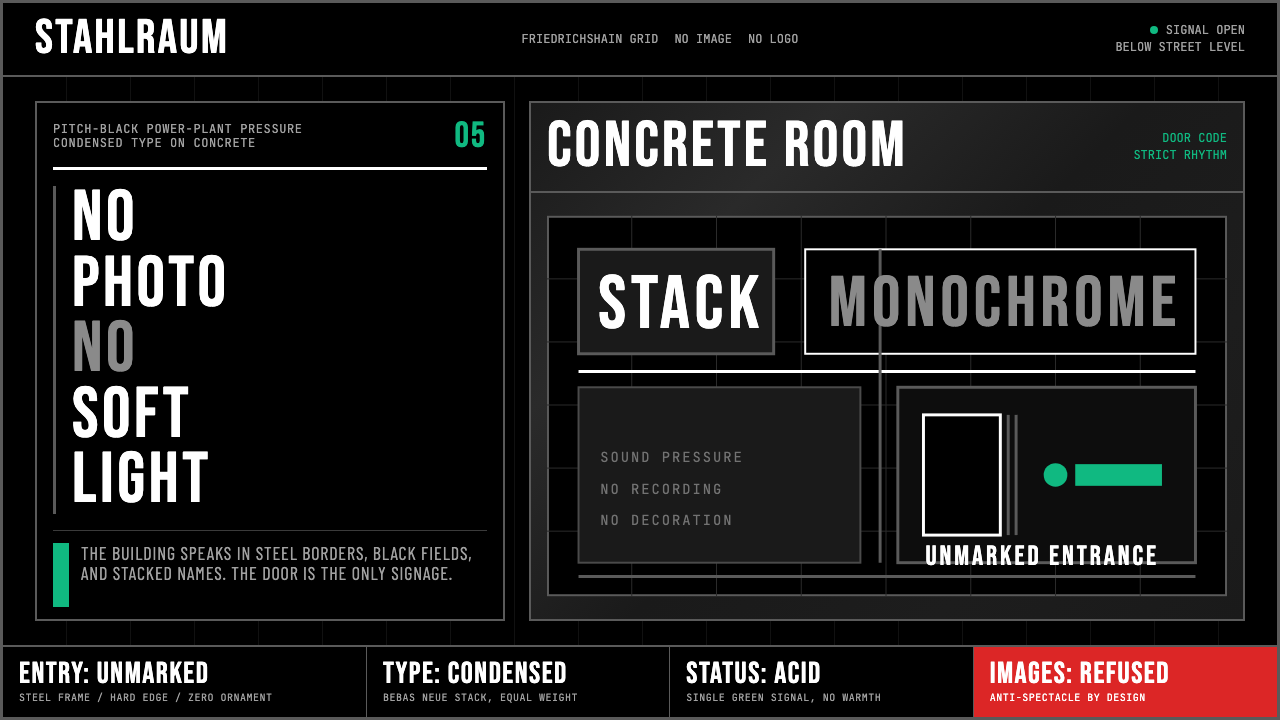 Berlin Techno (Berghain era)Refuses spectacle. Black grid, steel rules, condensed type, one acid-green si…拒绝景观:黑色网格、钢灰粗线、窄体大字,只留一盏酸绿信号。
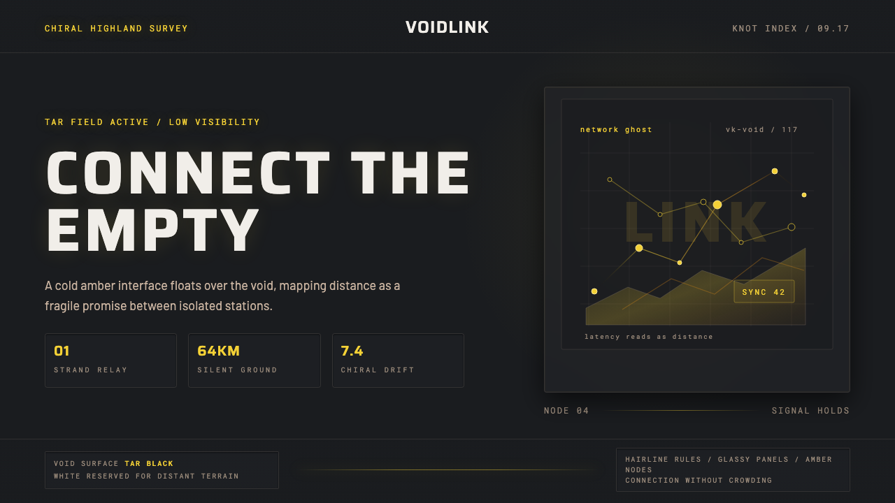 Death StrandingLonely connection, made visible. Amber HUD lines hover over a tar-black void.孤独连接被看见:琥珀 HUD 线悬浮在焦油黑虚空上。