What is Wodaabe Gerewol Charm Festival?
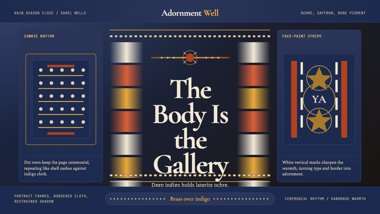
The Wodaabe Gerewol turns the desert into a gallery: nomadic Fulani men ornament themselves in ochre earth pigments, bone-white facial striping, and brass glints to compete in a beauty contest where restraint is never the point — saturated adornment, performed with ritualistic precision, is the whole language.
Wodaabe Gerewol Charm Festival in brief
The Wodaabe Gerewol is an annual male beauty and charm competition held among the Wodaabe, a sub-group of the Fulani (Peul) pastoral nomads of the Sahel. At the close of the rainy season, clans converge around desert wells in Niger, Chad, and northern Cameroon — men paint their faces with deep ochre and saffron pigments, line their features with bone-white stripes, don towering ostrich-plume headdresses, and perform the yaake: a slow, synchronized display in which rolling eyes and bared teeth signal magnetism and inner radiance.
As a design aesthetic, Wodaabe Gerewol distills that ritual into a visual system built on chromatic intensity and ceremonial pattern. Its palette is not decorative for decoration's sake — every element carries the weight of identity, status, and spiritual intention. Indigo grounds recall the deep-dyed cloth of West African textiles; laterite earth tones and saffron yellows evoke the mineral pigments pressed into skin; cowrie-shell rhythms and brass-line accents echo the jewelry that marks wealth and charm; bone-white striping creates structural tension across the warm field.
What distinguishes this aesthetic from generic 'African-inspired' pastiche is specificity of source and cultural depth. The visual language is rooted in a living tradition — the Gerewol is still performed annually — and every ornamental choice carries meaning within a social system that values beauty, wit, and personal magnetism as serious masculine virtues. Applying it well means honoring that precision: rich and layered, never flat; ceremonially ordered, never chaotic.
Where does Wodaabe Gerewol Charm Festival come from?
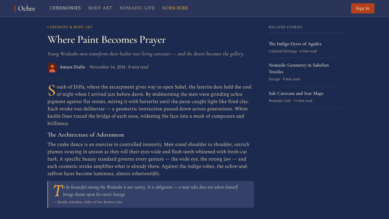
The Wodaabe are a sub-group of the Fulani, one of the largest and most widely dispersed pastoral peoples in Africa, spread across the Sahel from Senegal in the west to Sudan in the east. The Wodaabe, whose name translates roughly as 'people of the taboo' (a reference to their strict social codes around modesty and restraint in everyday life, which coexists paradoxically with the explosive display of Gerewol), have maintained a nomadic lifestyle centered on cattle herding. Their seasonal migrations and reliance on natural water sources make the rainy-season convergence around desert wells a natural occasion for inter-clan gathering, trade, courtship, and cultural performance.
The Gerewol itself — the word refers to the specific competition within the broader Wodaabe festival season — is documented in Western ethnographic literature from the mid-nineteenth century onward, though the practice is almost certainly older, rooted in pre-colonial Sahel adornment traditions. Photographers Carol Beckwith and Angela Fisher brought the Gerewol to international visual attention through their decades of documentary work in the 1980s and 1990s, producing images that are now among the most widely circulated records of the ceremony. Leni Riefenstahl also documented related Fulani festivals in the 1970s, though her photographs carry the complex freight of her prior career. The Wodaabe elders of clans such as the Mokao have been the primary custodians of the ritual's specific forms and meanings.
The visual conventions of the Gerewol are not arbitrary — they encode a specific theory of masculine beauty. The Wodaabe ideal, called togu, prizes tallness, long fine features, white eyes, and white teeth. Ochre and saffron face paint is applied to enhance the warmth and depth of skin tone; white stripes drawn from brow to chin along the nose ridge and from cheek to cheek elongate the face and frame the eyes; kohl lining the eyes deepens their apparent brightness. The headdress — ostrich plumes, beaded ornaments, and sometimes antelope horns — adds vertical height and ceremonial mass. The result is a total orchestration of the body as designed form: structured, symbolic, and executed according to inherited aesthetic rules.
Sahel nomadic adornment traditions share certain visual constants across distinct cultures: the preference for indigo-dyed cloth, the use of cowrie shells as monetary and ornamental objects, the prevalence of brass and bronze metalwork in jewelry, and the cultural importance of textiles whose surface patterns encode clan identity. The Gerewol concentrates these material traditions onto the body and the performance of self, making the human figure the primary carrier of a sophisticated visual culture that has no need of permanent architectural or craft objects to preserve its aesthetic intelligence.
What defines the Wodaabe Gerewol Charm Festival look?
Color Field
The ground is deep indigo — a saturated, near-black blue-purple that recalls the heavily dyed cotton cloth traditional to Sahelian dress. Against this ground, warm earth tones perform their full intensity: ochre and laterite reds, saffron and turmeric yellows, all appearing at their richest because the dark ground makes no competing claim on brightness. This is additive richness — warmth amplified by its dark surround — not the subtractive restraint of a light-on-white palette.
Pigment Palette
The working palette is mineral and organic: deep ochre, laterite red, warm saffron, bone white, kohl black, and the burnished gleam of brass. These are not arbitrary accent colors — they correspond directly to the pigments, metals, and organic materials used in Gerewol face painting and adornment. Bone white is used with precision, reserved for facial striping and highlight, never as a background fill. Kohl black appears as a dense concentrated element — outlining, defining — never as a ground tone.
Stripe and Line
Vertical white striping — the bone-white pigment lines drawn from brow to chin and across the cheekbones — is the most structurally decisive element in the aesthetic. These lines are not decorative in the ornamental sense; they are face architecture, creating elongation, framing the eyes, and organizing the warm field into deliberate zones. In design application, vertical light lines on dark grounds perform the same structural function: they create rhythm, direct the eye, and give the saturated palette an organizing skeleton.
Cowrie and Dot Rhythm
Cowrie shells are not mere ornament in Wodaabe culture — they carry histories of trade, value, and ritual protection. In the visual system, the cowrie-and-dot motif translates into a repeating rhythmic pattern: small oval or circular accents arranged in regular clusters or rows, interrupting solid fields with a controlled scatter. The rhythm is neither perfectly uniform (which would read as mechanical) nor random (which would read as noise) — it is the kind of ordered variation found in beaded textile weaving, where the pattern is obvious but alive.
Brass Accent and Metallic Gleam
Brass appears in the system as a warm metallic accent — small, precise, and used to mark the most charged points of a composition, just as brass jewelry in the ceremony marks ears, foreheads, and wrists as sites of particular social significance. The metallic quality is important: not gilded excess, but a specific warmth that differs qualitatively from the matte earth tones and creates a moment of concentrated attention wherever it appears.
Vertical Grandeur
The Gerewol aesthetic is inherently vertical in its aspirations — the towering ostrich-plume headdress is both a literal structure and a visual argument for upward energy, status, and ceremonial presence. In design, this translates to compositions that privilege height, that draw the eye upward, and that treat the vertical axis as the primary axis of dignity. Wide horizontal layouts dissipate this quality; tall-format applications, portrait-orientation frames, and stacked vertical hierarchies preserve it.
Layered Surface
Gerewol adornment is never a single flat application — it is built up in layers: base pigment, then striping, then jewelry, then feathers, each layer adding information without obscuring what lies beneath. In the design system, this principle of legible layering means that complexity is accumulated deliberately: the dark ground first, then the warm mid-tone pattern, then the bone-white structural lines, then the brass accents as the topmost and sparsest layer. Every layer is readable, and no layer needs to be removed for the composition to make sense.

Who shaped Wodaabe Gerewol Charm Festival?
The Mokao are among the Wodaabe clans whose elders serve as the primary custodians of Gerewol's specific aesthetic codes: the correct application of pigments, the arrangement of headdress elements, the choreographic form of the yaake. Their role is not merely administrative — they embody a living aesthetic tradition, training younger men in the precision and intentionality that distinguishes genuine Gerewol adornment from imitation. Their authority is the closest equivalent in this tradition to the role of a master craftsman in a formal design school.
These two photographers spent decades documenting African ceremonial traditions, including the Wodaabe Gerewol, producing work that brought the visual complexity of the ceremony to international audiences in books and exhibitions from the 1980s onward. Their photographs are often the primary visual reference through which designers and artists outside the Sahel encounter the Gerewol aesthetic — making them, inadvertently, significant transmitters of the visual language even as their work also raised ongoing questions about the ethics of representation and cultural access.
The broader Fulani cultural tradition — of which the Wodaabe are one sub-group — is one of the richest sources of textile, jewelry, and body adornment aesthetics in West and Central Africa. Fulani weaving traditions (strip-woven cotton with geometric inlay), Fulani gold jewelry (filigree earrings, twisted neck rings), and the cultural investment in personal elegance as a serious social value all feed into the Gerewol aesthetic. Understanding the style means understanding that the Gerewol is not an isolated spectacle but the most concentrated expression of a whole cultural orientation toward beauty as a form of knowledge.
The Wodaabe Gerewol sits within a broader Sahelian visual ecology that includes the indigo-dye traditions of the Tuareg and Hausa, the cowrie-shell economies that once connected West Africa to the Indian Ocean trade, and the brass and bronze casting traditions of cultures from the Sahel to the forest belt. Recognizing these shared material roots helps explain why the Gerewol aesthetic reads as simultaneously specific and archetypal — it draws on visual vocabularies with deep roots across a vast geographic area, giving it a resonance that extends far beyond any single ceremony.
How do you use Wodaabe Gerewol Charm Festival today?
Wodaabe Gerewol is a ceremonial style — it carries the weight of its source culture, and using it well requires the same intentionality that Gerewol participants bring to their adornment. The visual logic is the opposite of minimalism: richness is the default, and the discipline lies in knowing how to layer that richness without losing structure. A designer who applies this system timidly, reaching for one muted earth tone on a white ground, will produce something that captures neither the spirit nor the visual intelligence of the tradition.
For presentation slides, this aesthetic works most powerfully in high-stakes, ceremonial contexts: keynote openings, cultural institution launches, brand identity reveals, immersive event experiences. A cover slide should commit fully: deep indigo or near-black ground, a bold warm ochre or saffron headline in a weighty typeface, bone-white geometric accent lines, and a single brass-toned element that commands attention. Content slides sustain the palette but reduce its intensity — the indigo ground continues, but the warm tones shift to supporting roles as mid-tone dividers and section markers, with the bone-white reserved for key callouts and data labels.
For web interfaces, the style suits editorial and experiential platforms more than utilitarian tools. A media site covering African culture, a fashion brand rooted in heritage textiles, a music or arts festival with a strong visual identity — these are natural contexts. The approach: use the dark ground throughout, letting warm ochre and saffron serve as the primary foreground color family for headings, interactive states, and highlight cards. Cowrie-pattern motifs work well as decorative dividers and background textures on section breaks, applied lightly enough to remain legible beneath text. Brass accents belong on calls to action and featured labels only — never scattered across the layout.
For editorial and marketing work, the system lends itself to large-format print and immersive digital experiences. A poster in this aesthetic uses the full depth of the indigo ground and lets the warm palette float against it in a vertical composition — headline at the top, ornamental pattern mid-field, detail information anchored at the base in bone-white type. For social media formats, the cowrie-dot rhythm and brass-line accent translate well into border treatments and frame elements that give a recognizable visual identity without requiring the full depth of the ceremonial palette.
The most common mistake when applying this aesthetic is treating it as surface decoration — borrowing the color names without understanding the structural logic. Gerewol adornment is precisely ordered: each pigment has a zone, each element a hierarchy, and the total effect emerges from that precision rather than from accumulation. In design terms, this means establishing a clear layer order before adding elements, committing to one dominant warm tone rather than using ochre, saffron, and laterite simultaneously at equal weight, and reserving bone white as a structural signal rather than scattering it across the composition as neutral fill. The aesthetic rewards discipline as much as richness.
Wodaabe Gerewol Charm Festival — FAQ
Is the Wodaabe Gerewol aesthetic appropriate to use for non-African brands and projects?
It can be used thoughtfully, but it requires more contextual care than most historical design aesthetics because it draws from a living ceremonial tradition rather than a historically completed movement. The key distinction is between engaging with the visual logic — the color system, layering principles, and structural use of stripe and pattern — and wholesale appropriation of specific cultural symbols without acknowledgment. Projects that use this aesthetic work best when they can articulate what draws them to the tradition, when they avoid claiming cultural authenticity they do not possess, and when the context (art, culture, design, event production) is one where the visual reference is legible and considered rather than incidental.
How do you prevent the dark indigo palette from feeling heavy or oppressive in a digital interface?
The key is the vertical bone-white striping logic: regular thin light lines on a dark ground create visual breathing room without actually lightening the ground. A second strategy is ensuring that the warm ochre and saffron tones appear at sufficient scale to register as luminous rather than merely bright — a small warm accent on a large dark field reads as a pinpoint, while a generous warm heading or panel reads as warmth entering the space. The third strategy is surface texture: the cowrie-dot pattern, applied as a very low-contrast overlay on the dark ground, gives the eye something to rest on without breaking the depth of the field. Flatly dark interfaces without any of these elements will read as heavy; these three techniques restore the sense of layered richness that makes the source aesthetic feel alive rather than oppressive.
What typefaces work best within this visual system?
The Gerewol aesthetic is not a typographically prescriptive system the way Bauhaus or Swiss Style are — its source tradition predates movable type and its visual logic is about pigment, pattern, and adornment rather than letterform. This gives designers more freedom in typographic choice, but also more responsibility to choose deliberately. Typefaces with weight and warmth work better than geometric cold grotesques: humanist serifs, display typefaces with calligraphic roots, or heavy slab serifs that carry visual mass comparable to the bold stripe and pattern language. Ultra-thin or highly geometric faces fight the palette rather than supporting it. Arabic or Tifinagh scripts — used by Tuareg and other Sahelian peoples — can add cultural specificity in appropriate contexts.
How does this aesthetic differ from a general 'warm African' or pan-African design approach?
The Wodaabe Gerewol aesthetic is specific, not general. The deep indigo ground is not a generic 'African earth tone' — it is specifically the color of Sahelian dyed textiles. The bone-white vertical stripe is not decorative flourish — it is a precise face-painting convention with a defined function within the Gerewol togu beauty ideal. The cowrie-dot rhythm references a specific material culture, not a vague notion of African pattern. A pan-African design approach tends toward warm terracottas on white, Ankara-inspired geometric prints, or Adinkra-derived symbolism — all legitimate but quite different visual vocabularies. Gerewol is desert-specific, nomadic, ceremonially intense, and dark-ground: none of these qualities are universal to African visual culture, and conflating them misses the point of working with a specific tradition.
Can this aesthetic work in a light-mode or white-ground layout?
Technically yes, but it loses something essential. The dark indigo ground is not a preference in this system — it is the condition that makes the warm palette luminous rather than simply warm. Ochre on white looks earthy but flat; ochre on deep indigo glows. If a light-mode version is required by the product context, the best approach is to invert the hierarchy rather than simply swap the background: use warm ochre or saffron as the primary ground color (not white), keep white for text and structural lines, and use the indigo as an accent or panel background rather than the primary field. This preserves the warmth-against-depth dynamic while making the layout accessible in a light-mode context.
Related design styles
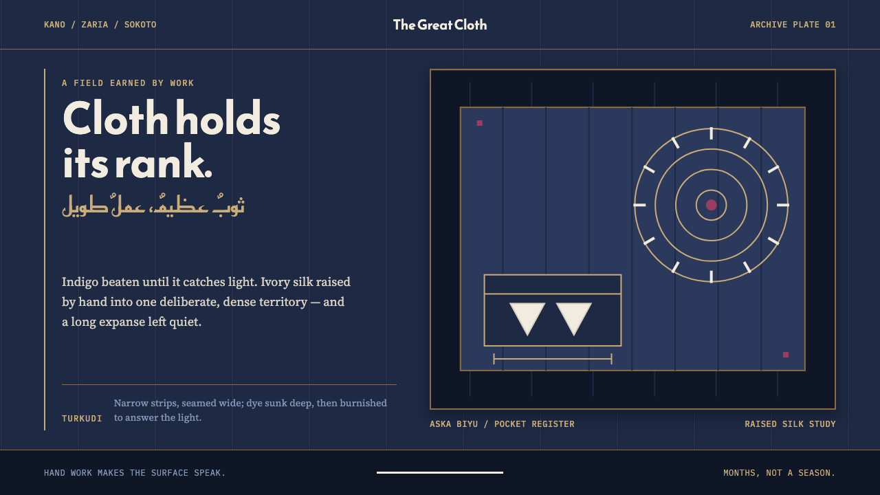 Hausa Babban RigaRank is worked, not announced. Burnished indigo holds raised ivory geometry i…
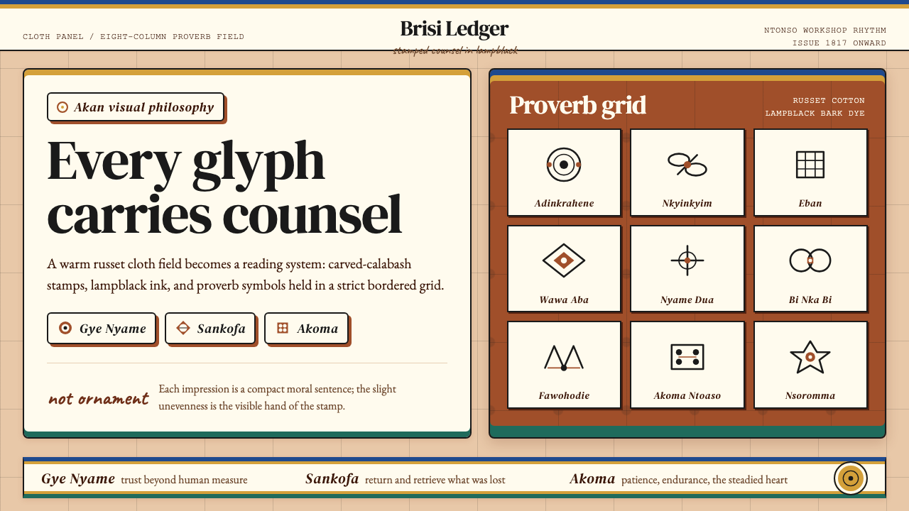 Akan Adinkra (Ghana)Proverbs become cloth. Russet grids, lampblack serif marks, and gold-edge ban…
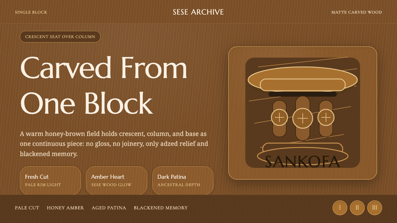 Akan Carved StoolMatte wood carries memory. Honey amber, Marcellus type, and crescent-column r…
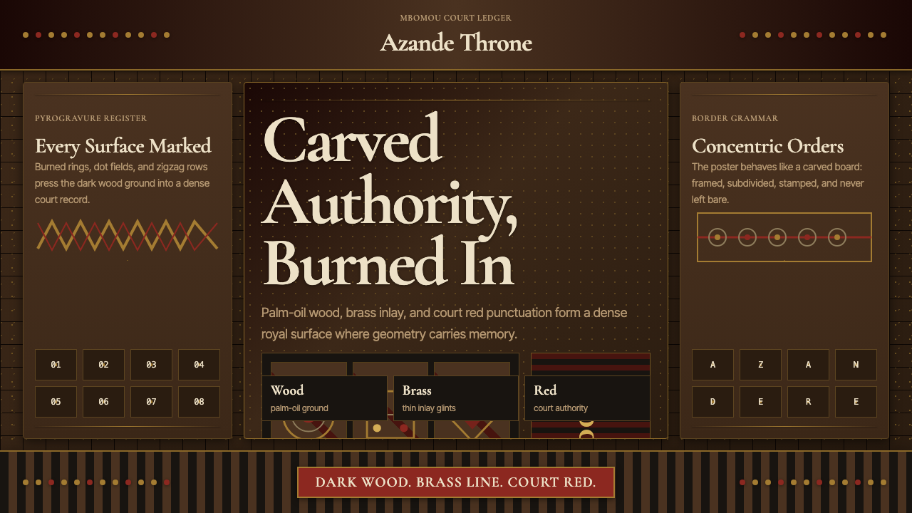 Central African Azande ThroneDense court gravity. Dark wood grids, brass dots, and court red cover every s…
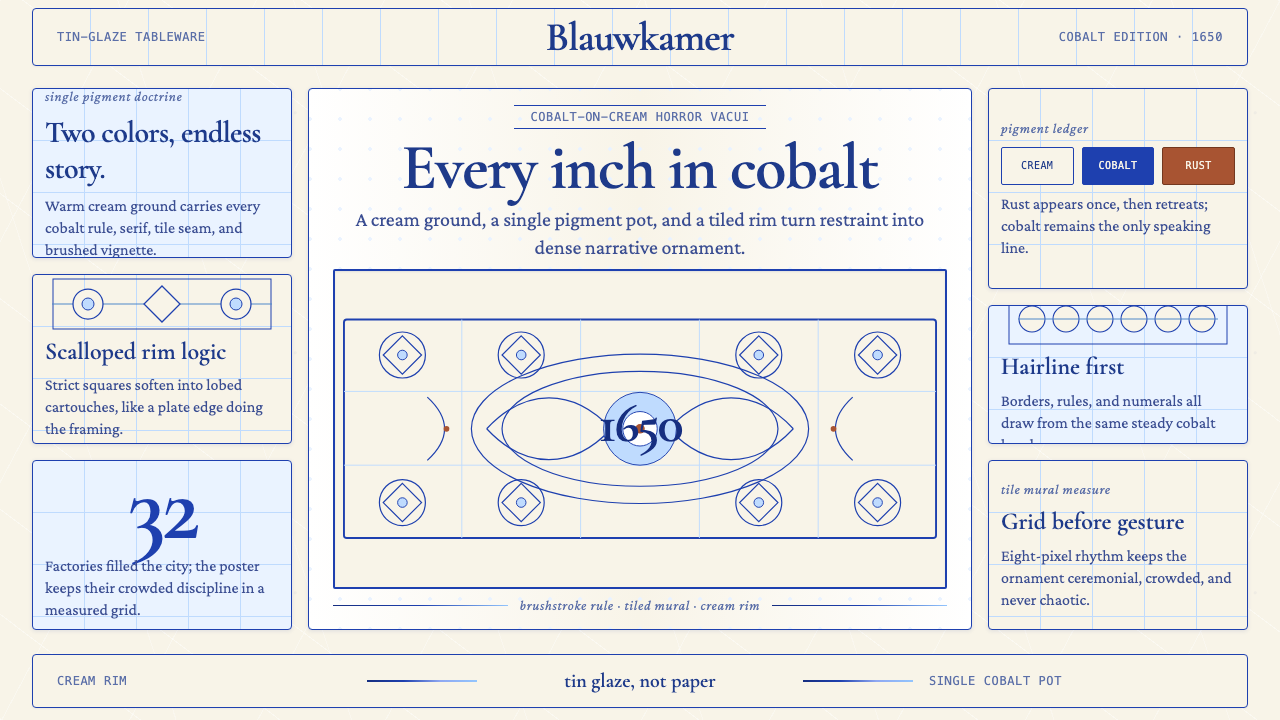 Delft Blue PotteryRestrained, yet every inch speaks. Cobalt hairlines crowd a cream tile grid.
 Ethiopian Geez GospelSacred color held in line. Orpiment gold and indigo panels sit on weathered v…