What is Witch House?
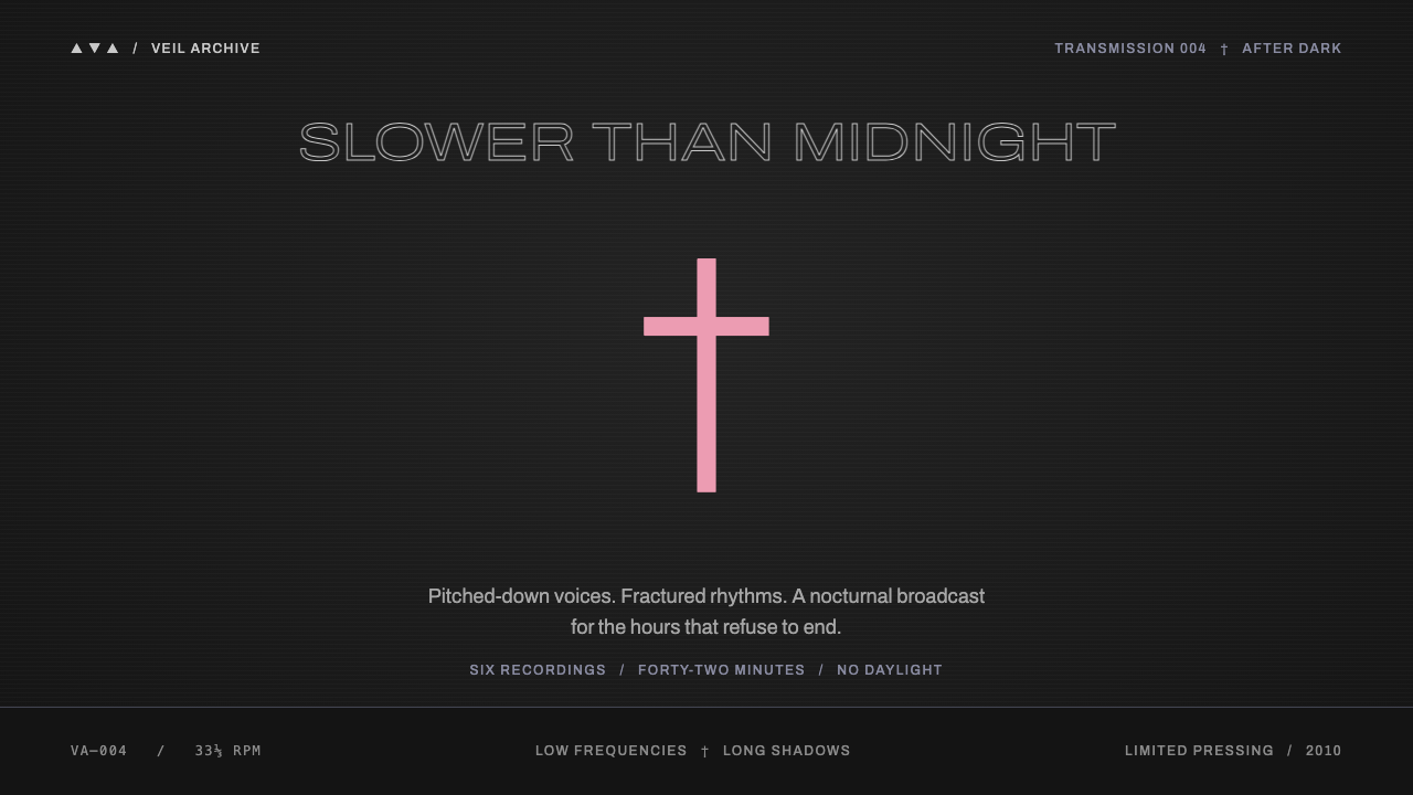
Witch House is a design of withheld information: charcoal grain, wide thin capitals, and one pale pink symbol that breaks the silence.
Witch House in brief
Witch House takes its look from a small electronic music micro-genre that emerged around 2010 and hid behind triangles, crosses and other symbols. Bands often had names that could not be typed or pronounced, so identity was carried by glyphs instead of words. The design style translates that atmosphere into a restrained, nocturnal visual system.
The pages sit on the charcoal of a grainy black-and-white photograph. Wordmarks are thin, outlined capital letters set very wide. Headings, bullets and separators can all be Unicode symbols, such as triangles and daggers, rather than ordinary graphics. The palette is almost entirely grey, with a storm violet taken from the night sky on the cover of Salem's King Night and one pastel pink borrowed from the cross marks on the Crosses release.
The mood is one of keeping distance. Darkness is not dramatic or gory; it is cool, empty and slightly distant. Space is generous, type is delicate and the interface seems to whisper. It is a style for music, nightlife and any project that wants to feel dark, cold and sparse rather than loud.

Where does Witch House come from?
The term witch house was coined in 2009, and the genre's peak is placed between 2010 and 2012. It appeared in North America, with scenes associated in the source material with Traverse City in Michigan, San Francisco and Los Angeles. Musicians working under symbol-heavy names made slowed, heavy, murky electronic tracks and released them largely online, where the packaging was often just as important as the sound. The look of the genre grew in step with the music, because both were designed to feel mysterious and hard to search for.
Production methods and imagery fed each other. The source material points to chopped and screwed production, a technique in which tracks are slowed down and cut up, producing a dragging, narcotic tempo. The visual counterpart was an image world of grainy, desaturated photographs, scanned textures and occult symbols. These pictures circulated on Tumblr, the blogging platform of the period, which acted as the genre's main gallery. The source material calls this tradition Tumblr-era occult collage, and it supplies the style's black-and-white grain and its fondness for signs over words.
Several figures are named in the source material. Travis Egedy, who records as Pictureplane, is associated with the term itself. John Holland and Chris Greenspan are listed among musicians connected with the scene, and the references to Salem's King Night and to Crosses point at the album covers that gave this style its palette. Chino Moreno, known as the singer of Deftones, appears in connection with the Crosses project and shows how far the genre's symbols travelled into more established music circles.
Witch house as a genre was short-lived, but its visual habits outlasted it. The wide, outlined lettering, the use of glyphs as typography and the grainy monochrome photography became a recognizable template for dark, quiet design. The source also lists Witch house itself, labeled in drag, among the movements behind the style, a reminder that the genre began partly in a playful, self-aware spirit. The style keeps that quality: it is serious in mood, but never solemn about itself.
What defines the Witch House look?
Charcoal grain ground
The ground is the dark grey of a coarse black-and-white photograph, with visible grain. It is not pure black: the slightly lifted, textured charcoal feels like film or print rather than a screen. Everything else sits on it with very little contrast between layers.
Thin outlined capitals
Wordmarks and headings are set in Archivo, in a wide cut, as outlined capitals with very thin strokes. The letters feel hollow, like a ghost of a poster title. Generous letter-spacing adds to the sense of distance and keeps the shapes legible despite the delicate lines.
Glyphs as structure
Headings, bullets and separators can be Unicode characters such as triangles and daggers. Instead of drawn icons, the interface uses these typographic marks as its structural vocabulary, which keeps the page light and makes the signs feel like part of the text.
Storm violet
The one hue beyond grey is a stormy violet-grey borrowed from the sky on the cover of Salem's King Night. It appears as a faint cast in panels and shadows rather than as a bold color, giving the greys a cold, bruised undertone.
A single pastel pink
A pale pink taken from the cross marks on the Crosses release is the only warm accent, and it is kept for the single most important thing on the page, such as one glyph or one link. Because it appears only once, it works like a held breath: the eye goes straight to it.
Empty space
Layouts are sparse, with wide margins and long pauses between elements. Content is small and widely spaced, and large dark areas are left untouched. The emptiness is part of the message, creating the feeling of a cold room at night.

Who shaped Witch House?
Egedy, who records as Pictureplane, is associated in the source material with the genre's naming in 2009. His role shows how much of witch house began as an online conversation about labels and aesthetics before it settled into a fixed look.
Holland is listed as a key figure among the musicians connected to the scene. His work belongs to the moment when slowed, murky electronic music met symbol-based branding and a visual identity of grain and glyphs.
Greenspan is another figure named in the source material in connection with the genre. Like many in the scene, he worked largely through online releases, where a name, a glyph and an image had to do the work of a whole marketing campaign.
Moreno, known as the singer of Deftones, is connected in the source material to the Crosses project, whose cross marks gave this style its pastel pink. His presence shows the aesthetic reaching beyond the small online scene where it started.
How do you use Witch House today?
On slides, Witch House suits quiet, atmospheric decks: music releases, nightlife brands, art and photography portfolios, fashion lookbooks and moody product stories. A cover can be a near-empty charcoal field with a wide outlined title, one glyph and nothing else. Content slides should stay sparse, with one idea per slide and a lot of dark space, and the single pink accent should mark the one thing you most want the audience to remember.
On data slides, restraint is essential. Draw charts in thin grey lines on the charcoal ground and use the storm violet only as a faint secondary tone. Use the pastel pink once, to highlight the key point. Labels should be small and widely spaced, and gridlines should be almost invisible, so that the chart feels like a whisper rather than a statement.
For web interfaces, the style works for music sites, artist pages, event listings, galleries and dark-mode editorial projects. Use Unicode glyphs for list markers, dividers and small navigation cues, and keep text small and widely tracked. Hover states should be subtle: a thin outline appears, a glyph fades in. Avoid heavy buttons or large filled shapes, which break the delicacy. Ensure sufficient contrast for body text, since thin outlined type is for headings, not paragraphs.
In editorial and marketing work, the style is excellent for teasers, announcements and posters that withhold information. A poster might show only a symbol, a date and a distant outlined title. Photography should be grainy, monochrome and slightly out of focus, and collage elements can stay sparse. The less the page explains, the better it works; mystery is the product.
The most common mistake is to treat it as generic dark mode and fill the page with bright accents, gradients or glowing effects. The strength of the style is that it has almost no color. A second mistake is overusing pink, which destroys its role as the single break in the silence. A third is using thin outlined letters at small sizes for body text, which makes reading difficult. Keep the outline for large headings and set paragraphs in a plain, readable face.

Witch House — FAQ
What is witch house?
Witch house is a micro-genre of slowed, murky electronic music that emerged in North America around 2010, with the term coined in 2009 and a peak between 2010 and 2012. It is known for symbol-heavy band names, grainy black-and-white imagery and occult-themed collage. The design style takes its look from that visual world.
Why is there only one pink accent?
The palette is almost entirely grey, so a single pastel pink, taken from the cross marks on the Crosses release, carries enormous weight. Using it for only the most important element on the page makes it a focal point. If it appeared everywhere it would stop meaning anything.
Which typeface does it use?
Headings use Archivo in a wide cut, drawn as thin outlined capitals with generous letter-spacing. Symbols such as triangles and daggers are Unicode characters set inline with the text. For long reading text, choose a plain, legible face rather than the outlined style.
Is it the same as gothic or dark academia styles?
No. Gothic styles tend to be ornate, with rich blacks, deep reds and decorative flourishes. Witch House is the opposite: sparse, grey, cold and almost empty, with symbols in place of ornament. It borrows occult signs but treats them with minimalism rather than theatricality.
Related design styles
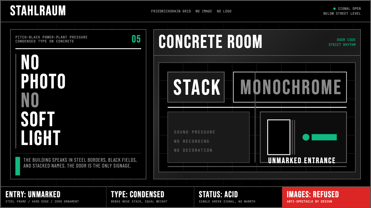 Berlin Techno (Berghain era)Refuses spectacle. Black grid, steel rules, condensed type, one acid-green si…
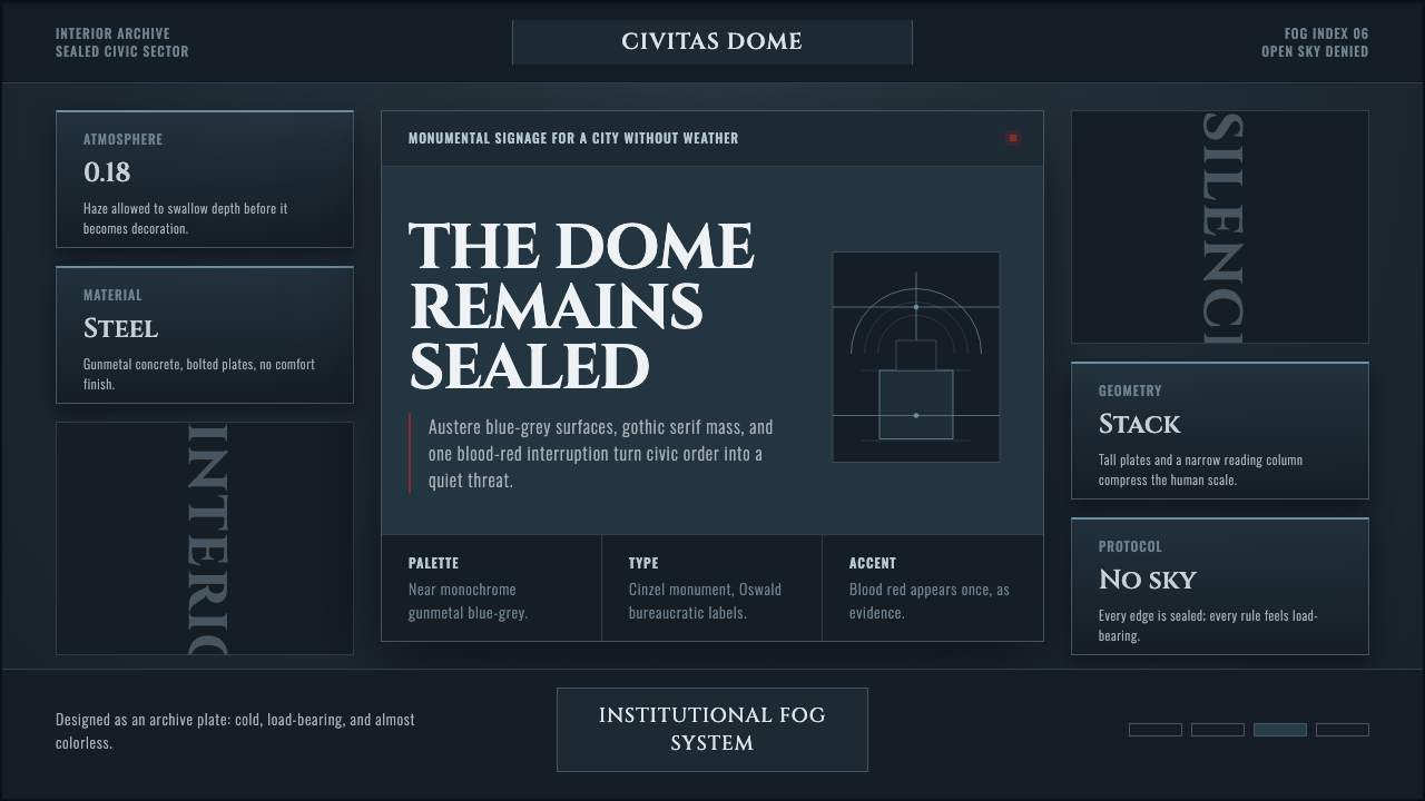 Ergo Proxy Romdo DomesCold order becomes dread. Gunmetal fog, gothic serif mass, one blood-red mark.
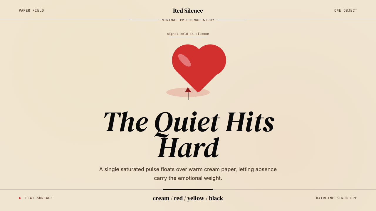 Kanye — 808s & HeartbreakGrief in restraint. Cream paper, one red heart, yellow heat, and a black hair…
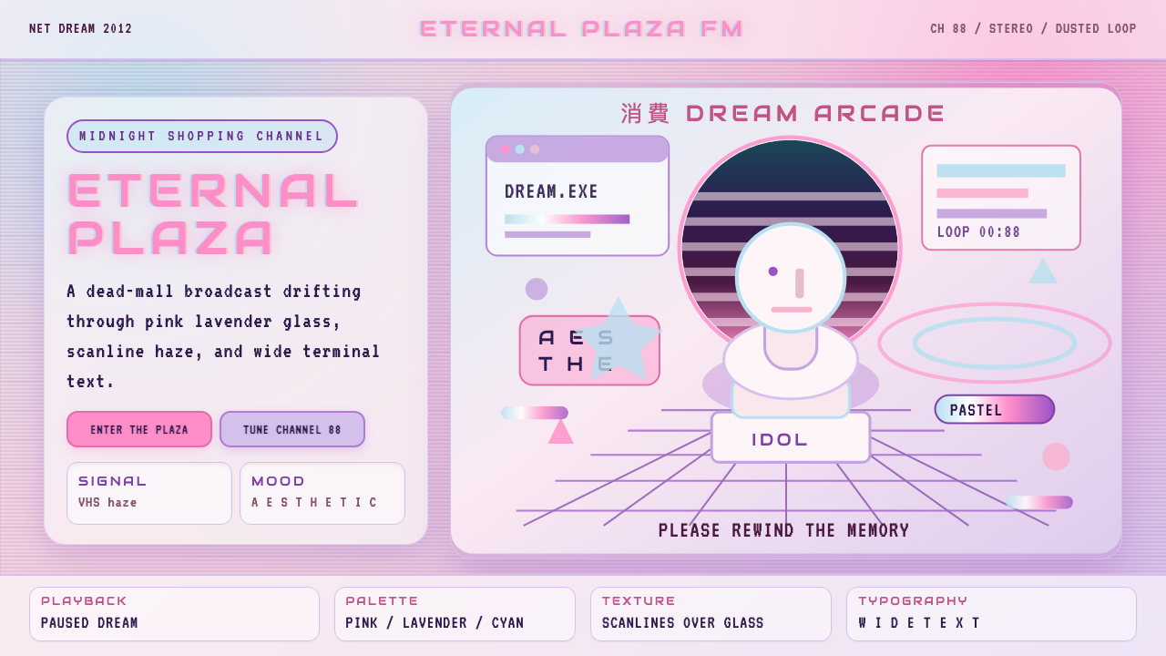 Vaporwave (Tumblr 2012)Dead-mall nostalgia glows. Pink-lavender glass, VHS scanlines, and wide retro…
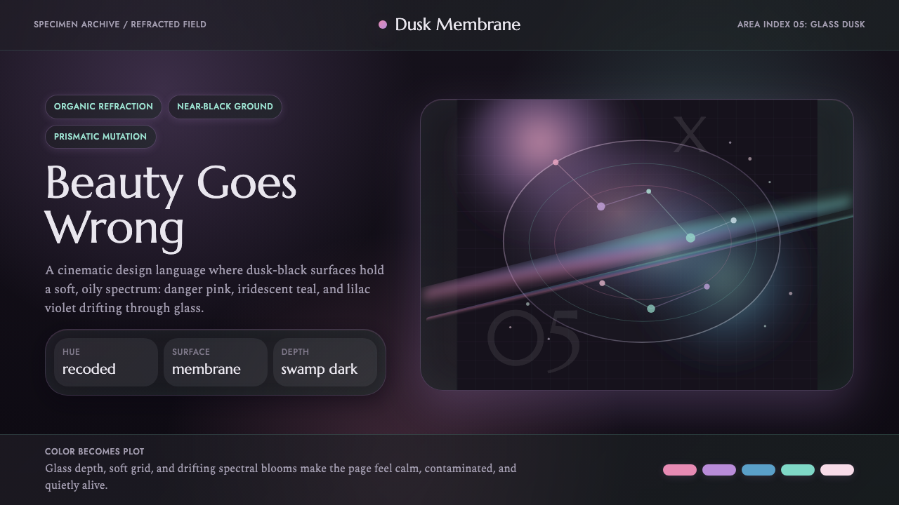 Annihilation (The Shimmer)Beautifully wrong. Dusk black carries pink, teal, and lilac refraction throug…
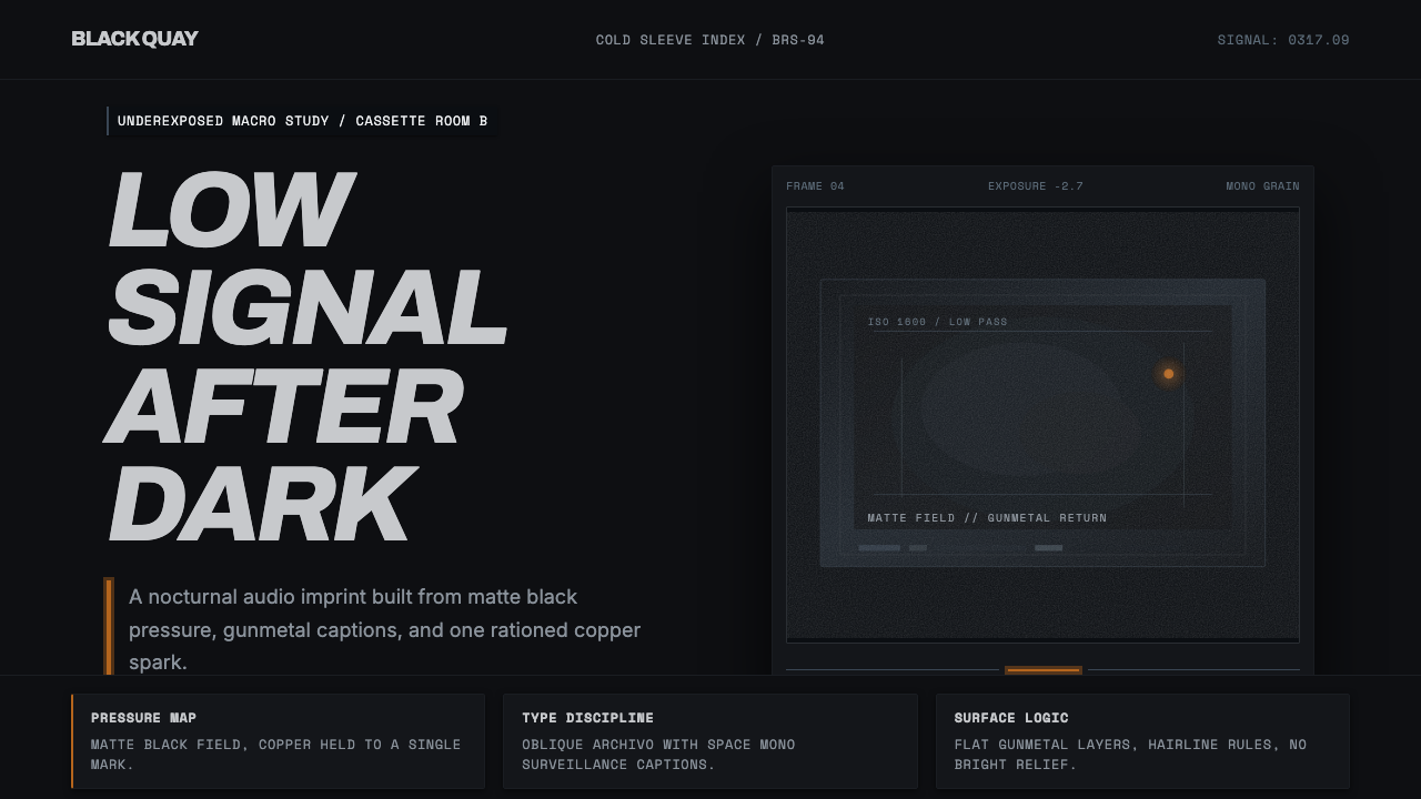 Bristol Trip-HopMenace through minimalism. Near-black grain, gunmetal type, one copper spark.