What is Winamp?
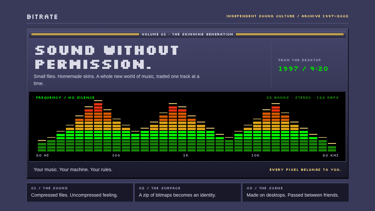
Winamp made the music player a small, dense machine of slate bevels and glowing green type, then let everyone repaint it.
Winamp in brief
Winamp is the Windows MP3 player that Nullsoft released in 1997, and its look is one of the most recognizable pieces of late-1990s software design. The style described here is based on the classic base skin of the 2.x versions: a compact slate-indigo chassis with hard bevels around every edge, recessed black display wells, green bitmap digits, and a spectrum analyser whose bars climb from green through yellow and orange to red.
Everything about it is dense and exact. There is no anti-aliasing, no rounded corner, no frosted glass and no soft shadow. Each surface is one of two things: a raised piece of metallic plastic, or a sunken black well with glowing content inside it. Controls are tiny and tightly packed, text is drawn from bitmap fonts, and every pixel sits exactly where its designer put it.
The second half of the style is cultural rather than visual. Winamp was built so that a user could drop a compressed archive of bitmap images onto the player and instantly change its whole appearance. That gave rise to a huge community of hobbyist skin makers, and it taught a generation of computer users that software could be personal. When people say a design has Winamp energy, they usually mean this: small, dense, glowing, pixel-exact, and open to being remade.

Where does Winamp come from?
Winamp was first released in 1997 by Nullsoft, a small software company associated with Sedona, Arizona, and later with San Francisco. Its creator, Justin Frankel, built the first version as a lightweight player at a moment when MP3 files were beginning to circulate widely on the internet. The timing mattered. People had suddenly accumulated music as files on their hard drives, and they needed a small, fast program to play it. Winamp became that program, and its interface became the face of the whole phenomenon.
The classic skin format that defines this style belongs to the 2.x line, which ran from 1998 to 2002 according to the source material. The format worked by assigning each part of the player a bitmap image: the main window, the buttons, the digits for the time display, the text for the song title, the sliders. A skin was simply a bundle of replacement bitmaps. Because the lettering and numbers were pictures rather than live fonts, they were rendered pixel for pixel, which is why the style leans so hard on bitmap type. The original files that held the lettering and the numerals are the reason this system uses pixel fonts as stand-ins.
In 1999, AOL acquired Nullsoft, and Winamp moved from a cult utility to a mainstream product. By then the skinning culture was already thriving. Fans designed and traded skins on the early web, borrowing from game interfaces, anime, science fiction, hardware stereo systems and the visual habits of the demoscene, the underground community that produced tiny, showy programs. This blend is why the source material names three currents behind the style: the late-1990s MP3 and file-sharing era, desktop skinning culture, and demoscene-style bitmap interfaces.
Several names recur in the source material. Justin Frankel and Dmitry Boldyrev are tied to the development of Winamp itself, Tom Pepper to the visual identity of the era, and Jordan Eldredge to the later effort of recreating the classic player in the browser and preserving its skins. That last connection says something about the style's afterlife. Decades later, people still care enough about these small bitmap designs to keep them alive, which is rare for functional software.
What defines the Winamp look?
Slate-indigo chassis
The player body is a muted blue-grey with an indigo cast, reading like brushed metal and plastic at the same time. It is neither bright nor dark, which lets the green and black elements on top of it glow. Large flat areas are avoided; the body is always interrupted by bevels, grooves and small controls.
Hard bevels
Every raised button and panel has a hairline light edge on one side and a dark edge on the other, creating a hard, crisp relief. There are no blurred shadows. The effect is instantly tactile and was the standard language of desktop controls in the late 1990s, pushed here to a particularly sharp and metallic finish.
Recessed black wells
Displays for the time, the song title and the spectrum sit in pure black wells that look cut into the chassis. They invert the logic of the raised buttons: the chassis comes forward, the screens go backward. Against the black, the content glows like a small instrument display.
Green bitmap type
Digits and scrolling titles are drawn in a green pixel font, with letterforms built from square dots and no smoothing. The system stands in Silkscreen and VT323 for the original bitmap lettering and numbers. The green-on-black pairing evokes terminals and hardware LCD panels, and it is the strongest single signature of the style.
Stepped spectrum meter
The analyser is made of narrow bars built from stacked blocks, graduating from green at the base through yellow and orange to red at the peaks. It is the only place in the interface where warm colors appear, which makes it a natural focal point and a little theatrical flourish in an otherwise cool, restrained palette.
Density without padding
Controls are packed tightly and labeled in the smallest legible type. The playlist uses a plain sans-serif; this system sets it in Arimo as the stand-in for Arial. There is almost no empty space, and the effect is not clutter but a feeling of a compact, well-engineered object where every part has a job.
Pixel-exact edges
No anti-aliasing, no rounded corners, no translucency. Shapes are made of whole pixels and sit on whole-pixel positions. This is the style's discipline: if you cannot draw it with crisp square dots, it does not belong.

Who shaped Winamp?
Frankel is the creator of Winamp and the founder of Nullsoft. He wrote the first version in 1997, in the early days of MP3 sharing, and the player's small, hackable design reflects the habits of an independent programmer more than those of a corporate design department.
Boldyrev is listed among the key figures of the period and is associated with the development of Winamp and Nullsoft. His name belongs to the engineering side of the story, a reminder that the skinnable architecture was as important to the player's cultural reach as its look.
Pepper appears in the source material as a figure tied to the visual side of Winamp's classic skins. His work belongs to the tradition of designers who produced small, intricate interface art within very strict limits.
Eldredge is associated with the modern preservation of Winamp's design, recreating the classic player and its skins so they run in a web browser. His effort shows how much affection the style continues to attract, and it makes the original bitmaps accessible to people who never installed the software.
How do you use Winamp today?
On slides, the Winamp style works best for decks that want a deliberate retro-tech tone: product history talks, developer conferences, music and audio launches, or any presentation about the internet of the late 1990s. A cover can be built as a single oversized player window, with a green bitmap title in a black well and a spectrum meter running along the bottom. Content slides can reuse the slate chassis as a frame, and a recessed black well is a good container for a quote or a headline number.
On data slides, treat the black well as the chart canvas and use the green bitmap face for values and labels. The stepped spectrum meter is a natural model for bar charts and gauges, since its color graduation from green to red already encodes low to high. Keep everything pixel-aligned and avoid smooth curves, which break the spell.
For web interfaces, the style suits audio tools, developer utilities, media players, retro portfolios and playful dashboards. Think of a panel as a chassis and each widget as either a raised control or a sunken readout. Buttons should have hard bevels and a clear pressed state; inputs should look like recessed wells. Because the style is so dense, give it a fixed, compact width rather than stretching it across a wide screen, and let the surrounding page stay quiet.
In editorial and marketing work, a Winamp-flavored layout can carry newsletters, release notes, music-related campaigns and nostalgia pieces. A playlist is an elegant metaphor for a table of contents or a list of articles. Because the original culture was about customization, it is natural to offer small visual variations, such as alternate color accents, as long as the underlying bevels and pixel rules stay constant.
The most common mistake is to soften it. Adding rounded corners, blurred shadows, gradients or translucent panels immediately turns the design into a generic dark theme and removes what made it special. A second mistake is to scale it carelessly: bitmap type looks blurry if enlarged by awkward amounts, so keep sizes at clean multiples. Finally, avoid using the spectrum colors as decoration across the whole page; they should live in the meter.

Winamp — FAQ
What is a Winamp skin?
A skin is a bundle of replacement bitmap images that changes how the Winamp player looks without changing how it works. Each image covers a part of the interface, such as the main window, the buttons, the digits or the sliders. The classic format of the 2.x versions made it easy to drop in a new archive and instantly get a new look, which led to thousands of fan-made designs.
Why does the style avoid rounded corners and soft shadows?
The original was built from bitmaps drawn at the pixel level, where hard edges and sharp bevels were the natural way to suggest depth. Rounded corners, blurs and translucency belong to later interface eras. Keeping them out is what makes the design read as authentically late-1990s rather than just dark and techy.
Which fonts replace the original bitmap lettering?
This system uses Silkscreen and VT323, two pixel-style typefaces, as stand-ins for the original bitmap files that held the letters and the numerals. For the playlist text, it uses Arimo in place of Arial. The aim is to keep the crisp, dotted look while working in ordinary web fonts.
Is Winamp style only good for music products?
No. Music and audio are its natural home, but its dense, glowing, instrument-panel feel also suits developer tools, retro-themed sites, status dashboards and nostalgia projects. Anywhere a small, tool-like interface with a strong personality is welcome, the style works, as long as the pixel rules are respected.
Related design styles
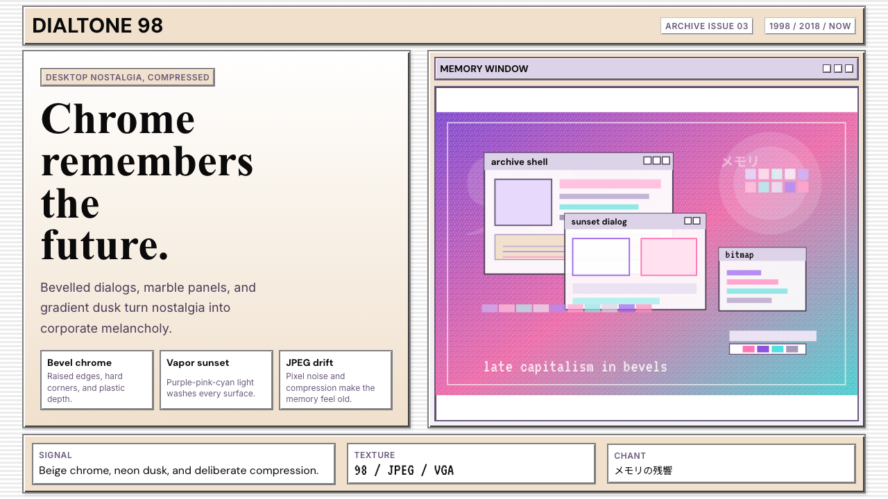 Windows 98 VaporwaveCorporate melancholy glows. Bevelled panels and purple-pink-cyan dusk do the…
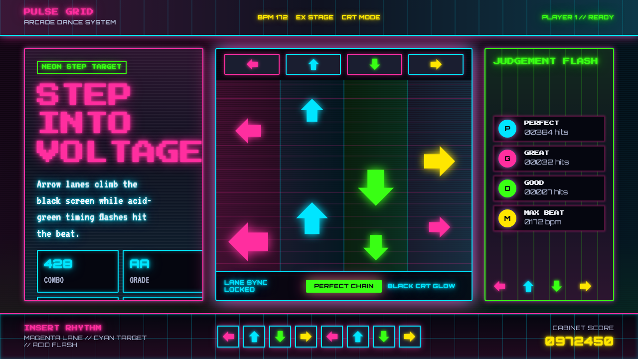 Dance Dance Revolution ArrowsPure arcade voltage. Magenta, cyan, and acid-green arrows climb a black CRT g…
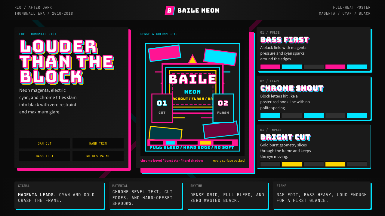 Funk Carioca FavelaMaximalist and unruly. Magenta, cyan, and chrome slam into black at thumbnail…
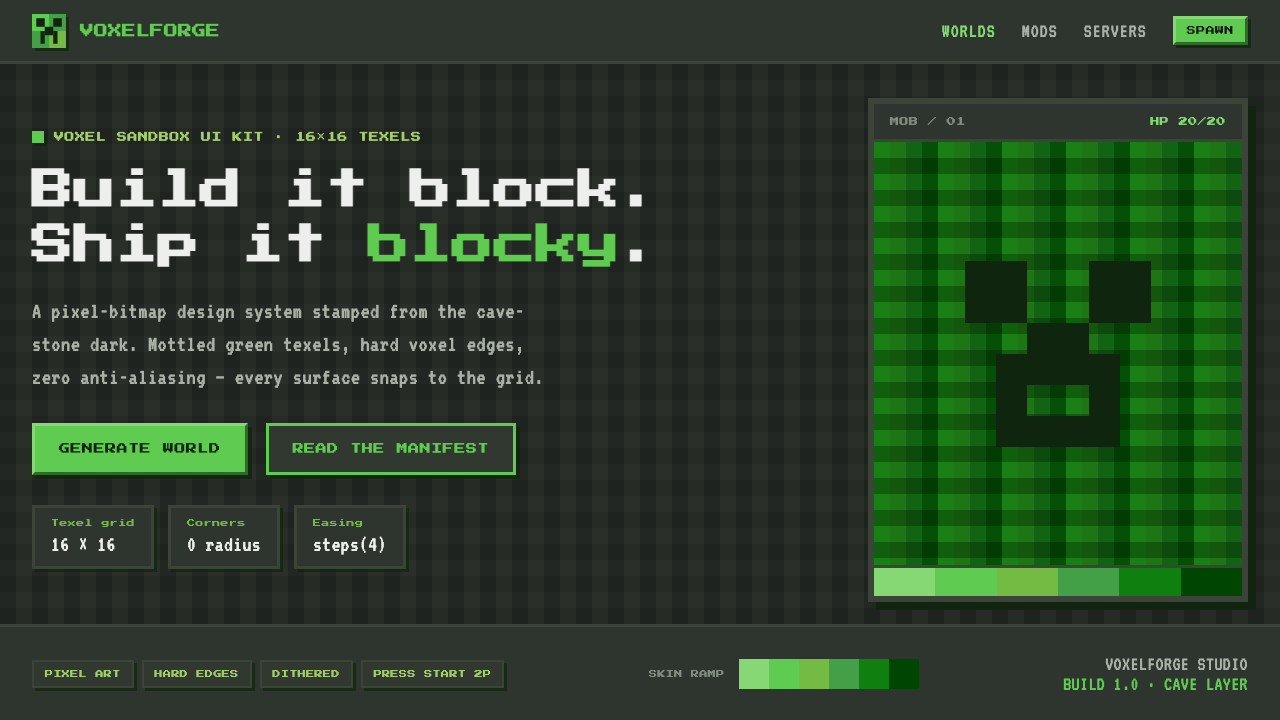 Minecraft CreeperBuild it blocky. Mottled lime texels on cave-stone gray, hard voxel edges, pe…
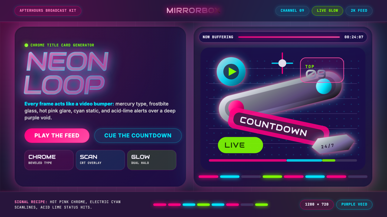 MTV Y2K (2000s)Maximum-volume Y2K. Hot pink chrome, cyan scanlines, and lime hits burn over…
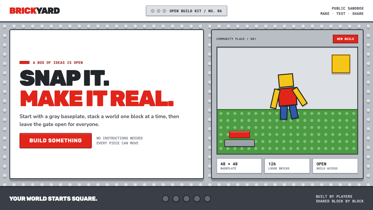 Roblox (2006)Play begins with a click. Fire-engine red cuts through a hard-edged gray stud…