What is Weird Twitter / Shitpost?
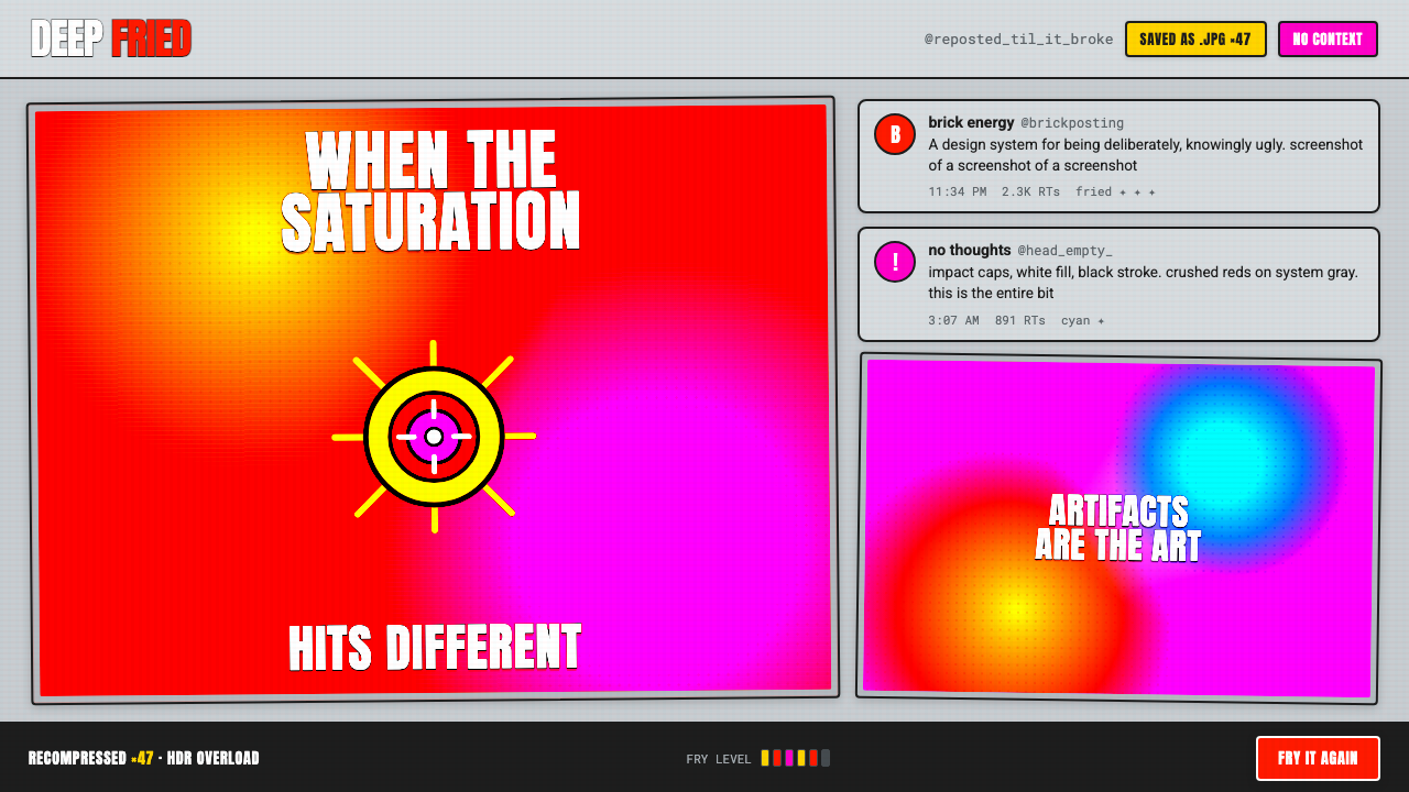
Weird Twitter / Shitpost makes degradation the punchline: a screenshot copied until it breaks, then captioned like it means everything.
Weird Twitter / Shitpost in brief
Weird Twitter / Shitpost is the deep-fried meme look associated with 2010s internet culture: overloaded reds, yellows, and magentas; JPEG damage blooming through repeated recompression; and all-caps Impact captions with white fill and a black outline. It does not seek polish, atmosphere, or visual comfort. Its force comes from pushing familiar image conventions past the point where they still behave normally.
The style is often a screenshot of a screenshot. A distorted image, a blunt caption, and the flat neutral gray associated with recycled Twitter or iMessage chrome combine into an object that feels forwarded, reposted, cropped, and already half ruined. The gray field matters because it keeps the image from becoming a clean poster. It tells the viewer that this is internet residue rather than a finished composition.
Its ugliness is deliberate and post-ironic. HDR overload is not an accidental technical failure to be corrected; it is the visual event. Compression artifacts, jagged edges, blown-out contrast, and mismatched screenshot fragments become evidence of circulation. The palette is not carefully harmonized in the conventional sense. It is driven until the image looks strained, loud, and unstable enough for the damage itself to carry the joke.
Where does Weird Twitter / Shitpost come from?
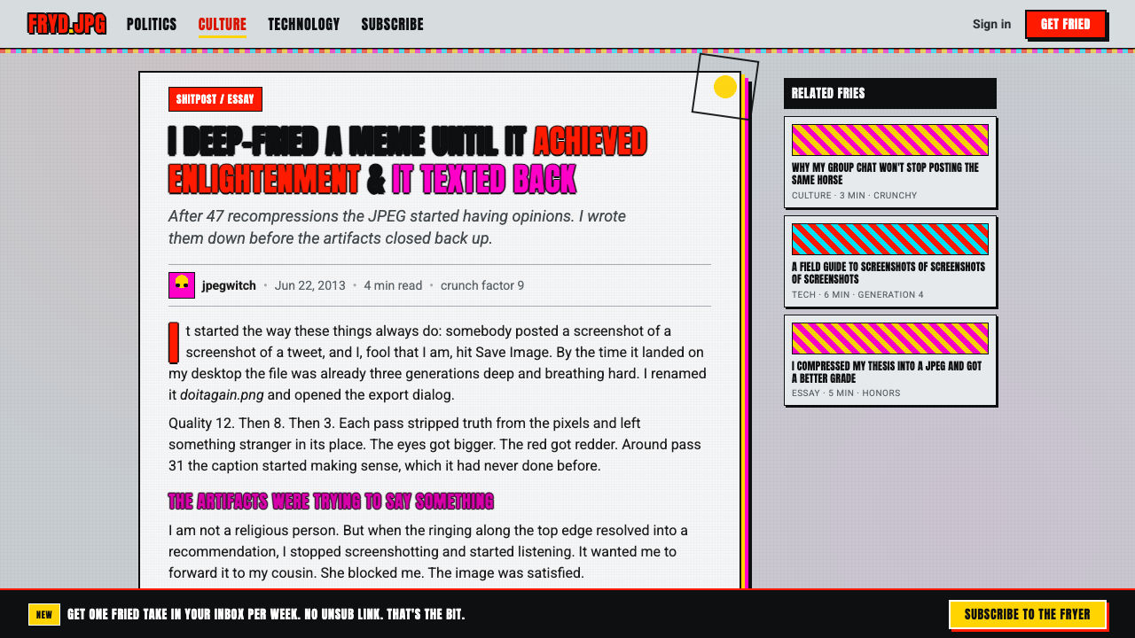
The style belongs to a global internet environment rather than a single school, studio, or named author. Its stated era runs from 2010 to the present, with deep-fried memes reaching a particularly visible peak around 2013 to 2017. Twitter, Tumblr, iFunny, and Reddit supplied the kinds of feeds where screenshots, reaction images, captions, and reposted fragments could circulate quickly and lose context just as quickly.
Deep-fried meme culture supplied the visual method. Rather than protecting an image from degradation, makers repeatedly recompressed and intensified it until artifacts became obvious: colors flare, contrast hardens, and image detail turns crunchy. This reversal is central. A convention normally treated as a defect becomes a deliberate sign that the image has been processed too much, shared too much, and pushed beyond ordinary legibility.
Weird Twitter gave that damaged visual language a social tone. The work is not simply loud or crude; it is post-ironic shitposting. The apparent seriousness of an emphatic all-caps caption can collide with a low-resolution image, a strange screenshot, or an already exhausted meme format. The humor lies in the mismatch between the forceful presentation and the intentionally flimsy, over-circulated material beneath it.
No individual designer can be separated from this aesthetic in the way a historical art movement can be tied to a founder. Anonymous shitposters, meme-fryer culture, iFunny uploaders, and KnowYourMeme archivists form the approved public cast around it. Their roles describe an ecosystem: images are made, intensified, uploaded, reposted, cataloged, and seen again as fragments. The style remains inseparable from that chain of circulation.
What defines the Weird Twitter / Shitpost look?
Compression as Texture
JPEG artifacts are not hidden. Repeated recompression makes edges brittle, fields uneven, and image information visibly crunchy. The result should read as an image that has survived too many transfers. Clean restoration works against the style because it removes the material evidence of digital circulation.
HDR Overload
Reds, yellows, and magentas are pushed toward visual overload rather than balanced into a refined palette. Brightness and contrast feel stressed, sometimes as if the image has been forced through an aggressive enhancement process. The color is loud because the image is meant to look processed, not naturally lit.
Impact Captions
All-caps Impact text appears in white with a black stroke, treating the caption as an unmistakable announcement rather than a subtle typographic layer. Its blunt, familiar meme presence gives even an absurd or contextless line the tone of an official declaration. The caption must remain immediately readable amid visual damage.
Screenshot Gray
The image sits on flat neutral gray borrowed from recycled Twitter and iMessage chrome, not on clean editorial white. This ground establishes a screenshot context before the viewer reads the content. It makes the composition feel captured from a feed or a message thread, then copied into another location without being cleaned up.
Post-Ironic Collision
The style combines emphatic presentation with content that may be strange, disposable, or knowingly low-status. A huge caption and overloaded image treatment refuse the polite hierarchy of conventional design. Nothing is refined into seriousness, yet everything is presented with too much force for the material to support.
Deliberate Ugliness
Ugly is not shorthand for careless. The distortion is purposeful: degradation, overexposure, clashing intensity, and recycled interface fragments are selected because they make the image feel internet-native. The visual system succeeds when its wrongness feels intentional and when the artifact is more expressive than a clean version could be.
Who shaped Weird Twitter / Shitpost?
Anonymous shitposters are the essential authorship model for Weird Twitter / Shitpost. The aesthetic is defined less by individual ownership than by rapid, context-poor circulation. Their unsigned images turn blunt captions, damaged screenshots, and visual escalation into a shared language whose authority comes from repetition rather than attribution.
Meme-fryer culture names the practice of pushing an already existing image through more visual processing until its artifacts become conspicuous. It established the logic that repeated compression and HDR overload could function as expressive content. The fryer is not merely editing an image; it is making overprocessing visible as the image's subject.
KnowYourMeme archivists represent the archival side of a style built from unstable reposts. In a culture where screenshots and captions are detached from their original setting, archiving gives names and continuity to forms that might otherwise appear only as disposable fragments. Their presence underscores that shitposting has histories even when it performs immediacy.
iFunny uploaders belong to the platform-level distribution layer of the aesthetic. Uploading and reposting turn the meme into a portable object, ready to be recaptured, recompressed, and detached again. That process matters visually: the image's worn, copied character is inseparable from the conditions under which it travels.
How do you use Weird Twitter / Shitpost today?
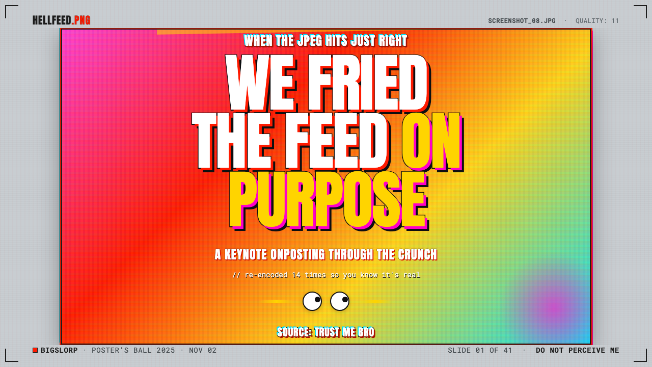
For presentation slides, use the style when the subject genuinely benefits from internet-native satire, media commentary, or a knowingly unruly voice. A cover can stage one degraded image against screenshot gray, with an all-caps Impact title acting as the blunt opening gesture. Avoid treating the cover as a polished brand poster; its credibility comes from looking captured and reposted.
Content and data slides need more restraint than a meme feed. Keep the screenshot-gray context, one crunchy image or caption fragment, and a clear line of readable explanation. Data can be framed as a deliberately overdramatic reaction rather than disguised as serious visual analysis: the surrounding meme treatment signals tone, while the data itself must remain legible enough to support the point.
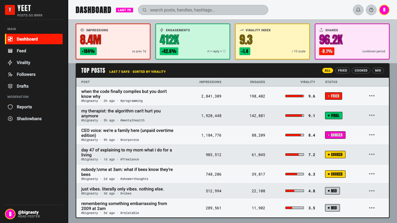
For web interfaces, the aesthetic works best as a campaign layer, editorial feature, temporary dashboard state, or playful pricing-page moment rather than as the default shell for a complex product. Screenshot fragments can mark sections, all-caps captions can announce a surprising state, and controlled artifact texture can create a feed-like atmosphere. Navigation, forms, and essential actions should stay clearer than the joke around them.
For editorial and marketing work, Weird Twitter / Shitpost is useful when a brand is speaking directly about internet culture, repost behavior, absurdity, or collective online exhaustion. Build the page around a few forceful image-caption collisions rather than making every element equally fried. The flat gray ground can connect sections as if they were pulled from the same stream of messages and reposts.
The common mistake is to imitate only loud color and call the result a shitpost. Without screenshot context, visible degradation, Impact-caption bluntness, and post-ironic mismatch, oversaturation simply looks uncontrolled. The opposite mistake is making the artifact so damaged that the caption, message, or action disappears. The image should look broken on purpose, while the joke and the intended reading path still survive.
Weird Twitter / Shitpost — FAQ
Is Weird Twitter / Shitpost the same as every internet meme?
No. It is a particular visual and tonal approach within internet meme culture. Its recognizable markers are deep-fried image treatment, overloaded reds, yellows, and magentas, visible JPEG artifacts, all-caps Impact captions, screenshot-gray surroundings, and post-ironic intent. A meme can be clean, illustrative, restrained, or platform-native in another way without belonging to this look.
Why is the neutral gray background so important?
Because it establishes that the image is a reused interface artifact rather than a self-contained poster. The gray recalls Twitter and iMessage chrome and makes the work feel captured from an existing conversation or feed. Without that surrounding screenshot logic, the same distorted image can read as generic loud graphic design rather than as a broken, reposted internet object.
Should the image be degraded until it becomes unreadable?
No. The degradation is expressive, but the effect still depends on recognition. Viewers should be able to perceive that the image has been pushed too far, read the Impact caption, and understand the broad source situation or reaction. If every signal is lost, the work becomes accidental-looking noise instead of deliberate deep-fried meme language.
Can this style work for a serious product or institution?
It can, but usually as a contained voice rather than an institution-wide system. It is effective for a campaign, an editorial feature, a social response, or a moment that comments on online culture. It is less suitable for essential workflows that require calm trust and sustained clarity. The style's intentional ugliness is strongest when the audience understands why the product is temporarily breaking its own polish.
Related design styles
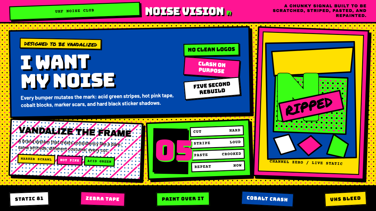 MTV Launch Identity (1981)Built to be vandalized. Hot pink, acid green, Bungee blocks, and crooked stic…
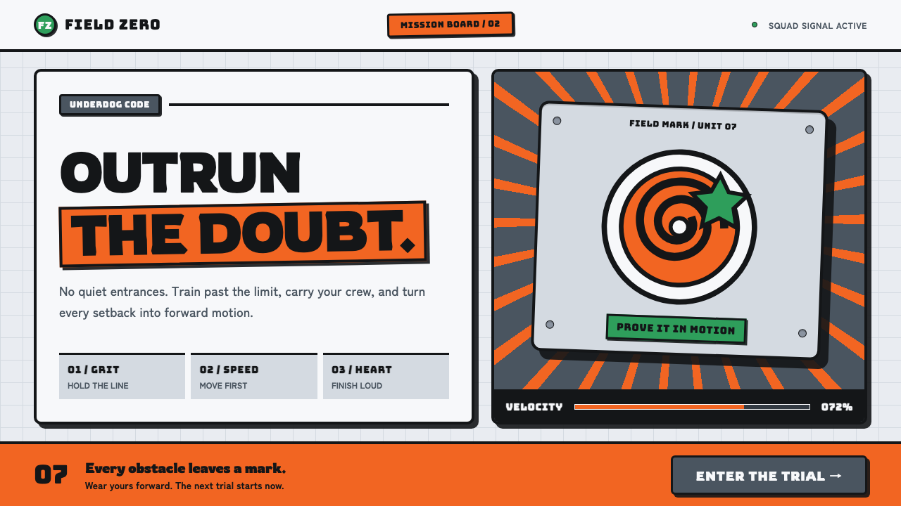 Naruto (2002 anime era)Underdog energy refuses the background. Hazard orange strikes steel-gray grid…
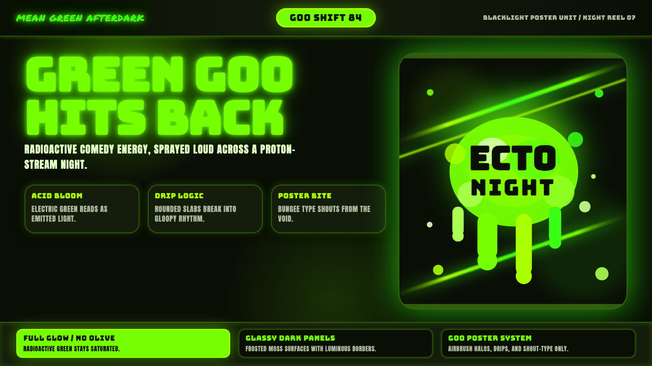 Slimer Ghostbusters GreenBlacklight goo shouts. Ecto-green Bungee type, drips, and proton streaks hit…
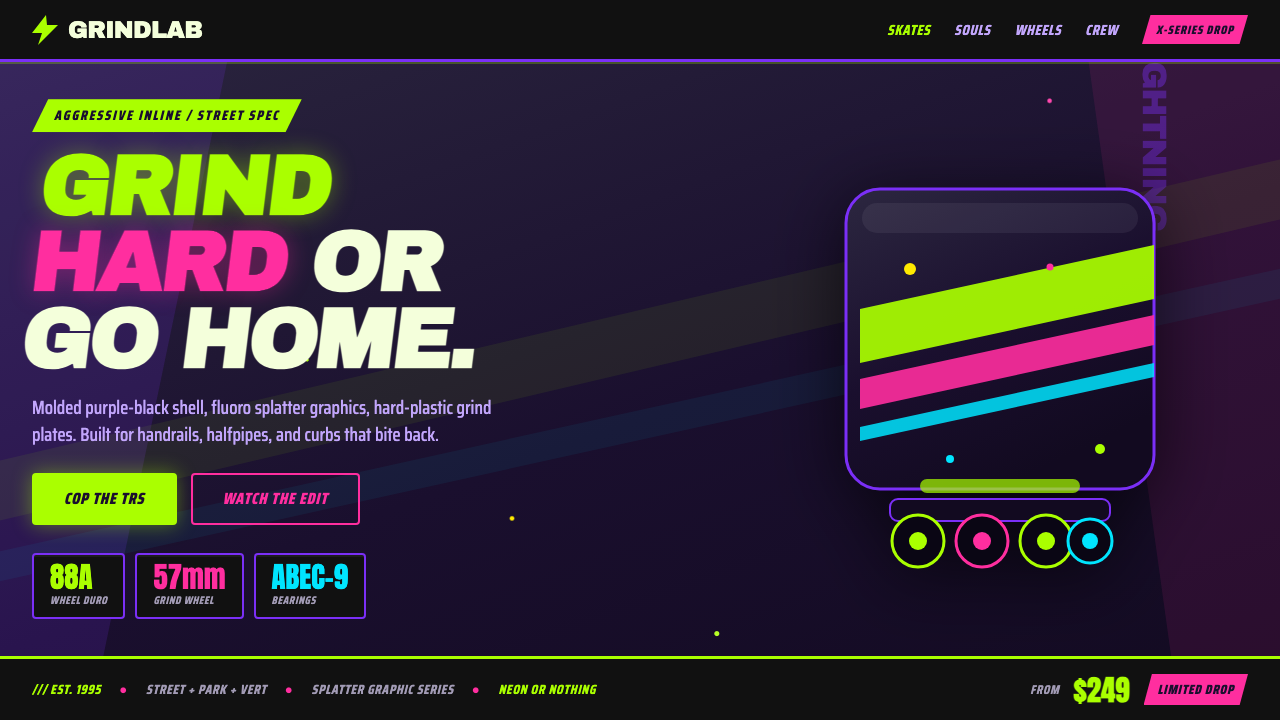 90s Aggressive Inline SkateX-Games attitude in plastic and paint. Fluoro lime and magenta slash across m…
 Acid House Smiley (1988)Rave energy hits first. Acid yellow on black, Anton caps, smiley glow.
 Ant Farm InflatablesTemporary architecture glows. Vinyl-blue domes swell over dark desert teal.