What is Synoptic Weather Chart?
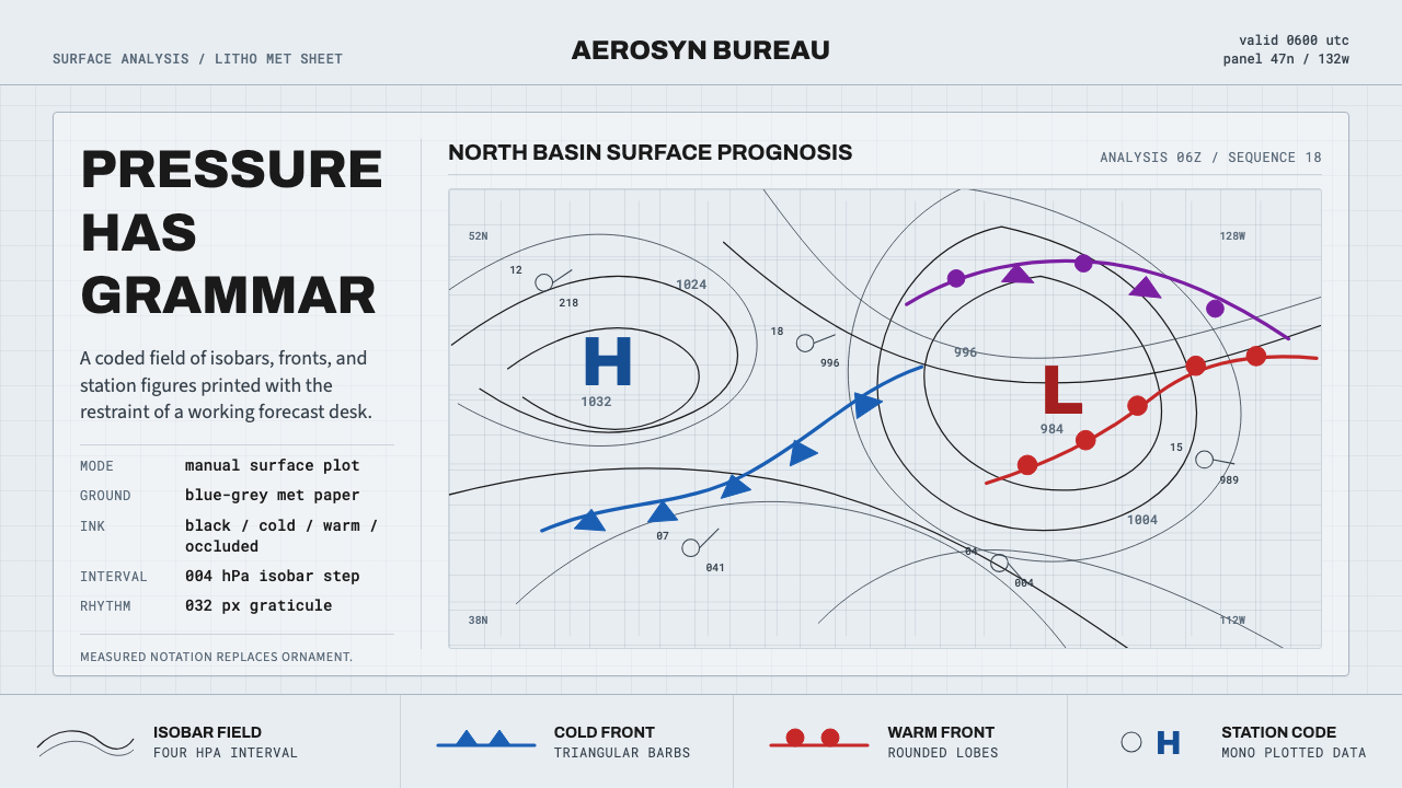
Every mark on a surface synoptic weather chart means something specific — nothing is decorative, and that discipline is exactly what makes it such a striking design language.
Synoptic Weather Chart in brief
Synoptic Weather Chart is a design system built from the standardized graphic language meteorologists used to chart the atmosphere from roughly the 1950s through the 1990s: a cool blue-grey printed ground, thin black isobars — lines connecting points of equal atmospheric pressure — winding in concentric curves around bold H and L pressure centers, overprinted with barbed blue cold fronts and rounded red warm fronts.
What sets this style apart from other technical or scientific aesthetics is that it is not merely inspired by data visualization — it is an actual coded notation system. Every symbol on a synoptic chart is standardized internationally: the spacing of isobars indicates wind strength, the shape and color of a front symbol indicates its type and direction of movement, and station data plotted at each observation point follows a fixed positional grammar. Nothing is arbitrary, and nothing exists purely for visual interest.
This gives the style a very particular kind of authority. Where many design systems borrow the surface appearance of precision without the underlying rigor, a genuine synoptic-chart-derived design carries the implicit promise that every mark is legible to someone trained to read it — an aesthetic of competence rather than decoration, well suited to any product that wants to feel authoritative, technical, and quietly confident rather than flashy.

Where does Synoptic Weather Chart come from?
The modern synoptic chart's intellectual foundation was laid by the Bergen School of Meteorology, a group of Norwegian scientists working in the coastal city of Bergen in the years following the First World War. The school's central figures — Vilhelm Bjerknes, his son Jacob Bjerknes, and their colleague Tor Bergeron — developed what became known as frontal theory: the idea that weather is driven primarily by the collision of large air masses with distinct temperature and humidity characteristics, and that the boundaries between these air masses, which they termed 'fronts' in a deliberate echo of the war then raging across Europe, could be tracked, mapped, and used to predict weather changes with far greater precision than existing methods allowed.
Vilhelm Bjerknes, who had already made foundational contributions to fluid dynamics and its application to atmospheric science before the war, established the Bergen Geophysical Institute in 1917 with support from the Norwegian government, motivated partly by wartime food security concerns that made accurate agricultural weather forecasting a matter of national importance. His son Jacob, still in his early twenties, published the key 1919 paper describing the structure of a cyclone in terms of warm and cold fronts, work that would reshape meteorological practice worldwide within a generation. Tor Bergeron later extended this into a full theory of frontal classification and the precipitation processes associated with different front types.
The visual notation that accompanied this science — the specific symbols for warm fronts (a line of solid red semicircles), cold fronts (a line of solid blue triangular barbs), and occluded fronts, along with the convention of labeling pressure centers with bold H (high) and L (low) letters and connecting equal-pressure points with isobars — was gradually standardized through the twentieth century by national meteorological services and international bodies, eventually converging on the conventions codified by the World Meteorological Organization, a United Nations agency established in 1950 to coordinate meteorological practice and data-sharing across national boundaries.
By the mid-twentieth century, these charts were produced daily by meteorological offices worldwide, printed on distinctive light blue-grey stock chosen for legibility under the fluorescent lighting of forecasting offices and for how it made hand-drawn black isobars and colored front symbols stand out clearly. This litho-print convention — precise, standardized, unglamorous by design — remained the dominant format for surface weather analysis for roughly four decades before digital displays gradually replaced printed charts in most professional forecasting contexts, though the visual grammar itself remains instantly recognizable and still appears in television weather broadcasts and public-facing forecast graphics today.
What defines the Synoptic Weather Chart look?
Met Paper Ground
The base is a cool, light blue-grey — the exact tone of the printed stock forecasting offices used, chosen for legibility under fluorescent office lighting. This ground should never shift toward warm neutrals; its coolness is what makes the black isobars and colored fronts read with such clarity.
Isobars
Thin black lines connect points of equal pressure, forming concentric, roughly oval curves around each pressure center. Their spacing carries real meaning — tightly packed isobars indicate strong wind, widely spaced ones indicate calm conditions — so line weight should stay uniformly thin and consistent, letting spacing rather than thickness carry the information.
Pressure Centers (H/L)
Bold capital H and L letters mark high- and low-pressure centers, set in a heavy, no-nonsense grotesque typeface at a size that dominates the surrounding isobar pattern. These letters are the loudest single element on the chart and should remain so — they are the anchor points around which everything else is organized.
Cold Fronts
Rendered as a solid blue line studded with triangular barbs pointing in the direction of movement. The barbs should be sharp, evenly spaced, and unmistakably geometric — never softened or rounded, since the sharpness itself signals the abrupt, aggressive character of a cold front's arrival.
Warm Fronts
Rendered as a solid red line studded with evenly spaced semicircular bumps, again pointing in the direction of movement. The rounded, gentler shape of the warm-front symbol against the sharp cold-front barbs is a deliberate contrast built into the notation itself, and this distinction should always be preserved clearly.
Station Data Typography
Numerical observations plotted at each station point — temperature, pressure, wind — use a monospace or fixed-width typeface, arranged in a fixed positional pattern around a small station circle. This typographic discipline signals that every number occupies a meaningful, standardized position rather than being placed for visual balance.
Restraint and Legibility
Beyond the fixed vocabulary of isobars, fronts, and station data, the chart contains no additional ornament — no decorative borders, no illustrative flourishes, no color used purely for visual variety. Every mark that appears must be traceable to a specific, standardized meaning; this restraint is the source of the style's authority.

Who shaped Synoptic Weather Chart?
A Norwegian physicist and meteorologist who applied fluid dynamics to atmospheric science and founded the Bergen Geophysical Institute in 1917. His theoretical framework for treating the atmosphere as a fluid system governed by physical laws laid the groundwork for the frontal theory his son and colleagues would develop, and for the standardized charting practices that followed.
Working alongside his father at the Bergen Geophysical Institute, Jacob Bjerknes published the seminal 1919 paper describing cyclone structure in terms of warm and cold fronts while still in his early twenties. This model of frontal cyclones became the theoretical basis for the visual notation — front symbols, pressure centers, isobars — that defines the modern synoptic chart.
A member of the Bergen School who extended frontal theory into a comprehensive classification of front types and their associated precipitation processes. His work helped standardize the symbolic vocabulary of front notation that meteorological services worldwide would eventually adopt as a shared visual language.
Established in 1950 as a specialized agency of the United Nations, the WMO codified and coordinated the international standards for synoptic charting, ensuring that a front symbol, pressure notation, or station data format meant the same thing regardless of which country's meteorological service produced the chart.
How do you use Synoptic Weather Chart today?
On presentation slide covers, the style delivers immediate technical credibility: a cool blue-grey field, a single bold H or L pressure-center mark anchoring one corner, and the title set in a heavy, no-nonsense grotesque typeface reading like a chart header. Content slides should treat data the way a synoptic chart treats a front — every visual element assigned a specific, legible meaning rather than existing for texture, with isobar-like concentric lines available as an organizing motif for background structure rather than as decoration.
For web interfaces, this style is a natural fit for dashboards and analytical tools where the product's entire value proposition is precision and legibility — financial data, scientific tools, logistics and monitoring platforms. Numerical data displays should borrow the monospace station-data convention directly; status indicators can borrow the sharp-versus-rounded contrast between cold- and warm-front symbols to distinguish alert types at a glance without needing additional color coding.
In pricing pages, isobar-like concentric lines can be used sparingly as a background texture that reads as technical rather than decorative, with pressure-center-style bold lettering reserved for the most important price point or recommended tier, echoing how an H or L mark draws the eye first on an actual chart.
For editorial and marketing content about precision, forecasting, data, or scientific authority, the style supports a restrained, confident tone — full-bleed sections built from a cool blue-grey ground with thin black structural lines and a single red or blue accent used exactly as a front symbol would be used: to mark one meaningful boundary or transition in the content, not for general decoration.
The most common mistake is treating the palette (blue-grey, black, red, blue) as decorative and applying it without the underlying discipline — using front-symbol-like marks purely for visual interest rather than to signal something specific, or filling large areas with dense isobar-like lines simply because they look technical. Authentic synoptic-chart-derived work always keeps every symbol legible and purposeful; a second common error is warming up the base ground color, which undermines the cool, clinical met-paper feel that anchors the entire system.

Synoptic Weather Chart — FAQ
Is the H/L notation the same in every country's weather charts?
The core convention of marking high pressure with H and low pressure with L, along with the basic front symbols, was standardized internationally through the World Meteorological Organization, so it reads consistently across most national meteorological services. Some countries historically used local-language abbreviations instead — for instance French-language services sometimes used A and D — but the English H/L convention is the one most widely recognized and the one this design system draws from.
Why does the ground color matter so much — wouldn't white work just as well?
The specific cool blue-grey tone is not arbitrary; it was the actual printed stock chosen by forecasting offices because it held up well under fluorescent lighting and made hand-drawn black lines and colored symbols stand out with maximum clarity. A pure white ground reads as generic office paper rather than specialized meteorological stock, and loses the slightly cool, clinical character that gives the style its specific identity.
Can this style be used for content that has nothing to do with weather?
Yes — its underlying value is the aesthetic of coded precision itself, which transfers well to any domain built on legible, standardized data: finance, logistics, scientific instrumentation, or engineering tools. The weather-specific symbols (fronts, H/L) can be reinterpreted as generic markers for boundaries and extremes in whatever data the product actually displays, as long as the same discipline of 'every mark means something' is preserved.
How thin should the isobars be relative to other lines in the composition?
Isobars should be noticeably thinner than the bold H/L lettering and thinner than front-symbol lines, since their meaning is carried by spacing pattern rather than by weight. If isobars are drawn too thick, they compete visually with the pressure-center markings and front symbols that should dominate the hierarchy, flattening the chart's built-in sense of what matters most.
What is the practical difference between how cold fronts and warm fronts should be drawn?
Cold fronts use sharp, evenly spaced triangular barbs on a solid blue line, signaling the fast, aggressive advance of cold air. Warm fronts use rounded, evenly spaced semicircular bumps on a solid red line, signaling the slower, gentler advance of warm air. Preserving the sharp-versus-rounded distinction is essential — softening a cold front's barbs into curves, or sharpening a warm front's bumps into points, erases the very contrast the notation was designed to communicate.
Related design styles
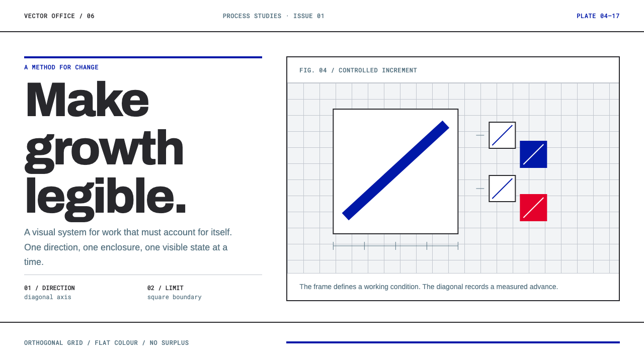 Anton Stankowski ConstructiveProcess becomes visible. Flat blue diagonals and hard square rules make chang…
 Doctor's Clinical Lab CoatSterile by design. Cool clinical white, teal signals, and seam-line grids enf…
 Frutiger CDG AirportLegibility at runway scale. Navy panels, white humanist sans, arrow-led grids.
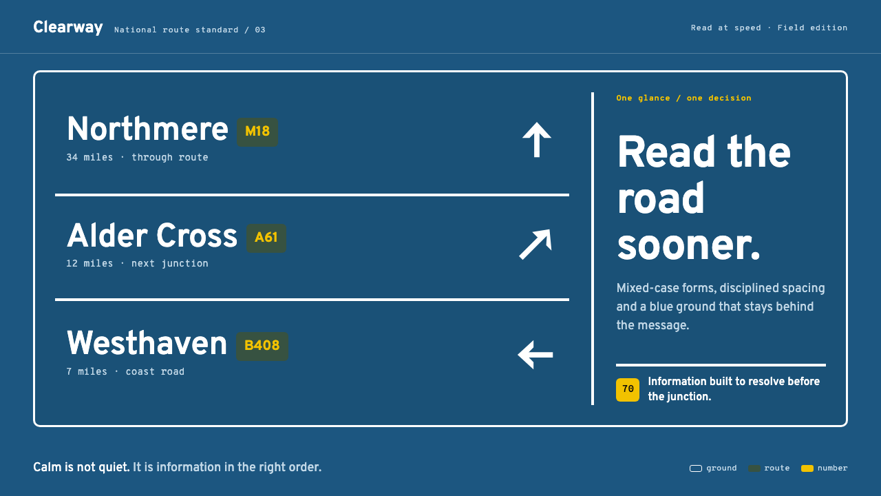 Transport UK Road SignsClarity at seventy. White mixed-case lettering advances across recessive moto…
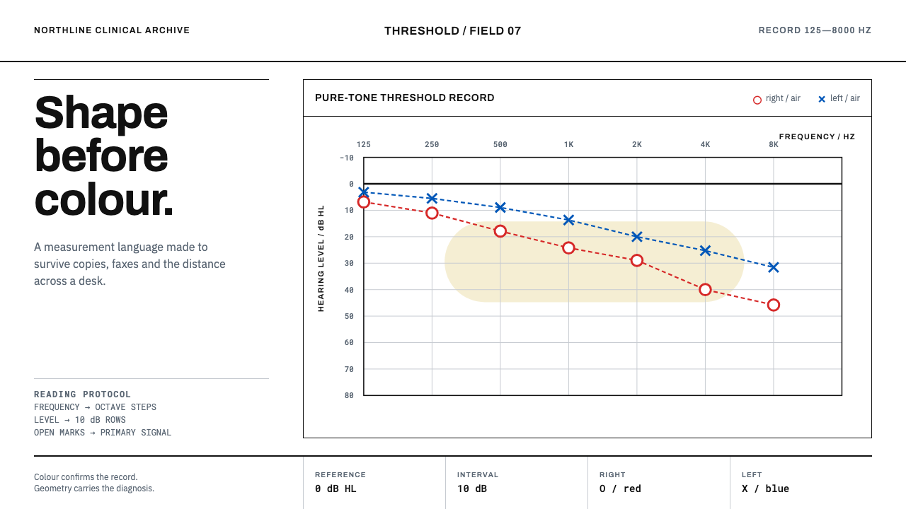 Audiogram ChartShape carries the diagnosis. Open red and blue marks cross a disciplined clin…
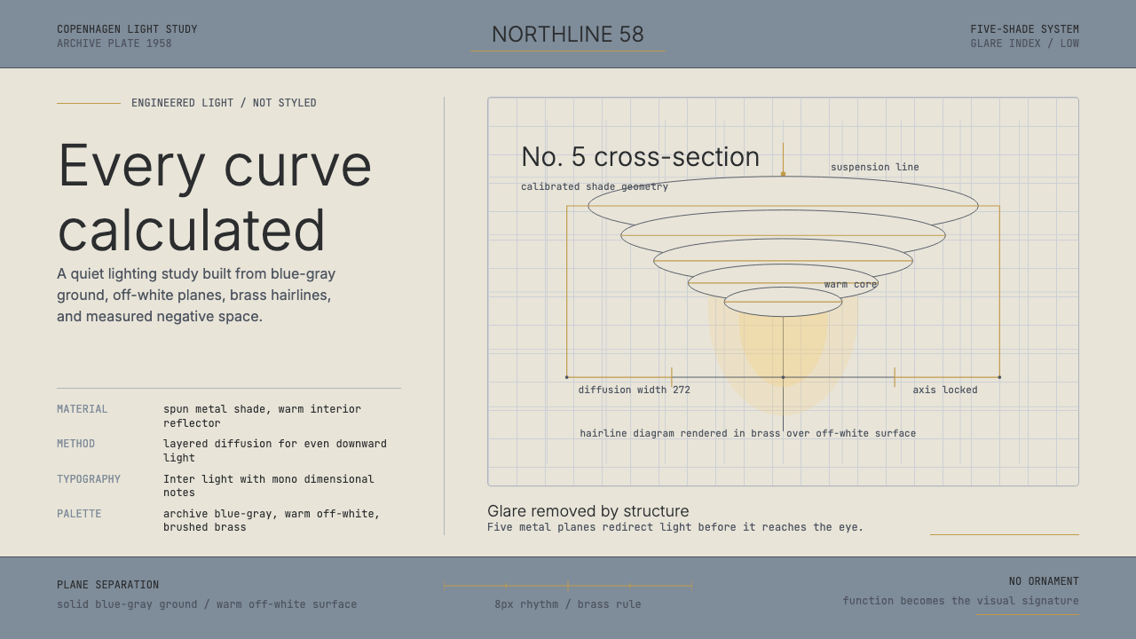 Danish PH5 Louis Poulsen (1958)Engineered, not styled. Blue-gray ground, brass hairlines, and a precise shad…