What is WarioWare?
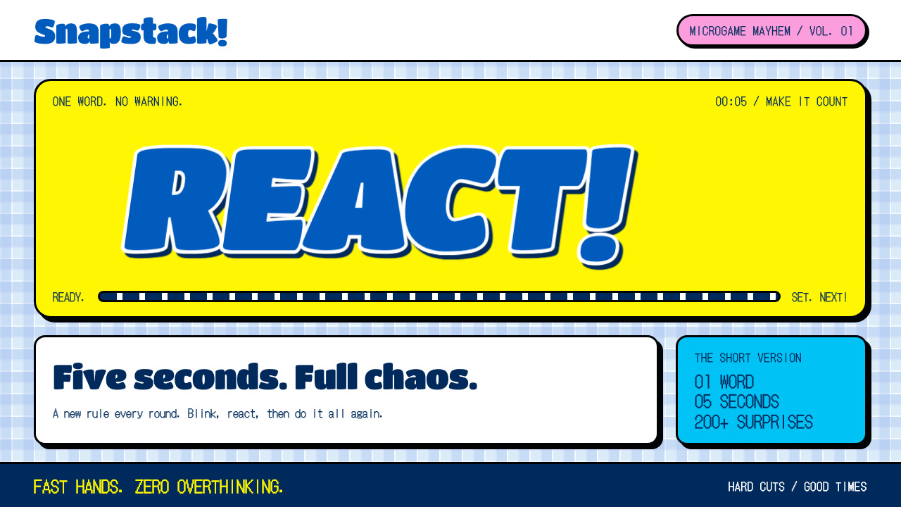
WarioWare turned a five-second game into a design language: loud commands, black-outlined yellow, and a fake desktop that never lets you sit still.
WarioWare in brief
WarioWare is the visual identity of WarioWare, Inc.: Mega Microgame$!, a Game Boy Advance title released in 2003 that packed more than two hundred tiny games into a single cartridge. Each game lasts about five seconds. A single shouted word appears on screen, a bomb fuse starts burning down, and when it runs out the game cuts hard to the next one, which is drawn in an entirely different style.
As a design style, it translates that tempo into an interface. The ground is a pale-blue gingham desktop, the kind of tablecloth pattern that reads as friendly and slightly childish, scattered with folder icons and bounded by a navy news ticker along the bottom. On top of that calm, checkered surface sit the loud elements: fat yellow buttons with heavy black outlines, sunburst rays in saturated colors, and chunky italic command words that look like they are being yelled rather than set.
What makes it distinctive is the deliberate collision. Quiet gingham meets aggressive yellow; a tidy mock operating system meets scrawled, collage-like illustration. Menus and scoreboards fall back on the blocky bitmap lettering of the handheld itself, so the page feels like a real game screen that has been stretched into a desktop. It is a style for speed, noise and play, and it is happiest when nothing on the page stays calm for long.

Where does WarioWare come from?
WarioWare, Inc.: Mega Microgame$! came out in Japan in March 2003 and in North America in May 2003, as part of Nintendo's long habit of using its handheld hardware for odd, experimental software. It was created in Kyoto, where Nintendo is based, and the source material lists Yoshio Sakamoto, Goro Abe and Ko Takeuchi among its key figures. The game was built around a simple provocation: what if a video game were stripped down until it contained only a single verb and a few seconds of time to act on it?
That premise dictated the look. A five-second game has no room for a tutorial, a title card or an elaborate scene. The designers solved this by making the instruction itself the main graphic. One word, shouted in heavy italic type, tells the player everything: dodge, grab, pick. The bomb fuse that burns beneath it is a timer, a visual rhythm and a joke at once. Because each microgame is so short, every one can afford to be drawn differently, and the game became famous for jumping between hand-drawn doodles, photographic collage and old-school pixel art within a single minute of play.
The framing device is a mock computer. The selection screens are dressed as a pale-blue gingham desktop with folder icons and a news ticker, a joke about the office-software world that the cheeky character Wario supposedly runs his game studio from. That choice places the game in a recognizable early-2000s tradition of mock-desktop interfaces, where a playful product pretends to be a piece of ordinary software. The gingham, with its association with picnics and school uniforms, softens the idea and keeps the whole thing feeling homemade rather than corporate.
Three currents feed the style, according to the source material: Nintendo's experimental handheld design, Japanese pop collage and doodle art, and the mock-desktop interfaces of the early 2000s. The first gives it a willingness to break rules about what a game screen should look like. The second gives it the scrappy, cut-and-paste energy of cartoon notebooks and zine pages. The third gives it structure, a tidy grid of icons and bars to rebel against. Together they produced a visual language that is easy to recognize and surprisingly hard to imitate without tipping into plain chaos.
What defines the WarioWare look?
Gingham ground
The page background is a pale-blue gingham, soft and low in contrast, like a picnic cloth. It plays the role of a calm desktop wallpaper. Because the pattern is so gentle, it gives the loud foreground elements something to bounce off, and it keeps the whole composition from tipping into visual noise.
Black-outlined yellow
Buttons and call-outs are a fat, saturated yellow with a heavy black outline, so they read like cut-out stickers or cartoon labels. The outline is not optional: it is what lets the yellow stay legible against any background, and it gives every control the same blunt, confident silhouette.
Chunky italic commands
Headings and command words use a round, heavy, slanted letterform that looks as if it is being shouted. Short imperatives work best, a single verb at a time. The slant adds forward motion, so even a static title seems to lean into the next screen.
Radiating sunbursts
Behind the key moments sit rays of saturated color fanning out from a point, in vivid hues such as magenta, cyan and the full rainbow. They add instant spectacle and direct the eye to the center of the action, in the same way a game announces a big moment with a flash.
Mock-desktop furniture
Folder icons, a navy ticker bar and window-like panels furnish the page. They give the layout a recognizable, slightly ironic software frame. The ticker in particular supplies a constant stripe of dark color that anchors the bottom edge and gives you a place for scores, countdowns or news.
Handheld bitmap type
Menus, scores and small labels are set in a blocky bitmap face borrowed from the Game Boy Advance itself. This pairing, loud italic for commands and rigid pixel lettering for data, tells the reader which text is a shout and which is a readout without any extra explanation.

Who shaped WarioWare?
Sakamoto is listed first among the key figures behind the game. He is a Nintendo veteran from the company's Kyoto development studios, and his name is closely tied to the idea of building a whole game out of tiny, instantly readable moments.
Abe is another of the key figures associated with the project. The microgame format depends on tight, disciplined direction, because every five-second scene has to communicate its rule, its stakes and its joke without a single wasted moment.
Takeuchi appears in the source material as a key figure of the same Kyoto team. Along with his colleagues, he belongs to the handheld-design tradition that treats limited hardware as a prompt for invention rather than a restriction.
How do you use WarioWare today?
On slides, the WarioWare style suits a cover that needs to announce itself. Use the gingham ground as the full-bleed background, set a single imperative word in chunky italic, and let a black-outlined yellow badge carry the date or the speaker. For content slides, keep the gingham quiet and give each slide one loud element, such as a sunburst behind a key number, instead of scattering them everywhere. It works well for team kickoffs, hackathon demos, internal celebrations and any deck where a playful tone is the point rather than a risk.
On data slides, restraint matters more than it might seem. Charts can sit on a plain, light panel with a heavy black outline, and the bitmap face can label axes and values, which keeps readouts crisp. Reserve the loud yellow for the one series or figure you want the audience to remember. The navy ticker bar is a natural home for a running total, a countdown or a single takeaway line.
For web interfaces, the style fits campaign pages, mini-games, quizzes, countdowns and event microsites far better than it fits a dense dashboard. A pricing page can use fat yellow buttons with black outlines as clear, unmissable calls to action, with the gingham background kept gentle behind the cards. Use the mock-desktop furniture, folders and a footer ticker, to organize sections in a way that feels like exploring a toy operating system. Keep hover and press states snappy and exaggerated, since the whole language is built on immediate feedback.
In editorial and marketing work, think of each section as a new microgame. Newsletters, launch announcements and social posts can change illustration style from block to block, a doodle here, a photographic cut-out there, as long as the frame stays consistent: gingham, black outlines, italic commands. A single shouted verb as a headline almost always beats a descriptive sentence in this style.
The most common mistake is to use every loud ingredient at once. If the sunbursts, the yellow, the italic and the ticker all compete for the same screen, the gingham stops working as a calm counterweight and the page simply becomes tiring. Pick one star per screen and let the rest stay quiet. The second mistake is to drop the black outline, which turns the yellow into a flat, washed-out patch and loses the sticker-like punch that defines the look.

WarioWare — FAQ
What is the WarioWare design style?
It is the look of the 2003 Game Boy Advance game WarioWare, Inc.: Mega Microgame$!, turned into a user-interface style. Its main ingredients are a pale-blue gingham desktop, fat yellow buttons with heavy black outlines, rainbow sunbursts, chunky italic command words and bitmap type for scores and menus. The overall effect is fast, loud and playful.
Why is the background gingham?
The gingham plays the part of a friendly, slightly childish desktop wallpaper in the game's mock-computer menus. Its low contrast gives the loud foreground elements a calm surface to stand against. Without it the black-outlined yellow and the sunbursts would have nothing to push against and the screen would feel crowded.
Is it suitable for serious or corporate products?
Usually not as a whole. The style is built around speed, humor and exaggeration, which suits events, games, quizzes, countdowns and playful campaigns. If you want a touch of it in a more serious product, borrow one idea, such as the outlined yellow call-to-action or the ticker bar, and keep the rest of the interface calm.
How is it different from other retro pixel styles?
Pixel lettering is only one ingredient here. Most retro pixel styles commit to a single consistent grid of tiny squares throughout. WarioWare mixes pixel text with fat cartoon outlines, doodle collage, sunbursts and a gingham desktop, and it is happy to change illustration style from one moment to the next. The energy comes from the contrast and the abrupt cuts, not from one unified retro surface.
Related design styles
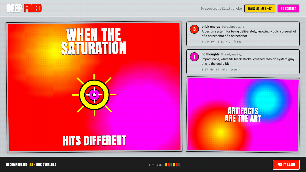 Weird Twitter / ShitpostGloriously ugly on purpose. Blown-out HDR reds and white-stroke Impact caps o…
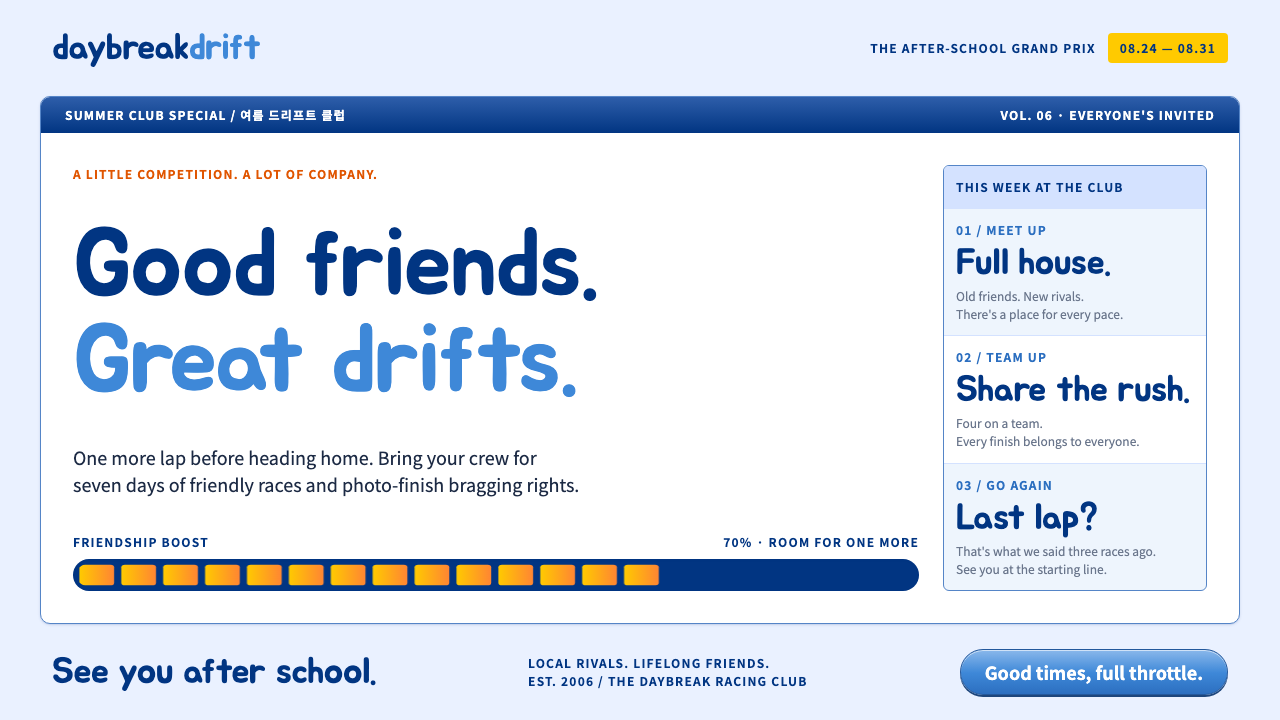 KartRiderCheerful, full-throttle nostalgia. Rounded Jua, blue panel frames and yellow…
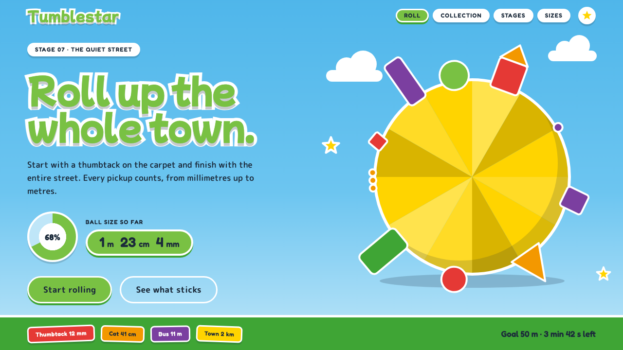 Katamari DamacySmall to huge in one roll. Cyan sky, green lettering ringed in white, one fac…
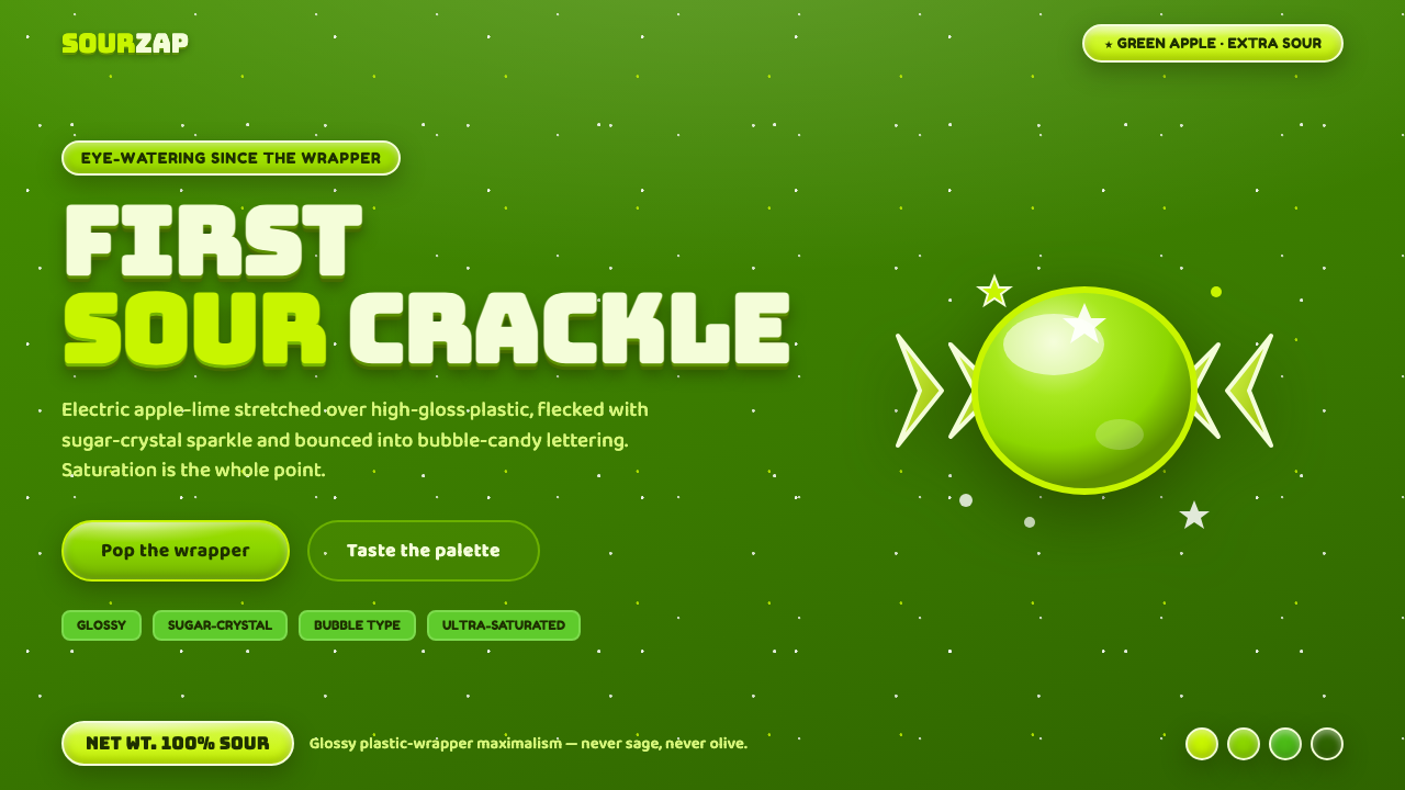 Sour Apple Candy GreenSaturation is the point. Electric apple-green on glossy plastic, sugar-crysta…
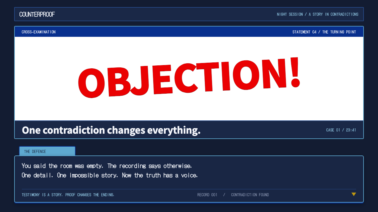 Ace AttorneyQuiet testimony. One red shout breaks the navy calm, with bitmap dialogue bel…
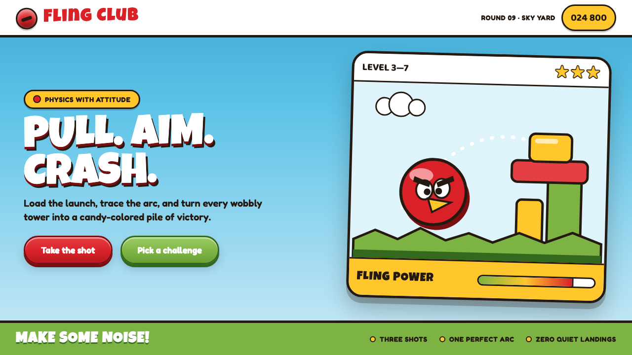 Angry Birds (2009)Adorable aggression takes flight. Candy primaries, chunky outlines, and a dot…