What is Sour Apple Candy Green?
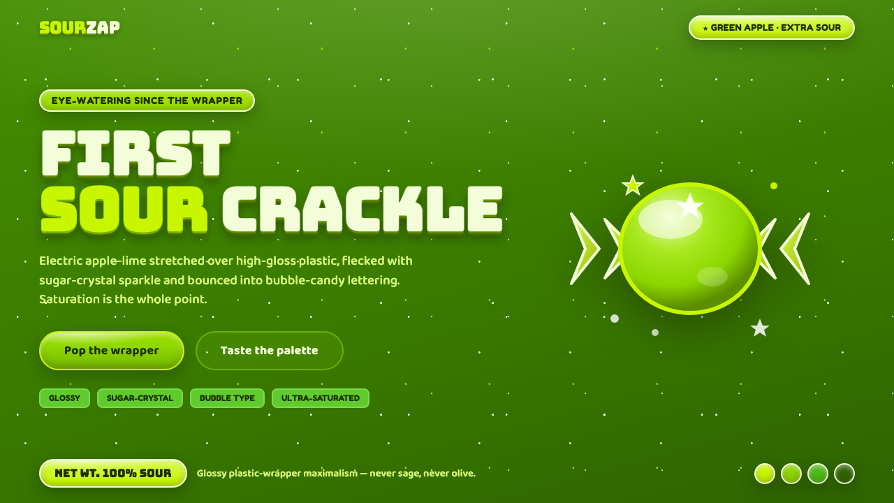
Sour Apple Candy Green turns design into a sugar rush — electric apple-lime saturation, glossy wrapper shine, crystal sparkle, and bubble lettering that looks ready to burst.
Sour Apple Candy Green in brief
Sour Apple Candy Green bottles the eye-watering punch of 1990s–2000s American sour-candy wrappers. Its visual lineage runs through the Jolly Rancher green-apple hard-candy tradition and the Sour Patch Kids world of bright, playful confectionery. The result is not a quiet green identity but a deliberately loud flavor signal.
The central material is glossy plastic wrapper stretched over candy. Surfaces appear wet, twisted, and highly reflective, with radial highlights, drippy sour glaze, and white sugar-crystal flecks. The style treats shine as structure: light does not merely decorate the surface but tells the viewer that the object is coated, sealed, sweet, and intensely flavored.
Saturation is the point. This green should read as the first sharp crack of a green-apple hard candy, never as sage, olive, or a softened botanical tone. Bubble and blobby lettering completes the system, giving headlines a rounded, inflated presence that feels mass-market, playful, and slightly excessive in exactly the right way.
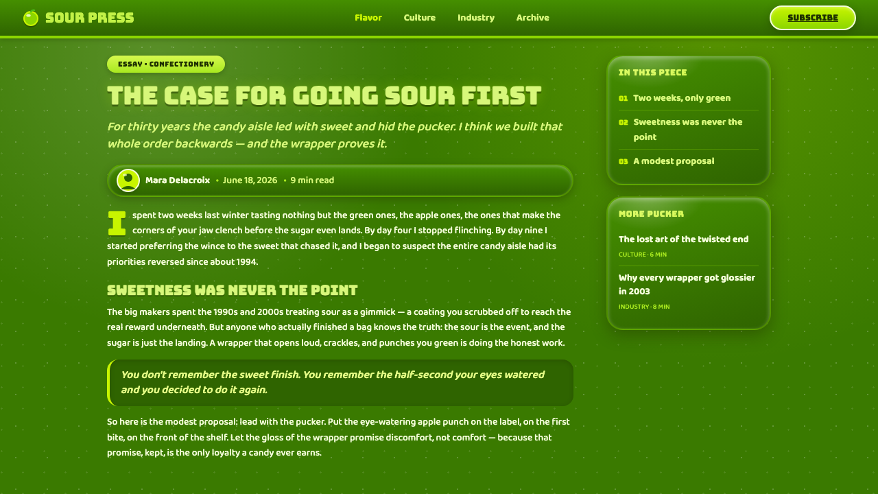
Where does Sour Apple Candy Green come from?
The style belongs to the peak period of American sour-candy wrapper culture from the 1990s through the 2000s. Its deeper roots reach back to the Sour Patch Kids United States relaunch beginning in 1985 and to Jolly Rancher green apple as a longstanding flavor. These references establish the aesthetic as confectionery design rather than generic neon futurism.
Its regional foundation is American confectionery, associated with the Mondelez and Hershey brand worlds, but its circulation is global. Internet candy culture helped detach the visual language from a single package or market and turned it into a recognizable shared shorthand for sourness, artificial fruit, playful excess, and instant appetite.
Three movements meet in the style. Mass-market candy packaging provides the loud flavor communication and shelf-level impact. Bubble or blobby display lettering supplies the soft, inflated voice. Glossy plastic-wrapper graphic design contributes the twisted surfaces, reflective bands, sugar flecks, and coated appearance that make the palette feel edible rather than merely fluorescent.
The resulting system is built from contradiction: the green is sharp but the lettering is round, the candy looks wet but the crystal flecks are dry and granular, and the wrapper is manufactured plastic while the flavor signal is fruit-like. That tension gives Sour Apple Candy Green its identity. It is not trying to imitate natural fruit; it dramatizes the processed, packaged, highly saturated experience of sour candy.
What defines the Sour Apple Candy Green look?
Electric Green
The dominant green is saturated, acidic, and unmistakably artificial-fruit in character. It should feel closer to green-apple candy than to foliage. Muted, dusty, earthy, or olive variations weaken the style because they remove the eye-watering punch that defines the palette.
Glossy Wrapper
Surfaces behave like twisted plastic packaging: bright reflective bands, wet-looking coatings, and highlights that radiate or bend around a form. The finish is active and physical. Even a flat panel should suggest a wrapper catching light rather than a calm painted field.
Sugar-Crystal Sparkle
White crystal speckle interrupts the green and gives the surface granular energy. The flecks should feel like sugar rather than dust or technological noise. Used selectively, they make a field appear coated and edible; spread everywhere, they lose their crystalline focus.
Sour Glaze
Drips, coated edges, and glossy pools suggest a sour glaze melting or stretching across the wrapper. This is a tactile cue, not a realistic food illustration. The glaze works best as a few emphatic gestures that make the interface feel flavored and unstable.
Bubble Display Type
Typography is rounded, inflated, and blobby, with a voice closer to candy lettering than formal editorial type. Letterforms can feel soft at the edges while remaining highly legible. The display face carries personality; supporting text should stay clear enough that the flavor language does not interfere with reading.
Playful Excess
The style is intentionally more than necessary: brighter, shinier, sweeter, and more animated than a restrained green system. Its confidence comes from committing to the confectionery premise. Removing every exaggerated highlight or rounded letter can make the result technically tidy but culturally unrecognizable.

Who shaped Sour Apple Candy Green?
The Mondelez brand team represents the Sour Patch Kids side of the style’s lineage. Its relevance here is not a specific individual but the candy-world reference: sour flavor, playful mass-market packaging, and a visual language that travels easily through global internet candy culture.
The Hershey brand team represents the Jolly Rancher side, especially the longstanding green-apple flavor reference. That connection anchors the palette in hard-candy sharpness: a bright green designed to signal an immediate sour crack rather than a natural or calming botanical mood.
Global internet candy culture is the force that broadens the style beyond its original wrappers. It turns glossy plastic, sour green, crystal sparkle, and bubble lettering into a portable visual vocabulary for digital interfaces, where the same cues can make a product feel loud, sweet, playful, and instantly recognizable.
How do you use Sour Apple Candy Green today?
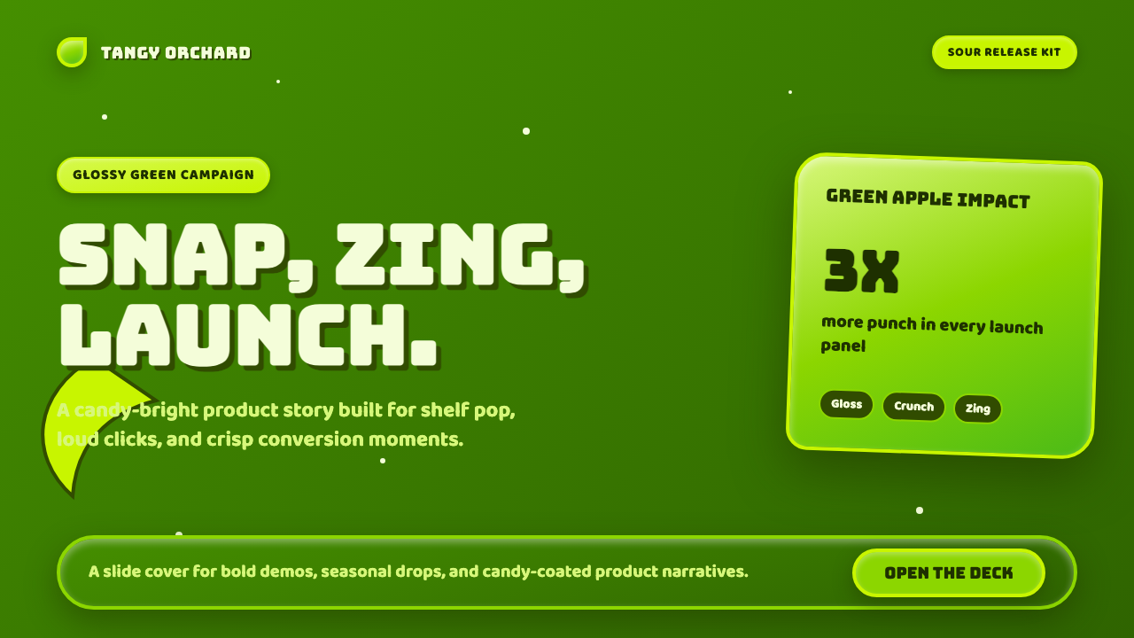
For presentation slides, use the style most strongly on the cover, where one large glossy green field can establish the flavor immediately. Bubble display type works for the title, while white crystal flecks or a sour-glaze gesture can create a memorable focal point. Content slides should reduce the surface effects and let rounded headings, bright contrast, and clear spacing carry the system. Data slides can treat charts as candy objects: saturated green bars, coated highlights, and restrained crystal accents make information feel energetic without turning every mark into decoration.
For web interfaces, Sour Apple Candy Green suits dashboards, pricing pages, and product surfaces that want to feel playful, youthful, and highly visible. Use a dark-ground composition with the electric green reserved for primary actions, active states, key metrics, and pricing emphasis. Glossy panels and drippy accents can distinguish featured tiers, but supporting text needs a calmer treatment so the interface remains scannable. The goal is flavored hierarchy: users should know what is active, important, and clickable at a glance.
For editorial and marketing work, the style is strongest when the page behaves like a wrapper rather than a neutral canvas. Large flavor-led headlines, rounded display lettering, reflective bands, and selective white sparkle can make campaigns feel immediate and tactile. Product stories can alternate between dark fields and sharp green emphasis, while callouts use glaze-like shapes or crystal clusters as visual punctuation. The language is especially effective for launches, promotions, candy-adjacent products, and brands that want deliberate mass-market energy.
A common mistake is confusing saturation with indiscriminate visual noise. Covering every surface in sparkle, drips, highlights, and oversized bubble lettering makes the flavor unreadable because nothing remains focal. Another mistake is softening the green into sage or olive, or pairing it with quiet natural textures that contradict the wrapper logic. Choose a dominant candy signal, add one supporting material cue, and leave enough dark space for the acidity to feel concentrated.
The style also benefits from separating voice from utility. Display lettering can be exuberant, but labels, navigation, prices, and explanatory copy must remain direct. Gloss should clarify a surface, not obscure it; crystal flecks should make a field feel sugary, not damaged. When the hierarchy stays legible, excess becomes character rather than clutter.
Sour Apple Candy Green — FAQ
Is Sour Apple Candy Green the same as a generic neon-green style?
No. The green is only one part of the system. Its identity depends on the relationship between electric apple-lime saturation, glossy plastic-wrapper surfaces, white sugar-crystal sparkle, sour glaze, and bubble lettering. Without those material and typographic cues, the result may be bright green but it will not communicate the specific experience of sour candy.
Can the style work on a light background?
Yes, although the supplied style is dark-ground in character. A light field can work when the green remains highly saturated and the wrapper cues stay visible through reflective bands, glaze, and crystal flecks. The background should support the candy rather than turn the system into a gentle botanical green identity.
Why are glossy highlights so important?
Gloss tells the viewer that the green belongs to coated plastic, glaze, and candy packaging rather than paint or foliage. Radial highlights and reflective bends give the surface a wet, twisted-wrapper character. They make saturation feel edible and physical, which is central to the style’s flavor logic.
How much sparkle should be used?
Use enough white crystal speckle to make the surface feel sugared, but keep it selective. The sparkle is most effective when it creates a concentrated interruption in the green or reinforces a focal area. If every region sparkles equally, the crystal cue becomes texture without hierarchy.
What is the biggest mistake when applying the style?
The biggest mistake is treating every cue as equally loud. Saturation, gloss, sparkle, glaze, and bubble type all demand attention, so they need a clear hierarchy. Keep the green as the flavor anchor, let one material effect lead, and protect functional text with calmer treatment. The style should feel like a powerful candy wrapper, not an unreadable pile of effects.
Related design styles
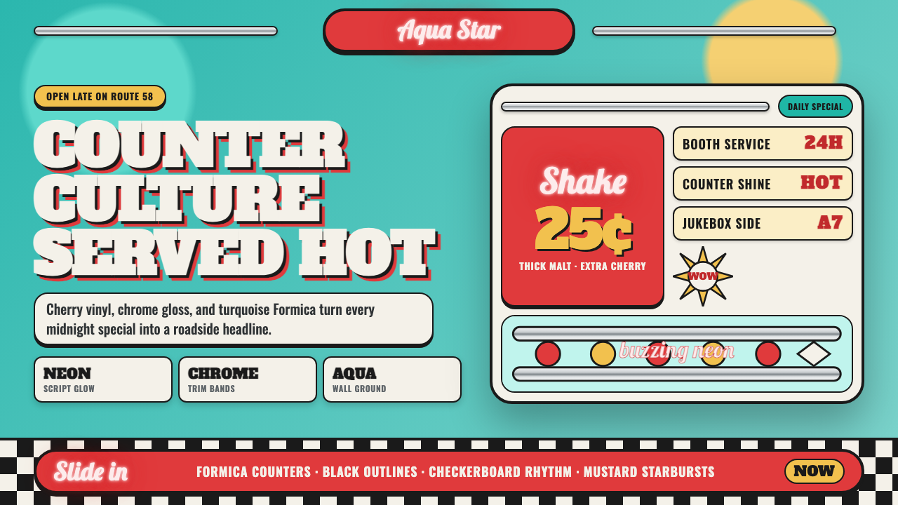 1950s Diner AquaRoadside optimism shouts. Aqua walls, cherry vinyl, chrome bands, and neon sc…
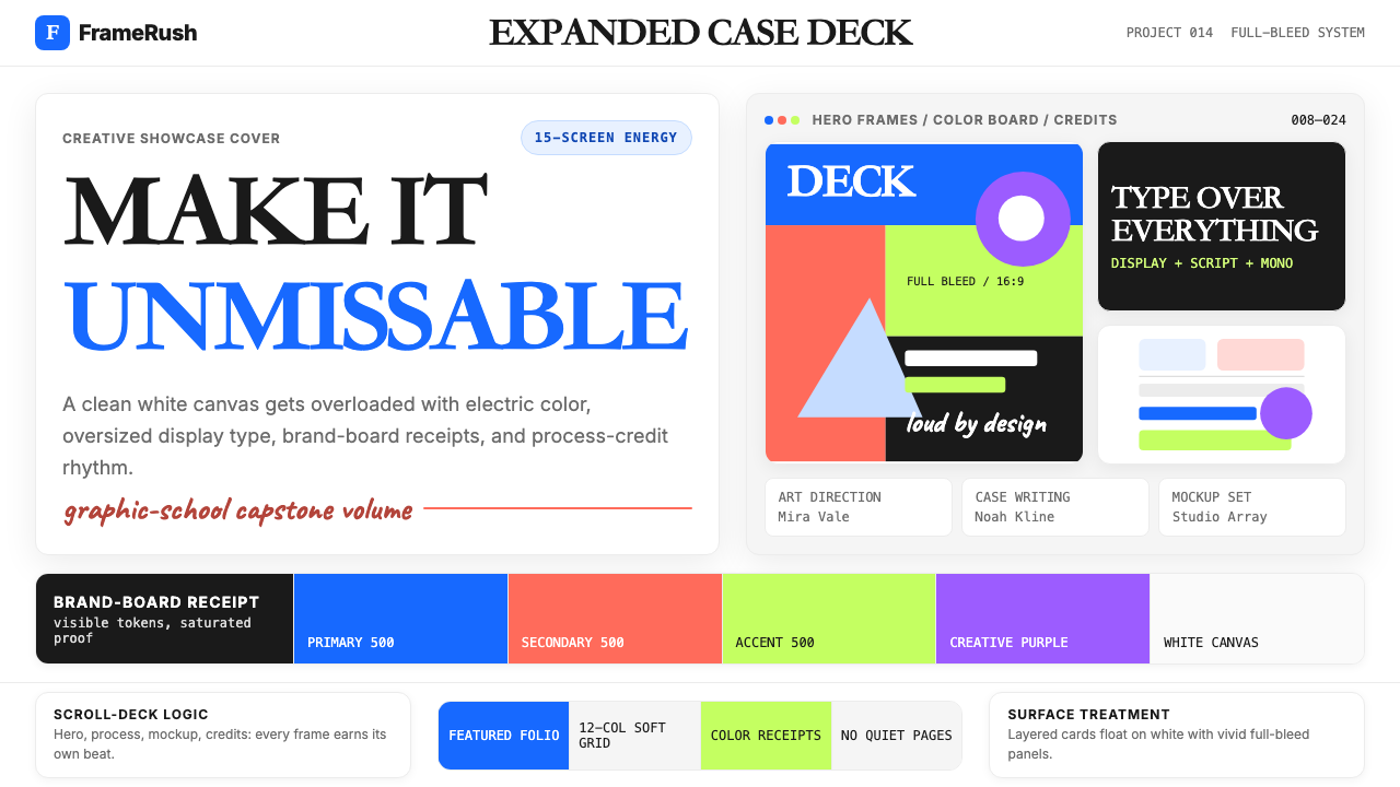 Behance Maximalist PortfolioPortfolio volume at max. Electric blue, coral and lime stack into a full-blee…
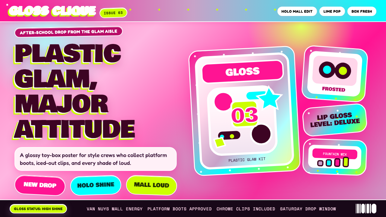 Bratz Doll 2003Y2K maximalism, mall-glossy. Hot-pink gradients, holographic lavender, chunky…
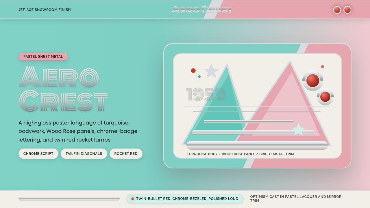 Cadillac TailfinShowroom optimism. Pastel aqua, Wood Rose panels, chrome Monoton, and rocket…
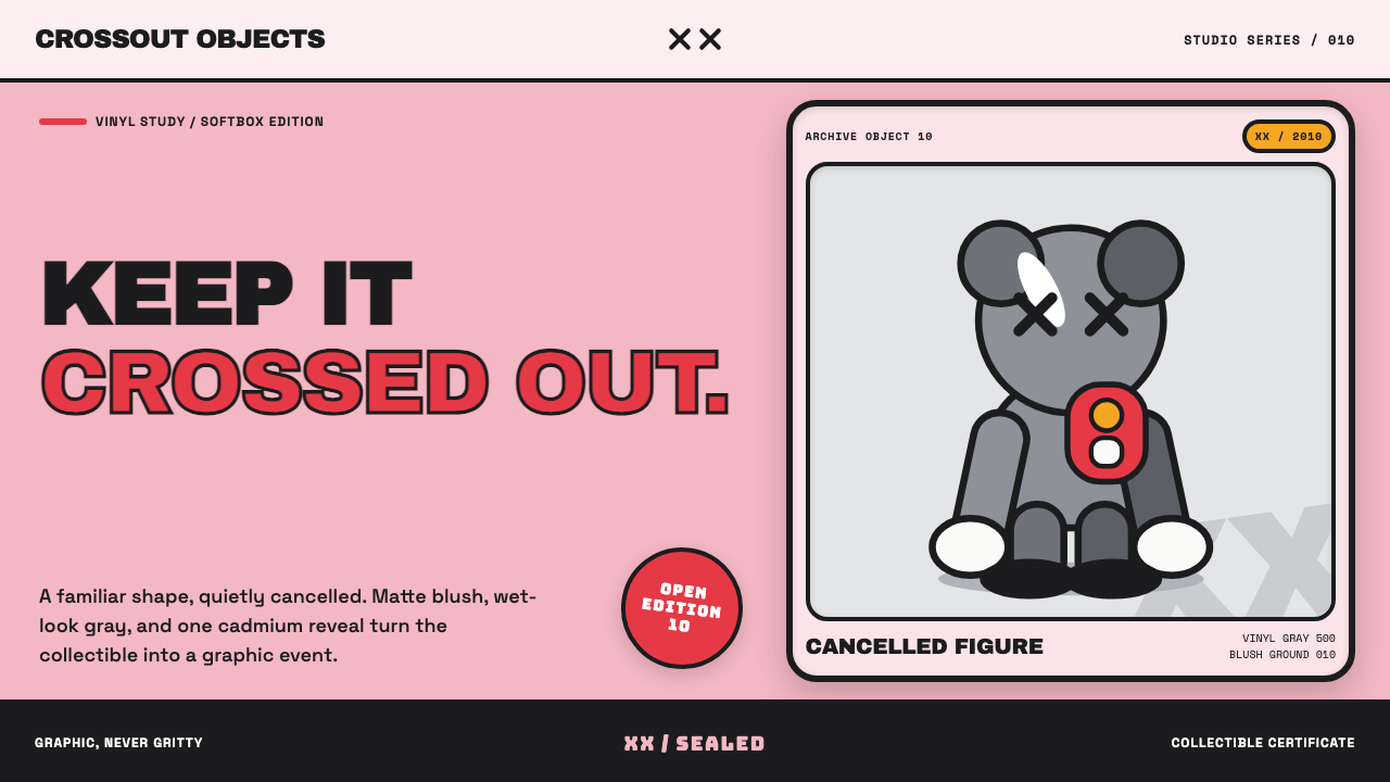 KAWS Companion (2010)Playful, with its eyes crossed out. Blush fields frame glossy gray vinyl and…
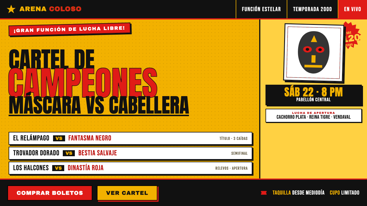 Lucha Libre Fight CartelTwo inks, maximum volume. Blood red on chrome-yellow, fat condensed type, sta…