What is Wari Tapestry Tunic?
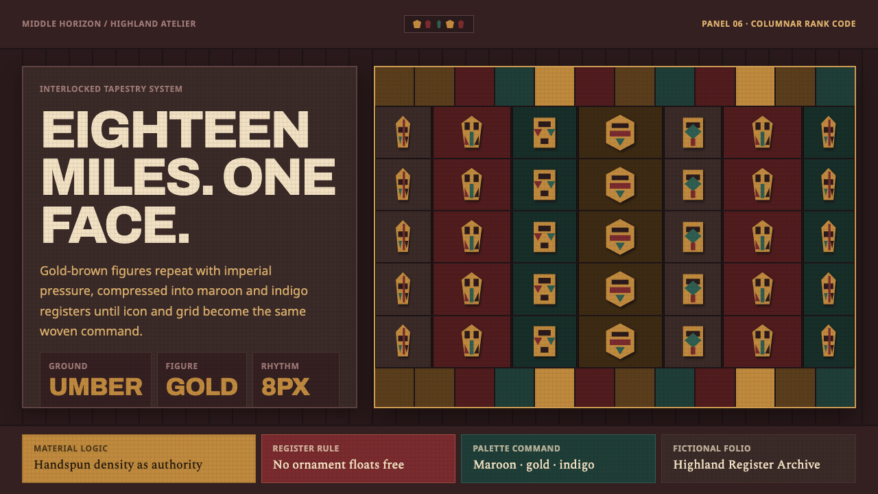
Wari Tapestry Tunic turns woven authority into a severe visual order: gold-brown figures advance through maroon, umber, and indigo columns with nowhere to drift.
Wari Tapestry Tunic in brief
Wari Tapestry Tunic draws on the imperial garments produced in the Andean highlands of Peru during the Middle Horizon, from roughly 600 to 1000 CE. These unku garments were not casual clothing. Reserved for the highest elite, they made rank visible through exceptional labor, saturated color, dense construction, and an iconographic discipline that repeats rather than improvises.
The visual language begins with interlocked tapestry weaving. Handspun cotton and camelid yarn were woven so densely that the surface can read less like ordinary cloth than like inlay. A single tunic could contain up to eighteen miles of yarn. That immense investment gives the style its central emotional quality: ornament is not a light embellishment but concentrated material authority.
Its motifs derive from pan-Andean Staff God iconography, abstracted until the face and its surrounding forms become almost geometric signs. Gold-brown figures appear in rigid vertical columns over dark maroon-umber and indigo fields. The result is compressed, frontal, repetitive, and ceremonial. Nothing floats freely; every figure belongs to a register, and every register belongs to the body-sized structure of the tunic.
Where does Wari Tapestry Tunic come from?
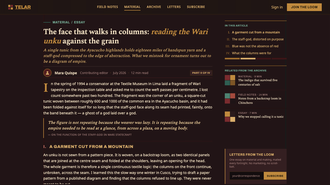
The source tradition belongs to the Wari imperial workshops of the Andean highlands in Peru, active during the Middle Horizon. Between roughly 600 and 1000 CE, these workshops produced tapestry-woven tunics whose complexity made them instruments of state power as much as garments. Their value lay not only in what they depicted, but in the labor visibly contained within them.
Interlocked tapestry weaving provided the technical foundation. Cotton and camelid yarn were handspun and worked into an unusually dense textile surface. Because the colors and motifs are structurally woven together, they feel integrated rather than printed onto a separate ground. The method turns each border, field, and figure into part of a single disciplined fabric system.
The iconographic foundation was pan-Andean Staff God imagery. In Wari treatment, the face is repeated and compressed toward geometry, allowing a powerful sacred image to operate as a modular sign. Repetition does not weaken the motif. It multiplies its presence, transforming an individual image into a field of ordered authority across the wearer’s body.
The social role of the tunic explains its visual severity. Worn only by the highest elite, it encoded rank through saturation, density, and controlled recurrence. A contemporary adaptation should preserve this logic: dark grounds carry visual weight, bright gold-brown motifs signal status, and rigid columns make every decorative act feel governed rather than spontaneous.
What defines the Wari Tapestry Tunic look?
Dark Saturation
The palette is intentionally dark and dense. Maroon, umber, and indigo form weighty grounds, while saturated gold-brown carries the highest visual emphasis. This is not a softened historical palette. Its contrast should feel dyed, costly, and concentrated, with light tones used only when they preserve the force of the darker field.
Columnar Order
Vertical columns are the governing structure. Motifs march down the composition in repeated registers, creating a body-like direction from top to bottom. The columns should feel strict enough to compress ornament, yet clear enough to let repetition become rhythm rather than clutter.
Geometric Abstraction
The Staff God face is not treated as a naturalistic portrait. It is reduced toward a compact sign whose facial and surrounding forms can be repeated within the grid. Geometry here is not modernist simplification for its own sake; it is the means by which iconography becomes structurally weaveable and serial.
Dense Surface
The style should imply the compactness of interlocked tapestry. Shapes sit tightly against one another, borders are firm, and the composition has little empty drift. A surface may be intricate, but it should never become airy or delicate. Its density is tactile, almost inlaid, rather than atmospheric.
Repetition as Rank
Repeated motifs carry social meaning. The same face advancing in disciplined sequence transforms decoration into a visible code of rank. Variation should therefore be limited and purposeful: changes can distinguish registers or establish hierarchy, but they should not dissolve the collective authority of the repeated figure.
No Free Ornament
Every ornament is bound to a grid, column, border, or motif field. Decorative marks should not scatter casually across the ground, and isolated flourishes weaken the system. The visual richness comes from disciplined accumulation: color blocks, woven-looking edges, and iconographic modules working together under a shared order.

Who shaped Wari Tapestry Tunic?
The imperial workshops are the central makers behind this visual language. Their output joined handspun cotton and camelid yarn with interlocked tapestry construction, producing elite tunics whose density and saturation turned textile labor into a public expression of power.
The named authors of these works have not survived in the approved record, but their mastery is legible in the textiles themselves. Their achievement was not simply ornament production: it was the control of yarn, color, geometry, and repeated iconography within a surface dense enough to resemble inlay.
The highest elite were the intended wearers of the unku. Their exclusive access gives the tunic its communicative force: repetition was not merely visual pattern, but a rank-bearing system carried on the body through costly materials, saturated dyes, and controlled ceremonial imagery.
How do you use Wari Tapestry Tunic today?
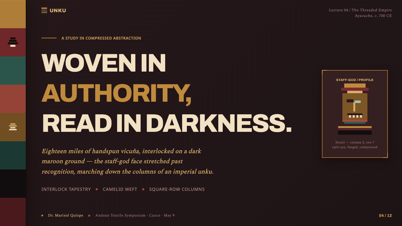
For presentation covers, use the style as a ceremonial field rather than a decorative pattern. Build a dark maroon, umber, or indigo ground, then establish a narrow set of vertical registers. One enlarged gold-brown face or a compressed stack of related motifs can anchor the title area. Keep the title direct and subordinate the remaining text to the column structure.
Content slides benefit from treating each section as a woven register. Arrange headings, short explanations, and supporting markers in aligned vertical bands, with repeated motifs used as section cues rather than as wallpaper. Data slides can use the same logic: groups become columns, categories repeat with controlled variation, and the strongest data point receives the gold-brown emphasis without abandoning the dark field.
In web interfaces, this language is most effective for dashboards, pricing pages, and other experiences that need hierarchy to feel deliberate. Use a stable vertical rhythm, dense framed regions, and a small number of recurring symbols. Dark grounds should support readable content, while gold-brown emphasis identifies primary status, selected states, or the highest-value information without turning every interface control into ornament.
For editorial and marketing work, Wari Tapestry Tunic creates a powerful identity for launches, cultural features, premium collections, and long-form pages. Treat banners, callouts, and section transitions as woven bands. Repeated iconography can frame an article or divide product categories, while large dark fields give photography or text a ceremonial setting rather than a neutral backdrop.
The common mistake is to reduce the style to an arbitrary ethnic-looking pattern. Random triangles, loose bohemian motifs, faded colors, and scattered symbols all lose the source logic. The essential discipline is vertical repetition under strict containment: deep saturated grounds, geometric Staff God abstraction, and ornaments that remain visibly bound to a coherent textile-like order.
Wari Tapestry Tunic — FAQ
Is Wari Tapestry Tunic simply a dark pattern style?
No. The dark palette is important, but it is only one part of a larger system. The style depends equally on dense interlocked-tapestry character, vertical registers, abstracted Staff God imagery, and repetition that communicates rank. A dark background with unrelated ornament may look dramatic, but it does not carry the structural logic of the source tradition.
Why are the motifs repeated so strictly?
Repetition was how the elite garment encoded authority. A single abstracted face becomes more than an image when it advances in columns across the body: it becomes a controlled visual field. Contemporary work should preserve that effect by repeating a limited motif vocabulary consistently, rather than introducing a different illustration in every section.
Can this style work with light backgrounds?
A light background can support content when readability requires it, but it should not erase the style’s dense and high-status character. The approved source emphasizes saturated gold-brown, maroon, and indigo blocked into dark columnar registers. If light surfaces are introduced, keep them contained and let the darker woven fields remain the dominant visual authority.
How should imagery be handled in a Wari-inspired layout?
Treat imagery as part of a register, not as an unbounded scene. Crop it into firm bands or framed fields, align it with columns, and let it participate in the same repeated rhythm as text and ornament. The strongest visual reference is the abstracted Staff God face, whose power comes from geometric compression and serial placement rather than naturalistic depiction.
Related design styles
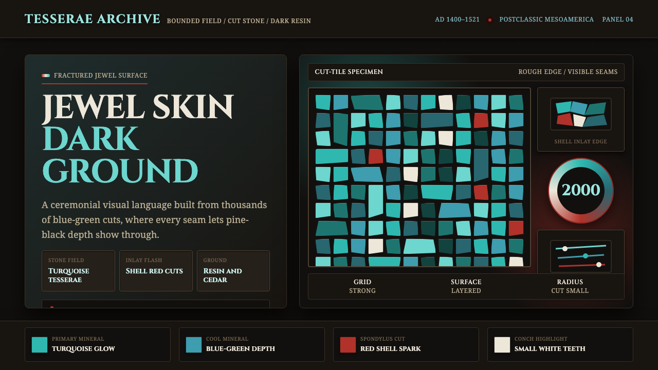 Mixtec Turquoise MosaicDarkness wears a jewel skin. Turquoise tesserae crack open with red and shell…
 Fijian Masi (Bark Stencil)Stencil memory stays sharp. Soot black and burnt coral strike bark-fibre band…
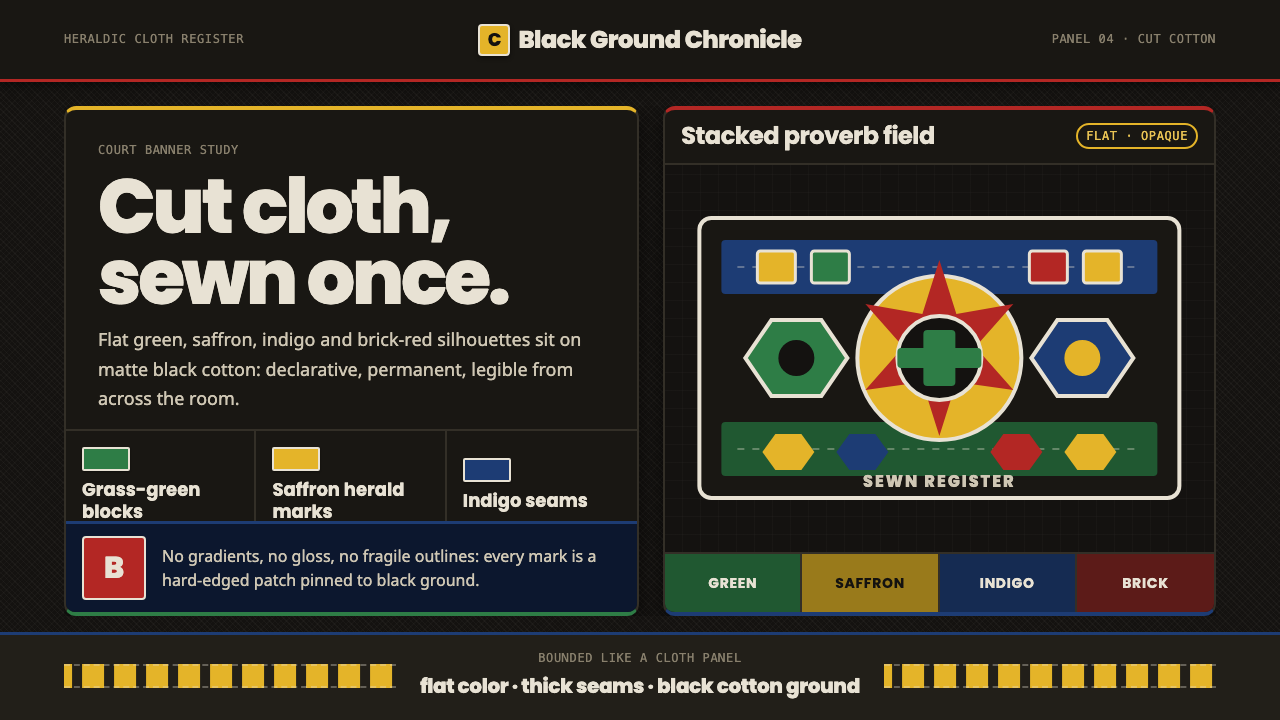 Fon Applique Banner AbomeyRoyal cloth speaks plainly. Flat saffron, green and indigo silhouettes on bla…
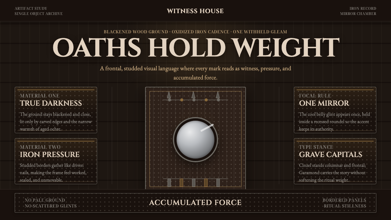 Kongo Nkisi Nkondi FigurePower accumulates in darkness. Black wood, iron studs, and one mirror glint h…
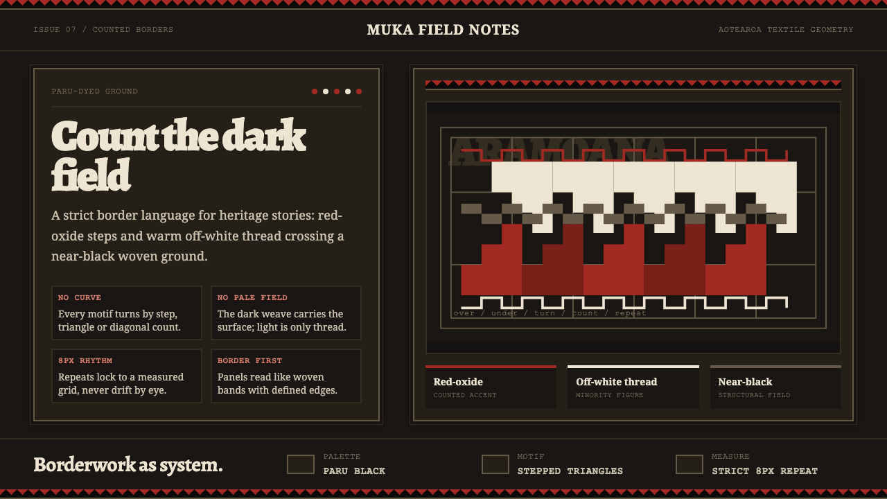 Māori Tāniko Border WeaveCounted darkness. Red-oxide steps and off-white thread cross a paru-black gri…
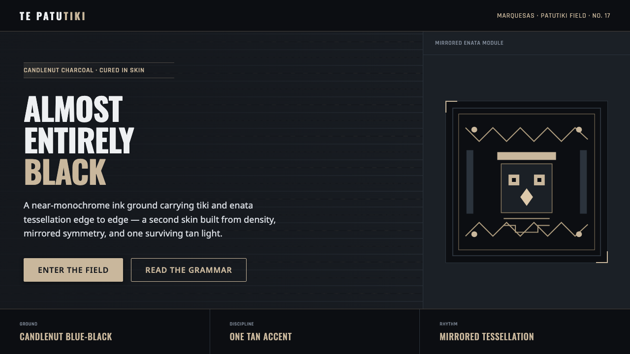 Marquesan Tatu PatternDensity as authority. Tiki and enata tessellation inked into blue-black, lit…