What is VTuber?
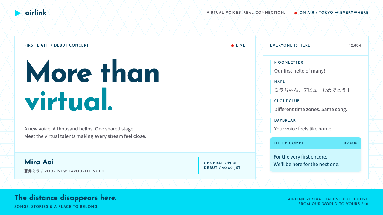
The VTuber look frames a drawn character in a live stream and keeps everything around her clean, white and softly cyan, so the personality supplies the color.
VTuber in brief
VTuber is the visual language of the virtual idol: a Live2D anime avatar framed in a widescreen stream, live chat scrolling up one edge, and Super Chat cards cutting in with a paid amount in their header band. The character moves and speaks in real time, and the interface is built around that presence.
Around the stream sits hololive's own brand, which is surprisingly quiet. It uses a pure-white page, a faint cyan triangle grid and a cyan play-triangle logo, with navy and grey type set in a geometric sans. The character art supplies the colour, and the chrome stays clean so that nothing competes with it.
The overall effect is sweet, tidy and friendly. It suits products that involve fandom, live events, merchandise and communities, where the emotional center is a personality rather than a product, and where the interface's job is to arrange the stream, the chat, the countdown and the acrylic stand merchandise in orderly rows.

Where does VTuber come from?
The VTuber phenomenon begins in 2016, when Kizuna AI debuted and described herself as a virtual YouTuber. In the same year, on 13 June 2016, Motoaki Tanigo founded Cover Corporation in Tokyo. The company's talent agency brand, hololive, started producing virtual performers the following year, and Tokino Sora debuted in 2017 as one of its first talents. From these beginnings hololive grew into an idol-style agency of streaming personalities.
The aesthetic sits at the intersection of several traditions. Japanese idol culture supplies the emphasis on personality, closeness to fans and a carefully managed image. Live2D rigged avatars supply the technology: a flat illustration that blinks, tilts and emotes in response to the performer's movements. YouTube live streaming, with its chat column and the paid highlighted messages known as Super Chat, supplies the interface language. Together they produce a form in which the visual product is a live relationship rather than a finished piece of content.
The brand design that emerged around these performers is notable for its restraint. Because each talent has her own colorful character art, outfits and themes, the corporate chrome could not be loud. The solution was a white ground, a faint cyan triangular grid echoing the play-button shape, and navy and grey type in a geometric sans. This gave the agency a consistent, friendly envelope in which many different characters could appear.
The look associated with this style is current from around 2020 to 2025, reflecting the period when VTubing moved from an internet novelty to a mainstream entertainment category with international audiences. It still retains the original structure of a stream, a chat and a set of cards, but it has been refined into a quiet system that can host events, shops and countdown pages as easily as a broadcast.
What defines the VTuber look?
The stream frame
The widescreen stream is the main object on the page. It holds the Live2D avatar and is presented as a clean rectangle with generous space around it. Everything else on the page is arranged in relation to it, since the character's live presence is what visitors have come for.
Live chat column
A scrolling column of viewer messages runs beside the stream. It brings crowd energy into the layout without requiring any decorative elements, because the messages themselves are the texture. Names, text and small avatars repeat in a steady rhythm that reads as togetherness.
Super Chat cards
Paid messages appear as cards with a colored header band that shows the amount. They are the one place where saturated color enters the interface, and the color indicates the level of support. The card shape, header band and body text form a compact, reusable component that identifies the genre immediately.
White ground and cyan triangle grid
The page is pure white, with a faint cyan grid of triangles behind the content. The grid adds a quiet pattern that echoes the logo's play-triangle without distracting from the character art. It is pale enough to disappear when needed and present enough to give the brand a recognizable texture.
Navy and grey geometric type
Headings are set in navy and body text in grey, both in a geometric sans-serif. The navy gives headings weight and trust without the harshness of black, and the grey keeps long copy gentle. The type is friendly and rounded in feel, in keeping with the tone of the whole system.
Character art supplies the color
The interface is intentionally neutral so that the illustrations can bring the saturation. Each character has her own palette, and the chrome needs to work beside any of them. This is the main rule of the system: if a color decision competes with the character, the chrome should step back.
Event and merchandise modules
Countdown timers, schedule lists and acrylic-stand merchandise cards are arranged on the same clean grid as the stream. They share the white ground and the cyan accents, so a page can move from watching to shopping to waiting for the next broadcast without changing its character.

Who shaped VTuber?
The performer who debuted in 2016 and described herself as a virtual YouTuber, helping to name and popularize the form. Her appearance in that year marks the starting point of the VTuber phenomenon and of the visual conventions this style draws on.
The founder of Cover Corporation, established in Tokyo on 13 June 2016. The company's hololive agency turned virtual performance into an idol-style enterprise with a consistent brand. His company's decision to keep the corporate chrome white and quiet is what defines the interface this style borrows.
A performer who debuted in 2017, in the first wave of hololive talents. Her debut shows the transition from a single virtual idol to an agency of many characters, which is the reason the brand chrome had to remain neutral enough to sit beside different character palettes.
How do you use VTuber today?
The VTuber style is best for products that revolve around a personality, a community or a live event. It treats the interface as a clean stage and lets images and people supply the energy. Applying it well means keeping the chrome light, the layout orderly and the saturated color in the illustrations and the paid cards.
For presentation slides, a cover can be a white field with a faint cyan triangle pattern, a large illustration or character image to one side and a navy title. Content slides can use a widescreen frame for an image or video, with a short column of comments or notes beside it. Data slides suit gentle charts with navy and grey text and one cyan highlight, with any bright color left to illustrations.
For web interfaces, the style fits fan communities, streaming platforms, event and ticketing pages, merchandise shops and creator portfolios. Build a layout around a stream or hero image, a chat-like side column and card components with colored header bands. Use navy for headings, grey for body text, and the cyan accent for links and the logo shape. Keep corners softly rounded in line with the friendly tone.
For editorial and marketing work, the style supports announcements, countdown pages and campaign sites. Use short, warm copy, clear schedules and tidy grids of merchandise cards. Let character art do the emotional work, and keep the supporting text minimal. Where a campaign has several characters, give each of them the same neutral frame so that they feel like members of one group.
The most common mistake is making the chrome too loud. Bright backgrounds, heavy gradients or strong brand colors will clash with character art and make the page look crowded. Another is removing the triangle grid or the cyan accent entirely, which leaves a generic white page with no identity. A third is using saturated color for ordinary cards; reserve it for paid or highlighted items so that it keeps its meaning.

VTuber — FAQ
What is the VTuber design style?
It is the interface language of virtual idols and live streaming: a widescreen stream frame holding a Live2D avatar, a live chat column, Super Chat cards with colored header bands, and hololive's own quiet brand of a white ground, faint cyan triangle grid, cyan logo and navy and grey type.
When did VTubing start, and how does that relate to the style?
Kizuna AI debuted in 2016 and described herself as a virtual YouTuber. Cover Corporation was founded in Tokyo on 13 June 2016, and hololive talents such as Tokino Sora debuted from 2017. The visual conventions of this style, including the stream frame and Super Chat card, grew from that period, and the current brand look is from about 2020 to 2025.
Why is the interface so restrained?
Because the characters supply the color. Each talent has her own palette and outfit, so the surrounding interface must be neutral enough to sit beside any of them. A white page, a faint cyan grid and navy and grey type provide that neutral envelope without becoming invisible.
Do I need character illustrations to use the style?
The style assumes that something vivid sits at its center, whether a character, a photograph or a product image. Without it, the pale interface can feel empty. If you do not have a character, use strong imagery or a set of colored cards to take on the role that the illustrations would play.
Where should saturated color be used?
Mainly in the character art and in highlighted elements such as paid message cards, where the color of the header band signals the amount. Everywhere else the interface stays white, cyan, navy and grey. Keeping color rare in the chrome is what allows it to carry meaning when it does appear.
Related design styles
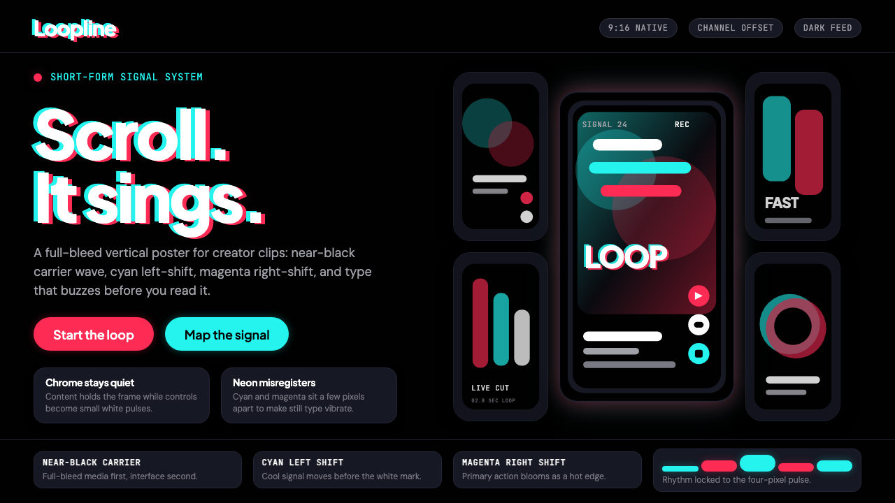 TikTok 2024Attention vibrates. Near-black feed, cyan-magenta offsets, and vertical frame…
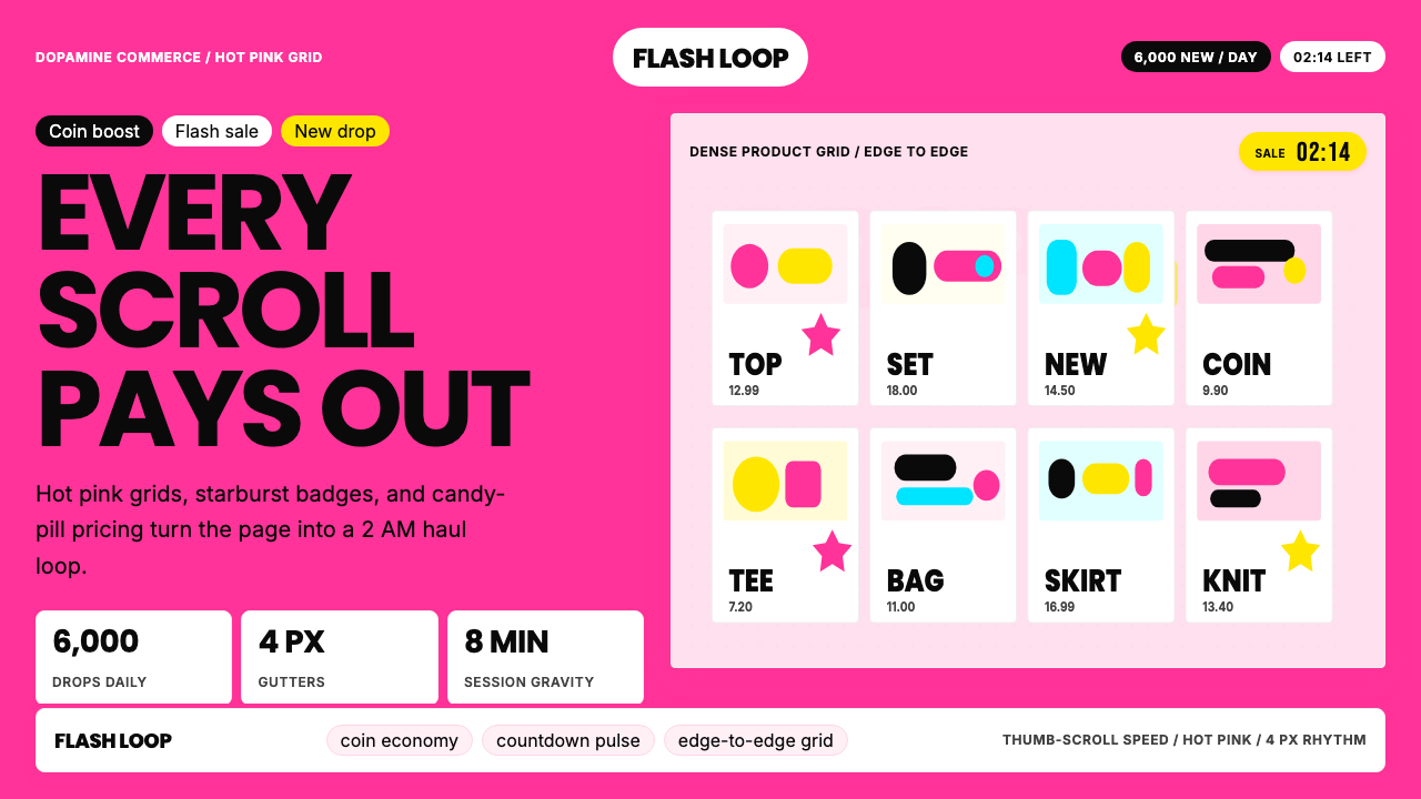 Shein Fast FashionDopamine density wins. Hot pink grids, starbursts, and candy pills pack every…
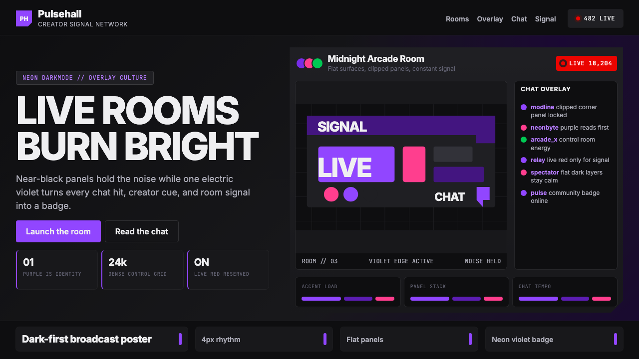 TwitchPurple is tribal signal. Neon violet cuts through flat dark panels and chat g…
 bilibiliCold grey feed, hot pink actions. White outlined danmaku race left across one…
 Discord Blurple Server (2020)Midnight server energy. Blurple panels, fuchsia pings, and green status dots…
 Naver Webtoon (2024)Built for late-night scroll. Charcoal grids, Noto Sans KR, and green episode…