What is Verner Panton?
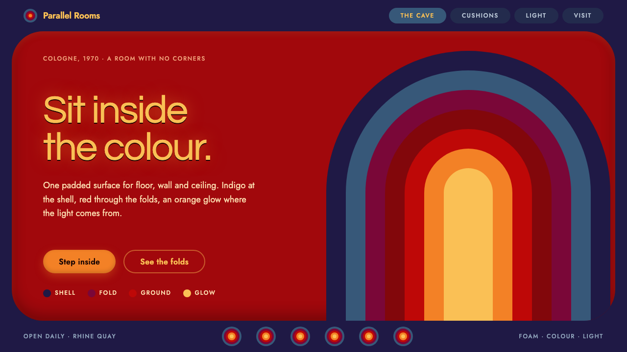
Verner Panton's Visiona 2 turned an entire room into one soft, glowing, cornerless surface — a cave you sat inside rather than looked at.
Verner Panton in brief
Verner Panton's Visiona style is the visual language of total-room design: an interior in which floor, walls, ceiling and furniture are treated as a single continuous, upholstered landscape. It belongs to the Pop and space-age strand of postwar design, and its signature is saturated colour used at full volume, with every edge rounded and every surface flowing into the next.
The most famous expression of the idea is the Phantasy Landscape, built for Visiona 2 in 1970. It was a windowless cave covered in foam wrapped in Dralon fabric from Bayer, so that the visitor did not stand in front of a display but sank into it. Furniture and architecture stopped being separate categories. The sofa, the wall and the ceiling were all the same soft, warm material.
Translated to screens, the style reads as a warm, immersive interface. The ground is a deep, hot red; the outer frame cools to indigo and slate; and the colour grows warmer toward the centre until it glows orange and yellow. Large type sits in a halo of light, cards feel like cushions, buttons feel like pills, and sections curve into one another instead of ending at a ruled line.

Where does Verner Panton come from?
Verner Panton was a Danish designer who made his name by refusing the polite restraint of Scandinavian modernism. His best-known object, the Panton Chair, was designed in 1959–60 as a single flowing form, and it reached series production with Vitra in 1967. The chair already contains the whole programme: a continuous curve with no legs, no joints and no corners, made possible by a new material and a willingness to let the material set the shape.
The step from a chair to a room came through the furniture fair. In 1970 the chemical company Bayer used the Cologne furniture fair, the IMM, to show what its synthetic fibres and foams could do for living spaces. The project was called Visiona, and its second edition, Visiona 2, was staged aboard the Rhine boat Loreley, moored on the river at Cologne. Panton's contribution was the Phantasy Landscape, a deliberately disorienting interior in which the visitor walked, climbed and lay down inside one continuous upholstered shell.
The setting matters. This was a corporate showcase as much as an art installation: a manufacturer wanted people to feel what its Dralon-covered foam could become when a designer was given a whole room and no constraints. That commercial, experimental mix is typical of the period, when plastics, synthetic textiles and new lighting made it plausible to imagine homes that looked more like stage sets than like the rooms of the previous generation. Panton, working between Denmark and West Germany, was one of the few designers able to deliver that fantasy at architectural scale.
The movements this belongs to are usually given as Pop design, space-age interiors and total room design. Pop supplies the saturated, unembarrassed colour and the love of synthetic surfaces. Space-age interiors supply the capsule-like enclosure and the confidence that the future would be soft rather than severe. Total room design supplies the ambition: to design not an object in a room, but the room itself, from the floor to the glow of the lamps. Together they describe a moment when European design briefly stopped being austere.
What defines the Verner Panton look?
Colour
The ground is a saturated, warm red that fills the whole field rather than serving as an accent. Around it the frame and footer recede into indigo and slate blue, and toward the centre the palette warms through orange to a yellow glow. The effect is a gradient of temperature, from cool shell to hot core, and the result is that colour itself feels like the light source in the room.
No corners
Every corner is rounded and the arches step inward in concentric rings, like the stages of a tunnel. Nothing in the composition ends in a hard right angle. Containers look poured rather than cut, and the eye is invited to travel along curves instead of stopping at edges.
Upholstered surfaces
Cards behave like cushions and buttons like pills. Surfaces are thick, padded and tactile, with no thin rules and no delicate outlines. Where separation is needed it comes from a shift of tone or a soft change of level, never from a hairline.
Glowing type
Large display type sits in a halo, as though lit from behind or from within. Headlines are big, rounded and confident, and they take on the same warm light as the centre of the composition. Body text is kept plain and readable so that the glow belongs to the headline rather than to everything at once.
Curved transitions
Sections do not meet at a straight horizontal line. They flow into one another through arcs and waves, so scrolling feels like moving through a continuous space rather than flipping through stacked panels. The page behaves like the Phantasy Landscape: one surface, many moods.
Total immersion
The style is meant to envelop. Rather than a neutral canvas with coloured components on top, the whole field is the design. This is why the style feels so different from restrained, white-space-heavy systems: the page is not a sheet of paper but a room the visitor enters.

Who shaped Verner Panton?
Danish designer behind the Panton Chair (designed 1959–60) and the Phantasy Landscape of Visiona 2 in 1970. His central idea was that an interior should be one continuous, saturated, sensory environment.
The chemical manufacturer that sponsored Visiona and supplied the Dralon fabric used to upholster the cave. The project was as much a demonstration of materials as an exhibition of design.
The furniture manufacturer that put the Panton Chair into series production in 1967, turning an experimental one-piece form into an object people could actually buy.
How do you use Verner Panton today?
In slide decks, the style works best on a cover or a section divider, where the full-bleed red field and the glowing centre can take over the whole slide. A title in large, soft type with a warm halo, framed by indigo and slate edges, gives an opening slide an immediate temperature. For content slides, keep one cave-like focal area and let the rest of the page recede, so the audience understands where the warm centre of the slide is. Data slides are harder: charts need clean, legible colours, so set them on a calmer panel inside the red field rather than letting the background interfere with the numbers.
In web interfaces, the style suits consumer and lifestyle products that want to feel like a place rather than a tool. A landing page can open on the concentric arches with the hero headline glowing at the centre. Cards, tags and buttons take the cushion and pill shapes naturally. It is a poor match for dense dashboards or pricing tables that depend on thin rules, tight alignment and a neutral background; if used there, confine the immersive treatment to the header or a feature section and keep data areas plain.
For editorial and marketing work, the style is excellent for launches, event pages, music and fashion campaigns, and anything that wants a seventies body temperature without becoming a retro poster. Pair the saturated ground with generous rounded shapes and let one warm glow carry the emphasis. Full-bleed colour, large soft type and one strong image are usually enough; extra ornament only competes with the room itself.
A good working rhythm is to decide where the centre of warmth is on each page, then let colour cool toward the edges. That single decision organises the hierarchy: the glow marks the most important thing, and everything cooler is secondary. It keeps the maximalist palette from turning into noise.
The most common mistake is to keep the colours but bring back hard edges. A saturated red page with square corners, thin rules and sharp-edged cards is not the Phantasy Landscape, it is just a loud page. The cornerless geometry is the style. The second mistake is using the warm glow everywhere: if every heading, button and card glows, nothing is the centre, and the room loses its depth.

Verner Panton — FAQ
What is the Phantasy Landscape?
It is Verner Panton's interior for Visiona 2, shown in 1970 on the Rhine boat Loreley during the Cologne furniture fair. It was a windowless cave in which the floor, walls and ceiling formed one continuous surface of foam covered in Dralon fabric from Bayer. Visitors sat, lay and climbed inside it. It is the direct visual source of this design style.
What is Visiona?
Visiona was a project by Bayer AG that used the Cologne furniture fair to show what synthetic fibres and foams could do in domestic interiors. The second edition, Visiona 2, was staged in 1970 on a boat on the Rhine, and Panton's room became its best-known contribution.
Why does the style have no right angles?
Because the source has none. Panton's chair and room were built from continuous soft forms, and the new foams and fabrics made it possible to avoid joins and corners. In an interface this becomes rounded containers, pill-shaped buttons, concentric arches and curved section transitions. A hard corner interrupts the sense of one continuous surface, which is the whole point of the style.
Is this style only for retro projects?
No. It carries a clear seventies warmth, but the underlying ideas — immersive colour, soft geometry and a single warm focal point — work in contemporary products too. The trick is to use the structure rather than the nostalgia: keep the cornerless shapes and temperature gradient, and avoid period clichés in imagery and lettering so the result feels current.
When should I avoid it?
Avoid it for dense, data-heavy or text-heavy interfaces, for products that must feel neutral or formal, and anywhere accessibility depends on calm, high-contrast reading surfaces. A saturated red field is demanding to look at for long periods. It works best in short, atmospheric experiences, where the user is meant to feel something rather than process a lot of information.
Related design styles
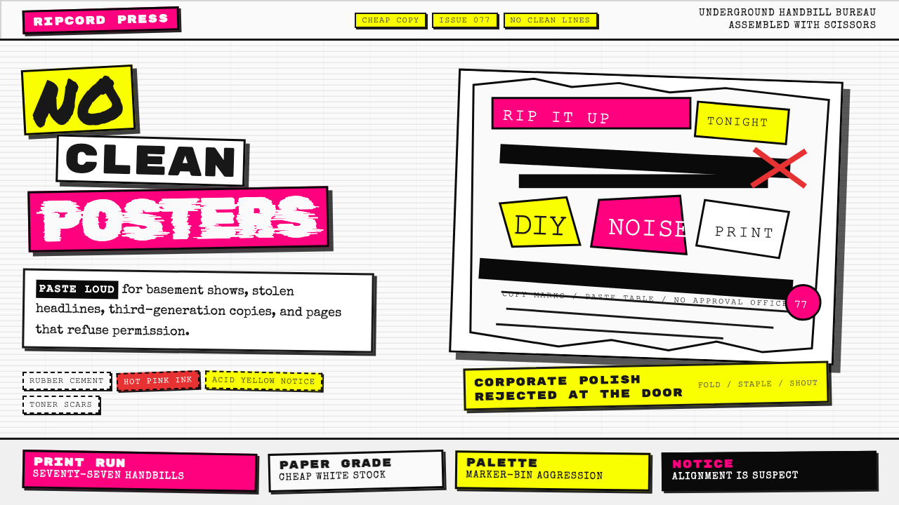 Punk Xerox 1977Anti-design shouts. Hot pink and acid yellow collide with ransom type on Xero…
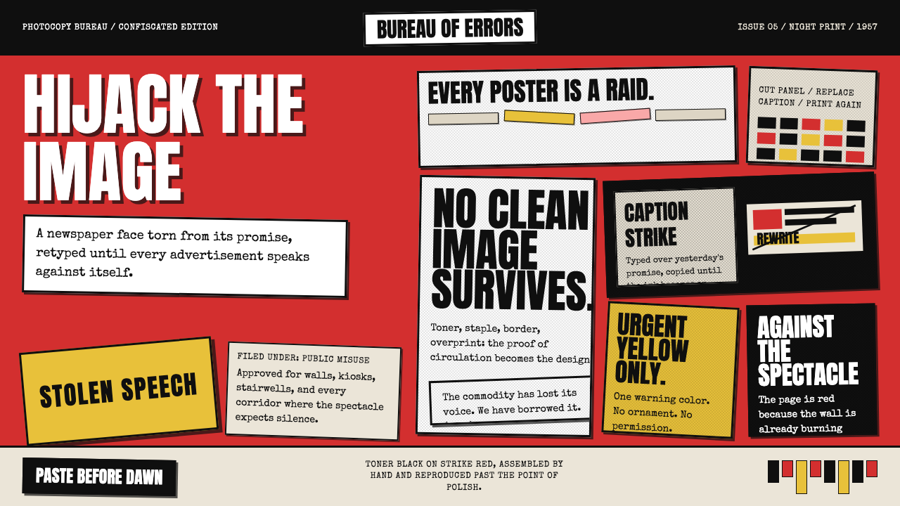 Situationist Détournement (1957)Contraband urgency. Strike red, toner black, and jagged comic panels make the…
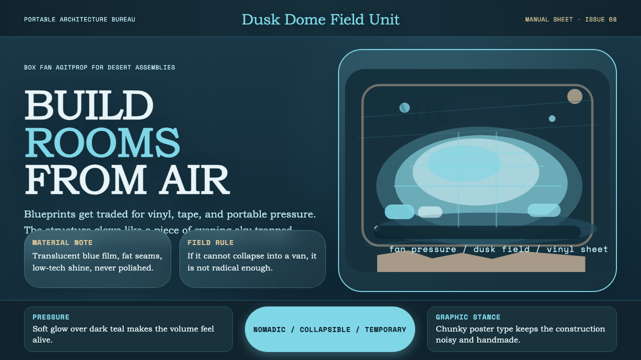 Ant Farm InflatablesTemporary architecture glows. Vinyl-blue domes swell over dark desert teal.
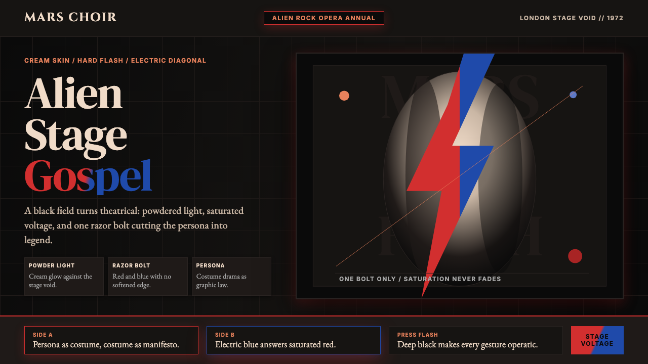 Bowie — Ziggy StardustTheater at full voltage. Cream-on-black portrait cut by one red and electric-…
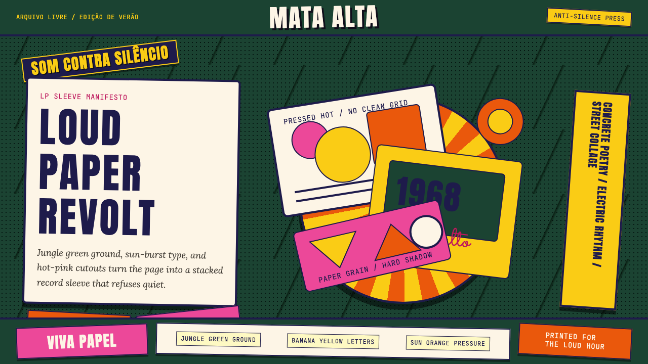 Brazilian Tropicália (1968)Art must be loud. Jungle green, banana yellow Anton type, and hard-shadow col…
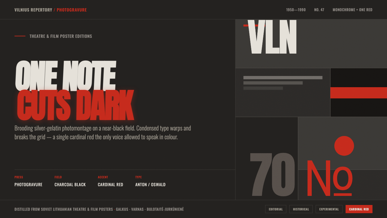 Lithuanian Poster ArtMonochrome plus one red. Charcoal photogravure field, warped Anton type, a lo…