What is Variable Fonts?
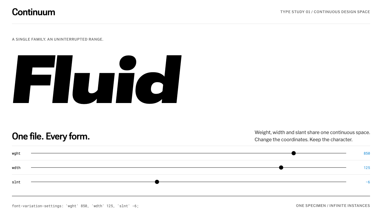
Variable fonts made type continuous, and the style that grew around them is a white page where the letters move and everything else holds still.
Variable Fonts in brief
The Variable Fonts look is the aesthetic of the testing site. A white page carries one enormous word set in black variable glyphs, beneath it a row of hairline slider tracks tagged with axis names such as wght, wdth and opsz, and beside them small numeric readouts. Drag a slider and the letters grow heavier, narrower or more slanted in a continuous sweep.
The style is defined by a division of labor. The type does all the moving, and the page stays still. White space, thin lines and black letterforms form a neutral laboratory in which the only thing that changes is the typeface itself. Even the interface is built from the same material it demonstrates, with labels, values and axis names all set as text.
It communicates precision and play at once. The sliders and readouts speak the language of instruments, while the oversized word is pure typographic pleasure. It suits any project whose subject is type, code, systems or continuous change.

Where does Variable Fonts come from?
On 14 September 2016, Apple, Google, Microsoft and Adobe jointly announced OpenType Font Variations, part of version 1.8 of the OpenType specification. The announcement came at the ATypI conference in Warsaw, Poland. The idea was to pack an entire type family into a single font file, with weight, width, slant and other properties sliding continuously along named axes instead of being limited to a few fixed styles.
The format has deeper roots. Its lineage runs back through TrueType GX and Multiple Master, earlier attempts to make letterforms adjustable that never reached the same level of cross-platform adoption. What changed in 2016 was that four platform and software companies agreed on one standard, which made the technology practical for the web. It fed directly into a broader conversation about responsive web typography, where a single font could adapt to the size and conditions of a screen.
The visual identity of the format emerged from tools rather than from posters. Axis-Praxis, launched on 28 October 2016 by Laurence Penney, and v-fonts.com, associated with Nick Sherman, were plain white pages built to let people play with the new technology. One large word, a column of sliders and a few numbers were enough. That testing-site look, roughly from 2016 to 2018, is the origin of this system.
Several people stand behind the technology and its public face. Peter Constable and Behdad Esfahbod are among the engineers associated with bringing the standard to life across platforms, while Penney and Sherman made the format visible and tangible to designers. Together they gave variable fonts an identity of experiment, openness and curiosity, which is exactly the tone this style preserves.
What defines the Variable Fonts look?
White ground and generous space
The page is plain white with a great deal of empty room. That emptiness is functional: it gives the oversized word space to expand and contract without colliding with anything. It also reinforces the laboratory feel, as though the page were a blank bench on which a single specimen has been placed.
Black variable glyphs
The hero of the page is a single word in black, set very large. Because it is a variable font, its weight, width and slant can change under the reader's hand. Black on white gives the shapes maximum clarity, so the subtle differences between two points on an axis are easy to see.
Hairline axis tracks
Each axis is shown as a very thin line with a small handle, like a ruler or a slider on an audio mixer. The thinness keeps the controls from competing with the specimen, and the repetition of identical tracks gives the page a rhythmic order. The lines are the only graphic elements besides the type itself.
Axis tags and numeric readouts
Short lowercase tags name each axis, and small figures report its current value. They make the invisible mathematics of the font legible and turn the page into an instrument panel. The tags and readouts are set in a plain, restrained text style so they read as data and not as decoration.
Motion belongs to the type
In this style, nothing else is allowed to move. Layout, background and controls stay fixed while the letterforms flex. This discipline is the heart of the aesthetic, because when only one thing changes, the audience understands exactly what the technology is doing. Any extra animation would blur the demonstration.
Monochrome with minimal accent
The palette is essentially black, white and a few greys. If a highlight is needed, it is applied to the handle of the slider or the active value, never to large areas. This keeps the focus on shape and proportion, which are what variable fonts are about.

Who shaped Variable Fonts?
A type-technology specialist associated with the OpenType specification and its work at Microsoft. His name is tied to the effort that made OpenType Font Variations a shared standard across platforms. He represents the engineering side of the format, which gave designers a stable foundation to build on.
An engineer known for text-rendering and font technology work, associated with Google and the open-source tooling that helped variable fonts function on the web. His involvement points to how much of the format's success depended on software that could actually draw and shape the letters at runtime.
A designer and typographer associated with v-fonts.com, the plain white resource built to explore and compare variable fonts. His work gave the technology a public, browsable face, and the clarity of that site helped establish the visual conventions this style draws on.
The creator of Axis-Praxis, which went online on 28 October 2016 and became the best-known playground for the new format. Its enormous word, hairline sliders and numeric readouts are the template for this entire style. He is the figure most directly responsible for how variable fonts first looked to the public.
How do you use Variable Fonts today?
The Variable Fonts style is a demonstration aesthetic. It works when the goal is to let an audience see a property change in real time, and it favors projects where typography, craft and technical curiosity are part of the subject. It is less suited to heavily branded, decorative or color-driven work.
For presentation slides, a cover can be a single huge word in black on white, with a thin slider line below it and one or two small tags. Content slides work as specimen pages: one idea, one large headline, and a few lines of small text beneath. Data slides suit hairline charts in black and grey, with axes treated as part of the design rather than hidden. Where a talk is about type, the slides can literally animate a weight or width change as a punctuation mark.
For web interfaces, the style fits font foundries, type tools, documentation sites, design-systems portals and developer playgrounds. Build controls from thin lines and text labels rather than heavy buttons. Show current values next to each control. Make the specimen text editable so that visitors can type their own words. Respect reduced-motion preferences by offering static states of the same specimen.
For editorial and marketing work, the style supports essays about typography, launch pages for typefaces and product announcements that want to signal precision. Pair a large black headline with narrow columns of small text, and let one headline use a variable axis to express emphasis. Keep photography minimal; this style trusts letters to carry the page.
The most common mistake is making the page move as well. Animated backgrounds, parallax and colorful gradients steal attention from the one thing that should be changing. Another is using a static font and calling it variable; the look depends on real continuous change. A third is crowding the page with controls, which destroys the calm that makes the hairline tracks readable.

Variable Fonts — FAQ
What is a variable font?
A variable font packs a whole type family into one file. Properties such as weight, width and slant are exposed as named axes that can take any value along a range, rather than being fixed to a few preset styles. OpenType Font Variations was announced on 14 September 2016 by Apple, Google, Microsoft and Adobe.
What do tags like wght, wdth and opsz mean?
They are short names for axes. Broadly, wght refers to weight, wdth to width and opsz to optical size, the adjustment of letter shapes for different sizes of text. Displaying these tags next to sliders is part of the testing-site look, because it shows the reader the exact language the font uses.
Why is the page kept still while the type moves?
Because the style is a demonstration. When only the letterforms change, viewers can see exactly what each axis does. Additional motion in the background or layout would distract from the one thing being shown. The stillness of the page is what gives the movement of the type its meaning.
Where did the look come from?
It comes from the testing sites that introduced the format. Axis-Praxis went online on 28 October 2016 and v-fonts.com followed, both as plain white pages with one oversized word, thin sliders and small numeric readouts. The look dates from roughly 2016 to 2018 and is rooted in the technical conversation about responsive typography.
Can I use it without a real variable font?
You can borrow the layout, but the aesthetic loses its point. The style exists to show continuous change along an axis, so a static font in the same layout will feel like an empty gesture. If you cannot use a variable font, consider a different system that does not promise movement.
Related design styles
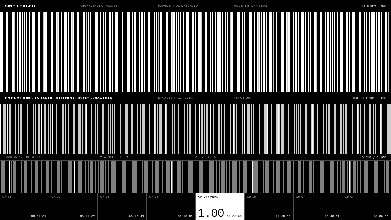 Ryoji IkedaData is the picture. White barcode bars on pure black, tiny gray numerals, 1p…
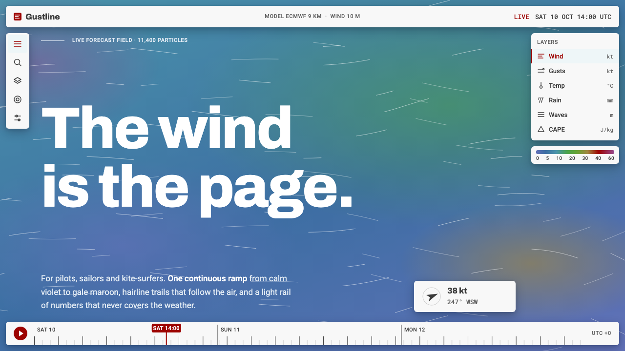 Windy Wind MapThe wind is the page. Steel-blue ramp, hairline trails, and a light Roboto in…
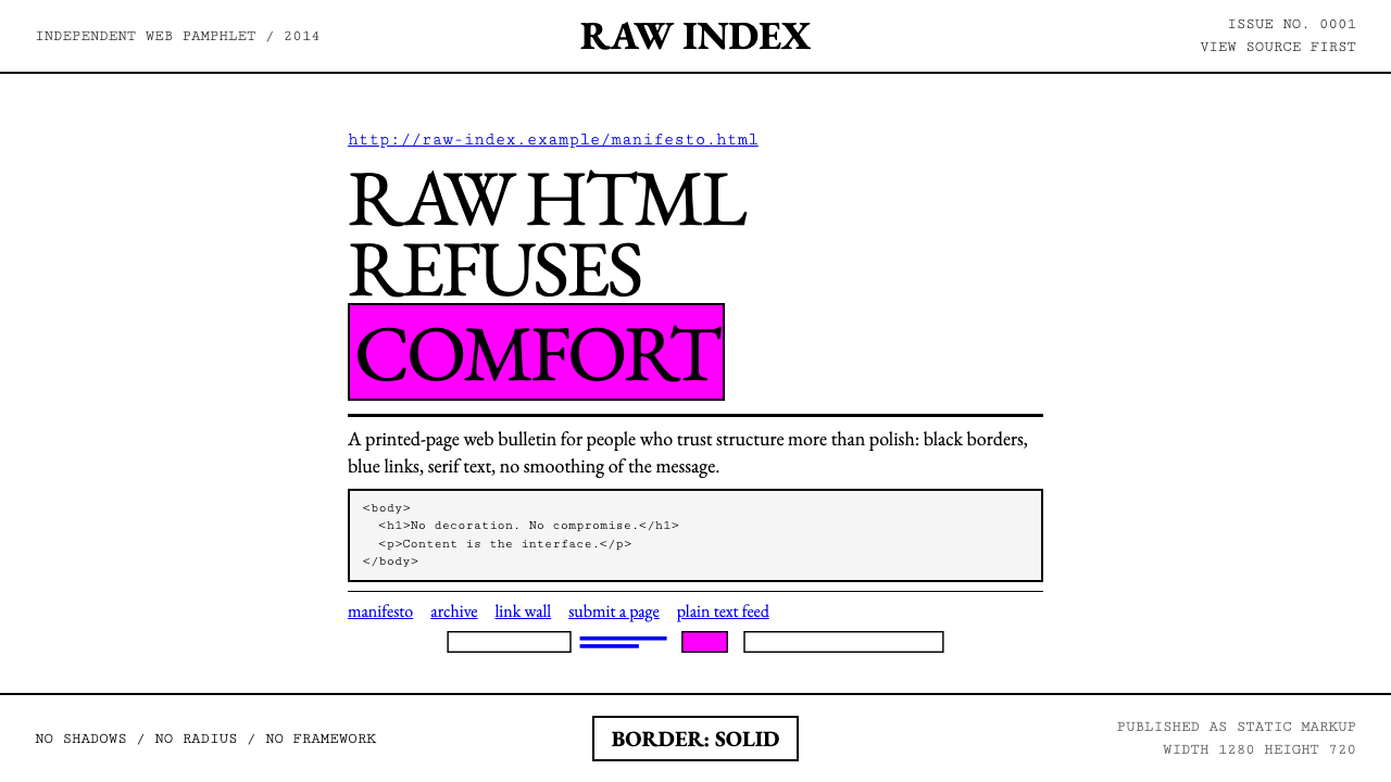 Brutalist Web 2014Browser defaults, weaponized. Times New Roman, electric-blue links — raw HTML…
 Ferrofluid Spike FieldPhysics turns sculptural. Jet black peaks, steel sheen, hex order.
 Flat Design iOS 7The day skeuomorphism died. Bright tints on white, hairline separators, frost…
 Mirror's Edge Clean CityWhite becomes motion. Cool daylight planes leave one signal-red route to comm…