What is Ryoji Ikeda?
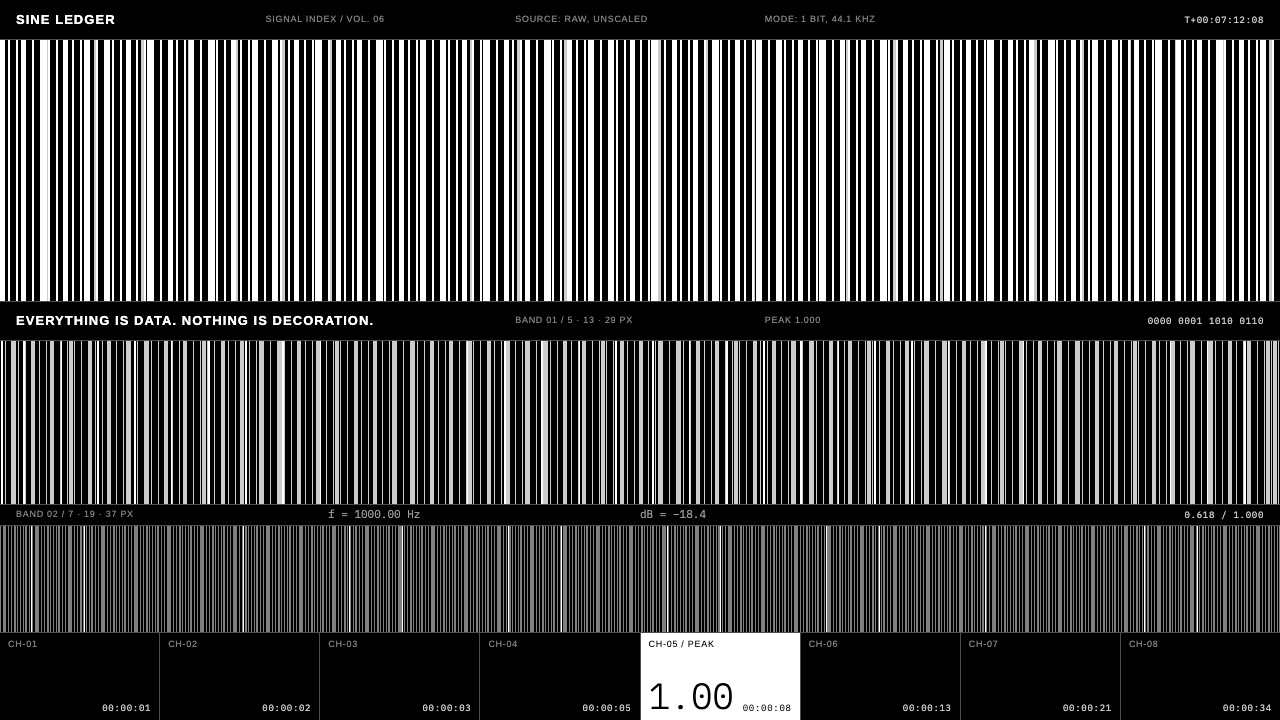
Ryoji Ikeda's visual world treats data itself as the picture: white bars on a black room, numerals too small to read at a glance, and not a single decorative gesture.
Ryoji Ikeda in brief
The Ryoji Ikeda style is a cold, exact and deliberately austere visual language derived from the work of the Japanese composer and media artist of that name. His installations and performances turn raw data into sound and image: a pure black projection space in which white barcodes, matrices of ones and zeros, columns of tiny numerals and hairline grids flicker, scroll and cut in time with sine tones, clicks and bursts of white noise.
Translated into an interface, this becomes a flat black surface divided only by the thinnest lines, populated by small grey figures and white bar graphics. There are no rounded corners, no shadows, no gradients and no easing. Content does not arrive gracefully; it appears, steps, flickers and cuts, exactly as the frames in his audiovisual pieces do.
The idea underneath is that precision itself can be the aesthetic. Nothing is dressed up to look friendly. Density, scale and rhythm replace ornament, which gives the style a laboratory or control-room feeling that suits experimental, scientific and media-art contexts.

Where does Ryoji Ikeda come from?
Ryoji Ikeda was born in Gifu, Japan, and began his career in Kyoto in the 1990s before settling in Paris. His 1996 debut album, titled with a plus and minus sign, announced a radically reduced approach to electronic sound: pure tones and bare pulses pushed to the edge of audibility, presented without melody or sentiment. From the beginning his music treated frequencies and data as raw material rather than as vehicles for expression.
The visual world used as reference for this style comes mainly from the audiovisual series that followed, notably datamatics, begun around 2006, and test pattern, from around 2008. In those works the sound is not accompanied by images; sound and image are generated from the same data stream, so that every flicker on screen corresponds to something you hear. Dense fields of numbers, barcode-like patterns and strict grids are not metaphors for data but the thing itself, mapped directly onto light.
Ikeda's work sits among several overlapping currents. One is microsound and glitch, the electronic-music tendency that treats tiny artefacts and errors as legitimate musical material. Another is data art, the practice of making aesthetic objects from measurements, code and information. A third is the Kyoto performance world around the collective dumb type, with which Ikeda has been associated and whose rigorous, technology-driven stagecraft shares his taste for black space and exact cuts.
Contemporaries working in a related territory include the German artist Carsten Nicolai, who also works at the junction of sound, image and scientific structure and has collaborated with Ikeda. Together they helped define a minimalist vocabulary for digital art in which restraint is a form of intensity. This design system extracts that vocabulary as rules rather than imitation: pure black, small grey type, monospaced figures, thin separators and motion that is quantised rather than smooth.
What defines the Ryoji Ikeda look?
Colour
The palette is essentially two things: pure black and white, with a ladder of greys between. The black is absolute, a room rather than a surface. White is used for the primary graphic marks, the bars and key values, while grey handles labels and secondary data. Colour as such is nearly absent; if any accent appears it is a brief, functional flash, never a theme.
Typography
Type is tiny. Labels are set in a very small, neutral grotesque in grey, and figures are set in a monospaced face so that columns of numbers align perfectly. Text is meant to be scanned as texture first and read second. Large display type is almost absent; scale contrast comes from the difference between a vast black field and a few minuscule characters.
Hairlines and grids
Structure is made from the thinnest possible rules. Surfaces are flat black and separated by faint grey lines rather than by boxes, fills or shadows. Grids are strict and often visible, with generous empty cells. There are no rounded corners anywhere; every edge is square and every division is a single line.
Barcode graphics
The signature graphic is a field of white vertical bars of varying width, reading like a barcode or an oscilloscope trace. It can serve as a loading indicator, a data visualisation, a divider or a hero image. The bars are never rounded and never softened; they are measurements, not illustrations.
Motion
Motion never eases. Elements cut in, step through values, flicker for a frame or scroll at constant speed. Transitions are binary: visible or not. This produces a mechanical, clocked feeling in which time is quantised, like a refresh rate you can almost hear. Any animation should look computed, not choreographed.
Mood
The feeling is calm, exact and slightly overwhelming at the same time. There is no warmth and no humour, but there is a strong sense of scale: too much information to take in, presented without apology. The interface does not try to please the user; it invites them to pay attention.

Who shaped Ryoji Ikeda?
Born in Gifu and later based in Paris, Ikeda is the composer and visual artist whose installations and performances supply the entire vocabulary of this style. His work with sine tones, clicks, noise and data-driven imagery treats information as a sensory material, and his large-scale black-room projections have become a reference point for the aesthetics of data in contemporary art.
A German artist working across sound, image and science, Nicolai operates in a neighbouring territory to Ikeda and has collaborated with him. His practice, like Ikeda's, uses strict structure, patterns and minimal means to make the underlying logic of signals perceptible, and it helps situate this style within a wider minimalist electronic-art movement.
dumb type is the Kyoto-based artist collective of which Ikeda has been a part. Known for rigorous, technology-heavy performances that combine sound, light, text and bodies in stark black spaces, the group shaped the performative and spatial thinking behind much of Ikeda's later work, including his taste for exact timing and unsentimental staging.
How do you use Ryoji Ikeda today?
For slide decks, the style suits technical keynotes, research talks, data-driven pitches and media-art presentations. Open with a nearly empty black slide carrying a single line of small grey type and a thin rule. Data slides should show raw numbers and bar graphics rather than polished charts, with columns aligned on a visible grid. Transitions should be hard cuts, never fades or slides, because the quantised rhythm is part of the identity.
For web interfaces and dashboards, it is a natural fit for monitoring tools, analytics consoles, developer products and anything where the audience wants density and accuracy. Use flat black panels separated by hairlines, monospaced figures, and white bars for values. Buttons should be understated: outlined, square and quiet. Avoid cards with shadows and avoid friendly illustrations; the interface earns trust through exactness.
For editorial and marketing work, the style is well suited to sound, installation and festival sites, record releases, art-and-technology publications and scientific communication. Pages can be built as sparse fields of tiny text, with one dominant graphic made from bars or numerals. Reading flow is deliberately slow and exploratory. It is not a style for persuasion through warmth; it persuades through seriousness.
For prototypes and experiments, the system is a useful starting point whenever you want the data to feel like the hero. Let counters, timestamps, coordinates and identifiers occupy the visual foreground. Small details such as a rapidly changing numeral, or a bar that jumps between widths, can carry more atmosphere than any decorative element.
The common mistake is to soften the style: adding rounded corners, soft shadows, friendly accent colours, smooth easing or large display type. Each of these breaks the logic of precision and turns the work into a generic dark theme. The second mistake is making text too large and too comfortable; legibility is deliberately secondary here, so for real-world products ensure the small type remains usable by controlling contrast and providing a way to scale up when needed.

Ryoji Ikeda — FAQ
Is this just a dark theme with small type?
No. Many dark themes are warm, soft and rounded. This one is pure black, completely flat, built from hairlines and bar graphics, and moves in hard cuts instead of eased transitions. The difference lies in its rules: no rounded corners, no shadows, no gradients and no smooth motion. Those constraints are what make it read as data art rather than a generic dark mode.
What are datamatics and test pattern?
They are two audiovisual series by Ryoji Ikeda, begun around 2006 and 2008 respectively. In both, sound and image are generated from the same data, so black-and-white patterns of bars and numerals flicker in sync with tones, clicks and noise. The design system borrows their visual rules — black space, white bars, tiny figures, strict grids and hard-cut timing — rather than reproducing the works.
Will tiny type cause accessibility problems?
It can, which is why the style needs care in real products. Keep contrast high for essential information, reserve the smallest text for secondary labels, support browser zoom and offer a larger-text option. The artistic original deliberately plays with the edge of legibility; a product should borrow the character without making core tasks hard to read.
Which fields is it best for?
It suits scientific, technical and artistic contexts: analytics and monitoring tools, research and data journalism, sound and media-art projects, experimental music, festival sites and developer products. It is a poor choice for friendly consumer shopping, children's products or anything that needs to feel soft and welcoming.
How does it relate to glitch aesthetics?
They share a lineage. Glitch and microsound music treat errors and tiny artefacts as material, and Ikeda emerged from that world. But his visual work is not chaotic or messy; it is hyper-ordered, with exact grids and clean bars. Think of it as glitch discipline: the same interest in raw signal, expressed through control rather than distortion.
Related design styles
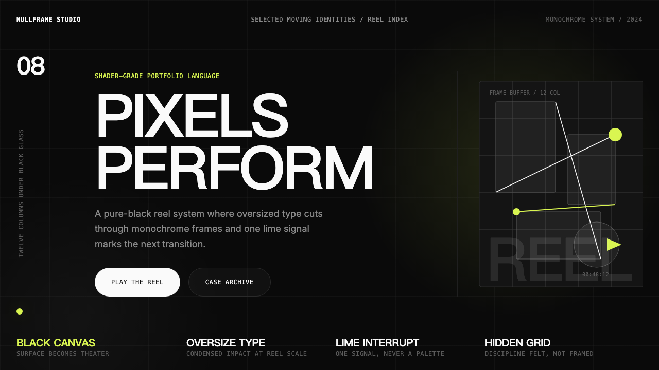 Awwwards Swiss PortfolioCinema, not interface. Black canvas, huge condensed type, and one lime signal…
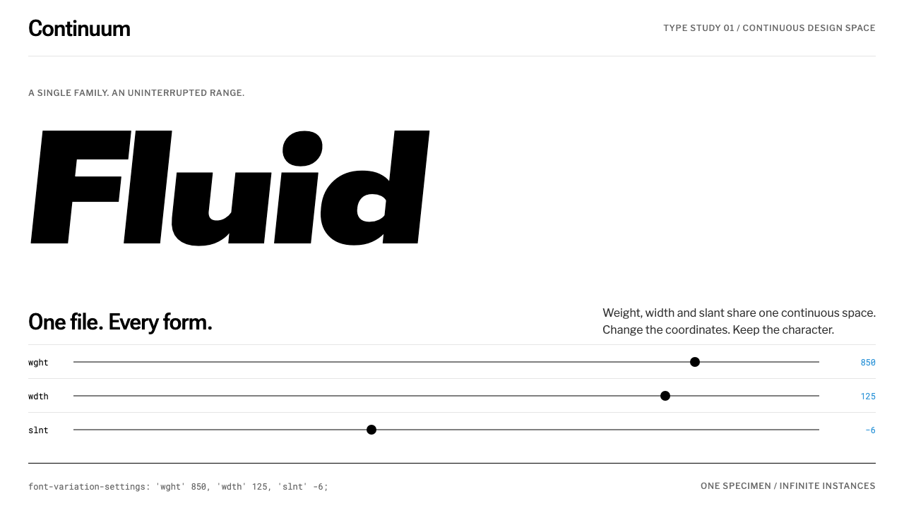 Variable FontsType moves. The page stays still. Black variable glyphs, white space and hair…
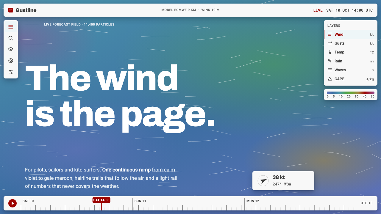 Windy Wind MapThe wind is the page. Steel-blue ramp, hairline trails, and a light Roboto in…
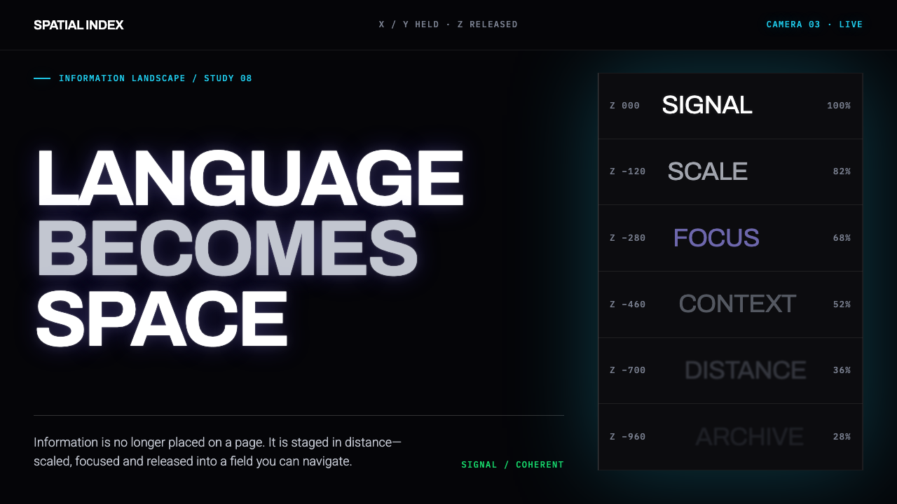 Muriel Cooper MITType escapes the page. White grotesque recedes through emissive black in laye…
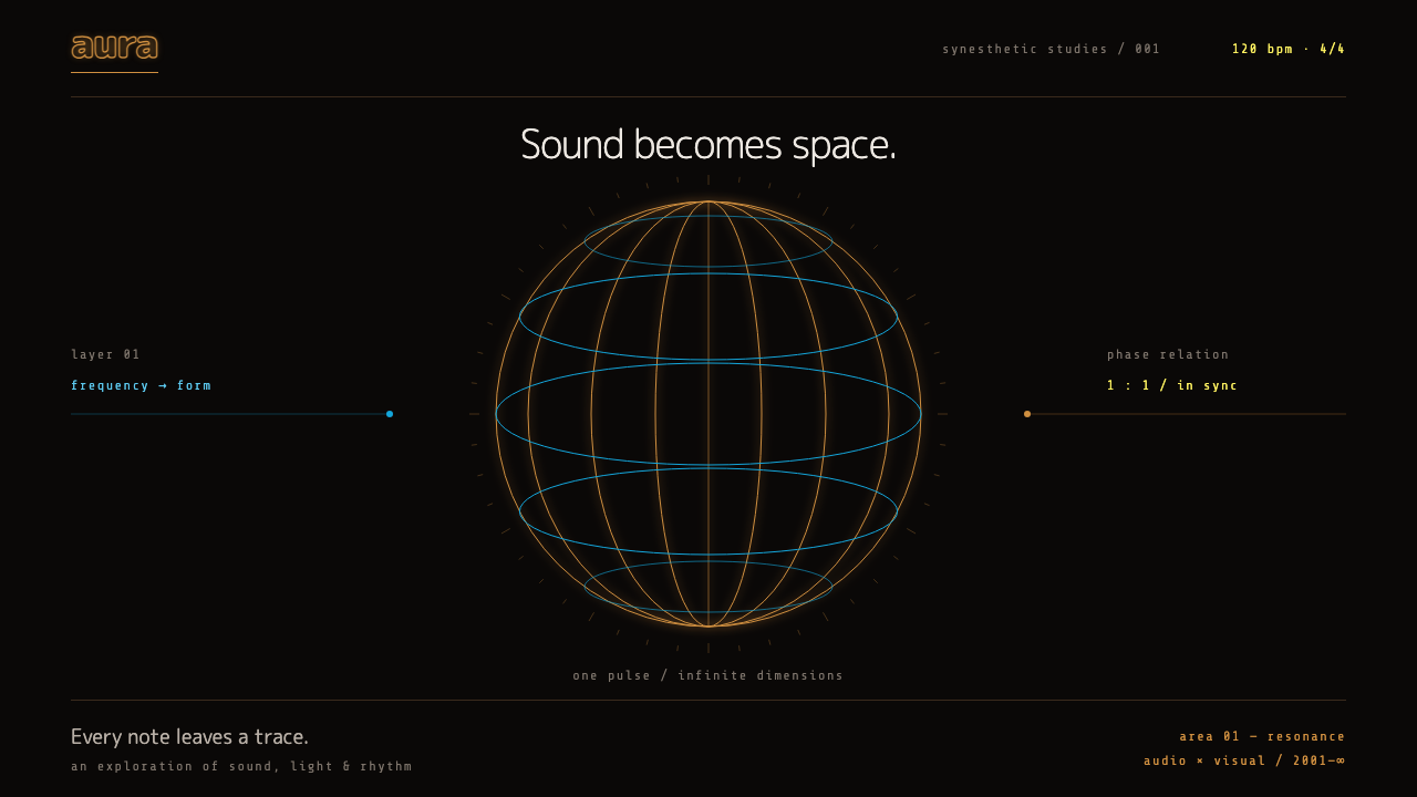 RezQuiet, with a pulse. Orange and cyan wireframes turn a warm black void into r…
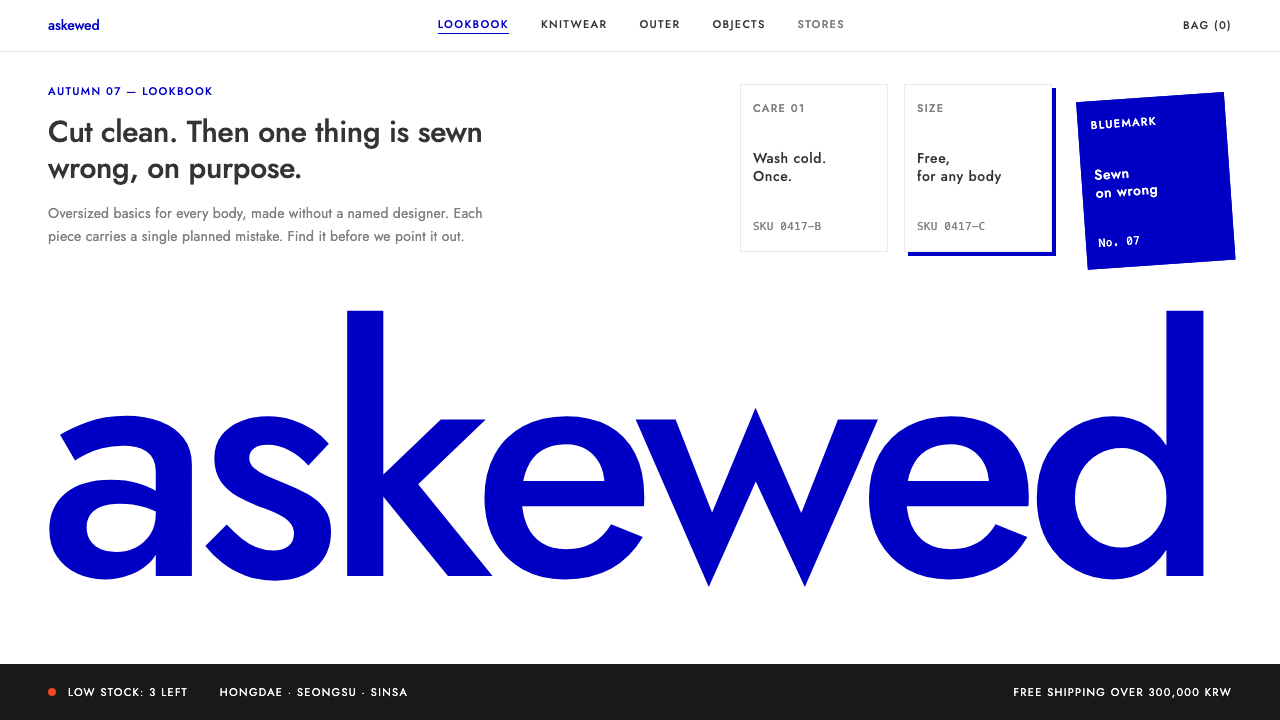 ADER errorOne planned mistake per view. Bluemark blue on stark white, wordmark cropped…