What is Valentine's Day Hearts?
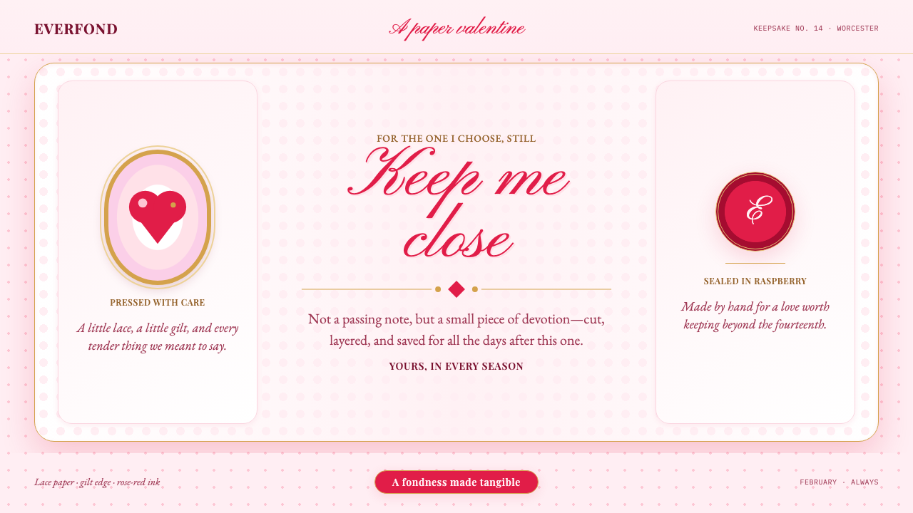
Valentine’s Day Hearts turns the interface into a Victorian paper valentine — raspberry hearts, white lace, soft blush paper, and enough ornament to make fondness feel gloriously visible.
Valentine's Day Hearts in brief
Valentine’s Day Hearts is a romantic design language built from the visual vocabulary of the Victorian paper valentine: die-cut lace, embossed hearts, sentimental verse, decorative borders, floral motifs, and illustrated figures arranged as an affectionate object rather than a neutral information surface. Its emotional register is deliberately direct. The page does not hint at fondness from a distance; it stages fondness at full volume.
The foundation is a softly blushing pink page, chosen to feel like paper warmed by emotion rather than a sterile digital background. White doily-like cards float above it like pressed petals, creating a gentle layered field for content. Raspberry-red hearts provide the principal accent, while gilt lace and ornamental details add a sense of preciousness. The result should feel assembled, handled, and cherished: handmade enough to be personal, polished enough to function as a coherent interface.
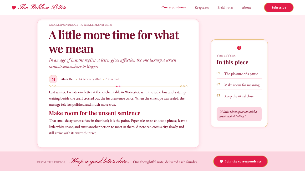
Typography carries the style’s central tension. Script lettering expresses sweet nothings, dedication, and intimacy, but it is paired with a clean serif so the page remains readable. Ornament is not treated as a decorative afterthought; it is the message. Every lace edge, heart, flourish, and framed card reinforces the idea that the interface is itself a love letter rebuilt for the screen.
Where does Valentine's Day Hearts come from?
The style draws from the Victorian paper valentine, whose peak period belongs to the nineteenth-century valentine boom from the 1840s through the 1900s, especially the 1850s to the 1870s. Its geographic imagination joins England, particularly London, with New England, particularly Worcester, Massachusetts. That pairing matters because the style feels both imported and assembled: formal enough to suggest a European paper tradition, intimate enough to feel like something made at a worktable for one particular recipient.
Esther Howland is central to the Worcester side of this story. In the 1850s, she assembled valentines by gluing together lace and ornamental pieces. That method supplies the design language with its strongest physical metaphor: the page should look composed from layers of affectionate fragments rather than generated from one perfectly uniform surface. Cards, borders, hearts, and flourishes can overlap gently, as though each element was selected and placed by hand.
Louis Prang represents the style’s printed and widely circulated dimension. His chromolithographed cupids were printed by the millions, turning romantic illustration into a visual vocabulary that could travel far beyond a single handmade card. In a digital adaptation, this suggests a balance between intimacy and abundance: the interface may feel personal, but its motifs can repeat confidently across cards, banners, invitations, and decorative states without losing their emotional clarity.
The wider source field includes Victorian sentimentalism, chromolithography, paper-lace die-cutting, and Romantic illustration. Kate Greenaway and Raphael Tuck belong to the same constellation of references named by this style. Together, these influences support a look that is decorative without irony, illustrative without harsh realism, and openly invested in the pleasures of paper, ornament, and romantic address. Its mid-century American revival, from the 1910s through the 1950s, extends that vocabulary beyond its original boom and confirms its ability to return as a recognizable emotional style.
What defines the Valentine's Day Hearts look?
Blush Ground
The background should feel softly pink, like paper warmed by emotion rather than a technical canvas. Keep it gentle and spacious so the white lace cards can float visibly above it. The blush ground establishes romance before any heart or greeting appears, but it should remain quiet enough for raspberry accents and dark lettering to retain their authority.
Lace and Paper
Lace is the style’s signature texture, but it should read as cut paper, not as a soft textile simulation. Perforated edges, doily-like frames, scalloped borders, and layered white cards create the impression of an assembled keepsake. The edges may be intricate, yet the central content area must remain calm and open so ornament frames affection rather than smothering it.
Hearts as Accents
Raspberry-red hearts provide the clearest visual signal and should be treated as meaningful punctuation. They can mark a call to action, frame a dedication, punctuate a title, or gather around an illustration, but their repetition should feel rhythmic rather than random. A heart is never merely a generic icon here; it is the small emblem that tells the viewer what the page feels.
Script and Serif
Script type carries the intimate voice: greetings, dedications, short declarations, and the parts of the interface that should feel handwritten. A clean serif handles longer reading, labels, and practical information. The contrast should feel like a card where a printed structure has been personalized by hand, not like two unrelated typefaces competing for attention.
Gilt Ornament
Gilt details suggest that the message is precious without turning the page into a luxury storefront. Use them on lace edges, tiny rules, corner ornaments, or selected flourishes where a gift-like glint helps establish hierarchy. Gold should support the raspberry heart and blush paper, not compete with them as a second dominant color.
Layered Keepsake
Depth comes from gentle stacking rather than technological gloss. A white card may sit above the pink page, a heart may overlap its edge, and a lace frame may sit between the two. The composition should suggest pieces gathered into a cherished object. Avoid making every layer equally loud; the charm depends on a clear recipient, a clear message, and ornament that knows when to recede.
Open Sentiment
The defining attitude is unapologetic fondness. The style does not hide behind neutrality, irony, or minimal restraint. Hearts, flowers, lace, cupids, and tender language are allowed to mean exactly what they mean. The page can be a little overwrought, because emotional excess is part of the historical reference and part of the contemporary pleasure.
Who shaped Valentine's Day Hearts?
Esther Howland is the clearest source for the handmade, assembled character of the style. Her Worcester valentines from the 1850s, built by gluing together lace and decorative pieces, provide the model for layered cards, cut-paper borders, and compositions that feel selected for a particular recipient. In a digital interface, her influence appears whenever the page looks lovingly composed rather than mechanically generated.
Louis Prang represents the expansive printed side of Valentine’s Day Hearts. His chromolithographed cupids, printed by the millions, connect romance with color reproduction and broad circulation. The digital lesson is not to make every element rare or precious, but to create a recognizable family of hearts, cupids, floral marks, and ornamental frames that can travel across a whole system while retaining a consistent emotional voice.
Kate Greenaway belongs to the style’s named constellation of Romantic illustration and Victorian sentiment. Her place in the reference field supports a gentle, storybook-like approach to figures and decorative scenes rather than a hard-edged or aggressively modern one. When using this influence, imagery should feel tender, composed, and suited to a keepsake page.
Raphael Tuck is another named reference within the paper-valentine tradition that informs this style. His inclusion reinforces the importance of printed greeting cards as designed objects: the message, border, image, and material impression belong to one complete gesture. For contemporary work, that means treating the whole card or screen as the romantic artifact, not decorating an otherwise unrelated interface with isolated hearts.
How do you use Valentine's Day Hearts today?
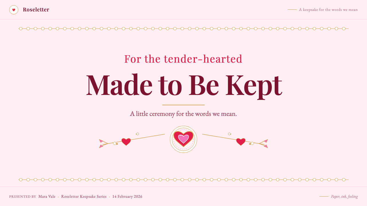
For presentation slides, use the style most confidently on covers, dedication pages, and transitions. A cover can place a large white lace card on the blush ground, with a raspberry heart or illustrated cupid providing the emotional anchor. Content slides should retain a calm reading field inside the ornament, using script for a short heading or quote and clean serif text for explanation. Data slides can turn charts into keepsake-like cards: a restrained lace frame, a clear serif label system, and raspberry accents reserved for the most important series or conclusion.
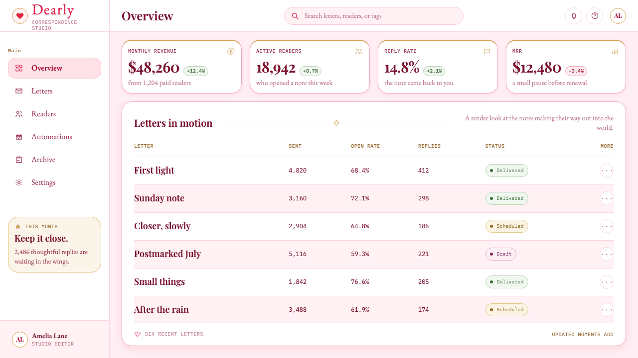
For web interfaces, Valentine’s Day Hearts suits dashboards and pricing pages that want to feel personal, celebratory, or gift-oriented rather than purely technical. Dashboard cards can resemble small paper notes arranged across a soft pink page, with hearts marking saved items, milestones, or affectionate status messages. Pricing tiers can use different ornamental treatments, but the practical information must remain in the clean serif voice. Buttons and interactive states should receive the strongest raspberry emphasis, while gilt details remain secondary and do not reduce clarity.
For editorial and marketing work, the style naturally supports invitations, seasonal campaigns, relationship products, stationery, gifting experiences, personal announcements, and content that benefits from visible warmth. Use lace to frame an opening statement, script lettering for a dedication or campaign phrase, and illustrated hearts or cupids as recurring narrative motifs. A long article should not decorate every paragraph; instead, let one or two keepsake-like moments carry the emotional identity while the body remains easy to read.
The most common mistake is confusing romantic abundance with unrestricted ornament. If every card has lace, every heading is script, every surface is pink, and every space contains hearts, the page loses hierarchy and begins to resemble visual noise. Another mistake is using generic modern icons beside historically suggestive paper details. The system works best when its motifs belong together: handmade-looking cards, tender typography, raspberry punctuation, and ornament that appears chosen for the message rather than added because the space was empty.
Valentine's Day Hearts — FAQ
Is Valentine’s Day Hearts meant to look historically accurate?
It is historically rooted rather than museum-like. The style draws from the Victorian paper valentine, Esther Howland’s assembled Worcester cards, Louis Prang’s chromolithographed cupids, paper-lace die-cutting, and Romantic illustration. The goal is to rebuild that emotional and material vocabulary as an interface, not to reproduce one surviving card exactly. A contemporary page can simplify the details while preserving the blush paper, white lace, raspberry hearts, script intimacy, and clean serif legibility that make the reference recognizable.
Can this style work outside Valentine’s Day campaigns?
Yes, when the product or message benefits from visible affection, ceremony, or gift-like presentation. It can support invitations, stationery, personal announcements, gifting experiences, relationship products, seasonal editorial, and celebratory dashboards. It is less suitable when the experience depends on severe neutrality, institutional distance, or purely technical authority. Its usefulness comes from matching the style’s open sentiment to the emotional promise of the product.
How should script type be used without hurting readability?
Treat script as an intimate accent rather than the main reading system. It works best for short greetings, dedications, campaign phrases, or a small emotional cue. Longer explanations, labels, navigation, and practical details should remain in the clean serif voice. The contrast creates the impression of a printed card personalized by hand, while keeping the interface useful for people who are not reading it as a decorative object.
Why are white lace cards important instead of using ornament directly on the pink page?
The white cards create the material logic of the style. They separate content from the blush ground, give lace a visible edge, and make each message feel like a small keepsake placed on a larger sheet of paper. Without that layer, the page can become a flat field of pink decoration. The cards also create a useful hierarchy: the background carries atmosphere, while the floating paper carries the actual message.
How much ornament is enough?
Enough ornament is whatever makes the page feel assembled and fond without obscuring its recipient, message, or action. Start with the soft pink ground, one clear white card structure, and raspberry hearts used as punctuation. Add lace or gilt detail where it strengthens the keepsake impression, then stop before every surface begins competing. The style can be overwrought, but its excess should feel intentional and rhythmic rather than accidental.
Related design styles
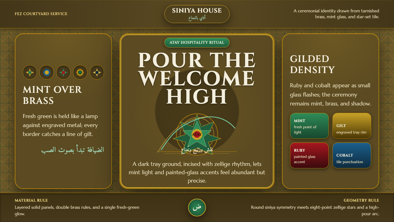 Moroccan Mint TeaCeremony glows in brass. Mint green, Cinzel type, and zellige geometry frame…
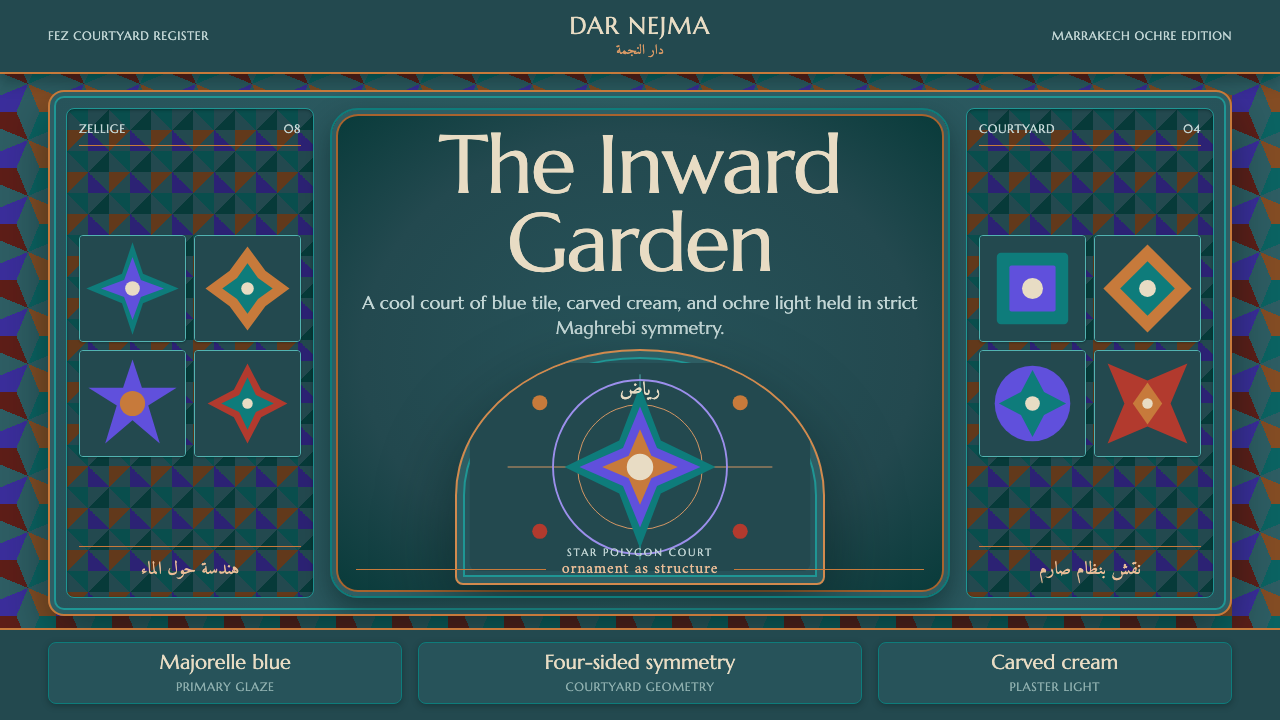 Moroccan RiadOrnament is structure. Majorelle blue and teal zellige frame a symmetrical ar…
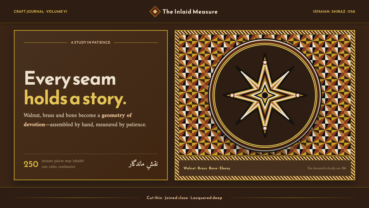 Persian Khatam MarquetryPatience becomes pattern. Brass-and-bone stars tessellate across lacquered wa…
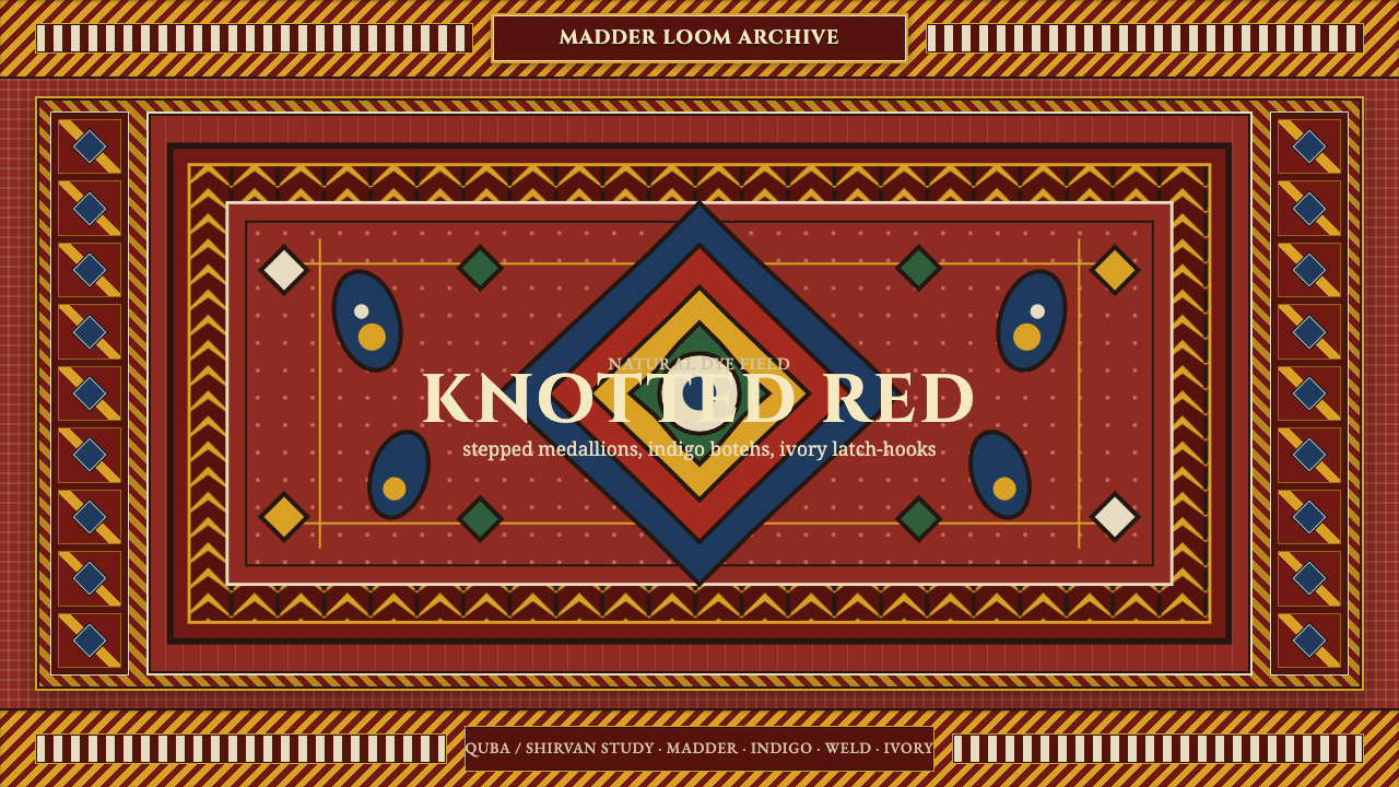 Azerbaijani Quba CarpetRed is the field. Indigo botehs and ivory latch-hooks orbit a stepped medalli…
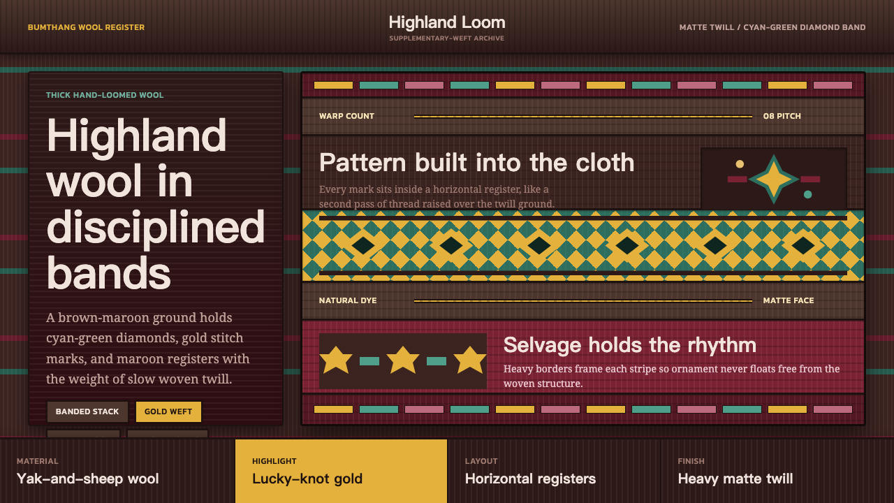 Bhutanese Yathra Wool WeaveHighland wool made digital. Brown-maroon bands carry cyan diamonds and spare…
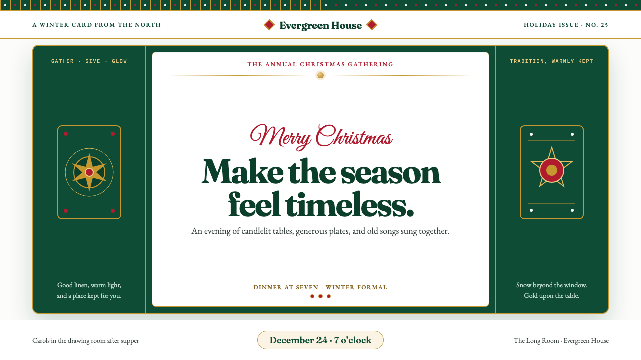 Christmas ClassicTradition glows warmly. Evergreen panels, berry-red notes and burnished-gold…