What is Uyghur Meshrep (Naan Oasis Gathering)?

Meshrep is the Silk Road's most musical communal institution — oasis evenings in Kashgar and Turpan where warmth gathers around a glowing tonur oven, naan is broken, the rawap sings, and the muqam poems unspool until dawn. This design system distils that gathering into a visual language of terracotta clay, saffron radial stamps, pomegranate-red ikat silk, and indigo tile dado bands — materiality first, warmth always.
Uyghur Meshrep (Naan Oasis Gathering) in brief
Uyghur Meshrep (Naan Oasis Gathering) is a design system rooted in the communal evening gatherings of the Uyghur oasis towns — Kashgar, Hotan, Turpan, Yarkand — where men circle a tonur oven to eat freshly stamped naan, play stringed rawap and frame-drum dap, and recite muqam poetry across the night. The visual system translates these material and social realities into a palette of warm earthy grounds, saffron highlights, pomegranate-red ikat patterning, and deep indigo tile accents.
The aesthetic draws directly from the craft objects and architectural surfaces of Kashgar's old city: the stamped radial geometry of naan bread, the warp-blur shimmer of ikat silk woven in the Hotan tradition, the geometric tilework of courtyard dado bands, and the clay-grain warmth of mudbrick walls. Nothing is abstracted for its own sake — every ornament traces back to a material you can touch in the bazaar.
What distinguishes this system from generic Central Asian decoration is its specific rootedness in the meshrep's social architecture. The gathering is simultaneously musical, poetic, culinary, and communal; the design mirrors that layering — a ground of materiality, a rhythm of repeating ornament, a focal warmth at the center, and a frame of structural coolness at the edge that keeps the composition from dissolution.
Where does Uyghur Meshrep (Naan Oasis Gathering) come from?
The meshrep as a social institution traces back to at least the ninth century Karakhanid era, when Turkic-speaking Muslim courts along the Tarim Basin oases began formalizing the gathering of men for music, poetry recitation, and moral education. Under the Karakhanids, court culture blended Persian literary traditions with Central Asian Turkic oral poetry, and the tonur oven — the clay bread kiln — was already a central symbol of hospitality and communal life. Naan, stamped with radial designs to identify the baker's household, was the currency of that hospitality.
The musical heart of the meshrep is the Twelve Muqam of the Uyghurs, a suite of twelve modal compositions integrating poetry, melody, and rhythm into extended performances that can last several hours. The muqam was systematically codified in the sixteenth century under the patronage of the Yarkand Khanate, with the Uyghur queen Amannisa Khan playing a decisive role in gathering and preserving the tradition. She is remembered as the principal compiler who rescued fragmentary muqam repertoires from regional variations and assembled them into the canonical twelve-suite form. UNESCO inscribed the Twelve Muqam on its Intangible Cultural Heritage list in 2005.
The ikat silk tradition that furnishes the design system's richest visual material — the pomegranate-red and indigo warp-dyed fabric known as atlas and adras — developed in the Hotan and Khoqand workshops across many centuries of Silk Road trade. The warp-resist dyeing technique, in which threads are bound and dyed before weaving so that colors blur slightly at boundaries, produces the distinctive shimmering bleed that gives ikat its visual signature. These fabrics were luxury goods traded as far as Persia, India, and Russia, and they carried the oasis culture's chromatic identity wherever they traveled.
Ethnomusicologists Rachel Harris and Nathan Light conducted landmark fieldwork among Uyghur communities documenting the meshrep as a living institution in the late twentieth century. Their scholarship established that the gathering was not merely a musical event but a complete social technology — a space for community dispute resolution, moral instruction, and the transmission of oral knowledge across generations. The performer Turdi Akhun was celebrated in the mid-twentieth century as the pre-eminent living carrier of the muqam tradition, his recordings preserving performance styles that might otherwise have been lost.
What defines the Uyghur Meshrep (Naan Oasis Gathering) look?
Ground Color
The dominant ground is terracotta — the warm reddish-brown of fired clay and sun-baked mudbrick. This is not a decorative choice but a material quotation: the tonur oven, the courtyard wall, the clay grain of Kashgar's old city architecture all share this chromatic family. Against this ground, saffron yellow reads as illumination — the color of the naan's stamped crust catching oven heat. The combination evokes warmth without sentimentality, giving interfaces a quality of lived-in earthiness.
Ikat Patterning
The ikat silk tradition provides the system's most visually distinctive element: bands of pomegranate-red alternating with deep indigo, separated by thin lines of saffron or cream, with the characteristic warp-blur at each color boundary. This is never a precise geometric repeat — the slight bleeding of the dye at edges is integral to the pattern's identity. In digital application, this quality is honored by allowing color boundaries to remain slightly soft rather than forcing sharp vector edges. The pattern reads as both ancient and alive, simultaneously textile and signal.
Radial Stamp Geometry
The stamped naan provides a vocabulary of radial and concentric geometry: a central motif — flower, star, or abstract boss — surrounded by rings of compressed repeating marks, all pressed into the dough before baking and charred slightly by the oven. This radial logic appears in the design system as focal-point decorations, loading states, and section dividers. The geometry is never purely mechanical — it carries the slight irregularity of hand-pressed craft, and that imprecision is part of its warmth.
Indigo Structural Bands
Courtyard dado bands — horizontal strips of deep indigo tilework at roughly waist height on a wall — provide the system's most structural chromatic element. Indigo cools the warmth of the terracotta ground, creating a baseline that grounds compositions vertically. In the design system, this translates to strong horizontal rules, footer treatments, and nav bar backgrounds that pull the eye downward and give the layout a sense of architectural rootedness. The blue is never sky-blue or digital-bright — it is the dense, slightly desaturated indigo of fired glaze.
Texture and Material Memory
Unlike design systems that aspire to frictionless flatness, Meshrep actively acknowledges material surface. Clay grain, fabric weave, and stamped relief are not literal textures but tonal qualities — a slight irregularity in how color sits, a suggestion of depth that comes from historical craft rather than digital drop-shadow. This material memory distinguishes the system from generic earth-tone palettes; it insists that every surface was once made by hands working with particular tools and particular traditions.
Typography with Arabic-Echo Character
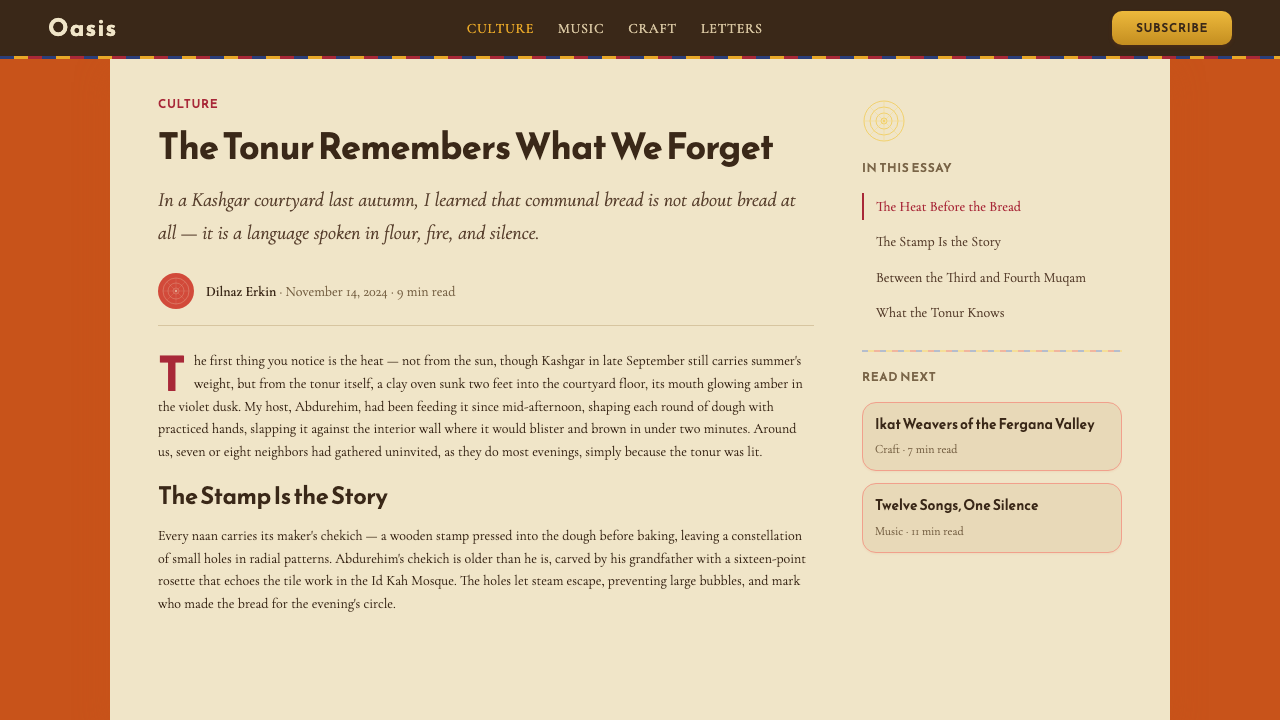
The typographic direction pairs a geometric heading face that carries echoes of Arabic Kufic letterform geometry — modular, constructed from repeated formal units — with a humanist serif for body text that grounds the reading experience in warmth rather than authority. This pairing reflects the meshrep's cultural layering: the Silk Road literacy tradition meets oral storytelling warmth. Headlines carry structural weight, body text invites extended reading, and the combination avoids both cold modernism and decorative exoticism.
Communal Warmth as Compositional Principle
The meshrep is organized around a center — the tonur oven — with participants radiating outward in a circle. This centripetal social logic informs the design system's compositional sensibility: compositions tend to have a warm focal heart surrounded by framing elements that orient attention inward rather than directing the eye off the page. This is a subtle but distinctive quality — layouts feel gathered rather than directed, inviting rather than announcing.
Who shaped Uyghur Meshrep (Naan Oasis Gathering)?
The sixteenth-century queen of the Yarkand Khanate is revered as the principal compiler of the Twelve Muqam, the modal suite system that forms the musical backbone of the meshrep tradition. According to historical accounts, she gathered muqam masters from across the oasis regions, reconciled divergent regional repertoires, and assembled the canonical twelve-suite form that has been performed ever since. Her patronage transformed a distributed oral tradition into a coherent cultural institution, and she remains the most celebrated figure in Uyghur musical history.
A celebrated twentieth-century Uyghur singer and instrumentalist, Turdi Akhun was recognized in the mid-twentieth century as the foremost living carrier of the muqam performance tradition. His recordings — made in the 1950s and early 1960s — captured extended muqam performances in a style and vocal quality that researchers consider definitive documentation of the pre-modern performance practice. Without those recordings, significant aspects of the tradition's melodic and ornamental vocabulary might have been lost to the standardization pressures of later institutional teaching.
A British ethnomusicologist who has conducted sustained fieldwork among Uyghur communities documenting the meshrep as a living social institution. Her scholarship revealed that the gathering functions simultaneously as musical performance, moral instruction space, and mechanism of community dispute resolution — a complete social technology, not merely an entertainment form. Her work has been instrumental in establishing the meshrep's complexity and cultural depth for international audiences.
Rather than a single individual, the Twelve Muqam represents a collective musical inheritance — twelve extended modal suites integrating poetry, melody, dance rhythm, and improvisational convention into performances that can last many hours. Each muqam has its own modal character, emotional register, and canonical repertoire of poems. UNESCO's 2005 inscription on the Intangible Cultural Heritage list formalized international recognition of the tradition's significance, though the living transmission of the tradition through master-apprentice relationships remains its primary vehicle of survival.
The spatial and material setting of the design system's visual vocabulary — a labyrinthine mudbrick city whose courtyard architecture, bazaar craft traditions, and social geography shaped the oasis aesthetic for centuries. Kashgar's old city concentrated the carpet weavers, silk dyers, copper beaters, and naan bakers whose work provides the design system's material references. The city's position at the meeting point of the Tarim Basin's northern and southern Silk Road routes made it a natural convergence of Central Asian craft traditions.
How do you use Uyghur Meshrep (Naan Oasis Gathering) today?
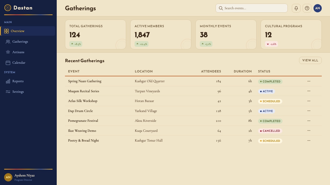
Meshrep is a warm, material-first design language best suited to products where human gathering, cultural richness, and sensory depth are core values. It is not a universal style — its particular strength is making digital surfaces feel inhabited and crafted rather than generated and frictionless. Before applying it, ask whether the product's emotional register calls for warmth and cultural specificity; if so, Meshrep is among the most coherent available answers.
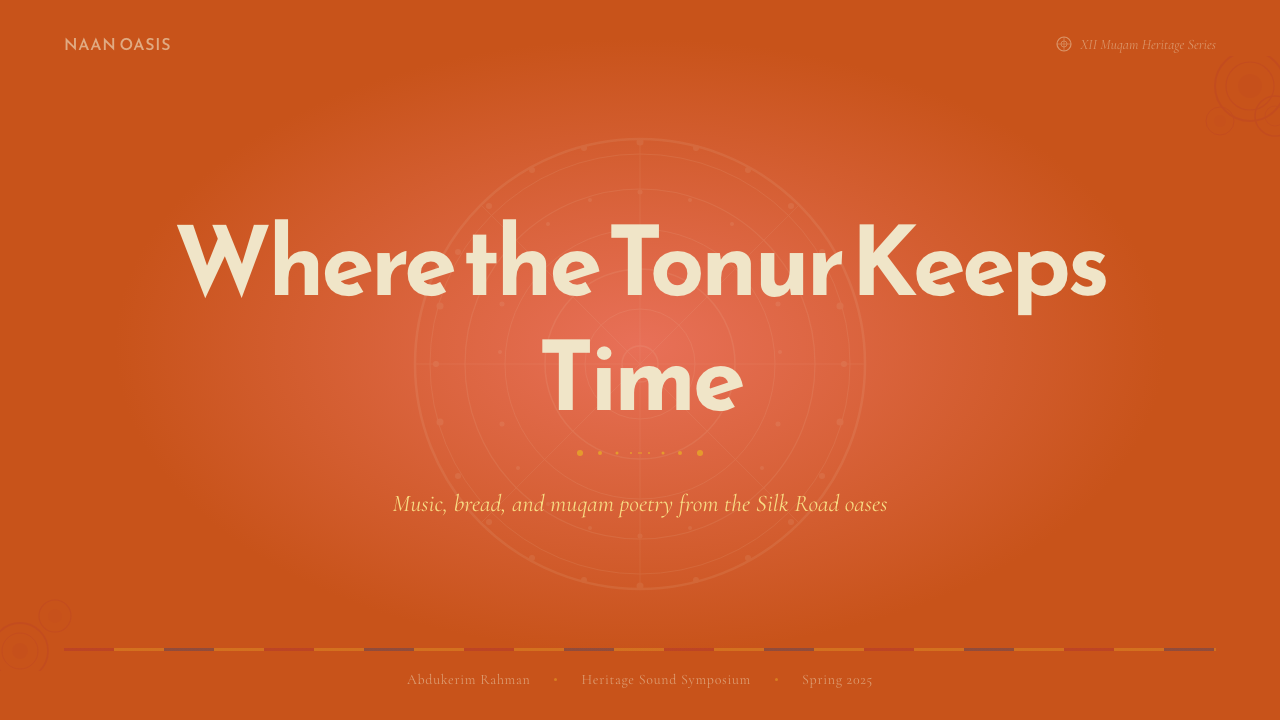
For presentation slides, the system works best with a terracotta or warm earth ground on cover slides, where the saffron radial stamp geometry can appear as a large decorative focal element behind or beside the title. Keep type hierarchies simple and strongly contrasted — a bold heading face in cream or near-white against the warm ground, with a body size that stays legible without competing for attention. Content slides should use a near-white or pale cream background to keep information legible, with the ikat band pattern appearing as a horizontal accent at the top or bottom rather than as a dominant surface. Data visualizations work well with the pomegranate-red and indigo palette — bar charts in these two colors on a warm neutral ground carry both clarity and character.
For web interfaces, the system suits cultural platforms, artisan marketplaces, editorial publications, hospitality and food brands, and any product where a sense of physical craft and regional identity is a selling proposition. The approach: use terracotta as a hero or feature-block ground, reserve indigo for structural nav bars and footer sections, and use saffron as a single accent color for primary calls to action and active states. Card components should have a slight warmth to their backgrounds — not pure white, but a very light cream — and borders that reference the tile-dado quality rather than generic UI convention.
For editorial and marketing work, the system supports richly layered page treatments. A feature article layout might use a terracotta hero with a white reading column, ikat band accents marking section breaks, and pull-quote treatments that use the radial stamp geometry as a background motif. Marketing pages benefit from alternating sections: warm terracotta feature blocks beside cool indigo comparison sections, with saffron used consistently for the primary interactive element in each block. The system's poster potential is strongest when the radial stamp geometry is given room to breathe at large scale.
The most common mistake when applying Meshrep is treating it as an opportunity for maximalist decoration — layering every element (terracotta ground, ikat bands, radial stamps, indigo dado lines) simultaneously at full intensity. The system's warmth comes from restraint, not accumulation. In a well-executed Meshrep composition, typically one or two of the system's characteristic elements appear per surface, with the others held in reserve. The ikat band and the radial stamp should almost never share the same visual region at the same scale; when both are present, one operates as ground and the other as focal accent.
Uyghur Meshrep (Naan Oasis Gathering) — FAQ
How is Meshrep different from generic Central Asian or Islamic geometric design?
Generic Central Asian or Islamic geometric design tends toward either the mathematical purity of tilework interlace — rigorous star polygons and interlocking patterns that tile infinitely — or the vegetal arabesques of Persian manuscript tradition. Meshrep is more specific and more material: its geometric vocabulary is rooted in craft objects you can locate in a particular place (the stamped naan of Kashgar's ovens, the warp-blur ikat of Hotan's looms) rather than in the pan-Islamic geometric tradition. The palette is warm and earthy rather than coolly jewel-toned or ceremonially gold. The overall register is communal and domestic rather than palatial or sacred. These distinctions matter when applying the style — the aim is a specific oasis warmth, not a generalized Orientalist evocation.
Can Meshrep work for digital products with no connection to Uyghur or Central Asian culture?
Yes, with one condition: the borrowing should be acknowledged rather than laundered into vague 'ethnic warmth.' The aesthetic is powerful precisely because it is specific — the terracotta ground, ikat band patterning, and radial stamp geometry are recognizable cultural references. Products that use Meshrep well tend to either (a) have a genuine thematic or geographic connection to the Silk Road cultural sphere, or (b) explicitly position the design choice as a curatorial gesture — the cultural identity of the style is part of the product's personality, not hidden behind generic 'warm earthy palette' language. Cultures are not interchangeable backdrops.
How should the ikat blur quality be handled in digital design, where everything defaults to sharp vector edges?
The ikat's blur is a structural feature of the warp-resist dyeing process, not an imperfection to be corrected. In digital applications, there are two honest approaches. The first is to embrace the blur literally — using soft-edge mask transitions between the ikat color bands rather than hard vector boundaries. The second is to acknowledge that the digital medium has its own material logic and use hard edges, while ensuring the color relationships and compositional rhythm of the ikat pattern are faithfully reproduced. What is not honest is to use an ikat-like pattern with hard digital edges and no awareness that something has been lost. Even small concessions to softness — a slight feathering at transitions, a texture overlay — acknowledge the material origin of the motif.
Is Meshrep appropriate for dark-mode interfaces?
Meshrep is fundamentally a light-ground system — the warmth of the design language depends on the terracotta and cream grounds against which the saffron, pomegranate-red, and indigo read correctly. A pure dark inversion tends to lose the earthy warmth and push the palette toward either a generic dark-jewel tone or a futuristic look that is contrary to the style's material sensibility. If a dark variant is necessary, the most coherent approach is to use a very deep terracotta-brown or warm near-black as the ground rather than a cool neutral dark, and to elevate the saffron highlight as the primary accent while reducing the pomegranate-red. The indigo can disappear or be replaced by a warm charcoal, since its role as structural coolness is less needed against an already-dark ground.
What kinds of products should avoid Meshrep entirely?
Meshrep struggles in contexts that demand visual neutrality, technical authority, or universal legibility across very diverse international audiences. Financial dashboards, enterprise SaaS tools, medical interfaces, and legal platforms generally need design languages that read as culture-neutral and globally professional — Meshrep's cultural specificity, which is a strength in the right context, becomes noise in those environments. The style also underperforms in contexts where the dominant visual mode is photographic and grid-driven, since its ornamental character competes with photography rather than supporting it. Finally, products targeting audiences who would experience the cultural references as distancing rather than inviting — for reasons of unfamiliarity or cultural distance — are better served by other design systems.
Related design styles
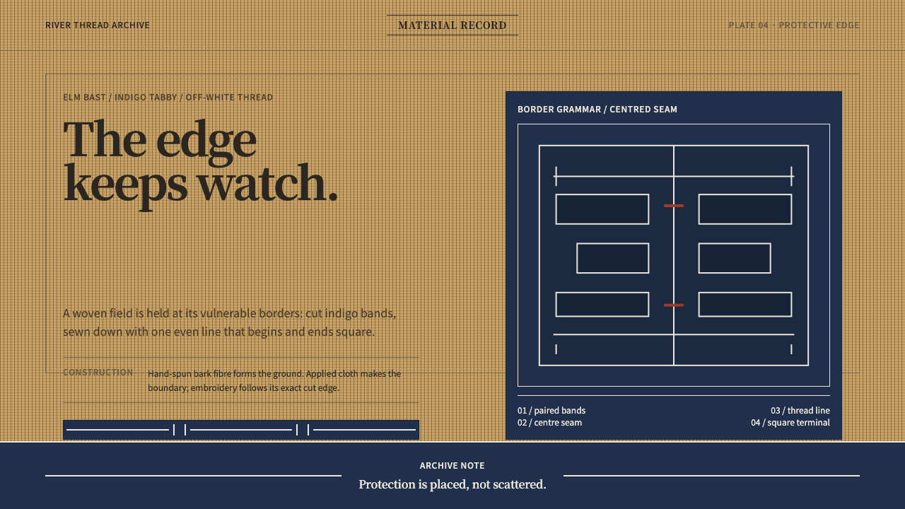 Ainu Attus RobeProtection is cut, not painted. Indigo bands and square-ended thread hold elm…
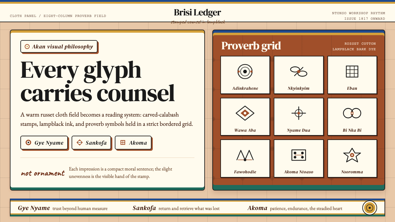 Akan Adinkra (Ghana)Proverbs become cloth. Russet grids, lampblack serif marks, and gold-edge ban…
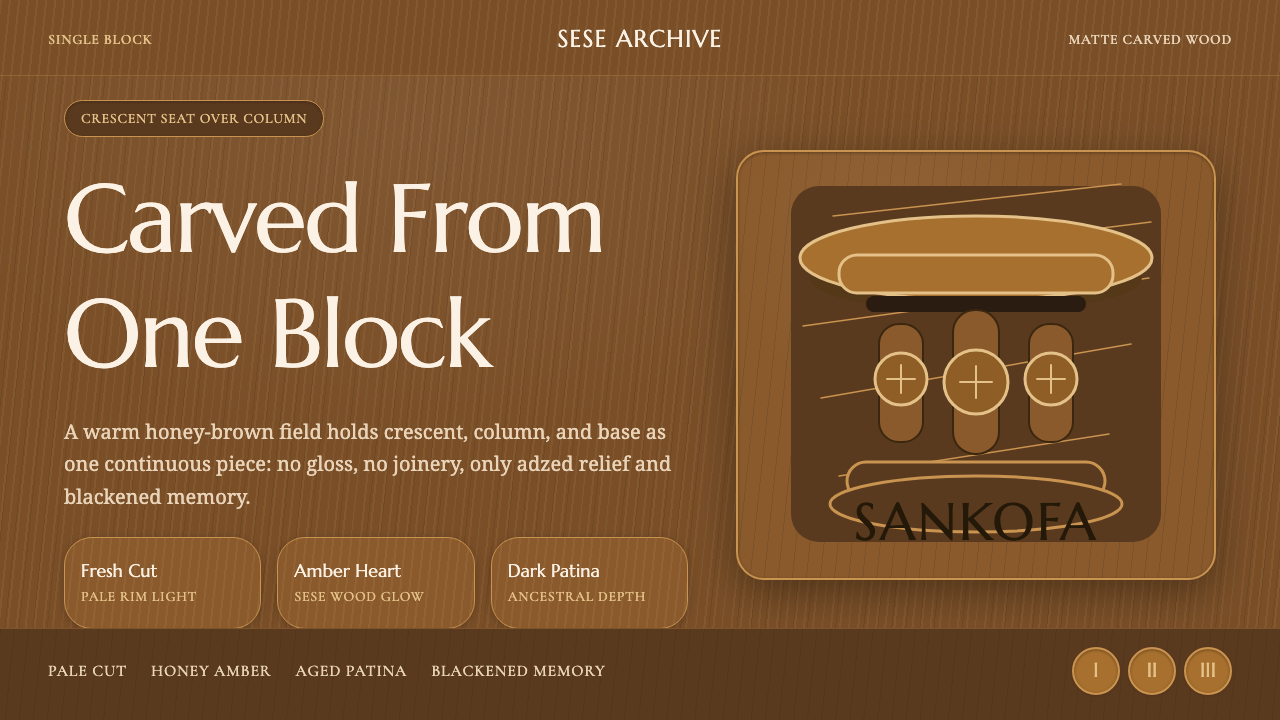 Akan Carved StoolMatte wood carries memory. Honey amber, Marcellus type, and crescent-column r…
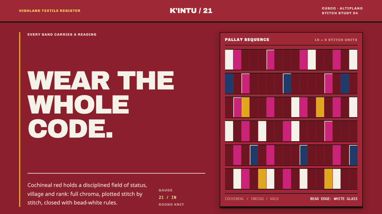 Andean ChulloOrnament carries a code. Cochineal red stacks strict stitch bands with bead-w…
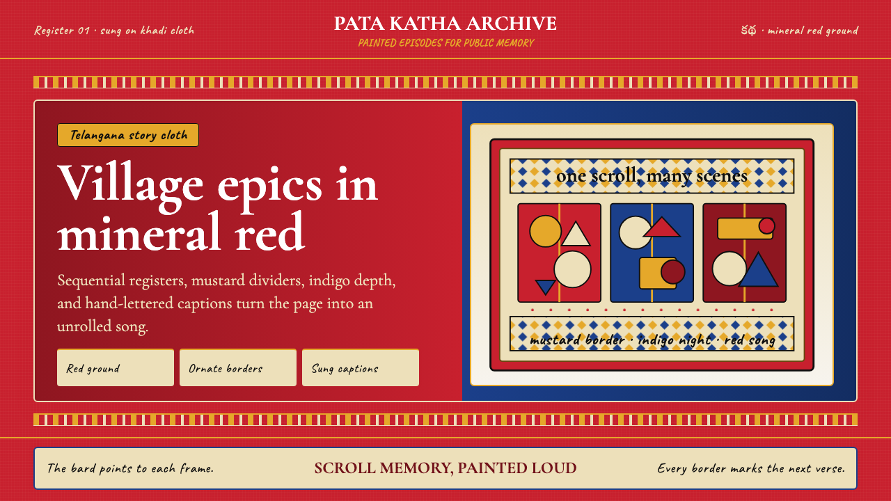 Andhra Cheriyal Scroll PaintingSaturated oral memory. Mineral red registers, mustard diamonds, and serif son…
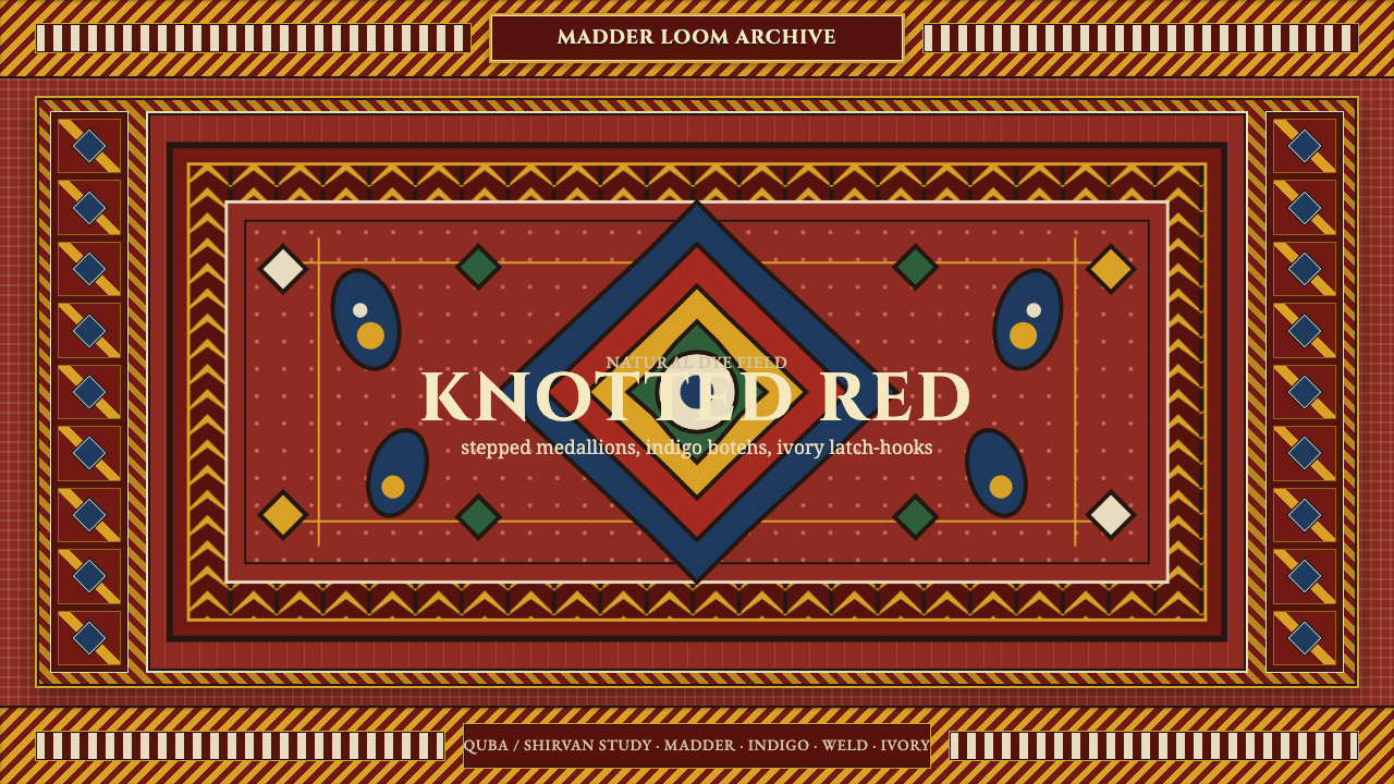 Azerbaijani Quba CarpetRed is the field. Indigo botehs and ivory latch-hooks orbit a stepped medalli…