What is Urnes Ribbon Beast?
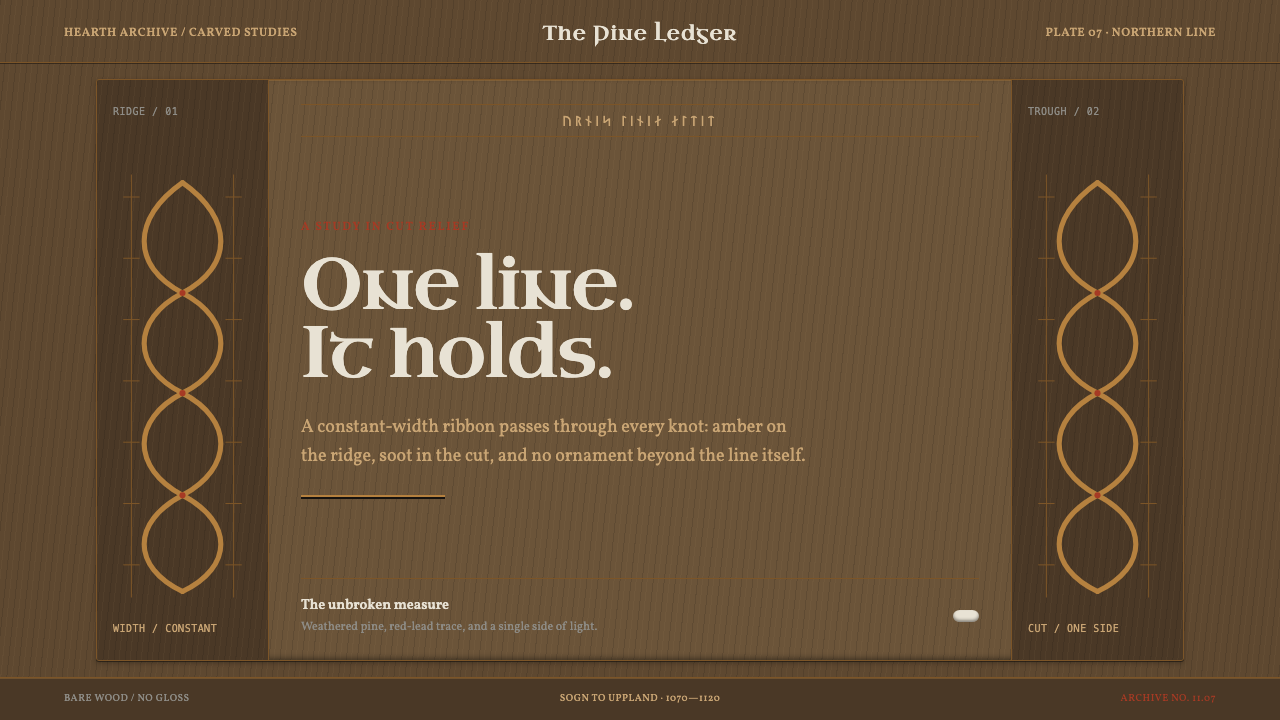
Urnes is the last of the Scandinavian animal styles: a single ribbon of unchanging width that loops through itself in figure-eights and closed knots, lit only by the edge of the knife.
Urnes Ribbon Beast in brief
Urnes is a style of ornament from the second half of the eleventh century into the early twelfth, and the final phase of the Scandinavian animal styles that Viking-age craftsmen developed over generations. Its subject is a slim four-legged beast, bitten by thinner snakes, that loops through itself in figure-eights and closed knots. The whole creature is drawn as one ribbon of unchanging width, which never tapers, never swells and never breaks into leaves.
The vocabulary is deliberately small. Almond-shaped eyes and curled lappets at the nose and neck are the only ornament the beast is permitted. Everything else is line: the body, the snakes, the knots and the spaces between them. The result is a composition governed by a single rule, in which hierarchy comes from overlap and curvature rather than from changes in thickness or colour.
Its look is carried by material as much as by outline. The carved pine of the north portal at Urnes weathered over nine centuries to a dark grey-brown, with cut ridges catching side light and the grooves falling into near-black. Nothing was painted; depth comes from how deeply the knife went. On the Swedish runestones the same line returns in granite, coloured with red lead, ochre, soot and chalk. Together they give the style a palette of dark wood, bright edge, lead red and chalk white.
Where does Urnes Ribbon Beast come from?
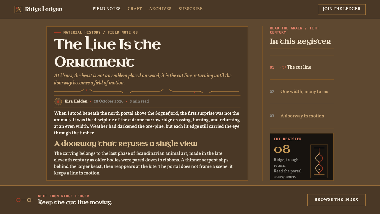
The style is named for the north portal of the stave church at Urnes, above the Sognefjord in Sogn, Norway. The portal is dated to about 1070, and the carving on it is the finest surviving statement of a manner that spread through Scandinavia in the second half of the eleventh century and lingered into the early twelfth. A stave church is a timber building of the medieval north, raised on upright posts, and its doors and portals were among the places where a carver could show the full range of what a knife could do in wood.
Urnes comes at the end of a long line. Earlier Viking-age animal ornament, which the record groups as late Viking animal ornament, was often heavier, with more varied limb shapes and plant-like offshoots. Urnes strips those away. It keeps the animal and its entanglement but reduces the body to a continuous line, as if the whole tradition had been boiled down to the one gesture that could not be removed. That is why Urnes is described as the last of the Scandinavian animal styles rather than one among many.
In Sweden the same line runs in a different medium. In Uppland, hundreds of granite stones carry runic inscriptions inside bands that follow Urnes curves, and many were painted with red lead, ochre, soot and chalk. Names survive because rune carvers sometimes signed their work: Öpir, Åsmund Kåresson and Fot are among those associated with this carving. The stones show that Urnes was not only a church style. It was a shared way of drawing, equally at home on a doorway in Norway and on a roadside monument in Uppland.
Three strands in the record meet in this style: late Viking animal ornament, stave church building and Uppland runestone carving. They share one discipline. The carver works a single continuous line and gives the viewer a puzzle to follow with the eye, and the line, once begun, must close back into itself. Weather has since done its own editing, sinking the cuts into the dark, quiet surfaces we now associate with the style, and a contemporary adaptation should take that weathered state as its reference.
What defines the Urnes Ribbon Beast look?
The Constant Ribbon
Every line has the same width from beginning to end. The body of the beast, the biting snakes and the knots are all drawn with one stroke weight that never tapers or swells. In interface and graphic terms, this means a single line weight applied to everything: dividers, frames, icons, charts. Variation comes from where lines cross and curve, not from how thick they are.
Figure-Eights and Closed Knots
The line turns back on itself in figure-eights and closes into knots, with every crossing clearly resolved as over or under. Nothing trails off or ends loosely. The shapes are loops, not spirals, and each is balanced against its neighbour. In layout, this suggests frames and ornaments that close, with borders that return to their starting point.
A Slim Beast and Thin Serpents
The quadruped is slender, almost a calligraphic line with legs, and the thinner snakes that bite it add counterpoint rather than bulk. There is no solid mass on the page. Space around and between the lines carries as much weight as the lines themselves, and negative space is part of the pattern.
Almond Eyes and Curled Lappets
The beast has almond-shaped eyes and small curled lappets at the nose and at the neck. These are the only embellishments allowed, the one place where the line is permitted to become a detail. They work like punctuation: a last flourish at a point of emphasis, never repeated as texture.
Weathered Pine and Edge Light
The ground is weathered pine, a dark grey-brown that is neither black nor quite brown, and it reads as a quiet dark field. The ridges of the cuts catch light from the side, and the grooves fall into near-black. The only brightness comes from the edges, which gives the style an amber, raking-light quality: light as a property of the cut, not a glow laid over it.
Pigment from the Stones
On the runestones the colour comes from earth and fire rather than a manufactured palette: red lead, ochre, soot and chalk. Translated into design, red appears as a mineral red used sparingly, white as a chalky residue rather than a pure white, and everything else stays dark. The palette is narrow and weathered, and no colour should look clean or new.
Depth from the Cut
There is no gradient, no glow and no drop shadow. Depth is made by the groove: a deep cut gives darkness, a raised ridge gives light. In practice, hierarchy is achieved by recessing and raising shapes against a dark field, with fine contrast lines separating them, rather than by blur or layered translucency.
Who shaped Urnes Ribbon Beast?
Öpir is one of the Uppland rune carvers whose name is attached to the runestone tradition behind this style. His importance here is as a representative of a craft: the carver who worked a single line across granite so that inscription and ornamental band became one thing. For a designer he is a reminder that the ribbon in Urnes was never decoration added to writing; it was the frame that held the writing.
Åsmund Kåresson is named among the Uppland carvers recorded with this style. Carvers of his kind show how a regional craft kept a consistent visual language across many stones: the same constant-width band, the same closed loops, adapted to the shape of each block. What matters for a designer is that the line is fitted to its field. The ribbon bends to the stone; the stone is not cut to fit a template.
Fot is the third carver recorded in connection with Urnes-style runestones. A short name and a thin surviving record are typical of this tradition, where the signature mattered less than the line. Like the others, Fot probably belonged to a workshop culture in which pattern knowledge passed through practice, and the discipline of the style reflects that: simple rules, applied again and again with great care.
The carvers who worked the north portal are not named in the record, but their work set the reference. Cut into pine rather than granite, the portal shows the style at its most refined: a single ribbon of constant width, almond eyes, curled lappets and nothing else. The unpainted wood has since aged into a dark grey-brown, and the cut ridges that catch the light are what the style is remembered for.
How do you use Urnes Ribbon Beast today?
Urnes suits subjects that want quiet intensity and a sense of age: heritage and history publishing, museums, games and fantasy worlds, craft and outdoor brands, literature and anything built around a single strong idea. It is a dark style whose light comes from edges, so it rewards a disciplined, dark-first layout and punishes anything busy.
On slides, a cover can be a dark weathered-pine field with one closed knot of ribbon framing the title, the ribbon edged in a pale amber and the title in a chalky off-white. Content slides use a thin ribbon border that closes on itself, and section dividers can be a single figure-eight. Data slides work with constant-weight line charts, no gradient fills, and one lead-red highlight.
For web interfaces, use constant-weight outlines on cards and inputs, focus rings drawn as closed loops, and cards without shadows. A loading state can be one line tracing a knot. Let amber mark interactive edges and reserve red for one primary action or alert. Keep type plain and legible in a warm light tone on the dark field, so the ribbon carries the ornament and the text carries the information.
In editorial work, such as long-form history, museum guides, lore pages and book design, a knotted ribbon can open each chapter or enclose a pull quote, and captions can sit in a band that echoes a runic inscription. Keep body text generous and quiet, and let one ornament per page be enough. The style rewards repetition of a single motif far more than variety.
The most common mistake is letting the line taper or sprout leaves, which turns Urnes into generic scrollwork. Mixed line weights, glowing gradients, clean bright white and saturated red all break the weathered logic, and so does filling the page with knots. Confusing Urnes with Celtic interlace is another trap: here the line is a creature, and the animal, however abstract, must remain in view.
Urnes Ribbon Beast — FAQ
What exactly is the Urnes style?
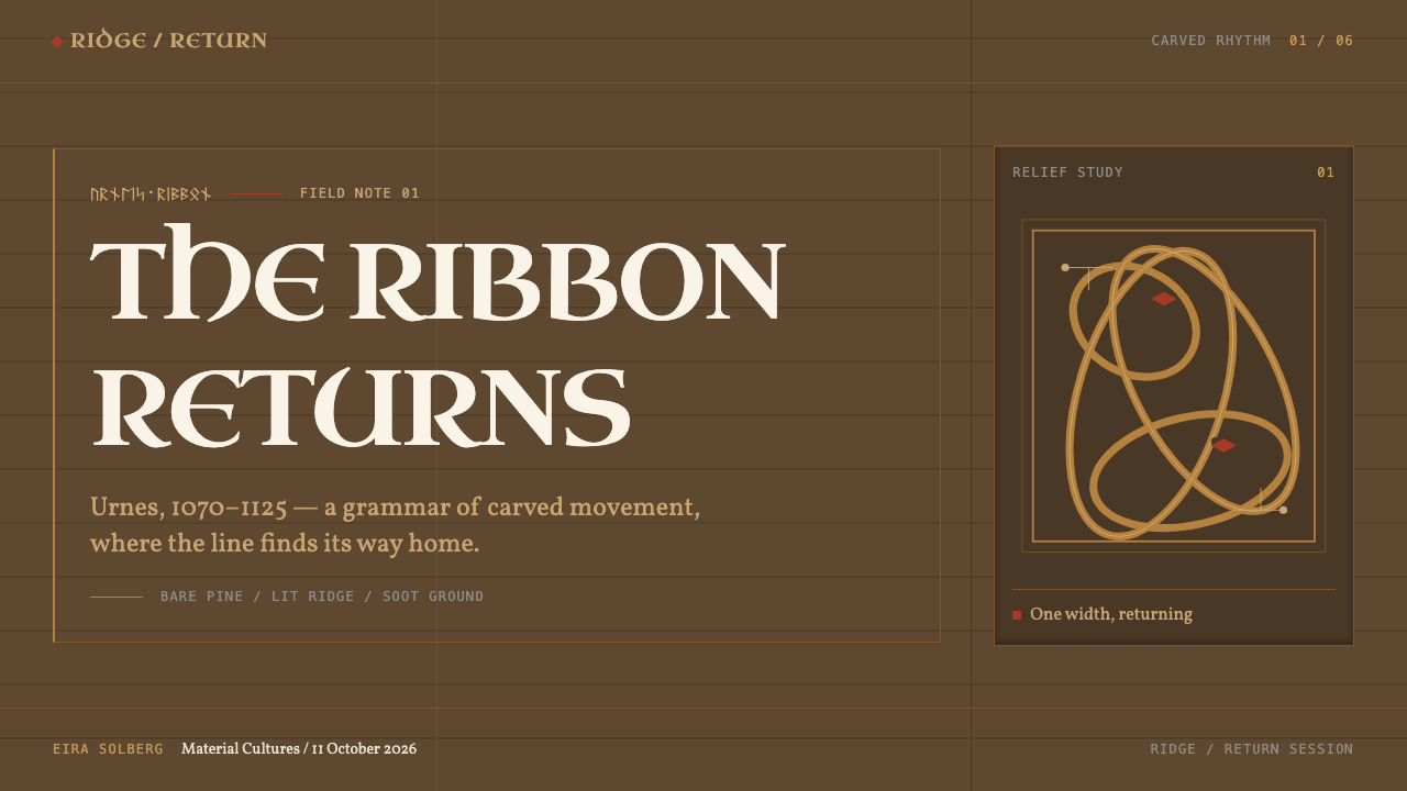
It is the last of the Scandinavian animal styles, in use from the second half of the eleventh century into the early twelfth. A slim four-legged beast, bitten by thinner snakes, is drawn as one ribbon of constant width that loops through itself in figure-eights and closed knots. Almond eyes and curled lappets at the nose and neck are its only ornament.
Is Urnes the same as Celtic knotwork?
No. Celtic knotwork is usually built from plain woven bands, while Urnes keeps a recognisable animal and the snakes that bite it, and its single line is the line of a creature rather than a pattern. Both love interlacing, but Urnes is a Scandinavian animal style, and the beast is the point of it.
Why is the palette so dark?
Because it is taken from weathered material. The portal at Urnes is unpainted pine that nine centuries of weather turned to a dark grey-brown, and the style's light comes only from cut ridges catching side light. A dark field is what lets those edges read, and it is why the whole system works best dark-first.
Can I use it on a light background?
The reference is dark, because the style's light comes from catching edges. A light version is possible by inverting the relationship: a chalky pale ground with a dark, constant-width ribbon. It will lose the raking-light quality, so keep the single line weight, keep the knots closed, and keep red to one small accent.
Where do the colours come from?
From two sources. The base and the light come from the weathered pine of the Urnes portal, dark grey-brown with bright cut edges. The accent colours come from the pigments on the Uppland runestones: red lead, ochre, soot and chalk. Both sources are earthy and aged, which is why clean, saturated colour does not belong in this style.
Related design styles
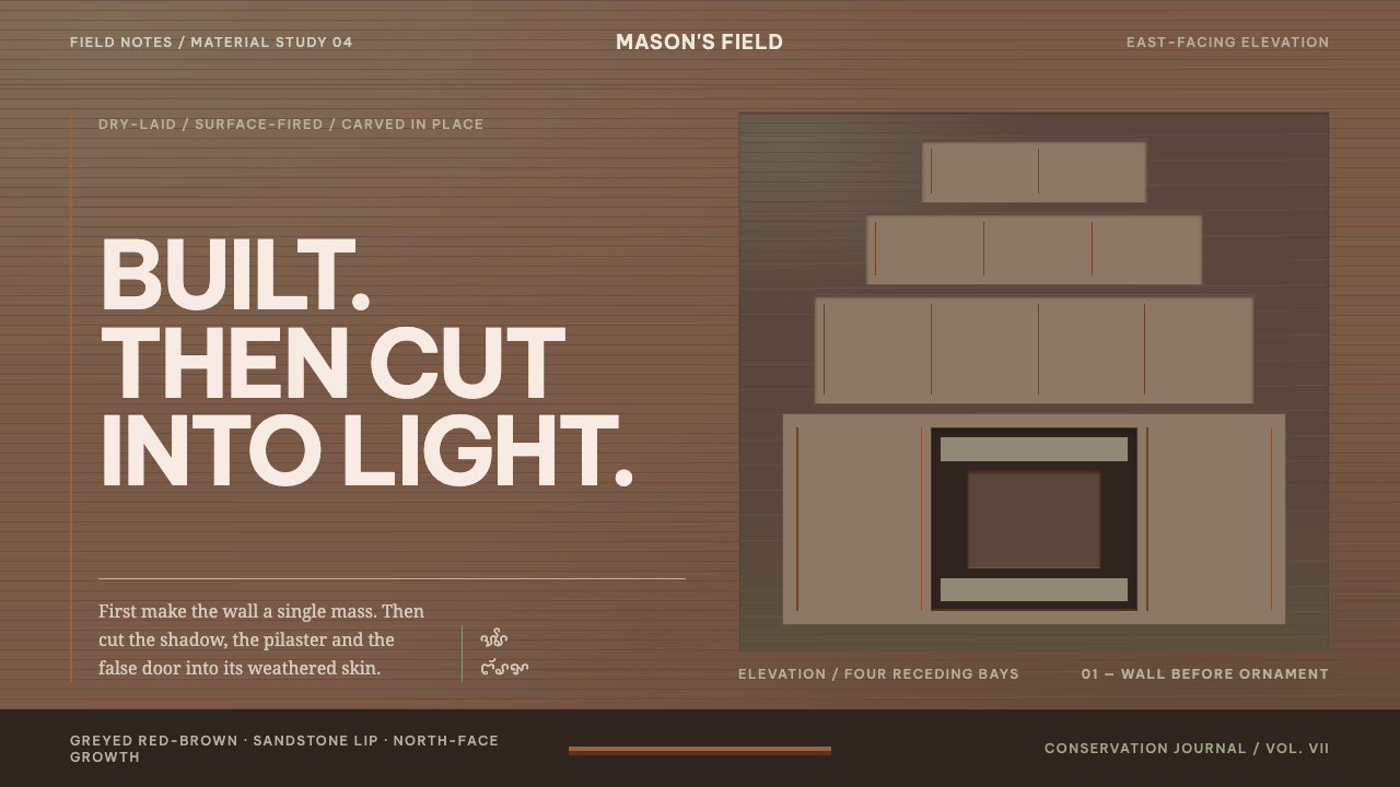 Cham My Son TowersWall before ornament. Greyed brick bays recede around cut shadows and sandsto…
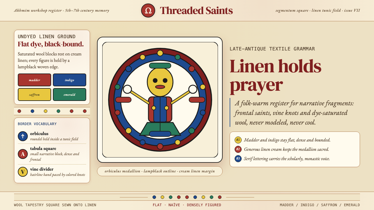 Egyptian Coptic TextileWarmth woven flat. Madder, indigo and saffron medallions sit on linen cream.
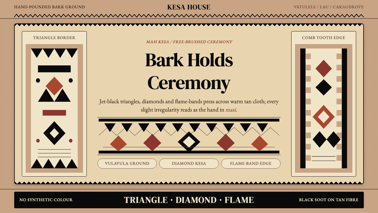 Fijian Masi (Tapa Cloth)Ceremony hits in black. Tan bark ground carries diamonds, zigzags and flame-b…
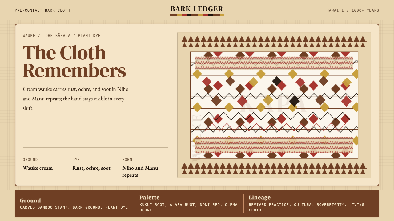 Hawaiian Kapa (Bark Cloth)Ceremonial geometry. Cream wauke, rust, ochre, and soot stamped in repeat.
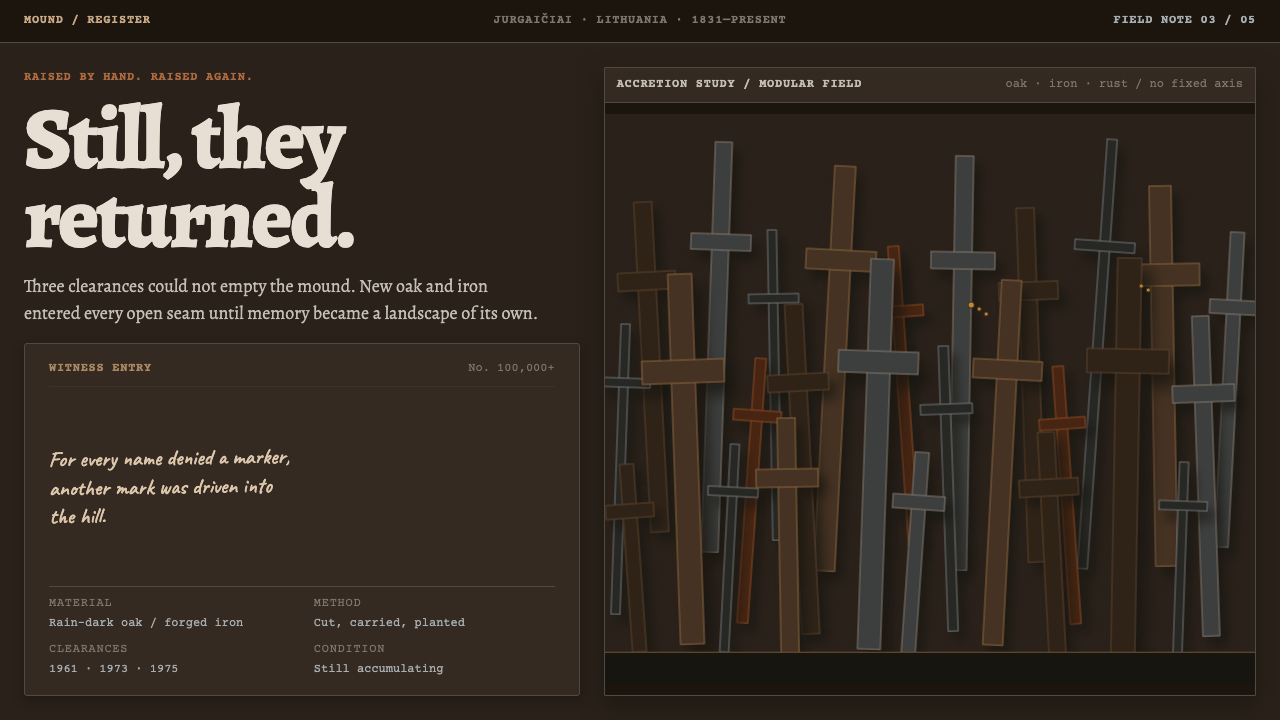 Hill of CrossesMemory returns by hand. Rain-black oak and rusted iron overlap until density…
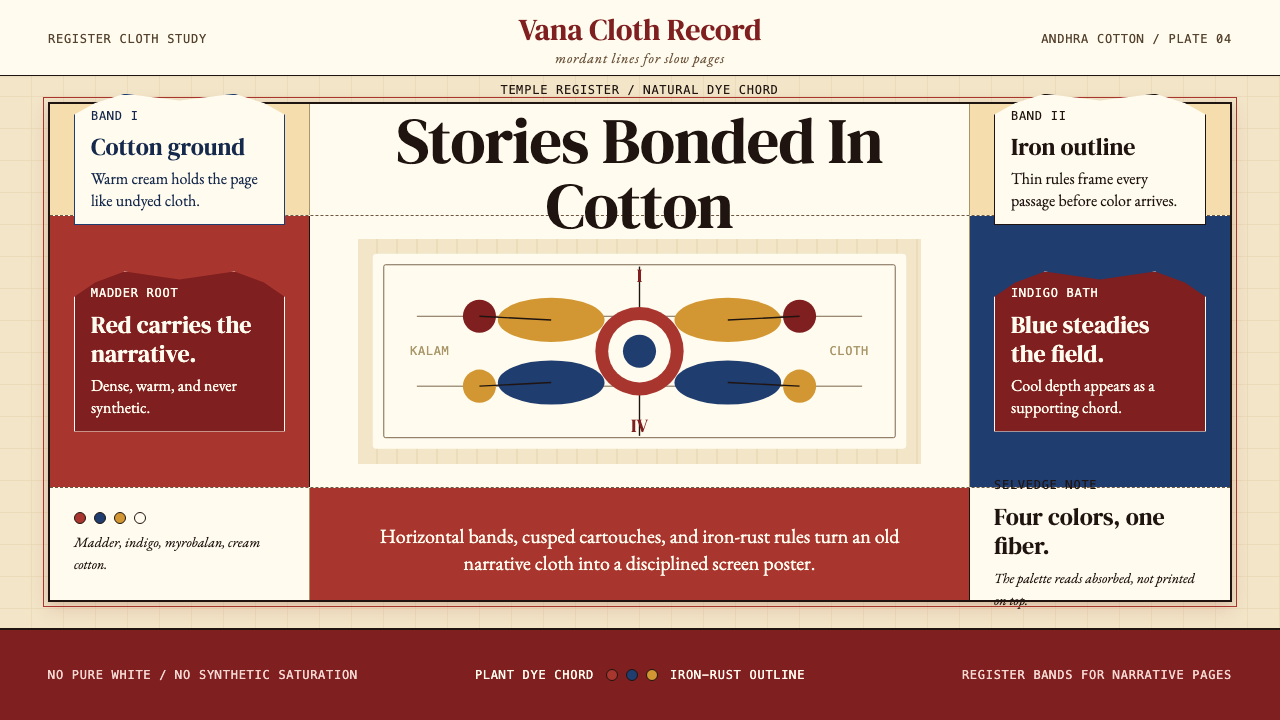 Kalamkari (Andhra Pradesh)Cloth becomes narrative. Madder bands, indigo panels, and iron rules stack li…