What is Untitled Goose Game?
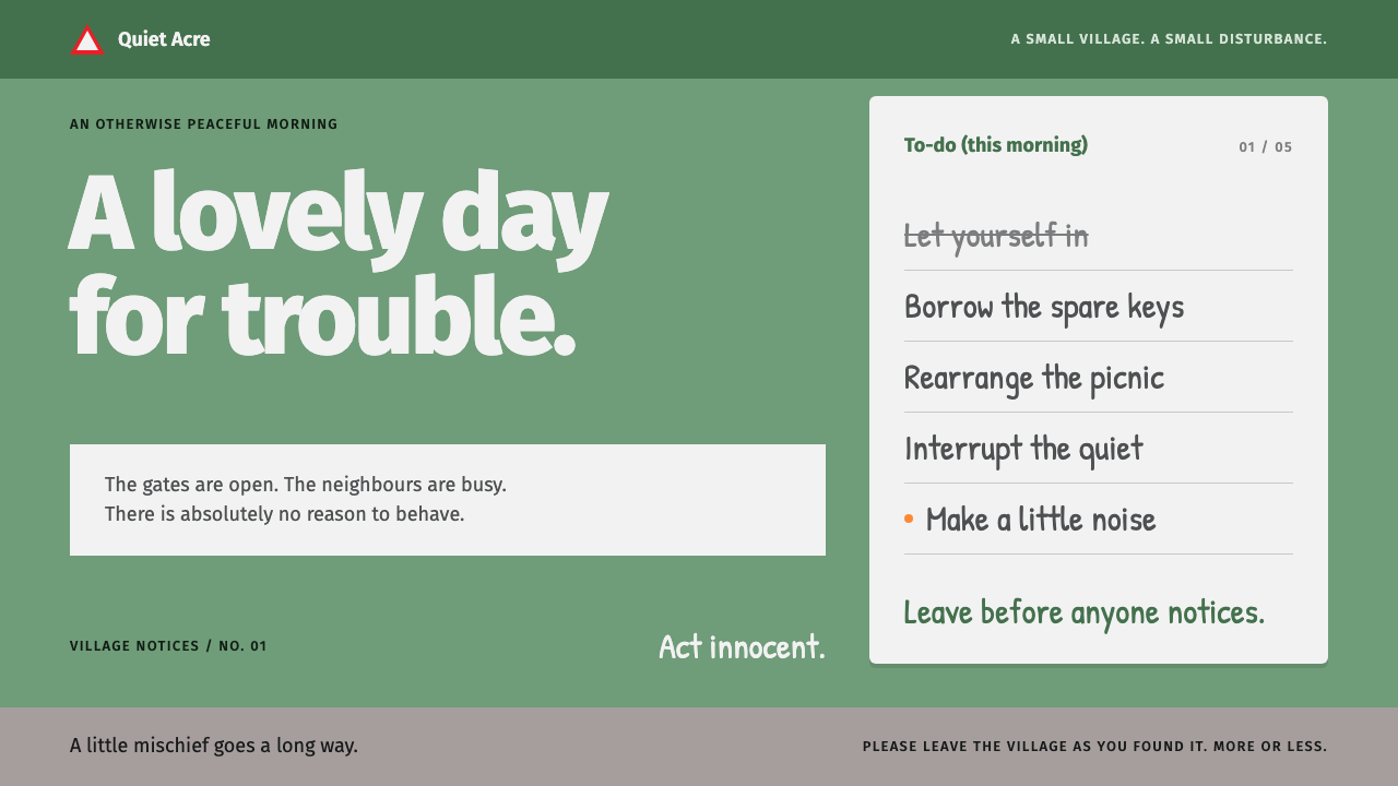
Untitled Goose Game turned a village into flat sage-green fills, road-sign lettering and a handwritten to-do list, and made mischief look genuinely calm.
Untitled Goose Game in brief
The Untitled Goose Game look comes from House House's 2019 slapstick stealth game: a sage-green lawn, warm grey paving, squared-off box hedges and a goose in plain white. Every surface is a flat fill with no outlines and no texture, separated only by soft ambient shading.
The page reads like a day in a village. A handwritten to-do list does the narrating, striking off each bad deed as it is completed. Road-sign type labels everything else. Beak orange appears only where something is about to happen, and the single sharp shape in the whole system is the red warning triangle.
The result is a quiet, polite surface that conceals a joke. Nothing in the interface raises its voice, which is exactly what makes the small act of mischief land. It is a style for products that want to be charming and a little cheeky without ever looking childish.

Where does Untitled Goose Game come from?
Untitled Goose Game was made by House House, a small independent studio based in Melbourne, Australia. The game was first revealed in 2017 and released on 20 September 2019. Although it was made in Australia, the setting is deliberately English: a quiet village with a garden, a high street, a pub and a back lane, populated by residents who have no idea they are about to be tormented by a goose.
The look belongs to the lineage of Australian indie games and, more specifically, to a tradition of low-poly, flat-colour three-dimensional work. Rather than chasing realism, the game uses simplified geometry and unified color fills, with only light ambient shading to give depth. This is a calculated choice: simple shapes keep objects readable at a glance, which matters in a game about noticing what can be moved, stolen or honked at.
The typography has a different and very specific source. The road-sign lettering associated with the game comes from the world of British highway signage, in the tradition of Jock Kinneir and Margaret Calvert's Transport typeface. That choice places a calm, civic, slightly bureaucratic voice on top of a game about chaos, and the contrast is where much of the humor comes from. The handwritten list sits against it as the human voice, a note someone has actually written.
The credited team shaped the tone as much as the picture. The studio's four founders, Nico Disseldorp, Stuart Gillespie-Cook, Jacob Strasser and Michael McMaster, built a game that is minimal in its graphics and precise in its comic timing, and the composer Dan Golding added a score that reacts to the goose's behavior. Together they produced an interface and an atmosphere in which the restrained palette and plain lettering do the setup, and the goose delivers the punchline.
What defines the Untitled Goose Game look?
Sage-green fields
Sage green is the dominant ground, a soft, slightly grey green that evokes a mown lawn without becoming saturated. Large areas of it give the page a calm, outdoor feeling. It is joined by warm grey for paving and structure, and by clean white for the goose and for paper surfaces. The palette is gentle and harmonious, and its quiet is what lets a few sharp accents work.
Flat fills, no outlines
Every form is a flat fill. There are no outlines, no textures and no hatching. Edges are defined by the contact between two colors, and depth comes only from soft ambient shading rather than from cast shadows or glossy highlights. This is what makes the system feel like a model village or a paper cut-out, tidy and slightly toy-like.
Road-sign typography
Headings, menus and labels are set in a clean sans-serif that draws on British road signs. It is legible, neutral and a little official, and it makes everything sound as though it were a public notice. Used in sentence case and moderate sizes, it gives the page a polite civic voice that the handwritten text then undercuts.
The handwritten to-do list
A white notepad carries a handwritten list of tasks, each struck through when done. It is the narrative device and the progress indicator in one. Visually it contributes the only organic, imperfect line in the system, and structurally it turns a checklist into a story. The strike-through is a small, satisfying act of completion.
Beak orange, used sparingly
Orange appears only where something is about to happen, in the manner of the goose's beak. It marks interaction, emphasis and moments of intent. Because the rest of the page is muted green, grey and white, a small amount of orange reads as an event. Spread across the page it would turn into a generic accent and lose that function.
The red warning triangle
The only sharp shape in a system of soft fills is the red-edged warning triangle, borrowed from road signage. It is used for alerts and for anything that deserves caution. Its angularity stands out precisely because nothing else is angular, and it ties the interface back to the road-sign type.
Calm, spacious composition
Layouts are uncluttered, with generous space around objects and a clear focal point. Elements sit on the page like props on a tidy stage, and the eye is allowed to rest. This relaxed pace is the setup for the humor; the interface never hurries because the goose is never in a hurry.

Who shaped Untitled Goose Game?
The four founders of the Melbourne studio that made the game, revealed in 2017 and released on 20 September 2019. Their shared decision to keep the graphics flat and simple while polishing the comic timing defined the style. Anyone adopting this look is inheriting their belief that restraint makes a joke land harder.
The composer credited with the game's music, which responds to what the goose is doing. His score is a reminder that the style is not only visual: calm surfaces, light movement and reactive sound together create the sense of a tidy village under quiet siege.
The designers behind the Transport typeface used on British road signs, the source of the lettering this style borrows. Their work shows how an everyday public typeface can be clean, legible and quietly authoritative. Setting that voice against a goose is the central joke of the typography.
How do you use Untitled Goose Game today?
The Untitled Goose Game style is a style of friendly understatement. It works best when the product wants a calm, civic tone with an undercurrent of mischief, and when the visual elements can remain simple enough to read at a glance. Applying it well means keeping the surfaces flat, the accents few and the voice dry.
For presentation slides, a cover can be a sage-green field with a single object or character shape placed with lots of space around it and a title in road-sign type. Content slides can be treated like pages in a village notice board, with a handwritten-style list used for agenda items or tasks, struck through as they are covered. Data slides suit flat bars or blocks in green, grey and white, with orange marking the one value to notice.
For web interfaces, the style fits playful but not childish products: community tools, local services, family apps, task lists, learning products and calm editorial sites. Use the road-sign sans for navigation and labels, flat panels with no outlines for cards, and a notepad-style component for checklists. Alerts can use the red triangle, and primary actions can use orange sparingly. Soft ambient shading should be the only depth cue.
For editorial and marketing work, the style supports a gentle, witty brand voice. A launch page can read like a village notice, with short deadpan copy and a list of small, specific promises. Illustrations should be simple, flat and slightly geometric, and photography should be avoided or heavily simplified. Humor should be understated; the layout itself should remain polite.
The most common mistake is adding too much contrast or too many colors. If bright, saturated hues crowd the sage green, the calm disappears and the joke has nothing to push against. A second mistake is adding outlines, textures or heavy shadows, which defeat the flat-fill logic. A third is using the red triangle decoratively; its sharpness only works when it is rare.

Untitled Goose Game — FAQ
What is the Untitled Goose Game design style?
It is a style drawn from House House's 2019 game: a sage-green and warm grey palette, flat fills with no outlines or textures, British road-sign lettering, a handwritten to-do list as narration, sparing orange for interaction and a red warning triangle as the only sharp shape.
Why does it use road-sign typography?
The lettering draws on British road signs, in the tradition of Kinneir and Calvert's Transport. It gives the interface a clean, neutral, civic voice, which is deliberately at odds with the chaos of the game. That gap between a polite surface and a mischievous act is where the humor comes from.
Can I use it for a serious or professional product?
Yes, with care. The calm palette and legible type work well for task managers, local services and educational tools. The playfulness lives in small details such as the handwritten list and the warning triangle. For highly formal or high-risk contexts, such as finance or medical interfaces, the toy-like quality may undermine trust.
Does the style work in dark mode?
It is built on a light, airy ground, and its charm depends on the soft green and white. A dark mode is possible but changes the mood from daytime village to something closer to night. If you create one, keep the same flat fills and role assignments, mute the greens further and make sure the orange and red remain rare.
How should I use the handwritten element?
Use it for the human, narrative layer: lists, short notes and progress that can be crossed off. Keep it to short passages so it stays legible, and keep the rest of the interface in the clean sans-serif. The contrast between the two voices is the point, so avoid using handwriting for everything.
Related design styles
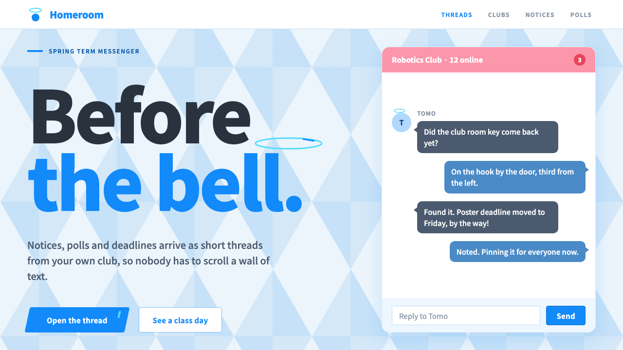 Blue ArchiveSchool-day brightness. White panels on a faceted sky, one bright Blue for eve…
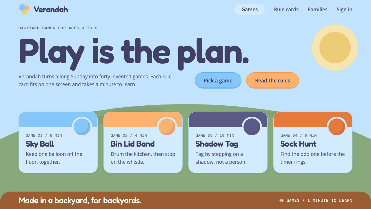 BlueyFlat, sunlit, built for play. Pale sky blue, rounded Fredoka type and a low l…
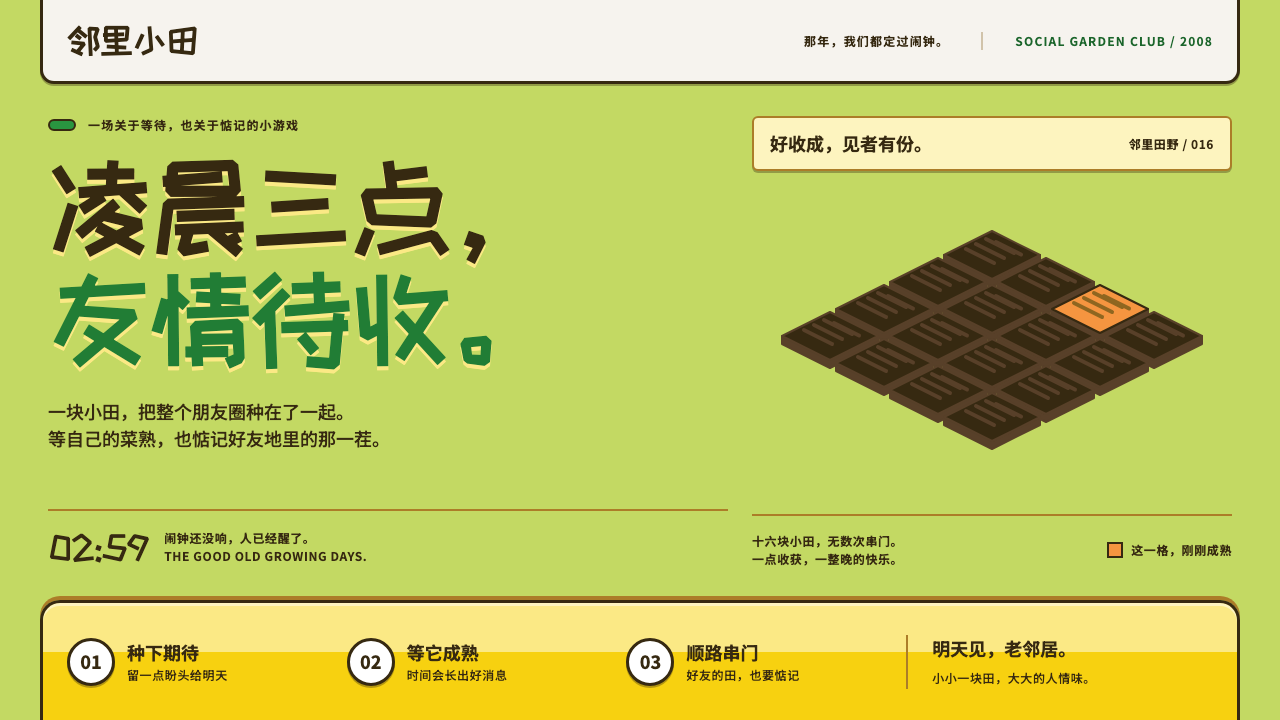 Happy FarmFriendship ripens after midnight. Lawn green, soil outlines and chunky yellow…
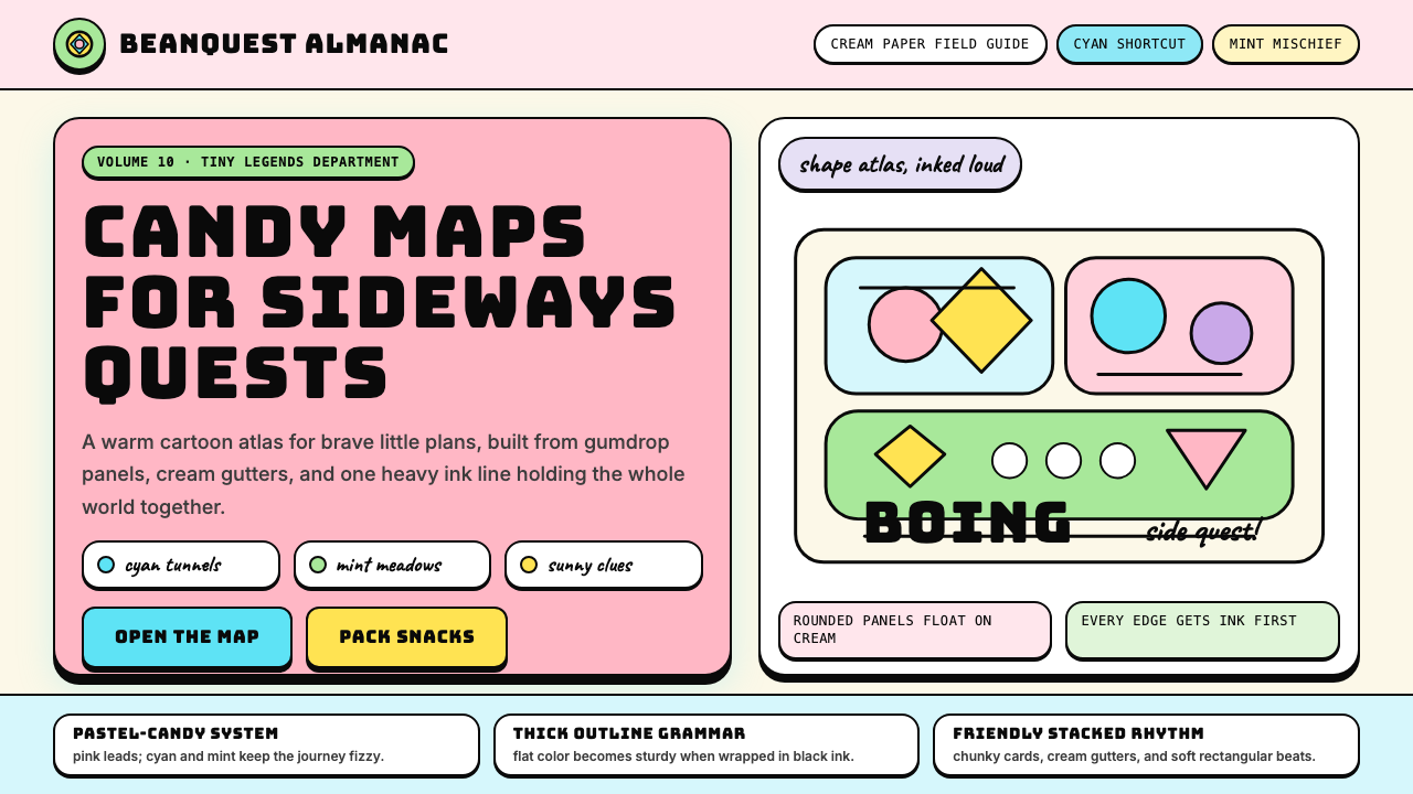 Adventure TimeCartoon warmth, inked loud. Cream gutters, candy pink, cyan and mint lock int…
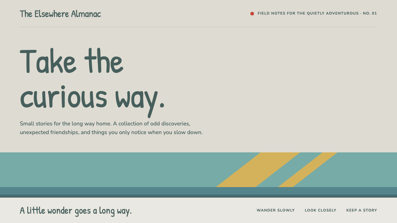 HildaQuietly curious. Hand-lettered type on snow greige, with teal bands and flat…
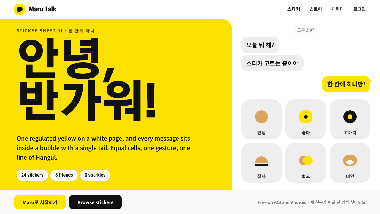 Kakao FriendsOne yellow, one gesture per cell. A white sticker sheet where speech bubbles…