What is Blue Archive?
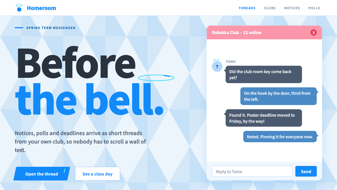
Blue Archive dresses a mobile game in school-day brightness: white panels on a faceted sky, one bright Blue for every key button, and a pink messenger for chat.
Blue Archive in brief
The Blue Archive style is the interface language of Nexon Games' school-life tactics role-playing game, set in the academy city of Kivotos. In an industry where game menus are usually dark, metallic and dramatic, it runs in daylight. Panels are white with thin sky-blue frame bands, the backdrop is a pale faceted pattern, text is navy, and the bright Blue taken from the logo marks every button that matters.
Its signature piece is MomoTalk, the in-game messenger the player, called Sensei, uses to talk to students. It has a pink header, rounded bubbles with small tails and circular avatars, so conversations feel like a real chat app. The thin halo rings that float above the students' heads have become a recurring graphic motif across the system, appearing in loading marks, badges and decorative lines.
The result is a light-mode game UI with the clarity of a well-made mobile app. It is cheerful without being childish, tidy without being cold, and strongly branded by the use of one blue and one pink. It suits products that want to feel bright, quick and a little anime-flavoured.

Where does Blue Archive come from?
Blue Archive launched in Japan in February 2021, with publishing handled by Yostar in Tokyo, and followed with a Korean and global launch in November 2021. It was developed by Nexon Games in Seoul, and Kim Yong-ha and Mitsukiyo are among the names associated with the project. The current visual identity has stayed broadly stable from 2021 through 2025, which is a long time in a market that often rebrands a game every season.
The game belongs to the family of Korean and Japanese mobile gacha role-playing games, a genre known for collectible characters and constant events. Within that family, Blue Archive chose a distinctive path in its interface: a flat, light-mode approach, rather than the dark and ornamental menus typical of the genre. The decision gives the game a fresh, open look even in screens full of information.
Its second tradition is the in-game messenger. Placing a chat interface at the heart of the experience makes the relationship between Sensei and the students feel personal. MomoTalk uses a recognisable messaging vocabulary: avatars on the left, bubbles with small tails, a colored header. By borrowing this familiar grammar, the game lets players read the interface instantly, and it gives designers a ready pattern to reuse in non-game products.
The setting of Kivotos, an academy city of many schools, inspires the overall tone. School-day imagery, such as clean white classrooms, bright sky and neat uniform colors, is translated into panels, bands and backgrounds. The faceted sky behind the panels suggests a stylised, cut-glass day, and the halo rings introduce a touch of the otherworldly without disturbing the cheerful mood.
What defines the Blue Archive look?
White panels with sky-blue bands
Panels are white, edged by thin bands of sky blue that act as frames. They feel like clean paper cards laid on a bright surface. The thin band is a quiet way to give structure without heavy borders or shadows.
Faceted pale sky backdrop
Behind the panels lies a pale, softly faceted pattern in sky tones. It adds depth and a hint of crystal without competing with content. Because it stays pale, white panels remain the clear foreground.
One bright Blue for key actions
The saturated blue of the logo is reserved for the buttons that matter: confirm, start, purchase. Because it is the only strong color on most screens, it works like a signpost, and players find the main action without hunting.
Navy text for calm legibility
Text is set in deep navy rather than pure black. This softens the contrast slightly, matches the blue palette and keeps long lists readable. Headings and numbers can step up in weight without changing color.
MomoTalk pink and chat bubbles
Chat screens switch to a pink header with rounded bubbles that carry small tails and circular avatars. The pink is used only here, so it signals conversation the moment it appears. The bubbles give the interface a friendly, human rhythm.
Halo rings as a motif
Thin circular rings, echoing the halos above the students, appear in loaders, badges and decorative lines. They tie separate screens together. They should remain light and thin so that they decorate without crowding.

Who shaped Blue Archive?
Kim Yong-ha is among the names most closely associated with Blue Archive and its creative direction at Nexon Games in Seoul. The game's decision to adopt a bright, light-mode interface sets it apart in its genre.
Mitsukiyo is another name tied to the project's creative identity. The cheerful, school-day look of the game and its characters is part of the shared vision that shapes the interface.
The Seoul studio developed the game. Its launch in Japan in February 2021 and in Korea and worldwide in November 2021 introduced a light-mode alternative to the dark menus common in mobile role-playing games.
Yostar handled the Japanese publishing from Tokyo. The collaboration between the Seoul developer and the Tokyo publisher is why the game blends Korean and Japanese mobile game traditions.
How do you use Blue Archive today?
For slides, the Blue Archive style suits bright product updates, education decks, community announcements and youth-oriented campaigns. A cover can place a faceted pale sky behind a white panel with a navy title and a single Blue button-like label. Content slides use white panels with thin sky-blue bands, with the Blue reserved for the one point you want the audience to remember.
For data slides, charts sit well on white panels, with Blue as the lead series and a lighter sky tone for comparison. Use pink only if you need a second, human-facing category such as messages or feedback. Keep labels in navy and let the thin band structure each card.
For web interfaces, the style is a natural fit for consumer apps, learning products, chat and community tools, and light-mode dashboards that want a friendly face. Primary buttons take the Blue, chat modules take the pink header and rounded bubbles, and loaders or badges can use the halo ring. Pricing pages can lay out plans as white cards with a single Blue call to action.
For editorial and marketing work, it supports lively campaigns where a clean white page and a single color are enough to carry the message. Pair it with illustration or character art, and use rounded shapes sparingly so the page keeps its tidy, daytime quality.
The most common mistake is using the Blue on everything, which removes its signposting power. Another is letting the pink spread beyond chat contexts. Keep the panels white, the text navy, the Blue reserved for key actions and the halo rings thin.

Blue Archive — FAQ
What makes the Blue Archive UI different from other gacha games?
Most mobile role-playing games use dark, ornamental menus. Blue Archive uses a flat, light-mode look with white panels, thin sky-blue bands, a pale faceted backdrop and one bright Blue for key buttons. The result feels like daytime and a clean messaging app.
What is MomoTalk?
MomoTalk is the in-game messenger that Sensei, the player, uses to talk to students. It has a pink header, rounded bubbles with small tails and circular avatars, and it is the signature element of the interface.
When and where was Blue Archive launched?
It launched in Japan in February 2021 with Yostar publishing, then in Korea and globally in November 2021. It was developed by Nexon Games in Seoul, with Kim Yong-ha and Mitsukiyo among the associated names.
What do the halo rings mean in the design?
They echo the thin halos above the students' heads and become a recurring graphic motif in loaders, badges and decorative lines. They tie screens together and should stay thin and light.
Can this style be used outside games?
Yes. Its light-mode clarity, single-accent buttons and chat patterns suit consumer apps, learning platforms, community tools and friendly dashboards. It is less suited to somber or highly formal products.
Related design styles
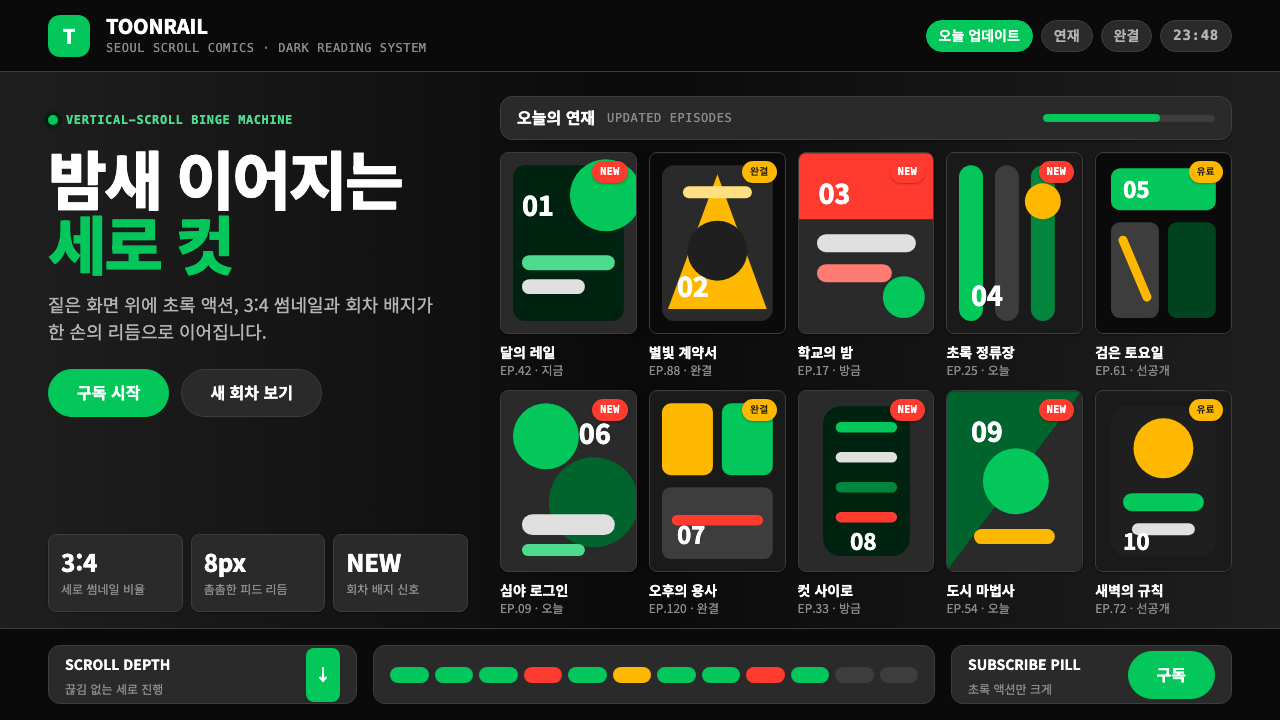 Naver Webtoon (2024)Built for late-night scroll. Charcoal grids, Noto Sans KR, and green episode…
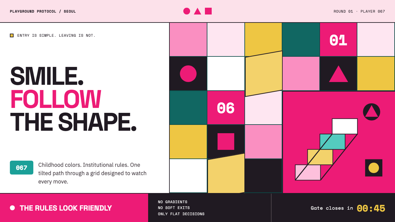 Squid Game (2021)Childhood color turns menacing. Fuchsia, teal, and rigid shape grids enforce…
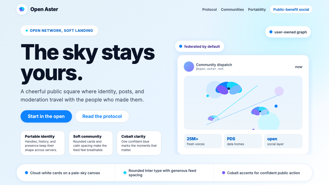 Bluesky AT Protocol 2024Open tech feels warm. Pale sky, cloud cards, Inter, and one cobalt accent car…
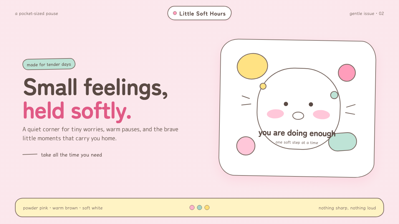 Chiikawa (2022)Tenderness made visible. Powder pink, warm-brown wobbles, and pill-soft forms…
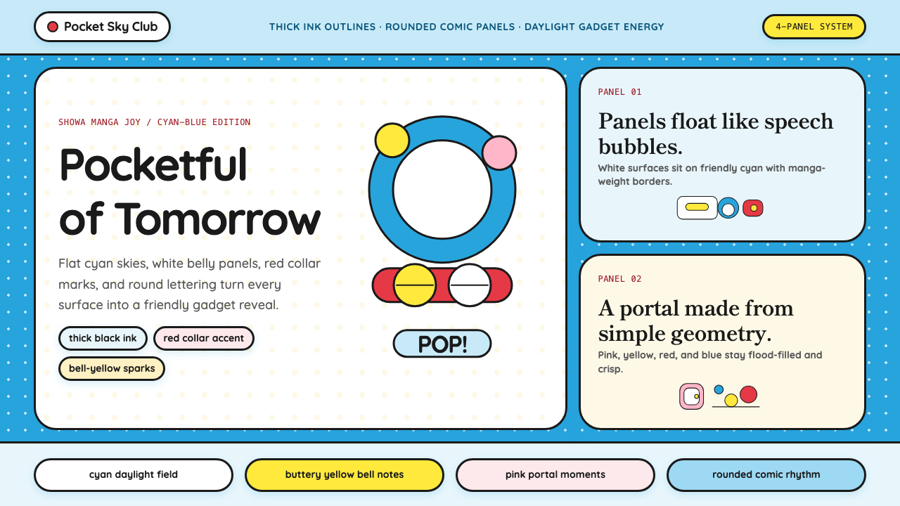 DoraemonChildhood joy, inked bold. Cyan fields, white panels, red collars, and rounde…
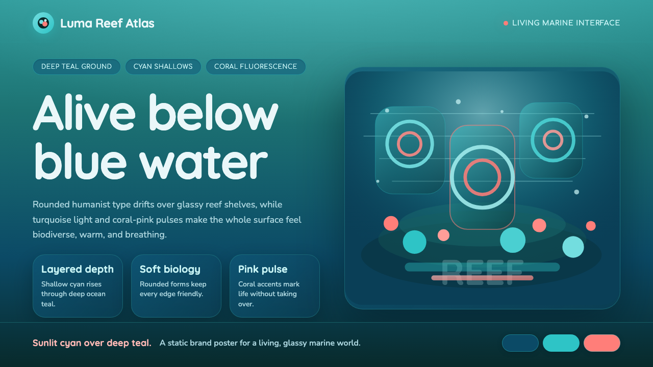 Great Barrier ReefAlive under deep teal. Quicksand curves, cyan glow, and coral-pink pulses bui…