What is Hilda?
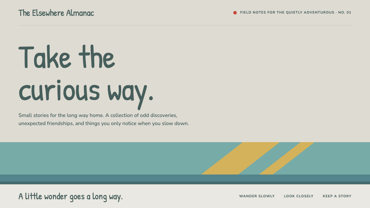
Hilda's look is a quiet kind of wonder: hand-lettered type, flat golden light and a pale stone-coloured ground where a small girl in red boots meets trolls.
Hilda in brief
The Hilda style is the visual language of Hilda, the Netflix animated series that began streaming in 2018 and is adapted from Luke Pearson's Hildafolk comics, first published in 2010. It belongs to a small family of flat, illustrated, storybook-like aesthetics: broad shapes, clean rounded outlines, no glossy rendering, and a palette that feels lifted from a cold northern landscape rather than a screen.
Everything sits on a pale greige ground, the colour of trampled snow and city stone. Against that quiet field, a soft teal stands in for sky and for Hilda's hair, while a single warm red is reserved for the boots and jacket, which is to say for whatever matters most on the page. The effect is calm but never empty, because the shapes are generous and every colour has a job.
Applied to interfaces, this becomes a design language for products that want to feel curious, patient and a little wild. It suits storytelling products, children's reading, field guides and nature references, and any surface where the user should slow down, look around and feel invited rather than sold to.

Where does Hilda come from?
The roots of the look lie in Luke Pearson's Hildafolk comics, which appeared in 2010. Pearson, a British illustrator, drew a world in which a blue-haired girl wanders out of a mountain valley into a land where trolls, wooden men and tiny spirits live alongside ordinary people. The books belong to the tradition of European graphic-novel illustration for young readers: confident flat colour, simple faces, and landscapes that feel both vast and friendly. The setting borrows heavily from Scandinavian scenery and from Nordic folklore retold for children, which is why the colour world is cold, pale and gentle at the same time.
When the story was adapted as a television series, the screen version was produced in Ottawa, Canada, by Mercury Filmworks, working with Silvergate Media, the company behind the project. Andy Coyle is credited among the key figures of the adaptation. The challenge of the adaptation was to keep the comic's hand-made quality while meeting the demands of weekly television animation. The answer was flat two-dimensional animation that keeps the visible outline and the solid colour fields of the original pages, instead of converting them into shaded three-dimensional rendering.
This is why the series became a reference for a particular approach to flat 2D television animation. Characters are built from simple, clearly bounded shapes. Backgrounds are painted in broad, almost graphic planes. Light does not glow or bloom; it arrives as solid golden wedges that fall across a scene like cut paper. Type, where it appears in titles and title cards, looks lettered by a person rather than set by a machine, which reinforces the feeling that the whole world has been drawn by hand.
The span of the visual identity is recorded in the sources as the comics of 2010 and the Netflix series visuals from 2018 through 2023. Within that span the language stayed remarkably stable, which is part of why it translates so well into a design system. It combines three lineages: the European graphic-novel tradition of flat storytelling illustration, the economical shapes of flat 2D television animation, and the quiet, weathered mood of Nordic folklore. A design system built from it inherits all three at once.
What defines the Hilda look?
Snow-greige ground
The base of every page is a pale greige, neither white nor cream: the colour of trampled snow and weathered city stone. It lets colour accents breathe and keeps long reading comfortable, because nothing glares. Surfaces that sit above the ground are only slightly lighter or darker, so layering stays quiet.
Teal bands for sky and structure
A soft teal, borrowed from Hilda's hair, appears as broad bands that act like sky, section headers or horizontal dividers. It is cool and low in contrast against the greige, so it organises a page without raising its voice. Wide bands rather than thin rules are the preferred way to divide content.
Red reserved for what matters
Hilda's boots and jacket are the only strong warm red in the world, and the system treats it the same way. Red marks the primary action, the key badge, the one thing the eye should land on. Used sparingly, it stays meaningful; scattered everywhere, it would lose the quiet logic of the whole look.
Flat shapes with rounded, clean outlines
Forms are broad and flat, with clean rounded edges and no bevels, glossy highlights or realistic shading. Cards, buttons and illustrations feel cut from paper. The softness comes from the rounding of corners, not from blur, so edges stay legible and crisp at any size.
Hand-lettered type
Display type looks as if a person lettered it with a brush or pen: slightly irregular, friendly and warm. It carries titles, chapter names and labels with a storybook voice. Body text stays plain and readable so the hand-made character never costs the reader any effort.
Light as solid golden wedges
Sunlight is never a glow or a gradient. It arrives as flat golden wedges and shafts that slice across a scene, like paper cut-outs laid over the picture. In an interface, this translates to hard-edged golden shapes used for highlights and decorative accents instead of soft shadows or glows.
A folk-creature cast
Trolls, wooden men and tiny spirits can populate field-guide cards, empty states and onboarding. Their chunky, friendly silhouettes fit the flat vocabulary naturally, and they let a product tell stories about the world it describes. Chapter lists can be styled like book spines to extend the storybook metaphor.

Who shaped Hilda?
British illustrator and author of the Hildafolk comics, first published in 2010, the source of the characters and the flat, storybook visual world.
Named among the key figures of the Netflix adaptation, which carried Pearson's hand-drawn look into flat two-dimensional television animation.
The animation studio based in Ottawa, Canada, that produced the series and kept the comics' flat shapes and solid colour fields on screen.
The production company associated with the series, which brought the Hildafolk comics to a global television audience.
How do you use Hilda today?
On slides, the Hilda style works best for narrative decks: a story-driven pitch, a children's programme, a museum or nature talk. A cover can be a broad teal band over the greige ground with a hand-lettered title and one red accent. Content slides should use large flat illustrations and generous margins, with one idea per slide. Resist filling the greige with dense text; the style depends on empty space to feel calm.
For data slides, keep charts flat and chunky. Use teal for the main series, a muted warm tone for comparison and red only for the single value the audience must remember. Avoid gradients, drop shadows and thin gridlines; direct labels in a friendly, readable type serve better than legends. Data should feel like a page from a field guide rather than a dashboard from a control room.
On the web, the system suits reading apps, nature and wildlife references, educational products for children and any product built around stories. Cards sit softly on the snow-greige ground, tabs and chapter lists can borrow the shape of book spines, and the red is kept for the one primary button per screen. Pricing pages and dashboards are possible, but they should stay roomy; this is not the style for dense enterprise tables.
In editorial and marketing work, the look excels at illustrated storytelling: newsletters, picture-book style landing pages, event posters and packaging for gentle, outdoorsy products. Golden wedges of light can frame a hero image, and hand-lettered headlines carry the voice. Copy should be warm, curious and plain, the way the series speaks, with short sentences and a sense of wonder rather than urgency.
The most common mistake is to treat the hand-lettered type as permission to use it everywhere. If body paragraphs, tables and form labels are all set in a decorative hand, the page becomes tiring and unreadable. A second mistake is to add soft shadows, glows or glossy gradients because they seem modern; these destroy the flat, paper-cut logic. Finally, avoid scattering the red: when everything is red, nothing is the boots.

Hilda — FAQ
What is the Hilda design style?
It is a flat, storybook-like design language drawn from the Netflix series Hilda, adapted from Luke Pearson's Hildafolk comics. It combines a pale greige ground, teal bands, a single reserved red, hand-lettered type and light rendered as solid golden wedges.
Where does the Hilda look come from?
It starts in the 2010 Hildafolk comics by Luke Pearson, which draw on Scandinavian scenery and Nordic folklore retold for children. The Netflix series, produced in Ottawa by Mercury Filmworks with Silvergate Media, carried it into flat 2D television animation from 2018 onwards.
What kinds of products suit this style?
Storytelling products, children's reading, field guides, nature references and any interface that should feel calm, curious and a little wild. It is less suited to dense enterprise tables or interfaces that need a sharp, high-contrast, technical tone.
Why is red used so sparingly?
In the series, red belongs to Hilda's boots and jacket, the one strong warm note against a cool, pale world. The design system copies that logic: red marks only what matters most, such as the primary action, so that it keeps its power to draw the eye.
Can I use hand-lettered type for body text?
It is better not to. Hand-lettered type is for titles, chapter names and labels that carry the storybook voice. Long paragraphs should stay in a plain, readable face so the charm of the lettering never costs the reader effort.
Related design styles
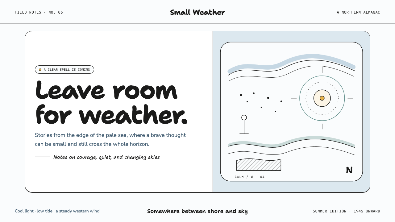 Moomin (Tove Jansson ink)Quiet makes the story brave. Fine black ink drifts through cool white and Bal…
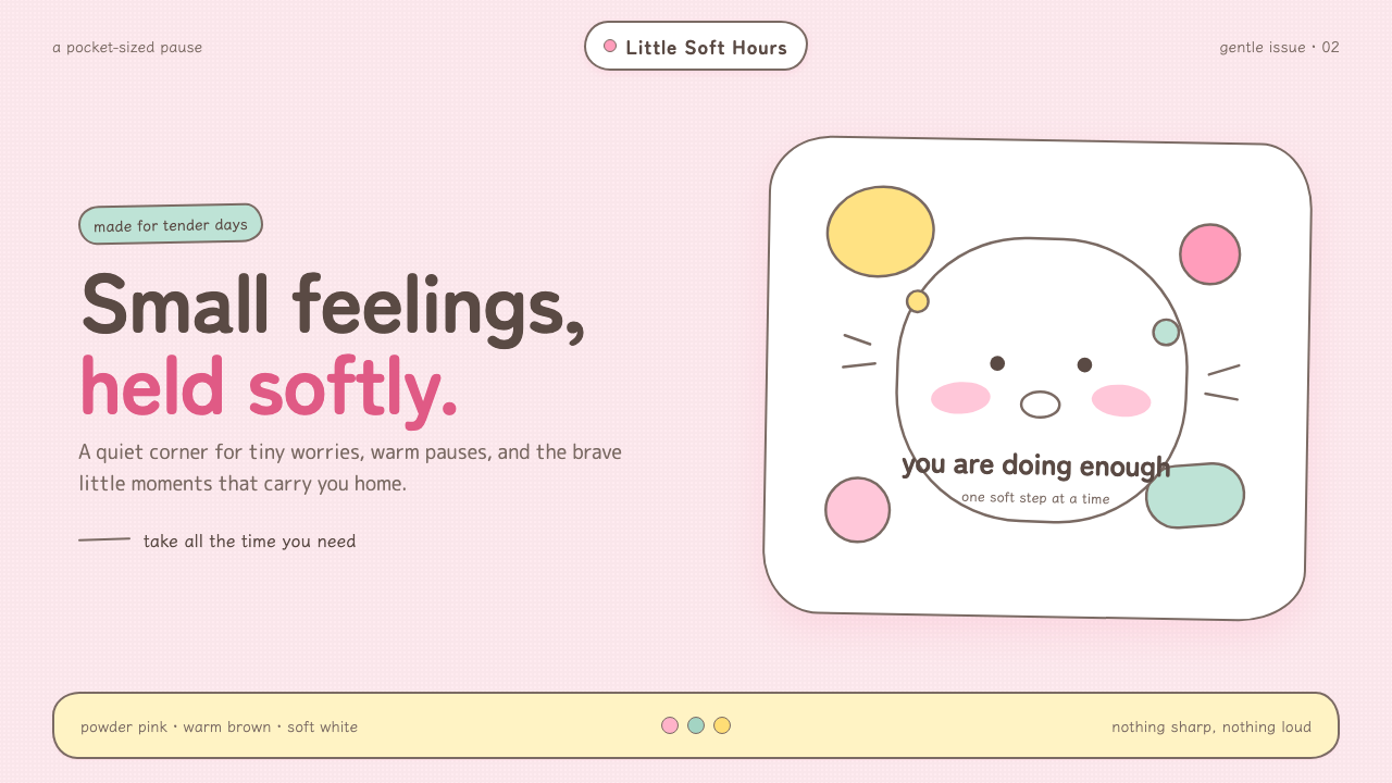 Chiikawa (2022)Tenderness made visible. Powder pink, warm-brown wobbles, and pill-soft forms…
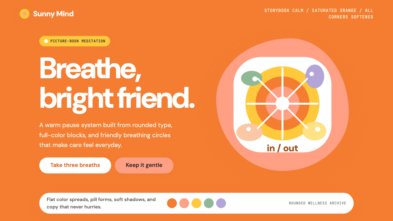 Headspace Orange MeditationMeditation becomes friendly. Orange blocks, DM Sans, and pill shapes soften e…
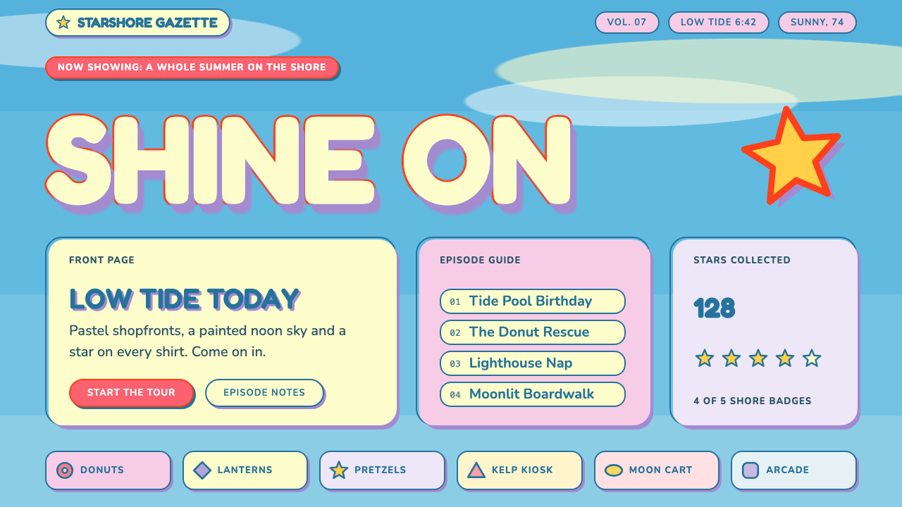 Steven UniverseSoft, round and a little off register. Lemon logotype with a lavender drop on…
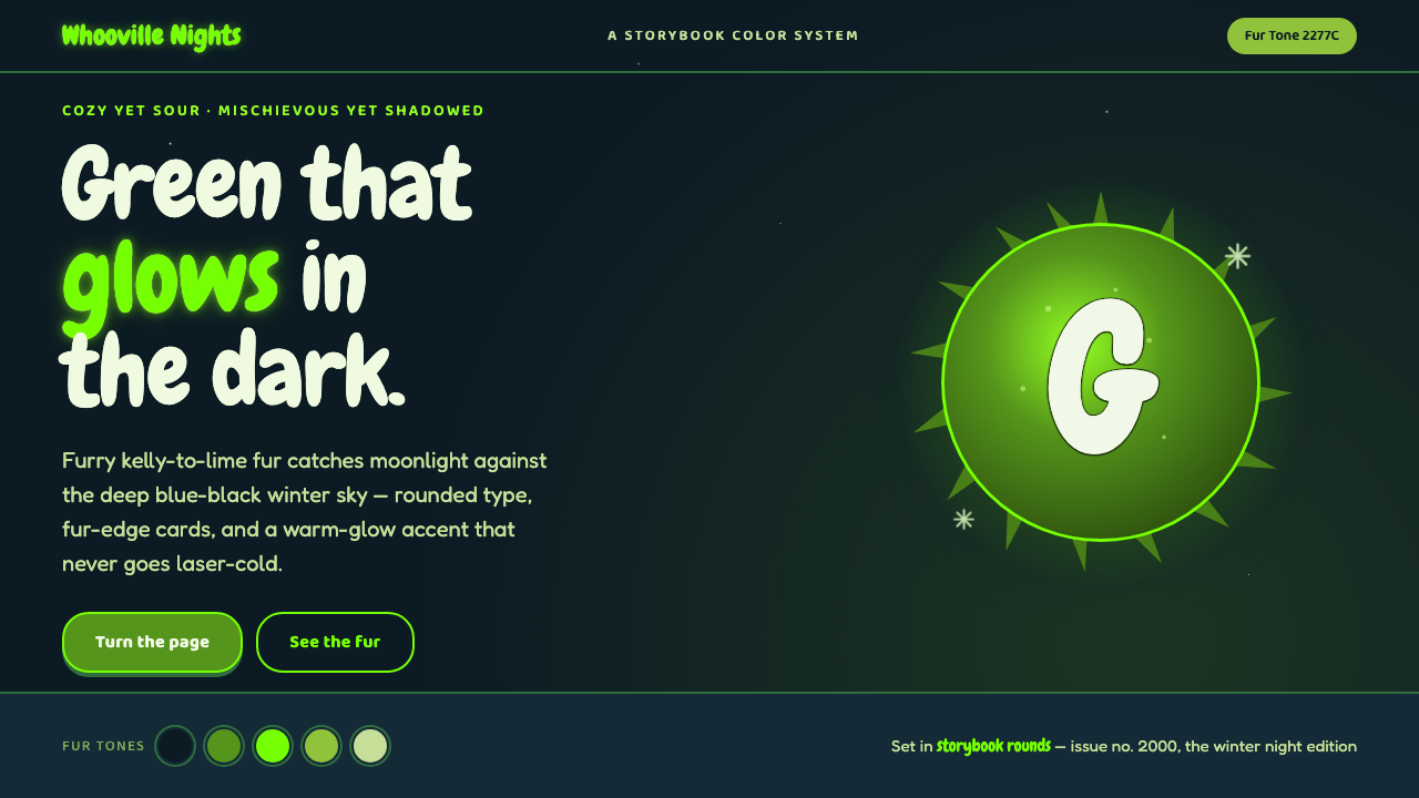 The Grinch Green Fur 2000Green that glows in the dark. Kelly-to-lime fur on blue-black Whoville night,…
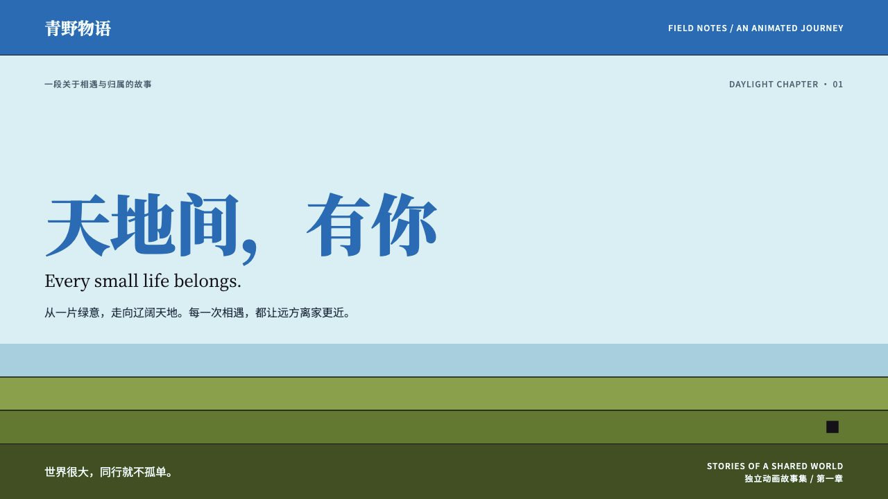 The Legend of HeiSmall lives, vast daylight. Cyan space, azure serif titles and flat olive ban…