What is Steven Universe?
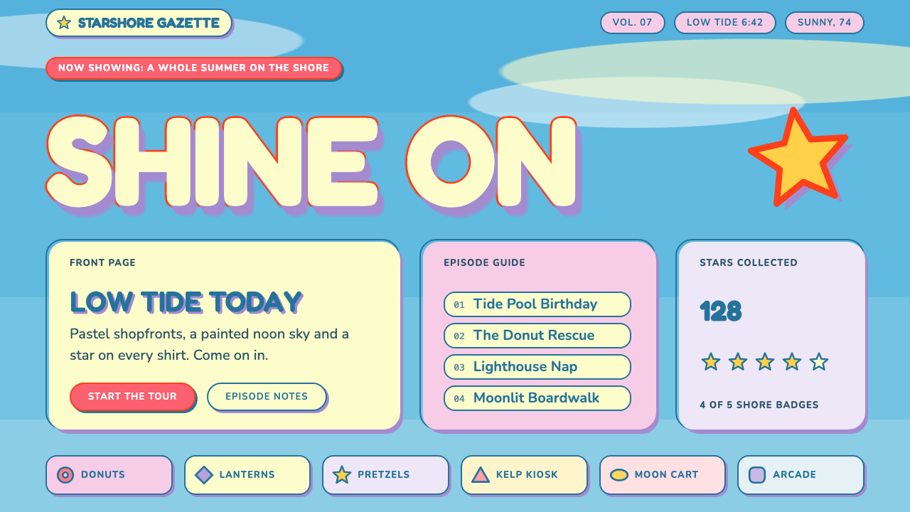
Steven Universe pairs a clear cyan seaside sky with soft, flat cel colors and a bubbly lemon-and-lavender logotype, all slightly off register, like a hand-painted cartoon that was never meant to be perfect.
Steven Universe in brief
The Steven Universe Pastel style is a soft, rounded, light-toned aesthetic based on Rebecca Sugar's Cartoon Network series, set in the seaside town of Beach City. The page is the show's clear mid-light cyan sky. On top of it sit flat cel-animation shapes in colors taken from the hero's wardrobe and world: a pink-red star shirt color, star yellow, lavender and rose.
The headline treatment borrows from the series' bubbly title logotype. Letters are fat, rounded capitals with a pale lemon face, a red-orange outline and a lavender extrusion underneath. This layered, cartoon-sticker effect is the signature of the style, and it gives even a simple heading a sense of warmth and play.
The style is gentle on purpose. Corners are rounded, fills are flat, and every shape sits a little off its outline, like loose print registration. The result is relaxed, friendly and a little childlike, but never sugary: the colors are pastel and the structure underneath is orderly.

Where does Steven Universe come from?
Steven Universe began with a pilot in 2013, and the series premiered in November of that year. Its run continued through 2019 and was followed by Steven Universe: The Movie in 2019. It was created in Burbank, California, by Rebecca Sugar, with Kevin Dart, Elle Michalka and Ian Jones-Quartey listed among its key figures. The design system takes its look specifically from the show's early identity, including the title card that carried through from the second season onward.
The visual approach rests on TV cel animation. Flat areas of color, clear outlines and simplified shapes are the traditional language of cel-based cartoons, and the show applied them with a deliberately handmade feel. Backgrounds in the series were painted rather than rendered, with a post-impressionist softness: skies, seascapes and interiors made of broad patches of color that suggest light more than they describe objects.
A third influence is anime-influenced character staging. The way characters are posed, framed and cut between, as well as the emotional openness of the story, show an affinity with Japanese animation, and this is part of why the show feels both American and slightly out of step with American cartoon conventions of its time.
The color story is simple and memorable. A sky-cyan ground, warm lemon and rose cards, and a lavender shadow give the style a legible pastel scheme with real contrast. Reading text is set in a denim blue, the color of the hero's jeans, which is darker than the surrounding pastels and keeps everything readable.
What defines the Steven Universe look?
Flat cyan sky ground
The page background is a clear, mid-light cyan, like the daytime sky over a seaside town. It is flat, with no gradient or texture. The sky is a ground for shapes to sit on, not a surface for reading text, which is why text goes on cards rather than directly on the cyan.
Bubbly three-layer logotype
Headlines are fat, rounded capitals built in three layers: a pale lemon face, a red-orange outline and a lavender extrusion. The stack reads like a sticker or cartoon title card. It works best at large sizes and in short phrases, where the layered shape can be seen.
Pastel cel palette
Color comes in flat fills of star yellow, lavender, rose and a pink-red taken from the hero's shirt. Each color is soft enough to feel friendly but distinct enough to stay clear against its neighbors. There are no gradients; depth comes from stacking flat shapes.
Deliberate print misregistration
Fills are offset slightly from their outlines, as if color and line were printed separately and landed a little apart. The shift is small, just enough to give shapes a hand-made wobble. It is a signature detail, and it should be applied consistently in direction and amount.
Denim-blue text on soft cards
Reading text is set in a deep denim blue and placed on lemon or rose cards rather than directly on the cyan sky. This keeps long text readable while keeping the page soft. Cards have rounded corners and a quiet, flat surface.
Rounded, soft shapes
Corners are generously rounded, buttons are pill-like, and icons are simple star and gem forms. There are almost no sharp angles. The softness communicates warmth and safety, and it makes the whole interface feel approachable even when it is dense.
Painterly background softness
Large background areas can borrow the show's painted skies and seascapes, with broad patches of color and light rather than detail. Used behind sections, they add atmosphere without competing with content. They should stay quiet and low in contrast.

Who shaped Steven Universe?
Sugar created Steven Universe for Cartoon Network, with the pilot in 2013 and the series premiering in November of that year. Her approach to soft, emotional storytelling and her hand-drawn sensibility are the source of the style's rounded, gentle and slightly imperfect look.
Dart is listed among the key creative figures of the series. His name is associated with the show's visual identity, including the use of flat color, painted backgrounds and strong graphic shapes that influenced the palette and layout choices of this design system.
Michalka appears among the credited key figures of the series. Along with the rest of the team, she contributed to the show's distinctive visual and emotional character, which the design system translates into soft cards, rounded shapes and pastel color.
Jones-Quartey is another of the series' credited key figures. His work is part of the collective effort that gave the show its mix of American cartoon structure and anime-influenced staging, a blend that is reflected in the design system's friendly yet carefully composed layouts.
How do you use Steven Universe today?
In slides, this style is delightful for education, kids' programs, community talks, creative workshops and any presentation that should feel friendly and open. A cyan slide with a three-layer lemon-and-lavender headline makes an unmistakable cover. For content slides, place text on lemon or rose cards in denim blue, and let a few flat star or gem shapes decorate the edges. Data slides can use flat colored bars and pill-shaped labels, keeping the palette to four or five colors.
On the web, it suits family and education sites, creative tools, community platforms, small shops, wellness and lifestyle brands, and portfolio pages that want warmth. Pricing and feature sections can be presented as rounded cards on the sky field. Buttons should be pill-shaped and flat, with the same slight offset between fill and outline that marks the style. Illustrations should be flat and simple, with soft edges.
In editorial and marketing work, it fits invitations, announcements, event posters, cover images and social content that need a gentle, joyful tone. Short, cheerful headlines in the layered logotype are the best vehicle. Use the painted sky or sea as a backdrop for a full-bleed image or a quiet section divider.
Keep the three-layer logotype for headlines only, and limit it to a few words. Everything else should be calm: flat color, rounded shapes and denim-blue text, so that the one bubbly element has room to be seen.
The most common mistake is applying the logotype treatment to everything, including body text and buttons, which makes the page noisy and hard to read. Another is placing text directly on the cyan sky, where contrast is weak. A third is using harsh shadows, hard corners or dark backgrounds, which strip away the soft, daytime warmth that defines the style.

Steven Universe — FAQ
What is the Steven Universe Pastel style?
It is a soft, rounded, light-toned style based on Rebecca Sugar's Cartoon Network series. It uses a flat cyan sky ground, flat cel-style colors in lemon, lavender and rose, a bubbly three-layer headline logotype, denim-blue text on soft cards and a slight print-misregistration offset between fills and outlines.
When and where was the show made?
It was created in Burbank, California. A pilot appeared in 2013, the series premiered in November 2013, the second season introduced a new title card, and Steven Universe: The Movie followed in 2019. This design system draws on the show's identity across those years.
Why is text placed on cards instead of the sky?
The cyan sky is a mid-light color, so dark text on it would have only moderate contrast and the page would feel flat and tiring to read. Lemon and rose cards give the denim-blue text a lighter, calmer surface and create clear reading areas while the sky stays as atmosphere.
What does the misregistration effect do?
It offsets color fills slightly from their outlines, so shapes look hand-printed rather than digitally perfect. This gives the style its relaxed, imperfect charm. The offset should be small and consistent in direction, and it is best used on logotypes, icons and key shapes rather than on text.
Which projects is it best suited to?
Education, family and kids' content, community platforms, creative tools, small shops, wellness and lifestyle brands, invitations and friendly campaigns. It is less suited to formal financial, legal or highly technical interfaces, where its playfulness could undermine seriousness.
Related design styles
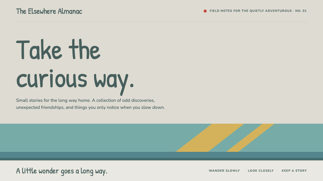 HildaQuietly curious. Hand-lettered type on snow greige, with teal bands and flat…
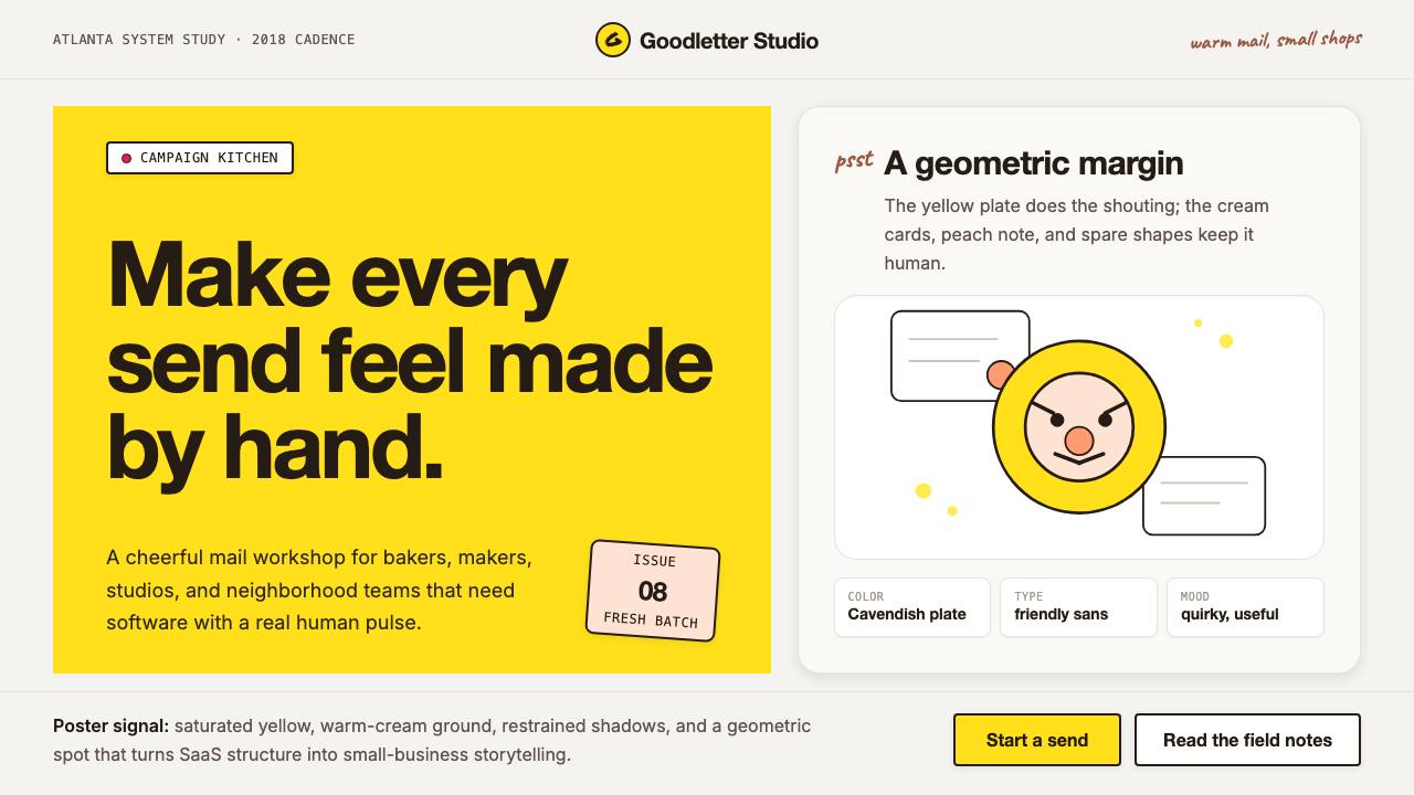 Mailchimp Freddie-YellowFriendly software, handmade. Cavendish yellow blocks and warm geometric masco…
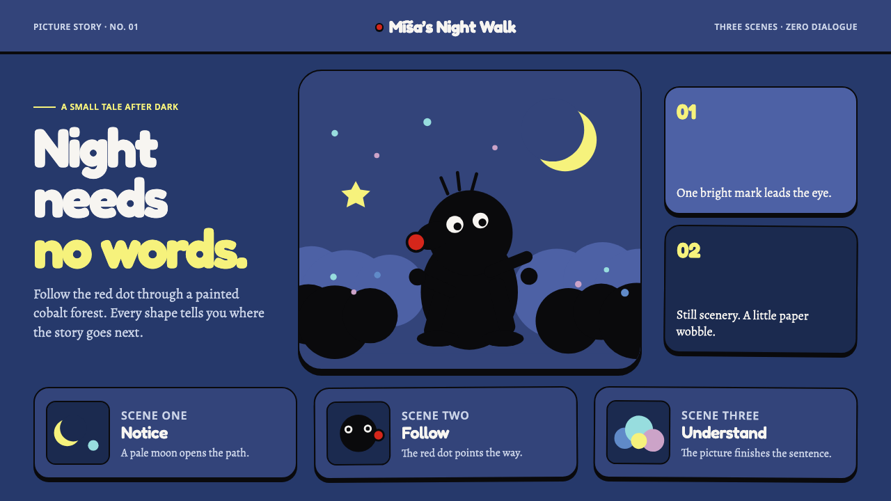 Krtek AnimationWordless wonder. Cobalt gouache stages black paper forms, guided by one red d…
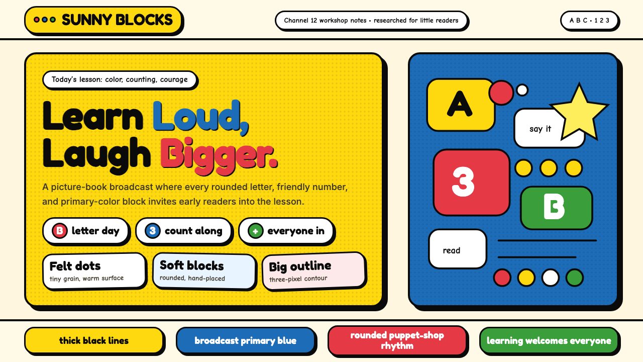 Sesame Street (1969)Learning feels handmade. Big yellow, monster blue, chunky outlines, and round…
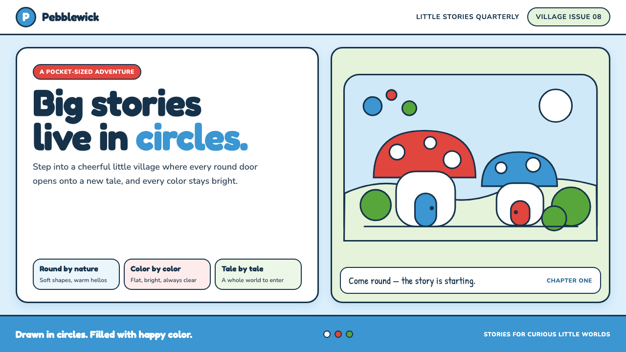 The Smurfs (Peyo, 1958)Joy comes full circle. Sky blue, candy red and soft ink outlines build a flat…
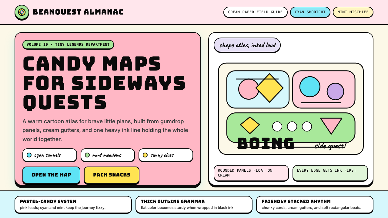 Adventure TimeCartoon warmth, inked loud. Cream gutters, candy pink, cyan and mint lock int…