What is The Legend of Hei?
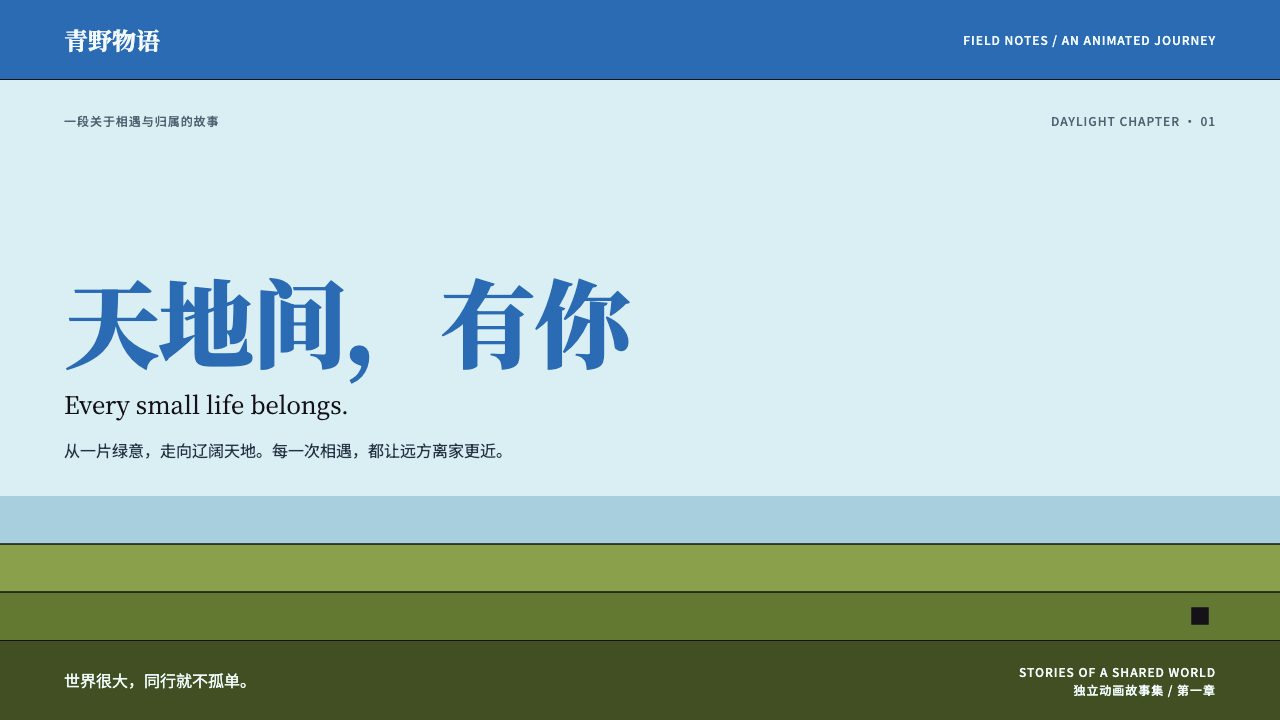
The Legend of Hei turns a small black cat spirit and a wide daylight sky into a design language of flat cel colour, even outlines and a great deal of open air.
The Legend of Hei in brief
The Legend of Hei style is a daylight design language drawn from the 2019 feature film The Legend of Hei, known in Chinese as Luo Xiaohei Zhanji. Its look is built from three things: a pale cyan haze that sits on the page like morning mist, a saturated azure that crowns the top of the composition like open sky, and bands of olive green that rise from the bottom like forested hills. Everything between those bands is flat cel colour, held inside clean outlines of an even thickness.
The emotional premise is scale. The hero of the story is a small, big-eyed black cat spirit, and the visual system keeps him small on purpose. Figures are tucked into a corner or a lower band, and the space above them is left empty and bright. That generous sky is not wasted room; it is the main message. It says that the world is large, that the character is tender and vulnerable inside it, and that the viewer is invited to look up rather than be crowded.
Unlike many anime-derived looks, this one is quiet. There are no neon glows, no heavy lens effects and no dramatic cast shadows. Colour is applied as even fills, depth comes from stacking bands of tone rather than from lighting, and typography leans on a refined serif for titles. The result feels closer to a printed film poster or an illustrated book than to a game interface, which is exactly why it suits content that wants calm, warmth and a faint scent of landscape painting.

Where does The Legend of Hei come from?
The story of The Legend of Hei begins as independent web animation in China in the early 2010s. In 2011 the artist MTJJ, whose name in full is Zhang Ping, began releasing a web series about Luo Xiaohei, a small cat spirit with large eyes who has lost his home and must find his way among humans and other spirits. The series was made at a time when Chinese independent animators were discovering that they could build an audience directly online, without waiting for a television slot or a studio contract, and Luo Xiaohei became one of the best-loved examples of that wave.
The web series did something that was unusual for its time. It combined the economy of independent production with a fluid, hand-drawn approach to action: movement that felt physical and inventive, characters whose expressions carried the emotion, and a gentle sense of humour. Over several years it gathered a loyal following, and that following eventually made a feature film realistic. The 2019 film was produced by Beijing HMCH Animation, the studio credited alongside MTJJ, and it carried the story from small screens to cinemas while keeping the same tender centre.
Visually, the feature film leaned on a tradition much older than the internet. The source material names blue-green landscape painting, known in Chinese as qinglü shanshui, as one of the movements behind the look. That tradition fills mountains and water with mineral blues and greens, builds distance out of layered colour planes and leaves large areas of the picture unpainted so that the eye can rest. When the film's key visuals place a tiny character beneath a high sky and above layered green forest, they are quietly speaking in that older language, translated into flat cel colour.
The current visual identity that this design system borrows belongs to the key visuals of roughly 2019 to 2020. The source also lists hand-drawn two-dimensional action animation as one of the lines of influence, and that matters for how the system feels: although the surfaces are flat, the world is meant to feel inhabited and alive. The Japanese release added its own typographic layer, which is why a Japanese serif sits in the system next to the Chinese serif and sans-serif families. The result is a design language with roots in independent web culture, classical Chinese painting and international release, all quietly compressed into a daylight palette.
What defines the The Legend of Hei look?
Cyan haze and azure sky
The page ground is a pale cyan, closer to mist than to a solid colour, and it grades upward toward a saturated azure that reads as sky. The system relies on this vertical movement from airy to deep rather than on any decorative gradient effect. Because the sky takes the top of the page, headlines and key information can sit in it with plenty of contrast and plenty of breathing room.
Olive forest bands
Lower sections of the layout are filled with flat bands of olive green, stacked like layers of forest or hills. They give the page a ground to stand on, separate sections without needing rules or borders, and echo the layered colour planes of blue-green landscape painting. The bands are matte and uniform, with no texture and no lighting, so they work as quiet structural shapes rather than as pictures.
Flat cel colour
Every area of colour is a single flat fill, the way a hand-painted animation cel is filled. There are no soft shadows, no glossy highlights and no ambient glows. When something needs to feel raised or important, the system changes its colour or its position rather than adding a lighting effect, which keeps the whole composition calm and legible.
Even outlines
Shapes are held in clean outlines whose thickness does not vary. The line is a quiet, uniform contour that closes each form, not an expressive brush stroke. This consistency is what makes the flat colour feel finished rather than empty, and it gives icons, cards and illustrations a shared drawing hand without needing a heavy border treatment.
Serif titles, sans body
Titles are set in a refined Chinese serif, Noto Serif SC, which gives headings a bookish, poster-like dignity, while body text uses the plainer Noto Sans SC for comfortable reading. English film titles and credits are given to Spectral, a serif designed for screen reading, and Japanese copy for the release in Japan uses Noto Serif JP. The pairing keeps the cultural flavour of a printed film poster while staying practical across several languages.
Open sky above the figures
Layouts deliberately leave empty space above the characters or the main subject. This is the system's most important compositional habit. It lets a small figure feel small without feeling lost, gives the headline somewhere calm to sit, and produces the sense of daylight and distance that defines the whole style. Filling that space with decoration would break the effect.

Who shaped The Legend of Hei?
MTJJ, whose real name is Zhang Ping, is the creator of Luo Xiaohei and the author of the original web series that began in 2011. His work is the root of the whole visual identity: the big-eyed black cat spirit, the gentle humour and the hand-drawn feeling of movement all began in that independent production. He stands for the early-2010s moment in which Chinese independent animators built audiences directly online.
Beijing HMCH Animation, known in Chinese as Beijing Hanmu Chunhua, is the studio credited with turning the web series into the 2019 theatrical feature. Its contribution was to carry an independent character into cinemas at full scale, and to supply the polished key visuals from which this design system takes its daylight palette and flat cel finish.
The source material names blue-green landscape painting, qinglü shanshui, among the movements behind the style rather than any single artist. Anonymous generations of painters in that tradition developed the habit of building mountains and water from layered mineral blues and greens and of leaving great stretches of the picture open. Their shared grammar is the deep ancestor of the film's sky-and-forest composition.
How do you use The Legend of Hei today?
The Legend of Hei style is best understood as a calm, airy system for content that wants to feel gentle, spacious and a little bit literary. It suits anything where a small subject deserves a large setting: an animated film site, a character guide, a screening schedule, or a content site with a touch of mountain-and-water atmosphere. Its strength is the combination of bright openness and disciplined flatness, and applying it well means protecting both.
For presentation slides, the cover is where the style shines. Put the title in the serif face high in a cyan-to-azure field, leave the middle open, and set a single small illustration or icon low on the page against an olive band. Content slides can keep the olive band as a footer or a section marker, with body text in the plain sans on the pale cyan ground. Data slides work best when charts use two or three flat colours from the palette with even outlines, so that the chart itself looks like a cel rather than a dashboard widget.
For web interfaces, treat the page as a vertical landscape. A hero section can use the sky colour at the top and fade to pale cyan below it, with the main call to action in a flat, outlined button. Character or product cards sit on the pale ground with even contours, section dividers become olive bands rather than thin lines, and the footer can be a full olive band. Dashboards and dense tools are a poorer fit, because the style depends on empty space that data-heavy screens rarely have.
For editorial and marketing work, the style suits long reads, release schedules, behind-the-scenes features and gentle brand storytelling. Use the serif for titles and pull quotes, keep line lengths comfortable in the sans, and let imagery sit inside outlined frames with flat colour rather than photographic gradients. A film release page can treat the sky area as the headline zone and the forest bands as the information zone for dates, cast and ticket links.
A common mistake is to fill the sky. Designers often feel uneasy about large empty areas and add badges, patterns or secondary headlines above the subject, which removes the sense of scale that makes the style work. Two related errors are adding soft drop shadows or glossy highlights to buttons and cards, which contradicts the flat cel finish, and varying the outline thickness for emphasis, which breaks the even contour. When in doubt, take something away and let the daylight do the work.

The Legend of Hei — FAQ
What colours define the Legend of Hei look?
Three colour zones define it. A pale cyan haze forms the ground, a saturated azure crowns the top as sky, and flat olive green fills the lower bands like forest. The colours are applied as even flat fills with no shading, and the character of the style comes from how they are stacked from top to bottom rather than from any extra accent colour.
Is this style the same as generic anime design?
No. Much anime-derived web design leans on saturated glows, dramatic lighting and busy overlays. The Legend of Hei look is quiet, with flat cel colour, even outlines and large open areas. Its structure borrows from blue-green landscape painting as well as from hand-drawn two-dimensional animation, so it feels closer to a printed film poster than to a game interface.
Which fonts does the style use, and why so many?
Titles use Noto Serif SC, body text uses Noto Sans SC, English titles and credits use Spectral, and Japanese release copy uses Noto Serif JP. The number of families follows the film's life across languages: Chinese for the original, English for credits and international contexts, Japanese for the Japanese release. In practice, a single page usually needs only the serif for titles and the sans for body text in one language.
Can it work for dashboards or data-heavy products?
It can, but it is not the natural fit. The style depends on open space above the subject and on flat colour bands, and data-heavy screens tend to remove that space. If you use it for a tool, keep the sky area for headers and summary, put the dense tables in the pale cyan zone with even outlines, and limit charts to a few flat colours from the palette.
What kinds of projects suit it best?
It suits animated film and series sites, character guides, release schedules, children's and family content, illustrated storytelling and content sites with a gentle, landscape-like atmosphere. In short, it fits any project where a small subject deserves a large setting and where calm, warmth and a faint literary feeling matter more than speed or density.
Related design styles
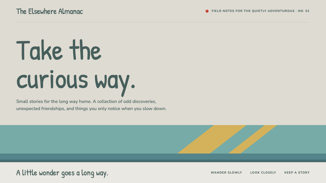 HildaQuietly curious. Hand-lettered type on snow greige, with teal bands and flat…
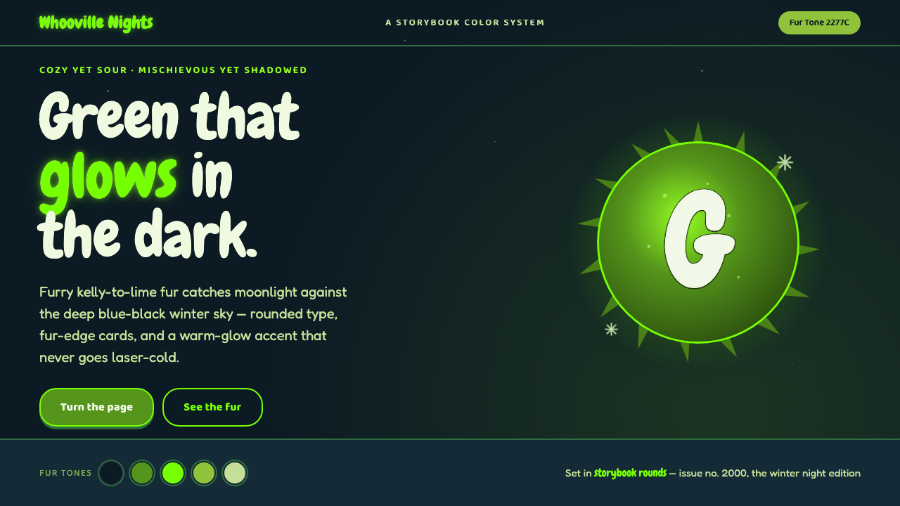 The Grinch Green Fur 2000Green that glows in the dark. Kelly-to-lime fur on blue-black Whoville night,…
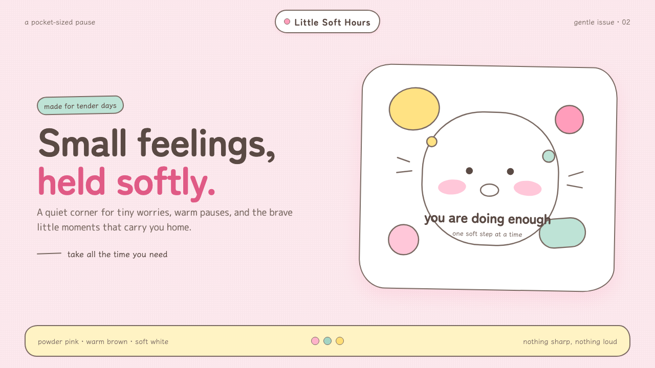 Chiikawa (2022)Tenderness made visible. Powder pink, warm-brown wobbles, and pill-soft forms…
 One Piece (Grand Line Adventure)Adventure shouts first. Vermilion splash type and cyan charts collide in hard…
 Steven UniverseSoft, round and a little off register. Lemon logotype with a lavender drop on…
 Ghana Barber Shop SignsChoice becomes a painted language. Chrome-yellow codes cut across an enamel-b…