What is Unitree Robotics?
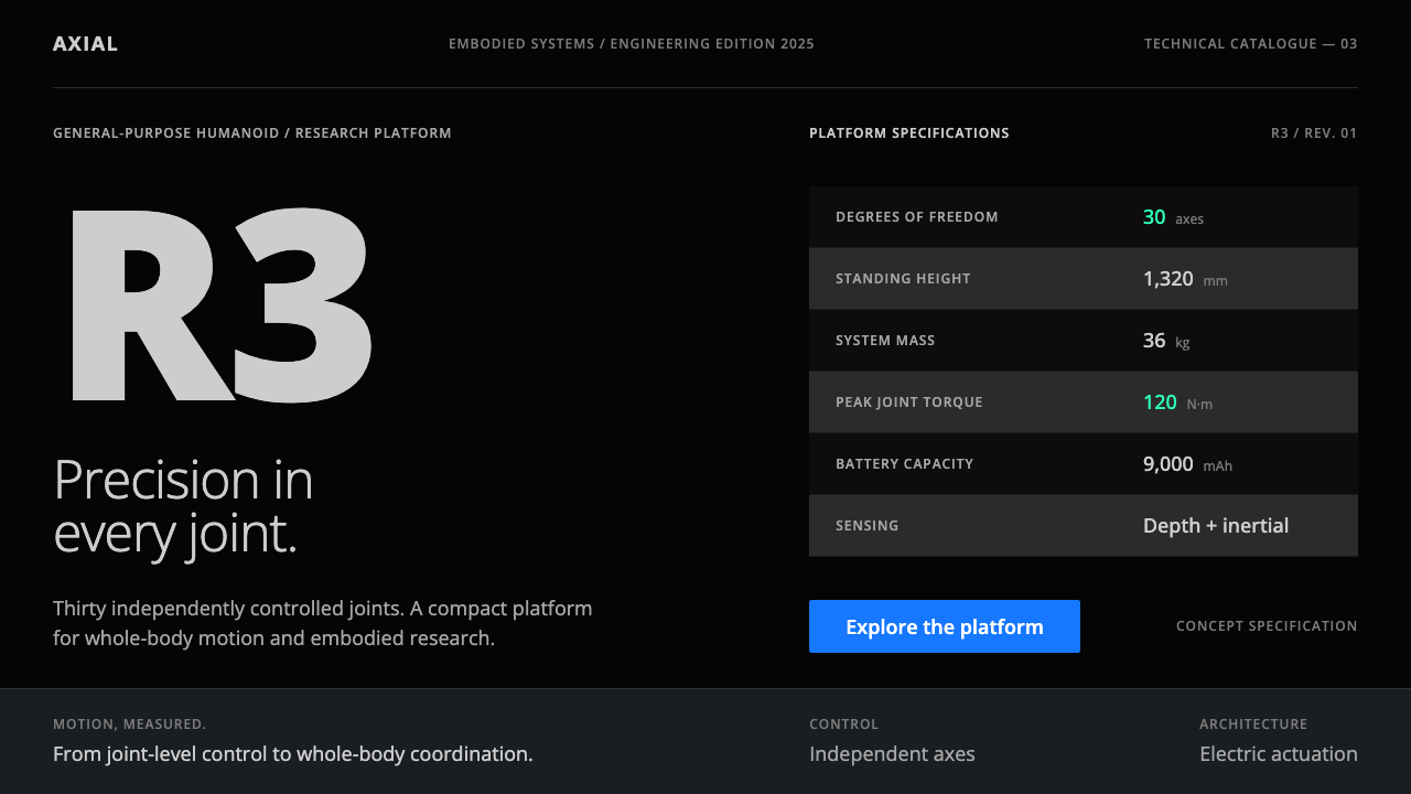
Unitree sells robots the way an instrument maker sells instruments: a black page, the machine centred, and then a long, calm table of numbers.
Unitree Robotics in brief
The Unitree look is the product page of a Chinese legged-robot company, taken as a design grammar. A black page, a cut-out photograph of the machine centred or turned slightly to one side, and below it a long specification table: height, weight, degrees of freedom, joint torque, battery, sensors. The type is grey, the rows alternate between two dark values, and mint appears only on the figures that matter.
It is a deliberately unspectacular style. Gunmetal is a surface, never a text color. A single action blue does the work of links, buttons and dimension lines, and a lighter blue is reserved for the thin annotation lines that point at parts of the machine. Everything else stays dark and quiet, so the numbers carry the argument.
The effect is closer to a datasheet than to a campaign. It tells the reader that the company trusts its engineering to speak for itself, which is exactly the signal that robotics, hardware and technical-infrastructure products want to send.

Where does Unitree Robotics come from?
Unitree Robotics was founded in 2016 in Hangzhou, in China's Zhejiang province, by Wang Xingxing. The company first became known for consumer-priced legged robots, then moved toward general-purpose humanoids. The Go2 and the H1 followed in 2023, and the G1 in 2024. The visual language this style draws on belongs to that period, roughly 2023 to 2025.
That look sits inside a broader movement. Unitree is part of a wave of Chinese embodied-AI hardware companies, and its marketing belongs to the grammar of consumer legged robotics and general-purpose humanoid robots: engineering shown as engineering. The product pages inherit the manner of technical datasheets and professional instruments rather than the glossy futurism common in earlier robot advertising.
The most public moment for the brand came on 28 January 2025, when sixteen H1 humanoids took part in the CCTV Spring Festival Gala. Dressed in floral padded jackets, they performed a folk dance with twirling handkerchiefs, in a segment associated with the director Zhang Yimou. It was an unlikely meeting of a nationwide, deeply traditional television event and a company whose pages look like laboratory equipment.
What makes the contrast useful for designers is what happened next. Once the cameras cut back to the website, the audience met the same cool, industrial face as before. The brand did not convert the exposure into confetti, gradients or slogans. It kept the black page, the table of figures and the single blue, and that consistency is what this system preserves.
What defines the Unitree Robotics look?
Black as the stage
The page ground is black, and the machine is cut out and placed on it with no scenery, floor reflection or dramatic lighting beyond a hint of rim light. The black does two jobs: it makes the metallic and light-coloured body of the robot stand out, and it signals a technical, instrument-like seriousness. Nothing competes with the product.
Grey specification tables
The long table is the centerpiece. Labels and values are set in grey type on rows that alternate between two dark values, so the eye can follow a line across without rules or boxes. The table runs further than a marketing page normally would, and that length is itself the message: there is more detail here than a headline could hold.
Mint for the numbers that matter
Mint green is rationed. It marks key figures and live-status indicators, the handful of values a reader should take away. Because the rest of the page is grey, a single mint number is enough to set an order of importance. Used on more than a few items per screen, it would turn the signal into decoration.
One action blue
Blue is the color of doing something. It appears on links and buttons, and a lighter blue draws the thin dimension lines that annotate the machine's proportions. Having one family of blue for both interaction and measurement gives the page a coherent technical voice: the things you can click and the things you can measure are of the same kind.
Gunmetal as surface, never text
Gunmetal grey is used for panels, cards and the body of the product, and never for type. Text is lighter grey or white so that it reads against the surface. This one rule keeps the dark page legible and stops the grey from collapsing into a single flat mass.
Restrained, quiet interface
The surrounding interface is minimal: a slim navigation bar, generous empty space around the product, and few decorative elements. Motion is slow and purposeful, tied to rotating or revealing the machine rather than to flourishes. The quiet is part of the brand argument that engineering needs no spectacle.

Who shaped Unitree Robotics?
Founder of Unitree Robotics, which he started in Hangzhou in 2016. His company's approach to presenting hardware, with the machine first and the numbers behind it, is the source of the look this system borrows. He is the central figure of the brand's identity.
The filmmaker associated with the 2025 Spring Festival Gala segment in which sixteen Unitree H1 robots danced in padded jackets. His involvement links a rigorous engineering brand to a mass-audience cultural moment, and explains why this robotic style is now widely recognized.
Not people but the reference artifacts of this system. The pages for the H1 and G1 humanoids set the grammar: black ground, centred machine, long table, mint figures and blue actions. Anyone working in this style should treat them as the canonical examples.
How do you use Unitree Robotics today?
The Unitree style is a datasheet aesthetic. It works whenever the product is something that should be trusted for its specifications rather than its story, and it works best when there are real numbers to show. It is weaker where emotion, warmth or storytelling should lead.
For presentation slides, a cover can be a black field with the product or a single hero image centred and one line of white type. Content slides should be treated as tables and spec sheets: grey labels, alternating dark rows and one mint figure per slide as the takeaway. Data slides suit plain charts on dark panels, with blue for the measured series and mint for the highlighted value.
For web interfaces, the style fits hardware, robotics, developer tooling, infrastructure and any dashboard that is read more than it is admired. Use a slim navigation bar, panels in gunmetal, text in light grey, links and primary buttons in the action blue, and mint only for live status or a key reading. Tables should be allowed to run long, with clear row alternation.
For editorial and marketing work, the style supports comparison pages, technical product launches, investor and partner material, and engineering explainers. Let the specification table lead, put the narrative below it, and keep photography to cut-outs on black. Where a campaign needs to borrow the energy of a large public event, use it in a single section rather than letting it spill over the entire brand.
The most common mistake is adding spectacle: gradients, glowing edges, neon accents or a rainbow of status colors. Another is using gunmetal as a text color, which makes the page unreadable, or spending mint on every number so that nothing stands out. Finally, a page with no real figures will feel empty; this style depends on actual data to justify its austerity.

Unitree Robotics — FAQ
What is the Unitree design style based on?
It is based on the product pages of Unitree Robotics, especially those for the H1 and G1 humanoid robots, in the visual form they took from about 2023 to 2025. The defining pattern is a black page, a cut-out machine, a long grey specification table, mint for key figures and one action blue.
Why is gunmetal never used for text?
Gunmetal is a surface color, meant for panels, cards and the machine body. Used as type it would sink into a dark page and fail to read. Keeping text in lighter greys or white preserves legibility, and keeping the gunmetal for surfaces lets the page show layers without borders or shadows.
Can I use it for a product that is not hardware?
Yes, as long as the product has real data to show. Developer platforms, infrastructure services, analytics tools and scientific products all benefit from the datasheet logic. It is a weaker fit for brands that need emotional warmth, playfulness or lifestyle imagery, since the style has very little room for them.
How much mint green is the right amount?
Very little. Mint is for key figures and live-status indicators, so a typical screen needs only a handful of mint items. If you find more than a few on one page, the emphasis has been spread too thin. Treat each mint element as a statement that this specific value is the one to remember.
Does the style work on a light background?
It is designed for dark pages, and its mint and blue accents are tuned to read against black and gunmetal. A light version is possible but changes the character: the machine no longer glows against the page and the instrument-like tone softens. If you must use light, keep the same table structure and the same color roles.
Related design styles
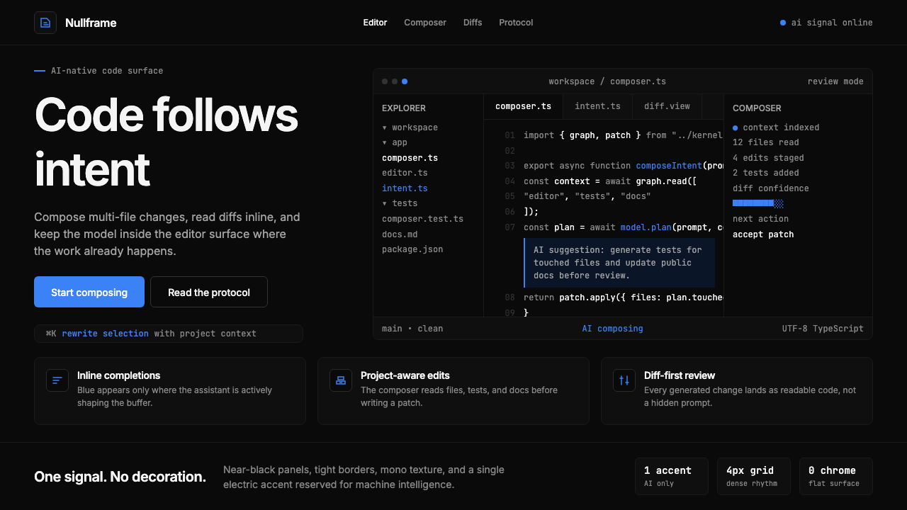 Cursor IDEAI-first code editor. Pure dark surfaces, off-white text, electric blue reser…
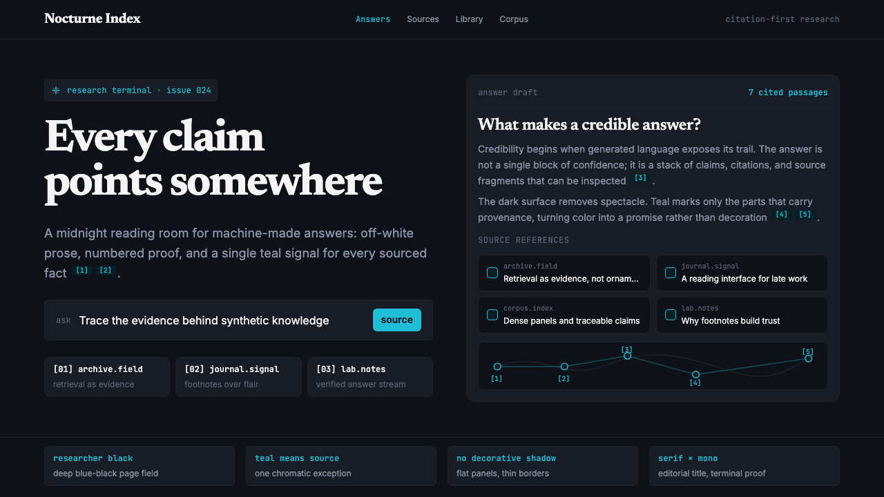 Perplexity AISerious search after midnight. Teal citations cut through black panels and de…
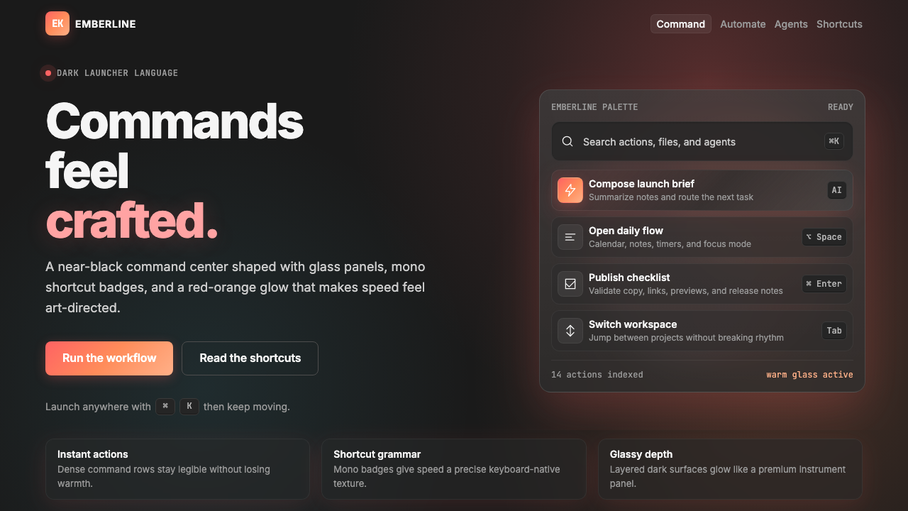 Raycast 2024Productivity feels art-directed. Red-orange glow, glass cards, and mono badge…
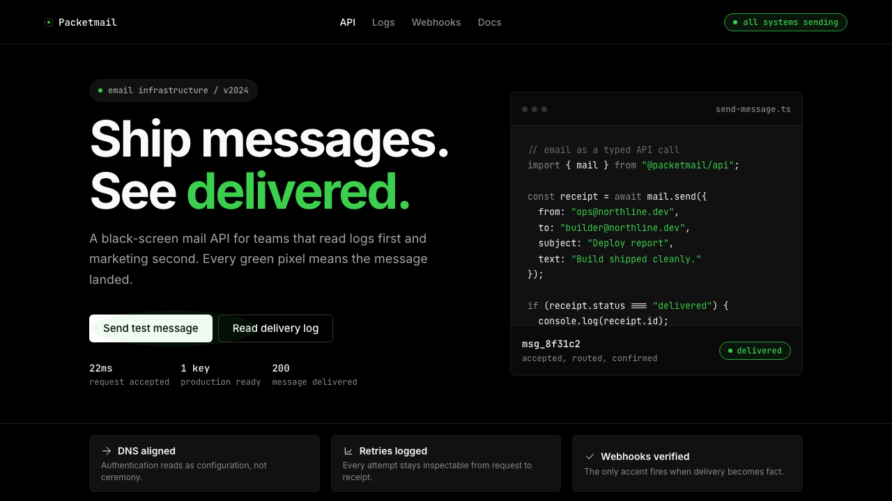 Resend 2024Clean code becomes brand. Pure black, JetBrains Mono, and one green delivered…
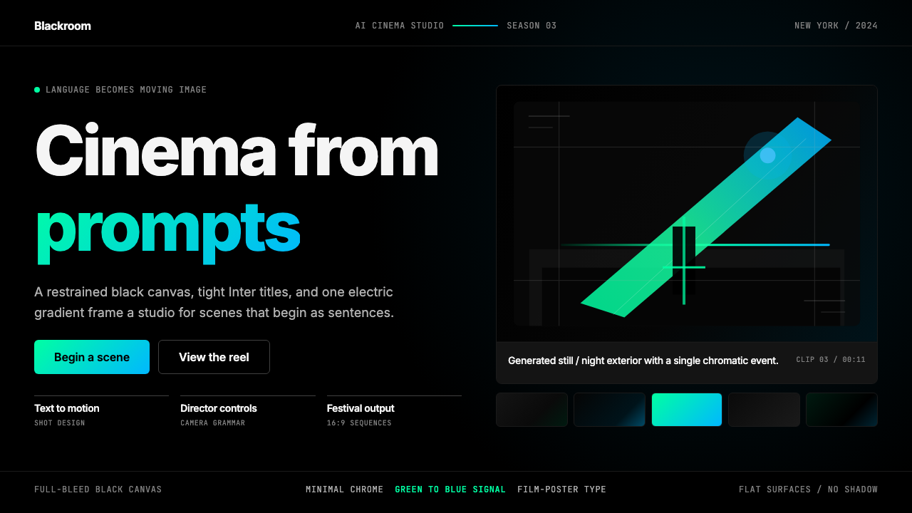 Runway MLCinema, not dashboard. Deep black frames tight Inter type and one green-blue…
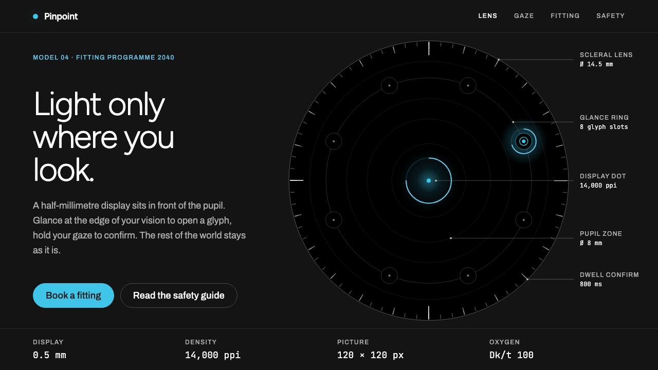 Smart Contact LensThe interface gets out of the way. One cyan dot in near-black, ringed by hair…