What is Smart Contact Lens?
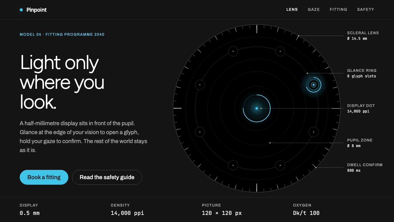
The Smart Contact Lens style is an interface that wants you to look through it: near-black space, a single cyan point of light, and the calm voice of a medical device.
Smart Contact Lens in brief
Smart Contact Lens is a visual style imagined for the product website of a display worn directly on the cornea, set in the year 2040. Its starting point is real: the Mojo Lens prototypes built by Mojo Vision between 2020 and 2023, which placed a tiny monochrome micro-LED display in front of the pupil and let the wearer control it with eye movement alone.
The visual language follows that physical reality. The page is a near-black field. Copy is calm, clinical and unhurried, closer to the instructions that come with a medical device than to a marketing page. One cyan accent stands for the glyphs that light up in front of the eye, and thin concentric rings echo the circular form of the lens itself. Large areas of black are left empty on purpose.
The guiding idea is invisible computing. Instead of demanding attention, the interface should appear only when needed and withdraw when it is not. On the website, that principle becomes a design rule: restraint, space and a single point of light. The black around the glyphs is as much a part of the design as the glyphs themselves.

Where does Smart Contact Lens come from?
The idea of putting a display on the eye is old, but the 2020s were the first time a working prototype could plausibly be called a contact lens. Mojo Vision, a start-up in Silicon Valley, California, worked on a lens called Mojo Lens through the period from 2020 to 2023. Its display was a micro-LED about half a millimetre across, so dense that it could draw a sharp monochrome picture only on the order of a hundred pixels wide. A first wearer demonstration was given in March 2022, which made the idea feel real to the public.
Because the picture is so small and monochrome, the engineers and designers had to work with extreme economy. The display shows simple glyphs, short words and minimal icons, not photographs or video. Control comes through eye tracking: you look toward the edge of your vision to summon icons, and you hold your gaze on one to confirm it. Navigation by glance and dwell is entirely different from tapping or clicking, and it demands a different visual logic, in which targets are spaced widely and the surrounding background is dark so that light does not scatter.
The people associated with this work include Drew Perkins and Mike Wiemer, along with the broader Mojo Lens engineering team. Their prototypes belong to the larger tradition of augmented reality, which seeks to overlay digital information on the physical world, and to the philosophy of invisible computing, which asks technology to disappear into daily life instead of sitting in front of it. Eye-tracking interfaces are the third strand: they treat the gaze itself as the pointer.
This system takes that research and projects it forward to the year 2040 for a fictional product site. The page does not try to sell the dream with spectacle. It adopts Mojo Vision's own visual language, with its near-black ground and cyan mark, and the sober tone of a clinical product. Wearing steps and safety notes are written plainly and without promotional exaggeration. The effect is to make a futuristic object feel trustworthy and routine, like something a doctor might recommend.
What defines the Smart Contact Lens look?
Near-black field
The page background is a very deep, slightly warm black rather than pure black, which keeps large areas from looking harsh on a screen while still feeling like empty night. Light elements are placed sparingly on top of it. The darkness is not a theme toggle but the substance of the idea, because the lens display is brightest against a dark background.
Single cyan accent
One cool cyan stands for the glyphs that appear in the eye, and it is used for little else. A dot of cyan, a thin cyan ring, or one cyan word per view is enough. Because only one colour is ever present, each appearance feels like a small light turning on, and the eye knows exactly where to rest.
Concentric hairline circles
Very thin circles, drawn in a faint grey or low-contrast cyan, surround key points like ripples or the iris of an eye. They echo the shape of the lens and of the pupil, and they structure the page without using boxes. A layout can be organised as rings around a centre, not as rows and columns.
Clinical typography
Type is a clean, neutral sans in modest sizes, with generous line spacing and short measures. Headings are plain, not shouting, and body text is soft grey on black for easy reading. Numbers and technical terms may appear in a monospaced face. The overall tone resembles an instruction leaflet or a specification sheet, never an advertisement.
Space as content
Large stretches of black are left empty so that each element is isolated and easy to fixate on. Spacing between targets is wide, which mirrors how eye-tracking interfaces need separation to distinguish one glance from another. Emptiness here is functional, not merely aesthetic.
Slow, minimal motion
Elements fade in or brighten gently rather than sliding or bouncing. A glyph might appear as a point of light that gradually resolves. Motion is meant to suggest attention shifting, not to entertain, and it should always be easy to ignore.

Who shaped Smart Contact Lens?
A figure associated with Mojo Vision and the Mojo Lens programme.
An engineer associated with the Mojo Lens display technology.
The group that built the prototypes from 2020 to 2023 and gave the first wearer demonstration in 2022.
How do you use Smart Contact Lens today?
In slides, this style suits product visions, deep-tech pitches, medical or wearable technology briefings and any talk about the future of interfaces. A cover is a nearly empty black field with a single cyan dot and a short title set quietly below it. Content slides should hold one idea each, with a heading, a few calm lines of text and a thin ring or line as the only ornament. For data slides, keep the chart nearly invisible: thin grey lines, one cyan series and numbers in a restrained face.
On the web, the style belongs to product sites for hardware, wearables, health technology, research projects and concept microsites. Build long scrolling pages in which each section is mostly black with one point of focus. Navigation can be minimal and revealed on interaction. Use wide spacing between links and buttons, keep calls to action small and quiet, and let instructions and safety notes be written as plainly as possible. A dark theme is native here, not an optional mode.
For editorial and marketing work, it is strong for futurist essays, speculative design, science explainers and brand films with a calm voice. Pair a single image or animation with a short paragraph and a lot of darkness. The tone should be sober and honest about what the technology can and cannot do. It is a poor fit for playful, loud or discount-driven content, where the emptiness would seem unfinished.
To adapt it, keep the black field and the rule of one luminous accent, and choose your own colour if cyan does not suit the brand. Preserve the generous spacing and the circular motifs. Pay attention to contrast, since small grey text on black can become hard to read; make body text clearly lighter than the background even if it is soft.
The most common mistake is to fill the space. Adding extra colours, gradients, glows and decorative shapes destroys the idea of a single point of light. Another is to write in a promotional voice, with exclamation and hype, which clashes with the clinical tone and undermines trust. A third is to make targets small and crowded, which ignores the fact that the whole system is built around looking at one thing at a time. Leave the dark alone and let the light be rare.

Smart Contact Lens — FAQ
Is the smart contact lens in this style a real product?
No. The style imagines a product site set in 2040. Its starting point is real, though: the Mojo Lens prototypes made by Mojo Vision between 2020 and 2023, with a first wearer demonstration in March 2022. The pages extend that research into a plausible future.
Why is the interface so dark and empty?
A display on the eye shows light against what the wearer is already seeing, so the interface needs very few, very small, high-contrast elements. Darkness and emptiness are functional: they keep glyphs legible and avoid cluttering the field of view. The website mirrors that logic.
How do you navigate an eye-controlled interface?
By glance and dwell. Looking toward the edge of your vision brings up icons, and holding your gaze on one confirms it. Because the pointer is your gaze, targets must be widely spaced and clearly separated, which shapes the layout of this whole style.
Can I use a colour other than cyan?
Yes, as long as you keep the rule of one luminous accent on a near-black field. Choose a colour that stays legible at small sizes and use it only for the elements that should light up. Keep everything else in muted grey so the accent keeps its meaning.
What kinds of projects suit this style?
Hardware and wearable products, health technology, research and concept sites, futurist essays and talks about invisible or ambient computing. It is less suitable for playful consumer brands, retail promotions or anything that depends on bright colour and energy.
Related design styles
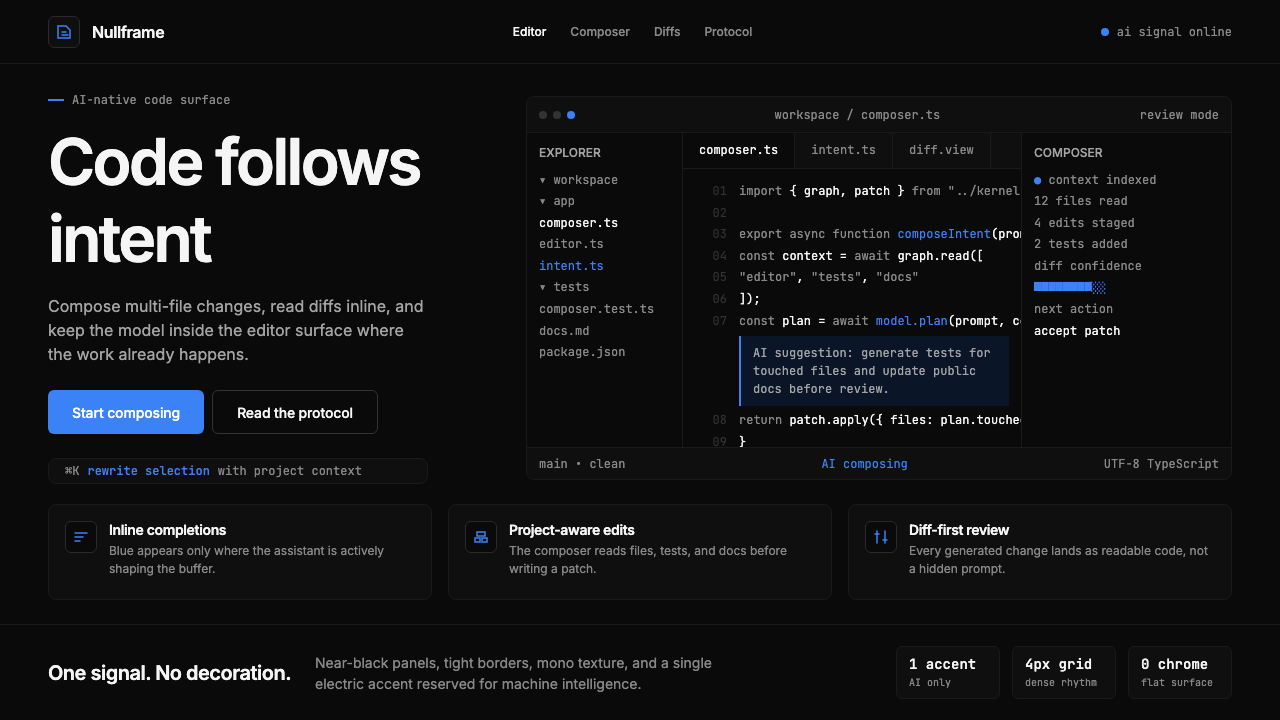 Cursor IDEAI-first code editor. Pure dark surfaces, off-white text, electric blue reser…
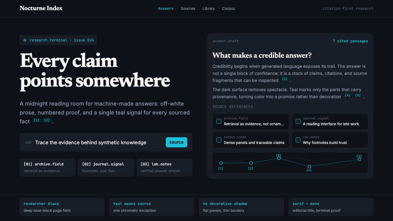 Perplexity AISerious search after midnight. Teal citations cut through black panels and de…
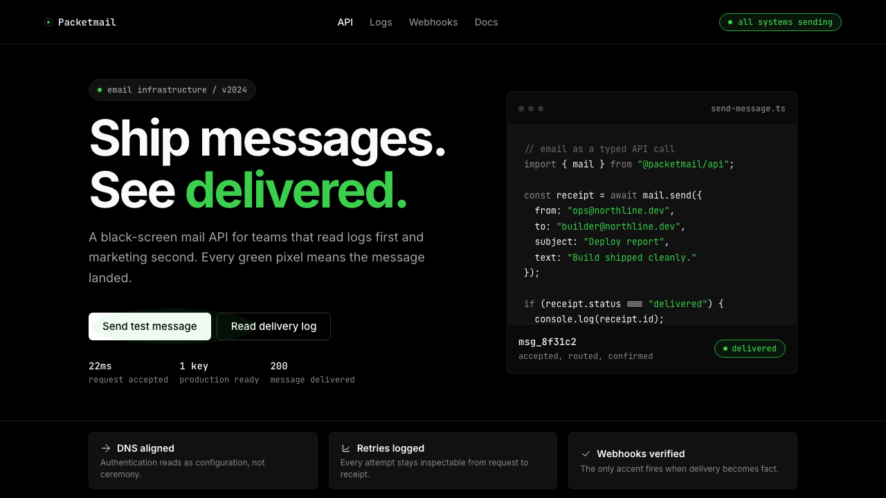 Resend 2024Clean code becomes brand. Pure black, JetBrains Mono, and one green delivered…
 Runway MLCinema, not dashboard. Deep black frames tight Inter type and one green-blue…
 Vercel 2024Developer luxury by subtraction. Pure black, white Inter, rigid grid, triangu…
 Apple Fitness Rings Closed (2024)Midnight feels exact. Magenta, green, and cyan rings lock onto OLED black.