What is Undertale?
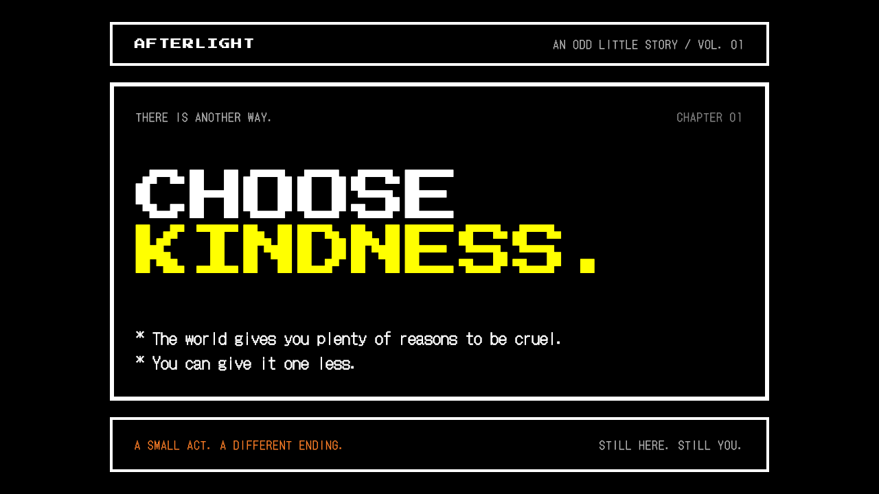
Undertale built an entire emotional register out of a black screen, a white box and a few loud colors, and made every one of them mean something.
Undertale in brief
The Undertale look is the interface of a black screen and a white box. Toby Fox's 2015 role-playing game puts almost everything inside thick, square, pixel-built borders: narration that types itself out one character at a time after an asterisk, a battle box in which a small red heart dodges bullets, and a row of four orange command buttons reading FIGHT, ACT, ITEM and MERCY.
As a design language, it is defined by economy. The ground is black, the frames are white, and a very small set of loud signals carries all the meaning: yellow for what you can choose or spare, red for the soul and for damage, orange for commands, cyan for cues. Type is bitmap, edges are hard, corners are right angles, and motion steps from frame to frame instead of easing.
That restraint is what makes it portable. It reads as nostalgic without being a costume, as funny without being loud, and as sincere without being sentimental. It suits pages that want a little retro warmth, a little humor, and a clear sense that the choices on screen matter.

Where does Undertale come from?
Undertale was released for PC in 2015 by Toby Fox, an American developer who made the game largely on his own. It arrived in the middle of a wave of independent pixel-art games in the 2010s, a period when small teams and single authors discovered that deliberately limited graphics could carry personality that expensive rendering could not. Console ports followed from 2017, which widened the audience well beyond the original PC community.
The visual lineage is easy to trace. Undertale openly pays homage to EarthBound, the Mother series, and the broader tradition of Japanese sixteen-bit role-playing games, whose menus were plain boxes and whose dialogue was a stream of short lines. What Fox borrowed was less a set of sprites than an attitude: the interface is not decoration around the game, it is the game. The text box is where jokes land, where characters reveal themselves, and where the player is quietly asked who they want to be.
The second influence is the bullet-hell shooter. In battle, the player controls a small heart inside a bordered arena while attacks arrive as patterns to be threaded. Combining that genre with a command menu that offers talking, sparing and fleeing as seriously as fighting is the idea that gave the interface its meaning. The four buttons are not a neutral menu; MERCY sits beside FIGHT as an equal, and the color of a monster's name turns yellow when it can be spared.
Because the screen is so spare, the few visual decisions carry enormous weight. Yellow became the color of choice and of the save point, red became the color of the soul, and a single phrase, DETERMINATION, became a kind of emblem for the whole game. Those color assignments, together with the white frame on black, are what people mean when they point at an interface and say it looks like Undertale.
What defines the Undertale look?
Color as signal
The palette is a signaling system, not a mood board. Black is the ground and white is the frame. Yellow marks anything the player can choose or spare, and by extension the save point. Red belongs to the soul and to damage. Orange is for commands, and cyan is for cues. Because each hue has one job, a glance is enough to read the state of the screen, and any new color added would dilute the code.
The white frame
Almost everything lives inside a thick, square, white border on a black field: dialogue, menus, the battle arena. The border is the main structural device, doing the work that cards, panels and dividers do in other systems. It is heavy enough to feel like a physical object and plain enough to disappear once the eye adjusts. Nesting one frame inside another is the only form of layering the style allows.
Bitmap typography
Type is built from visible pixels, so letters have a blocky, slightly handmade rhythm. Dialogue begins with an asterisk and appears one character at a time, which turns reading into a kind of pacing. All-capital labels are used for commands. There is no attempt at smoothing, and no mixing of a refined text face with the bitmap one; the style works because the typography commits to being a screen artifact.
Hard edges and right angles
Corners are square, edges are crisp, and nothing is rounded for friendliness. Shapes are rectangles and the occasional heart, drawn from the same pixel grid as everything else. There are no soft shadows, no blurs and no gradients. The result is flat and diagrammatic, and it keeps the screen honest: what you see is the whole of what is there.
Stepped motion
Animation advances in discrete steps instead of easing. A box appears, a cursor jumps between options, text prints in beats, a heart snaps to a new position. This frame-by-frame quality is part of the retro grammar and also part of the comedy, because abrupt changes land like punchlines. Smooth, springy transitions would feel like a different product.
Economy of ornament
The system spends almost nothing on decoration and almost everything on meaning. Humor, sentiment and character come from words and timing rather than from graphics. Whenever a visual element is added, it should be answering a question the player is actually asking, such as what can I do, who is this, or am I in danger.

Who shaped Undertale?
The American developer behind Undertale, who made the 2015 game largely on his own. His decision to treat the interface as the central expressive instrument, rather than a wrapper around it, defined the look this style borrows. He is the figure to credit for the pairing of a spare screen with a script that jokes, consoles and surprises.
An artist credited alongside Fox on the Undertale project, associated with the game's expressive character art. Her presence is a reminder that the austere interface frames a cast of vivid, lovingly drawn creatures; the contrast between the strict frame and the playful characters is part of why the style feels warm.
Not a single person but the creative tradition Undertale openly salutes. Its plain menu boxes, offbeat humor and everyday-world strangeness supplied the template that Fox reworked. Anyone adopting the Undertale look is working in a line that runs back through Japanese sixteen-bit role-playing games.
How do you use Undertale today?
The Undertale style is best understood as a signaling system that happens to be nostalgic. Applying it well means keeping the color assignments strict, the frames heavy and the motion stepped, and letting the writing do the emotional work. It is a poor fit for anything that needs a polished, premium or clinical tone.
For presentation slides, a cover works well as a single white frame on black containing a title that prints like dialogue, with one yellow word or symbol marking what the audience should remember. Content slides can be treated as a sequence of framed boxes, each holding one short idea, with yellow reserved for the sentence you want people to act on. Data slides suit simple bar-style graphics built from blocky rectangles, with red used only for the figure that signals risk or loss.
For web interfaces, the style fits game-adjacent products, community sites, devlogs, tutorials and playful tools. Navigation can be a row of command-style buttons in uppercase, orange against black, with the active item turning yellow. Forms read well as framed dialogue boxes, and confirmation steps can borrow the language of choice and mercy. Hover and focus states should snap rather than fade.
For editorial and marketing work, the style gives a campaign an immediate personality. A launch page can open with a black screen and a line of typed text, then reveal its sections as a series of boxes. Copy should be short, direct and a little self-aware. The tone does not require game content; a financial tool or a newsletter can borrow the structure while keeping the subject matter serious.
The most common mistake is adding colors. Once green, purple and pink appear alongside yellow, red, orange and cyan, the signals stop meaning anything and the page becomes generic retro. A second mistake is softening the system with rounded corners, shadows or smooth transitions, which breaks the hard-edged logic. A third is overusing yellow; if everything is a choice, nothing is.

Undertale — FAQ
What do the colors mean in the Undertale style?
Each hue has a single job. Yellow marks what you can choose or spare, and the save point. Red is the soul and damage. Orange is for commands such as the four battle buttons, and cyan is for cues. Black is the ground and white is the frame. Keeping those assignments consistent is more important than matching any exact shade.
Do I need a pixel font to get the look?
Practically, yes. The style depends on type that visibly shows its pixels, because that is what gives the text its blocky, handmade rhythm. A smooth text face set inside a white frame will look like a generic dark theme. If you need an easy-to-read body face, use it sparingly for long passages and keep the bitmap face for dialogue, labels and commands.
Is the style only suitable for games?
No. It suits any product that can carry a little humor and a clear choice structure, such as developer tools, community hubs, tutorials, personal sites and newsletters. It is a poor fit for contexts that need to feel premium, clinical or highly formal. The more the subject benefits from warmth, play and a sense that decisions matter, the better it works.
How does it differ from a generic retro or pixel-art theme?
A generic retro theme borrows the surface: pixel fonts, bright palettes, scanlines. The Undertale look is defined by restraint and by meaning. There is a nearly empty black field, a single heavy white frame, and a tiny set of colors that each carry a function. It is sparser and more disciplined, and its emotional effect comes from what it leaves out.
Can it work on a light background?
The system is built around a black ground, and its signal colors read strongest there. Inverting it to a light page is possible, but yellow in particular loses contrast, and the heavy white frame has to become a heavy dark one. If you do invert it, keep the same color roles and the same hard edges, and test that the choice color is still the most noticeable thing on the page.
Related design styles
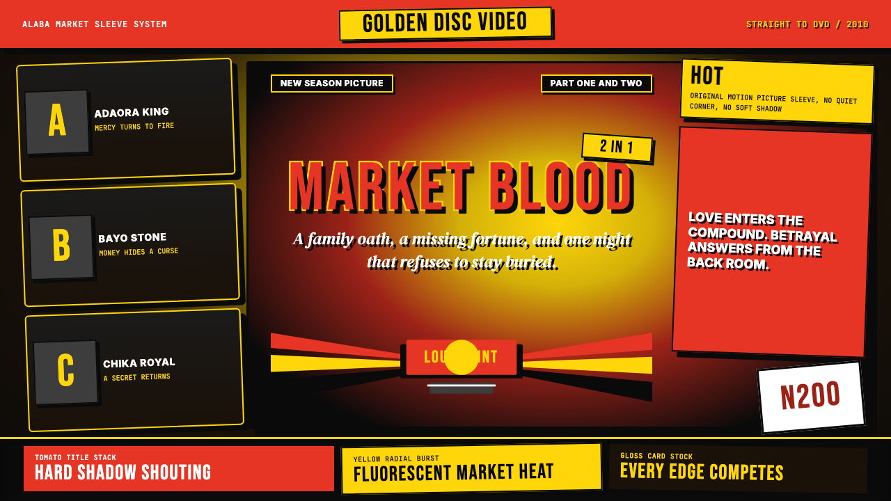 Nigerian Nollywood DVD Poster (2010)Market-stall cinema shouts. Tomato red type and yellow burst collide on jet b…
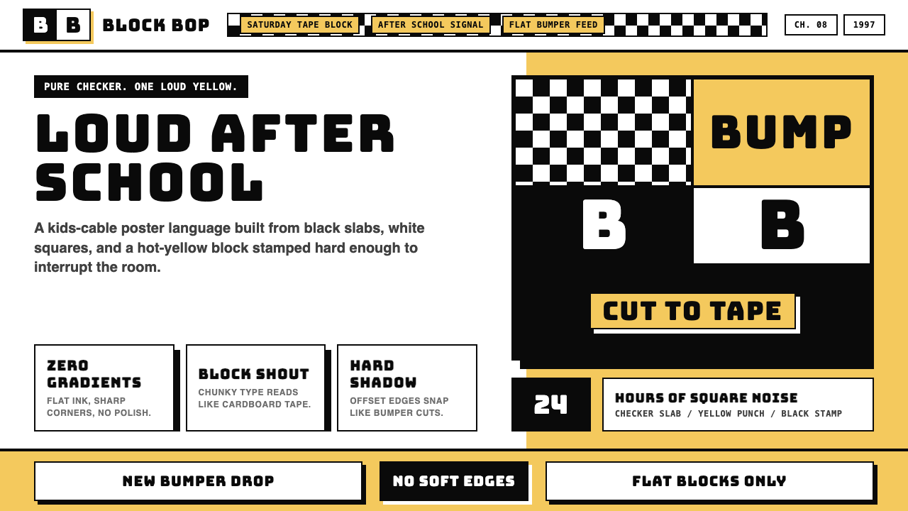 Cartoon Network 90s BlocksKids-cable noise, squared. Black-white checkerboards crash into hot-yellow Bu…
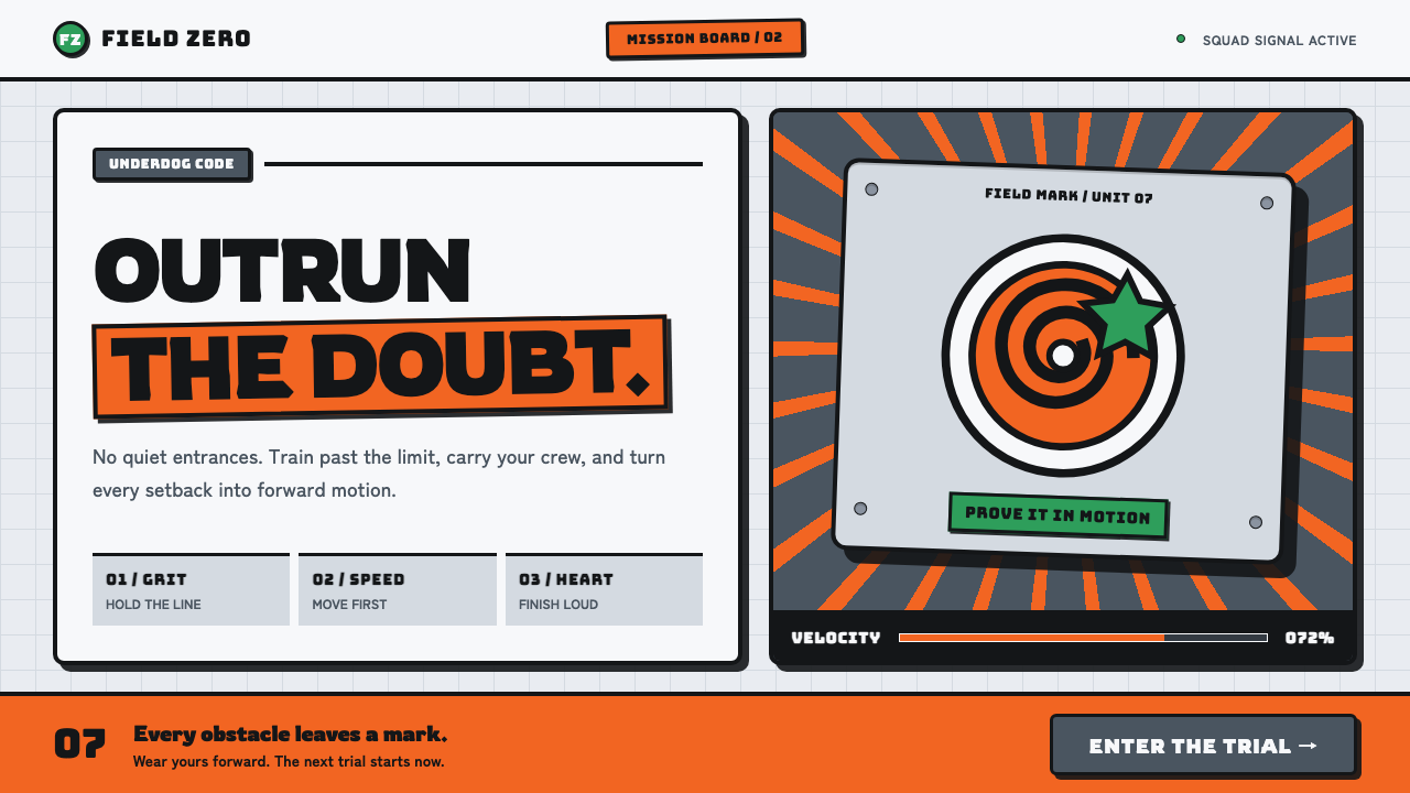 Naruto (2002 anime era)Underdog energy refuses the background. Hazard orange strikes steel-gray grid…
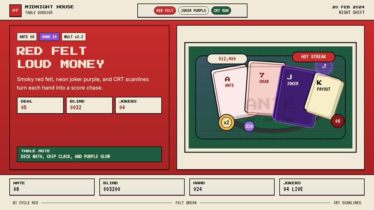 Balatro Poker RoguelikeLate-night poker math with a grin. Bicycle red, felt green, and CRT scanlines.
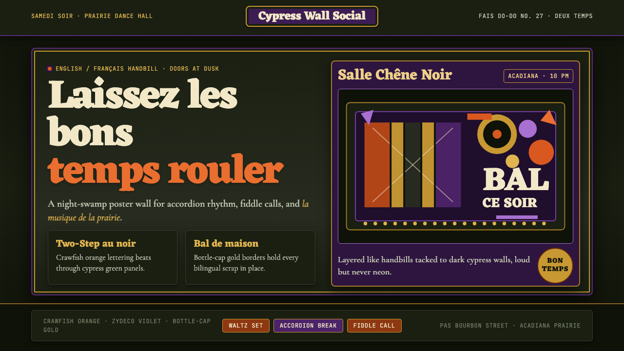 Cajun Louisiana Bayou Fais Do-DoSaturday darkness dances. Crawfish orange and Mardi Gras violet stack on bayo…
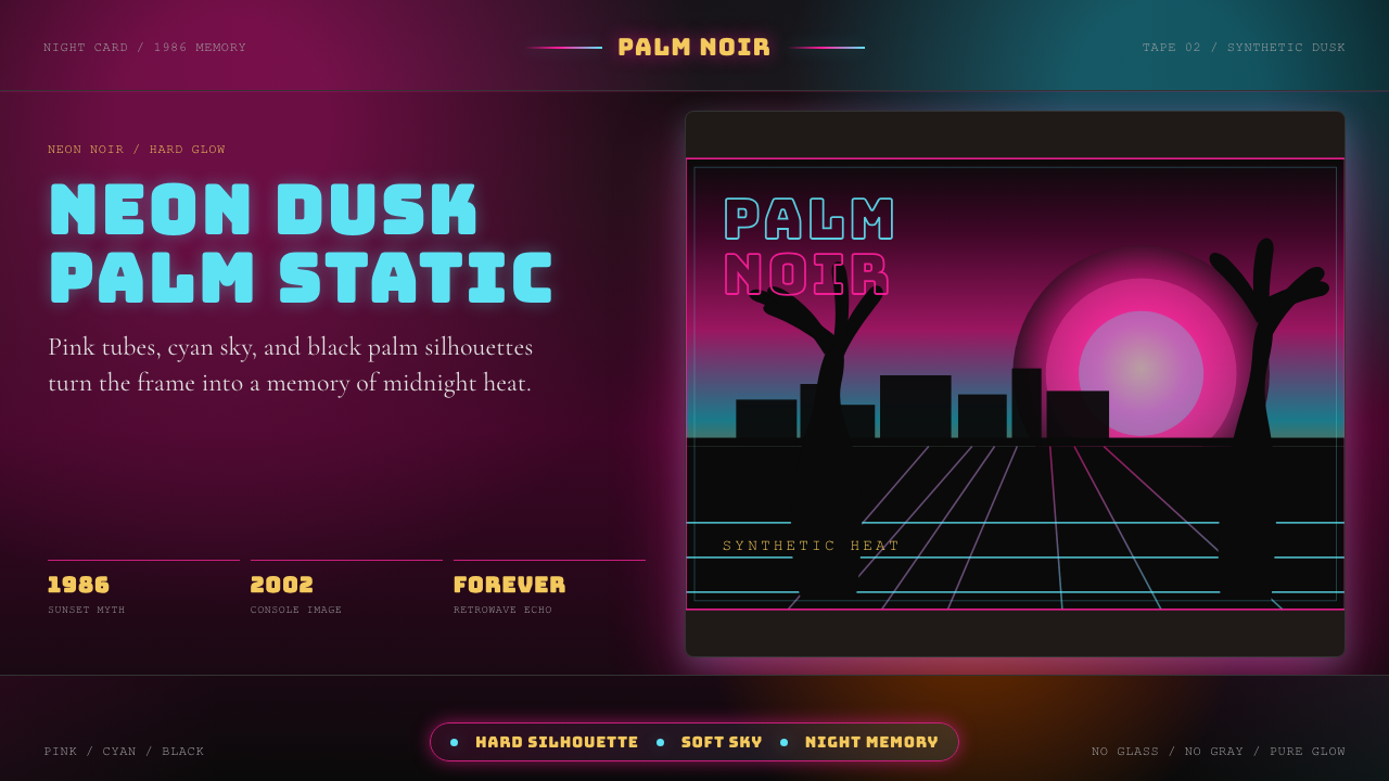 GTA Vice City (2002)Neon-noir nostalgia. Pink-cyan dusk, chunky type, and palm silhouettes.