What is Umamusume?
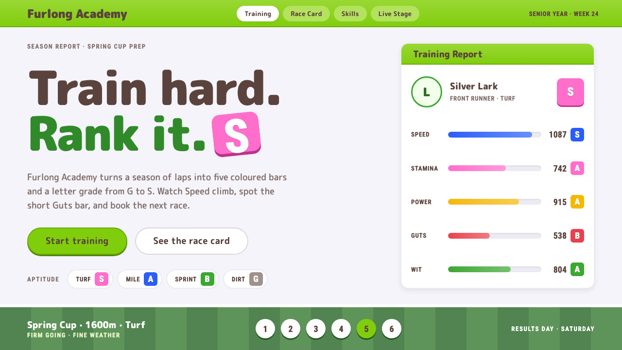
Umamusume turns a horse-racing training game into a bright, rounded interface where every stat earns its own bar and a letter grade.
Umamusume in brief
Umamusume is the interface language of Cygames' mobile game Umamusume: Pretty Derby, a Japanese training game in which players raise racing girls who carry the names and spirits of real racehorses. Its menus are near-white panels capped by a bright yellow-green header strip, with warm brown text where most interfaces would use black, and a mown-turf green racecourse sitting quietly behind everything.
It is a training game first and a racing game second, and the visual system shows it. Type is rounded and heavy, buttons are soft pills, and every attribute the player is working on, Speed, Stamina, Power, Guts and Wit, gets its own coloured bar and a letter rank running from G up to S. The whole thing reads like a coaching whiteboard after a long afternoon on the track: friendly, legible and endlessly measurable.
Pink and blue are held back for special moments. They appear on rank badges, event tags and the Winning Live stage, the idol-concert finale that follows a victory. Everywhere else the palette stays calm, so a single splash of colour reads as a reward rather than decoration.

Where does Umamusume come from?
The look is rooted in a franchise that began as an anime project. A television anime of Umamusume aired in 2018, with P.A. Works among the studios credited, and Cygames, the Tokyo developer known for its mobile games, carried the property into a game that launched in Japan on 24 February 2021. A global release followed in 2025, which is why the current visual identity is usually dated to the span between 2021 and 2025.
The interface sits at the meeting point of three Japanese cultural currents. The first is the mobile gacha game, a genre built on collecting characters, reviewing numbers and returning daily, which explains the dense but orderly stat screens. The second is idol live performance, which supplies the stage lighting, the pink-and-blue accents and the idea that a race ends with a concert. The third is the culture of Japanese horse racing itself, with its turf courses, its ranked classes and the affection fans hold for individual horses.
What makes the system distinctive is how it reconciles those influences. Betting slips and racing programmes are traditionally cramped and monochrome. Umamusume instead borrows the clarity of a school notice board and the warmth of a character-driven game, so a sport associated with wagering becomes something closer to a coaching diary. The yellow-green header strip, a colour taken from fresh grass, is the single strongest signal of that decision.
What defines the Umamusume look?
Yellow-green header strip
Almost every screen is capped by a bright yellow-green band that carries the title and the back control. It works like a flag on a racecourse rail: it tells the player instantly where they are, and it keeps a light, grassy colour present even when the panels below are nearly white.
Warm brown text
Body copy and numbers are set in a deep warm brown rather than black. The shift is small but it softens every panel, making dense stat tables feel like handwriting on a notice board instead of a spreadsheet, and it pairs naturally with the cream and lavender-tinted whites.
Rounded, heavy type
Headings and labels use a rounded, heavy letterform with generous weight. The roundness echoes the friendliness of the characters, and the weight keeps numbers readable at a glance on a phone held in one hand during a short play session.
Pill buttons
Actions are fully rounded capsules with a clear primary and secondary distinction. There are no sharp corners to catch on, and the capsule shape reads as pressable even in a crowded menu, which matters in a game where the next tap is always one decision away.
A bar and a letter for every stat
Speed, Stamina, Power, Guts and Wit each get a coloured bar plus a letter rank from G to S. The pairing means a player can read progress two ways, as a length and as a grade, and it turns even a plain number into something that feels earned.
Turf-green stage behind the panels
Behind the near-white cards sits a neatly mown racecourse green. It is rarely the star, but it sets the world: the player is always standing at the edge of a track, and the panels float over it like cards on a lawn.
Pink and blue held in reserve
Pink and blue are spent only on rank badges, event tags and the Winning Live stage. Because the rest of the interface is restrained, these two colours carry a sense of occasion, and the live finale feels like a change of mood rather than another menu.

Who shaped Umamusume?
Tokyo mobile game developer and publisher behind Umamusume: Pretty Derby, which released in Japan in February 2021 and globally in 2025.
Animation studio credited on the 2018 television anime that established the characters and the tone the game's interface later inherited.
Animation studio associated with the franchise's anime adaptations, part of the wider production circle around the property.
How do you use Umamusume today?
On slides, the system suits cover pages, progress reviews and anything that benefits from a coaching tone. A cover can pair the yellow-green header strip with a near-white panel and a heavy rounded title in brown. Content slides work best as stat cards: one metric per card, a coloured bar beside it, and a letter grade where a ranking makes sense. Data slides are its strongest suit, since the bar-plus-grade pairing makes comparisons readable without a chart legend.
In web interfaces, it is a natural fit for dashboards, learning platforms, habit trackers and anything with levels or streaks. Pill buttons and rounded cards make forms feel gentle, and the single strong header strip gives long pages a clear anchor. On pricing pages, keep the panels white and let the yellow-green carry the call to action, saving pink and blue for plan badges so that the special tiers stand out.
For editorial and marketing work, the system suits product updates, event announcements, community newsletters and campaign pages for anything youthful or character-driven. The turf-green backdrop gives hero sections a sense of place, and the reserved pink-and-blue accents can mark launches, limited offers or live events. Warm brown body text keeps long copy comfortable to read.
The most common mistake is spending the accent colours too freely. Pink and blue only feel special when they are rare, so scattering them across ordinary buttons and headings flattens the whole palette into candy. A second mistake is losing the bars: if every number is just text, the interface stops feeling like a training game and becomes an ordinary form. Finally, avoid pure black text, which breaks the warm, friendly tone the brown establishes.

Umamusume — FAQ
What is the Umamusume design style?
It is the interface look of Cygames' Umamusume: Pretty Derby. Near-white panels sit under a yellow-green header strip, text is warm brown, type is rounded and heavy, buttons are pills, and every stat gets a coloured bar and a letter rank from G to S, all over a turf-green racecourse backdrop.
When was the game released, and why does the style span 2021 to 2025?
The game launched in Japan on 24 February 2021 and reached a global release in 2025. The 2018 television anime came first. The interface evolved across those releases, so the current look is usually dated to the whole span.
Which colours matter most in this style?
Yellow-green for header strips, warm brown for text and a turf green for the backdrop form the everyday palette. Pink and blue are reserved for rank badges, event tags and the Winning Live stage, so they should stay rare to keep their effect.
Is this style only suitable for games?
No. Its core idea, turning every number into a bar and a grade, works for dashboards, learning tools, habit trackers and progress reports. It suits any product where measuring improvement should feel encouraging rather than clinical.
What is the easiest way to get it wrong?
Overusing pink and blue, or switching to pure black text. Both flatten the contrast between ordinary and special moments, and they remove the warm, coaching tone that defines the look.
Related design styles
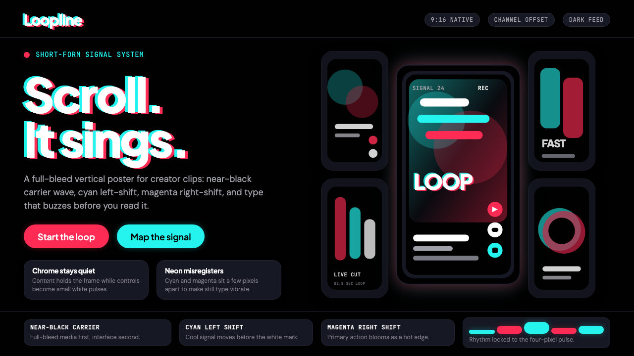 TikTok 2024Attention vibrates. Near-black feed, cyan-magenta offsets, and vertical frame…
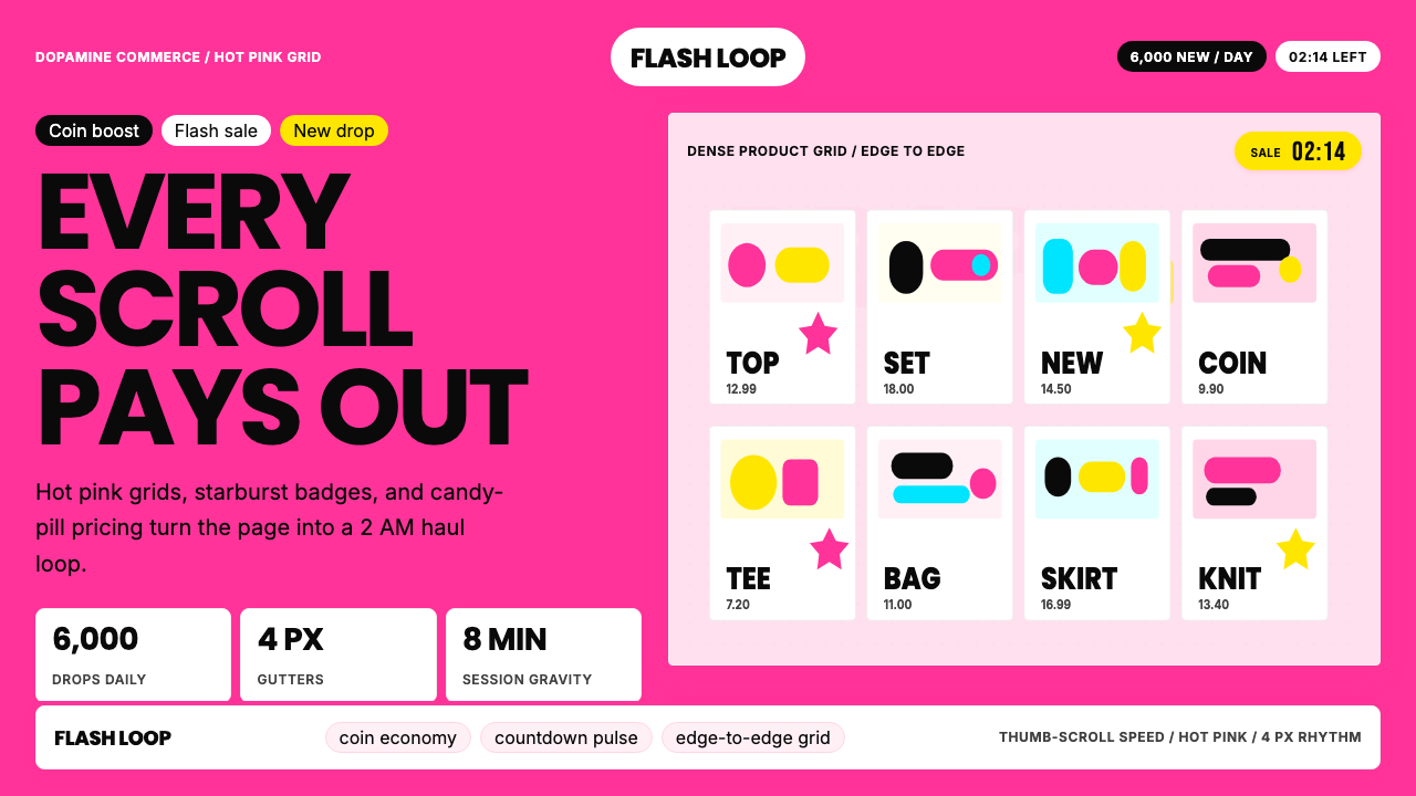 Shein Fast FashionDopamine density wins. Hot pink grids, starbursts, and candy pills pack every…
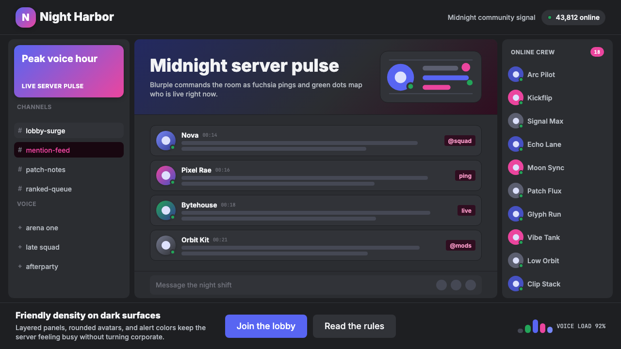 Discord Blurple Server (2020)Midnight server energy. Blurple panels, fuchsia pings, and green status dots…
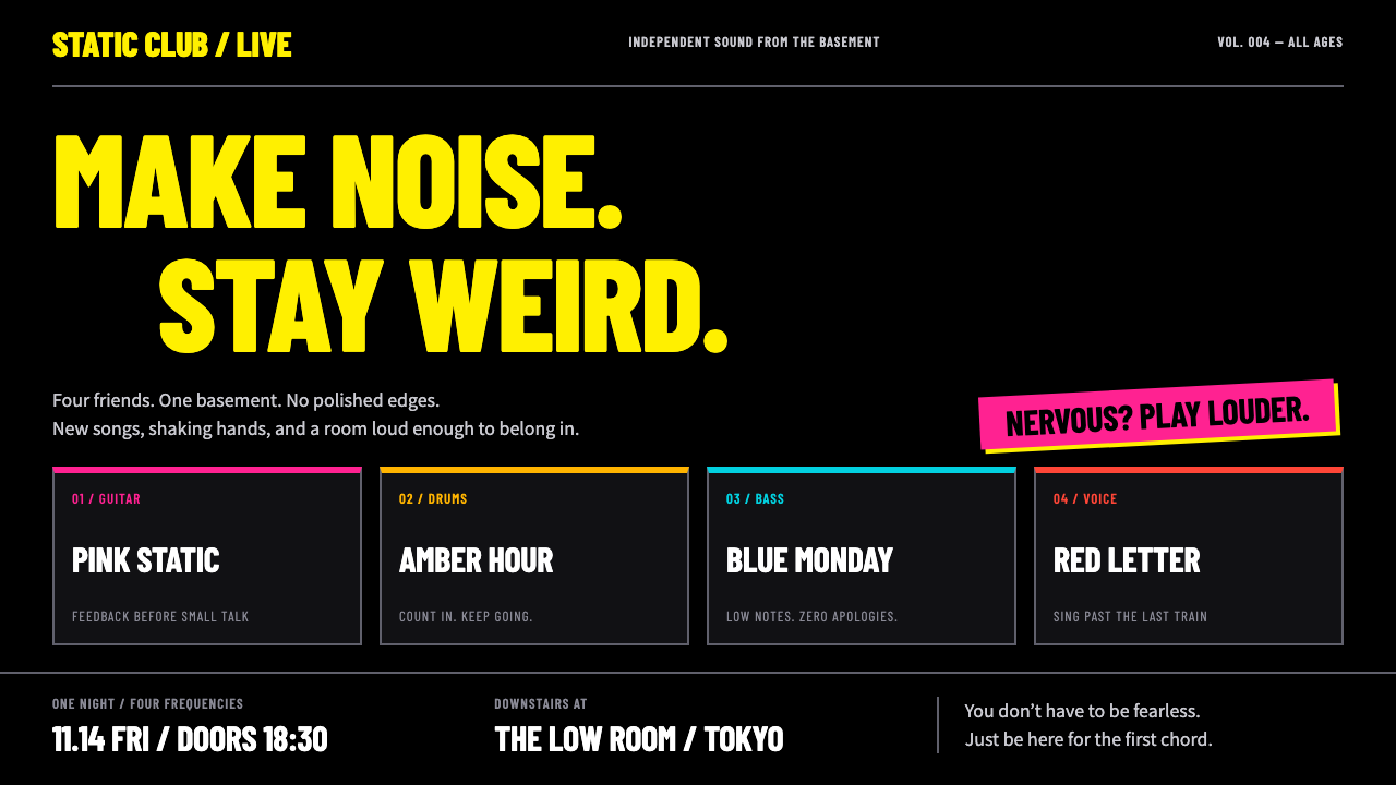 Bocchi the Rock!Nervous energy, turned up. Fluorescent yellow condensed type and four-colour…
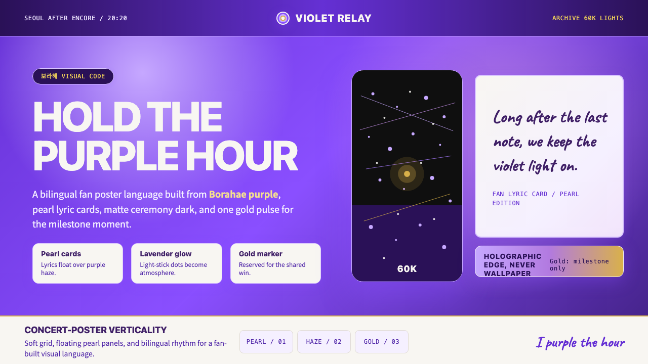 BTS Army Purple 2020Fandom becomes atmosphere. Borahae purple, pearl cards, lavender glow, one go…
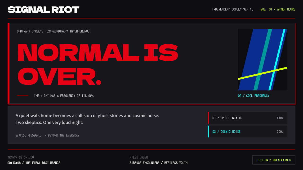 DandadanQuiet until impact. Massive red type breaks near-black panels; cyan and lime…