What is Akhal-Teke Golden Horse?
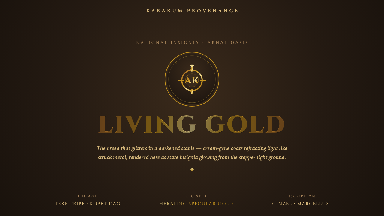
Akhal-Teke Golden Horse turns metallic radiance into ceremony: living gold emerging from a stable-dark field with the restraint of a national insignia.
Akhal-Teke Golden Horse in brief
Akhal-Teke Golden Horse is a dark, ceremonial design language inspired by Turkmenistan’s national breed, the Akhal-Teke, long known as the “golden horse.” The visual premise is unusually specific: gold is not treated as a flat decorative color. It behaves as reflected light, appearing in sharp, selective flashes against a deep burnished ground. The resulting contrast feels less like luxury retail and more like an emblem glimpsed in low light.
Its source image is the horse itself. The breed’s cream-gene coat has hollow hair shafts that act like fine light-pipes, producing a metallic gleam even in a dim barn. Darker mane, tail, and legs intensify the effect by framing the body as a concentrated field of radiance. The interface translation keeps that relationship intact: darkness establishes depth and silence; gold arrives sparingly as the surface that catches attention.
This is therefore not a general-purpose gilded style. It is singular, refined, and heraldic. It favors dark expanses, inscriptional typography, restrained borders, and one dominant luminous material effect. A successful composition should feel as though it belongs to a ceremonial object or state insignia: composed, legible, and quietly authoritative rather than crowded with ornamental proof of value.
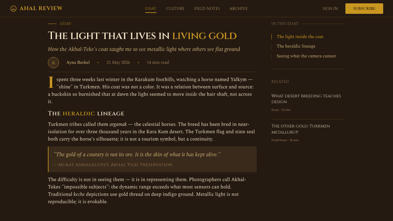
Where does Akhal-Teke Golden Horse come from?
The design language begins in Central Asia, in Turkmenistan’s Akhal oasis and the foothills of the Kopet Dag. Its reference is not an imported fantasy of gold, but the visible character of a national breed: a sleek horse whose coat can appear metallic under limited light. The dark stable and steppe-night setting is essential to the image because it gives the sheen a field against which to register.
The Akhal-Teke’s modern breed identity and role as a state emblem belong to the period from 1950 to 1990. Within that frame, the horse functions as more than an animal portrait. It becomes national visual material: a form capable of carrying dignity, lineage, restraint, and public symbolism. The design system takes its cue from that emblematic role rather than attempting to reproduce a literal equestrian scene.
Two groups anchor the source tradition: Teke tribe breeders and the horsemen of the Akhal oasis. Their presence matters because the visual language is tied to a living equestrian culture, not merely to a color effect. Gold, darkness, and the horse’s silhouette derive their authority from that connection to breed identity and place.
The relevant design movements are equestrian heraldry and national-emblem or state-insignia design. Both favor legibility at a glance, symbolic concentration, and a limited vocabulary of meaningful elements. Akhal-Teke Golden Horse adopts those principles in digital form: a dark ground acts like the field of an insignia, luminous gold marks rank and focus, and typography carries the gravity of an inscription.
What defines the Akhal-Teke Golden Horse look?
Gold as Light
Gold should appear as a specular event rather than a blanket fill. It is strongest when it catches an edge, title, crest, divider, or selected control, then recedes. The aim is the coat’s optical behavior: concentrated gleam against darkness, not a uniform metallic surface spread across every component.
Burnished Dark Ground
The background is stable, dark, and absorbing. It should create the sense of a night stable or steppe after daylight has withdrawn, allowing luminous marks to carry the visual temperature. Empty dark space is not unused space; it is the condition that makes the gold credible.
Heraldic Restraint
Each element should carry a clear role: identity, hierarchy, navigation, status, or ceremonial emphasis. Borders, seals, and rules are welcome when they frame meaning, but not when they multiply decoration. The system gains authority through concentration, as a state insignia does.
Inscriptional Typography
Typography should read as an inscription placed on a ceremonial object. Titles need poise, measured spacing, and a formal vertical presence; supporting text should remain calm and highly legible. The contrast is not theatrical excess but a shift from emblematic declaration to quiet explanation.
Sleek Silhouette
The horse suggests a visual preference for long, controlled contours and uninterrupted surfaces. Use silhouettes, tapered dividers, and elongated framing rather than bulky panels or busy collage. Where imagery appears, it should preserve the distinction between luminous body and darker mane, tail, or surrounding field.
Ceremonial Contrast
Contrast is deliberate and sparse: dark against gold, quiet text against proclamation, open field against a single focal mark. Avoid treating every card, button, and label as equally precious. Ceremony depends on hierarchy; if everything glows, nothing reads as an insignia.

Who shaped Akhal-Teke Golden Horse?
Teke tribe breeders are named in the source tradition as key custodians of the Akhal-Teke’s identity. In this design language, they represent the human continuity behind the emblem: the reason the horse should be treated as a cultural symbol with inherited gravity, rather than as a generic luxury motif.
The horsemen of the Akhal oasis locate the visual system in a specific Central Asian setting. Their role connects the sleek, luminous animal to riding culture, landscape, and practical familiarity. That connection keeps the interface language disciplined: ceremonial, but never detached from the horse’s real presence.
The Akhal-Teke itself is the central visual figure: Turkmenistan’s national breed, the storied golden horse, and the source of the system’s defining material contrast. Its luminous cream-gene coat, set against darker mane, tail, legs, and night ground, provides the complete compositional model.
How do you use Akhal-Teke Golden Horse today?
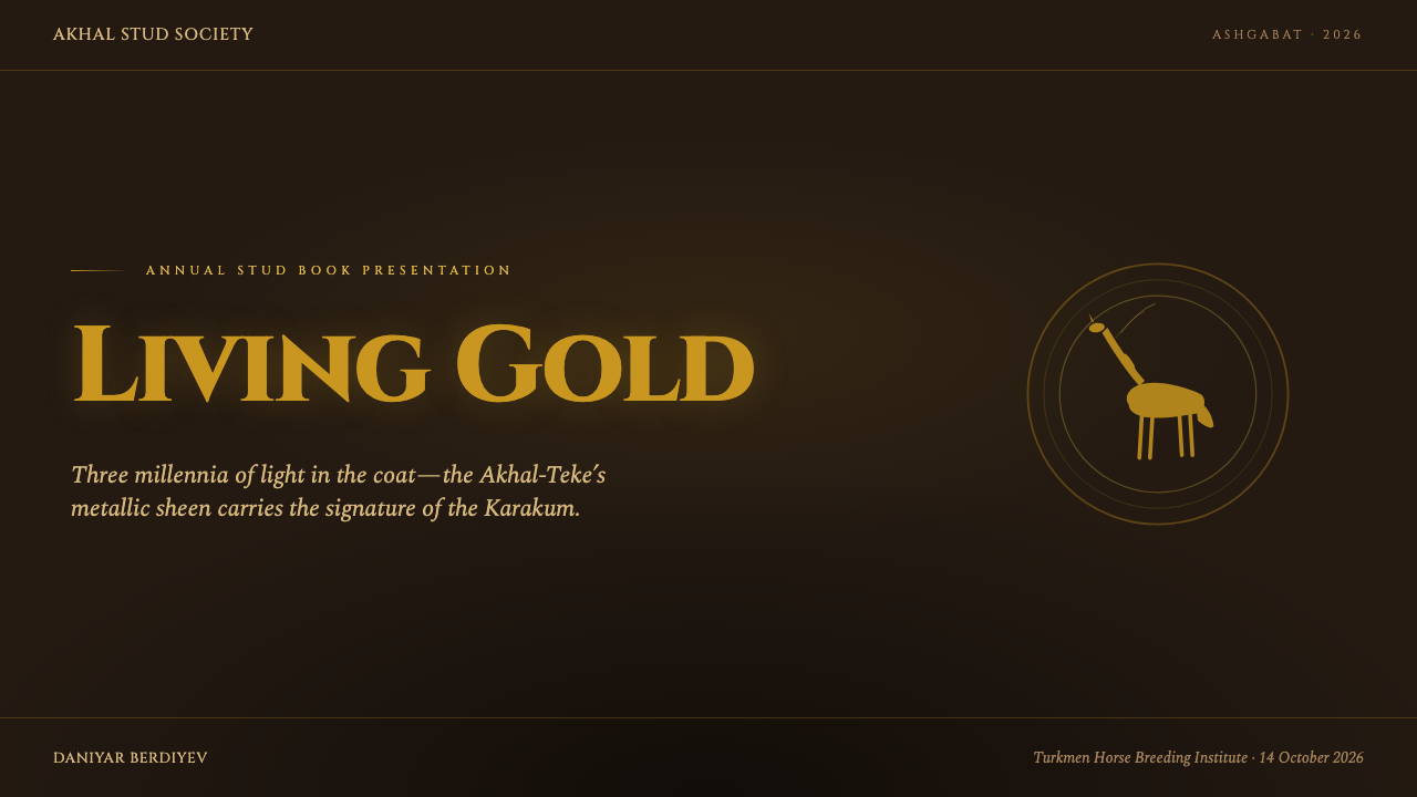
For presentation covers, treat the page as a ceremonial field. Let the title function as an inscription, supported by one controlled gold focal mark or a sleek horse-derived silhouette. Keep the surrounding darkness generous so the composition feels declared rather than decorated. Content slides should become quieter: clear text blocks, restrained rules, and gold only for hierarchy, key terms, or a decisive transition.
Data slides can use the style especially well when information needs gravity. Charts should remain structurally plain against the dark field, with a limited luminous accent reserved for the series or figure that matters most. Labels need to stay calm and readable; the visual drama belongs to the hierarchy of information, not to ornamental chart treatment.
For web interfaces, the system suits dashboards, account overviews, member areas, and pricing pages where status and confidence matter. Use darkness to organize broad regions, gold to identify the active path, premium state, or primary action, and inscriptional headings to anchor major sections. Controls should feel precise and composed, never jewel-box ornamental.
Editorial and marketing work should use the horse’s radiance as a narrative device. A long feature can open in darkness, reveal a gold headline or image detail, then settle into generous reading space. Marketing pages can alternate between broad dark panels and quieter explanatory passages, reserving the most luminous treatment for the product promise or formal call to action.
The common mistake is equating this style with indiscriminate gold decoration. If every surface shines, the material illusion collapses and the result becomes generic luxury styling. Preserve the relationship that gives the system meaning: an absorbing dark ground, a rare and directional gleam, formal typography, and enough silence for the emblem to carry authority.
Akhal-Teke Golden Horse — FAQ
Is Akhal-Teke Golden Horse simply a luxury-gold style?
No. Its defining idea is optical and emblematic, not merely luxurious. Gold behaves as reflected light emerging from a dark field, modeled on the Akhal-Teke’s metallic-looking coat. The style should communicate ceremony, national-symbol gravity, and concentration, not abundance for its own sake.
Why must the background remain so dark?
The dark ground is the visual equivalent of the dim stable or steppe-night setting in which the horse’s coat becomes vivid. Without that absorbing field, gold loses its status as a selective gleam and turns into ordinary pigment. Darkness provides contrast, silence, and the ceremonial field of the insignia.
Can this style use horse imagery literally?
Yes, but the image should support the system’s material logic. Favor sleek contour, controlled cropping, and the contrast between luminous body and darker mane, tail, legs, or surrounding ground. A literal horse image should feel like an emblematic presence, not an unrelated decorative photograph.
Where does the style work best?
It is strongest where ceremonial confidence, identity, and selective emphasis support the product’s purpose: formal presentations, premium member experiences, dashboards with meaningful status, editorial features, and carefully paced marketing pages. It is less suitable for interfaces that need a playful, densely patterned, or casually expressive atmosphere.
What is the quickest way to make the result feel inauthentic?
Making every element metallic is the fastest failure. The source image depends on contrast: a luminous coat reads because darker features and a dim environment surround it. Keep gold rare, make hierarchy visible, and let the dark ground do most of the atmospheric work.
Related design styles
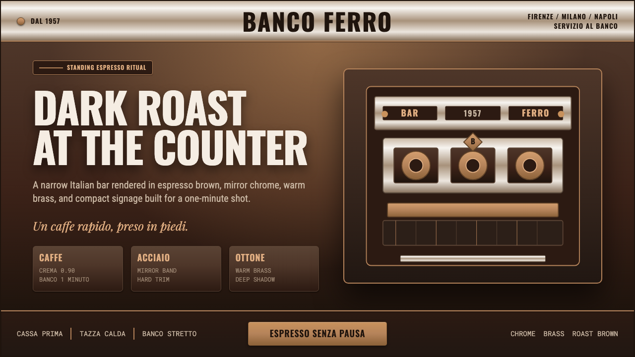 Italian Espresso BarDark roast, hard metal. Brass lines and Oswald signage slice a deep espresso…
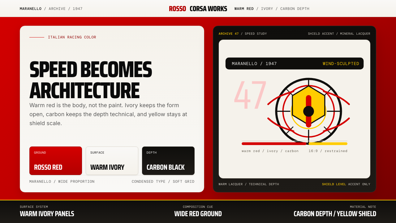 Ferrari Rosso Corsa (1947)Speed becomes architecture. Racing red, warm ivory, and carbon-black panels.
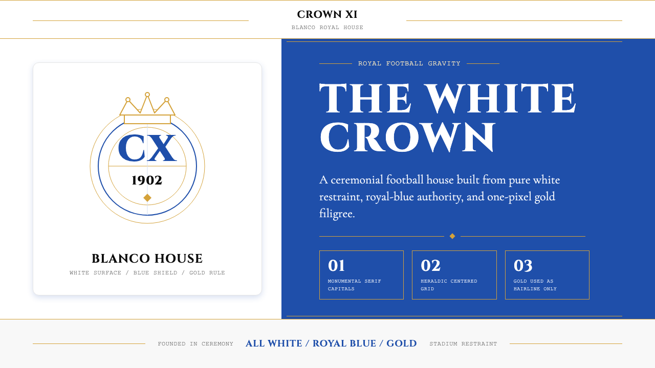 Real Madrid (Blanco)Royal restraint wins. Pure white, royal blue panels, and 1px gold filigree ca…
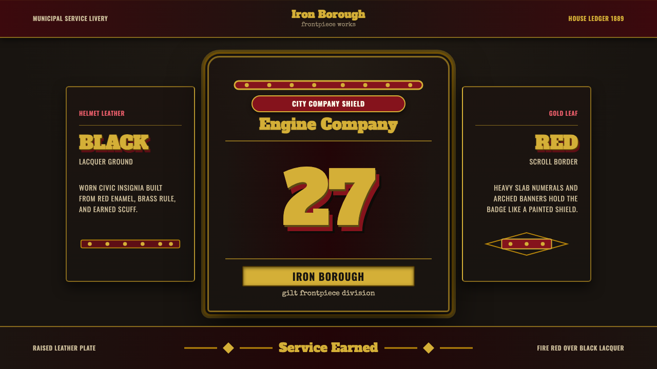 Fire Brigade ShieldEarned civic armor. Gold leaf numerals, fire-red borders, black leather symme…
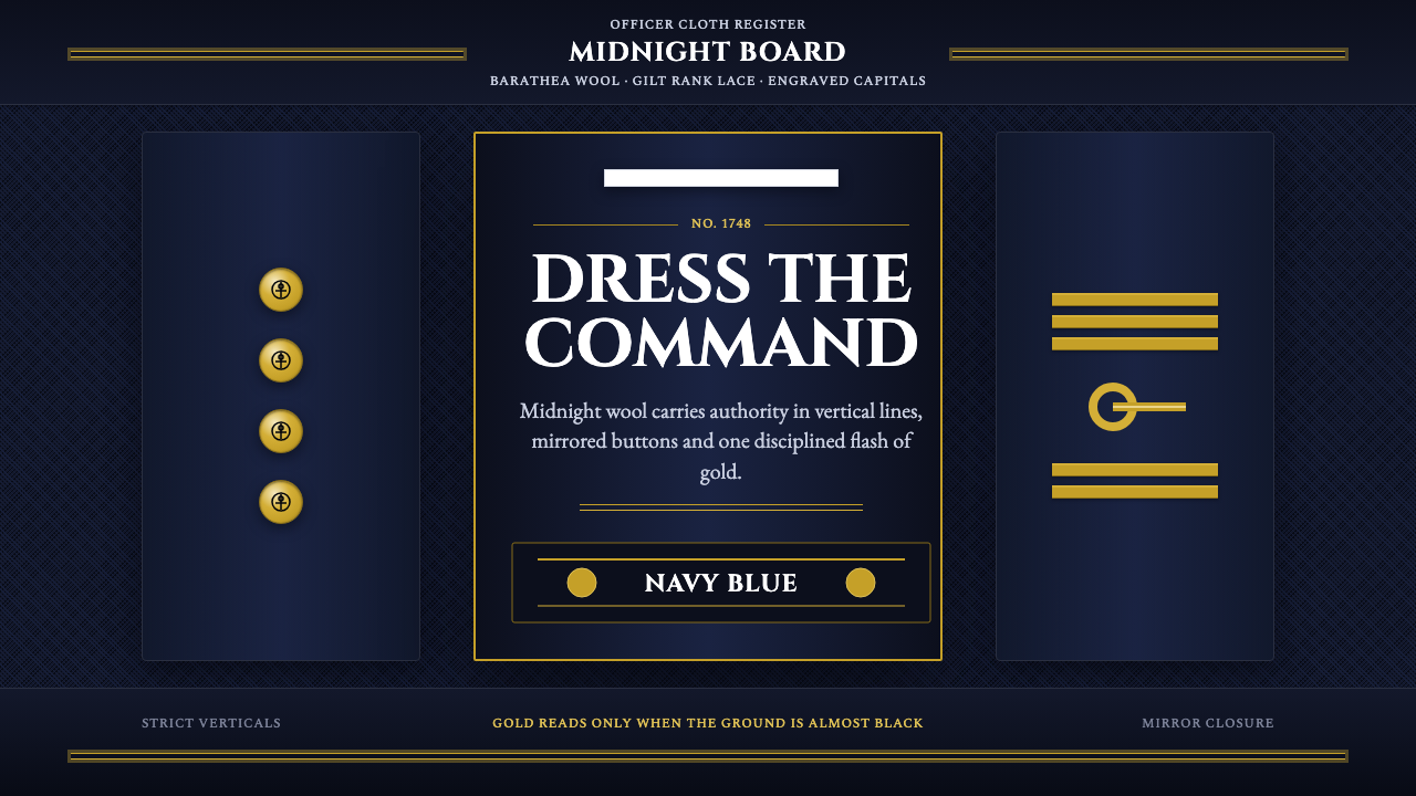 Naval Dress UniformAuthority in midnight wool. Cinzel capitals, gold lace and button symmetry ho…
 Gilt Leather BindingWeight without noise. Deep Morocco leather, Cinzel capitals, and burnished gi…