What is Turkish Alphabet Reform?
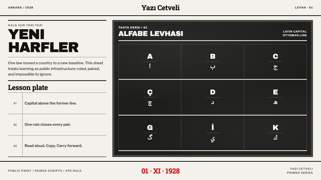
Turkish Alphabet Reform turns a 1928 wall chart into a design system — heavy black capitals, a ruled grid of letter cells, and one slate-dark section where the lesson is written in chalk.
Turkish Alphabet Reform in brief
Turkish Alphabet Reform is a light, severe, information-first design language drawn from the printed teaching charts that accompanied Turkey's switch from the Ottoman Arabic script to a Latin alphabet in 1928. It makes literacy visible as a layout: a ruled matrix in which each letter has its own cell, each row has its own line, and every pairing of old and new script sits directly one above the other.
The look is plain on purpose. Dense black letterpress ink on white machine-made paper, heavy grotesque capitals for headings, body text at the size a typesetter would set it, and fine rules that make the page into a table. In the middle of the page one section inverts completely, white chalk on dark slate, recalling the portable blackboard that carried the new alphabet to its audiences. Nothing is aged, gilded or decorated.
The idea behind it is that a mass campaign needs a mass-readable page. These charts were cheap public print, designed to be pinned to a wall, scanned from a distance and understood by people who were learning to read in a new script. Their beauty comes from discipline: order, repetition, clear contrast. This style keeps that discipline intact and treats the chart as the finished design.

Where does Turkish Alphabet Reform come from?
On 1 November 1928, Turkey replaced the Ottoman Arabic script with a Latin alphabet by law: Law 1353. It was one of the most sweeping cultural reforms of the early republic, known in Turkish as the Harf Devrimi, the Letter Revolution, and it belongs to the broader Kemalist program of reform. The new alphabet, tuned to Turkish sounds, adds letters such as the dotted and dotless i and uses ç, ğ, ö, ş and ü, for 29 letters in all. The reform did not land in parliament alone. It landed on walls.
The vehicle was the printed alphabet chart, in Turkish Alfabe Levhaları. Charts were pinned to stone walls in towns and cities and used in classrooms. The surviving format is stark: white machine-made stock, dense letterpress black, and a Latin capital letter ruled directly over its Ottoman Arabic parallel, joined by a horizontal line. Readers could see at a glance what the new form of a familiar letter was. The chart worked as a bilingual dictionary of shapes before it worked as a poster.
People and institutions stood behind the charts. A language commission, the Dil Encümeni, was charged with preparing the new alphabet. Mustafa Kemal Atatürk took the cause on the road; the source records his September 1928 lecture in Kayseri, where he used a portable blackboard to teach the letters in front of an audience. That chalk-on-slate scene is the origin of the dark inverted section in the system. Publishing houses of the day, such as Kitaphane-i Hilmi, also appear among the key names, standing for the commercial printers who turned the new alphabet into primers and sheets.
The reform then entered a long campaign. From 1928 to 1935 the Millet Mektepleri, or Nation Schools, taught adults to read and write in the new script. The geography the source gives for the campaign runs through Ankara, Istanbul, Kayseri and the network of village schools. The source dates the wider period of the style from 1900 to 1950. The aesthetic that survives is that of cheap public print under real deadlines, where legibility was the point. This system carries that functional look forward without turning it into nostalgia: no distressing, no dirt, no gold ornament, only the grid, the capitals and the chalk.
What defines the Turkish Alphabet Reform look?
The Ruled Matrix
The page is a grid of letter cells divided by fine black rules: one letter per cell, one line per row. The rules are the structure, not decoration, and they make the page scannable from a distance. The matrix works for any content that is a list of parallel items, and its strictness is what keeps a dense page from becoming noisy.
Paired Scripts
In the original charts a Latin capital was ruled directly over its Ottoman Arabic parallel, joined by a single horizontal line. This pairing is the core idea of the system: two forms of the same thing, stacked and separated by one rule, so a reader's eye can compare them without searching. It translates naturally into old-versus-new, before-and-after and source-and-target layouts.
Heavy Grotesque Capitals
Headings are set in heavy grotesque capitals, bold, upright and without ornament, in the type of the commercial printing shop. They announce rather than seduce. The weight carries across a room and holds its own against the grid of rules, so a title reads as the first and loudest item on the chart without needing any color.
Letterpress Black on White
The palette is nearly monochrome: dense, saturated black ink on white machine-made paper. The black is full and slightly heavy, as letterpress ink is, and the white is clean rather than creamy. This is the colour logic of cheap mass print, in which a single ink on paper had to do everything, and it gives the style a bracing clarity that more elaborate palettes cannot match.
Compositor's Body Text
Body text is set at the modest size of a print-shop compositor, compact and efficient, with explanatory notes that sit in the margins or between rules. It is not stretched for readability in the modern sense; instead it is organized by the grid so that short lines are easy to find and follow. The contrast between huge headings and small, tidy text is part of the style's directness.
The Chalk-on-Slate Inversion
One section of the page inverts completely: a dark slate field with white chalk-like letters and diagrams, recalling the portable blackboard of 1928. It acts like a lesson inserted in the middle of a printed chart. Because it happens only once, it creates an event on the page and shifts the reader's attention. Repeating it everywhere would remove the effect and reduce it to a dark theme.
Discipline Over Decoration
There is no aging, no staining, no gilded ornament and no patterned border. The look comes from order, not from texture. This is a deliberate choice: the original charts were new, cheap and clean, not antiques. Treating them as faded relics would misrepresent the energy of a campaign that wanted to be read immediately. The style stays crisp and contemporary in feeling, even when its sources are historical.

Who shaped Turkish Alphabet Reform?
Atatürk led the Kemalist reform program of which the alphabet change was a part, and he presented it in person. The source records his lecture in Kayseri in September 1928, where he used a portable blackboard to teach the new letters. That image, a leader at a blackboard, is the origin of the chalk-on-slate section in the system and a reminder that the reform was conveyed by teaching as well as by law.
The Dil Encümeni, or Language Commission, is named in the source as one of the key institutions behind the reform. It stands for the technical work that made a new alphabet usable: deciding which letters would represent which sounds, and how a script devised for one language could be taught to millions. The matrix of letter cells is, in a way, a picture of that decision-making: every sound given a single, fixed place.
Kitaphane-i Hilmi is a publishing house named among the key figures of the theme. It represents the commercial printers, publishers and booksellers who turned official decisions into physical objects: primers, wall charts and sheets that people could actually buy, hang and use. Their role explains why the style looks like practical print production rather than official ceremony.
The Nation Schools ran from 1928 to 1935 and brought adults into classrooms and village schools to learn the new script. The teachers who pinned the charts to walls and wrote letters on blackboards are the unnamed people the system serves. Everything about its design, from the big headings to the ruled cells, assumes a teacher pointing at the page and a learner following along.
How do you use Turkish Alphabet Reform today?
Turkish Alphabet Reform is among the most useful historical styles for work that has to teach, compare or explain. It is a design for people who need to read the page, and it assumes a reader who is learning something. It works best when content has natural parallels and a single moment of emphasis, and it works poorly as atmosphere for products that want softness or surprise.
For presentation slides, a cover can be a plain white field with a heavy capital title, a heavy rule and a small line of text beneath, like the heading of a chart. Content slides are matrices: a grid of cells with one fact each, or a two-row comparison of old and new. Use the dark slate inversion for a single slide or a single panel, such as a key takeaway or a worked example. Data slides become tables first, with charts drawn in black rules and a single fill.
For web interfaces, the style fits documentation, onboarding, migration guides, glossaries, language-learning products, civic and public-information sites, and any product that explains a change from one system to another. A page can be built as a ruled table of items with a bold heading, with side-by-side before-and-after columns. Keep the palette to black on white, let one panel invert to dark as a callout or tutorial block, and let the rules do the work of cards.
For editorial and marketing work, it supports explainers, history features, infographics and campaigns that want a public-notice directness. Pair a heavy capital headline with a narrow grid of facts, and use the chalk section as a pull-out lesson or definition. It suits civic information, education and nonprofit communication particularly well, where being understood quickly is more important than being admired. It also gives a clear and honest tone to product announcements about change.
The most common mistake is to add what the original does not have: sepia tones, torn edges, coffee stains, scanned-paper textures or golden ornament. These turn a crisp, cheap, urgent printed chart into a prop. The second mistake is overusing the chalk inversion so that it becomes a general dark theme. A third is treating the Ottoman Arabic script as exotic decoration; when it appears, it should be set correctly and legibly, as part of the information, never as a pattern.

Turkish Alphabet Reform — FAQ
What was the 1928 alphabet reform?
On 1 November 1928 Turkey adopted a Latin alphabet in place of the Ottoman Arabic script, under Law 1353. It was part of the Kemalist reforms and is known as the Letter Revolution, or Harf Devrimi. A new 29-letter alphabet was taught through printed charts, a language commission, and adult education schools, the Millet Mektepleri, which ran from 1928 to 1935.
Why does the page use a ruled grid?
Because the original charts were organized that way: every letter had its own cell and every row its own line. The grid made a large amount of parallel information scannable from across a room, and it gave learners fixed places to look. In design terms it is the most honest layout for comparison: each item has the same size, the same position and the same rule around it.
Why is only one section dark?
The dark slate section represents the portable blackboard that Atatürk used in Kayseri in September 1928. Because it appears only once, it works like a lesson inserted into a printed chart and shifts the reader's attention. If the whole page were dark it would be an ordinary dark theme, and if the slate section were repeated it would lose the effect of an event.
Can I use it for something that is not about language?
Yes. The structure is general: a ruled matrix, paired columns for old and new, heavy capital headings and a single inverted section. It suits product comparisons, glossaries, timetables, curricula, compliance guides and migration documentation. What matters is that the content is parallel and that someone needs to understand it quickly. Without that need the severity can feel heavy-handed.
Should I make it look old to match the history?
No. The original charts were new, cheap and clean at the time, produced to be read immediately. Adding age, stains or sepia would turn a functional campaign into a museum piece. The style is designed to stay crisp: white paper, black ink, firm rules. Let the structure and the capitals signal the period, and keep the surface clean.
Related design styles
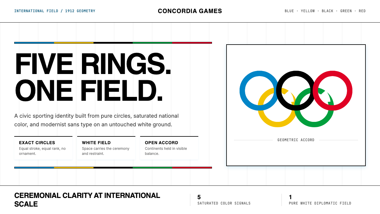 Olympics Five Rings (1912)Ceremony without noise. Saturated five-ring color on pure white, locked to a…
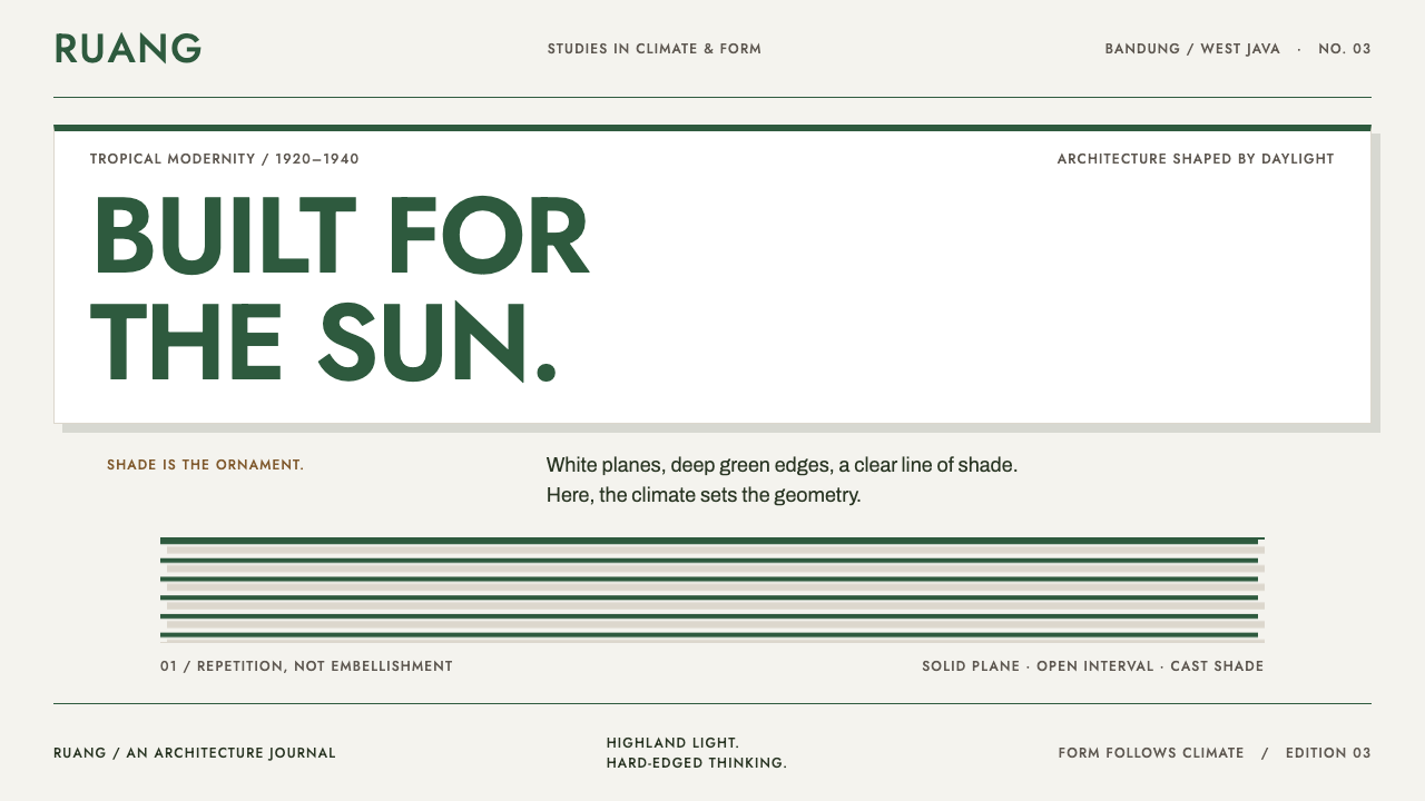 Bandung Tropical Art DecoClimate writes the geometry. Bottle-green bands on stucco white make hard sha…
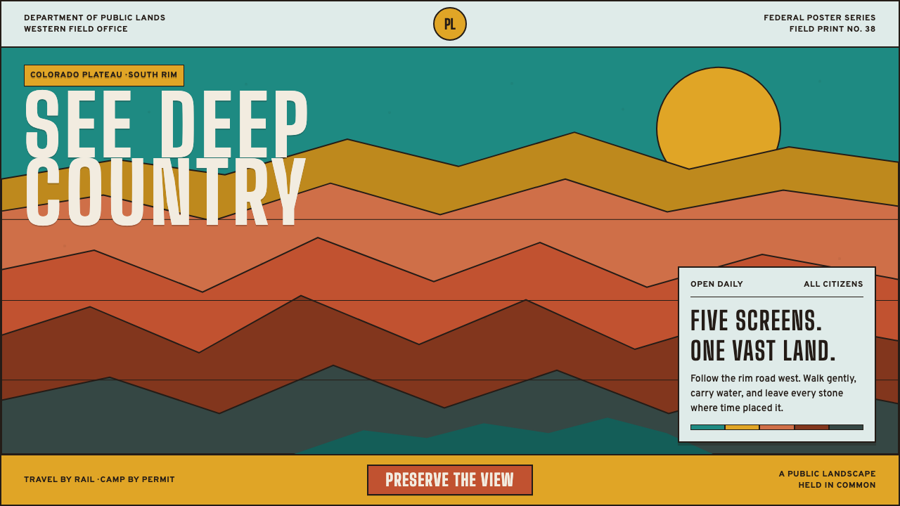 Grand Canyon WPA (1938)Public grandeur in five screens. Turquoise, ochre and terracotta stack in har…
 Hong Kong Handover 1997 PosterCivic pressure, printed loud. Vermilion on black, yellow type, bilingual grid…
 Java Tourism Poster 1930Distance in four flat inks. Chrome yellow, ultramarine diagonals and geometri…
 Olympic Poster Berlin (1936)Monumental and legible. Green-gray, cream, and gold turn type into architectu…