What is Trolls Poppy Magenta 2016?
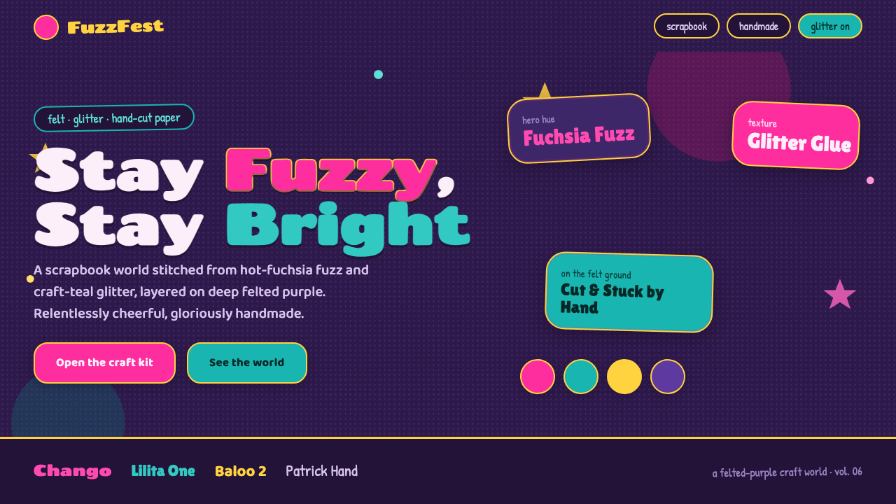
Trolls Poppy Magenta 2016 turns relentless optimism into a tactile scrapbook world: fuchsia fuzz, craft-teal glitter, felted purple, and an unapologetic abundance of handmade delight.
Trolls Poppy Magenta 2016 in brief
Trolls Poppy Magenta 2016 is a contemporary animation-derived design style inspired by DreamWorks’ Trolls, released in 2016. Its visual premise is simple but unusually complete: a whole environment appears to have been assembled from felt, glitter, fuzzy fibers, hand-cut paper, stitching, and cheerful craft-table leftovers. The style takes Poppy, the relentlessly optimistic Trolls queen, as its emotional center: hot fuchsia fuzzy hair rises from a dark felted-purple world and makes joy feel physical rather than abstract.
The resulting system is maximalist, but it is not chaotic. Vivid fuchsia creates the emotional focal point, craft-teal supplies contrast and sparkle, and the deep purple ground gives bright materials somewhere to land. Titles look cut, pasted, and slightly imperfect; body copy remains rounded, clear, and welcoming. Rather than hiding construction, the style makes construction part of the picture: paper edges, soft fibers, scattered speckles, stitched seams, and glitter-like marks all announce that a person could have made this world by hand.
Its character comes from treating decoration as atmosphere rather than polish. A flat digital surface is transformed into something that suggests a scrapbook page, a felt wall, or a child’s imaginative craft project. The aim is not realism and not nostalgia for any single historical craft tradition. It is buoyant, theatrical, and franchise-ready: every element should feel as if it belongs to a colorful animated world where texture, kindness, and celebration are allowed to be loud.
Where does Trolls Poppy Magenta 2016 come from?
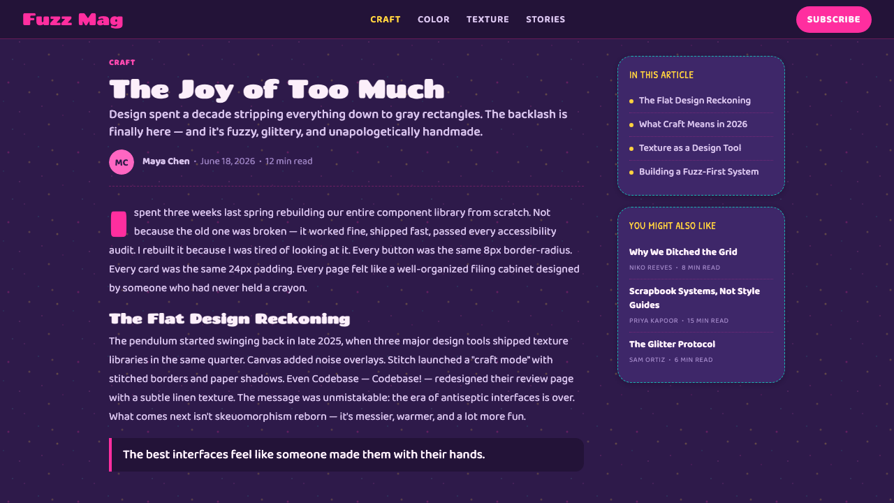
The style belongs to the contemporary craft-and-scrapbook art direction associated with DreamWorks Animation’s Trolls film of 2016. The film’s world was built around tactile-looking materials rather than sleek digital surfaces: felt, glitter, hand-cut paper, fuzz, and decorative craft detail. That material vocabulary matters because it gives the visual language a clear internal rule. Objects should not merely be colorful; they should appear soft, layered, cut, scattered, stitched, or sprinkled into place.
Poppy provides the style’s most immediate visual and emotional cue. As the relentlessly optimistic queen of the Trolls, she represents the system’s refusal of restraint for restraint’s sake. Her fuchsia fuzzy hair is not simply a character feature; it establishes a contrast between an exuberant warm accent and the deep felted-purple setting around it. The style therefore uses color and texture together: brightness communicates celebration, while fuzzy materiality makes that celebration feel friendly and touchable.
The art-direction approach is closely aligned with handmade craft logic. Paper can look hand-cut rather than mechanically precise. Glitter can appear scattered rather than evenly applied. Stitching can create a visible boundary instead of disappearing into a flawless finish. These signs of assembly are essential because they prevent the result from becoming generic neon pop. A polished interface may borrow the colors, but without felt, fuzz, paper edges, or small irregularities, it loses the scrapbook conviction that defines the reference.
As a kids-franchise design language, Trolls Poppy Magenta 2016 also has a communication task: it must stay instantly readable while carrying high emotional energy. Friendly rounded type keeps information approachable beneath the visual noise. Strong headline shapes help the eye find its way through layered material. The best applications preserve this balance between exuberance and legibility, using the handmade world to make interaction feel inviting rather than turning every surface into an uncontrolled craft pile.
What defines the Trolls Poppy Magenta 2016 look?
Felted Dark Ground
The dark felted-purple ground is the system’s stabilizing surface. It should feel soft, dense, and slightly fibrous rather than like a sterile dark screen. Its job is to absorb visual energy so fuchsia, craft-teal, paper forms, and glitter marks can appear more vivid. The ground is not empty negative space; it is a material field that makes the composition feel built on a craft table.
Fuchsia and Craft-Teal
Fuchsia is the emotional spark: bold, warm, fuzzy, and impossible to ignore. Craft-teal acts as the cooler companion, bringing a glittery, handmade contrast without making the world feel clinical. They work best as active accents against the dark field, not as equal full-surface fills. The palette should read as celebration with structure: one color leads the mood while the other catches attention, signals interaction, or adds a playful secondary beat.
Hand-Cut Paper Titles
Headlines should feel chunky, cut out, and physically placed on top of the background. Slightly irregular contours and layered paper-like silhouettes are welcome because they suggest human assembly. The title treatment must remain legible at a glance; irregularity is expressive only when it supports the word shape. It should feel like a celebratory label made for a scrapbook page, not a distressed poster or an intentionally damaged type experiment.
Friendly Rounded Type
Body typography balances the exuberant title language. It should be rounded, open, and conversational, with an approachable rhythm that suits a joyful character world. Dense, severe, or highly technical letterforms fight the reference because they introduce distance where the system wants warmth. The hierarchy should come from clear contrast between headline and supporting information, leaving enough calm space for readers to understand the message beneath the texture.
Texture Everywhere
Fuzz, speckle, glitter-like scatter, stitching, and paper edges are not occasional embellishments; together they make the style recognizable. Each texture should imply a different craft action: fibers suggest softness, speckles suggest sprinkled material, seams suggest assembly, and torn or cut edges suggest collage. The important discipline is variation. Repeating one identical texture across every panel makes the world feel digitally stamped instead of handmade.
Cheerful Layering
Elements are allowed to overlap, peek from behind one another, and create a sense of assembled depth. This layering should feel buoyant rather than heavy: a fuzzy form can sit behind a label, a paper shape can frame a photograph, and a small glitter accent can reward a focal point. The composition needs a clear lead element, however. Handmade maximalism succeeds when the eye can still identify what to notice first.
Who shaped Trolls Poppy Magenta 2016?
DreamWorks Animation is the studio behind Trolls, the 2016 film from which this visual system draws its world of felt, glitter, fuzz, and hand-cut paper. Its contribution is not a single motif but an integrated material universe: color, character, scenery, and decorative detail all share the same craft-forward logic.
The Trolls art-direction team established the craft-and-scrapbook sensibility that makes the reference distinct. The visual language treats felt, glitter, paper edges, and soft fuzzy surfaces as world-building materials rather than isolated effects. For designers, that lesson is central: the handmade look must be systemic, appearing in background, hierarchy, decoration, and framing together.
Poppy, the relentlessly optimistic queen of the Trolls, is the style’s mascot and emotional compass. Her hot fuchsia fuzzy hair creates the clearest signature contrast against the deep felted-purple setting. She also defines the tone of application: energetic, generous, friendly, and celebratory rather than merely bright or cute.
How do you use Trolls Poppy Magenta 2016 today?
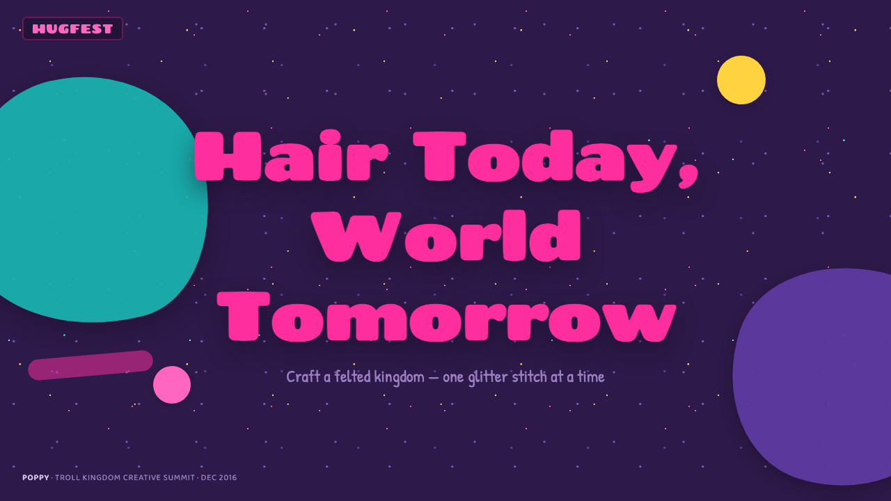
For presentation covers, use the style as an announcement of mood. Let a dark felt-like field establish the stage, then place one dominant fuchsia fuzzy form or hand-cut title where it can carry the message. Craft-teal glitter-like accents should support the focal point rather than compete with it. On content slides, reduce the amount of texture and use rounded body type for explanations; the handmade atmosphere should frame information, not make every bullet look like decoration.
Data slides need extra restraint. Treat charts, comparison blocks, and key metrics as the calm structure inside the craft world. A paper-like label can introduce a category, a fuchsia highlight can identify the primary takeaway, and craft-teal can distinguish a secondary relationship. Keep the data area clean enough to scan, avoiding textured marks behind values, legends, or fine labels. The visual reward should arrive around the data, while the data itself remains direct.
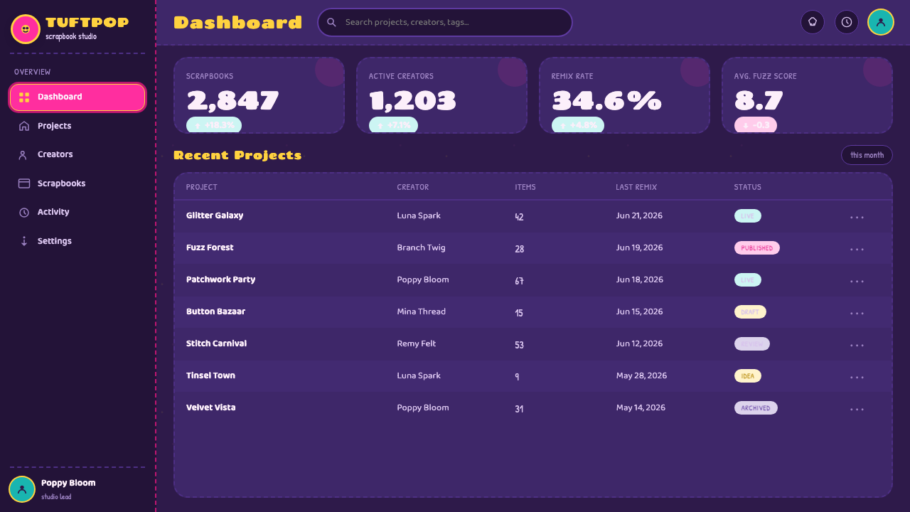
For web interfaces, the style suits children’s entertainment, community spaces, event pages, playful learning products, and expressive campaign experiences. Dashboards can use the felted dark ground as an ambient shell while keeping panels orderly and readable. Pricing pages can turn plan names into cheerful paper labels and reserve glitter or fuzzy emphasis for the most important choice. Controls should stay predictable even when their surrounding cards feel handmade; familiar interaction patterns are what allow the visual personality to remain joyful rather than confusing.
For editorial and marketing work, build stories through collage-like framing. A feature image can be surrounded by cut-paper shapes, a quotation can sit on a textured label, and section transitions can use stitched lines or sprinkled accents to maintain the world between paragraphs. Marketing pages benefit from the style’s emotional immediacy when promoting celebrations, releases, family-facing experiences, or anything that genuinely welcomes exuberance. It is less convincing when used to make a serious or restrained message look artificially cheerful.
The common mistake is to confuse handmade maximalism with indiscriminate clutter. Using fuchsia, teal, glitter, fuzz, stitching, paper edges, and layered shapes all at full intensity leaves no room for the message or for Poppy-like optimism to register. Start with one clear focal point, choose a limited set of material cues for each section, and preserve quiet reading areas. The work should feel joyfully assembled, not as if every craft supply was tipped onto the page.
Trolls Poppy Magenta 2016 — FAQ
Is this style only appropriate for Trolls-related work?
No, but its values should match the subject. The system can work for playful entertainment, celebratory campaigns, children’s experiences, creative communities, and warm educational material because it communicates visible joy and handmade welcome. It is less suitable for messages that depend on restraint, institutional distance, or sober authority. Borrow the craft logic and emotional energy, not character-specific imagery, when adapting it beyond its original reference.
How can a digital interface feel handmade without becoming impractical?
Assign handmade texture to framing, emphasis, and atmosphere, then keep reading and interaction areas clear. Felt-like backgrounds, paper labels, fuzzy accents, and stitch-inspired separators can make a screen feel tactile, while text fields, navigation, data, and controls remain easy to identify. The goal is to suggest a crafted world around the interface, not to force every functional element to imitate a physical craft object.
Why is the dark felted-purple ground so important?
It gives the bright accents both contrast and material context. Without a dark, soft-looking ground, fuchsia and craft-teal can drift into generic bright pop graphics. The felted field makes them appear placed, fuzzy, and tactile, while also giving layered paper and glitter details a visual stage. It is the quiet material beneath the style’s loudest gestures.
Can the style work with photography?
Yes, if photography is invited into the collage rather than treated as a separate polished layer. Frame it with hand-cut-paper forms, allow friendly texture around its edges, and give it a clear role in the hierarchy. A highly sleek, glossy image placed without any material relationship can break the illusion. The photograph should feel like one treasured piece pinned into the scrapbook world.
What makes a Trolls-inspired design feel cheerful rather than childish?
Cheerfulness comes from confidence, not from adding every playful motif available. Use the material system with intent: a strong focal color, a few tactile cues, friendly language, and a clear message. Childishness appears when hierarchy collapses and every element asks for attention at once. The most convincing work lets its audience enjoy the craft world while still feeling guided, respected, and informed.
Related design styles
 Adventure TimeCartoon warmth, inked loud. Cream gutters, candy pink, cyan and mint lock int…
 Aardman ClaymationHandmade warmth, visibly touched. Clay-orange panels, Caveat notes, thumbprin…
 Arc BrowserPersonal software, visibly alive. Aurora purple glows over cream cards and ro…
 Bahamian Junkanoo CowbellNight refuses silence. Acid crepe stripes and block type collide like cowbell…
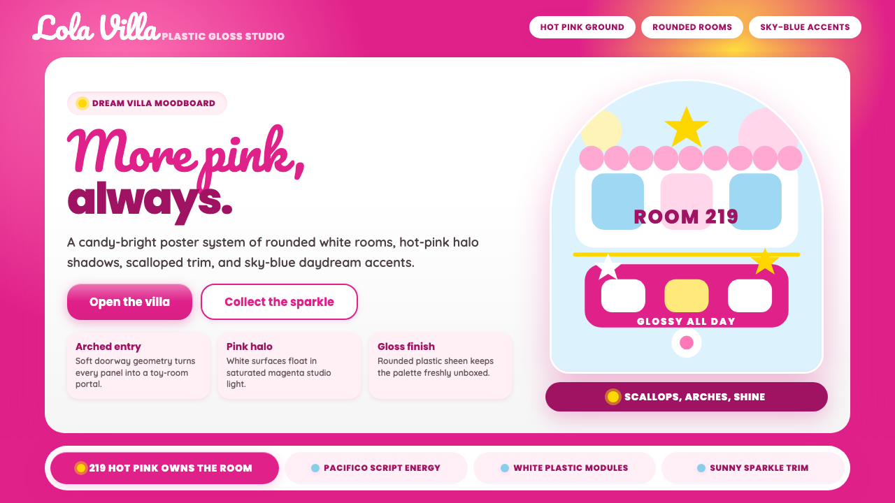 Barbie DreamhousePink is the whole world. Hot magenta ground, Pacifico script, scallops and gl…
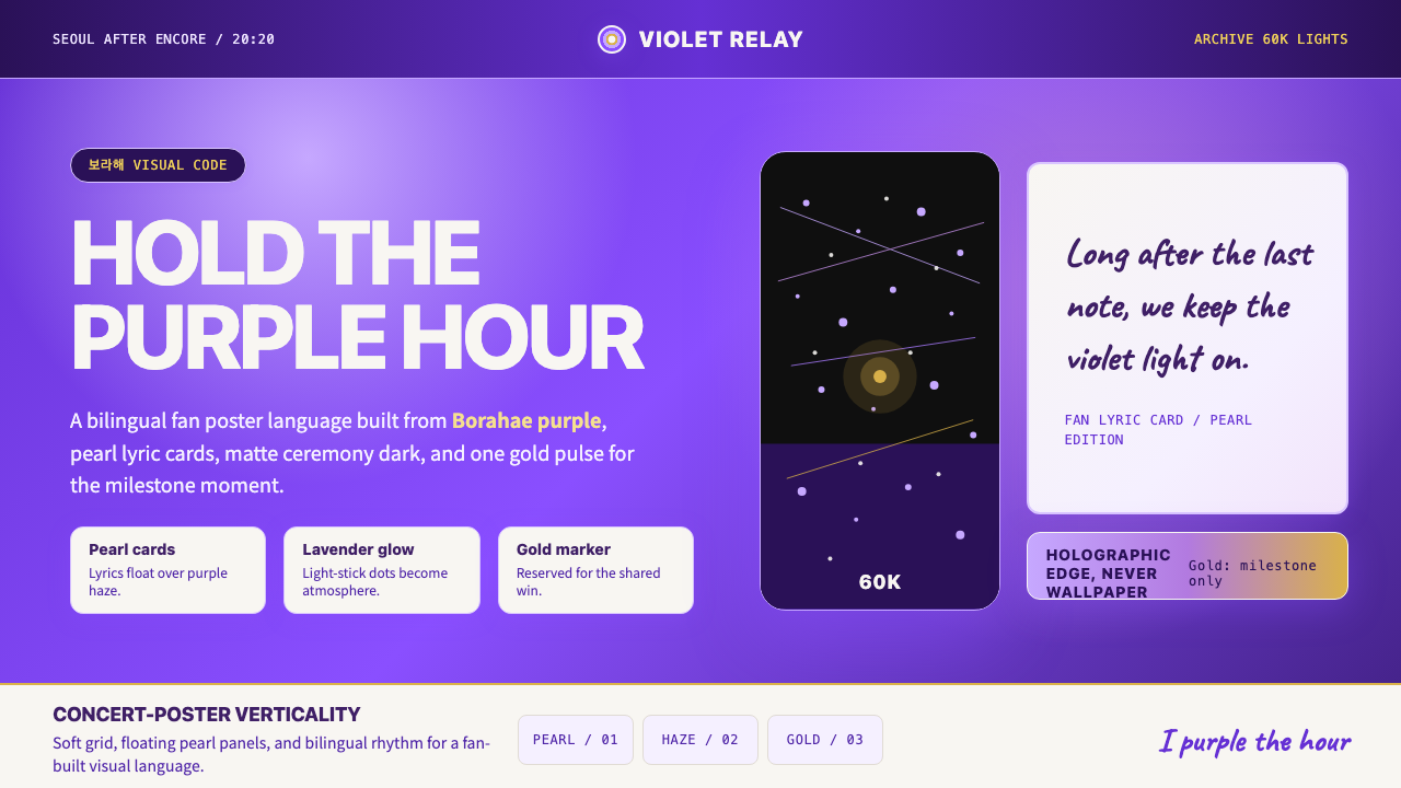 BTS Army Purple 2020Fandom becomes atmosphere. Borahae purple, pearl cards, lavender glow, one go…