What is Trello?
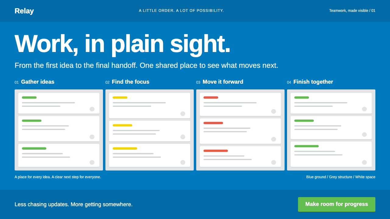
Trello turned teamwork into a picture: a blue canvas, grey lists running left to right, and white cards that move from one list to the next.
Trello in brief
Trello is the kanban board that Fog Creek Software showed at TechCrunch Disrupt in New York in September 2011. The whole product is one screen: a saturated blue canvas, a row of grey lists, and white cards that can be dragged from list to list. Coloured label bars sit on top of cards, and small badges for due dates, checklist progress and round member avatars sit beneath.
As a design system, it keeps the grammar of that board strictly. Blue is the ground and never the text. Grey is the list. White is the card. Confirming actions use a green of the product's own. The type is a neutral grotesque, set in a dense working size, so that a lot of information fits and remains readable.
The aim is to let people see at a glance who is doing what and how far along it is. The style suits task management, project collaboration, team workspaces and any interface where work moves through stages.

Where does Trello come from?
The product was launched at TechCrunch Disrupt in 2011 by Fog Creek Software, a New York company. The classic board look, with its blue background, grey lists and white cards, is dated from about 2011 to 2016. Joel Spolsky, Michael Pryor and Bobby Grace are the names associated with the product; Spolsky as the company's well-known figure, Pryor with leading the product and Grace with its design.
The idea underneath is kanban, a method that originated in the Toyota Production System. Kanban makes work visible by placing it on cards that move across columns representing stages. Trello took a method designed for factory floors and gave it a friendly, digital surface that anyone could use without training. That transfer from the physical to the screen is the core of the design.
Trello also belongs to the agile software development tradition, in which small teams track work in short cycles and prefer visible, shared boards to hidden status reports. Its card-and-list model matches the sticky notes on a whiteboard that agile teams used long before the product existed.
The third background is the Web 2.0 software-as-a-service wave of the period, which favoured simple web interfaces, drag and drop, and products that individuals could adopt without procurement. The look of Trello, light and friendly rather than corporate, is typical of that moment, and its blue canvas became one of the most recognised work surfaces of the decade.
What defines the Trello look?
Colour
Blue is the canvas, grey is the list and white is the card, and the three never swap roles. Blue is never used for text on the blue ground. Coloured label bars on cards supply a limited vocabulary of categories, and a product-specific green marks confirming actions. The scheme is bright but functional: every colour has a job.
Board grammar
Lists run in columns from left to right, and the board scrolls horizontally when there are many. Cards stack vertically within a list. The layout directly represents stages of work, so position carries meaning: a card's list is its status.
Cards
Cards are white, lightly rounded and have a thin, soft shadow so that they appear to rest on the grey list. A card holds a title, optional label bars, and a footer of small badges. They are designed to be picked up and moved, which is why they have clear edges and a consistent size.
Badges and avatars
Due dates, checklist progress, attachments and comments appear as compact badges under the card title. Members appear as round avatars. These small elements carry the detail, so the card face can remain brief while still telling the whole story of a task at a glance.
Typography
The system uses a neutral grotesque, with an open-source face standing in for Helvetica Neue, set at a compact working size. Titles are regular or medium weight, with no decorative display type. The goal is density without strain, because users look at many cards at once.
Density and calm
The interface is dense but quiet. There is little ornament, spacing is tight but consistent, and motion is functional, limited to lifting a card while it is dragged and dropping it into place. The board never competes with the work placed on it.

Who shaped Trello?
A well-known figure associated with Fog Creek Software, the company that launched Trello. His writing on software and teams is part of the culture from which the product emerged.
Associated with leading the product. His name is tied to the decision to keep the interface to a single board that anyone could understand immediately.
Associated with the design of the product. The grammar of blue canvas, grey lists and white cards, and the discipline of giving each colour one job, belong to this side of the work.
How do you use Trello today?
In slides, the board metaphor is a ready-made structure for status and roadmap pages. Draw a blue canvas, three or four grey columns and a few white cards, and the audience reads stages instantly. Cover pages can be as simple as a blue ground with a short white title and one or two cards peeking in from the edge.
For content and data slides, use position as the main channel. A pipeline, a hiring funnel or a release plan can each be drawn as lists and cards, with coloured label bars for categories and small badges for owners and dates. Charts should stay plain, in the blue and grey family, with the green reserved for completed or confirmed values.
In web and app interfaces, the style is built for task management, project collaboration, team workspaces, support queues, content calendars and any workflow with clear stages. Keep the three-role colour rule, make cards draggable with clear lift feedback, and let badges carry detail. A dense, calm layout is a feature, not a flaw.
In editorial and marketing work, the board can illustrate how a team works. A product page might show a board in motion with a card travelling across lists, and a case study can use the same grammar as a diagram. Copy should be practical and direct, describing outcomes such as clarity and shared visibility.
The most common mistake is to break the colour roles, for example by using blue text on the blue canvas or colouring lists to compete with cards. Another is to overload cards with decoration, which defeats the purpose of seeing many items at once. A third is to use the style for content that has no stages, since the board grammar only makes sense when position means status.

Trello — FAQ
What defines the Trello design style?
A blue canvas, grey lists running left to right, white cards that can be dragged between lists, coloured label bars, compact badges for due dates and checklists, and round member avatars. Each colour has one role, and position on the board indicates status.
What does kanban have to do with the design?
Kanban originated in the Toyota Production System as a way to make work visible by moving cards across stage columns. Trello brought that method to a friendly digital surface, and the whole interface is a direct representation of it: lists are stages and cards are work items.
When was the classic board look from?
The product was launched at TechCrunch Disrupt in New York in September 2011, and the classic blue-canvas board visual dates from about 2011 to 2016. Fog Creek Software was the company behind it.
Why never put blue text on the blue canvas?
Because each colour has a defined job. Blue is the ground, grey is the list and white is the card, and text sits on the grey or the white. Breaking that rule would damage contrast and blur the roles that make the board easy to read at a glance.
Can the style be used for things other than task management?
Yes, wherever work or items move through stages: support queues, content calendars, hiring pipelines, roadmaps and release plans. It does not suit content without stages, because the board grammar depends on position meaning status.
Related design styles
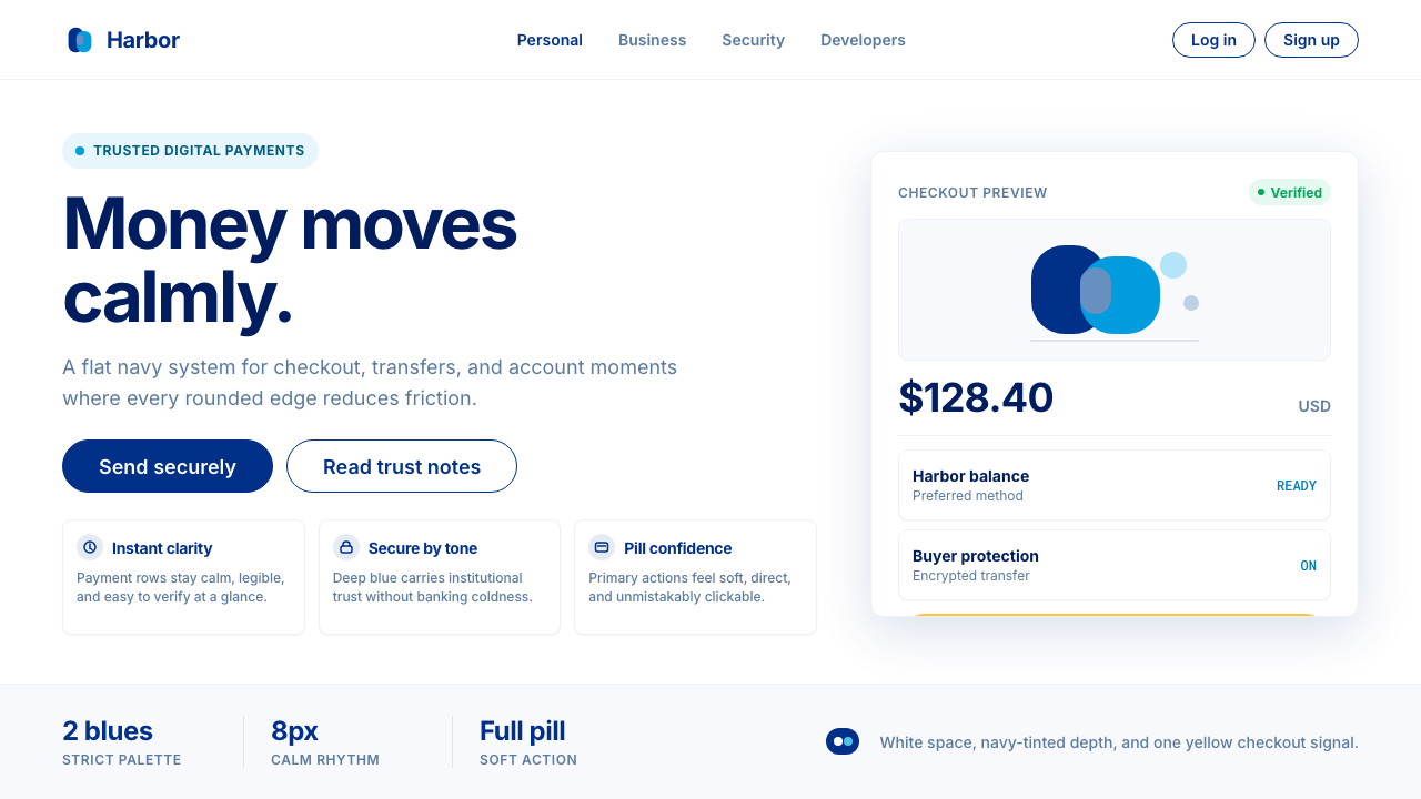 PayPalTrust without coldness. Deep navy, sky cyan, white cards, and pill checkout c…
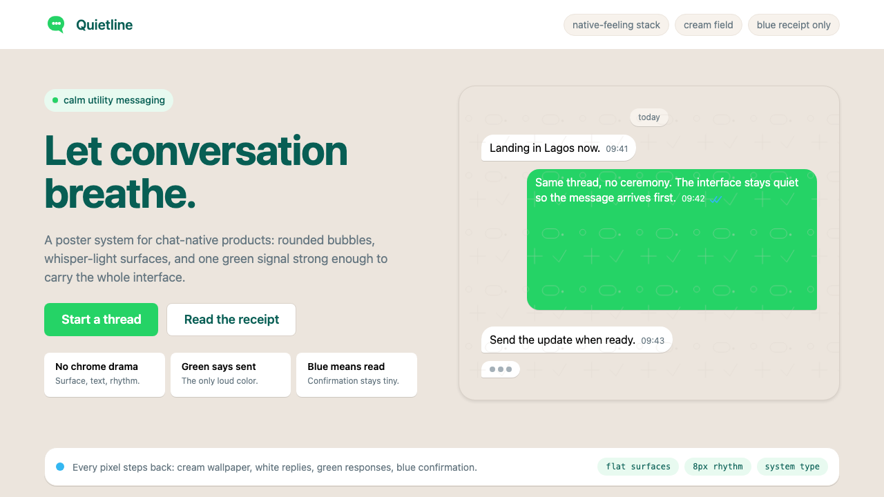 WhatsAppConversation is the interface. Cream wallpaper, green bubbles, and tiny blue…
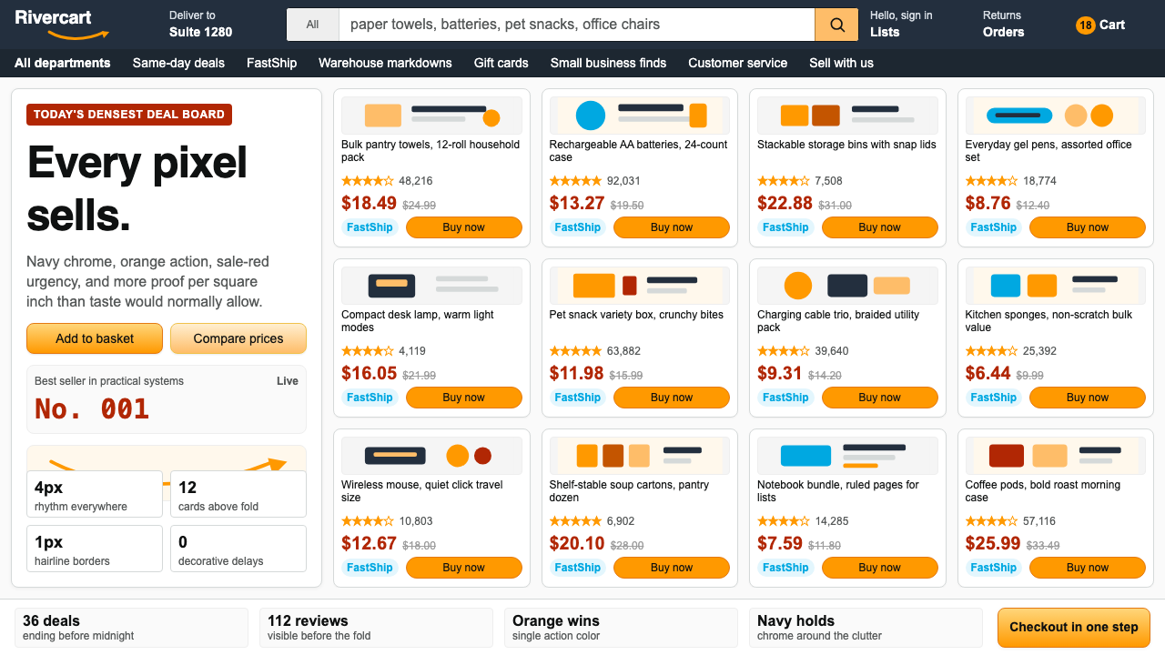 AmazonUgly sells efficiently. Navy chrome, orange buttons, red prices crowd a dense…
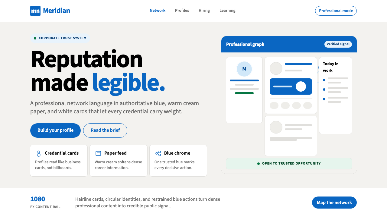 LinkedInCorporate trust, digitized. Authoritative blue frames white cards on warm cre…
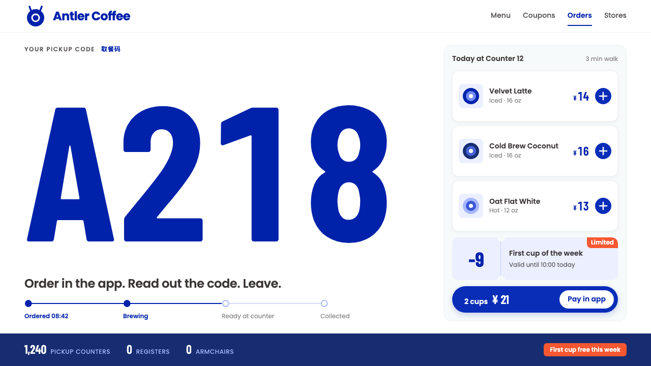 Luckin CoffeeWhite as a paper cup. Deer-blue roundel, tall condensed pickup codes, one ora…
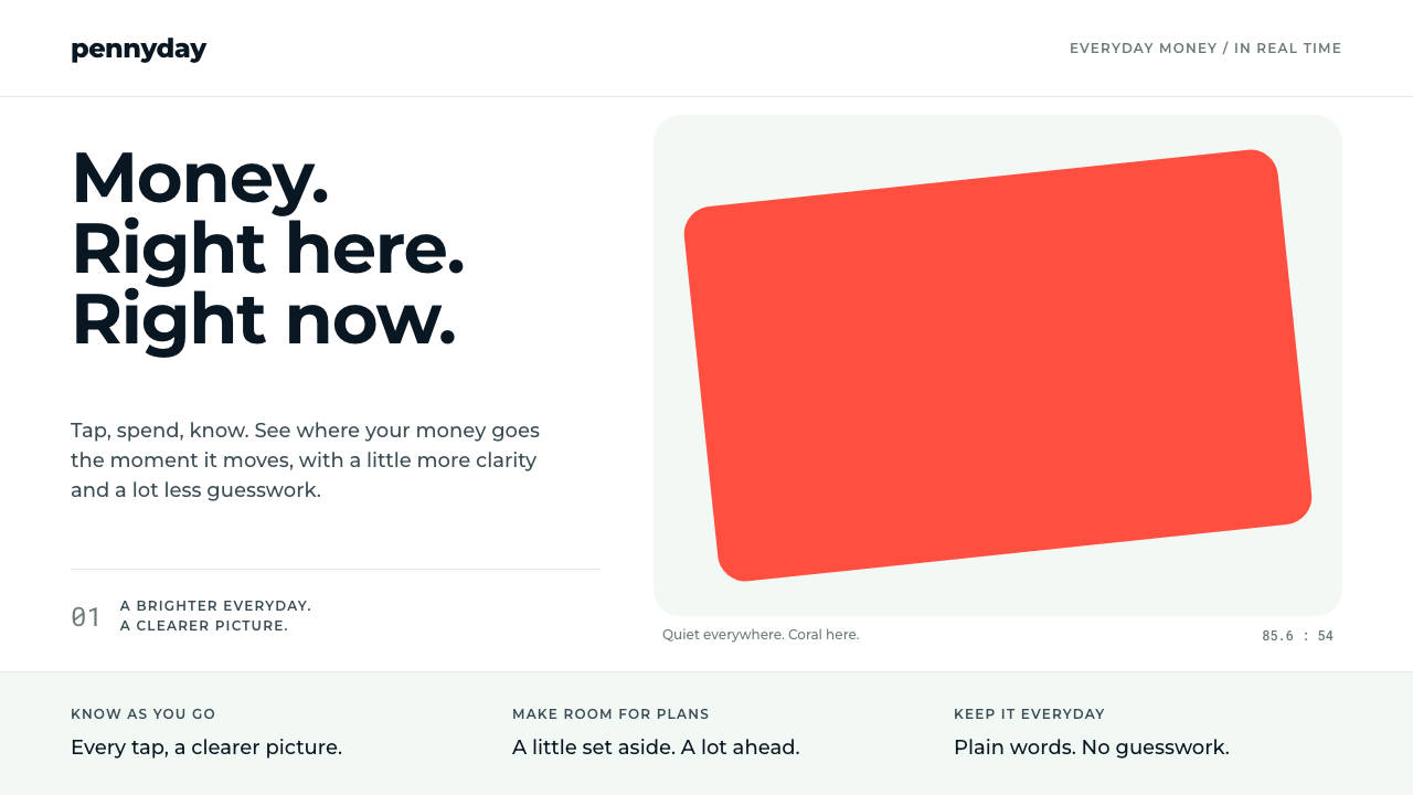 MonzoOne loud coral, everything else calm. Navy type and mint-grey space keep mone…