What is Saxon Fortified Church?
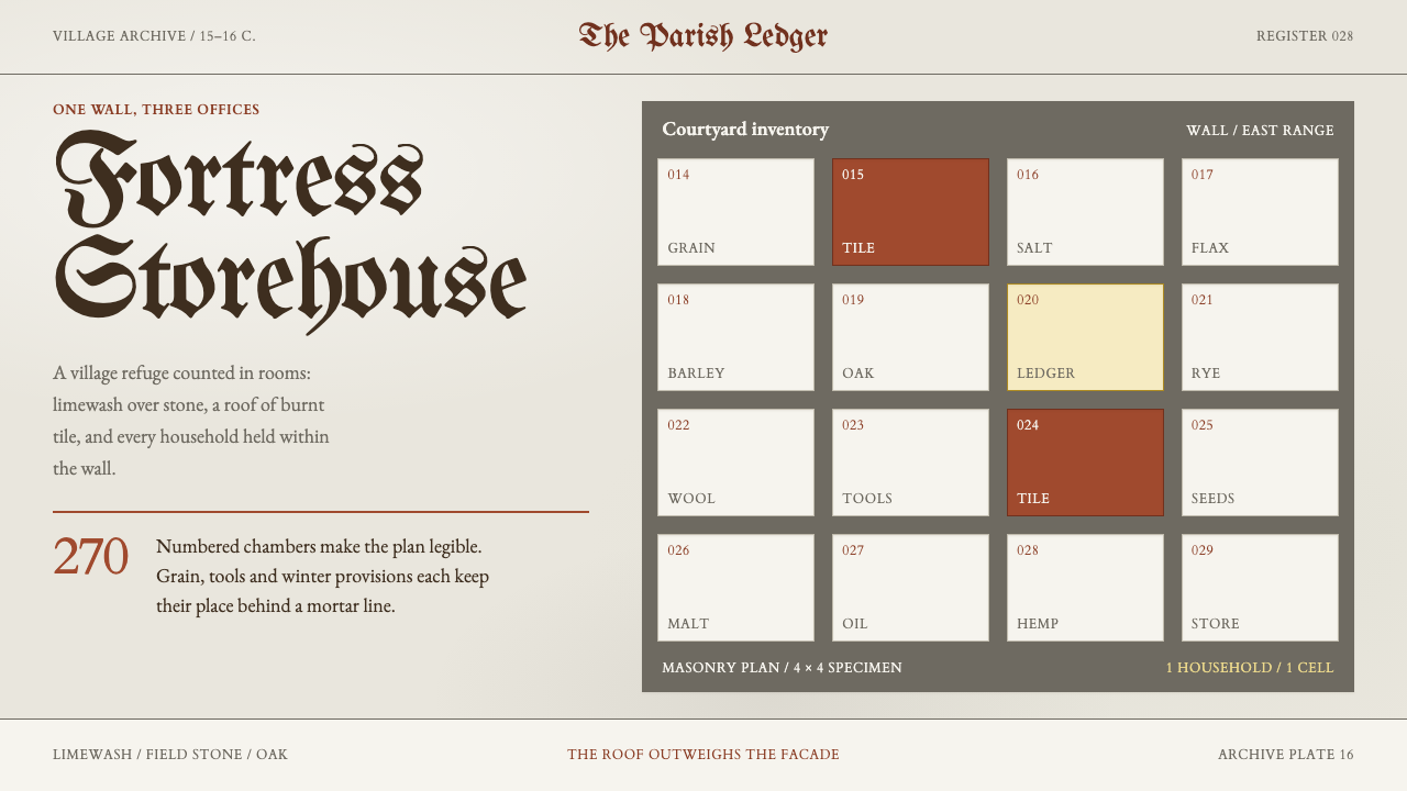
The Saxon fortified church is a fortress counted by households: limewashed stone, one loud burnt-tile red, and a grid of small numbered cells where every family had its own room.
Saxon Fortified Church in brief
Saxon Fortified Church is the design language of the fortified village churches built by the Transylvanian Saxons, mainly through the fifteenth and sixteenth centuries, in villages such as Biertan, Viscri and Prejmer in present-day Romania. These are buildings in which a church, a fortress and a food store are one structure: a Gothic hall church surrounded by ring walls with wall-walks, battlements and loopholes, and topped with a steep roof of red tile that outweighs the facade beneath it.
As a visual system it is built from a few honest materials and one organising idea. The ground is limewash over field stone, white to faintly pink and never perfectly even, so the stone shows through. The one loud colour is burnt clay tile red. The structural motif is a strict grid of small numbered cells, one for each family, which comes from the storage rooms built against the inner face of the walls. Blackletter appears where it appeared on gravestones and parish registers: large, and rarely.
Its character is austere but not cold. It follows the plan of the building rather than the emotion of the faith, and it records how a community lived: counted, sheltered, provisioned and organised. A fortress counted by households is a strong image for a layout, because it makes order and care visible in a single gesture.
Where does Saxon Fortified Church come from?
In the Saxon villages of Transylvania, in present-day Romania, one building does three jobs. It is the church, it is the fortress the village retreats into, and it is the store where the grain and the bacon hang. The Transylvanian Saxons, a German-speaking community that settled the region in the Middle Ages, built these fortified churches over generations. The source dates their medieval foundations before 1900, with the fortifications added through the fifteenth and sixteenth centuries. The three villages most associated with the style are Biertan, Viscri and Prejmer.
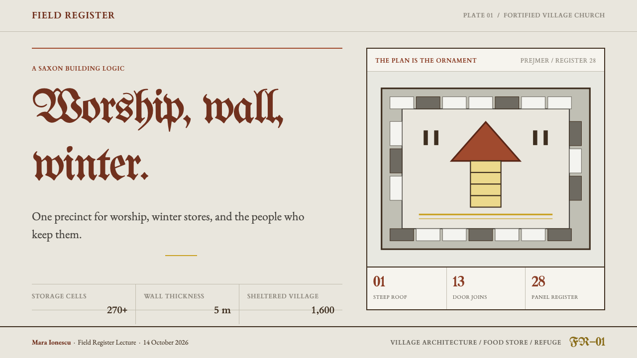
The reason for the fortification was practical. The region faced Ottoman raids in the fifteenth and sixteenth centuries, and a village of scattered houses could not defend itself. The solution was to turn the parish church into the village's strongpoint. Ring walls were built around it, with covered wall-walks, battlements and loopholes, and rooms were set against the inner face of the walls. Prejmer is the extreme case: walls about five metres thick and nearly twelve high, with more than two hundred and seventy rooms, enough to shelter some sixteen hundred people. Each family had its own numbered storage cell for food and belongings.
At heart the buildings are Gothic hall churches, in which the nave and aisles rise to a similar height. They were later adapted to the Lutheran Reformation, which the Saxon church embraced in the sixteenth century. That religious change reshaped interiors but not the fortress logic. At Biertan the interior is famous for a late Gothic winged altarpiece and for inlaid woodwork, the work of local altarpiece and intarsia workshops, which shows that the community which built such severe walls also commissioned fine craft inside them.
The written culture of the community also survives in the design vocabulary. Parish registers and gravestones used blackletter, and the source notes that registers were kept in this script into the 1800s. That tradition gives the style its one ornamental flourish: a heavy, angular lettering used large and rarely, as on a headstone, rather than as everyday type. Together, the stone, the lime, the clay tile, the numbered cell and the blackletter make up a design language that follows the plan of a village under threat. Nothing is there for show, and every element records something about how people lived inside the walls.
What defines the Saxon Fortified Church look?
Limewash Ground
The ground is limewash over field stone: white to faintly pink, slightly chalky, and never perfectly even. The stone beneath shows through in patches, so the surface reads as a wall rather than as paper. The unevenness is a feature of the material and not a flaw to be corrected, and a perfectly flat white background erases exactly the quality that makes the style recognisable.
Burnt Tile Red
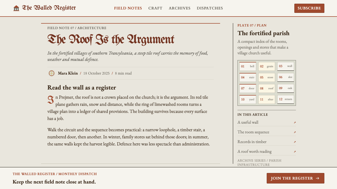
The one loud colour is the red of burnt clay roof tile. The roof is steep, and it outweighs the facade beneath it, so the colour belongs at the top of the composition and in large, confident masses rather than in scattered accents. Everything else stays pale and quiet. The result is a layout in which a single warm band over pale ground carries all the emphasis.
The Numbered Cell Grid
The structural motif is a strict grid of small cells, each with its own number, one per family. It comes from the storage rooms set against the inner wall, and it gives the layout a way of counting: each unit is distinct, labelled and equal in standing. In design terms it turns content into households, with numbering carrying order and ownership, and square boxes forming the basic building block of the page.
Blackletter, Rarely
Blackletter appears where it appeared on gravestones and in parish registers: large, and rarely. It is a titling and memorial script, not a text face. A single large line or a logotype can carry it, but it is not used for body copy, buttons or labels. Its power comes from contrast with the plain structure around it, and it loses that power the moment it becomes a general decorative treatment.
Thick Walls and Loopholes
The defensive geometry gives the system its edges. Walls are thick, frames are heavy, openings are narrow slits or small deep windows, and the battlement's regular notches suggest a rhythm along the top of a band. Wall-walks become horizontal bands that organise the page. The effect is protective: content sits inside enclosures with a strong outline, and the edge of every box is a boundary that means something.
Plan Over Piety
The design language follows the plan, not the piety. There is no stained-glass colour, no devotional ornament and no sentimental imagery. The building is a church, a fortress and a store all at once, and the style reflects that by being useful first: layouts are organised by function, and decoration appears only where it records something, such as a number, a date or a name. The restraint is practical, and the austerity is the sign of a community that needed every room to work.
Who shaped Saxon Fortified Church?
The German-speaking community that settled Transylvania in the Middle Ages and built the fortified villages. They treated the church, the fortress and the granary as a single communal institution, kept their records in blackletter, and embraced the Lutheran Reformation. The style is, in the most literal sense, a portrait of how they organised shared life under threat.
The craftsmen behind the late Gothic winged altarpiece and the inlaid woodwork of Biertan. They are the counterweight to the austere walls: inside the fortress, fine joinery and painted panels. In design terms they justify the principle of restraint outside and precision inside, and they remind us that severity and craft belong to the same community.
The villagers who built and maintained the walls and the tiled roof at Viscri, one of the villages named in the source. Limewash and clay tile are materials that are renewed rather than preserved, so the surface carries the traces of repeated care. That is why the style treats an uneven, lived-in ground as correct and a perfectly new one as wrong.
The unnamed hands who wrote the parish registers and cut the gravestone inscriptions in blackletter, where the script was kept into the 1800s. They give the style its one rule about lettering: heavy, angular and used for names and records, at a scale where it can be read at a glance, and rarely anywhere else.
How do you use Saxon Fortified Church today?
Saxon Fortified Church suits subjects built on community, protection, storage, record-keeping and heritage: archives, libraries, museums, cultural-heritage and travel guides, food and agricultural producers, insurance, security, cooperatives and neighbourhood platforms, and products that help groups organise shared resources. It conveys that something is solid, communal and built to last, with a note of age. It is less suitable for subjects that want speed, glamour or lightness.
For presentation slides, the cover can be a limewash field with a red band across the top like a steep roof, a numbered cell grid below, and the title in blackletter, set large and used once. Content slides use cells as containers: each idea is a numbered unit, and the numbering carries the reading order. Data slides can use grids of small cells like a household count, where filled and empty cells show proportion more clearly than a pie chart. The red marks the highlight, and blackletter stays off the content pages.
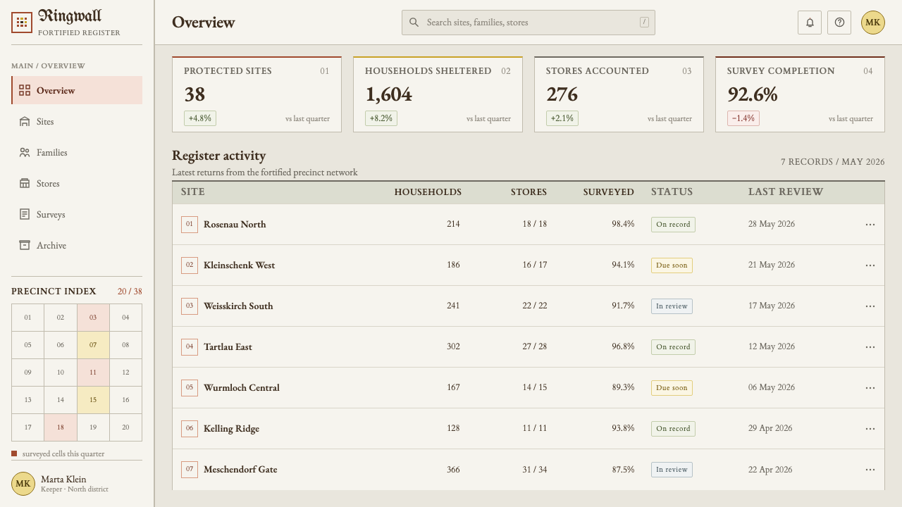
For web interfaces, the numbered cell grid maps naturally onto dashboards, inventories, listings, calendars and booking tables. Each card is a cell with a visible number, square corners and a heavy border. The roof colour is reserved for primary actions and active states. Backgrounds stay in limewash with a faint unevenness. Keep blackletter out of controls and body text, and use it only for a logotype or a single hero line.
In editorial and marketing work, the style supports long-form pieces about history, rural life, food storage, craft and community. Numbered sections, footnotes and archival captions fit it naturally. Photography should favour whitewashed walls, red roofs and ledger-like details, ideally in daylight. Campaigns for cooperatives, local producers and heritage sites can use the cell grid as a visual device for one-per-household stories.
The most common mistake is to treat blackletter as a gothic-horror flourish. In the source it was a record-keeping and memorial script, used big and rarely, and spreading it across headings, buttons and body copy turns the look into costume. The second mistake is overusing the red. The roof is the single loud colour, so a layout with red headings, red icons and red borders loses the effect of a roof over pale walls. The third is polishing the ground: a perfectly white, perfectly even background erases the uneven limewash that makes the style recognisable.
Saxon Fortified Church — FAQ
Why did the Saxons fortify their churches?
Because scattered village houses could not defend themselves against raiding, and the parish church was already the strongest and most central building in the village. The Saxons strengthened it with ring walls, wall-walks, battlements and loopholes, and built storage rooms against the inner face so that families could shelter with their food. The fortification is why one building does three jobs, and it is the reason the style treats utility and order as its main values.
Why is blackletter used so sparingly?
Because that is how it was used in the source: as a memorial and record-keeping script, large on gravestones and in parish registers, not as everyday lettering. Blackletter is dense and angular, and it is hard to read in long passages. Used once, at scale, it acts as a signature and a reference to the community's written culture. Used everywhere, it loses its force and makes the design look like a themed costume.
Is this a religious style?
Not in expression. The design language follows the plan of the building rather than the piety of the congregation, so it carries no devotional ornament, stained-glass colour or sacred imagery. Its subject is communal organisation: protection, storage, counting and record. That makes it usable for entirely secular products, and it also means a layout that adds religious iconography is moving away from the system rather than toward it.
Can the style work on a dark background?
The natural form is light, because the limewash is the identity of the surface. A dark variant is possible if the field stone becomes the ground: a dark, slightly uneven stone tone, with limewash as the colour of the cells and text, and the tile red kept as the single loud accent at the top. You lose the chalky brightness, so a dark version works best for night views, archives and ledger-style screens rather than for the main brand surface.
What does the numbered cell grid mean for a layout?
It means every unit of content is a distinct, numbered, equal cell, the way each family had one room. Reading order is carried by the numbers, boxes have square corners and a firm border, and gaps between them stay consistent. The grid is a counting device as much as a layout one, so it suits anything that needs to show how many, who owns what, or what belongs where, and it asks that the numbers on the page mean something.
Related design styles
 Hatra Parthian ReliefStone faces forward. Cinzel capitals and recessed red pigment hold a strict a…
 Russian IzbaSky-blue craft, solemn and warm. White fretwork frames deep blue with pine-br…
 Belarusian RushnykRed carries meaning. Madder rhombs crowd aged flax edges while the woven cent…
 Chuvash SurpanThe ends remember. Madder geometry frames an open hemp field, counted for bot…
 Crimean Tatar OrnekOrnament that can be read. Kök blue and tamga gold hold a mirrored stem on un…
 Erzya PangaDensity is the ornament. Madder and black stepped stitches crowd unbleached l…