What is Woven City?
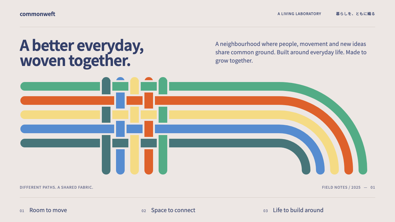
Woven City makes the future feel neighbourly: thick coloured ribbons of even width weave across a warm greige page, with calm navy type keeping everything quiet.
Woven City in brief
Woven City is the visual identity of Toyota's test-bed town in Susono, Shizuoka, built on the site of a former car plant below Mount Fuji. As a design style it takes the idea of weaving literally. Thick ribbons of equal width, in green, orange, yellow, blue and teal, turn at rounded corners and pass over and under each other on a light, warm greige ground, with calm navy type set in a Japanese sans-serif.
The effect is deliberately gentle. Futuristic projects often reach for black, chrome and glow. Woven City reaches instead for timber, courtyards, daylight and ordinary neighbourhood life, and its visual language follows: warm neutrals, soft geometry, friendly colour and a lot of space. The future it describes is lived in, not staged.
The style suits anything that wants to feel technological and human at once: mobility, urban planning, smart-home and energy services, community platforms, sustainability reports and architecture presentations.

Where does Woven City come from?
The project was announced at CES in January 2020. Groundbreaking took place in February 2021, the first phase was completed in 2024, and the first residents arrived in 2025. The site in Susono, Shizuoka Prefecture, sits on land that once held a Toyota factory, which gives the whole project a quality of reinvention: an industrial place turned into a living laboratory.
The masterplan is by the architecture firm Bjarke Ingels Group, with Nikken Sekkei also named among the figures behind it. The plan divides streets into three kinds, one for autonomous vehicles, one for mixed mobility and one for pedestrians, and weaves them around green courtyards, while deliveries and hydrogen supply run underground. The identity borrows that structure directly: the ribbons are streets, and where they cross, the visual overlap echoes the planning logic.
The name itself has a history. Toyota began as a maker of automatic looms, and the word woven points back to that origin. The visual ribbons therefore carry two meanings at once, the weave of a city's circulation and the weave of the company's own heritage. Woven by Toyota is the name of the organisation associated with the project, and Akio Toyoda is the person associated with its announcement.
Three movements sit behind the look. One is the living-lab smart city, in which a real community tests technology in daily life. Another is mass-timber construction, which explains the warm wooden facades and the greige, natural tone of the page. The third is hydrogen and solar energy systems, which gives the project its sustainability narrative and its clean, daylight-lit imagery.
What defines the Woven City look?
Colour
The ground is a light warm greige, and the type is a calm navy. On top, five ribbon colours, green, orange, yellow, blue and teal, supply the personality. They are friendly, mid-saturated hues rather than neon, and each ribbon keeps one colour throughout its length. The palette feels optimistic but not loud, and it never leaves the warmth of the ground.
Ribbon weave
The signature graphic is a set of thick ribbons of identical width that run in straight lines, turn at rounded corners and cross over and under one another. The over-and-under crossing is essential: it is what makes the pattern read as weaving rather than as plain stripes. Ribbons are used for covers, section dividers and map-like diagrams.
Typography
Type is set in a clean Japanese sans-serif in navy, with comfortable line spacing and moderate weights. Headlines are plain and declarative. There is no display extravagance, because the ribbons already do the expressive work. The tone is that of a neighbourhood notice rather than a product launch.
Warm neutrals and timber
Greige, off-white and natural timber tones appear in backgrounds and photographs. Wood-clad facades, courtyard planting and daylight renderings are the preferred imagery. These materials temper the technological subject and keep the page feeling inhabited.
Rounded geometry
Corners are rounded throughout, from the ribbon turns to cards and buttons. Shapes are simple and soft, and there are no hard shadows or sharp outlines. The rounding reinforces the friendly, safe feeling of a place designed for walking.
Layered paths
Information is arranged as paths: sequences that start in one place, travel along a ribbon and arrive at another. Timelines, process diagrams and maps are drawn as ribbon routes, so a page about a city, a service or a plan feels like a route you can follow with your finger.

Who shaped Woven City?
Associated with the public announcement of the project at CES in January 2020. His name ties the town to the company's own history and its broader ambition to move from vehicles to mobility.
The architect associated with the masterplan through Bjarke Ingels Group. The three-street structure woven around courtyards is the planning idea that the visual identity translates into ribbons.
A Japanese architecture and design firm named alongside the project. It represents the local design and engineering side of the town's realisation.
The organisation associated with developing the town. Its name carries the loom heritage of the company, and it is the origin of the weave metaphor on which the visual identity depends.
How do you use Woven City today?
In slides, use the ribbons on cover and section-divider pages. Let two or three ribbons enter from one edge, turn once at a rounded corner and cross, then leave generous greige space for a short navy title. The weave works as a recurring navigation device, with the current section's ribbon appearing in the corner of each following slide.
For content and data slides, treat ribbons as routes. A process can be a single ribbon travelling through labelled stops; a comparison can be several ribbons of different colours running in parallel. Charts should use the five ribbon colours at consistent meanings, a navy axis and plenty of space. Photographs should be daylight scenes with wood, greenery and people.
In web and app interfaces, the style fits mobility services, energy and home platforms, civic and community tools, and sustainability dashboards. Use the greige page, navy text, rounded cards and small ribbon accents as section markers. Keep forms and tables calm and generously spaced, so the product feels like part of the neighbourhood.
In editorial and marketing work, it suits architecture presentations, urban-planning reports, brand books for infrastructure projects and campaigns about community and sustainability. Ribbon graphics can frame photographs or lead the eye across a spread. Copy should be plain, human and specific about daily life rather than technology.
The most common mistake is to use the ribbons as flat stripes, without the over-and-under crossing that makes them weaving. Another is to add black backgrounds, chrome and glow, which pushes the style towards the generic future it was meant to avoid. A third is to use too many ribbon colours at once without assigned meanings, which turns the weave into confetti.

Woven City — FAQ
What is the Woven City design style?
It is the visual identity of Toyota's test-bed town in Susono, Shizuoka. Thick ribbons of equal width in green, orange, yellow, blue and teal weave over and under each other at rounded corners on a light warm greige page, with calm navy type in a Japanese sans-serif.
Why is it called Woven?
The name looks back to Toyota's beginnings as a maker of automatic looms, and it also describes the town's plan, in which three kinds of street are woven around green courtyards. The ribbon graphics carry both meanings: heritage and circulation.
Who masterplanned the town?
The masterplan is by Bjarke Ingels Group, with Nikken Sekkei also named among those involved. The announcement came at CES in January 2020, groundbreaking in February 2021, the first phase was completed in 2024 and the first residents arrived in 2025.
What kinds of products suit this style?
Mobility, energy, smart-home, civic and community platforms, sustainability reports, architecture and urban-planning material. It works whenever a product should feel technological and human at the same time, and it fits less well with aggressive, high-contrast or luxury branding.
How do I use the ribbon colours without making a mess?
Give each colour a consistent meaning, such as a route, a category or a section, and keep every ribbon at the same width. Preserve the over-and-under crossings, round every turn, and leave plenty of warm greige space around them. Use two or three ribbons on most pages rather than all five.
Related design styles
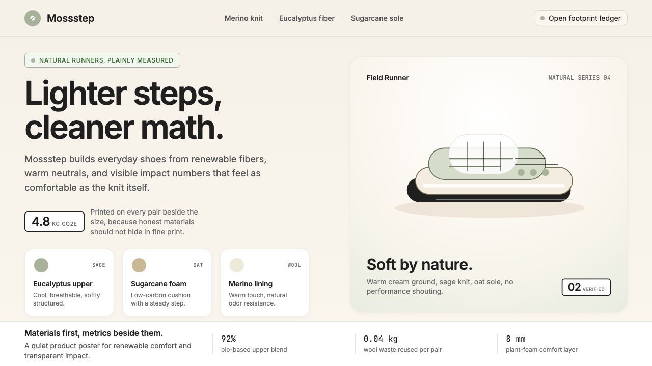 AllbirdsSustainability that breathes. Cream-and-sage tones, carbon labels next to pri…
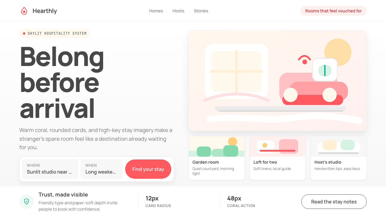 Airbnb 2014Coral red, soft pill cards, Cereal type. The Bélo wraps strangers in warm, da…
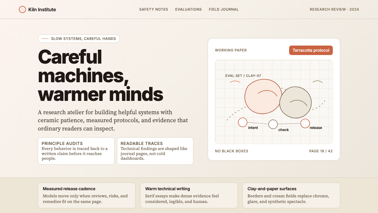 Anthropic ClayAI safety in handmade clay. Sand backgrounds, terracotta accents, serif body…
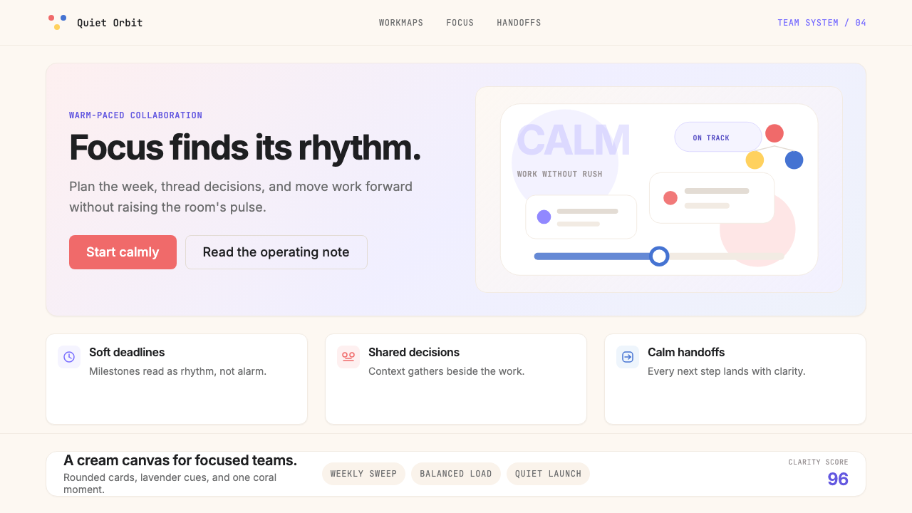 AsanaCalm productivity breathes. Cream canvas, lavender panels, coral-blue-yellow…
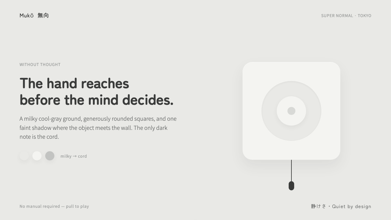 Fukasawa Without ThoughtHand reaches before mind decides. Milky cool-gray plastic, rounded squares, o…
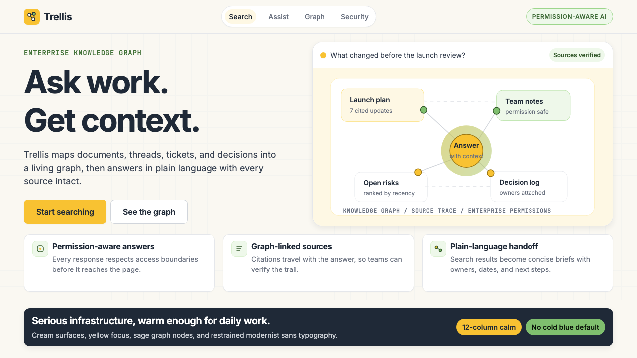 Glean Enterprise-SearchWarm enterprise AI. Cream ground, yellow focus, sage graph nodes, and sans ca…