What is Tom and Jerry (1940)?
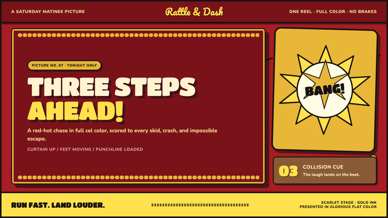
Tom and Jerry turns the theater cartoon into interface language: theatrical scarlet, scalloped gold, black ink, and every collision arriving as a visual punchline.
Tom and Jerry (1940) in brief
Tom and Jerry is an interface style rebuilt from the MGM theatrical cartoon short: a deep theatrical-red field, a gold-edged title plaque, bouncy brush-script lettering, flat cel-painted color, and broad black outlines that hold every object in place. Its visual world behaves like a projected cartoon rather than a polished digital product. Shapes feel cut from painted cels, stacked against a stage-like background, and pushed forward by hard-edged shadows.
The style is powered by slapstick timing. A mouse, a cat, a mallet, a plate, or a button does not simply sit on screen; it appears to be caught in the instant before impact. Yellow-white BANG stars, speed lines, tilted lettering, burst shapes, and exaggerated contrast turn ordinary interface events into comic beats. The result is intentionally loud, immediate, and theatrical.
This is not a style of quiet refinement. It uses visual exaggeration to make hierarchy obvious: the title plaque announces itself, the central action gets the brightest burst, and supporting information stays inside stable fields of color. The energy comes from the tension between firm graphic construction and apparent motion. Thick outlines make the composition legible while lively curves, angled forms, and collision marks make it feel ready to spring away.
Where does Tom and Jerry (1940) come from?
The source image is the MGM cartoon short tradition, located in Culver City, California, during the golden age of American cel animation. Tom and Jerry debuted with Puss Gets the Boot in February 1940 and belongs to a theatrical run spanning 1940 through 1958. That theatrical setting matters to the style: it assumes an audience should understand the premise instantly, recognize the central conflict at a glance, and receive each visual surprise with the speed of a joke.
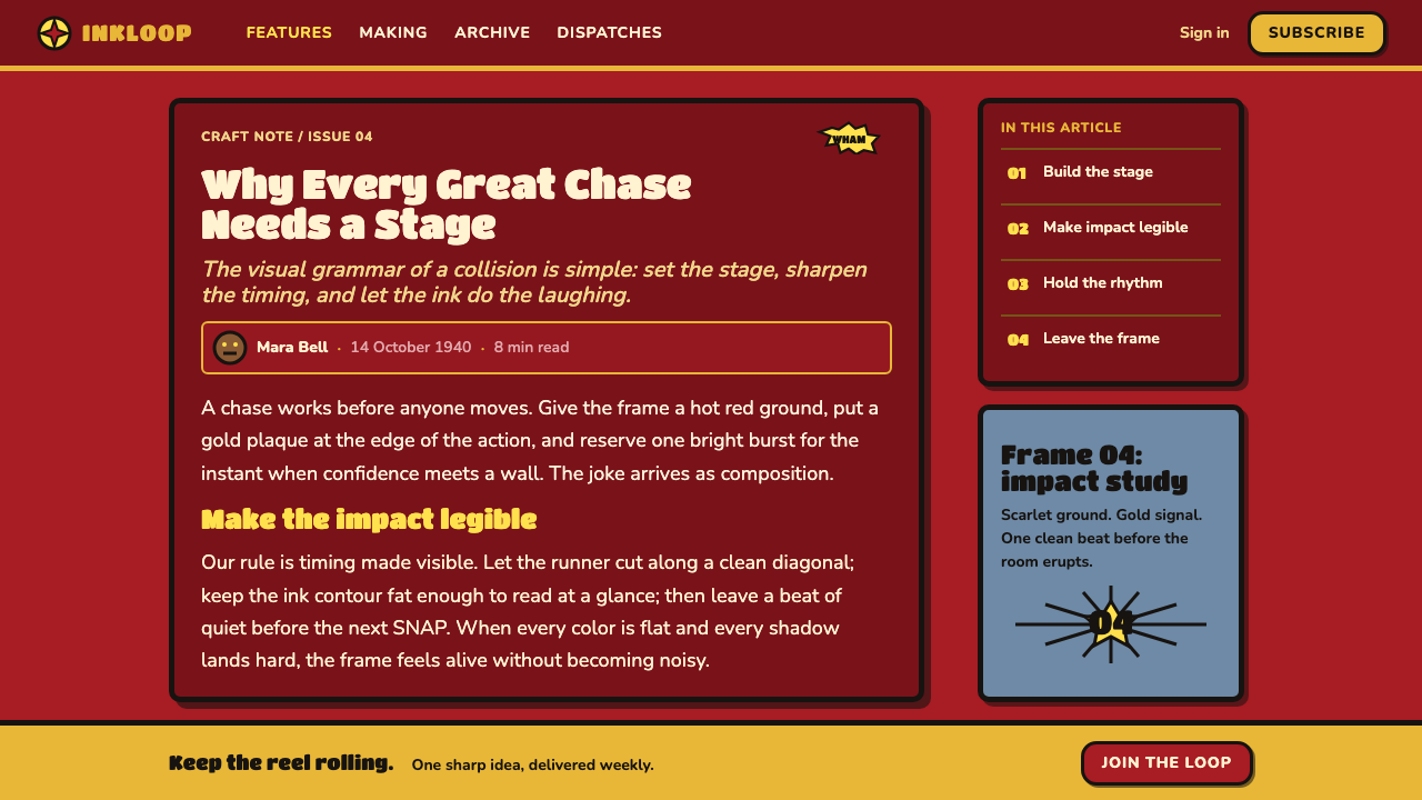
Its visual grammar belongs to theatrical animated shorts and slapstick chase comedy. The title plaque has the ceremonial presence of a curtain rising; the scarlet field reads as a dramatic backdrop; the gold scallops frame the name like a marquee. Once the chase begins, flat painted shapes and fat ink outlines keep the action readable even when bodies, objects, and direction marks seem to move all at once.
William Hanna, Joseph Barbera, Fred Quimby, Scott Bradley, and Irven Spence are named among the key figures associated with this source material. Their presence situates the style within a collaborative studio form rather than a single-author graphic system. For contemporary use, that is an important clue: the visual language is an ensemble of title treatment, drawing, color, movement, sound-like punctuation, and comic timing, all serving one clear chase.
What defines the Tom and Jerry (1940) look?
Theatrical Color
The palette begins with a hot, deep red ground that makes the screen feel like a lit theater. Gold supplies ceremony and framing through the scalloped title plaque, while yellow and white are reserved for impact bursts and moments that must read immediately. Flat cel-painted fills keep colors emphatic rather than atmospheric. Color is not used to create subtle mood transitions; it announces role, pressure, and comic emphasis.
Title Plaque
The central plaque is a theatrical object, not a neutral container. Its scalloped gold border makes the title feel displayed, announced, and celebrated. It works best as a dominant opening gesture: a broad stage for the name, a stable center before motion begins, and a visual promise that the surrounding page will perform rather than merely present information.
Brush-Script Bounce
Brush-script lettering carries the sense that words have bodies. Letters can rise, dip, lean, and swell like performers reacting to the chase around them. The effect should remain boldly readable: expressive curves belong in the title or short exclamations, while supporting copy needs a calmer companion treatment. The contrast between animated display lettering and orderly information gives the page its comic cadence.
Cel Paint and Ink
Flat painted fills are contained by fat black ink outlines. This is the structural discipline beneath the chaos: outlines separate forms, protect legibility, and make every object read as a distinct performer. Avoid soft, airbrushed depth or glossy rendering. The desired impression is painted artwork photographed in layers, with each contour clear enough to survive a frantic chase.
Impact Punctuation
The yellow-white BANG star is a punctuation system for collision, completion, warning, or comic surprise. It should arrive where the action lands, not decorate empty space. Burst shapes, exclamatory words, and abrupt contrast give a moment a clean ending before the next chase beat begins. Used sparingly, this device makes interaction feedback feel physical and funny.
Motion and Hard Depth
Speed lines, angled placements, and hard-edged shadows imply movement without requiring realistic animation. Shadows behave like another painted cel: solid, offset, and visibly separate from the object above. This keeps depth graphic and playful. Nothing should look softly illuminated from an invisible studio light; the page should look assembled for a gag, with every offset helping the eye follow direction and force.

Who shaped Tom and Jerry (1940)?
William Hanna is listed as a key figure in the source material. His inclusion places the style within the MGM cartoon collaboration from which the cat-and-mouse chase, theatrical title treatment, and forceful comic rhythm are drawn.
Joseph Barbera is named among the key figures associated with Tom and Jerry. In this design reference, that association supports an approach where character, action, and readable silhouette remain inseparable from the visual identity.
Fred Quimby appears in the source material’s key-figure list. His association anchors the reference in MGM’s theatrical cartoon context, where a title card, a chase premise, and a decisive visual payoff must work together as one short performance.
Scott Bradley is identified as a key figure in the approved material. His inclusion is a reminder that this style should feel rhythmically organized: a burst, a pause, a directional cue, and then the next comic escalation.
Irven Spence is included among the source material’s key figures. The reference supports a drawing-led visual system in which emphatic contours, clear action, and exaggerated reaction are essential rather than incidental details.
How do you use Tom and Jerry (1940) today?
For presentation covers, treat the screen as the first frame of a theatrical short. Let the scarlet field establish the stage, place the scalloped plaque as the main announcement, and allow brush-script display lettering to carry the title. A small burst or a trailing speed line can suggest that the chase has already begun, but the cover still needs a clear resting point: one unmistakable title and one dominant comic gesture.
On content slides, use black outlines and flat color fields to group information as if each section were a painted cel. Short headings can bounce or lean, while body copy should settle into calm, highly readable blocks. For data slides, let charts inherit the language of props and impacts: clear outlined bars, forceful labels, and a single burst reserved for the finding that deserves the loudest laugh. Do not turn every data point into a gag; the joke works only when the evidence remains easy to read.
For web interfaces, the style suits playful dashboards, campaign pages, event recaps, onboarding moments, and pricing experiences that benefit from immediate visual hierarchy. A plaque can frame the product name or selected plan; thick outlines can distinguish cards, controls, and active states; speed lines can indicate momentum around a primary action. Keep functional paths stable even when the surface is animated in spirit. Users should never have to guess where to begin because the page is trying too hard to perform.
For editorial and marketing work, use the style to make a story feel serial, kinetic, and shareable. Hero sections can open with theatrical framing, while article modules become comic scenes with bold captions, outlined illustrations, and impact bursts used at genuine turning points. Marketing calls to action should feel like a well-timed reveal rather than a constant visual shout. The strongest applications alternate between energetic moments and quieter fields that let the reader reset.
The common mistake is to copy the red, gold, and BANG star while losing the timing. If every card has a burst, every line tilts, every phrase uses brush script, and every object throws speed lines, the page stops feeling funny and starts feeling noisy. Give each comic device a job. Keep outlines consistent, reserve the brightest impact treatment for meaningful events, and leave enough stillness for the next collision to land.
Tom and Jerry (1940) — FAQ
Is this style only appropriate for children’s products?
No. Its strongest value is not childishness but instant comic clarity. It can work for entertainment, events, playful productivity tools, food or pop-culture campaigns, and editorial stories that need energy. It becomes less suitable when the product needs a restrained, solemn, or highly contemplative tone, because the visual language is built to announce action rather than recede.
How should the BANG star be used in an interface?
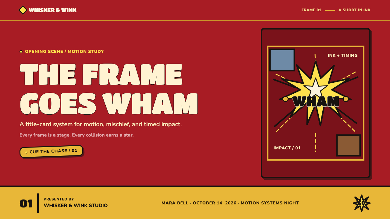
Use it as an event marker. It can punctuate a completed task, a successful reveal, a warning, a reward, or a major change in status. It should be tied to a specific moment with a clear consequence. When placed everywhere as a decorative sticker, it loses its role as visual punctuation and weakens the hierarchy it is meant to create.
Can the style use photography?
It can, but photography should be treated as an active comic element rather than a quiet realistic window. Use decisive cropping, strong silhouette, flat color surroundings, and bold outlined framing so the image participates in the same theatrical world as the lettering and bursts. A softly lit lifestyle photograph will usually clash with the cel-painted, inked logic of the system.
What keeps a Tom and Jerry-inspired page from becoming visually chaotic?
Hierarchy and timing. Give the title plaque one clear responsibility, reserve the brightest yellow-white impact language for the most important event, and use thick outlines to separate competing forms. Motion lines should point toward an action, not fill every gap. The page succeeds when a viewer can immediately tell what is moving, what just happened, and where to look next.
Related design styles
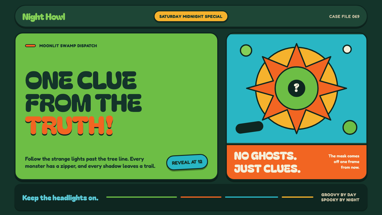 Mystery Machine (Scooby-Doo 1969)Groovy by day, spooky by night. Balloon type and acid-green panels hide the n…
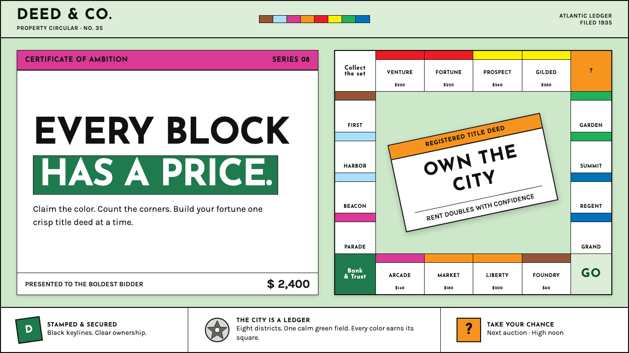 Monopoly (1935)Everything is ownable. Candy-bright deed bands snap across a calm sage board.
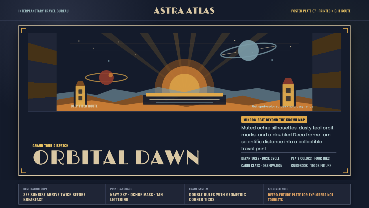 JPL Visions of the FutureSpace travel as print craft. Burnt orange silhouettes and Deco tan type on na…
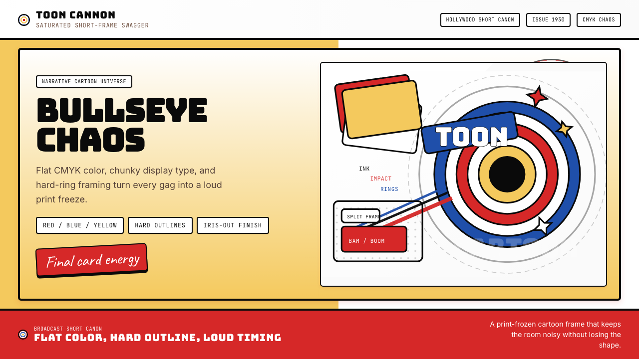 Looney Tunes (Warner Bros.)Pure cartoon chaos. Bull's-eye rings, Bungee type, and red-blue-yellow blocks.
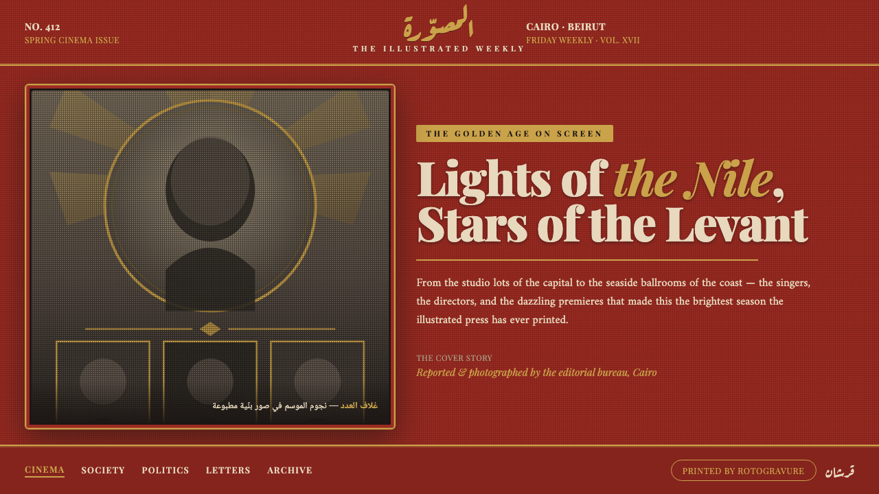 Pan-Arab Illustrated MagazineMid-century Arab press glamour. Brick-red fields, sepia halftone montage, gol…
 The Wizard of Oz (1939 Technicolor)Color arrives like a curtain rising. Ruby, gold, and emerald blaze across a d…