What is Monopoly (1935)?
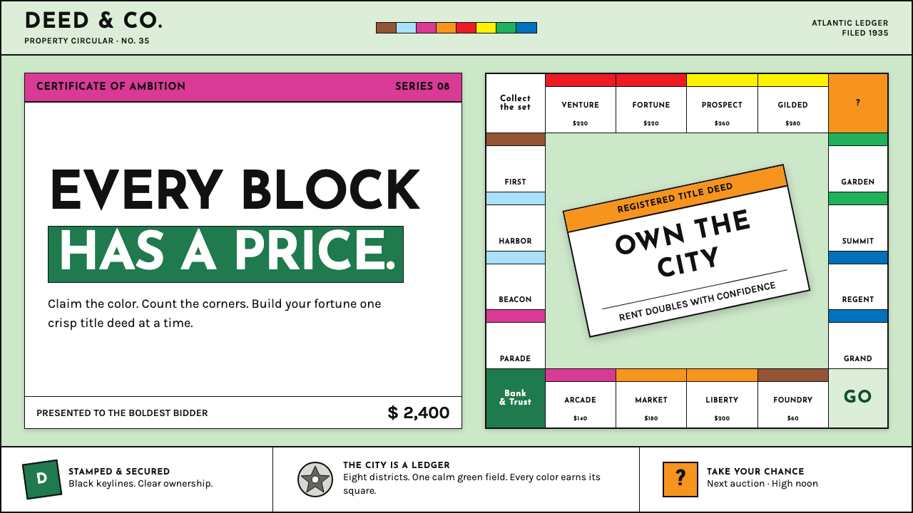
Monopoly turns ownership into a visual language: candy-bright deed bands, crisp rules, and a calm sage field where every square looks stamped, priced, and ready to trade.
Monopoly (1935) in brief
Monopoly, as standardized by Parker Brothers in 1935, is one of the world’s most recognizable game-graphic systems. Its board is built as a pale sage-green square ring, with spaces arranged around the perimeter and divided into bright property groups. The visual character comes from a productive contrast: the board’s ground is restrained and orderly, while the property bands announce themselves in candy-bright color. A player reads the board as both a route and a catalog of increasingly ownable things.
The style treats information as a certificate. Property spaces and deed cards use a colored ownership band above black keylines, giving even small labels the authority of printed documents. Geometric capital lettering, tabular-looking prices, sharp corners, and carefully separated fields make each unit feel official without becoming bureaucratic. The result is playful, but its playfulness depends on order: every color, line, price, and title belongs to a visible system.
In interface terms, Monopoly is not simply a vintage-game look. It is a grammar of claims, categories, and transactions. A calm field holds a small number of loud signals; white deed-like surfaces carry colored headers; orange Chance interruptions introduce surprise. Pressed-pewter token motifs add a material reminder that the game concerns objects moving through a regulated world of property, payment, and chance.
Where does Monopoly (1935) come from?
The visual roots of Monopoly reach back to Elizabeth “Lizzie” Magie’s 1904 patent. That earlier point of origin matters because it places the later board within a longer American conversation about property and game rules, rather than treating the familiar 1935 board as an isolated graphic invention. Monopoly’s eventual visual system makes ownership legible at a glance: spaces are named, grouped, bounded, and given a visible price-bearing identity.
The decisive period for the familiar board was 1933–1935. Parker Brothers standardized the board in 1935, producing the version whose pale green ring, colored property bands, and crisp printed hierarchy became culturally durable. The publisher was based in Salem, Massachusetts, while the board’s street names locate its imaginary property world in Atlantic City. That combination gives the design a specific American commercial setting: regional place names organized through a national publishing system.
Its lettering belongs to the visual climate of American Art Deco commercial graphics and the geometric type associated with Kabel and Futura. The capitals are direct, compact, and declarative. They do not ask the player to linger over expressive calligraphy; they label a space, establish a category, and keep the game moving. Depression-era board-game graphics supplied the practical discipline behind this approach: clear printing, strong separation, repeatable units, and visual interest achieved through grouping rather than elaborate illustration.
The names associated with this lineage include Magie, Charles Darrow, George Parker, and Dan Fox. Together, those names frame the period from the earlier patent through the Parker Brothers standardization. For a design reader, the important point is less a single authorial gesture than the consolidation of a visual system: a board whose color bands, deed-like cards, geometric lettering, and rule-bound spaces make ownership feel tangible, countable, and theatrically public.
What defines the Monopoly (1935) look?
Sage-Green Ground
The board begins with a pale sage-green field that performs an essential calming role. It is not a neutral blank background; it establishes the board as a continuous shared territory. Against that quiet ground, colored bands become events. The restraint prevents the property groups from competing with one another all at once and gives the eye somewhere to rest between transactions.
Property Color Bands
Eight candy-bright property color groups provide the board’s most immediate hierarchy. Color is not atmospheric decoration here; it identifies a family of spaces and turns position into a visible category. The bands are narrow relative to the full square, which gives them force. A small strip can announce ownership class more efficiently than a large illustrated panel.
Deed-Card Structure
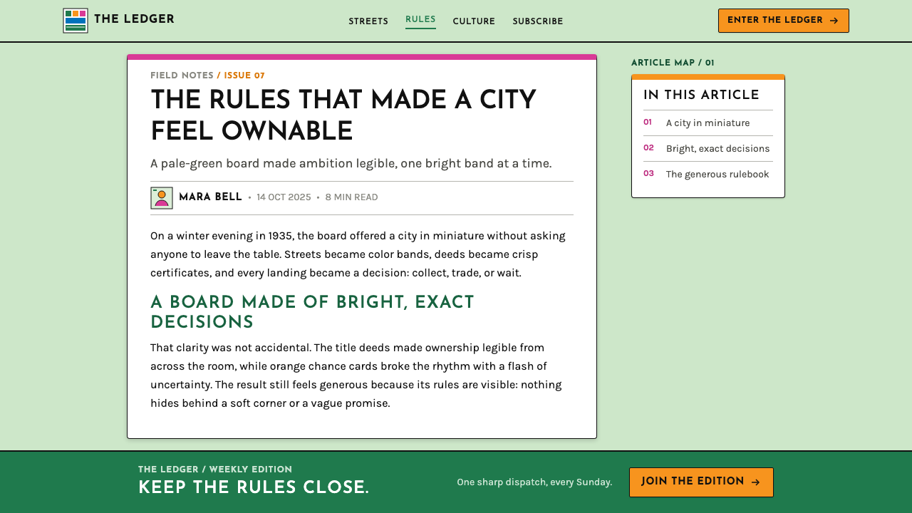
White deed cards carry solid ownership headers over black hairline rules. This arrangement gives information a documentary rhythm: category first, terms beneath, boundaries always visible. The card feels printed and stamped rather than soft or app-like. In a contemporary adaptation, that quality should come from clear fields and disciplined rules, not from artificially aged texture.
Geometric Capitals
Depression-era geometric capitals give labels a brisk, commercial authority. Their purpose is functional: names must remain clear around a crowded ring, while prices and instructions need to read as part of the same printed family. The type should feel pressed, centered, and decisive. Expressive scripts, delicate editorial serifs, and casual handwritten forms break the system’s transactional confidence.
Black Rules and Sharp Corners
Fine black rules separate values, titles, and conditions without filling the board with heavy framing. Sharp corners reinforce the sense that each space is a bounded parcel, a field with terms attached. The visual language is exact but not sterile: the lines make the bright color bands and small text feel accountable to a shared order.
Chance as Interruption
Orange Chance signals are designed as interruptions rather than background color. They cut across the quieter field and announce a break from predictable ownership logic. This contrast is central to the style: most information is classified and stable, so the exceptional message can arrive with real visual force. Surprise works because the surrounding system is controlled.
Pressed-Pewter Motifs
Pressed-pewter token motifs introduce a small sense of objecthood into an otherwise flat printed system. They suggest pieces that can be moved, held, and placed, while remaining consistent with the board’s stamped, regulated character. Used sparingly, such motifs can add physical memory without displacing the stronger language of bands, cards, and rules.
Who shaped Monopoly (1935)?
Magie is associated with the 1904 patent identified as the root of Monopoly’s later history. Her presence places the familiar 1935 board within a longer lineage, reminding readers that a highly recognizable commercial graphic system can have roots that precede its standardized form.
Darrow is one of the key figures named in the 1933–1935 Monopoly lineage. Within this visual history, his name belongs to the period in which the board moved toward the familiar standardized graphic identity associated with Parker Brothers.
Parker is a key figure connected to Parker Brothers, the Salem, Massachusetts publisher that standardized the Monopoly board in 1935. That standardization is central to the style because it fixed a repeatable relationship among the sage board, property bands, deed cards, and printed hierarchy.
Fox is named among the key figures in the Monopoly lineage. In a style study, that association helps keep attention on the collaborative and commercial conditions behind a board whose graphic coherence can otherwise make it appear to have emerged fully formed.
How do you use Monopoly (1935) today?
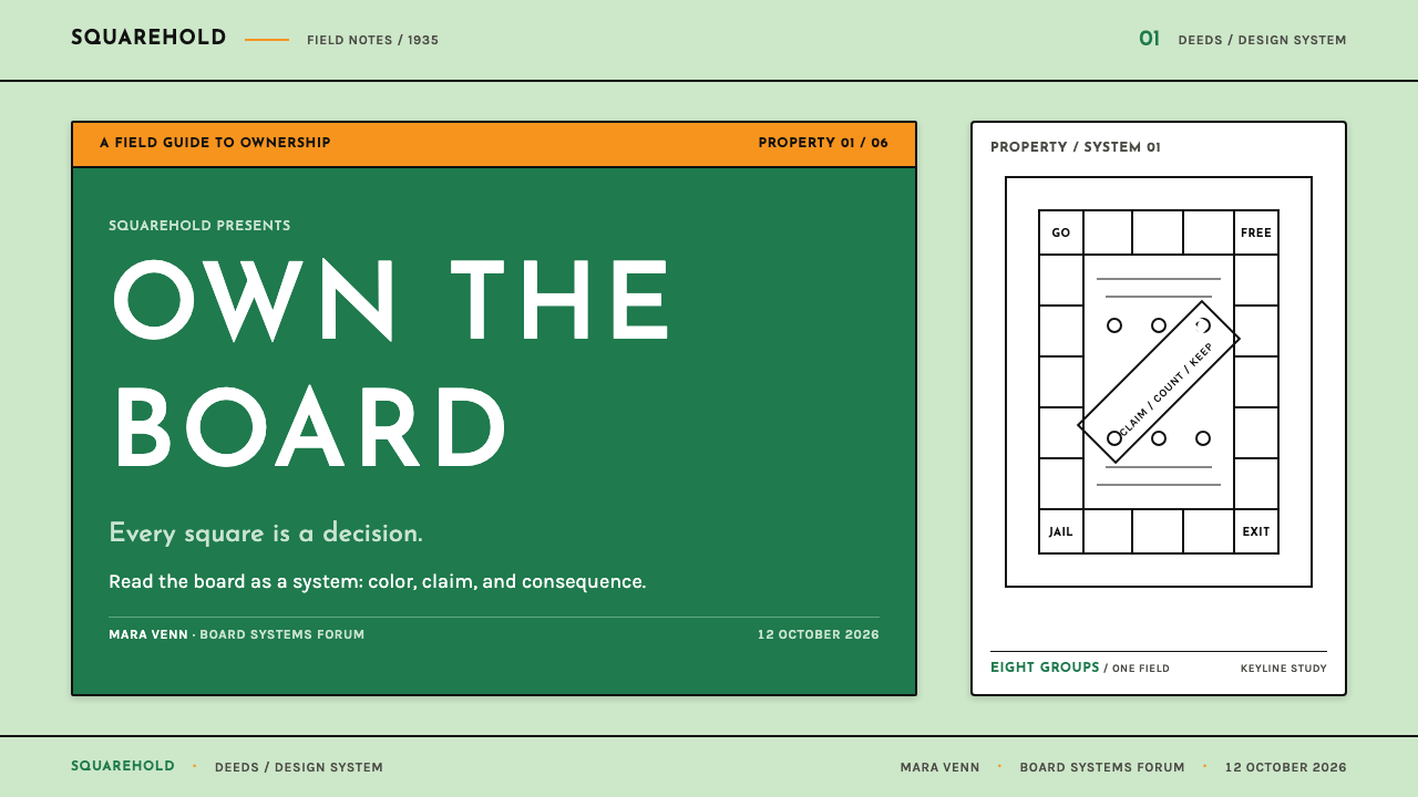
For presentation slides, use the Monopoly system as an information architecture rather than a board-game costume. On a cover, let a sage-like field carry one deed-card title block, a single bright ownership band, and a compact geometric headline. On content slides, create a sequence of document-like panels with black rules separating title, label, and explanation. Do not scatter every property color across each page; a limited active group keeps the slide readable.
For data slides, the style is especially useful when categories need to feel comparable and collectible. Use color bands to identify recurring groups, while keeping charts and supporting labels on a calm field. A summary card can behave like a title deed: a bright category header, a clear value field, and a bounded explanatory area beneath. The goal is to make data feel accounted for, not merely decorated with retro color.
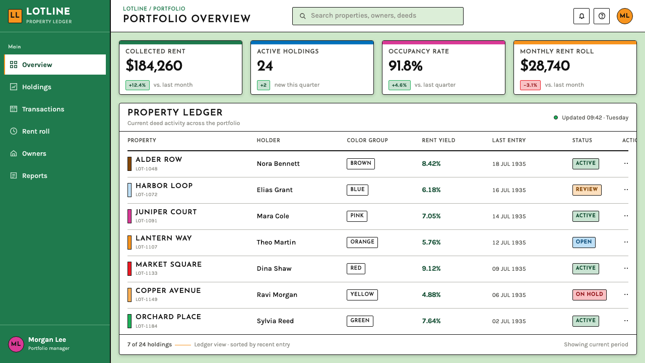
For web interfaces, this language suits dashboards, pricing views, account summaries, inventories, and other products where users must understand categories, status, and value quickly. A pale green ground can unify the application, while white cards establish ownership-like records. Reserve bright bands for category identity, tier differentiation, alerts, or actions that genuinely require attention. Black rules should clarify fields and tables, not become a grid laid over every surface.
For editorial and marketing pages, Monopoly’s certificate grammar can create a strong campaign rhythm. Use a deed-like feature card for a central promise, then arrange supporting claims as adjacent parcels with distinct headers and concise copy. An orange interruption can introduce a promotion, a surprise, or a limited editorial aside. The style works best when the writing is as direct as the board: named offer, visible condition, clear next action.
A common mistake is to confuse this system with unrestricted candy-color maximalism. The board works because bright bands are contained by sage space, white cards, and black rules. Another mistake is to turn every component into a novelty game piece, which reduces clarity and makes serious information feel theatrical. Keep the property metaphor structural: categories should be banded, valued, and bounded; decorative references should remain secondary.
Monopoly (1935) — FAQ
Is Monopoly style just a generic vintage board-game aesthetic?
No. Its identity depends on a particular system: a pale sage-green ring, eight bright property groups, deed-like white cards, black keylines, geometric capitals, and orange Chance interruption. A generic retro treatment may use old-looking type or distressed texture, but it misses the style if ownership categories and printed document structure are absent.
Why is the quiet green background so important?
It creates the contrast that makes the property bands legible. If the whole composition is equally loud, color groups lose their organizing role and the board becomes visual noise. The sage ground also makes the system feel like a shared field governed by rules, rather than a pile of unrelated collectible cards.
Can the style work for a serious financial or productivity product?
Yes, when the product benefits from explicit categories, visible value, and document-like clarity. Dashboards, pricing pages, account summaries, and inventories can use its banded hierarchy effectively. The application should stay restrained: use the visual language to clarify status and ownership, not to make consequential information feel like a joke or a game.
Should every property color appear in a single interface?
Usually not. The original system can sustain many groups because the board distributes them around a large ring and repeats its rules consistently. A screen or slide is more concentrated. Choose the few colors needed for active categories, keep the remaining field calm, and preserve orange for genuinely exceptional Chance-like moments.
How can a contemporary design avoid becoming a literal Monopoly imitation?
Adopt the grammar rather than copying the board. Use restrained ground color, banded category headers, documentary card structure, sharp boundaries, and direct geometric labels, but replace game-specific spaces with the product’s real information. The strongest adaptation preserves the idea that every item is named, grouped, priced, and bounded without borrowing the game’s exact board arrangement.
Related design styles
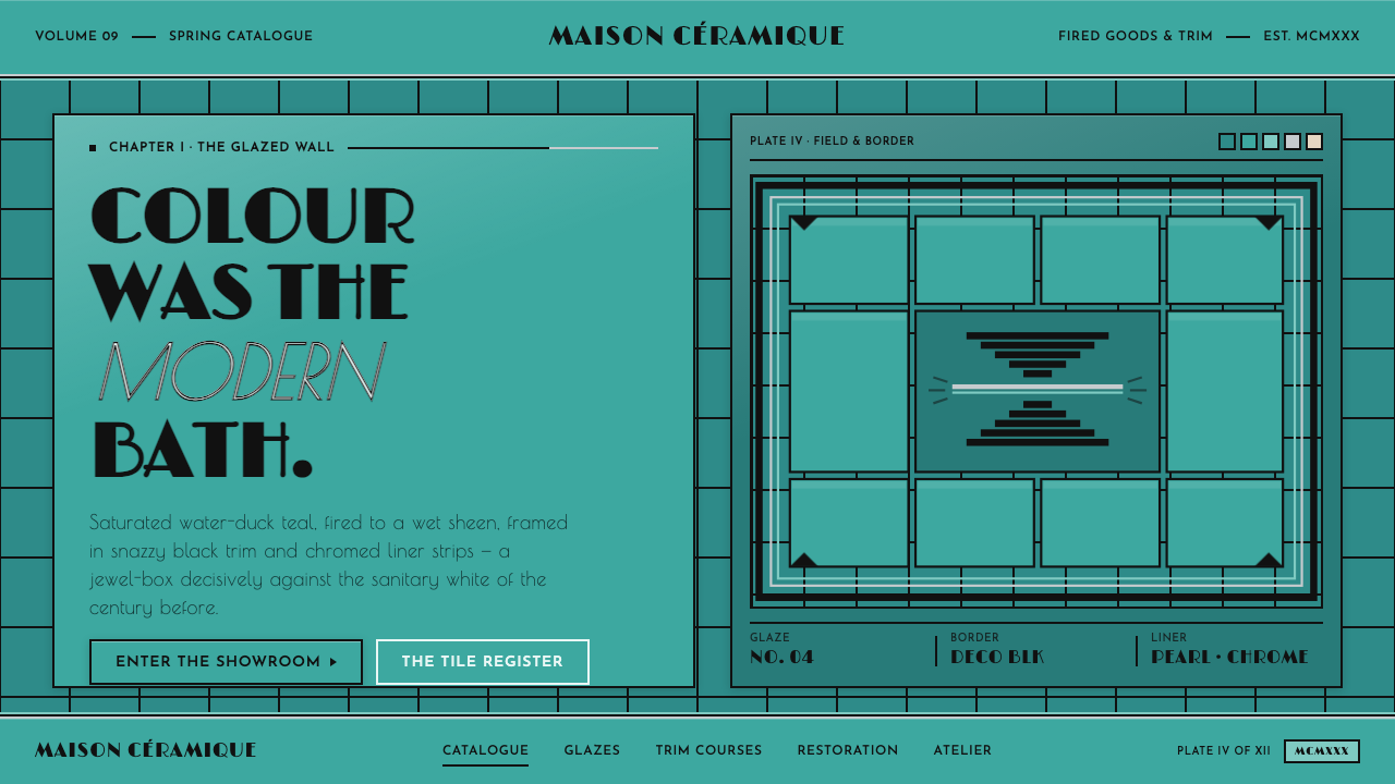 Art Deco Teal BathroomColour was the modern bath. Water-duck teal glaze, snazzy black trim, Limelig…
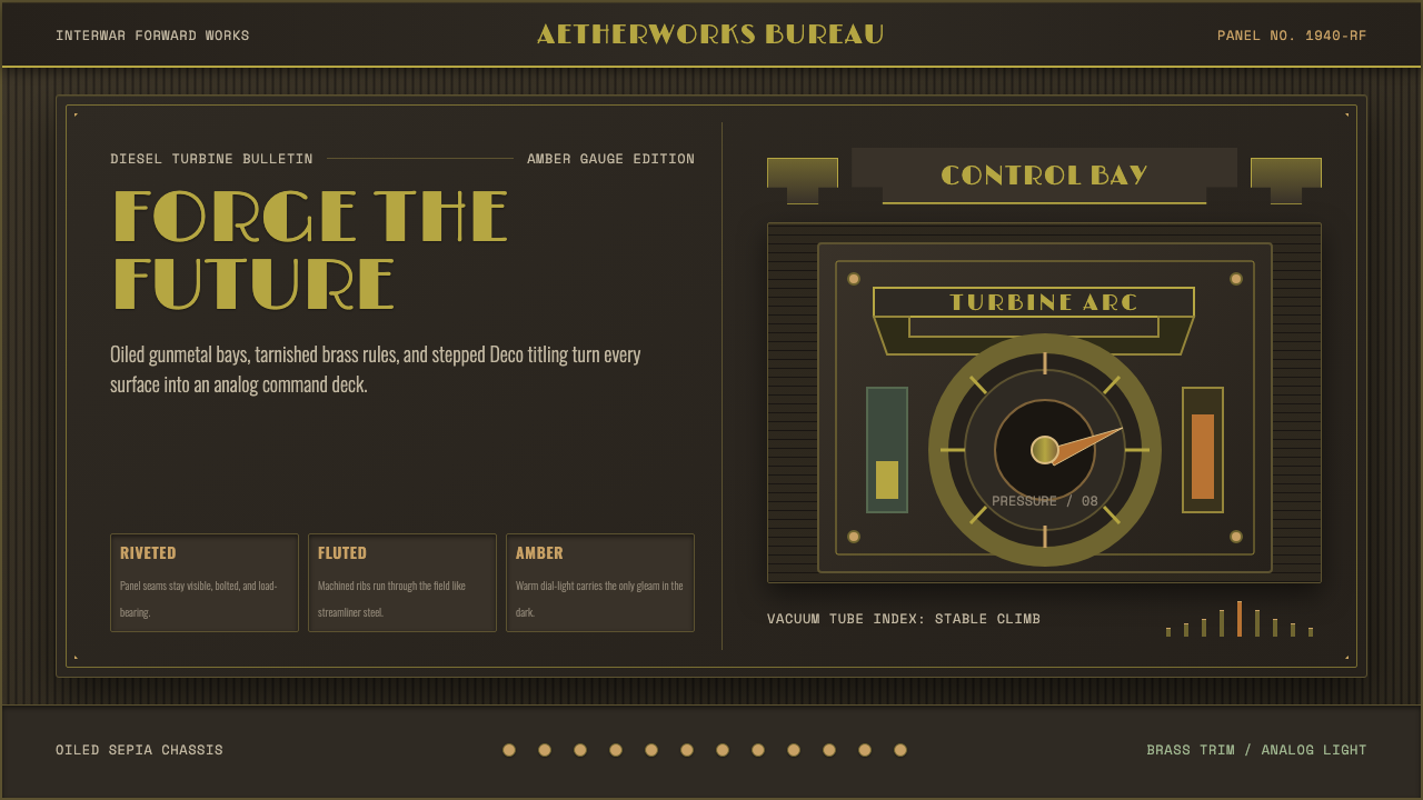 Dieselpunk RetrofutureMachine age, dark and bolted. Gunmetal grid, brass rivets, amber gauge geomet…
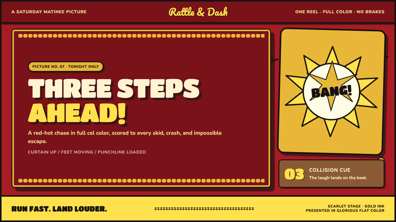 Tom and Jerry (1940)Every frame lands a laugh. Scarlet, scalloped gold and a yellow impact burst…
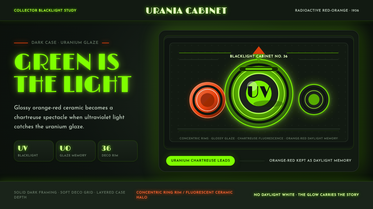 Fiestaware Radioactive Red-OrangeGlows like a collector's secret. Chartreuse rims cut through a dark deco case.
 Harley Orange & BlackBuilt like a tank badge. Burnt orange, chrome hairlines, gothic type on near…
 JPL Visions of the FutureSpace travel as print craft. Burnt orange silhouettes and Deco tan type on na…