What is Titanium Product Design?
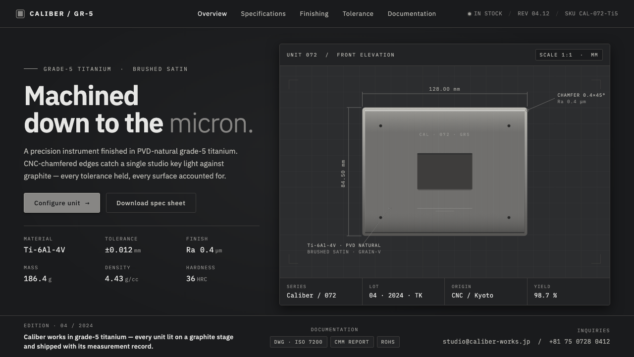
Titanium Product Design turns premium-device manufacturing into an interface language: brushed metal, engineered edges, and information presented with the calm authority of a specification sheet.
Titanium Product Design in brief
Titanium Product Design is a contemporary premium-electronics aesthetic built around brushed, satin grade-5 titanium presented on a dark studio stage. Its material impression is cool rather than flashy: silvery grey metal with a faint blue cast, fine machined grain, and crisp chamfered edges that catch a controlled key light. The background is graphite, not a neutral showroom white, so the product reads as an engineered object under inspection rather than a lifestyle accessory.
The style borrows its organizing logic from manufacturing documentation and industrial product photography. Tight orthogonal compositions, thin metallic borders, dimensioned callout lines, and monospace numeric labels make each panel feel measured and accountable. Information is not merely placed around the object; it appears attached to it, as though a designer, engineer, and photographer were all describing the same finished component.
Its luxury is restrained and technical. Instead of decorative richness, it relies on surface finish, edge precision, controlled reflection, and disciplined spacing. The result suggests that quality comes from tolerances, machining, coatings, and deliberate assembly. A successful Titanium Product Design layout should feel as if every line has a reason to exist and every highlight has been allowed to appear only where the material earns it.

Where does Titanium Product Design come from?
Titanium Product Design belongs to the contemporary premium-electronics era, from 2010 to the present. Its regional context is East Asian high-end consumer-electronics manufacturing and product photography, where the finished device is often presented as the visible outcome of a highly controlled production process. The style does not emerge from a single named school or manifesto; it is a practical visual idiom shaped by how premium hardware is designed, finished, photographed, and explained.
Minimalist industrial design provides its first foundation. The object is reduced to its material, silhouette, joints, edges, and surface treatment. Rather than covering engineering with ornamental styling, the visual presentation asks the viewer to notice the evidence of manufacture: a satin plane, a brushed direction, a tightly resolved chamfer, or a seam made legible by light. This is minimalism with a material subject, not an empty preference for fewer elements.
The precision-spec product idiom supplies the second foundation. Premium devices need to communicate details without losing composure, so callouts, numeric labels, guide lines, and border systems become part of the aesthetic rather than merely explanatory furniture. Monospace labeling is particularly important because it gives specifications a measured, technical voice. Orthogonal alignment keeps the language disciplined, even when the object itself is presented at a dramatic angle.
Dark-studio product photography completes the system. A graphite stage suppresses environmental distraction and makes cool titanium surfaces readable through selective reflection. One controlled key light defines the chamfered edge and reveals the fine machined grain without turning the object into a mirror. Premium device industrial-design teams, PVD coating specialists, CNC finishing engineers, and dark-studio product photographers all contribute to this shared vocabulary: engineered luxury expressed through finish, restraint, and precise observation.
What defines the Titanium Product Design look?
Graphite Stage
The ground is decisively dark, usually graphite in character rather than theatrical black. It creates a controlled field in which the cool silvery surface can separate through reflection and edge light. Cream, warm white, and pure white grounds break the idiom because they turn a precision object into a generic catalog product. Darkness here is not mood alone; it is the condition that makes the material legible.
Brushed Titanium
The defining surface is satin, brushed grade-5 titanium with a fine machined grain and a restrained bluish cast. It should read as finished metal, not chrome, glitter, or generic grey plastic. The grain gives broad planes direction and scale, while the satin finish keeps reflections controlled. Material detail carries the visual interest that a more decorative style might seek through patterns or gradients.
Chamfered Light
CNC-chamfered edges are the principal highlight event. A single key light catches them cleanly, making the boundary between faces appear exact and intentional. The lighting should reveal geometry rather than bathe the whole object in glow. Broad, soft, multi-directional shine weakens the sense of machining; a restrained edge highlight makes the object feel cut, finished, and inspected.
Orthogonal Precision
Layouts use compact horizontal and vertical alignment to establish control. Panels, labels, borders, and callouts share an implied engineering grid, creating a clear contrast with the photographed object's reflected surfaces or angled silhouette. Composition should feel assembled rather than decorated: each zone has a task, and whitespace behaves like a measured clearance around a component.
Specification Typography
Monospace numerals and concise labels translate the visual language of specifications into interface hierarchy. Their role is not to make every word look technical; it is to give measurements, identifiers, and concise metadata a stable, instrument-like rhythm. Display text can remain restrained and highly legible, while numeric details become the small moments that signal engineering discipline.
Dimensioned Callouts
Fine leader lines and dimension-like annotations connect information to physical features. They imply that the object can be examined, compared, and understood through its construction. The effect works best when selective: a few precise annotations create authority, while a crowded field of technical marks becomes noise. Callouts should clarify the relationship between a feature and a claim, never impersonate a complete engineering drawing.
Who shaped Titanium Product Design?
These teams define the relationship between object, material, and silhouette. Within this idiom, they are responsible for making titanium feel integral to the device rather than an applied luxury cue, and for resolving the physical edges and planes that photography later turns into visual evidence of quality.
PVD coating specialists shape the controlled surface character associated with premium titanium hardware. Their contribution is central to the restrained metallic impression: cool, finished, and deliberate rather than flashy. In the visual language, coating is not a cosmetic afterthought; it is part of how the object earns its dark-stage presence.
CNC finishing engineers supply the vocabulary of machined precision: brushed grain, resolved planes, and chamfered specular edges. Their work is what makes dimensioned lines and specification labels credible. The interface may be digital, but its authority depends on referring back to a believable process of cutting, finishing, and inspection.
Dark-studio product photographers make the material readable without overwhelming it. By controlling the graphite setting and a focused key light, they show the titanium surface, its faint cool cast, and the sharpened edge geometry. Their photographs establish the contrast discipline that the surrounding interface should continue rather than compete with.
How do you use Titanium Product Design today?
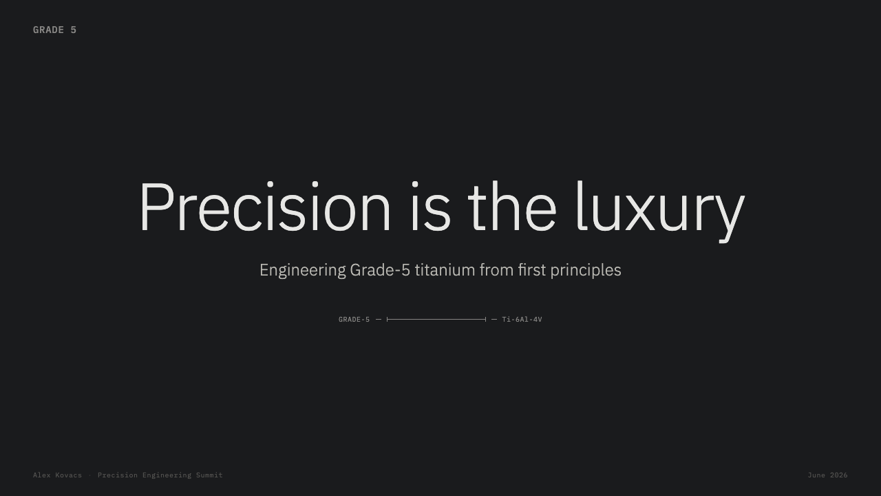
For presentation slides, treat the cover as a product reveal: place a titanium object or material-detail crop on a graphite field, then let a concise title and one technical label establish the subject. Content slides should use an orthogonal information frame with short headings, measured annotations, and clear separation between narrative text and specification-like detail. On data slides, charts should remain calm and structural; labels, guide lines, and comparison points can borrow the precision idiom without pretending that the chart is an engineering drawing.
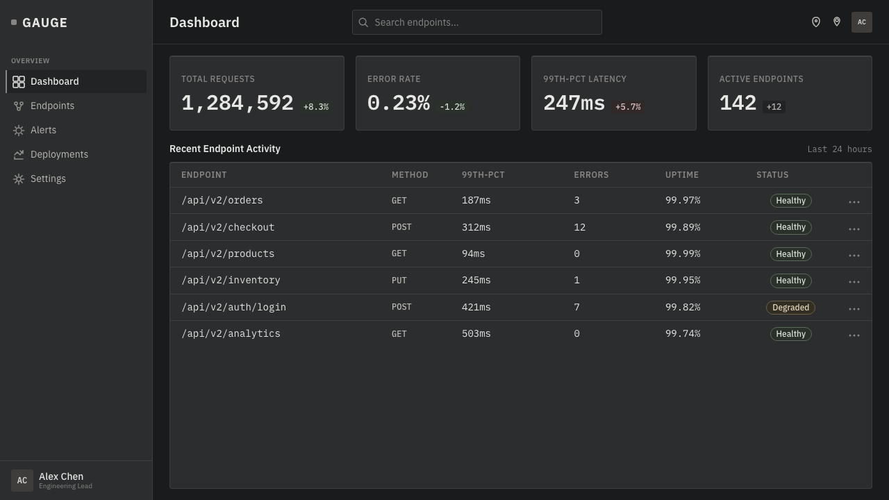
For web interfaces, the style is especially effective in product dashboards, device-management views, configuration pages, and premium pricing experiences. Use the dark stage to establish focus, then divide information into clear, bordered regions. Reserve metallic edge treatment and callouts for key product states, plans, or device details. The interface must still prioritize ordinary reading and interaction; technical atmosphere should clarify hierarchy, not make common actions feel inaccessible.
For editorial and marketing work, Titanium Product Design is strongest when the subject genuinely involves material, craft, hardware, or engineering quality. Feature pages can alternate between close material observation and concise explanatory modules. A product story should move from the broad silhouette to the brushed surface, edge finish, and measured detail, mirroring how a viewer would inspect a premium object in person. Marketing claims gain credibility when they are paired with a specific visible feature rather than floating in an empty dark field.
For product launch pages and comparative editorial layouts, use dimensioned callouts selectively to connect a claim with a surface, corner, border, or component area. Monospace details are useful for identifiers and short specifications, while larger text should remain direct and quiet. Fine metallic borders can establish containment around cards or image regions, but they should not turn every section into a simulated device enclosure. The stage belongs to the product and its evidence, not to decorative interface chrome.
A common mistake is mistaking the style for any dark interface with silver accents. Without brushed grain, controlled chamfer highlights, orthogonal structure, and purposeful specification language, the result becomes generic futuristic luxury. The opposite error is excessive technical theater: too many leader lines, labels, reflections, and borders make the page look busy rather than precise. Choose a small number of material cues, make them credible, and leave enough darkness around them for the titanium to command attention.
Titanium Product Design — FAQ
Is Titanium Product Design simply a dark-mode visual style?
No. The dark graphite ground is necessary, but it is only one part of the system. The style depends on the relationship between a cool brushed titanium surface, CNC-chamfered highlights, controlled studio lighting, orthogonal information structure, and specification-like annotation. A dark background without those material and informational cues does not communicate the same engineered precision.
Why should the background avoid cream and white?
The material language is designed around titanium displayed on a deep graphite stage. That environment gives the cool metal its separation, reveals the selected edge light, and keeps the presentation close to dark-studio product photography. Cream and white shift the object toward a general retail catalog treatment, reducing the contrast discipline and the sense of restrained engineered luxury.
How should monospace type be used without making the interface hard to read?
Use it as a precision signal, not as a universal voice. Monospace works best for numeric labels, identifiers, concise specifications, and annotations tied to a feature. Larger narrative headings and explanatory copy should remain highly legible and calm. The contrast between ordinary reading text and measured technical detail is what gives the style its hierarchy.
Do dimensioned callouts need to show real engineering measurements?
They should remain truthful to the information they present, but they do not need to reproduce a complete manufacturing drawing. Their visual role is to attach a claim or specification to a visible feature and make the relationship inspectable. A few accurate, restrained callouts are more convincing than a dense imitation of technical documentation.
Where does this style work poorly?
It is weakest when the subject has no genuine relationship to engineered material, premium hardware, technical specification, or controlled product presentation. Applying brushed titanium, metallic borders, and inspection-like labels to an unrelated warm or expressive subject can feel performative rather than meaningful. The style succeeds when its visual evidence supports the product's actual promise of precision and finish.
Related design styles
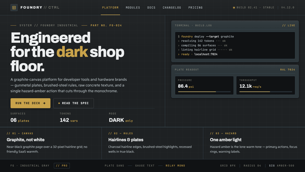 Foundry Industrial GrayBuilt for the dark shop floor. Graphite canvas, hairline plates, mono labels,…
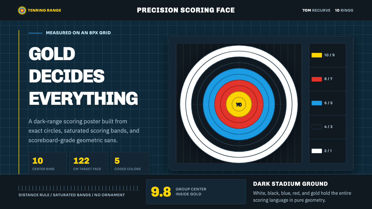 Olympic ArcheryPrecision is the drama. Gold-red-blue rings snap from a dark stadium grid.
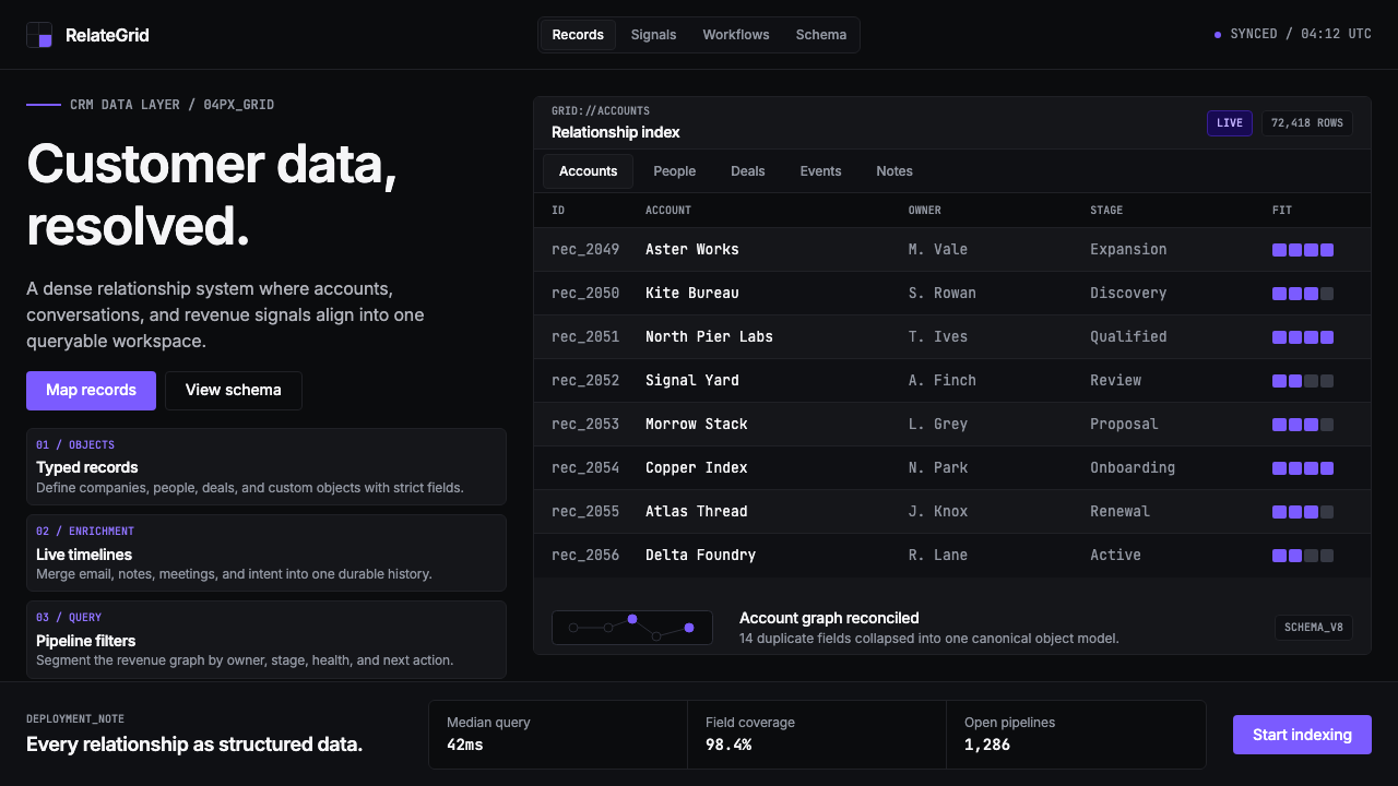 Attio CRMCRM stripped to its data layer. Single-pixel borders, monospaced IDs, violet…
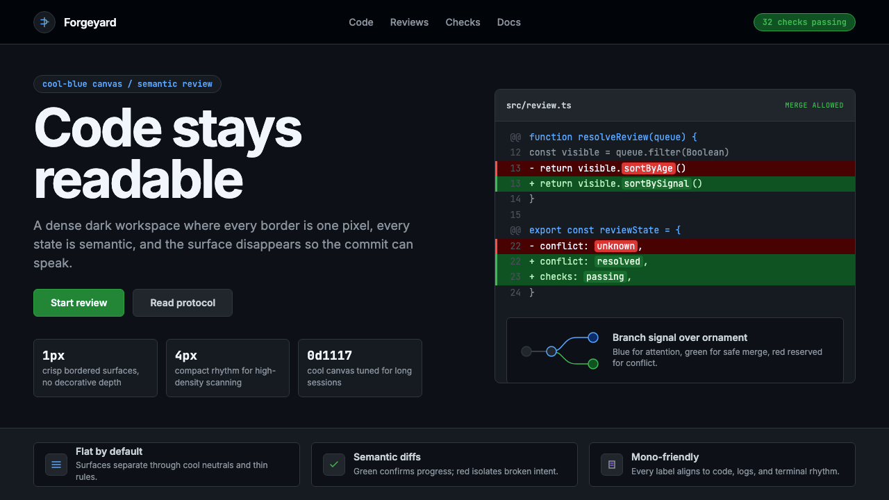 GitHub DarkCode-first darkness. Cool-blue canvas, 1px borders, green/red diff lines.
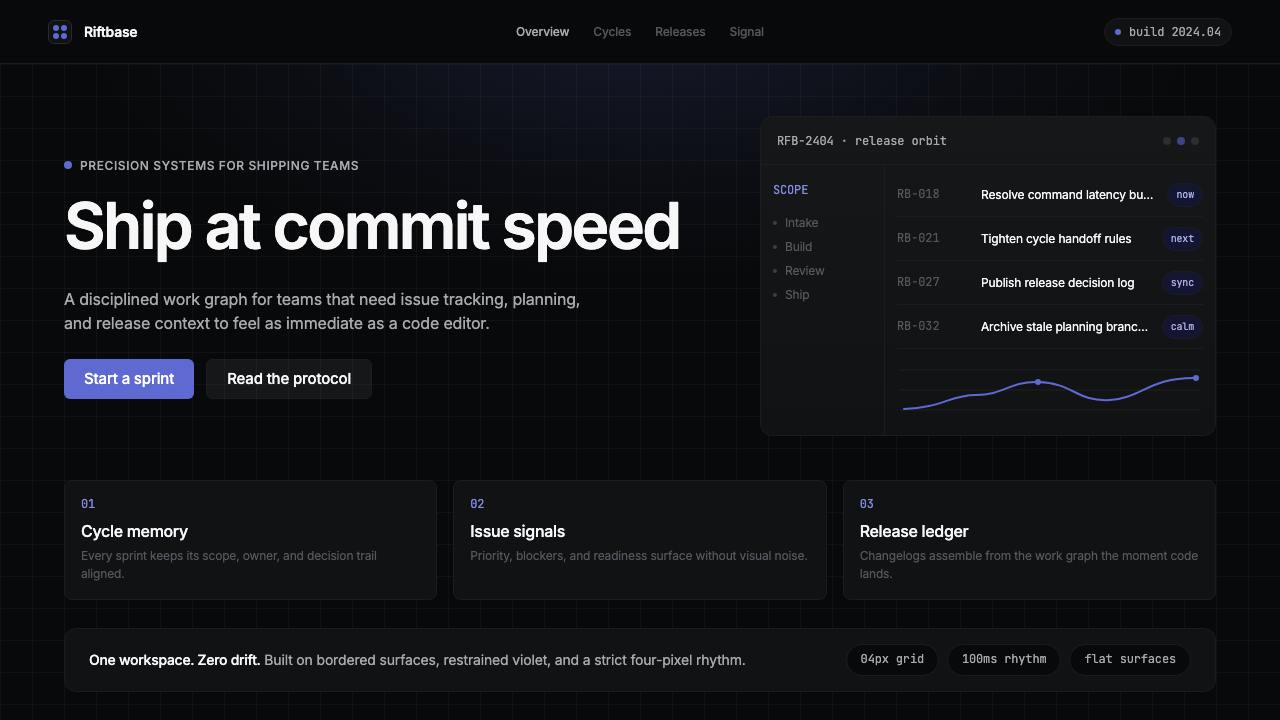 Linear 2024Precision down to the millisecond. Near-black, indigo-violet accents, Inter D…
 Lunar Regolith SettlementMoonlight without the myth. Regolith gray, hard terminators, and a strict tec…