What is Tintin (Hergé Ligne Claire)?
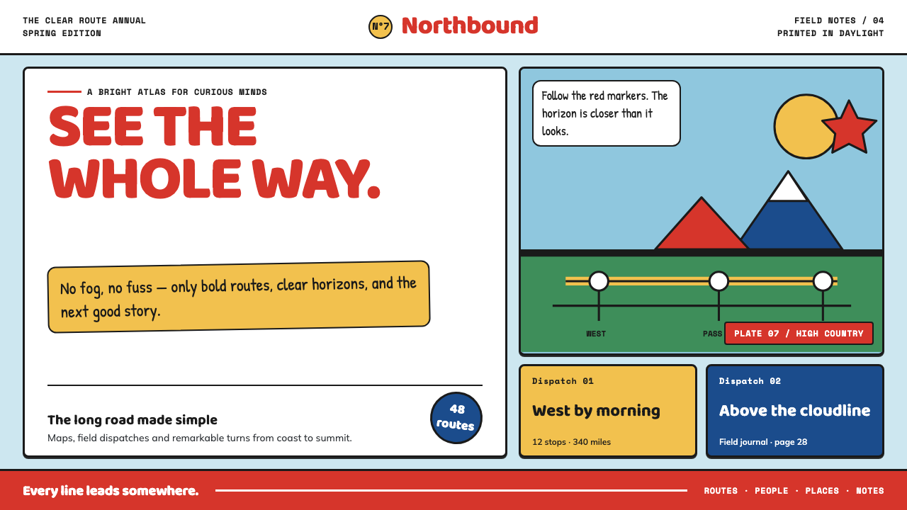
Ligne claire makes adventure legible at a glance: every route, clue, vehicle, and horizon is held in place by an even black contour and a field of calm color.
Tintin (Hergé Ligne Claire) in brief
Ligne claire, or clear line, is the visual language associated with Hergé’s Tintin and the Franco-Belgian bande dessinée tradition. Its essential promise is unusually direct: the depicted world should be readable immediately. Objects are enclosed by consistent black contours, then filled with flat, unmodulated color. A car, a face, a wall, and a distant hill receive the same basic graphic respect, so the eye can move through a scene without fighting atmosphere, texture, or visual noise.
The style refuses hatching, gradients, and dramatic cast shadows. Rather than using rendering to make an object feel heavy, glossy, or cinematic, it uses contour, silhouette, and placement. This makes the page function partly like a map and partly like a travel poster. The viewer understands where things are, what belongs together, and where attention should travel before dwelling on individual details.
In contemporary visual work, Tintin-derived clear line often takes on the logic of a printed adventure cover. A framed vignette introduces the scene, a broad field of sky or landscape establishes the setting, and a hand-drawn title can carry the page’s energy. Strong red and blue accents sit beside sunny yellow and green, while generous white gutters keep panels and information from colliding. The result is cheerful, orderly, and quietly confident rather than nostalgic merely for its own sake.
Where does Tintin (Hergé Ligne Claire) come from?
The style begins with Tintin’s debut in Le Petit Vingtième in January 1929. Its visual system developed in Brussels, Belgium, and remained tied to the world of Éditions Casterman and Studios Hergé. From the beginning, clear line was suited to serialized adventure because it gives action an immediate geography: characters, vehicles, props, and destinations can all be understood quickly within the same composed field.
The period named for this Hergé-centered tradition runs from 1929 to 1976, with peak albums appearing from 1943 to 1963. Those dates matter because the style is not simply a decorative look detached from publication. It is a way of organizing repeated visual information across pages, covers, scenes, and journeys while keeping the world stable enough for readers to trust its details.
Ligne claire belongs to Franco-Belgian bande dessinée and is also associated with the Brussels clear-line school. Its clarity comes from a disciplined equality among visual elements. A foreground object may be narratively urgent, but a building, sign, road, or horizon still receives a clean contour and a deliberate place. The page remains lively without becoming visually unstable.
Hergé, whose name was Georges Remi, stands at the center of this lineage. Edgar P. Jacobs, Bob de Moor, Jacques Martin, and Joost Swarte are named among its key figures. Together, these names locate clear line as a continuing graphic school rather than a single isolated album technique: one rooted in Brussels, shaped through adventure comics, and recognizable wherever flat color and decisive contour make complex scenes feel instantly navigable.
What defines the Tintin (Hergé Ligne Claire) look?
Uniform Contour
Every object is defined by a black outline of consistent character. The contour does not become painterly when an object is near, nor disappear when it is distant. It is the style’s primary organizing device, making people, architecture, vehicles, and landscape parts of one coherent illustrated world.
Flat Spot Color
Color is poured into enclosed shapes as a stable field, not modeled through tonal shifts. Red and cobalt can concentrate attention, while yellow and green make the environment feel open and inviting. The palette reads as printed color: clear, intentional, and free of atmospheric haze.
Instant Geography
The horizon stays clean, and spatial relations remain easy to decode. A scene should tell the viewer where a road leads, which vehicle is moving, and how a foreground clue relates to its setting. Detail supports orientation rather than obscuring it.
Framed Adventure
A bold border or vignette can turn a composition into a self-contained episode. This album-cover logic gives the image a clear entrance and a memorable silhouette. The frame is not ornamental clutter; it gathers a story world into a readable unit.
Orthogonal Calm
The world feels composed through steady horizontal and vertical relationships. Even when action is underway, signs, panels, gutters, and title areas establish calm structure. This restraint lets a chase or discovery feel exciting without making the interface itself frantic.
White Gutter
Generous white space between panels gives each action room to register. It acts like printed daylight around the scene, separating information without adding decorative devices. Clear line depends on this breathing room as much as it depends on its contours.
Who shaped Tintin (Hergé Ligne Claire)?
Hergé, the name of Georges Remi, is the central figure of the Tintin clear-line tradition. Tintin’s 1929 debut established the visual world from which ligne claire became recognizable: precise contour, flat color, clean horizons, and adventure made readable in a single glance.
Edgar P. Jacobs is listed among the key figures connected with ligne claire and the Brussels clear-line school. His presence places the style within a wider Franco-Belgian comics lineage, where graphic clarity could be carried beyond one title into a shared visual discipline.
Bob de Moor appears among the key figures of the Hergé-associated tradition. In the context of Studios Hergé, his name reinforces that clear line is a studio-shaped language: a method capable of maintaining coherence across an extended illustrated world.
Jacques Martin is identified as a key figure in the clear-line lineage. His inclusion connects Tintin’s visual method to the broader Brussels school, where orderly contour, flat color, and legible space formed a recognizable approach to narrative illustration.
Joost Swarte is named among the key figures associated with ligne claire. His place in the list confirms that the term describes an enduring graphic vocabulary, not merely a historical label for Tintin’s original publication period.
How do you use Tintin (Hergé Ligne Claire) today?
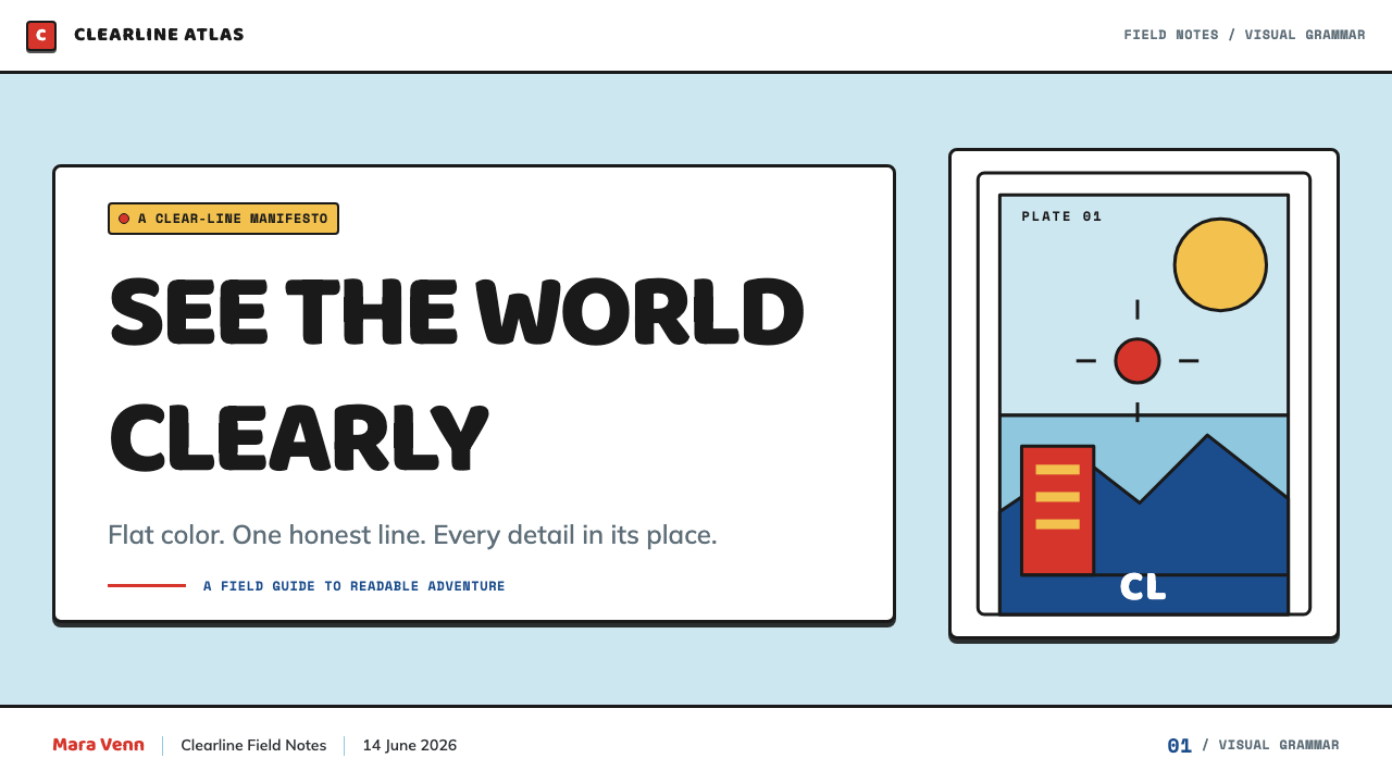
For presentation covers, use the style as an invitation into a destination or episode. Place a single framed scene against a broad, flat field and let the title read like a hand-lettered adventure masthead. On content slides, preserve wide white gutters, keep labels inside crisp outlined containers, and use illustration-like icons only when they clarify a route, object, or action. The cover may feel theatrical; the content should feel navigable.
For data slides, treat charts as parts of an illustrated map rather than as technical ornaments. Use flat color families to distinguish categories, firm outlines to define bars or regions, and restrained callouts to identify important turns in the story. Avoid glossy effects and dense texture. A reader should understand the data’s shape first, then discover the annotations as supporting evidence.
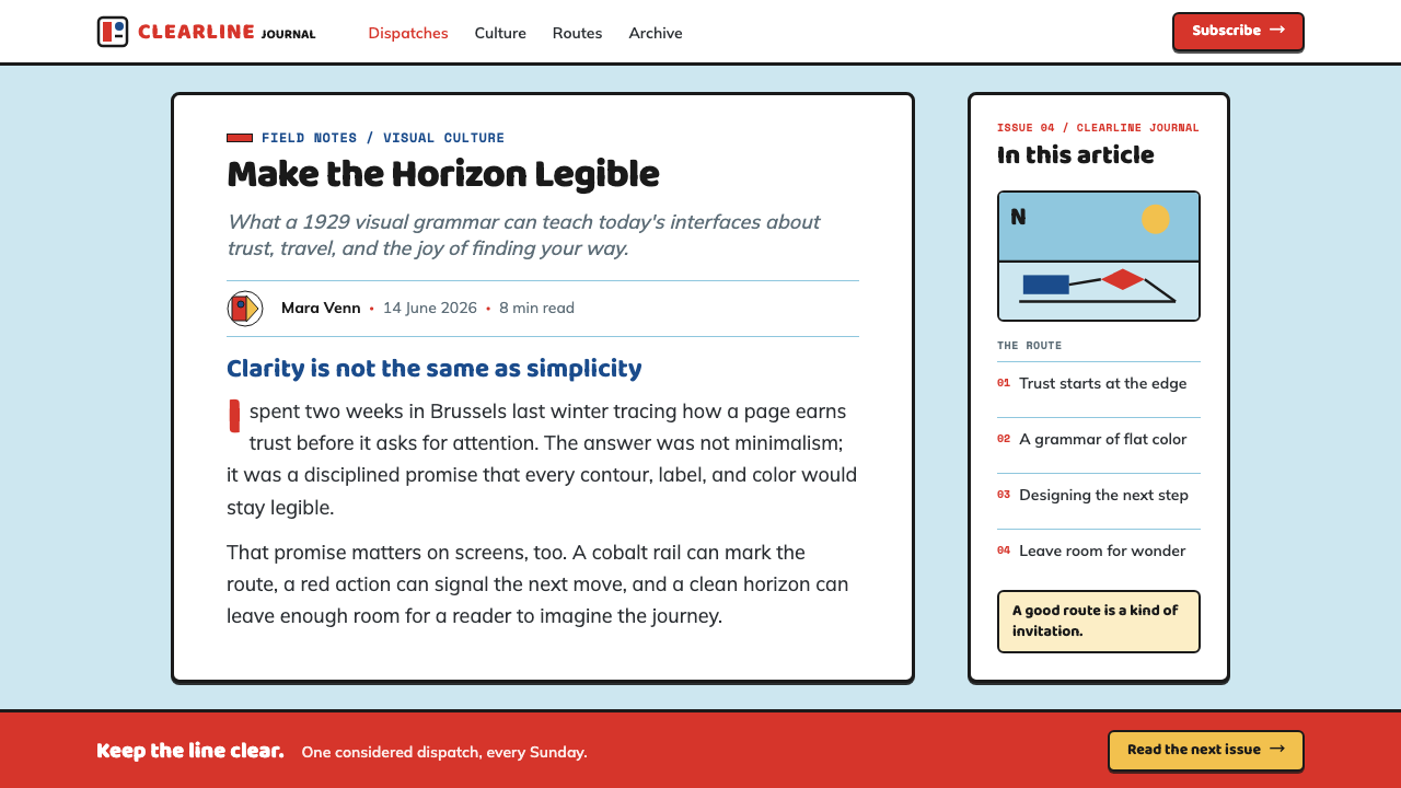
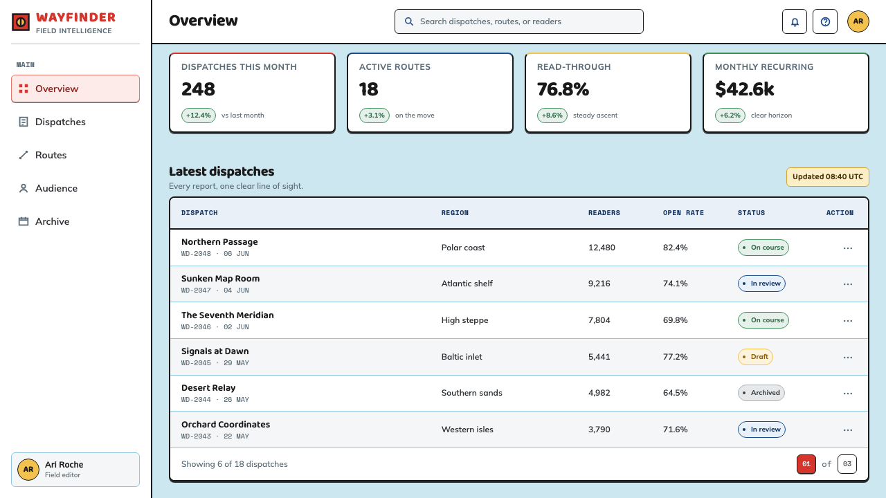
For web interfaces, clear line suits dashboards, project trackers, travel tools, and pricing pages whose value depends on immediate orientation. Cards can behave like comic panels, with clear borders and calm interiors. Navigation benefits from short labels, simple directional symbols, and a horizon-like division between primary information and supporting context. Accent colors should mark decisions, statuses, or destinations rather than decorate every surface.
For editorial and marketing work, use the style to make a complicated subject feel approachable without making it childish. An article can open with a map-like vignette, then use white space and clean dividers to move readers from one idea to another. Marketing pages can frame product moments as small adventures: a clear setting, a recognizable object, a decisive headline, and an obvious next action.
The common mistake is to reduce Tintin-inspired design to bright colors and cartoon outlines. That produces visual noise when every element competes to be a prop. Authentic clear-line logic depends on equal contour discipline, unmodulated fills, readable geography, and generous blank space. If an added texture, shadow, or decorative mark does not improve orientation or narrative clarity, it weakens the system.
Tintin (Hergé Ligne Claire) — FAQ
Is ligne claire simply a cartoon style?
No. Its forms can feel friendly and immediate, but its logic is highly structured. Uniform contour, flat color, and clean spatial relationships make it useful for communicating complicated environments and sequences. The childlike accessibility is an outcome of clarity, not an excuse for careless drawing or random decoration.
Why are gradients and dramatic shadows a poor fit?
They shift attention from the object’s graphic identity to an illusion of lighting and material. Clear line wants a car, building, or character to read first as a precise silhouette within a stable world. Flat fills and clean contours preserve that priority; gradients and theatrical shadows make the scene less map-like and less immediately legible.
Can clear line work without illustrated characters?
Yes. The style’s core is not a particular character design but a way of making a world legible. Architecture, products, vehicles, diagrams, routes, and interface components can all use consistent outlines, flat color fields, calm orthogonal composition, and white gutters. What matters is that the viewer can quickly understand the scene’s structure.
How should accent colors be used in a clear-line interface?
Use them as narrative signals. Strong red or blue can identify an action, destination, alert, or structural anchor, while yellow and green can establish the broader world. Let color clarify importance and direction. If every control, panel, and illustration receives equally intense color, the interface loses the calm readability that defines the style.
Related design styles
 Parisian Zazou (1942)Defiance swings in the dark. Ink black, record-sleeve red, and battered typew…
 Film Noir ChiaroscuroLight is the crime. Silver serif cards, blind stripes, and grain carve drama…
 LIFE Magazine (Red-Banner)Photojournalism stripped bare. One red banner, cream newsprint, stark black p…
 Mexican Tarjeta Postal (Posada Engraving 1900)Tabloid drama in two inks. Fraktur mastheads, vermilion rules, and cream news…
 Pan-Arab Illustrated MagazineMid-century Arab press glamour. Brick-red fields, sepia halftone montage, gol…
 Finnish Kalevala EpicEpic weight in cold night. Birch-white Cinzel, Sampo-gold rules, blue-grey fr…