What is Tiangong?
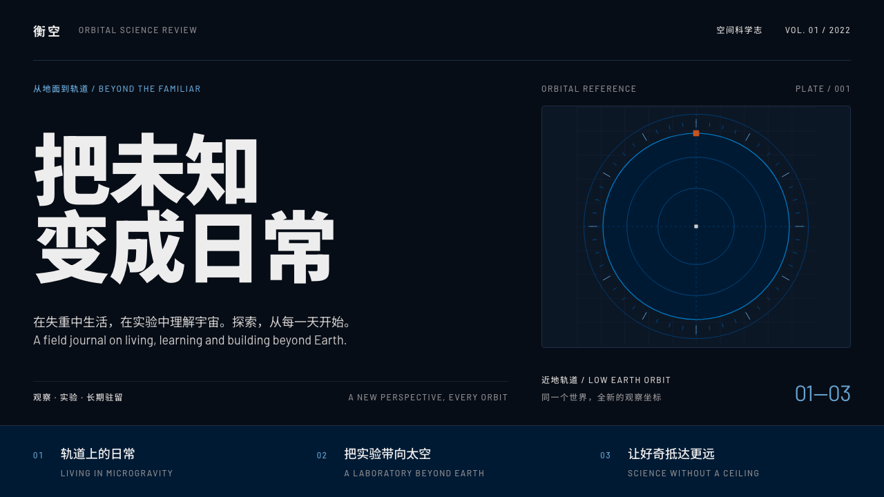
Tiangong is precision in the dark: heavy Chinese lettering, emblem blue and a single burnt-orange marker on a near-black sky, drawn from orbital photographs and mission emblems.
Tiangong in brief
Tiangong is China's space station, and as a design style it translates the look of its orbital photographs and mission emblems into a system for interfaces and documents. The page is a near-black navy sky, the primary colour is a deep emblem blue, body text is a station-hull white-grey, and a single burnt-orange accent is used only where something must be noticed.
The typography is as important as the palette. Mission and module names are set in heavy-weight Chinese type, which gives them the authority of a nameplate. Codes, flight designations and telemetry are set in a tracked-capital sans, so numbers and abbreviations read as instrument labels rather than prose. The pairing makes a page feel like a mission control display that happens to be readable by the public.
The overall effect is calm, exact and a little ceremonial. It does not rely on glow, lens flares or decorative nebulae. It relies on darkness, clear hierarchy and the discipline of sparing colour, which suits space science outreach, education, data dashboards and mission timelines.

Where does Tiangong come from?
The reference point is the station itself. Tianhe, the core module, launched in April 2021, and in November 2022 the Wentian and Mengtian laboratory modules joined it to complete a T-shaped configuration. Orbital photographs from this period show white modules and long solar wings suspended against black sky, with a thin blue edge of the Earth below. The visual reference period of the style is 2021 to 2023.
The second source is the mission emblem of China's manned space programme, a round badge that depicts a white station against a deep blue field. The palette of this design system comes from both sources together: near-black navy from the sky, emblem blue from the badge, grey-white from the hull and one warm burnt-orange accent.
Several traditions sit behind the look. One is modular space-station construction, the idea that a complex structure is assembled in stages from named parts, which is why module names carry such weight in the typography. Another is China's three-step manned space programme, a long-range plan that gives the project a sense of sequence and milestone. The third is space science outreach to schools, which asks for visuals that are both authoritative and approachable.
People associated with the programme include the astronauts Nie Haisheng, Wang Yaping, Zhai Zhigang and Chen Dong. They appear in public as the human face of the missions, in crew portraits, spacewalk reports and classroom lectures delivered from orbit, and their presence is the reason such a system must also work for storytelling and education, not only for instrument-like data.
What defines the Tiangong look?
Colour
The ground is a near-black navy, the primary is a deep emblem blue, text is a hull-like white-grey, and a single burnt-orange accent appears only at decisive points such as an active stage on a timeline or a current-position marker. Because the accent is rare it behaves like an orbital marker: you always know where to look.
Heavy Chinese type
Module and mission names are set in a heavy weight of a clean Chinese sans-serif. The strokes are thick and evenly toned, which keeps them legible on a dark ground and gives each name the weight of an engraved nameplate. Headlines are short and declarative.
Tracked-capital telemetry
Codes, mission designations, dates and numeric readouts use a tracked-capital sans. The extra spacing makes short strings read as labels on instruments. It also separates data from narrative at a glance, so that the eye can scan the numbers without having to parse sentences.
Dark canvas and restraint
The page is dark but not decorative. There are no glows, no lens flares and no ornamental starfields. The darkness works as empty space, a way to give weight to the few things that appear in it. Generous margins and clear separation between groups add to the sense of calm.
Modular composition
Layouts echo the assembly logic of the station. Content is divided into named modules that attach to a central spine, and blocks line up on a clear grid. A timeline or a dashboard feels like a structure being built from parts, each part with its own label.
Emblem and orbital motifs
Round emblems, thin orbital lines and simple station silhouettes serve as the few decorative gestures. They are drawn with the same flat colours as the rest of the system and are used for section markers and cover pages, not scattered across the layout.

Who shaped Tiangong?
A veteran astronaut associated with the first crew to enter the Tianhe core module. His public presence stands for the early, careful phase of the station's occupation.
An astronaut known to the public for her spacewalk and for delivering classroom lectures from orbit. She is the clearest human link between the station and its science outreach audience.
An astronaut associated with China's early spacewalk history and with later station crews. His career connects the first steps of the manned programme to the completed T-shaped station.
An astronaut associated with the crew that was aboard as the Wentian and Mengtian modules joined the core module. His name is tied to the completion of the T shape.
How do you use Tiangong today?
In slides, Tiangong suits cover pages, mission briefings and science talks. Put a short heavy Chinese title on the near-black ground, a tracked-capital code or date underneath, and let the burnt-orange accent mark one thing only, for example the current stage. A thin orbital line or round emblem can act as the single decorative gesture.
For content and data slides, use modular blocks aligned to a grid, with each block carrying a labelled module name. Charts should use the emblem blue for the main series, hull grey for reference values and orange for the one value or marker you want to emphasise. Keep numbers in the tracked-capital face so that they read as telemetry.
In web and app interfaces, the style works well for educational sites, mission timelines, research dashboards and data-heavy status pages. A timeline can be drawn as a horizontal spine with module-shaped nodes, the active node in orange. A dashboard can place named modules around a central summary, echoing how the station is arranged.
In editorial and marketing work, it is suitable for science communication, museum and exhibition material, school programmes and reports that need an authoritative, calm voice. Orbital photographs sit comfortably in it, as long as captions use the same heavy type and tracked-capital system and the page stays dark.
The most common mistake is to turn the orange accent into a theme colour and scatter it across the page, which destroys the marker effect. Another is to add decorative glows or stars that fight the restraint of the system. A third is setting long Chinese paragraphs in the heaviest weight; reserve it for names and headings and use a regular weight for reading text.

Tiangong — FAQ
What is the Tiangong design style based on?
It is based on orbital photographs of China's space station, which was completed in a T shape in November 2022, and on the round mission emblem of the manned space programme. From these it takes a near-black navy sky, a deep emblem blue, a hull-like white-grey and one burnt-orange accent.
Why is only one accent colour allowed?
The burnt-orange accent acts like an orbital marker. It tells the reader where to look, such as the active stage of a timeline. If it appears everywhere it stops signalling anything, so the system keeps it rare and lets blue, grey and white do the rest of the work.
How should type be used?
Use a heavy-weight Chinese sans-serif for module and mission names and headlines, and a tracked-capital sans for codes, dates and numeric readouts. Use a regular weight for body text. The contrast between nameplate type and telemetry type is what gives the style its mission-control character.
What content suits this style best?
Space science outreach, school education, research dashboards, mission timelines, museum material and reports that need an authoritative, calm tone. It also works for any product that wants to feel exact and instrument-like, but it is not a good fit for playful consumer brands.
Can I use a light background with it?
The style is designed around a dark sky, and its colours were chosen for contrast against it. A light variant is possible for print, but you would need to rebalance the blue and the accent and accept that some of the orbital atmosphere is lost. For screens, stay with the dark page.
Related design styles
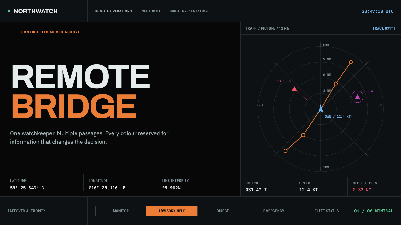 Autonomous Cargo Ship BridgeColour is protocol. Near-black chart grids reserve orange for decisions that…
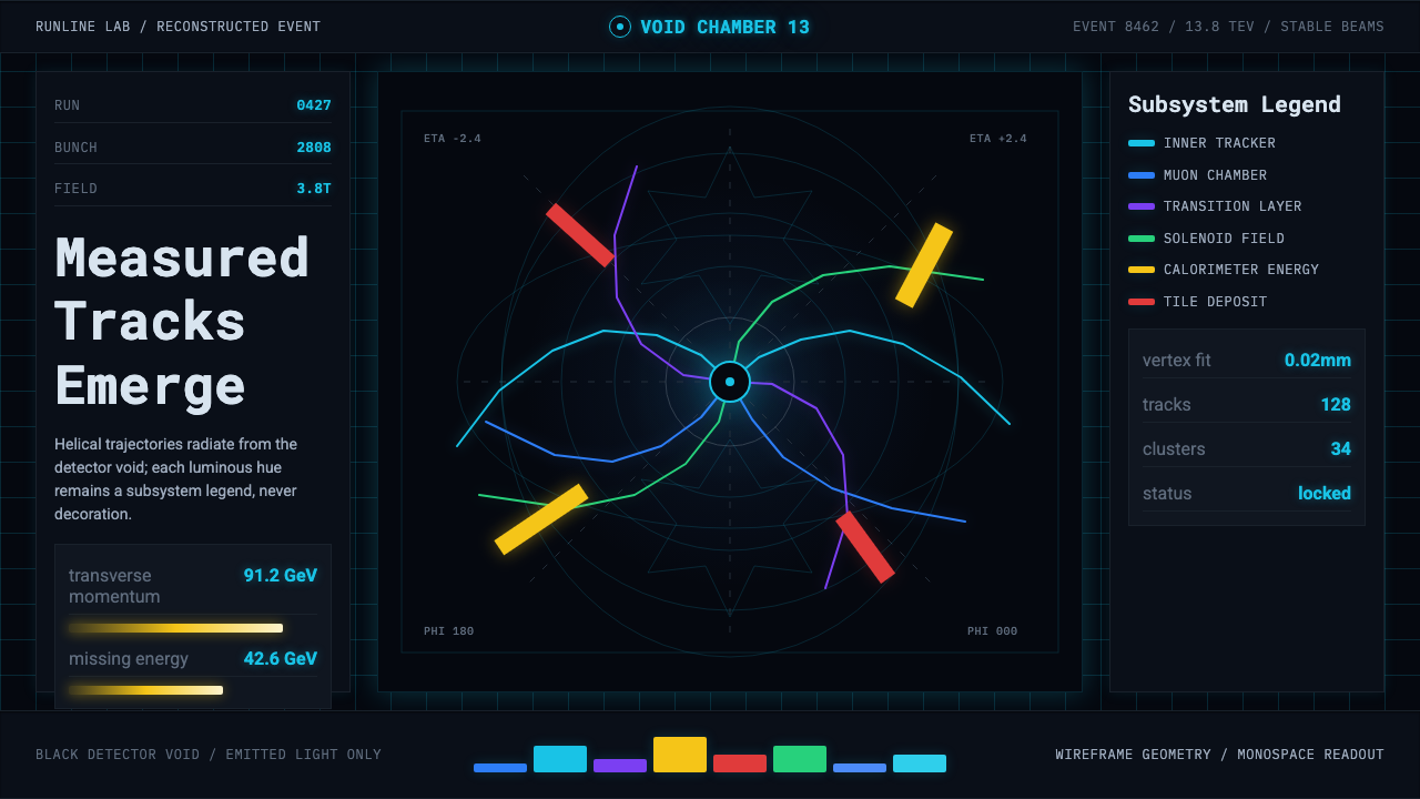 CERN CollisionData, not spectacle. Cyan tracks on black wireframes make every subsystem col…
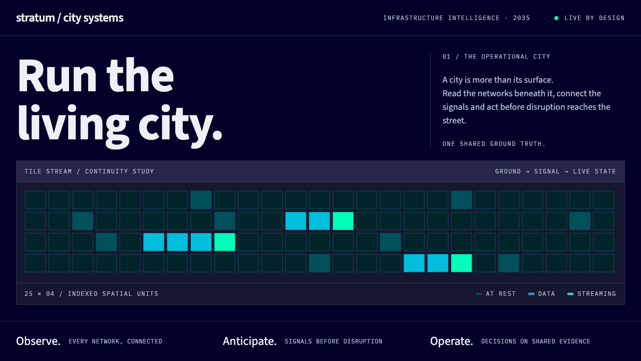 Digital Twin City OpsColour reports, never decorates. Deep blue grids reserve cyan and green for d…
 Lunar Regolith SettlementMoonlight without the myth. Regolith gray, hard terminators, and a strict tec…
 The Expanse Belter UIEngineering, not neon. Cyan glass panels, mono data, orange warnings on ship-…
 Vertical Farm TowerFood production without daylight. Magenta LED tiers cut through a near-black…