What is Tholu Bommalata?
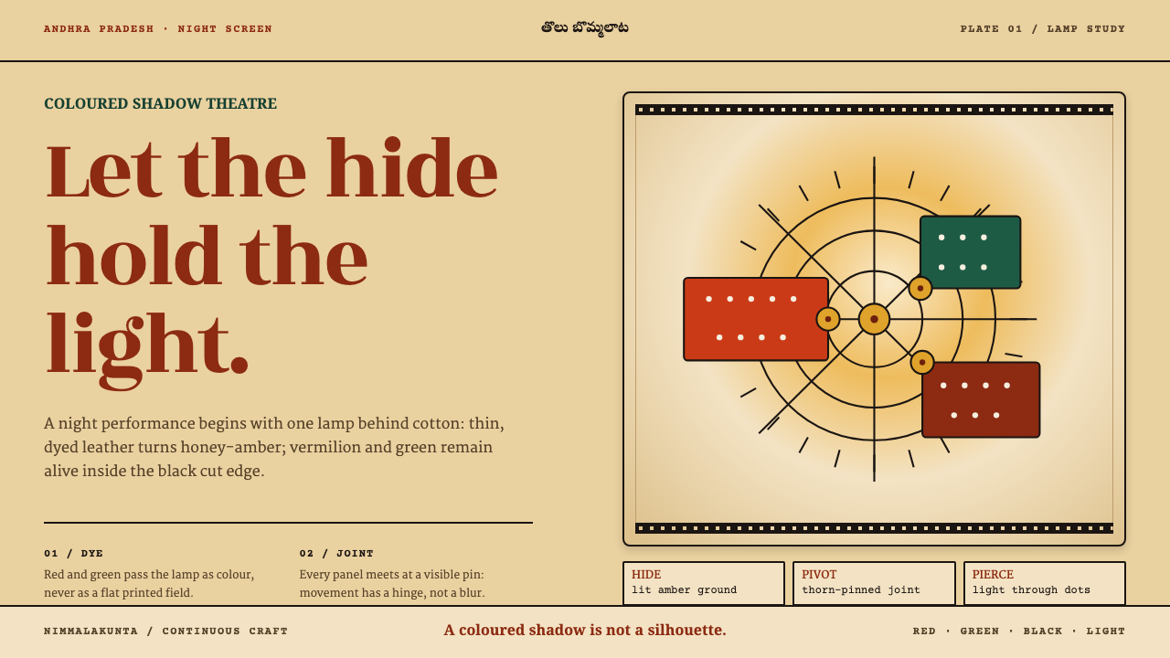
Tholu bommalata turns light into coloured shadow: translucent hide, a single lamp, and ornament punched through the figure rather than drawn onto it.
Tholu Bommalata in brief
Tholu bommalata is the leather shadow theatre of Andhra Pradesh, in southern India. The name joins tholu, meaning hide, to bommalata, the play of puppets. Its visual language comes straight from the way the figures are made and lit: a translucent hide ground that glows honey-amber when a lamp burns behind it, heavy opaque black outlines that hold each figure together, dyes in red, green and black with white highlights, and surface ornament that is punched out of the skin so that light can pass through.
As a style, it is defined by a physical process rather than by a school of drawing. The figure is not painted on a flat surface. It is a piece of treated animal skin made thin enough to pass light, dyed on both faces, jointed with rivets and carried on a palm stem with separate sticks for the arms. Everything the audience sees is the projection of that object onto a white cotton screen. The aesthetics are therefore those of transmitted light: colour that glows, edges that stay dark and decisive, and pattern made of holes.
The character is warm and theatrical. Instead of flat ink, the dyes read as coloured shadow, deepening where the hide is thick and brightening where it is thin. A single lamp produces a hot centre and a gradual fall-off toward the edges of the screen, so the image is never evenly lit. That slight unevenness, which a flat digital fill would erase, is a large part of why the form feels alive.
Where does Tholu Bommalata come from?
Tholu bommalata belongs to the older family of Indian shadow puppetry, a set of regional traditions across southern India, and it is bound to epic oral narration. The performance tradition predates 1900, and the craft has continued without a break in places such as Nimmalakunta, a village in the Anantapur district of Andhra Pradesh, into the 2020s. A show is a combination of figures, voice, song and narration: stories from the great epics are told by the puppeteers while the figures appear, argue and fight on the lit screen.
The making of a figure is a long sequence of labour. The hide comes from animals that died naturally, such as antelope, deer or goat. It is shaved, treated with herbs, beaten thin and stretched until it passes light. Both faces are then dyed, so the colour is visible from either side of the screen. The joints are riveted and pinned with date-palm thorns, and the whole figure rides a palm stem, with detachable sticks controlling the arms. Each of those steps leaves a trace in the finished look: the stiff, parchment-like body, the dark rim, the dye that sinks into the skin.
Light is the final collaborator. The performance takes place behind a white cotton screen with a single lamp, traditionally an oil lamp, behind the puppets. Where the hide is undyed, it burns honey-amber. Where dye has soaked in, the colour reaches the audience as shadow rather than paint. A figure held close to the screen is sharp; one drawn back toward the lamp grows larger and softer. The puppeteers use that physics as part of the performance, and the lamp itself has a hot spot and a falloff that no one tries to flatten.
Because the tradition is oral and craft-based, its history is carried by families more than by named artists. The Nimmalakunta puppeteer families keep the repertoire and the making methods, and the tradition has also been documented by scholars such as Stuart Blackburn, who has written on Indian shadow puppetry and its epic stories. The same family-based transmission explains the rules of the style: the red-green-black dye set, the black outline and the punched ornament are not stylistic choices but the grammar of a craft, handed down along with the material knowledge of vegetable and mineral pigments.
What defines the Tholu Bommalata look?
Translucent Hide Ground
The ground is not paper but treated hide, thinned until it passes light. Undyed areas burn honey-amber when lit from behind, and that warm glow is the background colour of the whole system. Surfaces should feel translucent and slightly cloudy, with the faint variation of skin, rather than opaque and flat. When the ground turns white or grey, the style is lost.
Opaque Black Outline
Each figure is held together by a dark, opaque outline. Because the hide is translucent, the line is what gives the figure edge and legibility from a distance. Outlines are bold and continuous, with deliberate breaks only where a joint or a punch demands it. Colour never runs outside the outline, and the line itself is never faded or feathered.
Dye, Not Ink
Colour comes from a restricted dye set of red, green and black, with white used for highlights. Because dye soaks into a translucent ground, it reads as coloured shadow: saturated where it pools, lighter where the skin is thin. The reds are warm and vermilion-like, the greens are deep, and the black is dense. Flat, uniform fills look wrong here; there should be depth inside each patch of colour.
Ornament by Punching
Pattern is made by removing material. Rows of small holes, circles and cut-outs let light pass through, drawing dotted, lace-like texture on the screen. This inverts the usual logic of decoration: ornament is a gap, not a mark. In a layout it translates into patterns of small apertures that let the ground show through, rather than lines drawn on top of a fill.
The Lamp's Temper
The lamp creates a hot spot and a falloff. The centre of the screen is brighter and warmer, and the edges darken and cool. This asymmetry is a feature, and the system keeps it by using gradual, radial variation in brightness instead of an even field. The page should feel lit by a flame rather than by a uniform backlight, and the glow should never be flattened away for the sake of tidiness.
Jointed, Segmented Figures
Figures are built from separate pieces joined by rivets and thorn pins, with arms operated by their own sticks. The shape language is therefore segmented: parts with visible joints, clear silhouettes, and an obviously hand-made assembly. In interface terms this suggests components that read as distinct pieces fixed to each other, with clean outlines and deliberate overlaps rather than seamless blobs.
Who shaped Tholu Bommalata?
The living centre of the tradition. In Nimmalakunta, in the Anantapur district, families have kept both the performance repertoire and the craft of making figures, from preparing the hide to dyeing it, punching it and jointing it. Their methods are the source of every rule in this style: when the system insists on dye over ink or on punching over drawing, it is following their workshops.
A scholar of Indian folklore and performance, cited here among the people who have documented the shadow puppet stage and its epic stories for a wider readership. Documentation matters for a tradition carried by oral narration and family transmission: it records the repertoire and the vocabulary of materials and techniques on which this style draws.
The oral epic is the other half of the art. The puppeteers narrate, sing and speak the roles, carrying stories from the great epics while figures appear and vanish on the screen. In this style's logic, narration is the reason every figure must be instantly legible: the audience follows the story by silhouette and colour before it follows any detail.
How do you use Tholu Bommalata today?
Tholu Bommalata is a style for stories, craft and warmth. It works wherever the subject is heritage, narrative, performance, handmade objects, or a product that wants to feel lit from within, and it is especially strong for projects about storytelling, education, culture, food and hospitality. The system depends on an unmistakable contrast between a glowing ground and a dark outline, and it rewards designs that commit fully to that contrast.
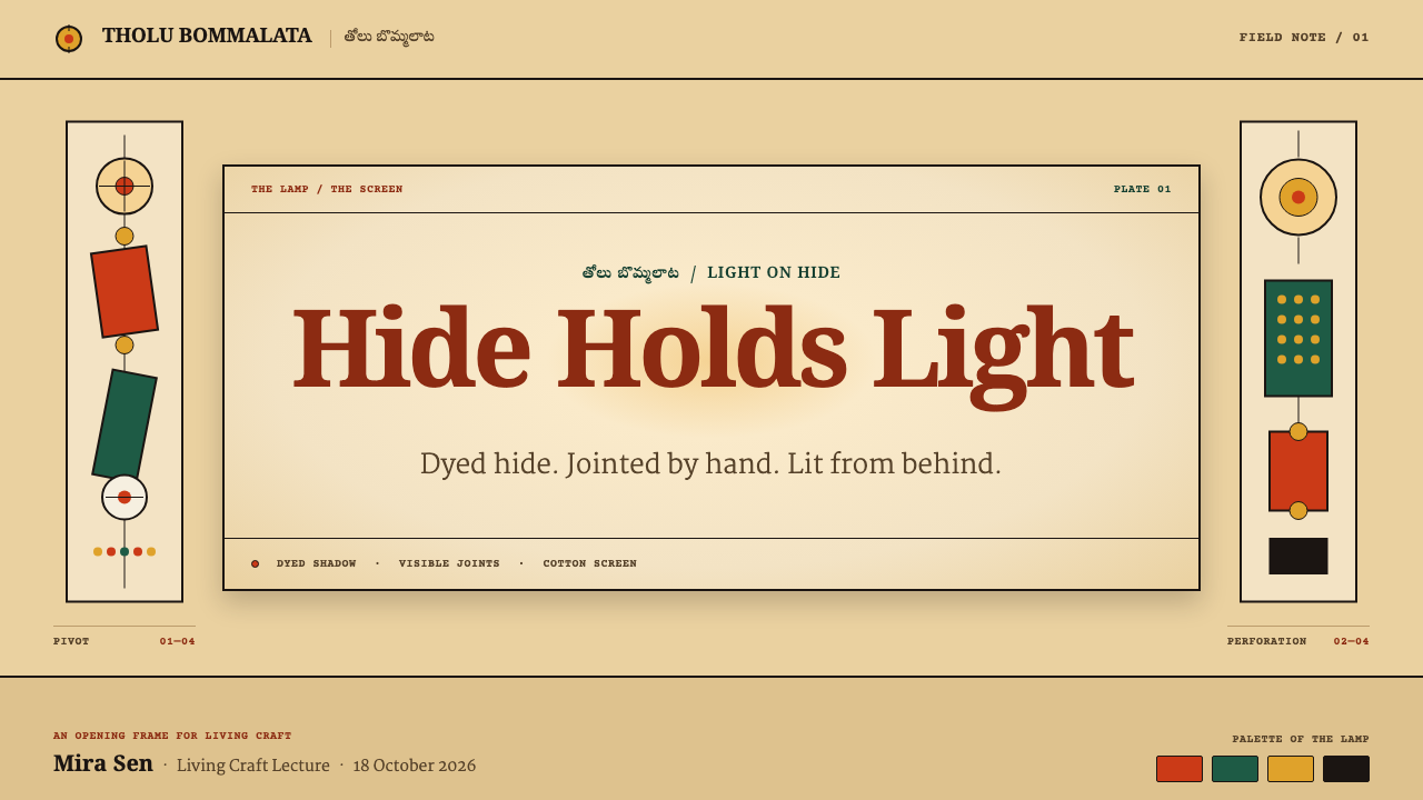
For presentation slides, the cover can be a translucent amber field with a dark-rimmed panel holding the title and ornament punched along one edge as a border of small apertures. Content slides use the dark outline as a framing device: every panel, chart and callout is closed by a black line, and colour fills stay within red, green and black with white highlights. Data slides translate into coloured shapes with outlines, like figures on a screen, and a lamp-like gradient behind them helps focus the eye.
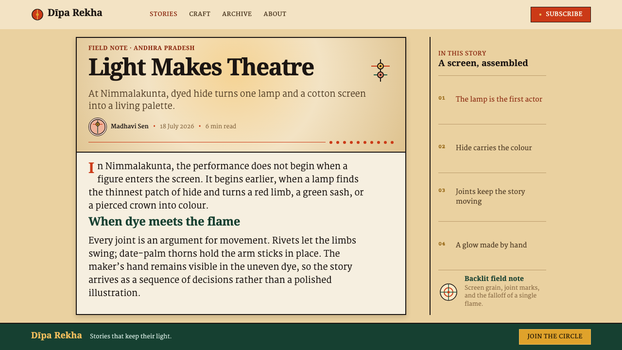
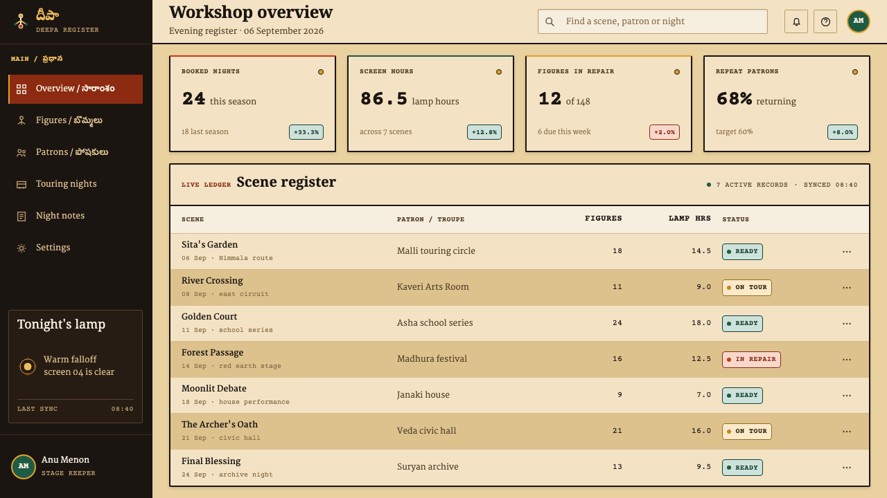
On the web, the style suits cultural sites, storytelling products, heritage archives, and consumer products that want warmth and a hand-made character. Cards become dark-rimmed panels over a warm ground, buttons take solid red with a black outline, and dividers are made from rows of small circular cut-outs. A subtle radial glow behind the hero can imitate the lamp, as long as it stays quiet enough that text remains easy to read.
In editorial and marketing work, the style gives an immediate sense of narrative and ritual. A long article can open with a large dark-rimmed figure panel, and sections can be separated by punched borders. Photography works best when it is warm, low-key and lit from one side, and illustration should favour silhouette. Campaigns about festivals, performance, craft cooperatives or storytelling can lean on the lamp glow with a single warm ground colour and a disciplined use of black.
The most common mistake is flattening the lamp. If the ground is a uniform amber and the colours are opaque flat fills, the design reads as a generic warm palette and loses its transmitted-light quality. The second mistake is drawing the ornament on rather than punching it through: patterns should read as holes where the ground shows, not as decorative lines laid over a fill. The third is weakening the outline; a thin, grey or semi-transparent outline destroys the readability of the figures.
Tholu Bommalata — FAQ
Is this the same as other Indian shadow puppet traditions?
They are related but not identical. Indian shadow puppetry is a family of regional traditions, each with its own figures, repertoire and visual conventions. This style follows the Andhra craft in particular: hide that is thinned until it passes light, dye on both faces, a black outline, red-green-black colour with white highlights, ornament made by punching, and a single lamp behind a white cotton screen. Borrowing only one of these features, such as an amber colour, does not produce the same look.
Why does the style punch ornament instead of drawing lines?
Because that is how the figures are decorated. The hide is thin enough to pass light, so a hole becomes a bright point on the screen, and rows of holes become a glowing texture. In design terms this means ornament should be a gap that lets the ground show through, not a stroke laid on top. It keeps the surface honest to its premise as a lit, translucent material and prevents the pattern from competing with the outline.
Can the style work on a dark background?
The performance happens in a dark space, but the system's ground is the lit screen, so the natural form is a warm, glowing field. A dark version is possible if the darkness is treated as the surrounding theatre and the amber is kept as a pool of light with a hot centre and a falloff. Keep the black outline readable by lightening the fill next to it, and avoid placing text on the darkest areas where the glow has faded away.
Why is the palette limited to red, green and black?
Because the dye set of the craft is restricted, drawn from vegetable and mineral pigments, and because a small palette gives translucent colour a better chance to glow. White appears only as a highlight where the skin is left clear or lightened. Extra hues muddy the effect, since each dye interacts with the amber ground. A restricted palette also keeps the figure legible as a silhouette, which is what the narration relies on.
Where does the style struggle?
It struggles in contexts that demand cool precision, dense data or a neutral voice: enterprise software, financial tools, technical documentation and anything that relies on small, high-contrast text over a perfectly even background. The glowing ground and the punched ornament compete with fine detail. It also needs care for accessibility, because red on amber has limited contrast; text should use black or the darkest dye, never the lighter reds.
Related design styles
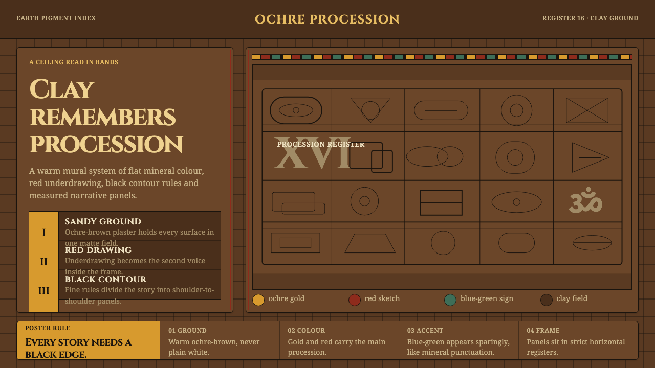 Lepakshi Vijayanagara CeilingEarth remembers in registers. Ochre gold, red underdrawing and black rules ma…
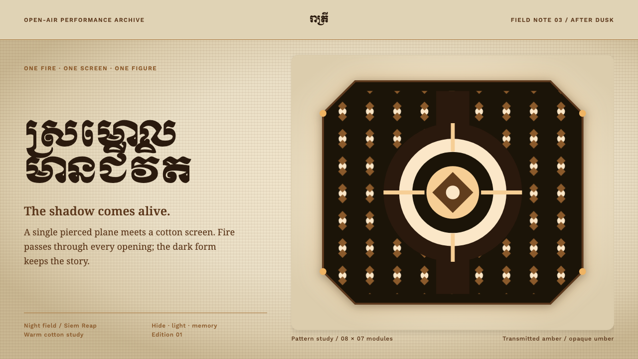 Sbek Thom Shadow PuppetShadow becomes ceremony. Pierced umber geometry holds firelight on a warm cot…
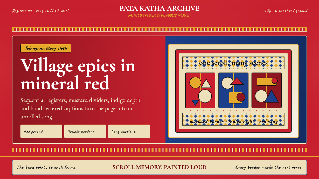 Andhra Cheriyal Scroll PaintingSaturated oral memory. Mineral red registers, mustard diamonds, and serif son…
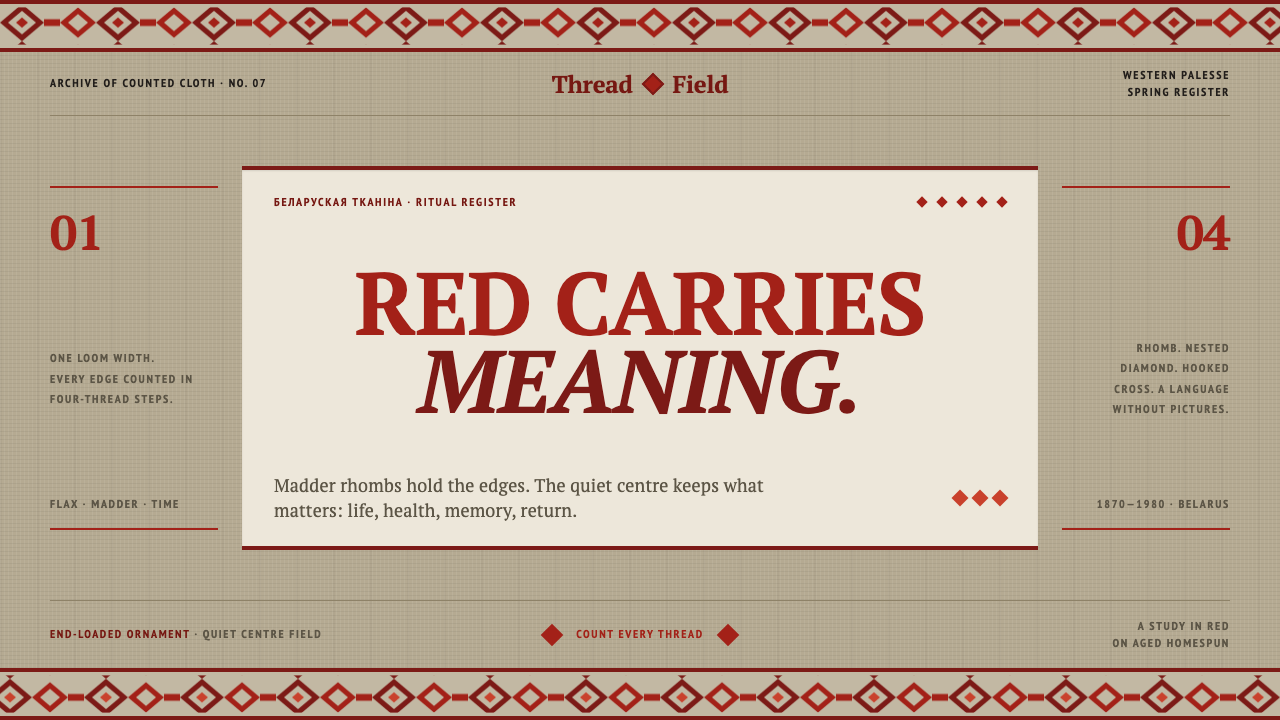 Belarusian RushnykRed carries meaning. Madder rhombs crowd aged flax edges while the woven cent…
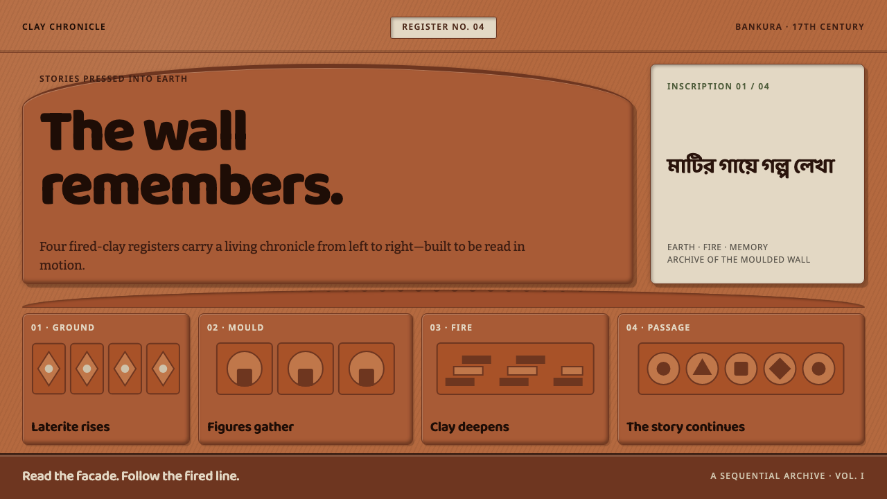 Bishnupur Terracotta TemplesThe wall tells the story. Fired-clay relief panels unfold in warm horizontal…
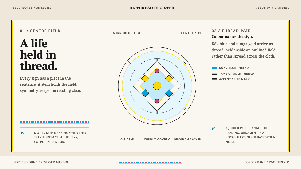 Crimean Tatar OrnekOrnament that can be read. Kök blue and tamga gold hold a mirrored stem on un…