What is Theremin?
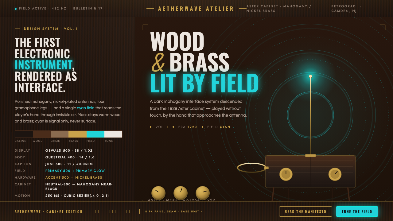
Theremin is an instrument style built around an apparition: dark polished wood and brass hardware made tangible, with a restrained cyan signal standing in for the invisible field between hand and sound.
Theremin in brief
Theremin takes its visual identity from the RCA production model of 1929: a dark mahogany cabinet, polished to a furniture-like sheen, raised on gramophone-style legs, and crowned by nickel-plated brass antennas. It belongs to an early electronic age that did not yet imagine technology as weightless, seamless, or screen-bound. The instrument looks built, housed, and presented like a serious domestic object, even as its essential mechanism is an invisible electric field.
That collision is the core of the style. Wood supplies warmth, gravity, and craftsmanship; brass and nickel suggest calibration, transmission, and physical precision. Cyan appears only as the sign of an etheric wave or active signal. It is not a broad decorative fill and should never overpower the cabinet-like darkness of the composition. The visual system makes technology feel uncanny precisely because it remains materially grounded.
Theremin imagery is therefore not generic retro futurism. Its period voice comes from radio-era instrument design and geometric modernism: disciplined sans-serif lettering, technical labels, concentric ripple rings, antenna-like verticals, and controlled contrast between dense dark mass and luminous field. The result should feel like a rare electrical instrument in a quiet room—formal, tactile, and slightly supernatural.
Where does Theremin come from?
The historical frame is unusually compact and unusually charged. The theremin was invented in 1920, placing it among the earliest electronic instruments, during a period when radio technology had begun to make invisible transmission imaginable as an everyday force. Its origin belongs to the Soviet Union, while its later mass-produced visual identity became closely associated with American manufacture. That geographic crossing matters: the instrument carries both an Eastern European invention story and the polished commercial presence of an RCA cabinet.
Leon Theremin, also known as Lev Termen, gives the style its central human figure, but the design language is inseparable from the instrument’s unusual method of performance. Antennas rise from the cabinet and read a player’s hands through an invisible electric field. Unlike a keyboard, string, or valve, the primary interaction is spatial. The player does not visibly strike the source of sound; gesture happens in the air around the object. The visual system should preserve that strange relationship rather than reduce the instrument to a conventional music-device silhouette.
The RCA AR-1264 production model of 1929 provided the most important physical reference. Its polished dark mahogany enclosure, gramophone-style legs, and nickel-plated brass antennas presented electronic novelty through established furniture and instrument-making cues. Rather than hiding the object’s domestic presence, the design gave the electrical apparatus a dignified cabinet. This is why Theremin styling works best when its surfaces feel substantial and its hardware feels placed with purpose.
Between 1900 and 1950, early electronic music, geometric modernism, and radio-era instrument design formed the broader visual environment around the theme. Theremin condenses those currents into one object: an electronic voice housed in wood, a scientific apparatus made ornamental only through its own materials, and a field that can be represented by a single cool glow or a set of widening rings. It is historical without being nostalgic for clutter; its atmosphere comes from disciplined restraint.
What defines the Theremin look?
Dark Wood Mass
The cabinet is the visual anchor. Use a dark, polished mahogany-like presence with visible depth, restrained highlights, and the gravity of a finished instrument or radio cabinet. It should read as wood first, not as a generic dark panel. Broad dark surfaces establish quietness and make every metallic fitting and cyan trace feel intentional.
Brass and Nickel Hardware
Metal details should feel engineered rather than luxurious. Brass brings warmth against the wood, while nickel-plated surfaces introduce a cooler radio-era precision. Antennas, mounts, rings, and small fittings work best as sparse structural accents. Their polish may catch light, but they should never become decorative jewelry detached from the instrument’s function.
Cyan as Signal
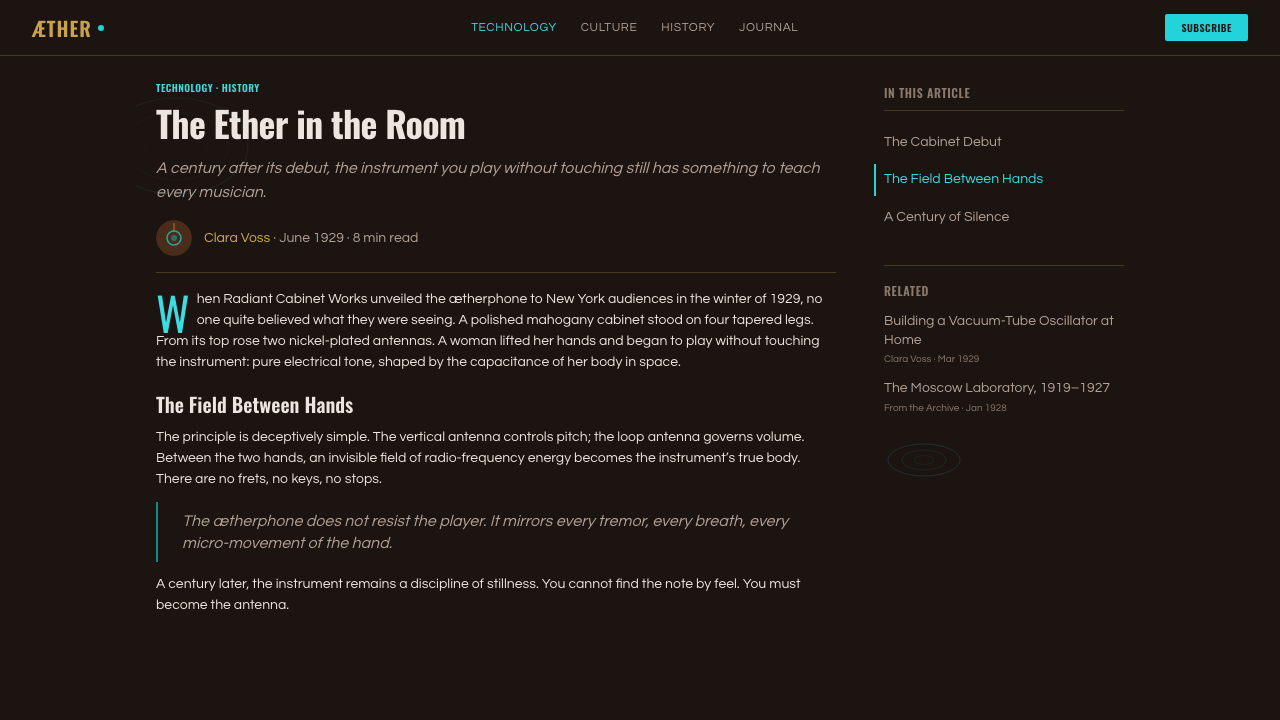
Cyan represents the field: an etheric trace, an active frequency, or the moment a hand enters electrical space. Use it sparingly against dark wood and metal, where its cool luminosity can carry meaning without filling the composition. It should behave like evidence of an invisible system, not like a surface color applied everywhere for atmosphere.
Antenna Verticality
The antennas establish the style’s most distinctive silhouette. Their upward reach introduces a ceremonial, almost scientific vertical tension above the grounded cabinet. In graphic applications, slender vertical rules, isolated rods, or carefully placed line elements can echo this idea. They should imply sensing, transmission, and the boundary of an interaction zone rather than merely decorate empty space.
Concentric Field Rings
Concentric ripple rings translate the invisible field into a diagrammatic motif. They can radiate from a control point, antenna, hand-like gesture, or cyan signal source, but should remain orderly and spacious. The rings are not a psychedelic pattern. Their purpose is to visualize propagation and proximity: the quiet geometry of a field becoming perceptible.
Geometric Radio Typography
Typography should borrow the reserve of period geometric sans-serif lettering: clean forms, measured spacing, and a technical calm that supports the object rather than competing with it. Titles can feel instrument-like or archival, while labels should read as disciplined identifiers. Avoid ornate display type, handwritten gestures, or futuristic lettering that turns the historical radio-era character into science-fiction spectacle.
Who shaped Theremin?
Leon Theremin, also known as Lev Termen, is the inventor named in the theme’s historical record. His importance is inseparable from the instrument’s defining proposition: sound is shaped through a player’s hands in an invisible electric field. For the design system, he represents the point at which electronic invention becomes performance, gesture, and visual mystery rather than mere apparatus.
RCA is the manufacturer associated with the 1929 AR-1264 production model that anchors the Theremin visual reference. Its role matters because the model gave an experimental electronic instrument a finished, furniture-like public form: polished mahogany cabinet, gramophone-style legs, and nickel-plated brass antennas. The system’s balance of domestic materiality and radio-era hardware follows this manufactured object.
The RCA AR-1264 is the 1929 production model specified by the source material. More than a historical label, it is a compositional template: a grounded dark cabinet below, precise metal apparatus above, and an invisible field extending outward from the antennas. Contemporary interpretations should preserve that hierarchy even when they do not depict the instrument literally.
How do you use Theremin today?
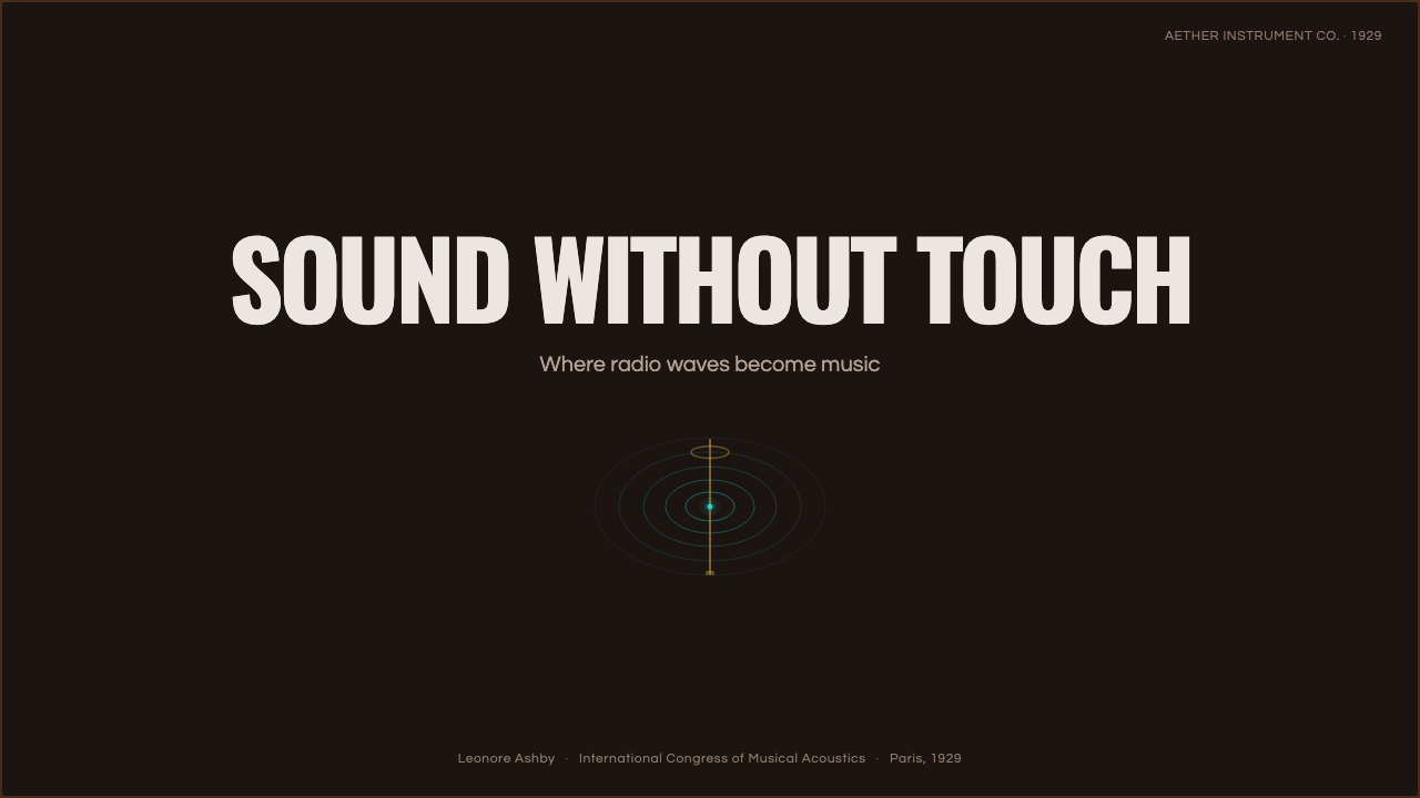
For presentation covers, Theremin works best when the page behaves like an instrument portrait. Let a dark wood-like mass occupy the visual base, introduce one antenna-like vertical or a carefully cropped hardware detail, and use cyan only where a signal needs to appear. A title in restrained geometric sans-serif type should feel engraved, catalogued, or transmitted rather than theatrically announced. Preserve generous darkness around the signal so the field has room to register.
Content slides should translate the instrument into a calm information system. Use dark panels as cabinet-like containers, brass or nickel cues for structural separators, and concentric rings only when they clarify a relationship, process, or range. Data slides are particularly effective when charts retain a technical, radio-instrument character: one cyan series can identify active signal while subdued wood, metal, and dark neutrals hold the rest of the structure. The glow is meaningful because it is rare.
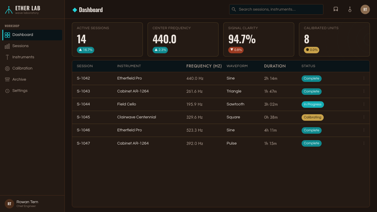
For web interfaces, the style suits dashboards, monitoring tools, music technology products, and pricing experiences that benefit from an atmospheric but disciplined technical identity. A dashboard can treat activity as a field: signal states, proximity, inputs, and outputs become sparse cyan indicators against dark cabinet-like surfaces. Pricing pages can use brass-like dividers and measured typographic hierarchy to make tiers feel engineered and deliberate. Interaction should remain highly legible; the historical mood must never obscure controls, status, or comparison.
Editorial and marketing work should use Theremin as a narrative of material versus invisible force. Feature pages can alternate between close wood-and-metal object views, quiet technical captions, and open field diagrams. A campaign can make one cyan trace travel through sections as the visual equivalent of an etheric wave, while the rest of the composition stays tactile and dark. This works especially well for stories about sound, transmission, experimentation, instruments, and technological wonder.
The common mistake is to turn Theremin into a neon cyberpunk style. Flooding the page with cyan, adding excessive glow, or replacing wood and metal with generic black glass destroys the system’s central tension. Another mistake is treating concentric rings as decorative noise. The style succeeds when material mass comes first, hardware remains sparse and purposeful, and the cyan field appears as a precise interruption in an otherwise grounded world.
Theremin — FAQ
Is Theremin simply a dark retro-futurist style?
No. Retro-futurism often treats the past as a collection of speculative props, while Theremin is anchored to a specific instrument reference: the 1929 RCA production model, its dark mahogany cabinet, metal antennas, and invisible field. The style should feel historically situated in early electronic music and radio-era design. Its futuristic quality comes from the genuinely strange method of interaction, not from adding generic space-age imagery.
Why is cyan used so sparingly?
Cyan is the visible signature of the field, not the object’s main material. If it becomes the dominant surface color, the cabinet, brass hardware, and radio-era atmosphere disappear behind a generic digital glow. Restricting cyan lets it mark activation, transmission, or proximity with unusual force. The style depends on the contrast between a physically grounded instrument and the one part of its behavior that cannot be touched.
Can the style work without depicting the instrument itself?
Yes, provided the hierarchy remains intact. A dark wood-like mass can suggest the cabinet, a precise metal line can suggest an antenna, and a small cyan ring or trace can suggest the field. Geometric sans-serif typography and restrained technical labels reinforce the period voice. The goal is not literal reproduction; it is to preserve the relationship between material enclosure, engineered hardware, and invisible signal.
Where does Theremin styling struggle?
It can struggle where broad warmth, playfulness, or immediate visual simplicity is the primary requirement. The dark cabinet mood and technical restraint may feel too formal for cheerful consumer campaigns, children’s products, or experiences that need abundant color and soft friendliness. It also requires careful accessibility work in interfaces, because dark surfaces and luminous accents can become atmospheric at the expense of clarity if hierarchy is not maintained.
Related design styles
 Biplane AviationPioneer flight feels hand-built. Dark walnut, brass, stitched edges, and char…
 Taishō RomanLonging framed in bronze. Maroon ground, Mincho type, and sepia ornament hush…
 Cricket Whites FlannelsSummer, kept in good order. Ecru serif and fine club trim cross a dark mown g…
 Czechoslovak New Wave CinemaNoir without nostalgia. Letterbox bars, off-white titling, and 35mm grain do…
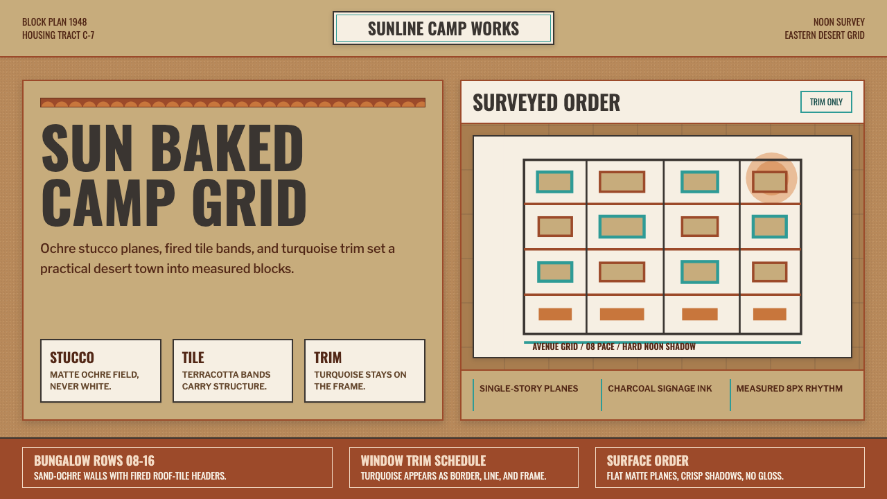 Dhahran Aramco Camp ModernismDesert order, sun-baked. Ochre stucco fields, terracotta bands, turquoise tri…
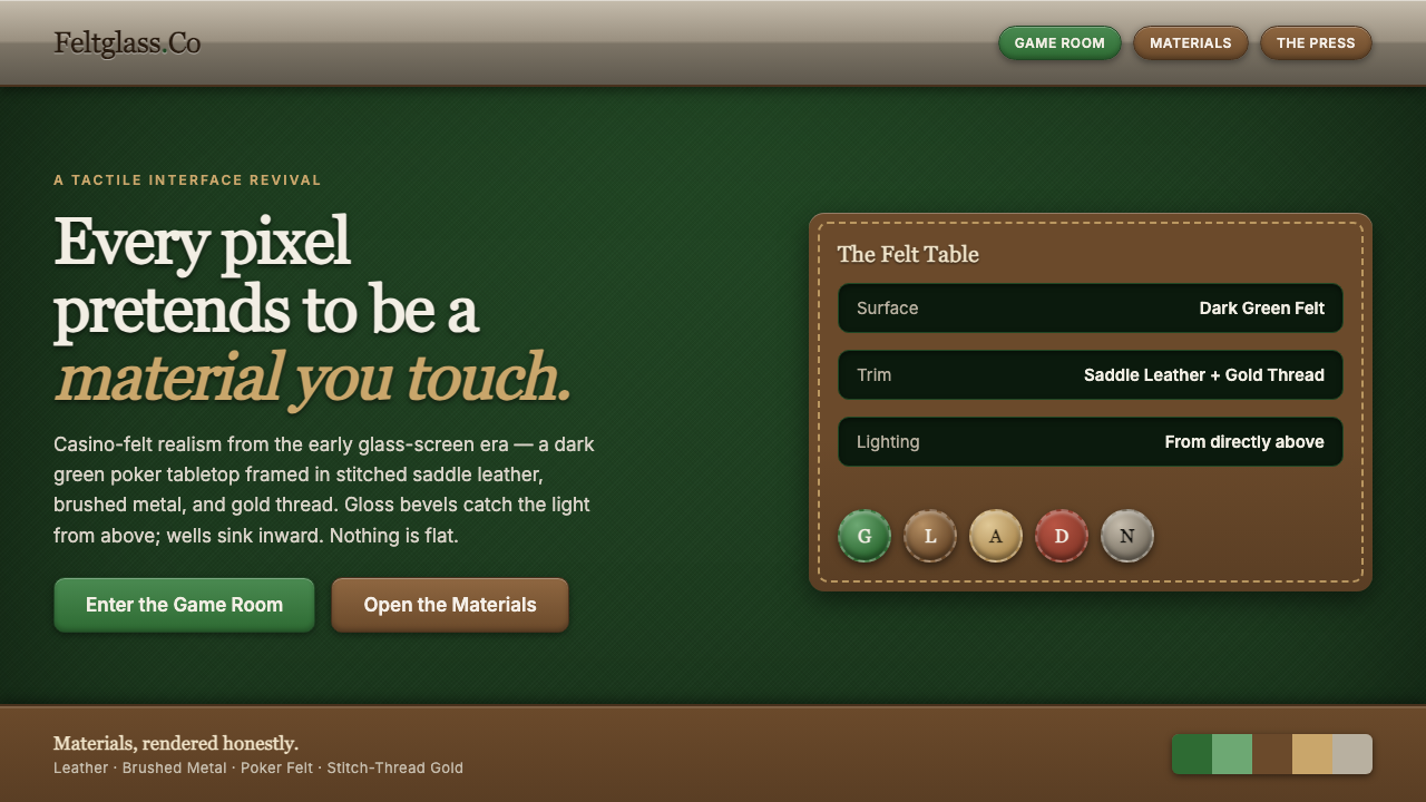 Skeuomorphic iOSEvery pixel pretends to be touchable. Dark green poker felt, stitched leather…