What is The World Ends with You?
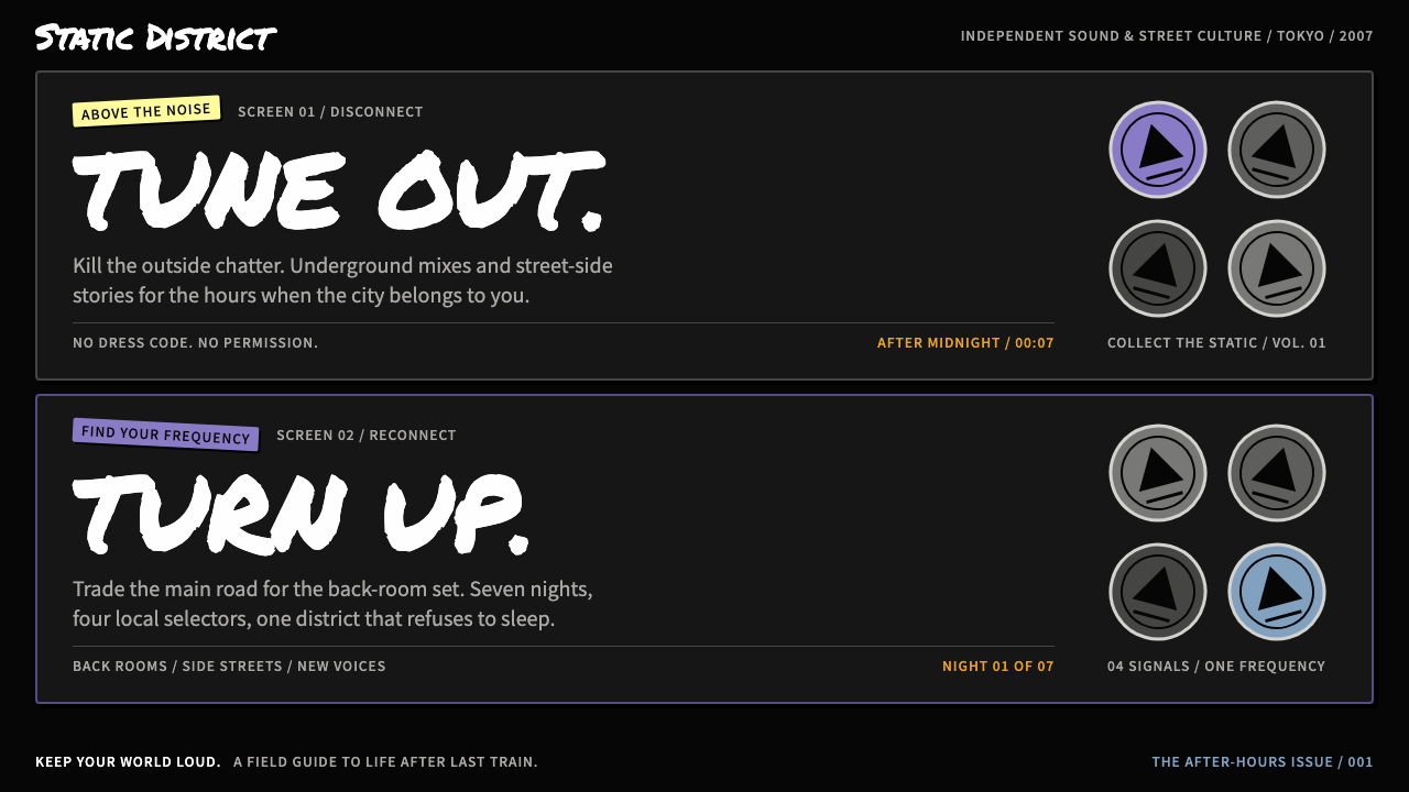
The World Ends with You turns Shibuya into an interface: a traced, concrete-grey city on ink black, a screen split in two, and a cast in flat full colour wearing their attitude like a badge.
The World Ends with You in brief
The World Ends with You is the visual language of a 2007 role-playing game from Square Enix and Jupiter, made for the Nintendo DS and set in a recognisable Shibuya, Tokyo. As a design style it is dark, graphic and deliberately loud: white marker-style lettering on ink black, violet pins, tilted sticker labels, and a city that has been traced from photographs and washed down to concrete grey so that people, not buildings, become the colour.
The defining structural idea is the split. Every layout is divided into an upper and a lower field, a direct echo of the two screens of the handheld it was born on. In the game the partner acts above while the player acts below; in a design system that becomes a reliable compositional habit, with one half for context, character or atmosphere and the other half for the thing the user actually touches.
Its personality is street rather than polished. Interactive objects are round, collectible pins rather than neutral buttons. Labels look like stickers slapped on at an angle. Headlines read as if someone wrote them with a marker on a shop shutter in the small hours. The result suits products that want attitude, youth culture and a sense of place, and is a poor fit for anything that needs a calm corporate face.

Where does The World Ends with You come from?
The source is a game released in Japan in July 2007 for the Nintendo DS, followed by a Solo Remix in 2012 and a Final Remix in 2018. It was a Square Enix and Jupiter production, and it chose to set its story not in a fantasy kingdom but in the real streets of Shibuya, the Tokyo district long associated with youth fashion, music and crowds.
That choice matters for the look. The game's backgrounds are not illustrated from imagination but traced from photographs of the actual district, then drained of colour until they read as concrete grey. Laying a flat, saturated cast over a monochrome city is what gives the style its pop: the world is the stage and the characters are the colour. Neku's violet headphones and orange hair are the clearest examples, instantly legible against grey and black.
Behind it sit several traditions the style quietly blends. One is the street fashion and graffiti culture of the 2000s in Shibuya, which supplies the marker lettering, the stickers and the sense of a surface written on by passers-by. Another is the Japanese urban-fantasy role-playing game, where an ordinary city hides a second, stranger layer. The third is the design of the Nintendo DS itself, with two screens and a touch interface, which gave the game its split layout and its habit of treating the lower field as a tactile playground.
Several named creators are associated with the work: Tetsuya Nomura, Gen Kobayashi, Tatsuya Kando and Takeharu Ishimoto. Nomura and Kobayashi designed its characters, Kando directed it and Ishimoto wrote its music, and the combination explains why the visual language feels so cohesive. Type, colour, character art and sound all share the same restless, urban energy, and that cohesion is what a design system built on it tries to preserve.
What defines the The World Ends with You look?
Colour
The ground is ink black and the city is washed to concrete grey, which leaves almost all the colour to the cast and the interface. Characters and key objects are flat, full-strength fills with no shading. Violet and orange are the signature pairing, drawn from the lead character, and they work because everything around them is so restrained. Colour here is a spotlight, not a wallpaper.
Typography
Headlines imitate a thick marker: white, hand-lettered in feel, a little uneven, and set directly on the dark ground. Supporting text is plain and compact so that the marker voice stays rare and therefore strong. Letters may be rotated or cut off by an edge, as if they were written on a surface rather than typeset onto a grid.
Split layout
Every composition is divided into an upper and a lower field. The upper half carries atmosphere, character art or context; the lower half carries the actions. The line between them is a real structural boundary, not a decorative rule, and elements are encouraged to lean across it for drama. This is the most recognisable organising principle of the style.
Pins
Interactive elements are round, collectible pins rather than rectangular buttons. They feel like objects you pick up and wear, with a clear circular silhouette and bold, simple emblems. Selected and available states are told apart by colour and by how loudly the pin sits on the dark ground, not by subtle shadow.
Sticker labels
Captions and tags behave like stickers slapped on at a slight tilt. They sit on top of imagery with flat fills and tight padding, and the tilt is small enough to read easily yet large enough to break the rigidity of a grid. They give the page a sense of having been handled by people.
Traced city imagery
Backgrounds derive from photographs that are outlined and reduced to grey, so the architecture stays recognisable but loses its colour and detail. This gives the style a documentary honesty about place while keeping the image quiet enough to support foreground type and characters.
Attitude over polish
Edges are allowed to be rough, angles are allowed to be off, and density is allowed to be high. The goal is to feel like a place and a moment, not like a tidy product page. Restraint exists, but it is in the palette and the number of competing accent colours, not in the confidence of the gestures.

Who shaped The World Ends with You?
Associated with the character design of the game. The cast's flat, high-contrast look, with bold silhouettes and strong signature colours, is central to why the style reads so clearly against its grey and black backgrounds.
Co-designed the characters with Tetsuya Nomura and is associated with the game's art. The flat, heavily outlined cast and the street-poster feel of its Shibuya help explain why the interface treats Shibuya as a character in its own right and not only as a backdrop.
The game's director. The marker lettering, tilted labels and collectible pins that define the interface vocabulary took shape under his direction.
Associated with the game's music. Although sound is not a visual element, the soundtrack shares the same restless urban energy, which is part of why the visual style feels unified rather than merely decorative.
How do you use The World Ends with You today?
In slides, this style works best on cover and section-divider pages. A title in white marker lettering on an ink-black ground, with a single violet or orange pin or sticker label as the accent, sets the tone immediately. Use the split rule: put the image or character art in the upper half and the title or key message in the lower half, so that every slide has a clear above and below.
For content and data slides, keep the density up but the accents down. Charts should sit on the dark ground with white or grey lines, and only the one series you want people to remember should receive a signature colour. Treat sticker labels as annotations that point at the most important number, not as decoration on every element.
In web and app interfaces, the style suits music, fashion, events, games, streetwear, creator communities and youth-oriented products. Dashboards built in it feel like a playlist or a collection: cards become pins, filters become stickers, and the main call to action becomes the biggest, brightest pin on the lower field. Pricing pages are possible, but should stay clean enough that the marker voice appears only in headings.
In editorial and marketing work, the traced-city treatment is powerful. A location-based campaign can reduce a photograph to concrete grey and lay flat-coloured people or products over it, then add one tilted label with the key message. The same recipe works for posters, social cards and campaign landing pages that want to feel street-level and authentic.
The most common mistake is to apply the attitude without the restraint. If every element receives a bright colour, a tilt and a sticker, the page turns to noise and the split structure is lost. Another mistake is using the style for serious financial, medical or legal content, where its slang-like voice undermines trust. Keep the grey and black dominant, let one or two colours carry the energy, and protect the split between upper and lower fields.

The World Ends with You — FAQ
What is The World Ends with You as a design style?
It is a dark, street-level visual language drawn from the 2007 Nintendo DS game set in Shibuya. Its signatures are white marker-style lettering on ink black, a traced city washed to concrete grey, flat full-colour characters, round collectible pins, tilted sticker labels and a layout split into an upper and a lower field.
Why are layouts split into two halves?
The split comes from the two screens of the Nintendo DS the game was made for. In the game the partner acts above while the player acts below. In design practice it becomes a habit: one half for atmosphere, character or context and the other half for the interactive tasks, with a clear structural boundary between them.
Which colours define the look?
Ink black and concrete grey carry the world, white carries the lettering, and violet and orange, taken from the lead character's headphones and hair, supply the accents. Characters and key objects are flat fills without gradients. The restraint in the surroundings is what lets the few bright colours stand out.
What kinds of products suit this style?
Products that want attitude and a sense of place: music, fashion, events, games, streetwear, creator communities and youth-oriented campaigns. It is a poor fit for conservative corporate, medical or financial interfaces, where a loud, slang-like voice would work against trust.
How do I keep it from looking chaotic?
Keep grey and black dominant, give only one or two elements per view a signature colour, reserve the marker lettering for headings, and protect the line between the upper and lower fields. Tilt and stickers work because they are exceptions against an ordered structure, so use them sparingly.
Related design styles
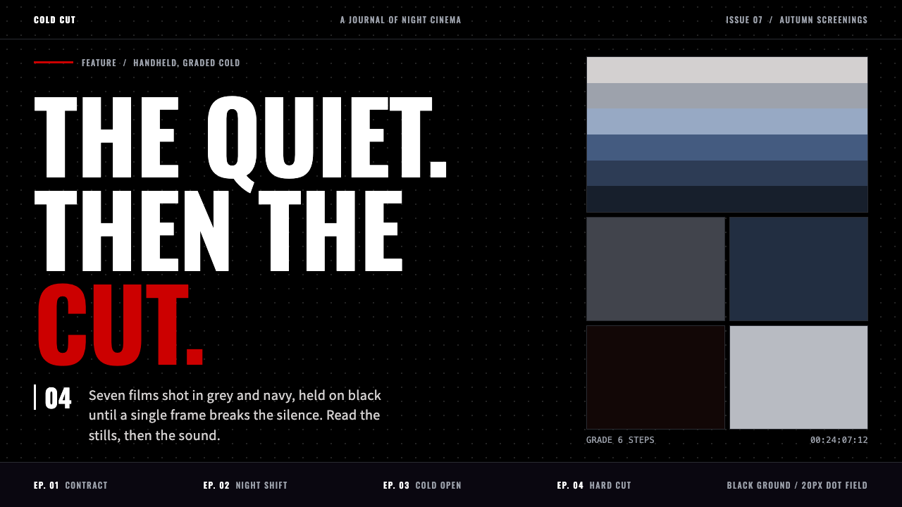 Chainsaw ManSilence, then one red cut. Dotted black page, cold grey-blue grade, condensed…
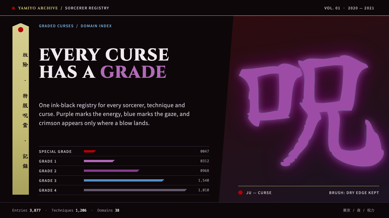 Jujutsu KaisenCrimson only at impact. Ink-black night, purple cursed glow, brush kanji and…
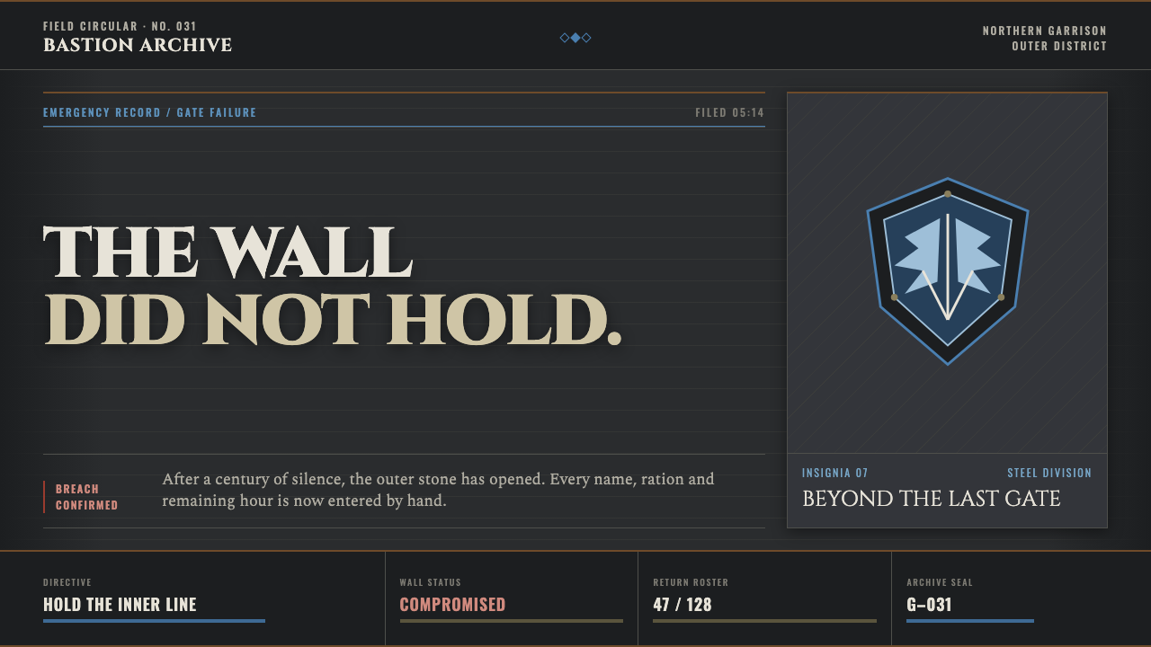 Attack on Titan (2013)Dread becomes duty. Stone-gray bands, engraved caps and one steel-blue crest…
 Death Note (2003)Silence becomes judgment. Bone-white blackletter and blue rules break under o…
 Demon Slayer (2019)Quiet craft, sudden force. Pine-black checks split beneath a water-teal strik…
 Ghana Barber Shop SignsChoice becomes a painted language. Chrome-yellow codes cut across an enamel-b…